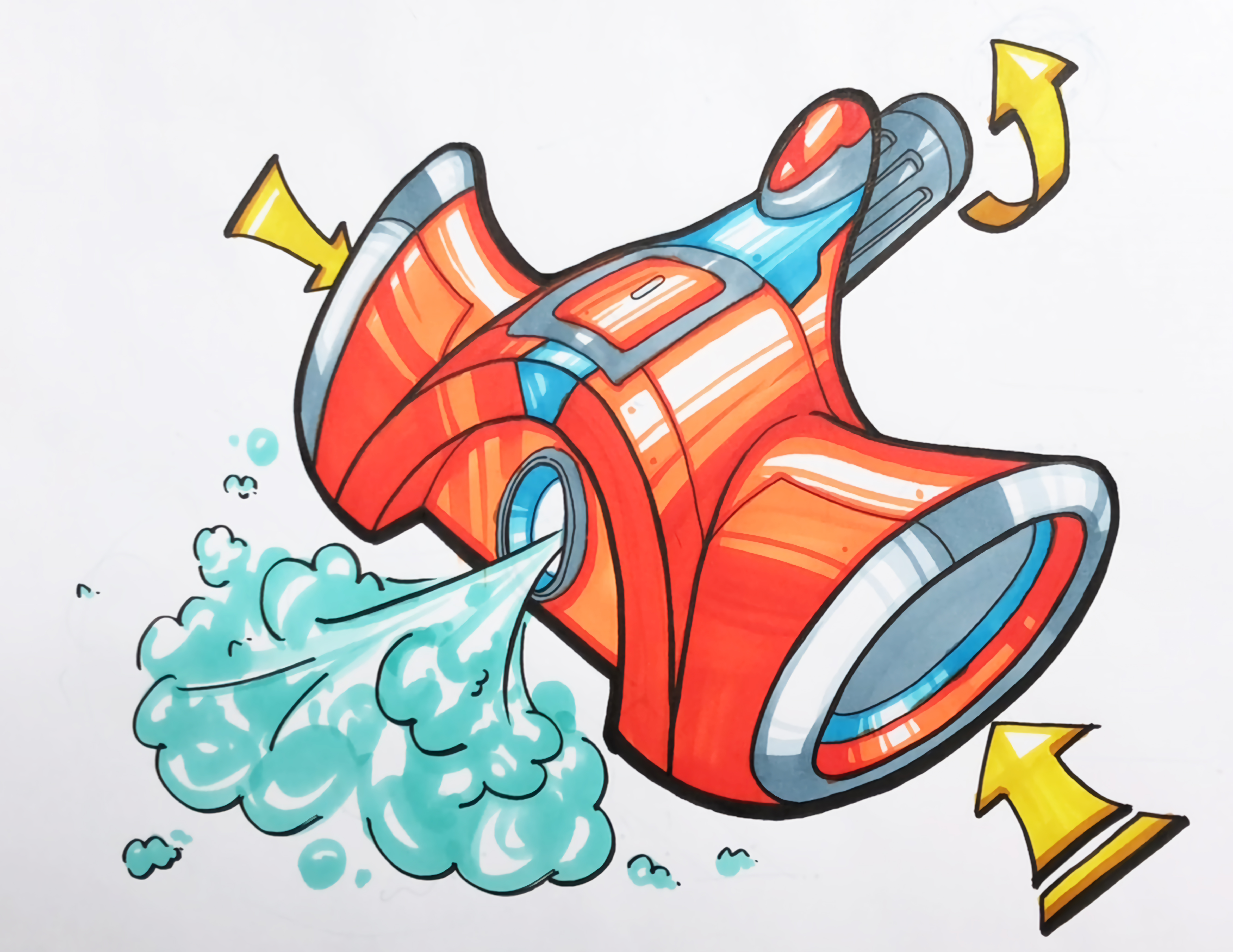
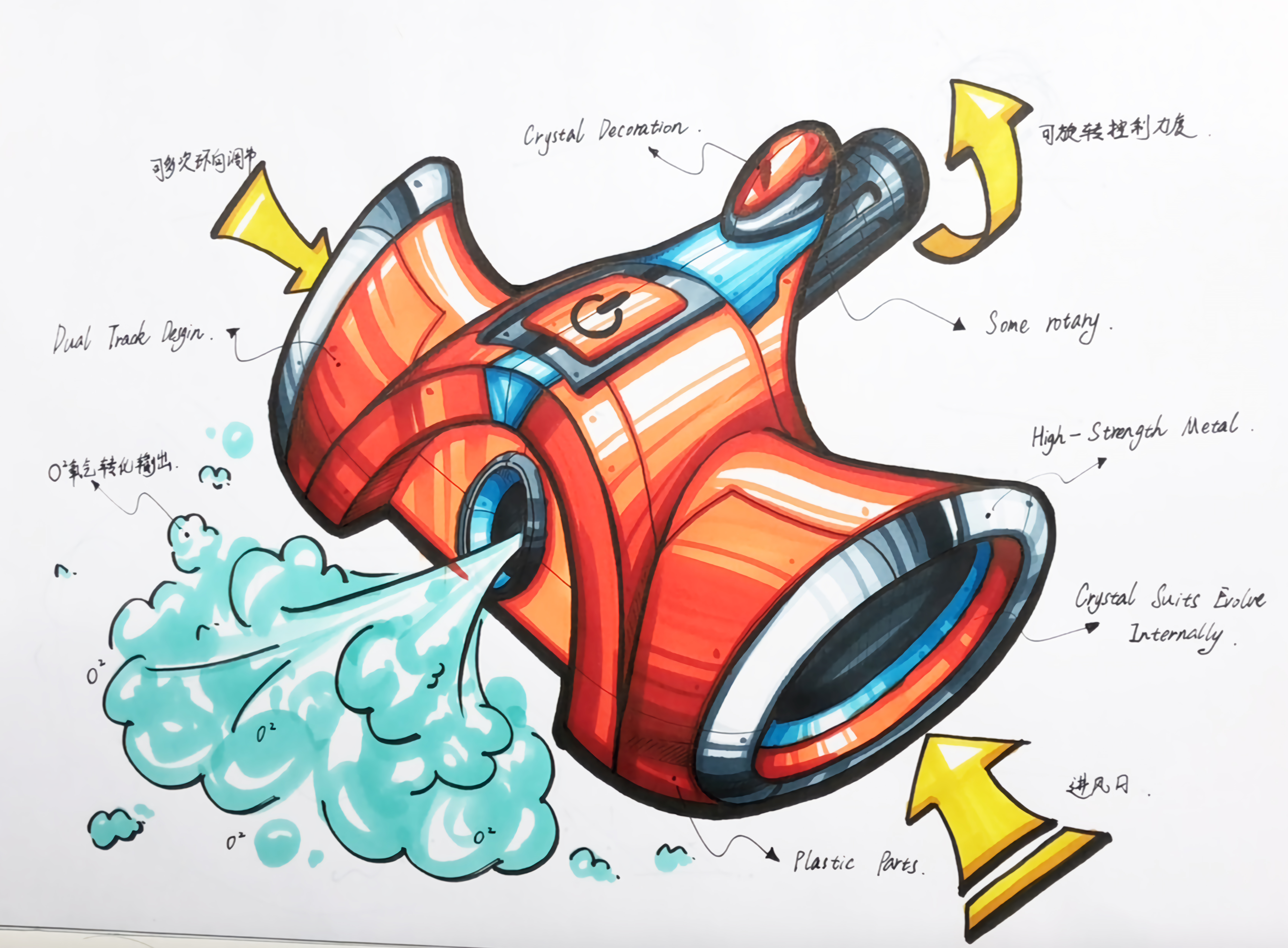
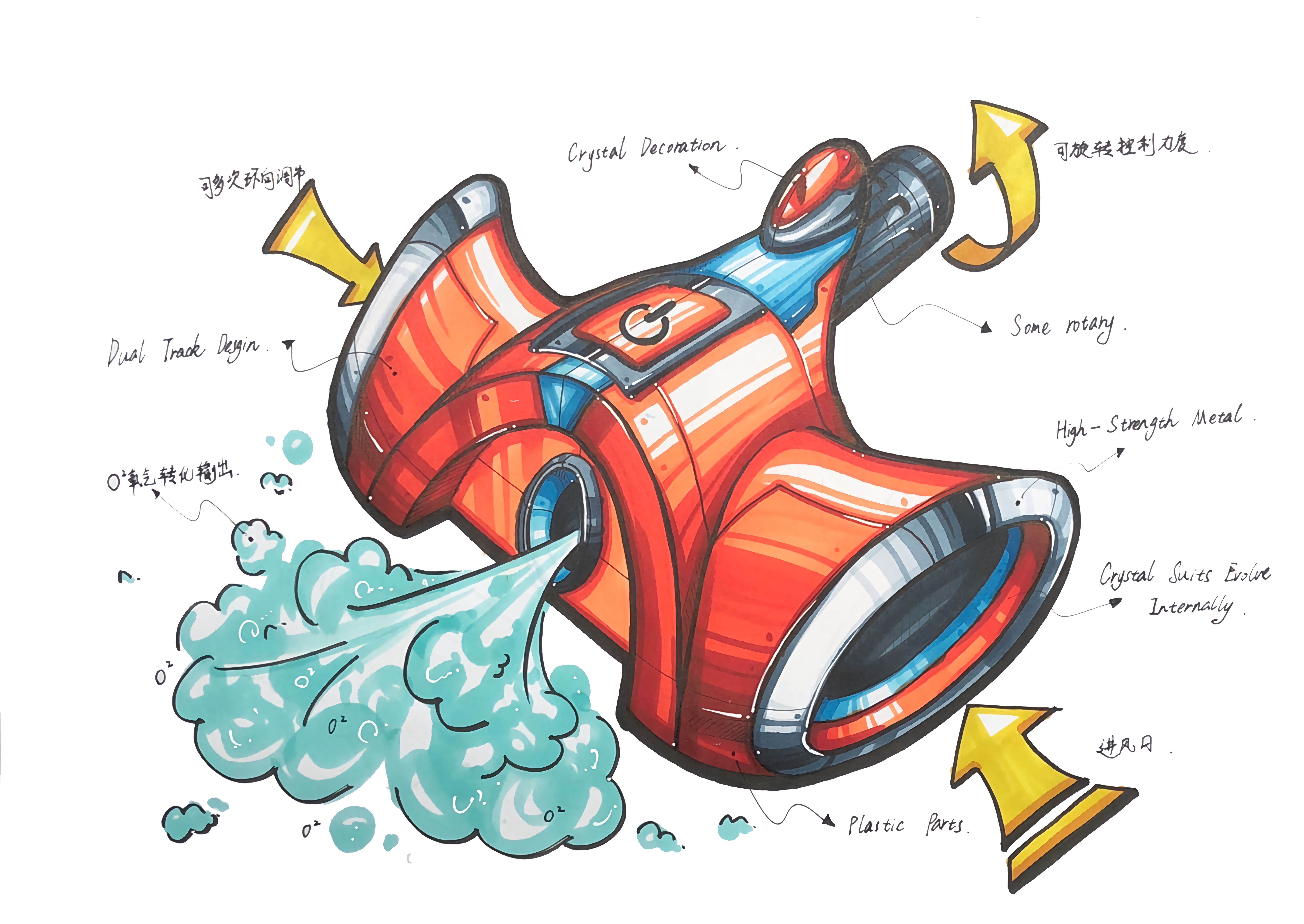
A super fun air purifier, come and let's play together ~
Hello everyone, I am Xuanwei, a hand-painted little white, you can call me Xiaoyi, in the next period of time, I will learn product hand-painted with you, hope to grow up with you
Today we are going to draw an air purifier, and the picture will finally show a clear and solid feeling. The tools we need to use are marker pens, needle pens, high-gloss pens, white colored lead and A3 paper. The following is a detailed tool list needed today. Next, let's draw happily together ~

In the starting stage//you can spend more time, in the perspective and characteristics of the product, grasp the shape accurately, the next step can get twice the result with half the effort oh ~
When it comes to tracing the line//everyone should remember a mouth feeling: fast, accurate, quick, quick, accurate, hard, pay attention to the fluency of lines and the harmony between bodies. if you are not mature in mastering lines, you can practice two or three straight lines or curves to warm up before drawing, which can make your hands more stable ~

Then we strengthen the linear relationship of the product on the original basic line draft. The core of the emphasis is four points: the relationship between front and back, the relationship between light and dark, the relationship between primary and secondary, and the relationship between modeling characteristics. Grasping these four points can make it easier for others to understand and agree with our plan.

When it comes to coloring///the light source must be determined first, and then appropriate white space can make the whole product feel more bulky. We can slow down the first color, think clearly about the proportion of each color and arrange the appropriate material type effect and then color. The color proportion of the product can refer to the visual principle of 60:30:10, with the main color block accounting for 60% and the gray block accounting for 30%, the dotted contrast color block accounts for 10%, which can make our scheme more prominent and the visual effect more coordinated. When we describe the oxygen it ejects, we need to show its gentle texture, layering and volume.

When we arrange the proportion of bright and dark products, we can also use the principle of 60:30:10, which can effectively prevent us from accidentally painting the picture. When painting gray surface, we can incidentally draw the surface light effect of some materials, so that the product has more interaction with the light source, which can make our picture more vivid and save a lot of adjustment time for our later period.
This hand-painted product, in addition to the material of oxygen, also needs to be depicted in three other different materials, namely plastic material, gem material and stainless steel material, each material has its own performance characteristics. In the product, adding appropriate different materials can enrich our picture.

Then came the link of dealing with the dark part // The dark part is the smallest part of the bright and gray when we portray the conventional products. It should be noted that the dark part should be depicted as much as possible to avoid cutting the dividing line of the dark surface, and to ensure the integrity of the boundary line of the second dark part as much as possible, so that the products can look more integrated and comfortable. When expressing the rounded corners of some products, we can also use the dark side to make the turning more smooth.

When it comes to the card point link // it is necessary to pay attention to the point until the point is reached. there is no need for more, just put it in place. The dividing line of the dark part and the expression of the effect of stainless steel are the key links of the card point. If you need it, I can also arrange different performance effects of other materials in the next video to communicate and learn with you.

When it comes to the detail description//we should pay attention to using our needle pen to deal with the shape features of some shapes. We need to show some midlines, structural lines, fillet lines and parting lines between parts of the product parts. Adding small cable lines to the dividing lines of the dark surface can make the dark parts more breathable.

Adjust the integrity of the picture // We can add arrows and introduction text about the product in the blank place of the picture, and we can add Chinese and English as appropriate to enrich our overall picture effect.

At the last step, it is time for us to inject our soul. At this time, we need to use our highlight pen to depict the reflection, highlight and partial turning points of the product to make our product look more complete.
The copyright of this work belongs to 小艺设计考研. No use is allowed without explicit permission from owner.

New user?Create an account
Log In Reset your password.
Account existed?Log In
Read and agree to the User Agreement Terms of Use.

Please enter your email to reset your password
The sketch became a drawing
A strong taste of hand-painted postgraduate entrance examination
666
Special thinking
What a big brain hole
[Creative Expression//Hand-painted Product Design-Fresh Air Really Fragrance ~] https://www.bilibili.com/video/BV1id4y1w763?share_source=copy_web&vd_source=2e222812481ac3497ec0e2f3da0eb012
Thank you for your support ~