Recently always like some tattered style.
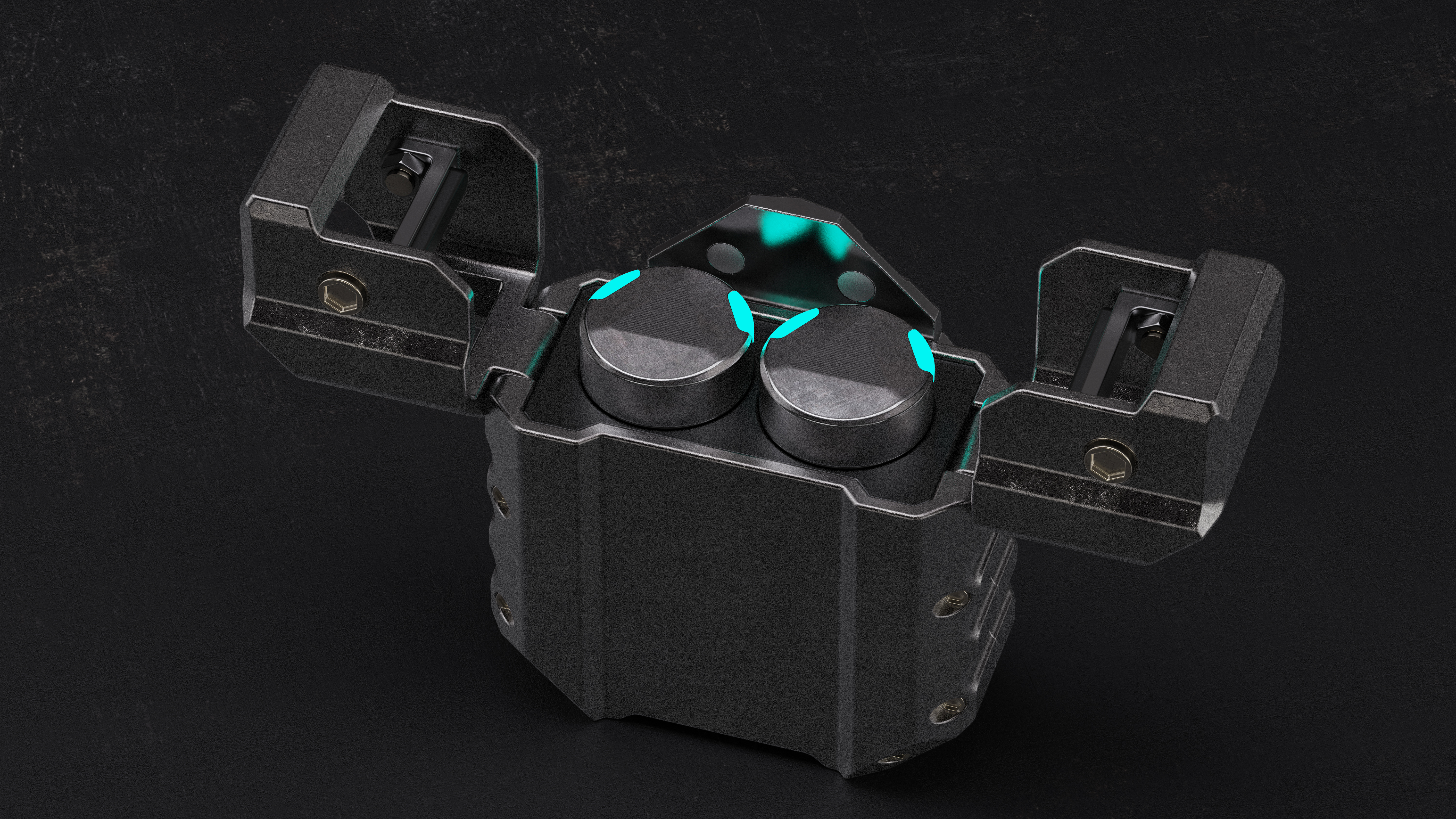
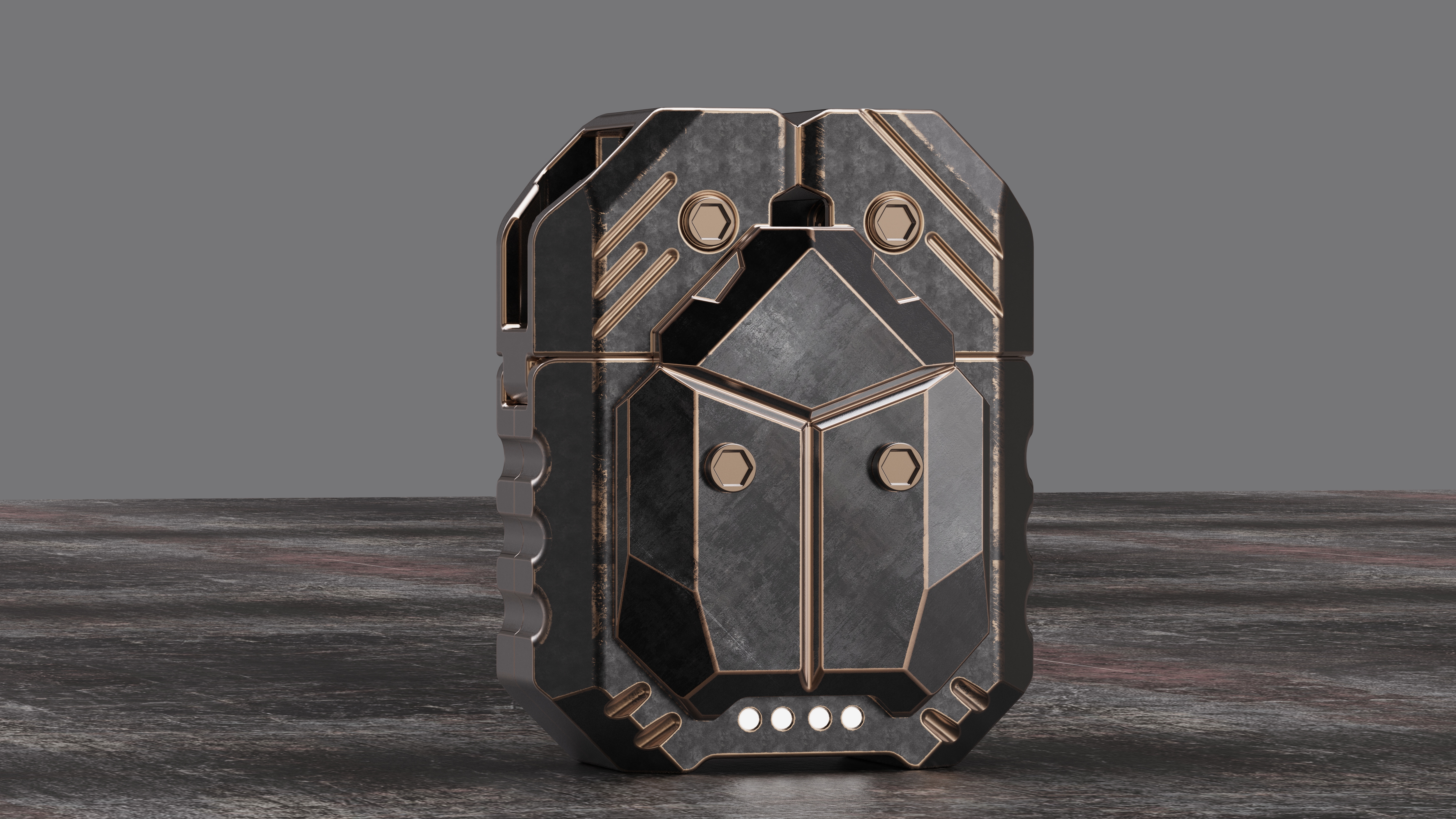
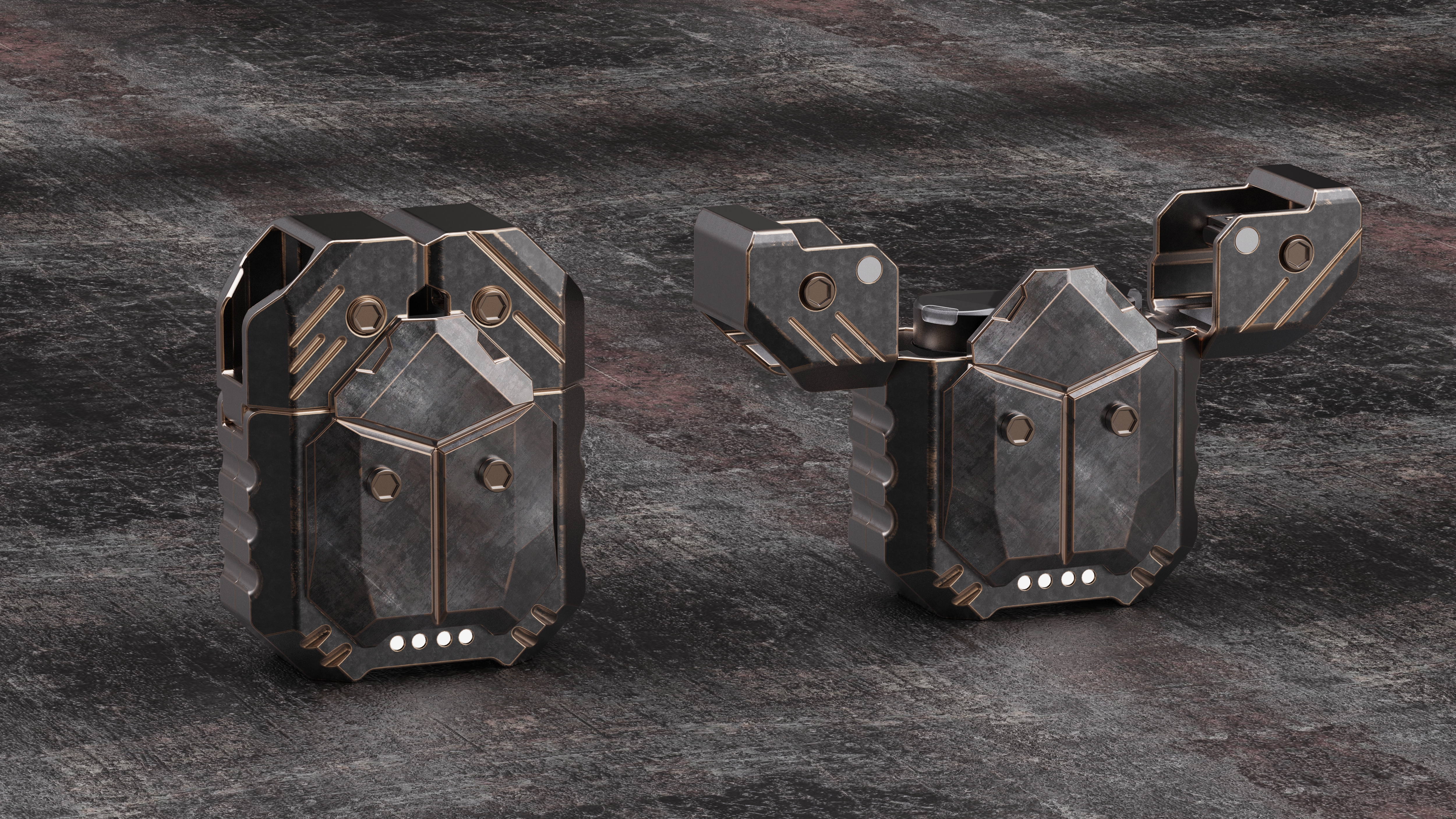
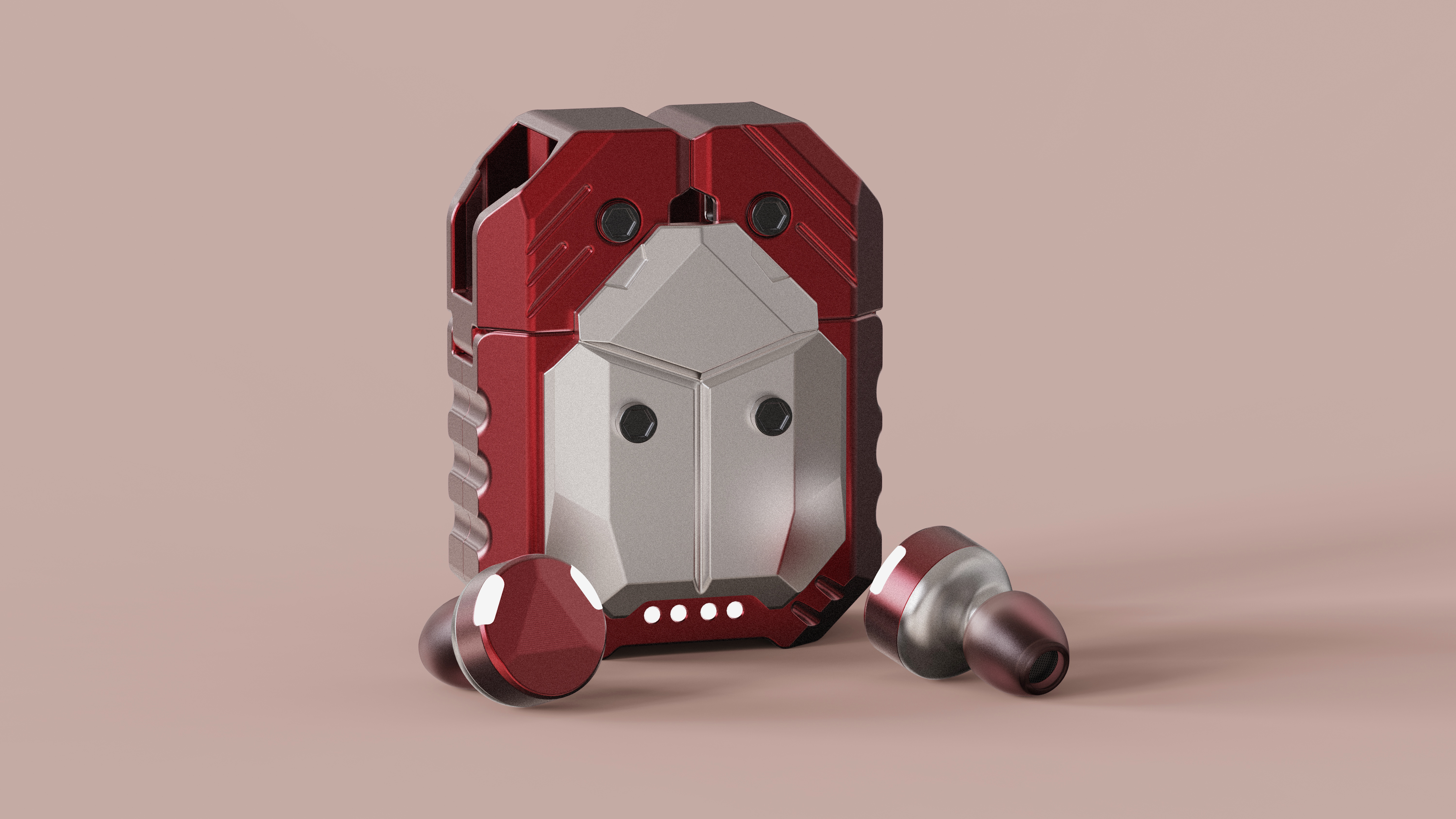
The design inspiration comes from a beetle brand product map on the Pinterest. Those who often look at industrial design should be familiar with that map.
Recently, I also talked about products with some people in various industries. In fact, I just want the so-called "differentiation"
In fact, my understanding of the so-called "differentiation" is nothing more than two points.
The first point: technological innovation, but the cost is relatively high, which requires multiple elements to break through at the same time.
The second point: is the appearance of innovation, including color, material, process. This is relatively easy for most companies.
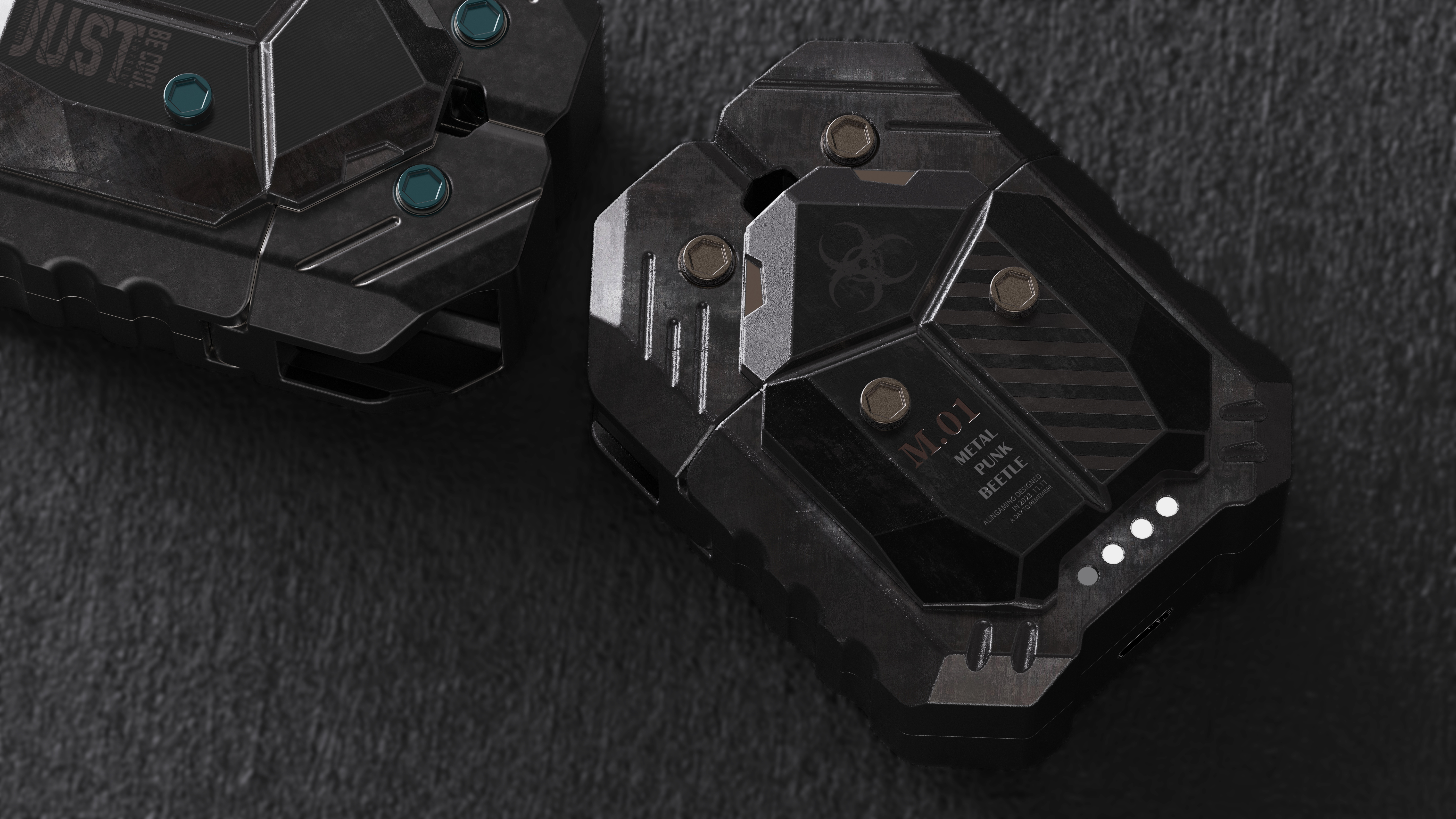
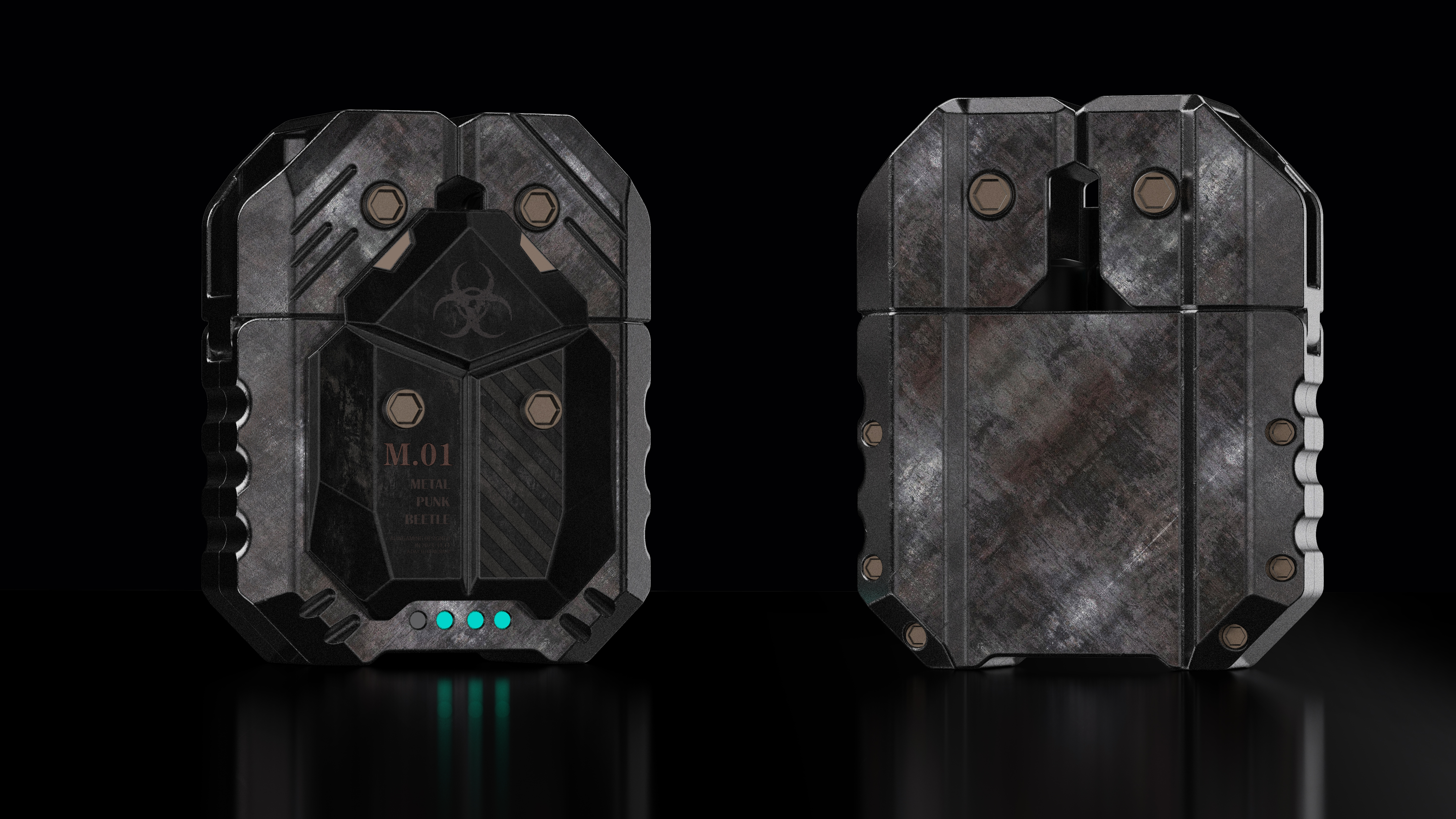
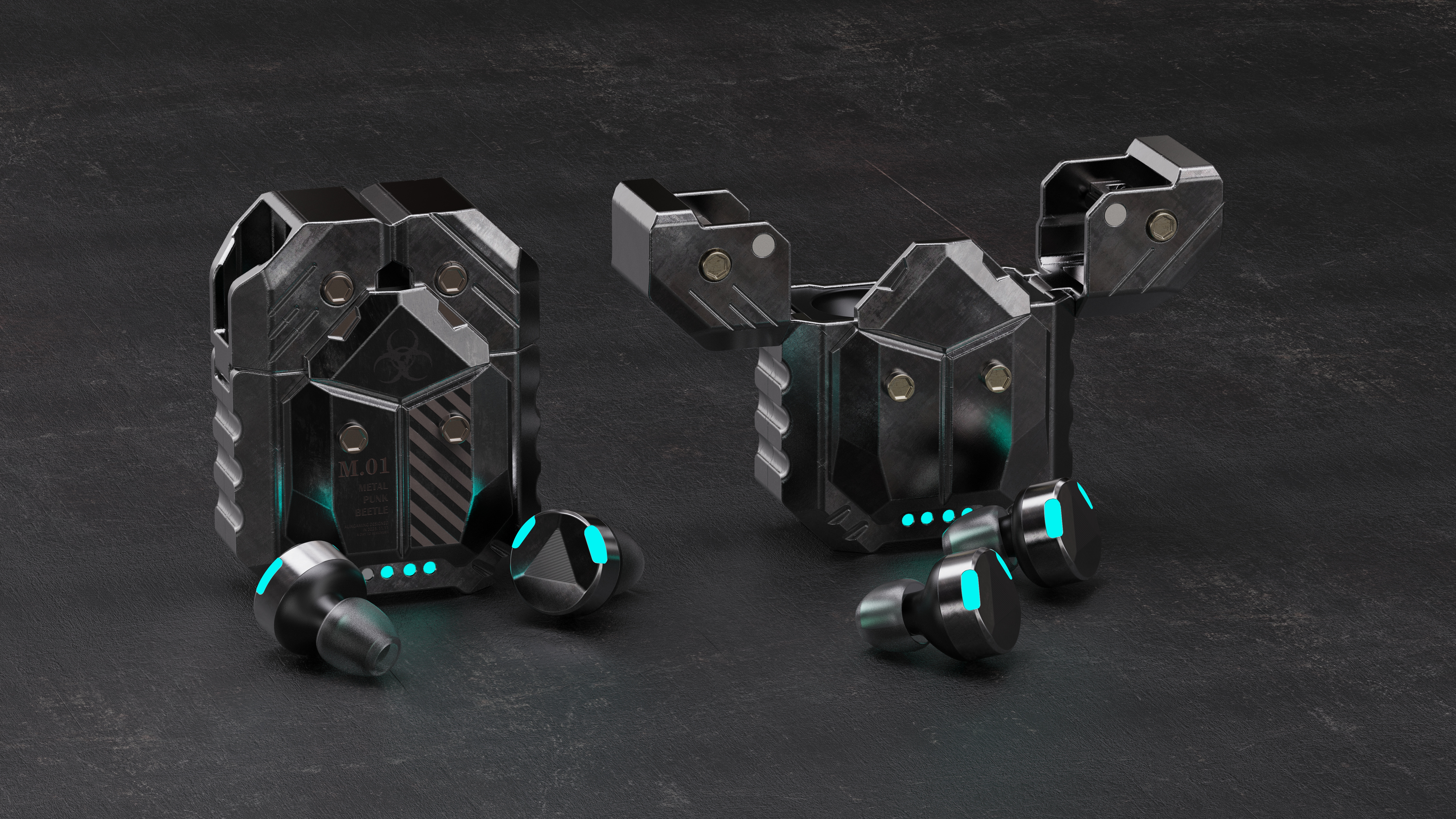
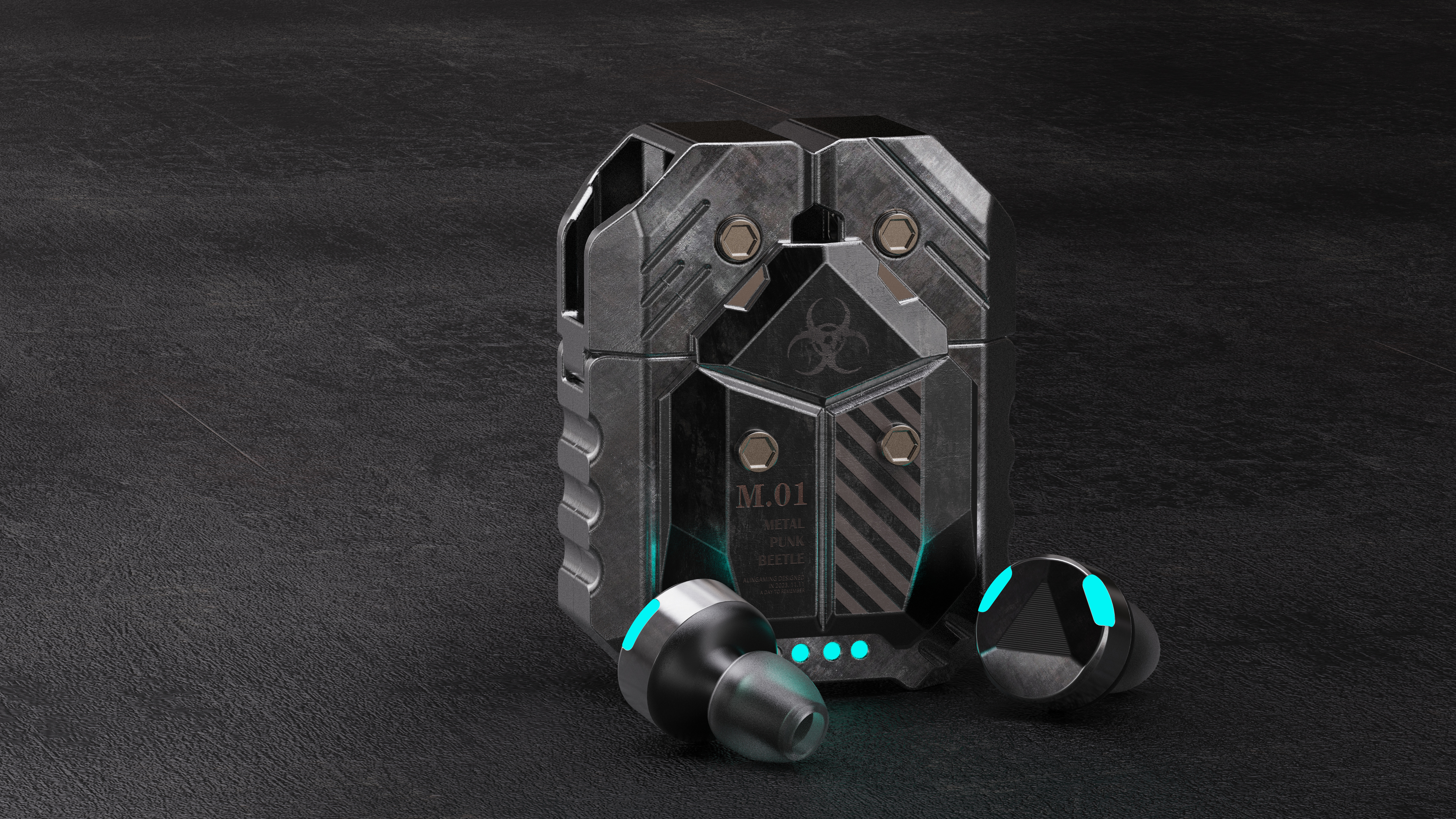
I 've said too much, look at the picture! I feel that the texture of this group of pictures is not bad. Behind the more simple process of surface treatment color matching.
Design Collaboration: 13774556647



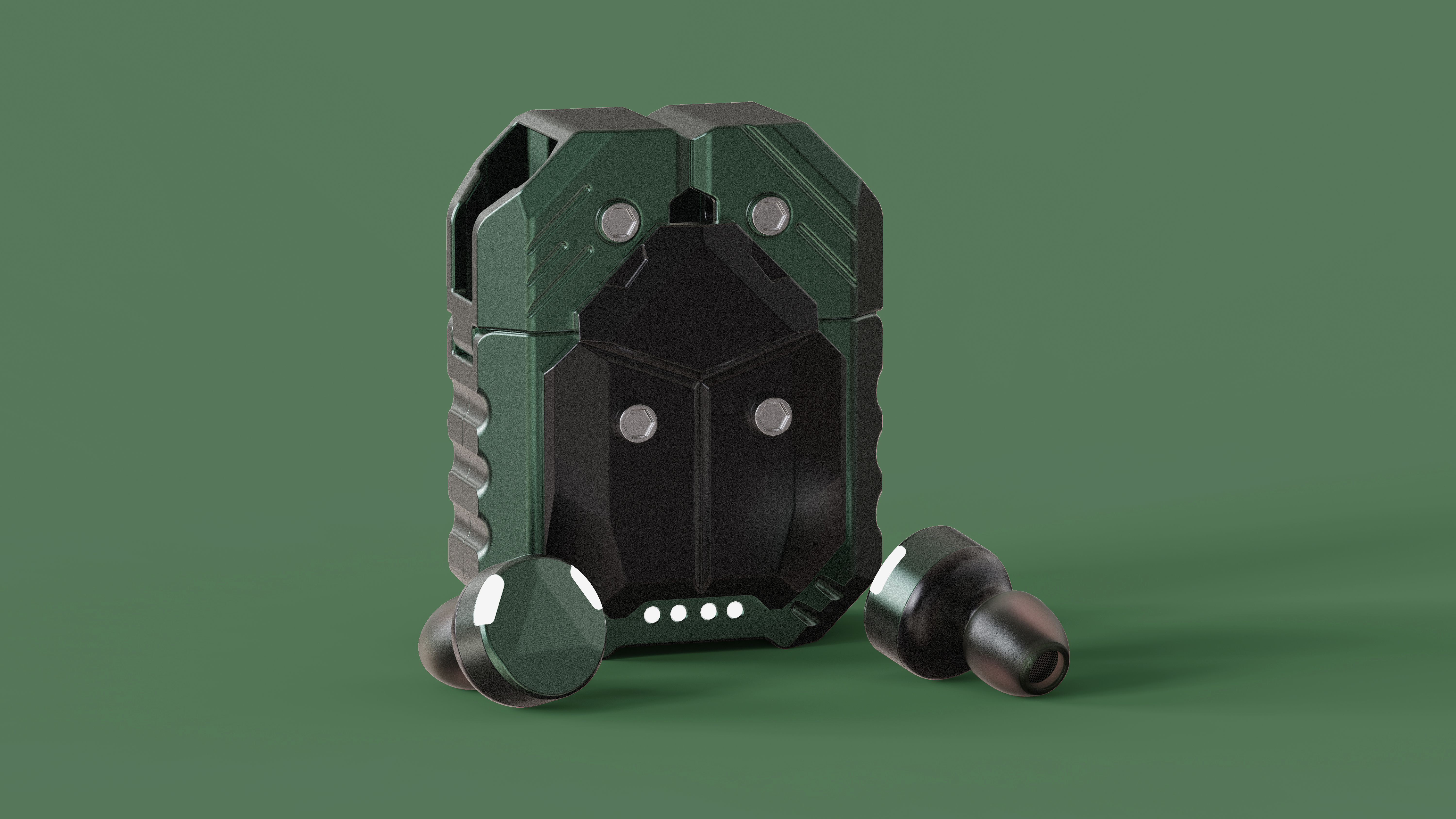
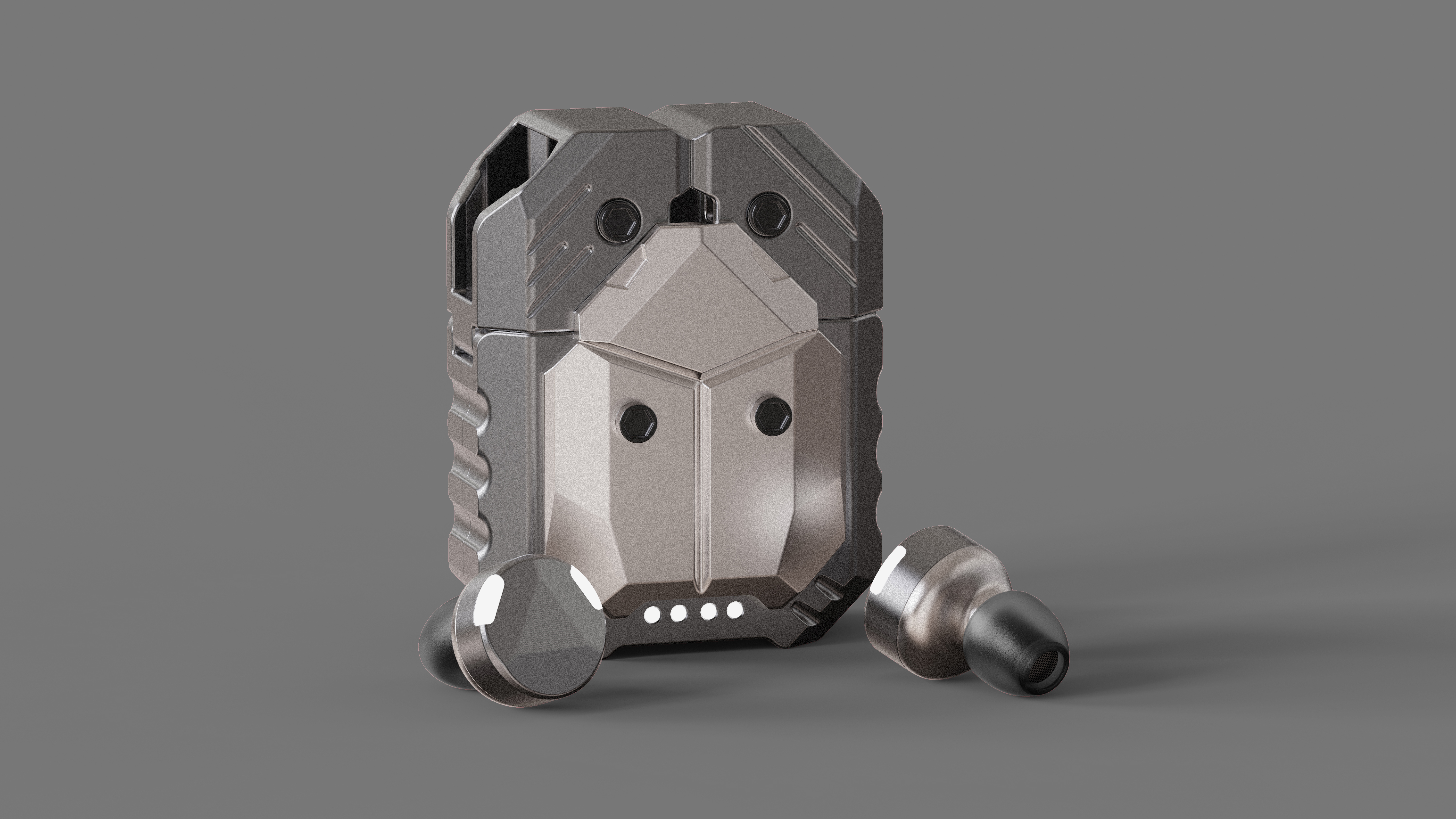
The copyright of this work belongs to AlinGaming. No use is allowed without explicit permission from owner.

New user?Create an account
Log In Reset your password.
Account existed?Log In
Read and agree to the User Agreement Terms of Use.

Please enter your email to reset your password
Perfect sense of contrast, look at the old one, but it has more embellishment effect on the product
Hello, can you cooperate
This magnetic flap is well designed!!!
The old effect is good.
This retro style is really good