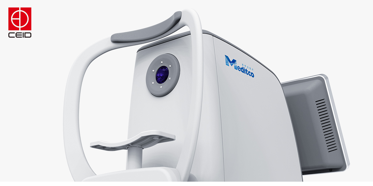
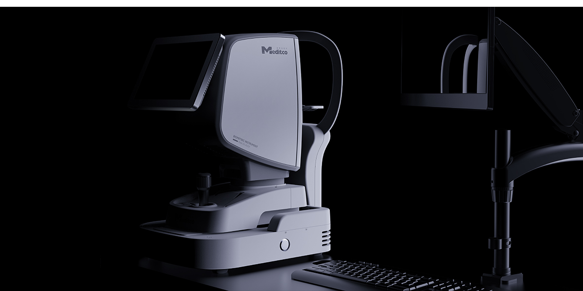
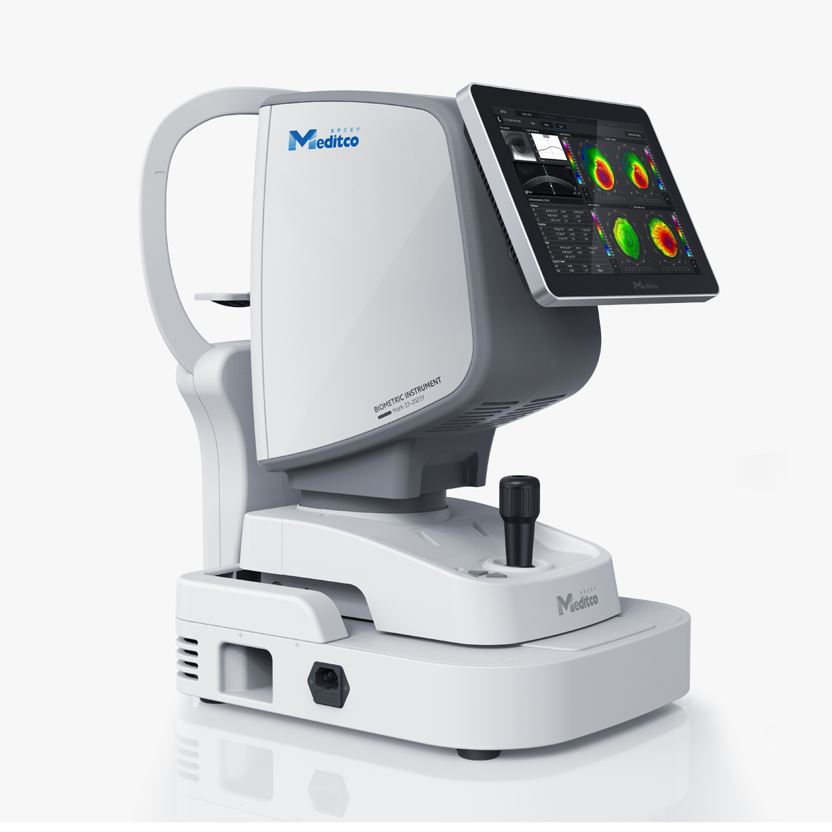
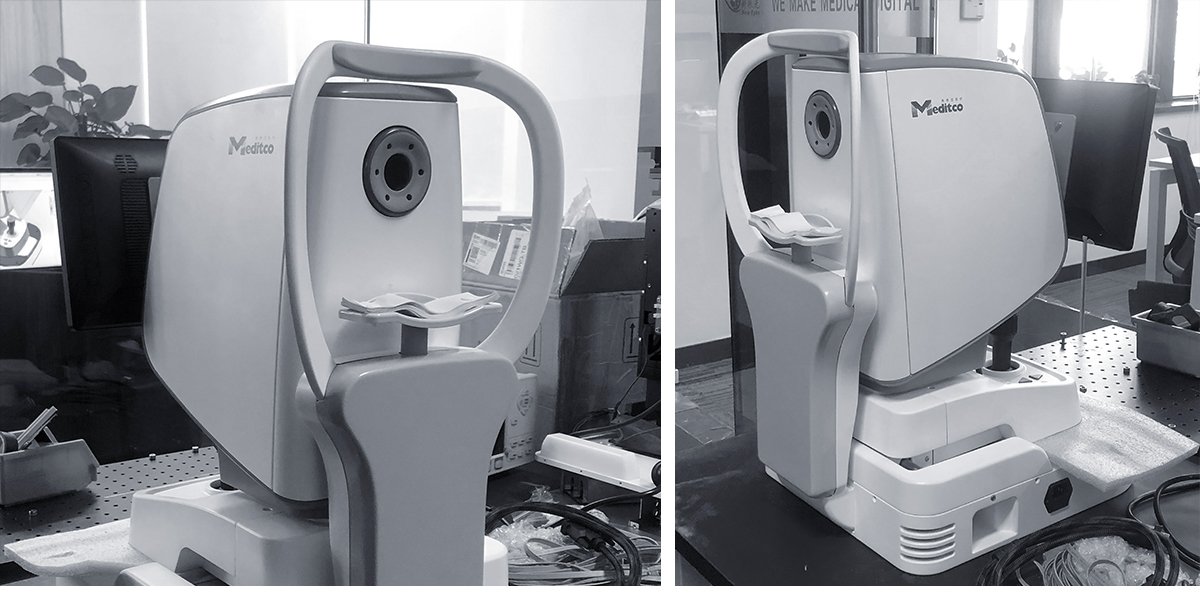
After decades of catching up, China finally has the technical strength to compete with foreign first-line optical medical companies in optical medical technology. However, due to the high-tech barriers of optical medicine, everyone has been focusing on technology research and development, and in industrial design, basically no one pays attention. This has led to the neglect of brand image and other aspects even if we have the first-line R & D capability and technology, which makes the domestic first-line brands lose the opportunity to enter the international environment competition. There is no exquisite appearance design, no structural design that can withstand scrutiny, which is the current problem in the industry.
We have unified the entire product line by re-regulating the design semantics of the Metima brand and using the family language of C- type wrapping. The redundant structural parts are wrapped in, and the overall operation mode will become more efficient and direct. The feedback from users will also be clearer and clearer. The iconic blue ring at the eyepiece represents the brand image and visual identity of the Metimai family. The combination of rounded corners and cambered surfaces weakens the oppression and tension caused by medical products to patients and enhances affinity.
The copyright of this work belongs to 合木设计. No use is allowed without explicit permission from owner.
New user?Create an account
Log In Reset your password.
Account existed?Log In
Read and agree to the User Agreement Terms of Use.
Please enter your email to reset your password
It's not easy
it can be