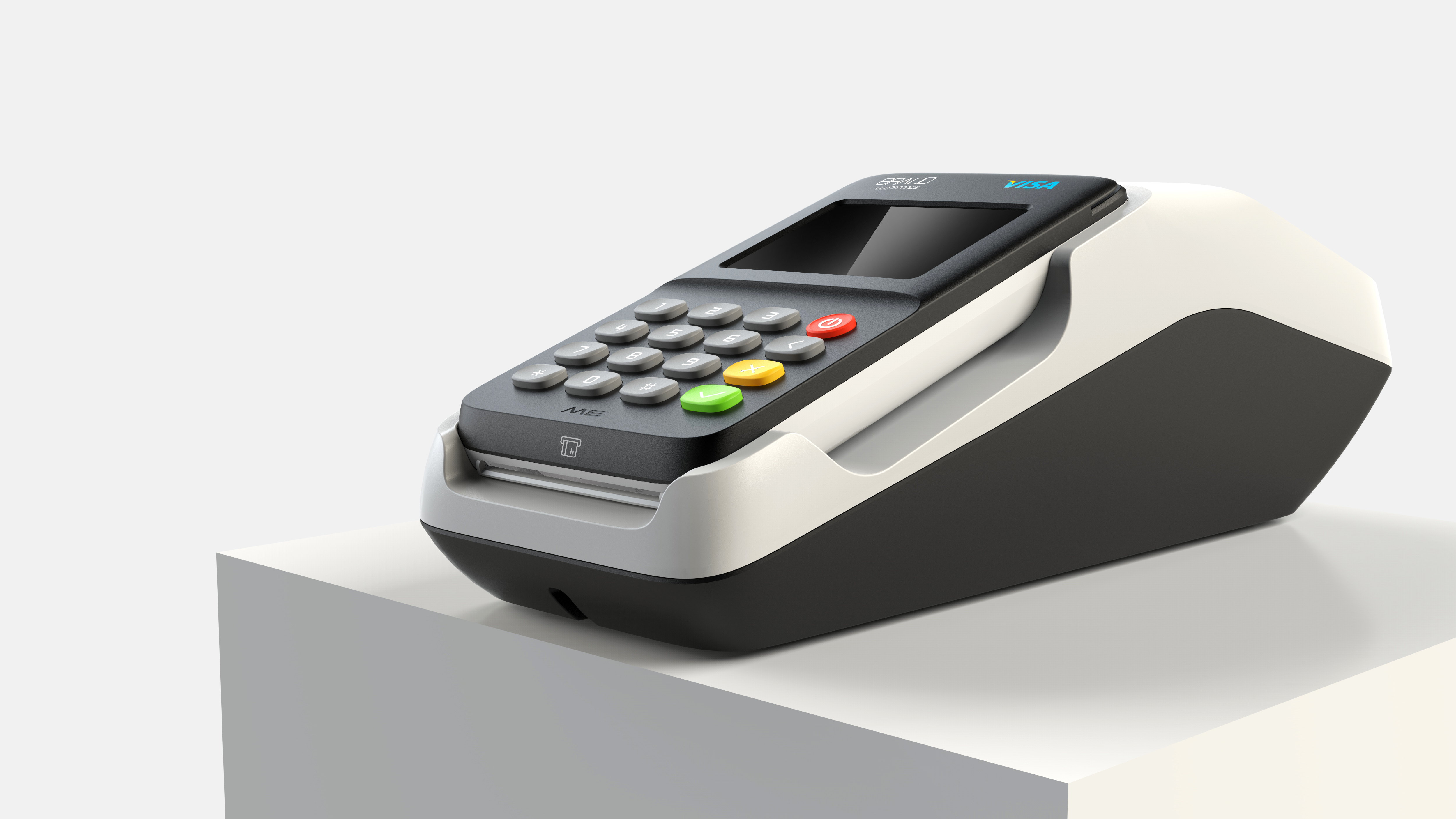
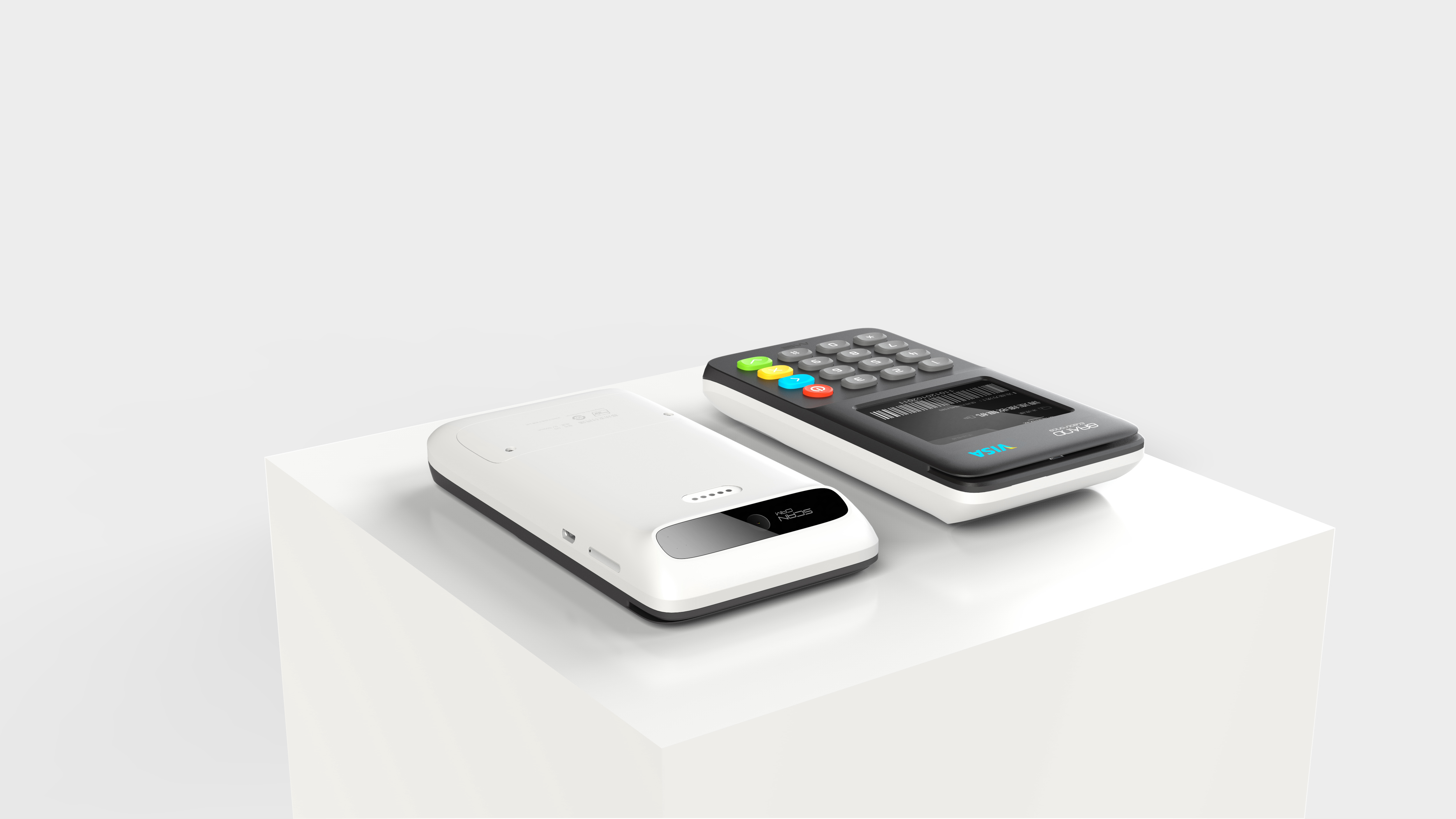
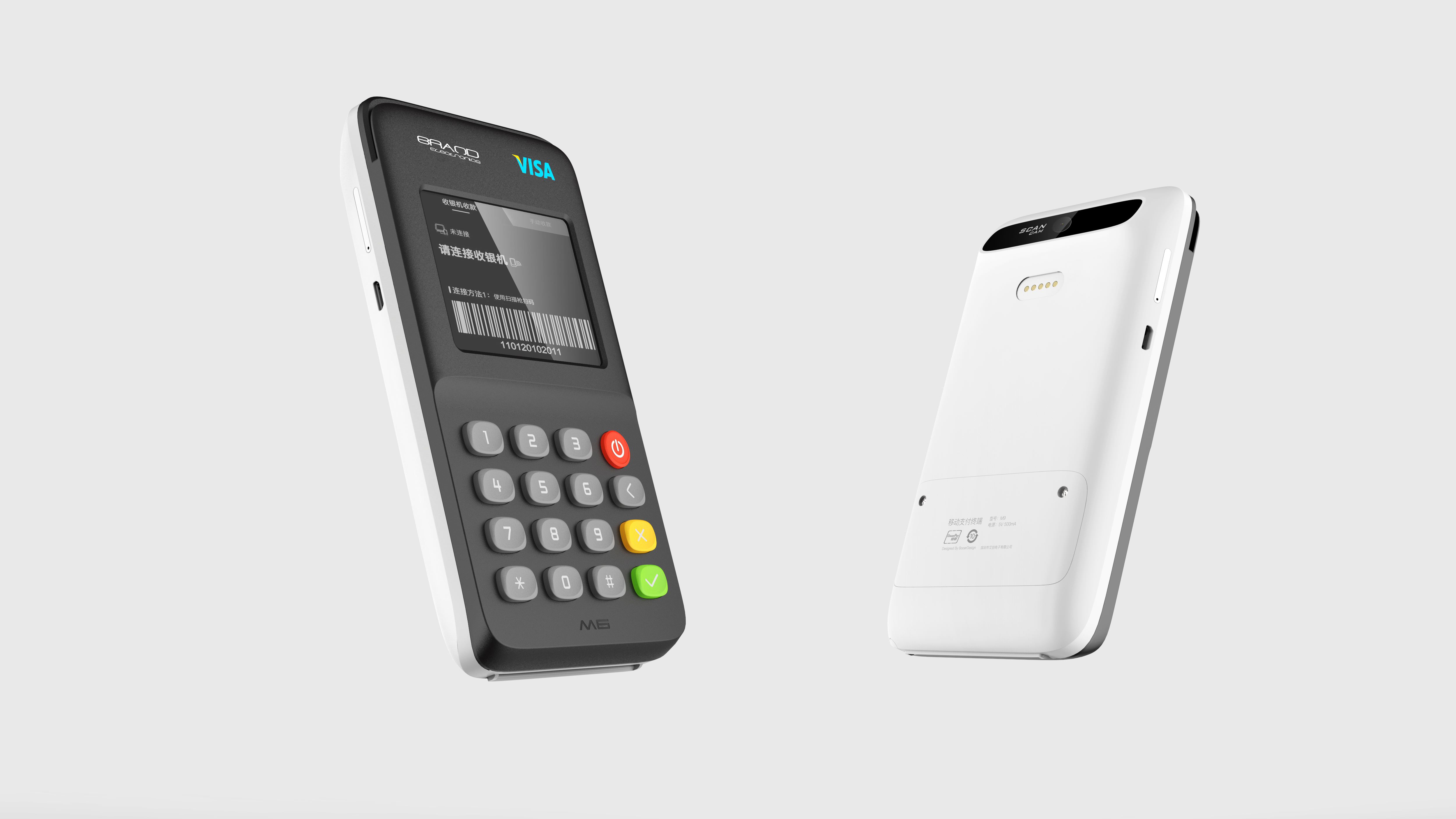
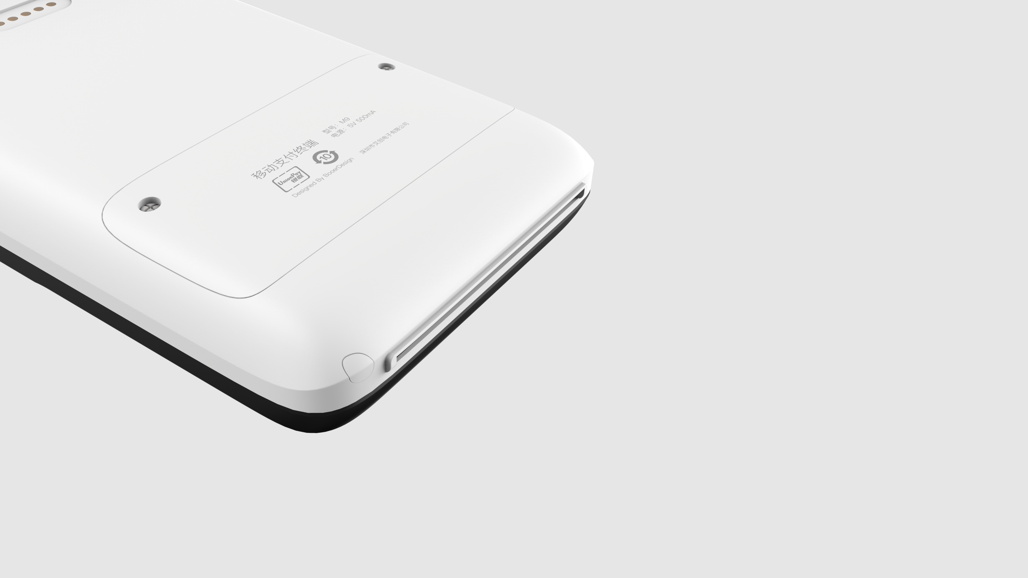
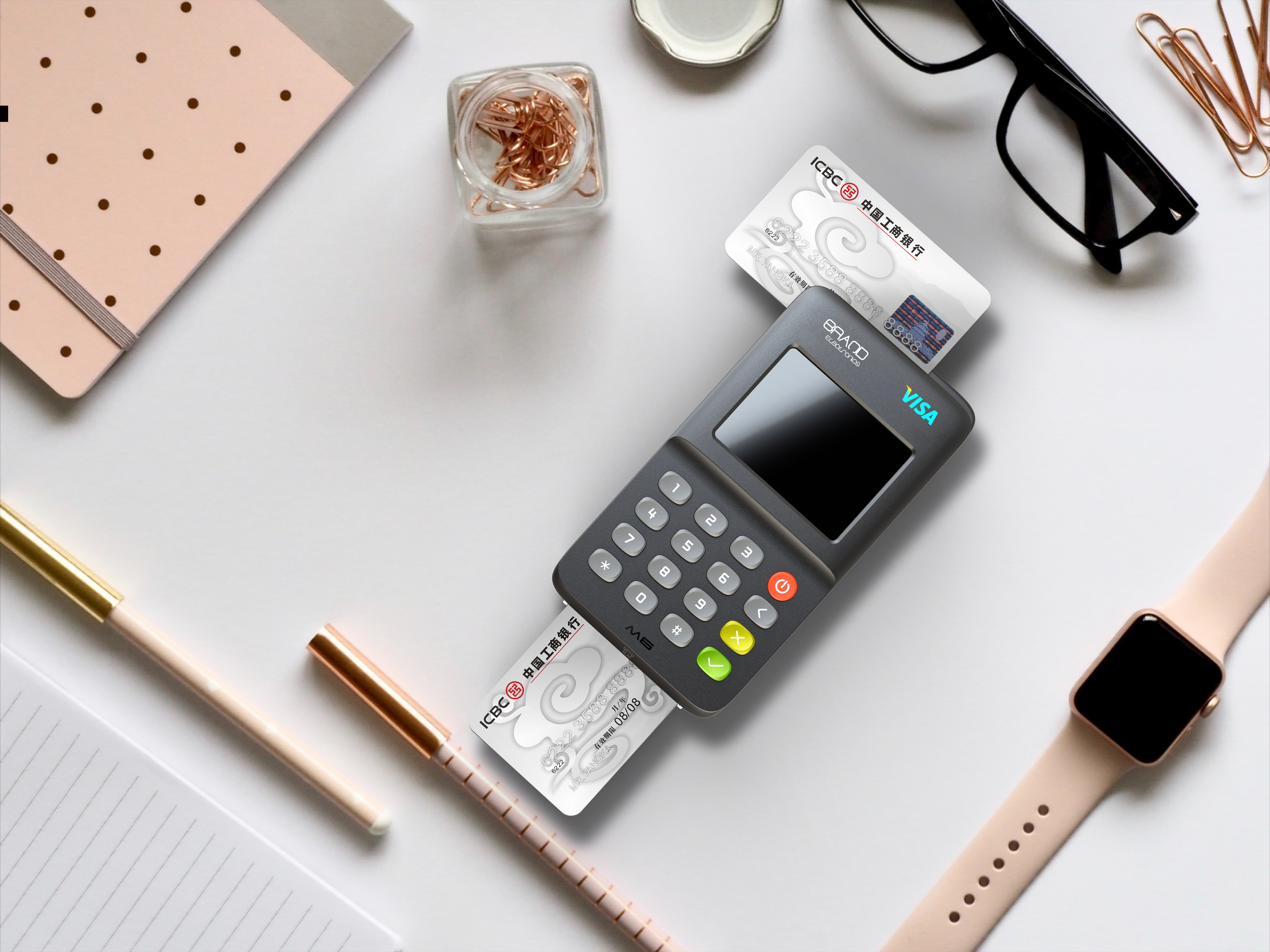
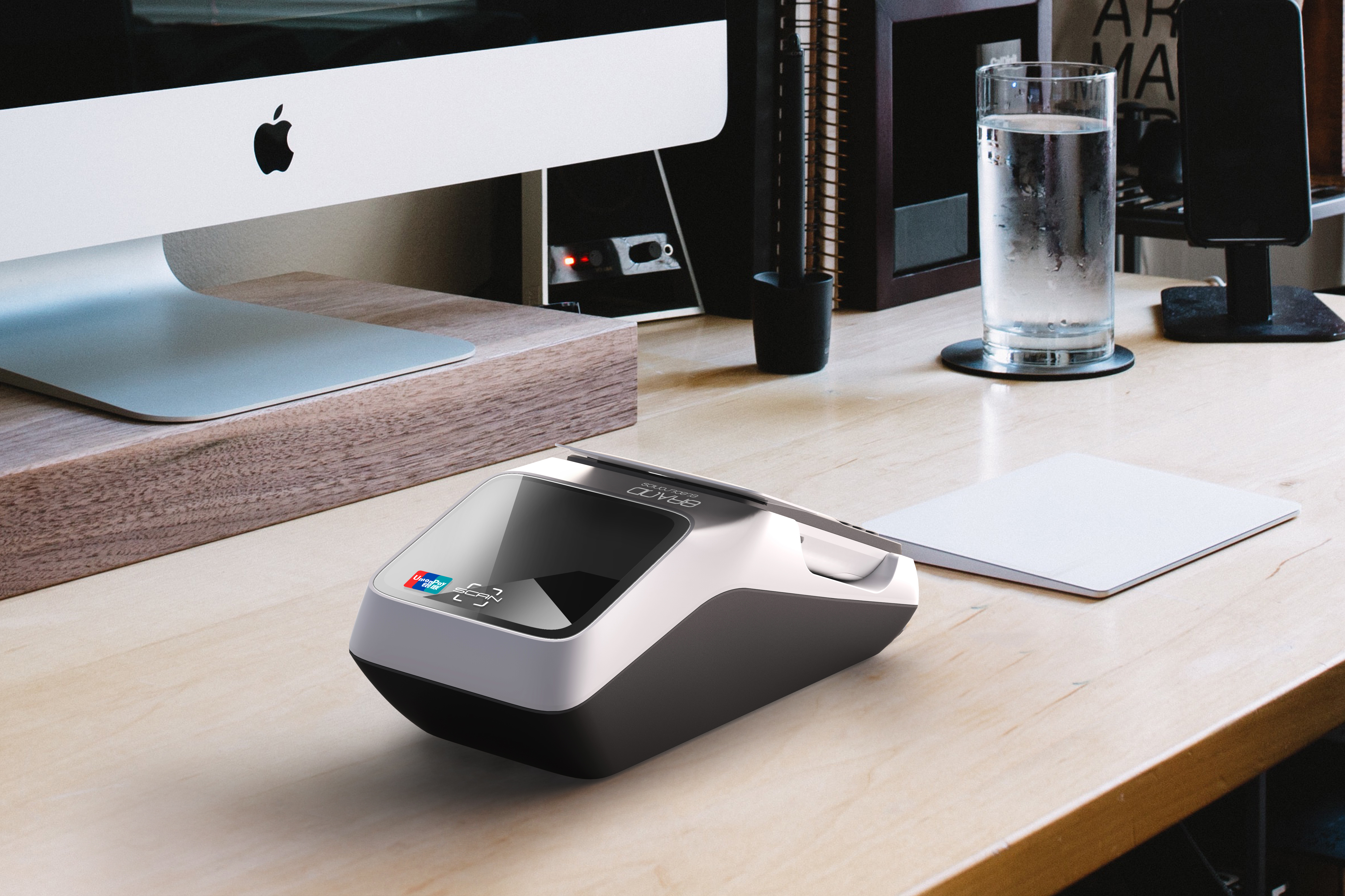
Design of cash register system for a pos machine. Almost all products in the walkie-talkie industry are from the perspective of professional design, which looks like cold equipment, and the complex shapes are really disliked by individuals. Until Xiaomi designed a walkie-talkie, simple and clear design, without exaggerated sense of three-proof equipment, I prefer this. Many people say that the designed product must conform to its professional field. I am more disgusted with this kind of view. How can the design be certain. Of course, products in some professional fields like Germany are really professional and beautiful. I don't reject professional product design that looks professional, but if we jump off some labels in the original product field, it will also be a brand-new visual experience. There are many people complaining about millet. Although millet is not the best, I think it is the most suitable. The following is an 18-year pos machine design project. The sketch cannot be found and other subsequent updates.

The copyright of this work belongs to ZEON. No use is allowed without explicit permission from owner.

New user?Create an account
Log In Reset your password.
Account existed?Log In
Read and agree to the User Agreement Terms of Use.

Please enter your email to reset your password
Very good! Have a sense of the times
Very good
It can be very professional and beautiful and fashionable at the same time, raising the public's aesthetic
Great