Lingyun Creative Design-Lao Guang Liang Fang
Most consumers' impression of herbal tea is basically shops run by grandfathers or old women. They cook tea diligently every day only to bring the most authentic herbal tea to their neighbors.
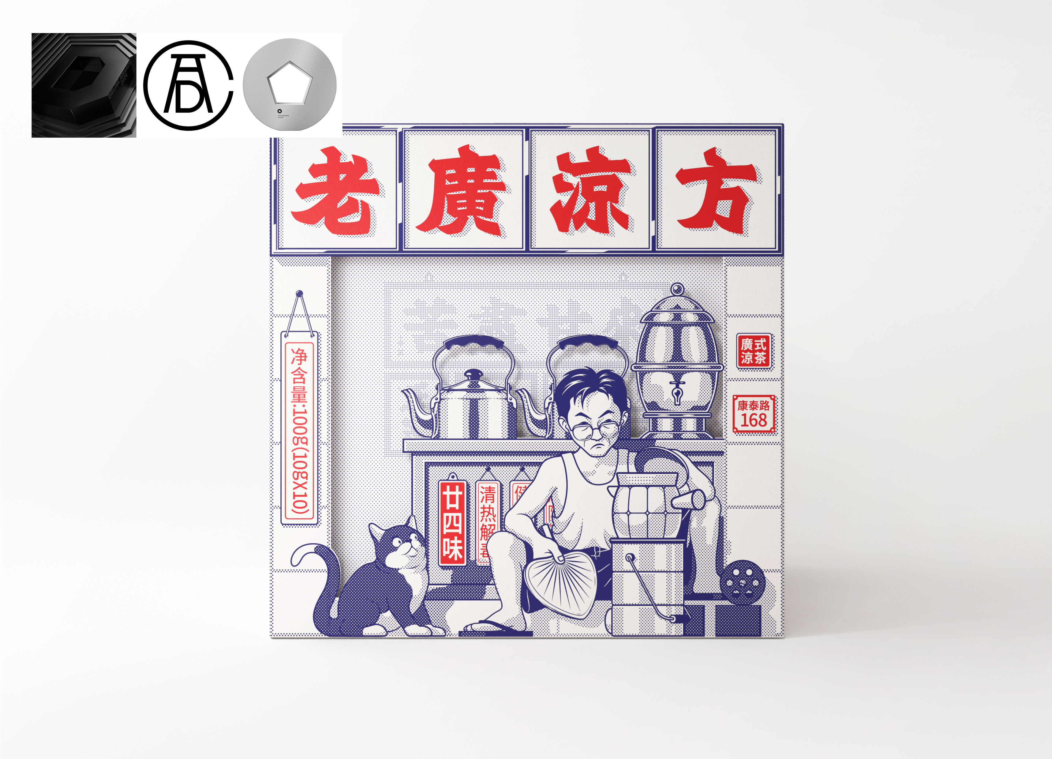
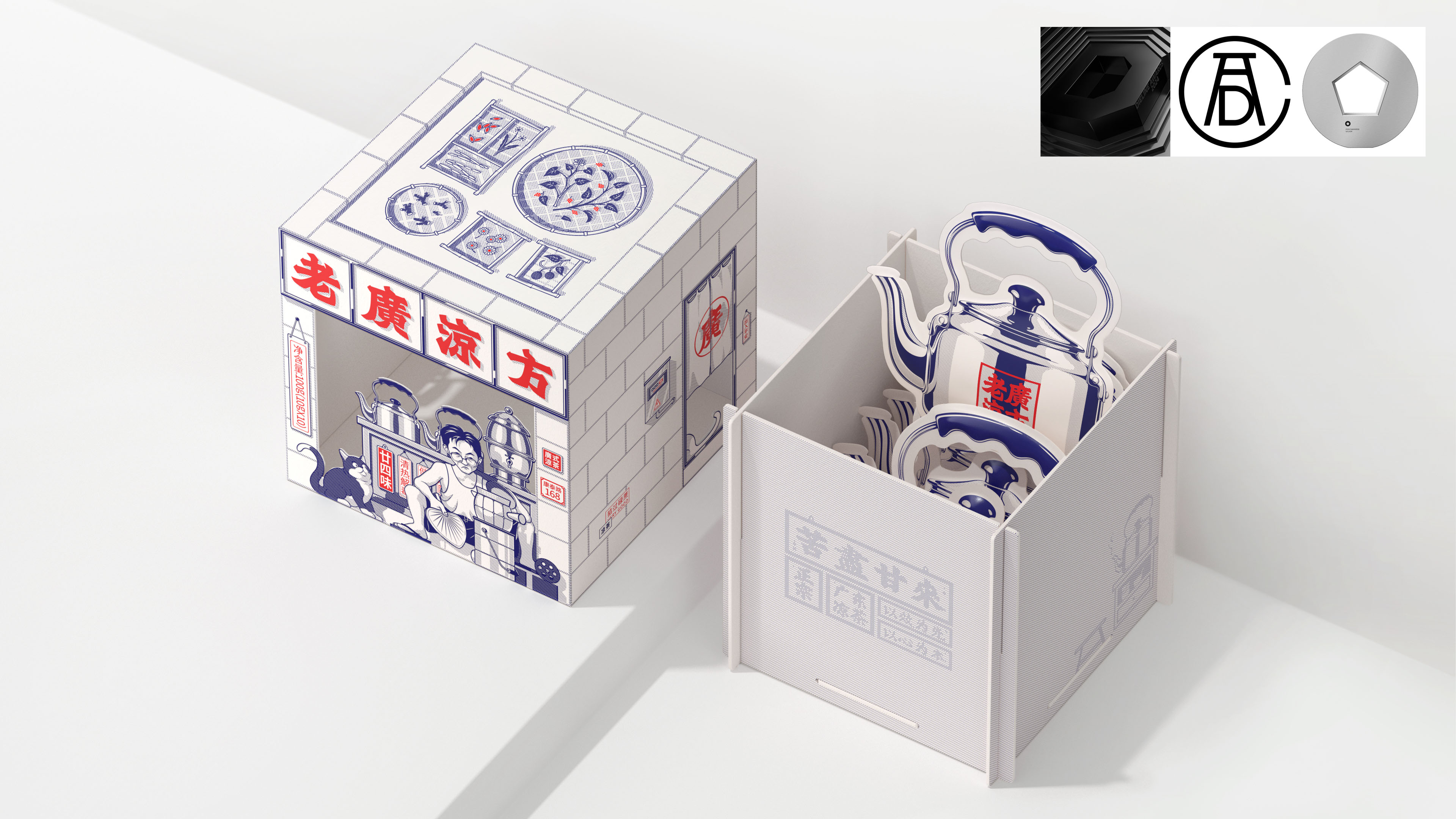
"Laoguang" refers to the Cantonese-speaking and native-born Guangdong locals. As a group of people who have been exposed to "herbal tea" since childhood, it is said that they have the most research on "herbal tea. The shape we created is like the packaging of a herbal tea shop, which is full of strong "Laoguang" flavor.
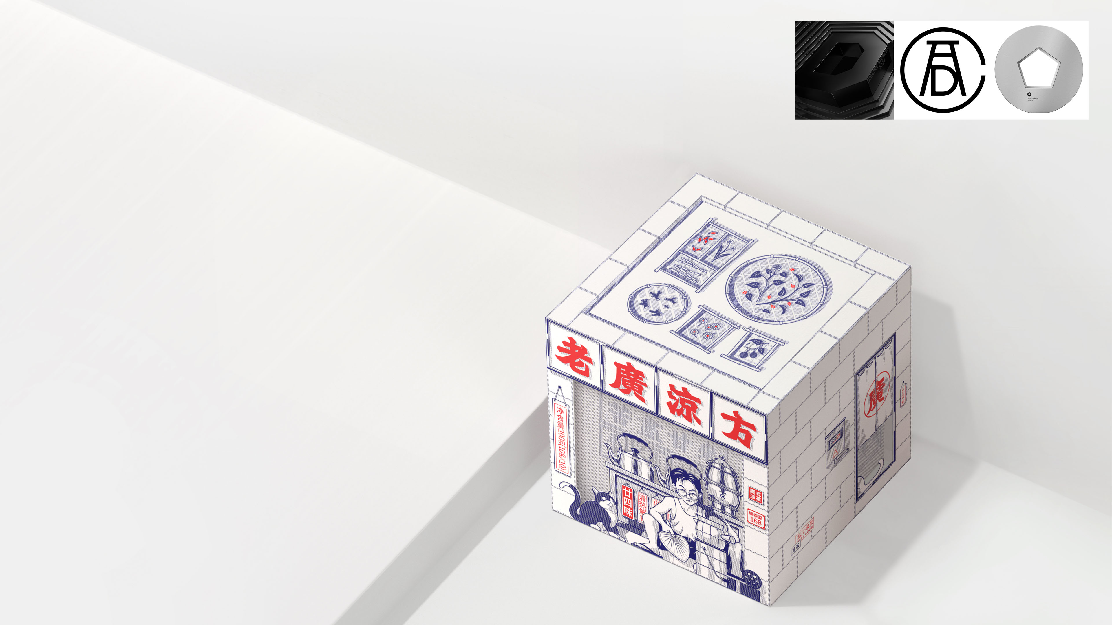
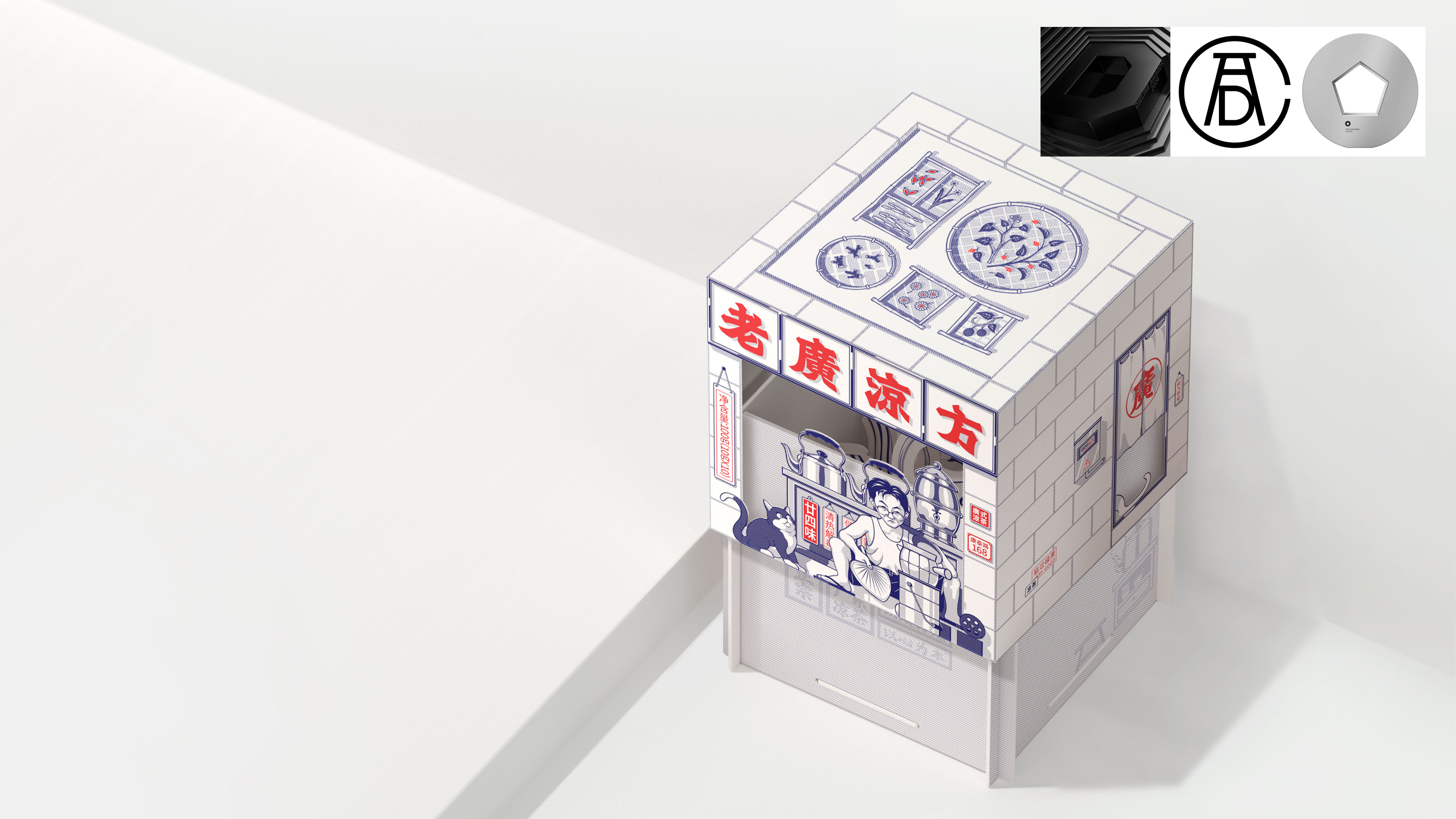
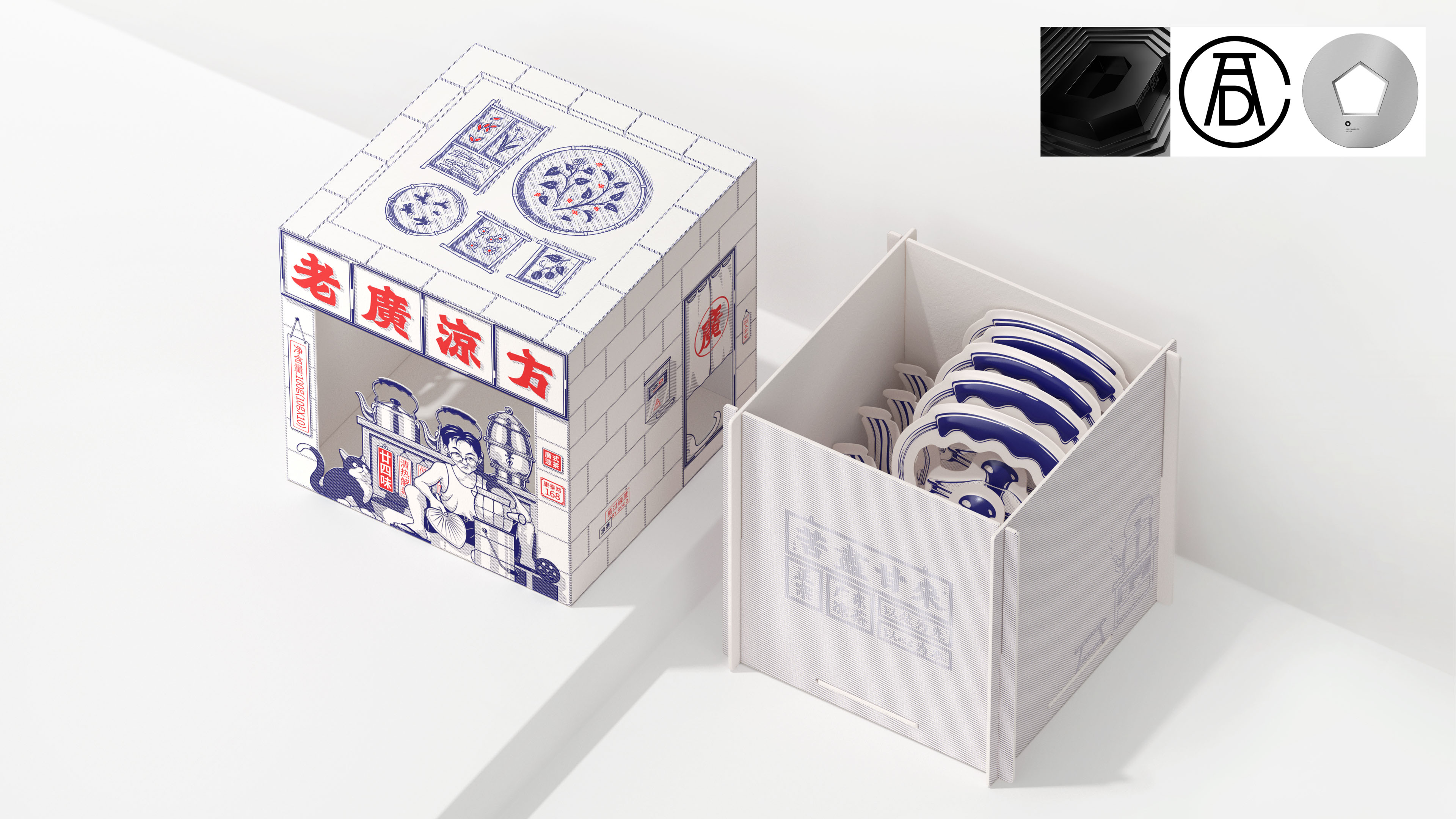
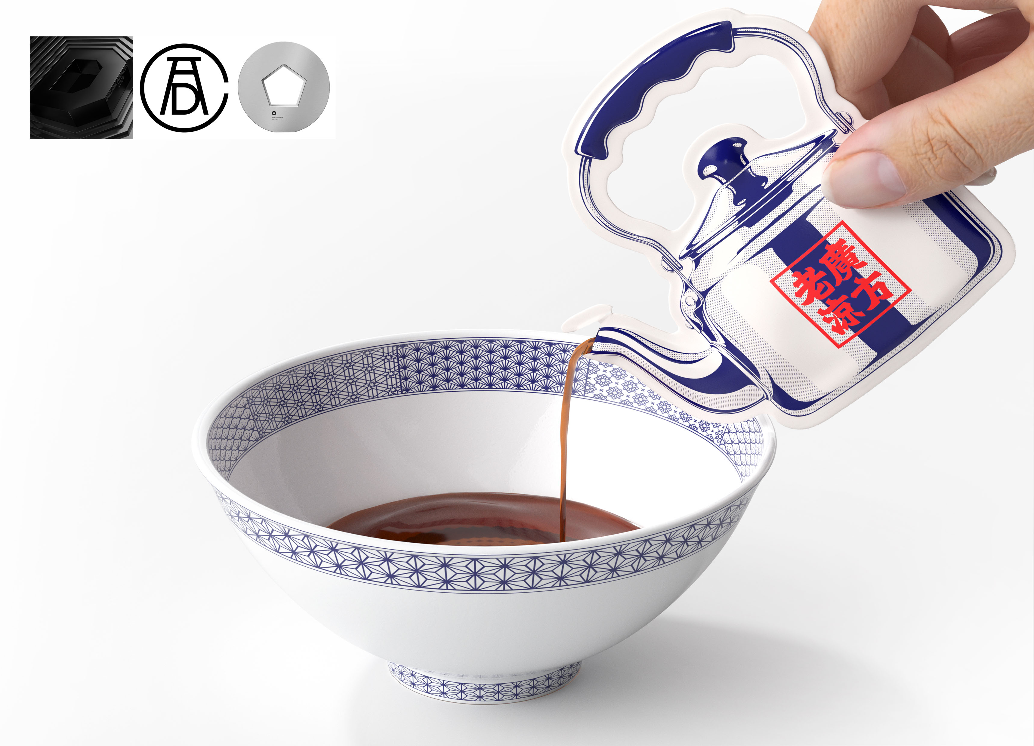
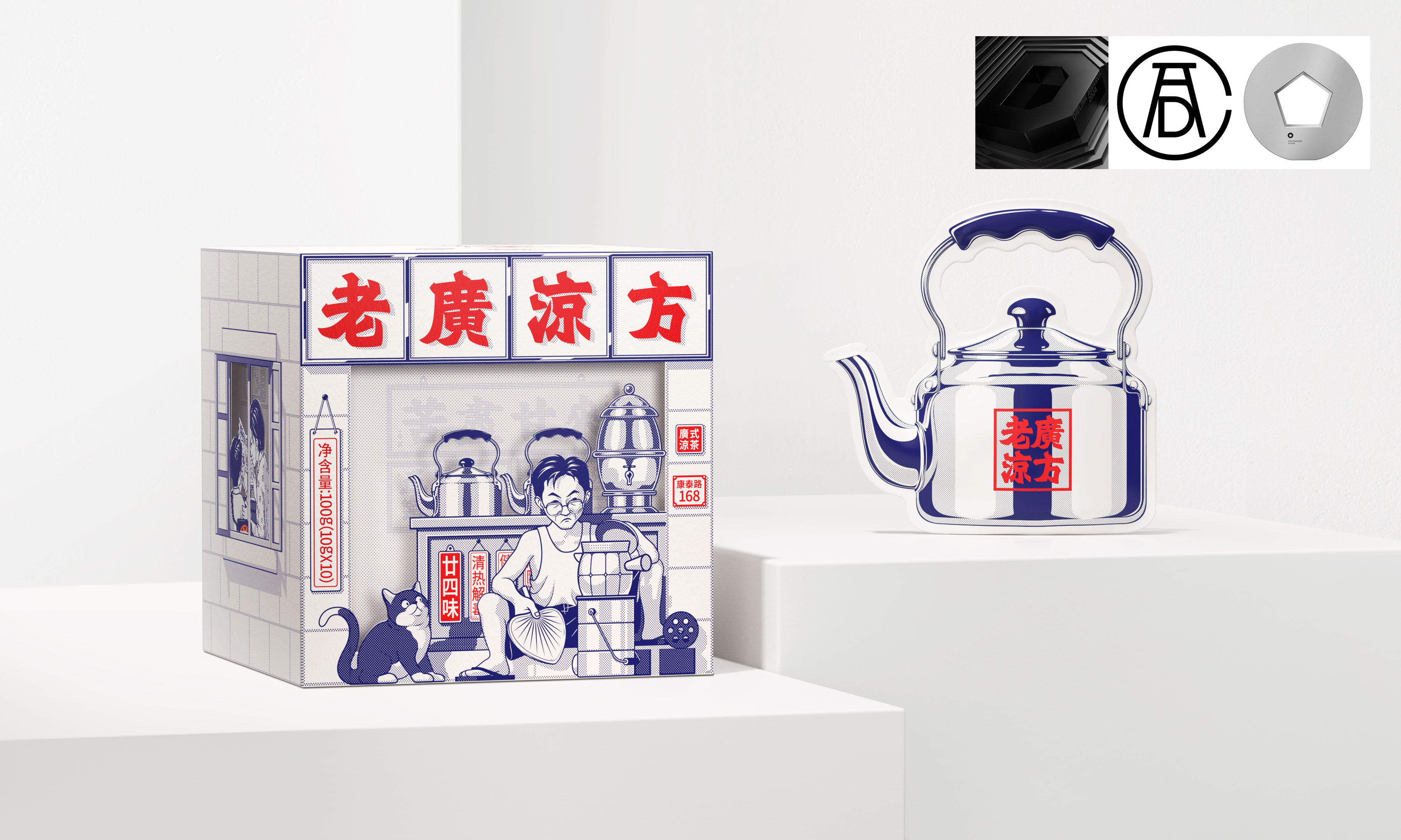
The brand font adopts the traditional signboard body, and the front of the package depicts the image of an old wide character wearing a vest, shorts and flip-flops, who is cooking herbal tea in front of the store. Through the packaging structure, you can also see the equipment and tools cooking inside the store. The left side of the outer box shows the impression that the local people in Guangdong drank herbal tea for the first time when they were young. It was the mother who took herself to drink herbal tea. Among them, the mother would explain it patiently. The top surface of the outer box is the roof of the cold tea shop, which shows the graphic indication of the 24-flavor taste materials of this product. It is dried on the roof, highlighting the traditional process making method of this product. Inside the box is a herbal tea packaging bag with a small bag of concentrated liquid. We designed the bag into a stainless steel pot, which is more suitable for the taste of traditional herbal tea shops. It is simple and simple, making people full of memories.
Most consumers have the impression of herbal tea as shops run by grandparents, who diligently brew tea every day to bring the most authentic herbal tea to their neighbors.
"Lao Guang" refers to Guangdong locals who speak Cantonese and are native to Guangdong. As a group of people who have been exposed to "herbal tea" since childhood, it is not an exaggeration to say that they have the most research on "herbal tea". The packaging of this product that we have created looks like a herbal tea shop, and is full of a strong "Lao Guang" flavor.
The brand font adopts traditional signature font, and the front of the packaging depicts an image of a veteran character wearing a vest, shorts, and flip flops. There is a scene of brewing herbal tea in front of the store, and through the packaging structure, the equipment and tools being cooked inside the store can also be seen. On the left side of the outer box, it shows the impression of Guangdong locals drinking herbal tea for the first time when they were young. It was their mother who took them to drink herbal tea, and they patiently explained various things that they didn't understand. The top surface of the outer box is the rooftop of the herbal tea shop, which represents the graphic representation of the ingredients used for the 24 flavors of this product. It is hung on the rooftop to highlight the traditional production process of this product. Inside the box is a small bag of concentrated herbal tea packaging. We have designed the bag in the shape of a stainless steel pot, which is more in line with the taste of traditional herbal tea shops. It is simple and simple, making people full of memories.
Awards:
2024 ADC 103rd Annual Awards(Package design)
2024 ADC 103rd Annual Awards(Illustration)
2024 Dieline Concept Awards(BEST OF SHOW)
2024 Pentawards(silver)

The copyright of this work belongs to 凌云创意. No use is allowed without explicit permission from owner.

New user?Create an account
Log In Reset your password.
Account existed?Log In
Read and agree to the User Agreement Terms of Use.
Please enter your email to reset your password


Why is it that the water is cold at three o'clock? does it have any special meaning
It's all memories.
Too much feeling