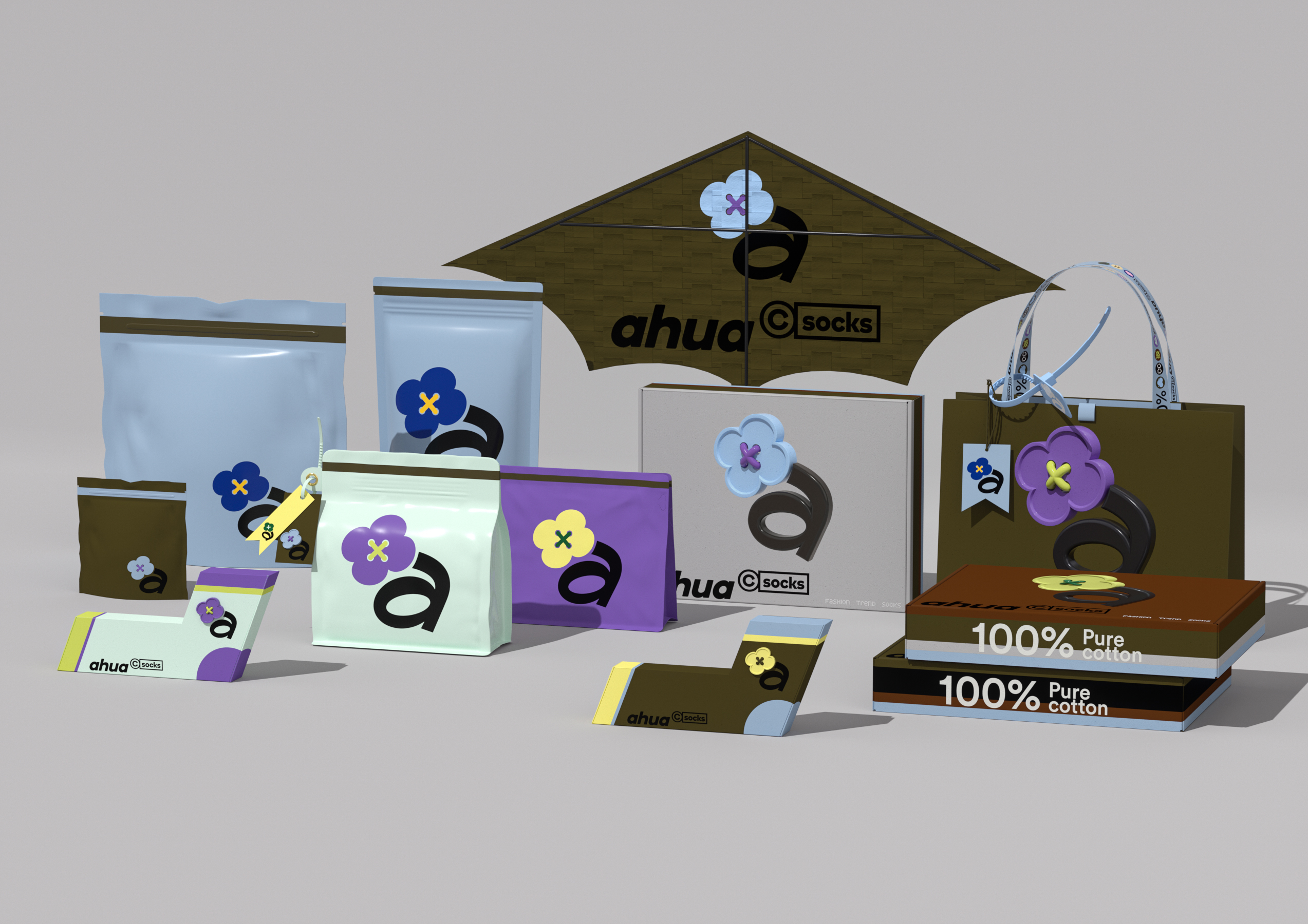
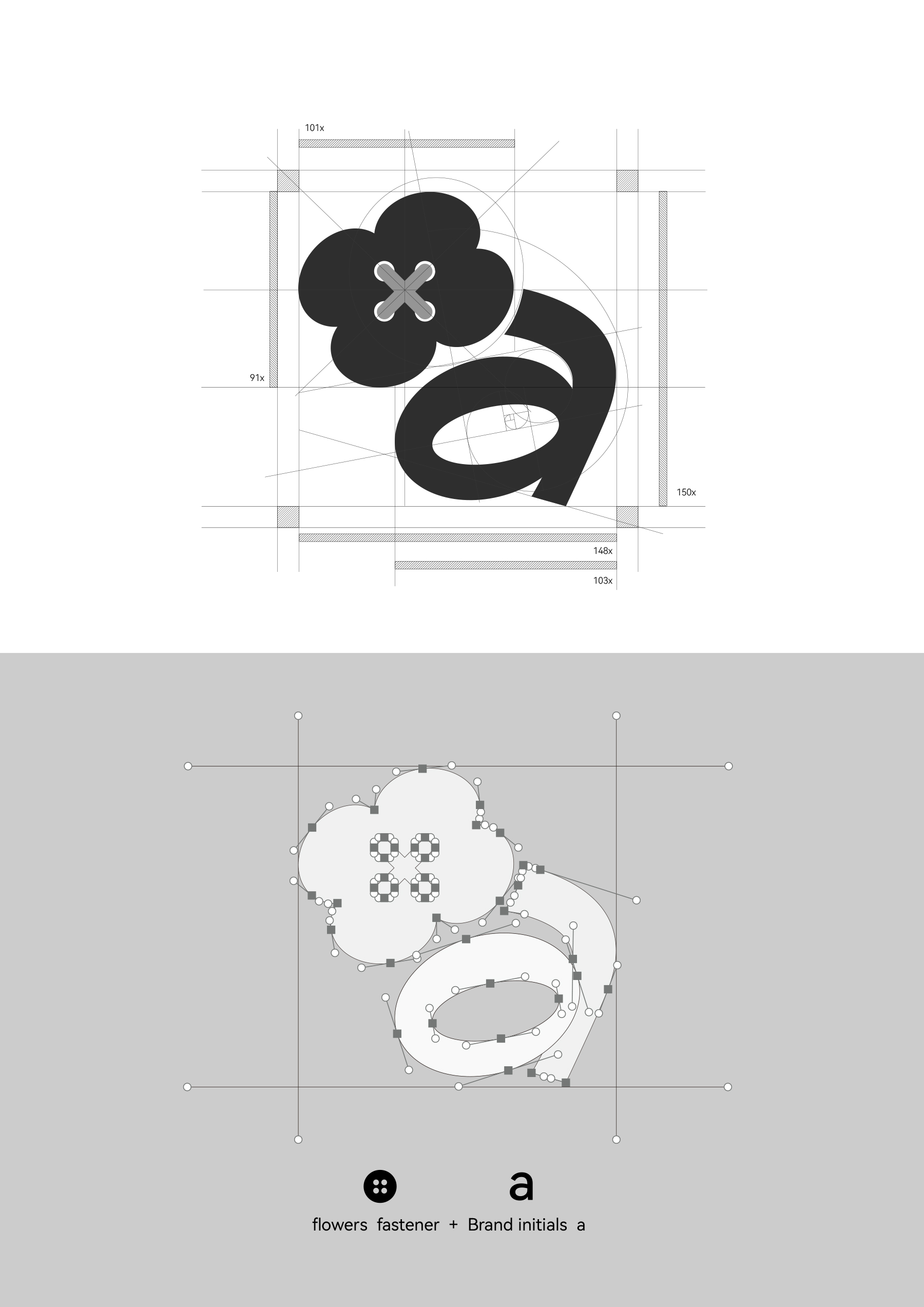
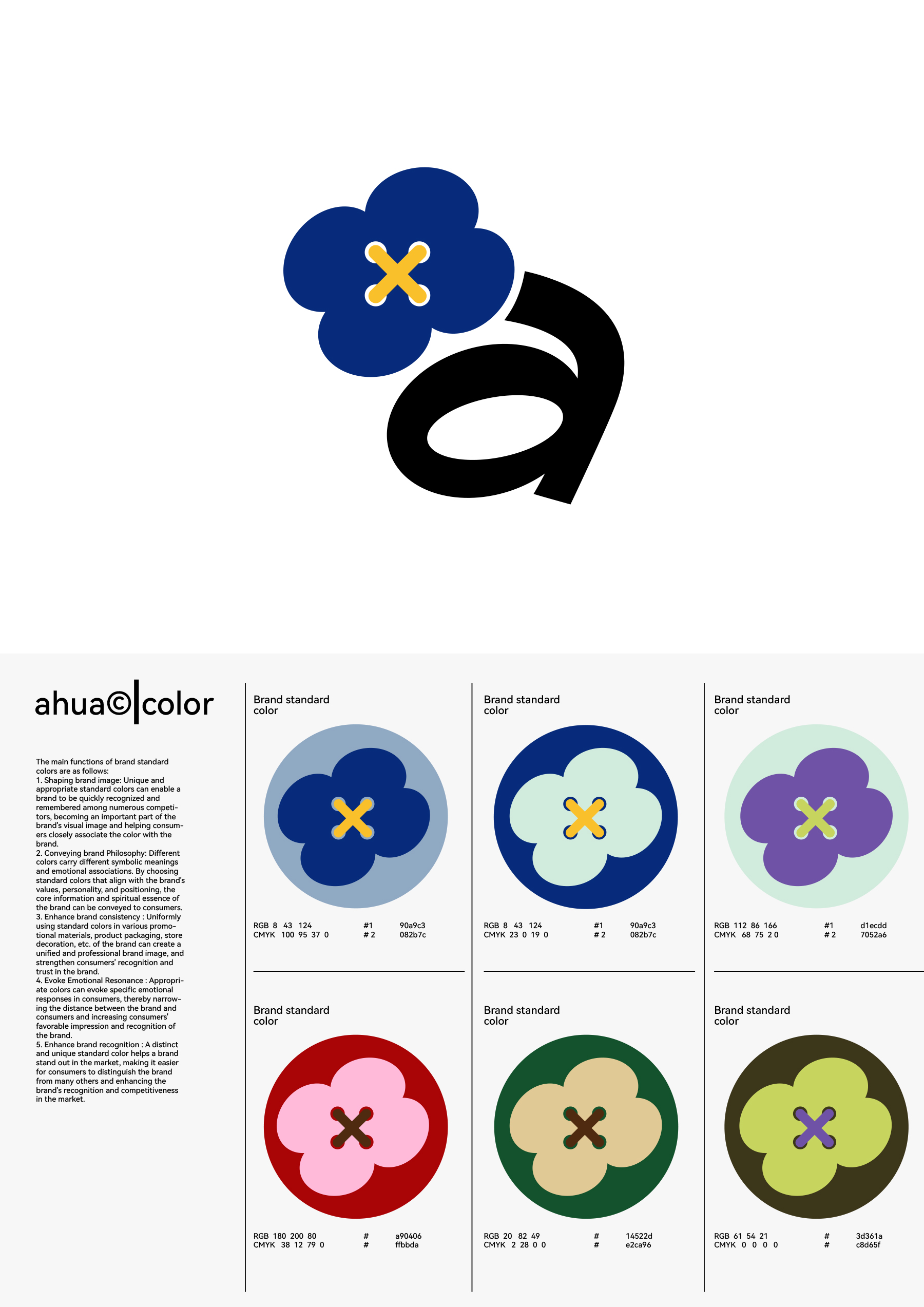
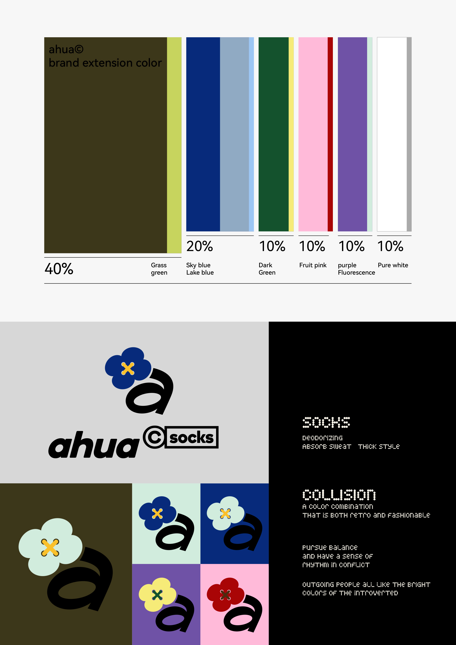
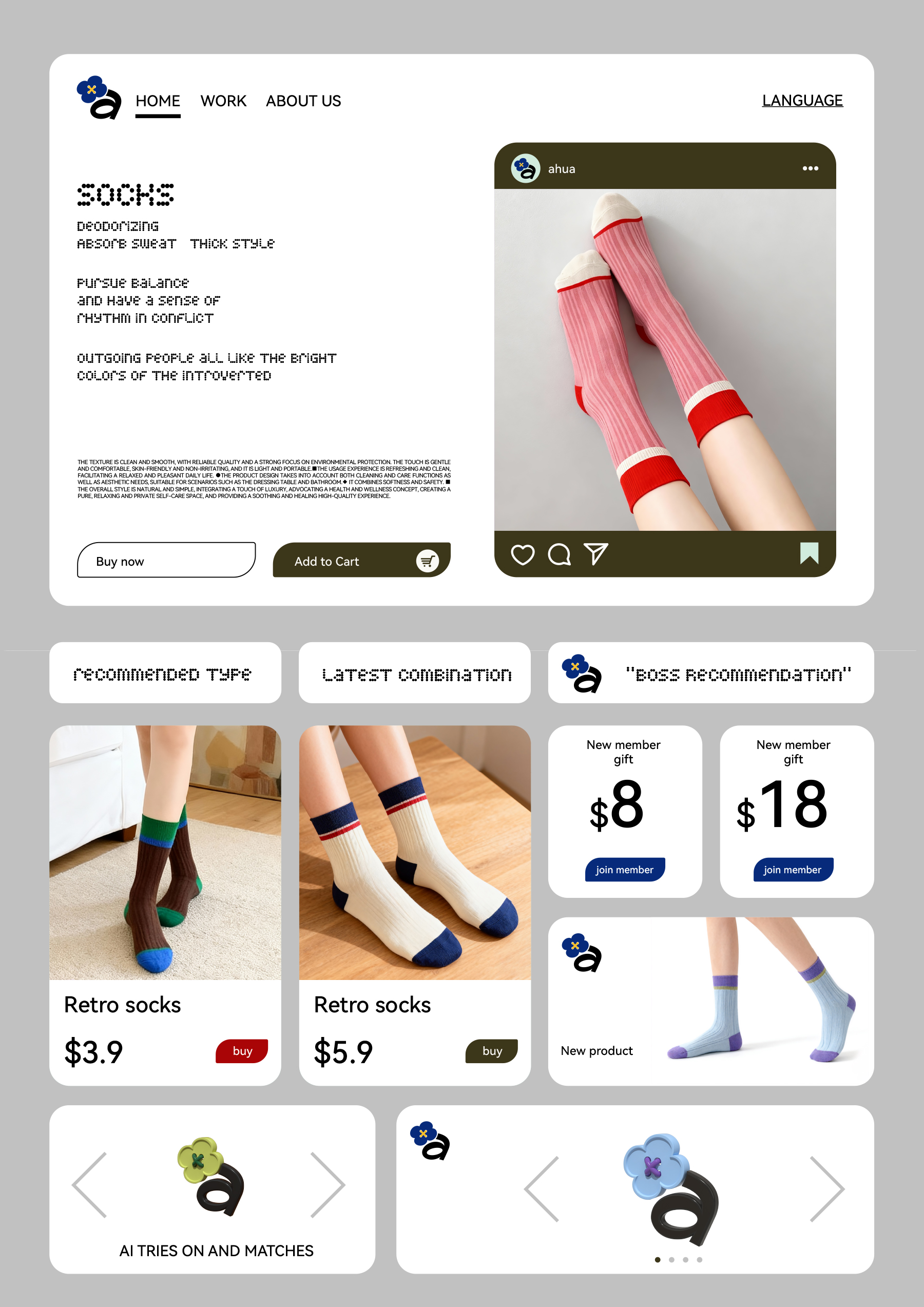
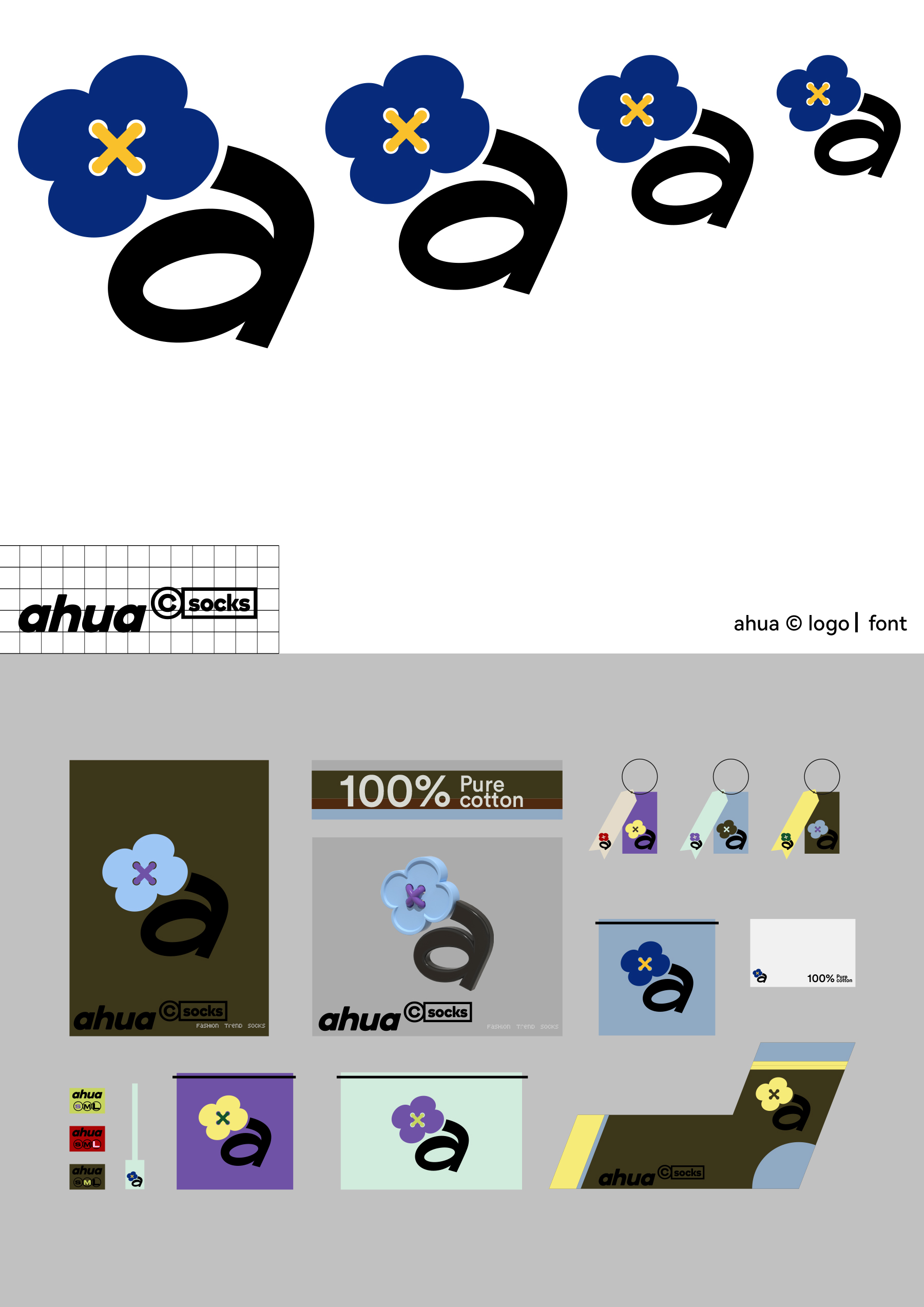
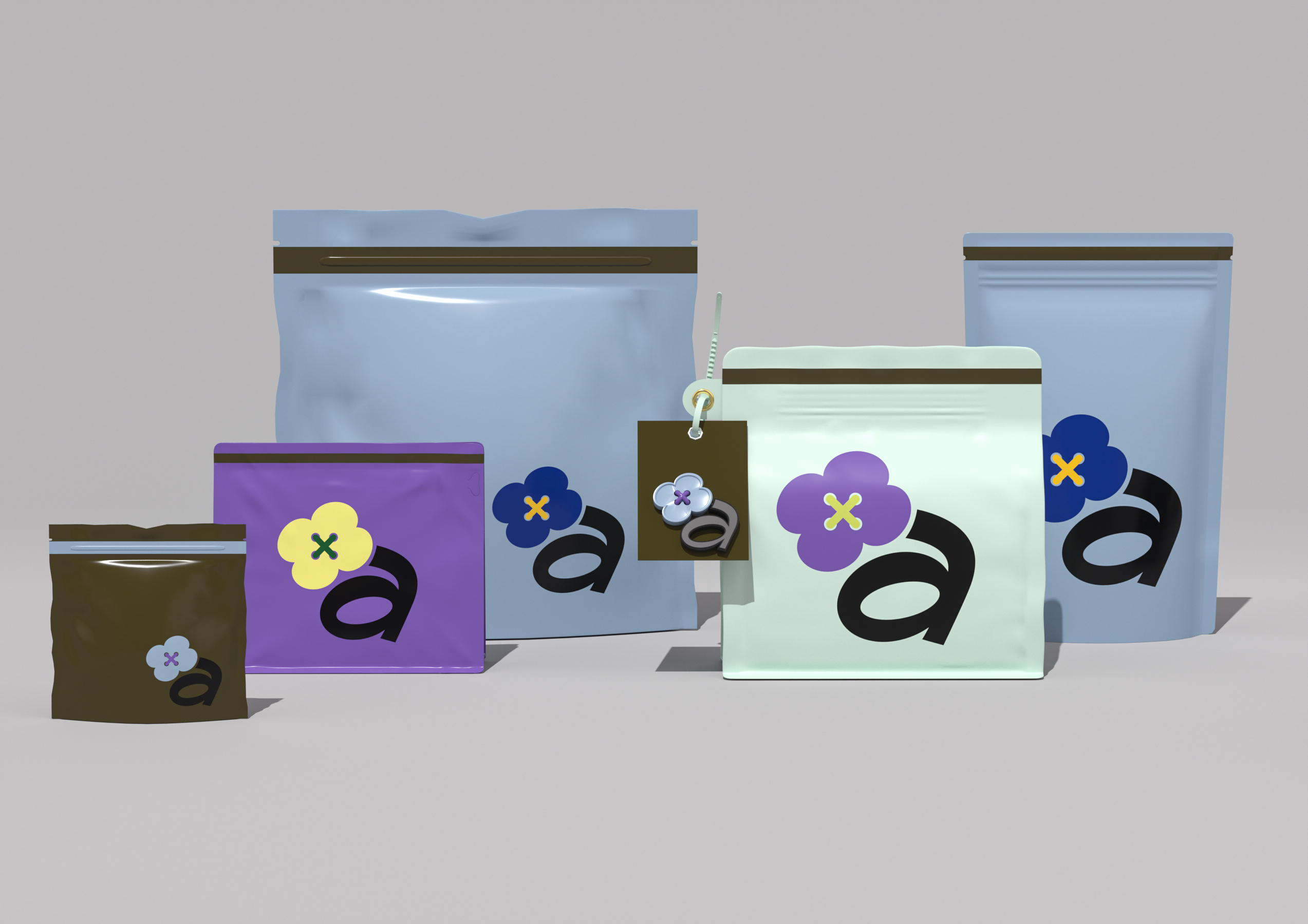
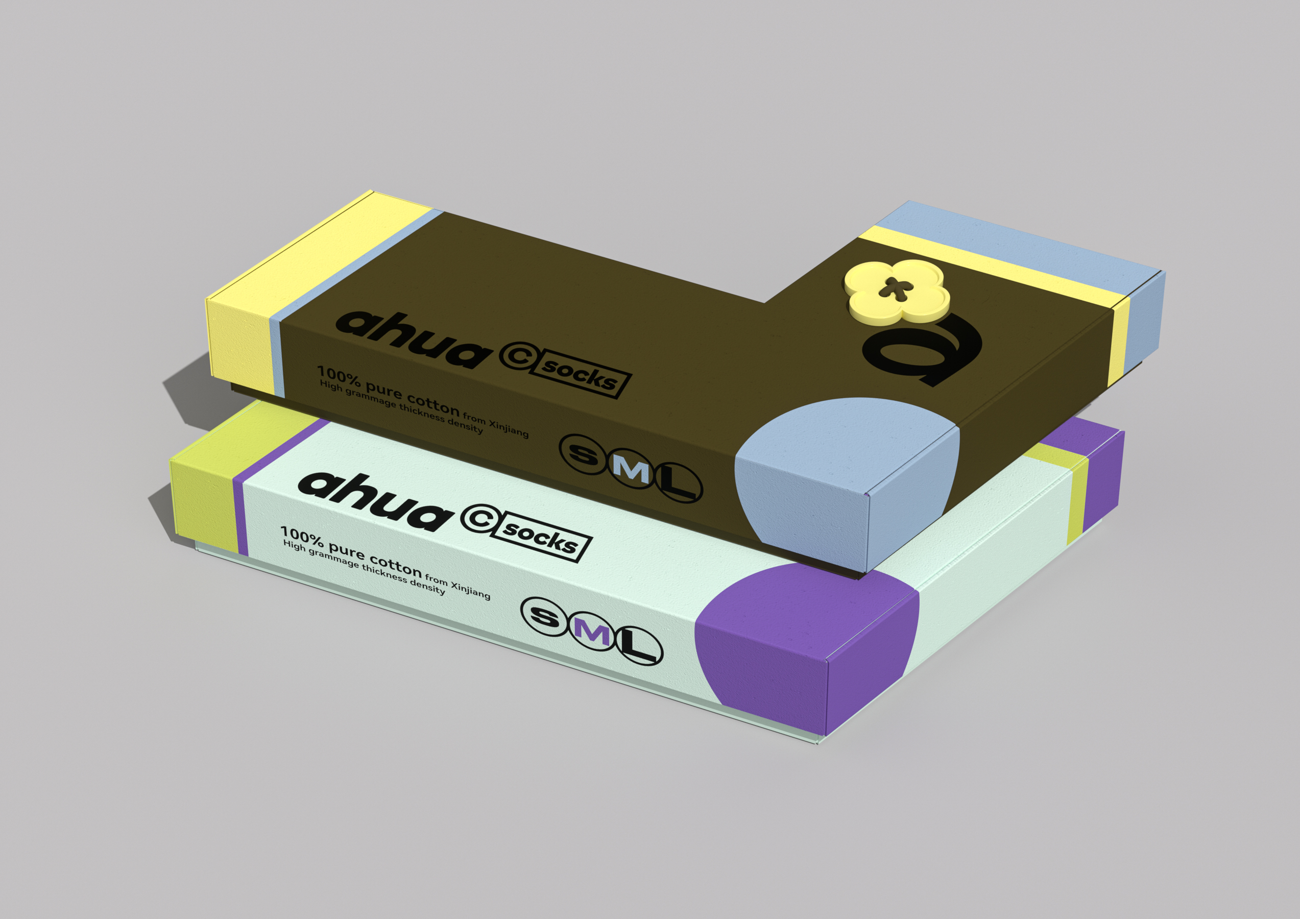
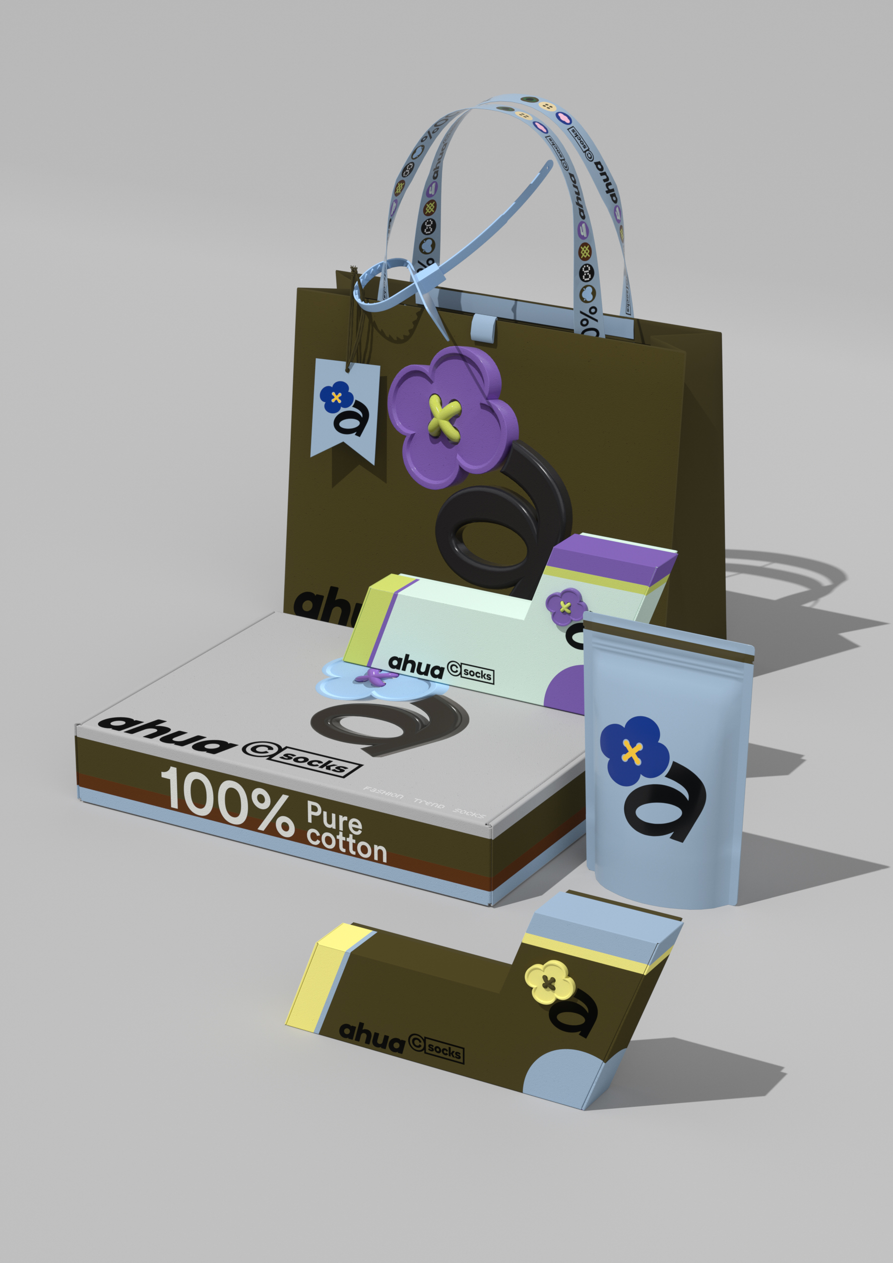
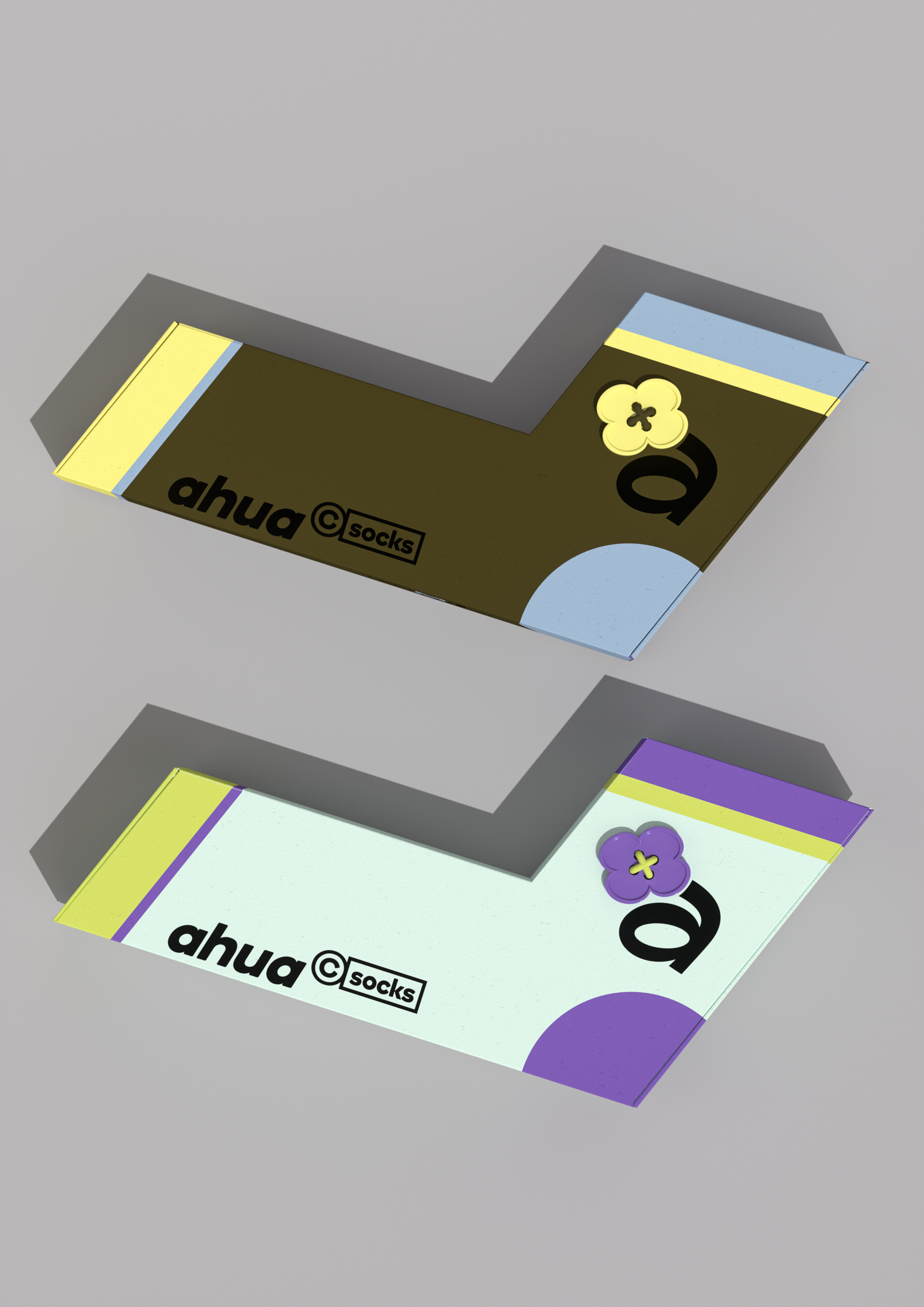
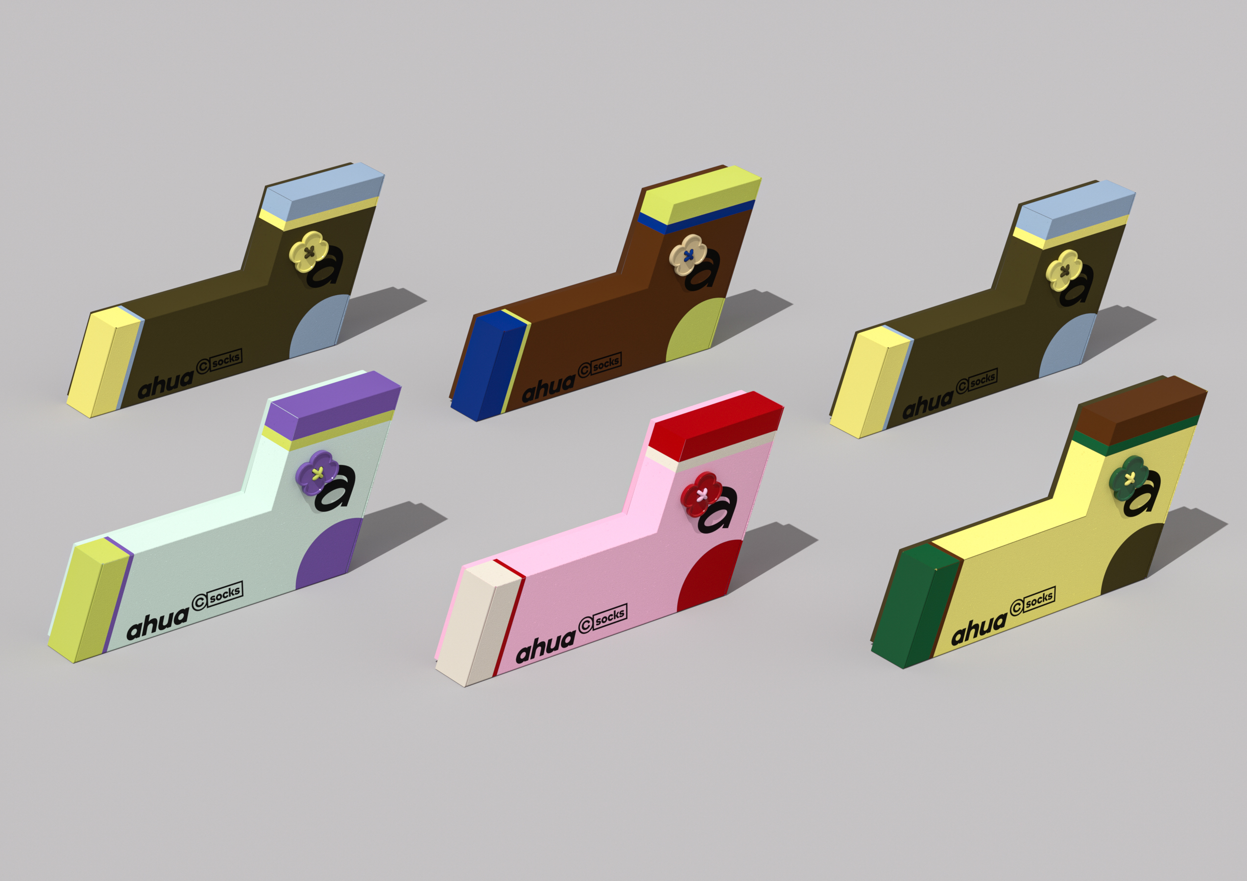
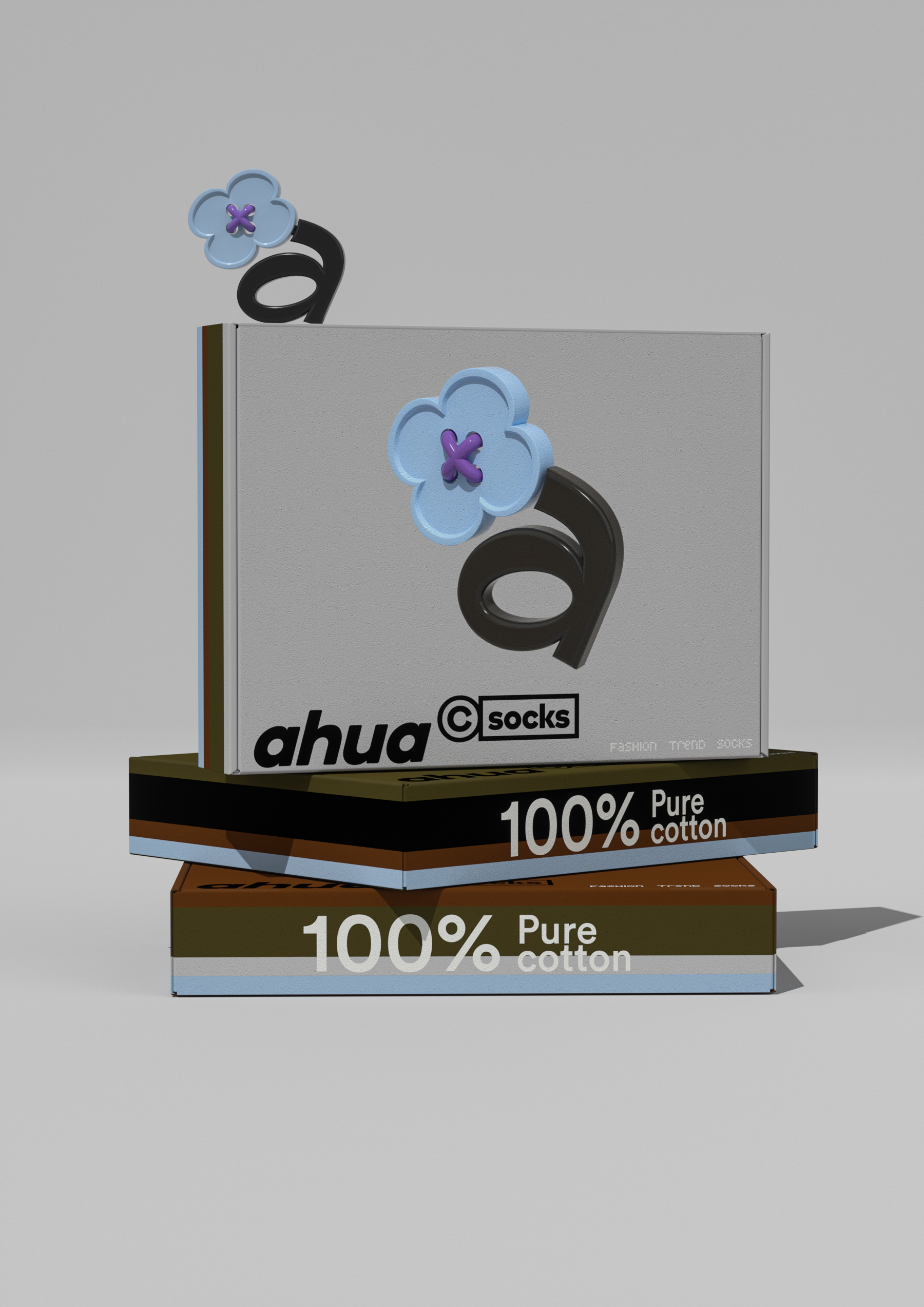
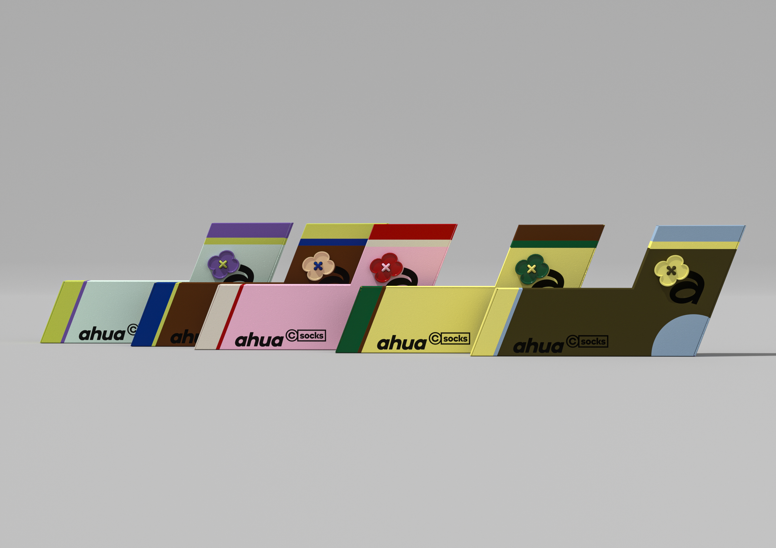
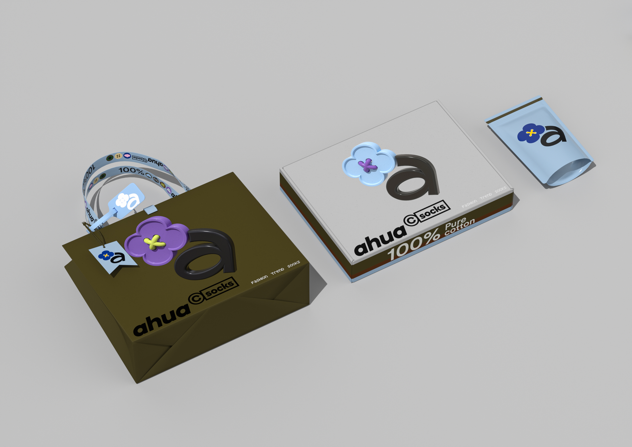
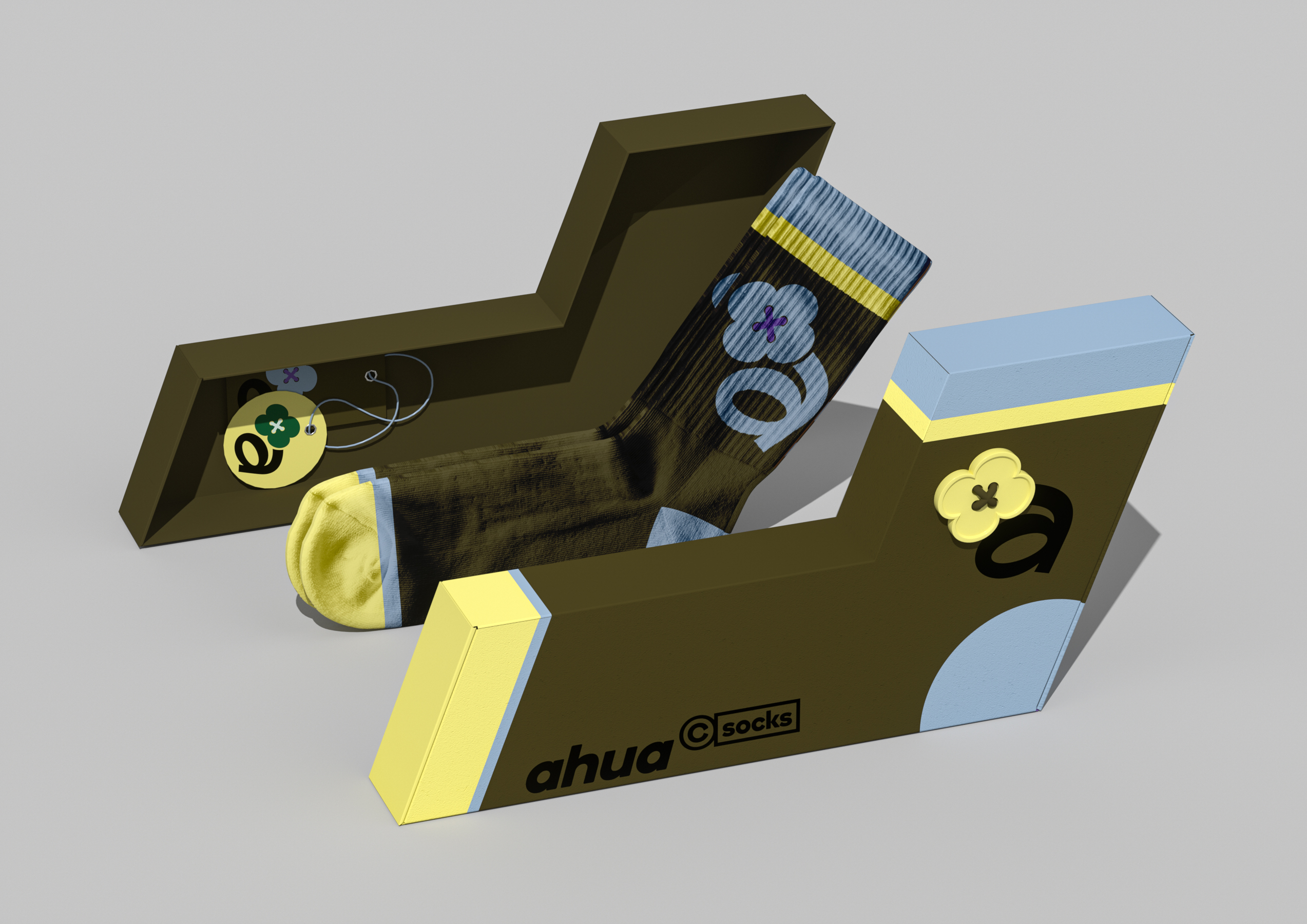
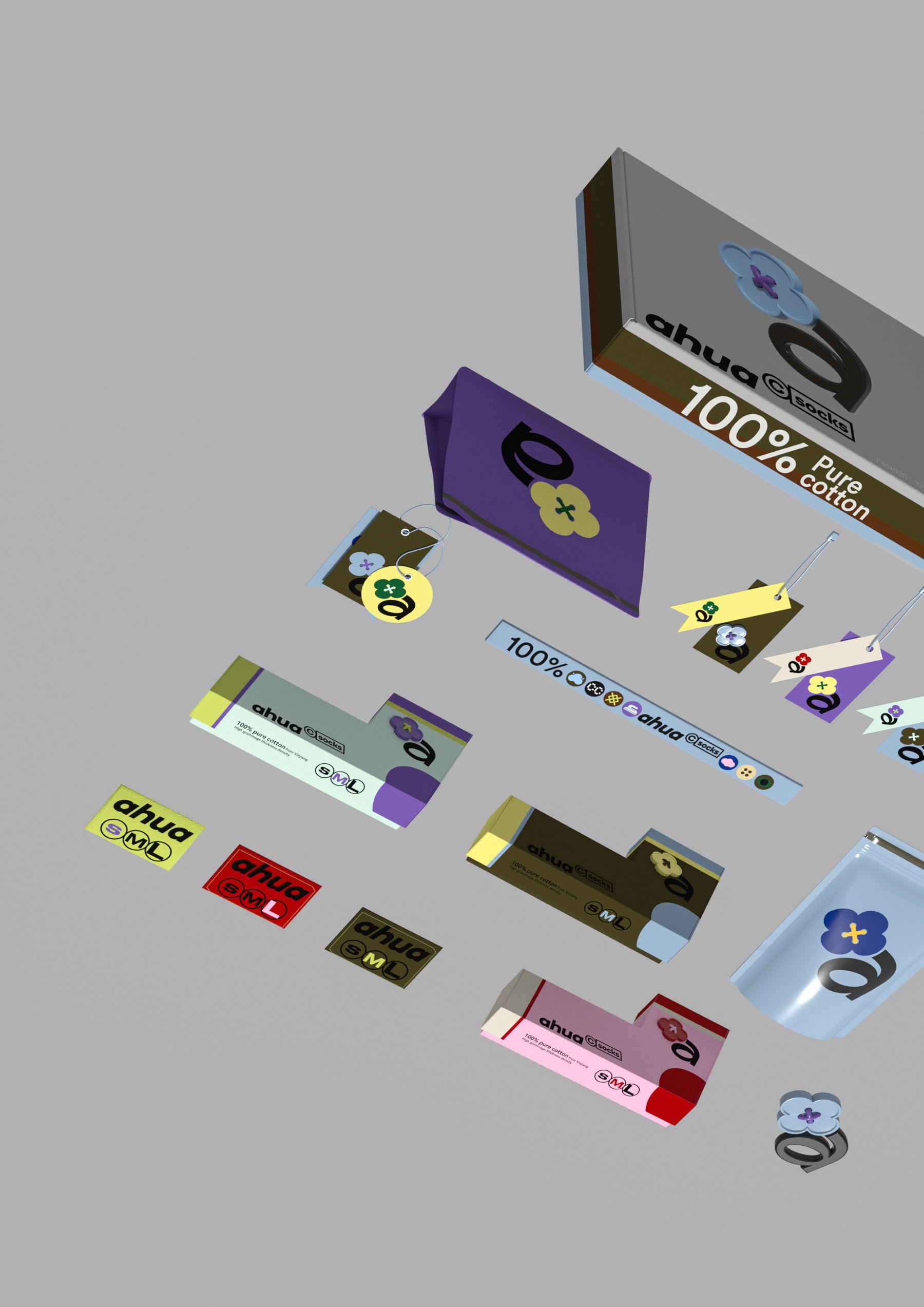
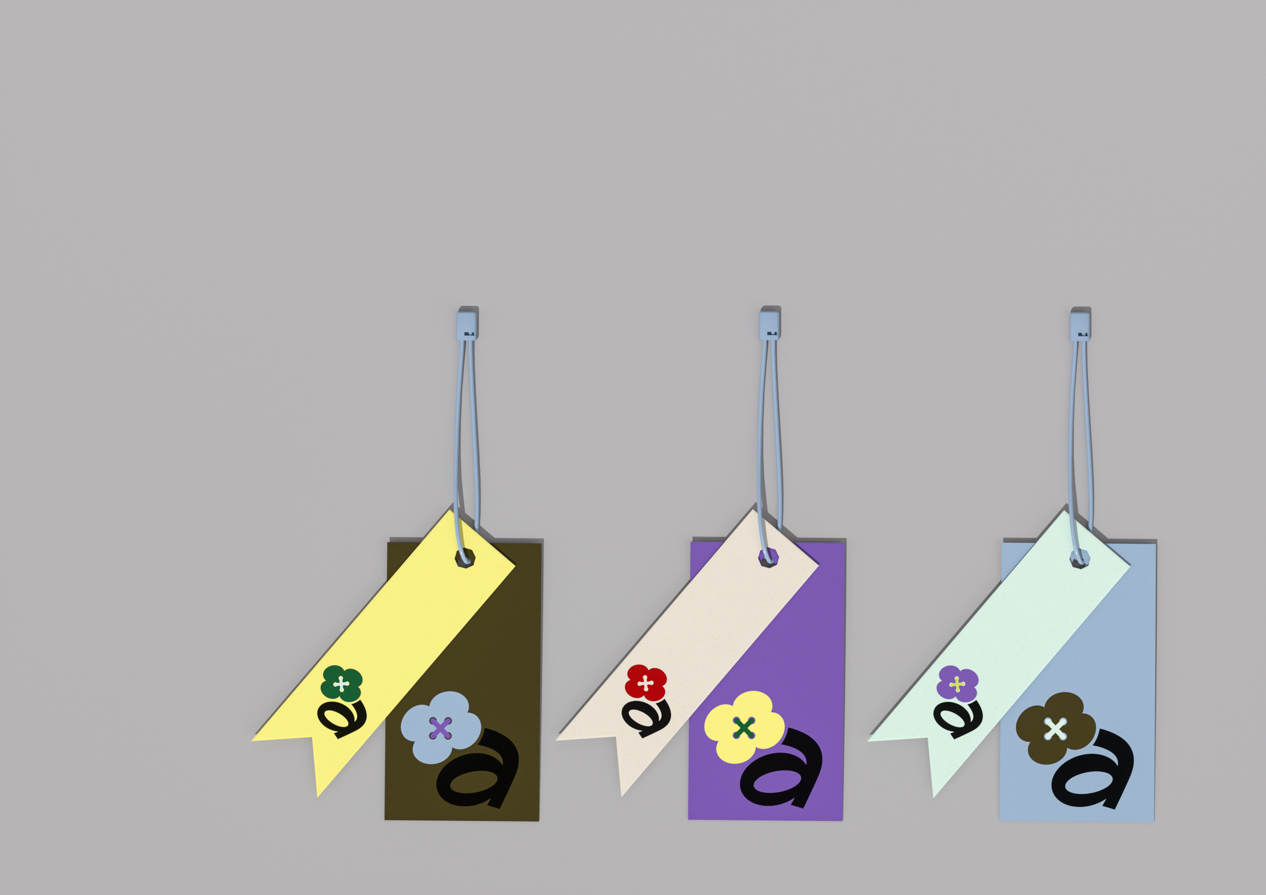
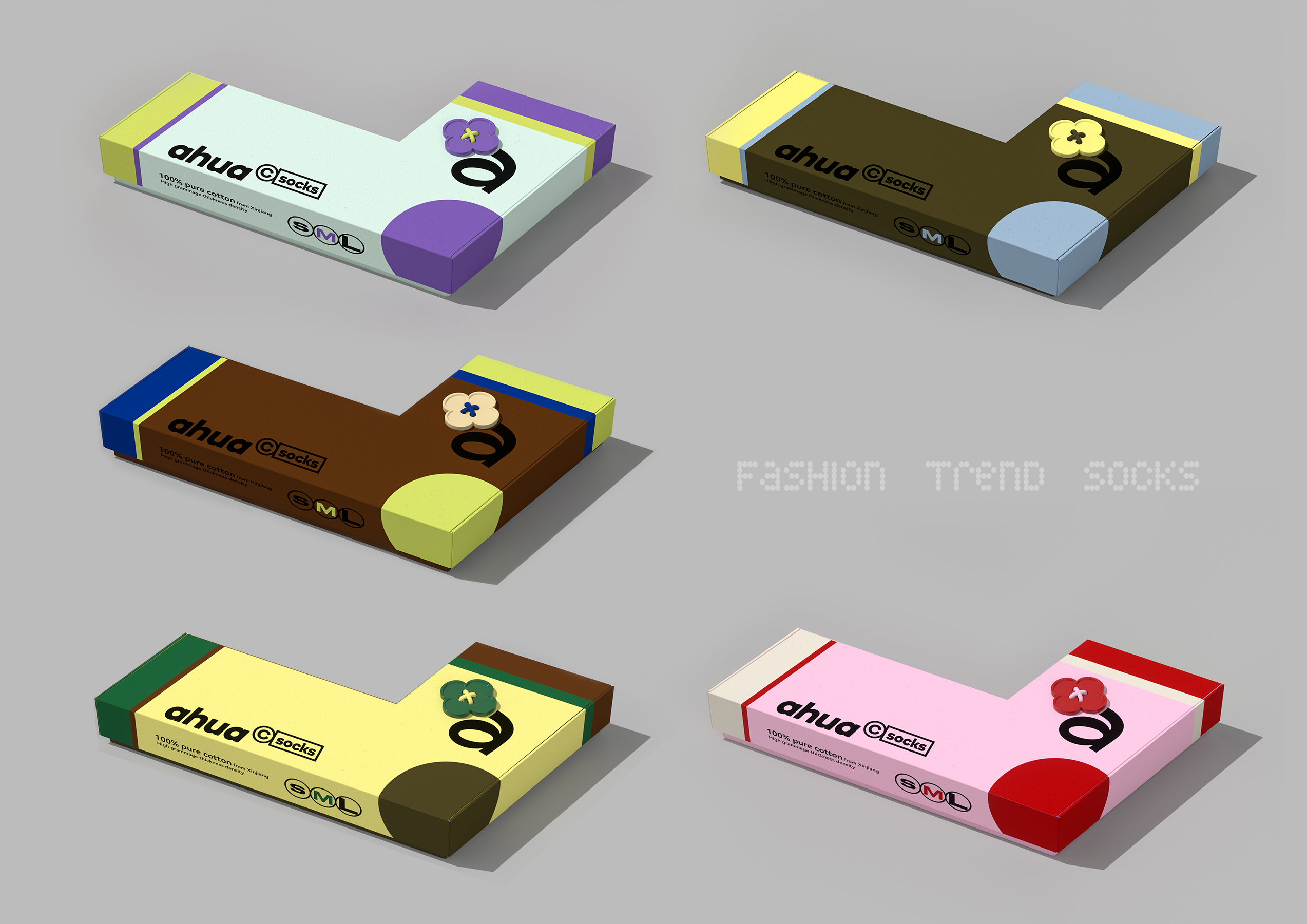
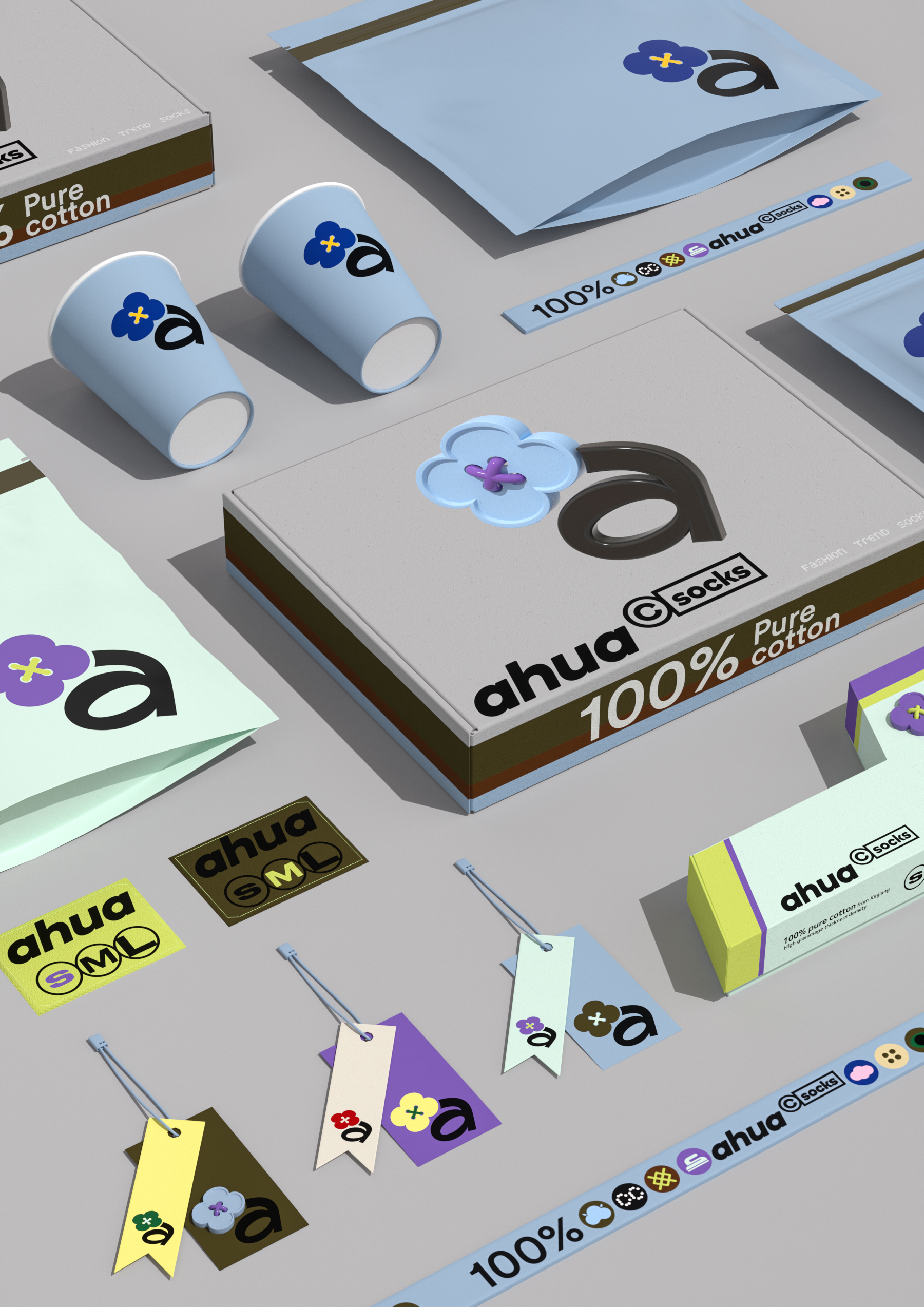
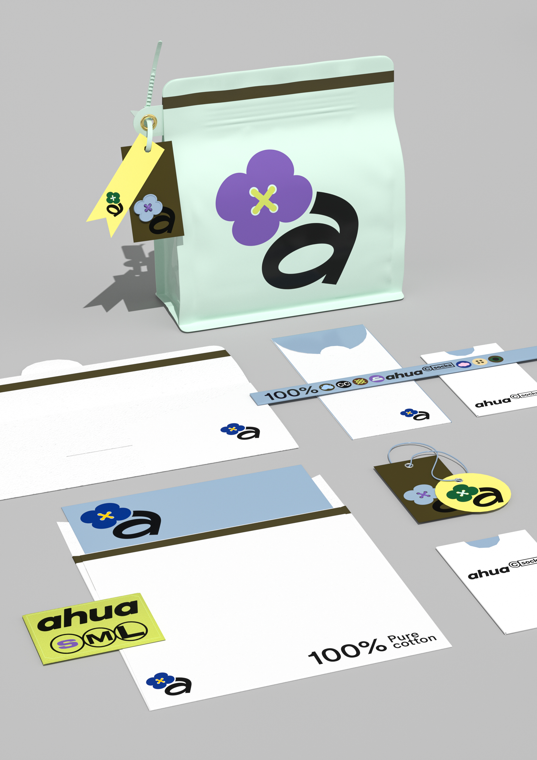
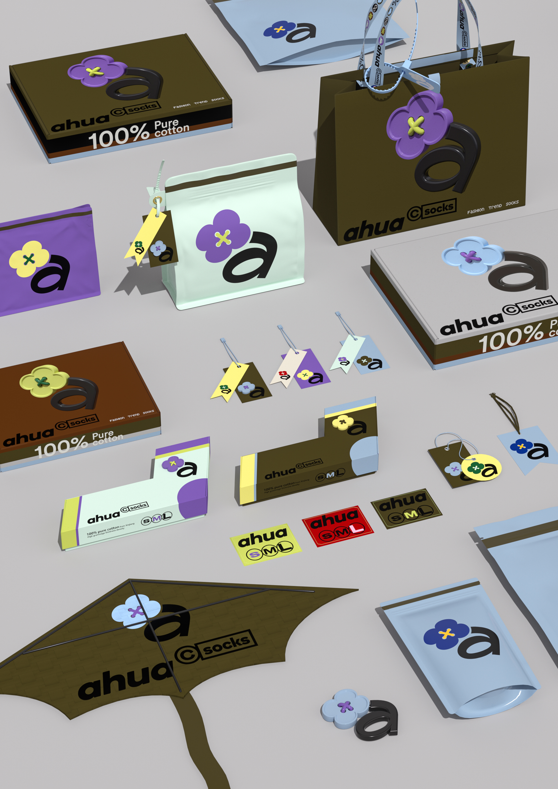
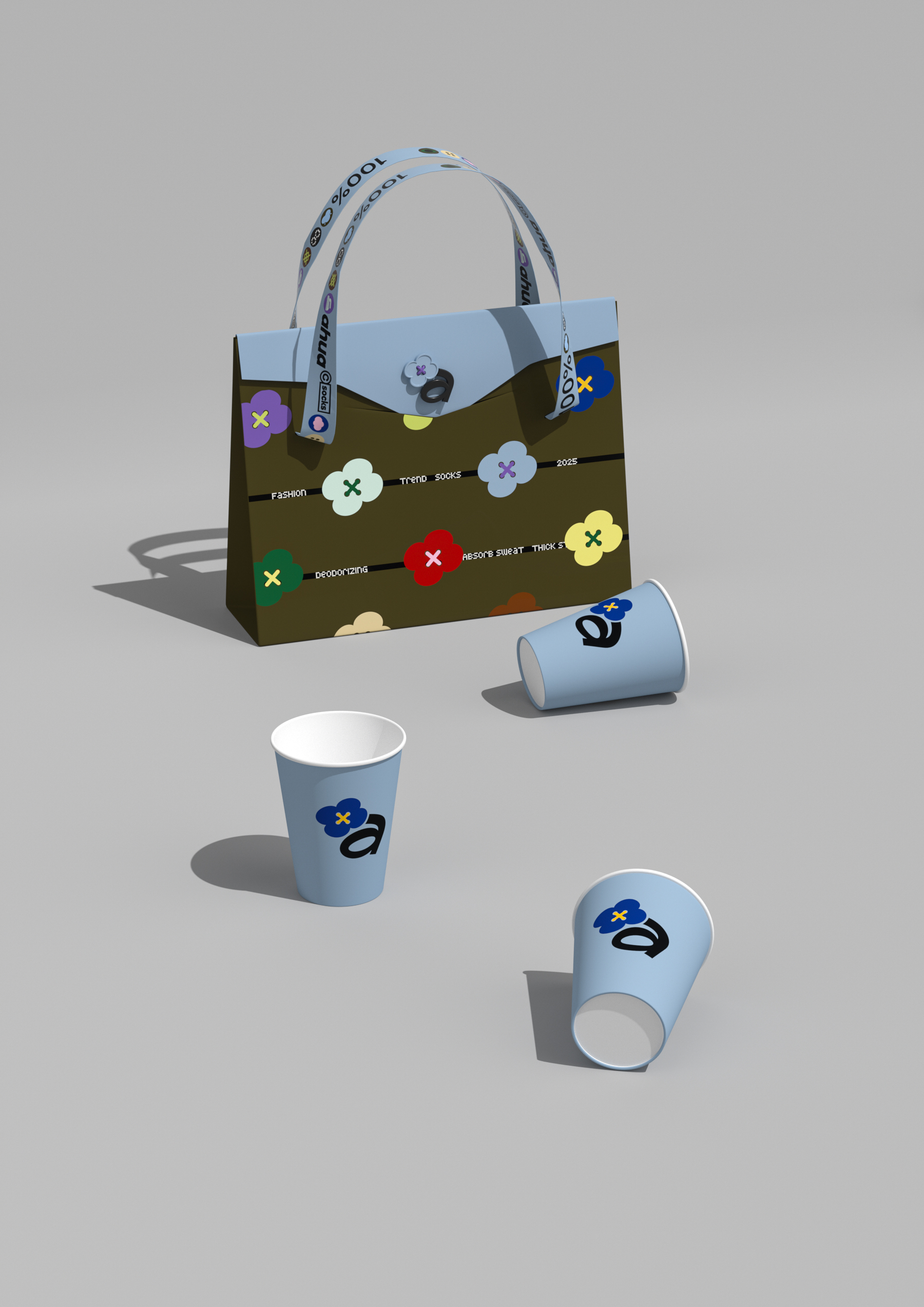
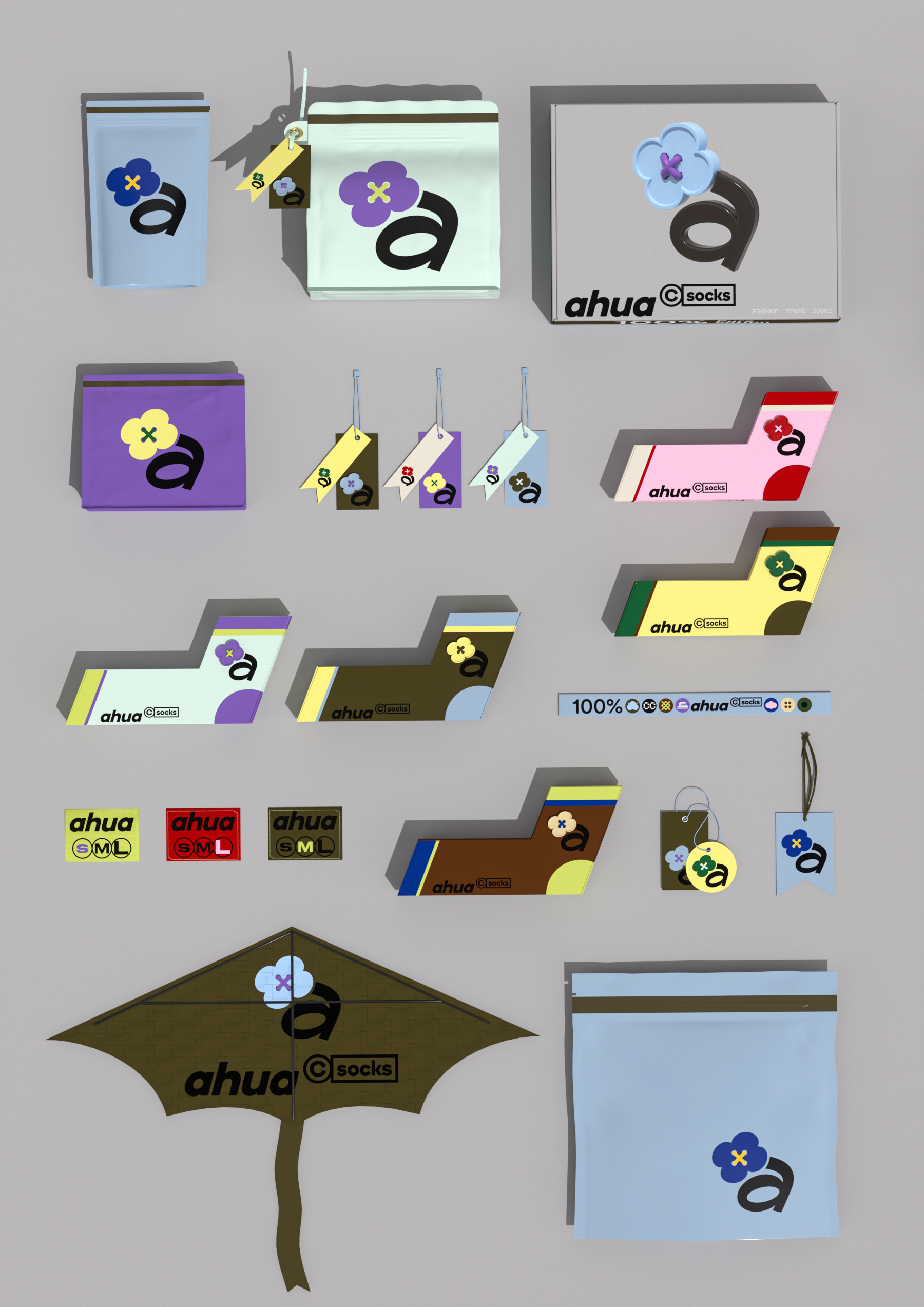
Ahua is a socks enterprise with its own factory. With the solid supply chain strength accumulated for long-term supply of first-line brands, Ahua has a considerable scale of its overseas business, but due to the lack of branding strategy in the early stage, it has always been trapped in low-price competition. In March 2025, Ahua joined hands to create a difference and officially launched a brand upgrade for overseas markets. In this brand design, we carry out in-depth exploration with brand symbols as the core, and build an integrated symbol recognition system that runs through the brand, product and e-commerce scene. If enterprises lose innovation, it is bound to enter the low-price war. The core point of A Hua's cross-border e-commerce brand upgrade is to solve the problem of "from white brand to brand. In a more complex international cultural and linguistic environment, the brand is shifted from low-cost traffic to brand equity construction. We come to this world from a simple, but also from a flower began to appreciate the world. Back to the real, Ahua is a simple start. Therefore, our design also starts from a flower. The logo is in the shape of a flower, and the stamens are naturally transformed into a button, implying "discovery and connection to the world". Buttons are the flowers that connect the fabric. We combine the brand symbols with buttons and flowers to make people feel the circulation of time and the artistic and humanistic temperature contained in the fabric in a complicated world. Through the symbolic language with wide resonance, a clear international identity is established, and at the same time, the expression of relaxed interest is integrated to shape the core of brand vision. In terms of color, the collision between Gome gray and bright colors has become a bright spot. Its inspiration is drawn from Pop graffiti art, thus extracting Ahua's iconic color visual gene. The brand builds a system with a highly unified visual language: including an exclusive sock-shaped custom outer box, as well as the orderly use of graphics and colors in minimalism and repetition, resulting in a complete and unique sensory experience.
Creation is different from x Ahua cross-border e-commerce socks brand visual image design I logo design I brand symbol I vi design I series packaging design I gift box design I tag design I peripheral materials I e-commerce icon and page specification

The copyright of this work belongs to 造物起异. No use is allowed without explicit permission from owner.

New user?Create an account
Log In Reset your password.
Account existed?Log In
Read and agree to the User Agreement Terms of Use.
Please enter your email to reset your password


Excellent
not bad
Very representative
What this rendering does is really a long story