Different colors represent different meanings and give people different feelings. For example, warm colors and cold colors give people two completely different feelings. The color matching of medical product design needs to pay special attention to the industry characteristics and symbolic significance of colors to avoid the problem of using colors in details. When considering color, you need to understand the people who will use the product and what is attractive to them from a color perspective. "Appeal" does not mean what color they like. It means the characteristics and value that users associate products.
I. Choice of Color Temperature
Most products have a color that can cover most of their surface, and the dominant color should be warm. Most current and historically medical products have used green, blue and colors in neutral spaces of white and gray. There are several reasons for this. The most important is that blues and green are calm colors, which are needed in the anxious environment of hospitals and clinics.

II. Purpose
The use of color will affect people's emotions, a product that attracts users and meets their needs. Apart from the medical features of the product, is your main purpose to make the product easy to use? To make it attractive to specific market segments? To give it an aura of precision, power, etc.? Color makes people feel calm or exciting or interesting? A good strategy will combine many elements and, when brought together, will achieve your goals. Color is one of the most powerful of these elements.
III. Color Design
In the color design of the function button, when it is only used to indicate the meaning of realizing various functions of the device, it can be represented by colors other than red and yellow, and the yellow mark indicates that care or attention is required. If the indicator light is used to indicate that the operation of the device is stopped in an emergency, use red. The color design of the operation interface should also take into account human factors, and people understand and operate visually.

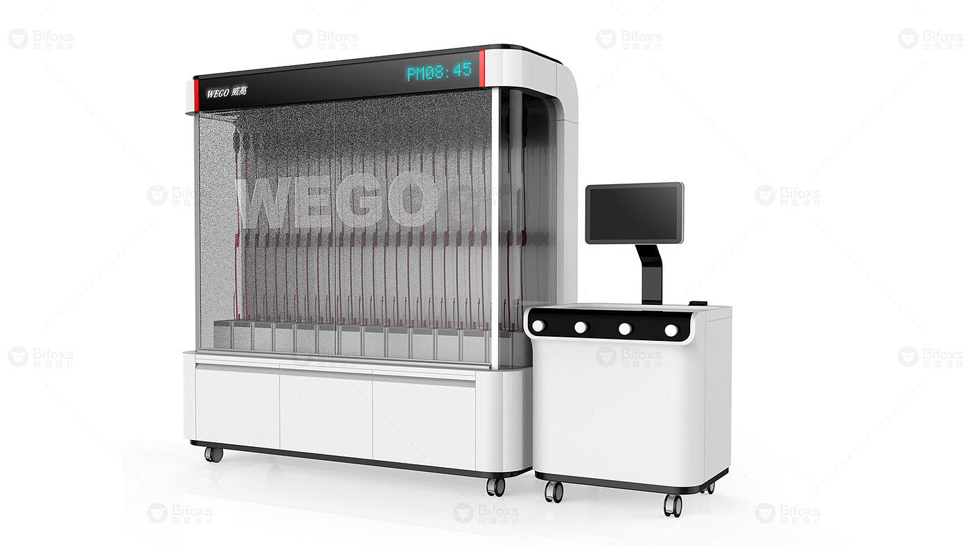
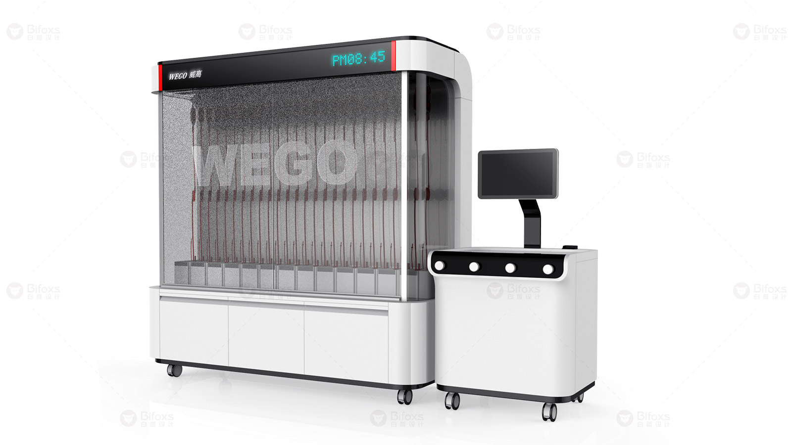
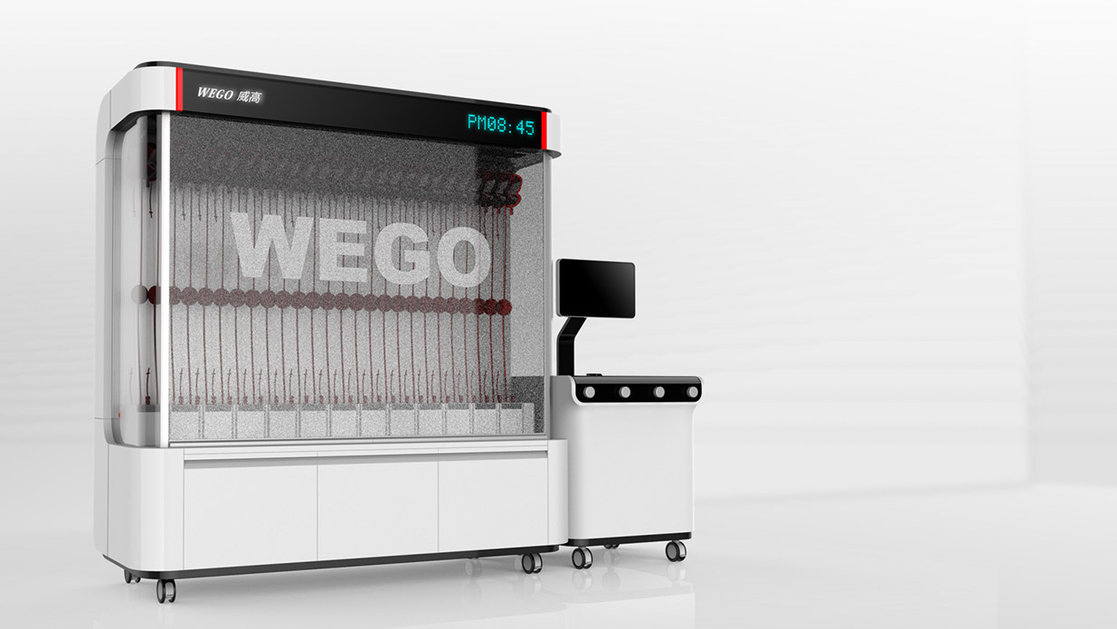
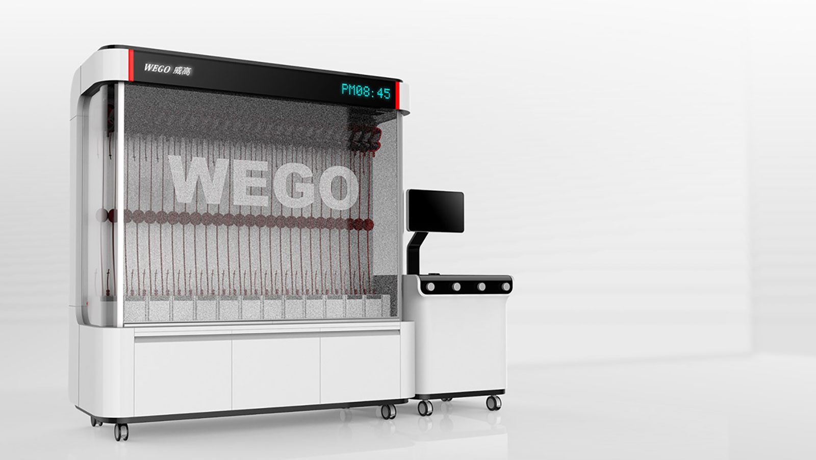
The color matching of medical product design in appearance should conform to national and industry standards, make good use of colors, and meet people's aesthetic and emotional needs. It not only needs to give people a comfortable and friendly beauty, but also give people the necessary human safety warnings. The design is more warm, reflects the care for people in the fine body, and ensures the safety and simplicity of equipment operation.


Comment Board (0)
Empty comment