[General Image Evaluation] Surface Book 3 Commercial Edition Evaluation
Owners
Owners
Owners
Surface Book 3 Commercial Edition
Figure/Text
By escape fish
The brand of Microsoft must be printed in everyone's heart. Its hardware products have always been large and comprehensive in breadth and small and precise in depth. As a product series that has attracted much attention under Microsoft, the Surface series has always been Microsoft's sword. It can be said that the Surface series has played an overall reference role in Microsoft's future hardware product planning.
This evaluation is the commercial version of Surface Book 3 newly launched by Microsoft Surface series this year. Because it is not a brand new product, let's skip out of the box and look directly at the product. This evaluation includes Surface Book 3 commercial version, Surface stylus and Surface Dial.
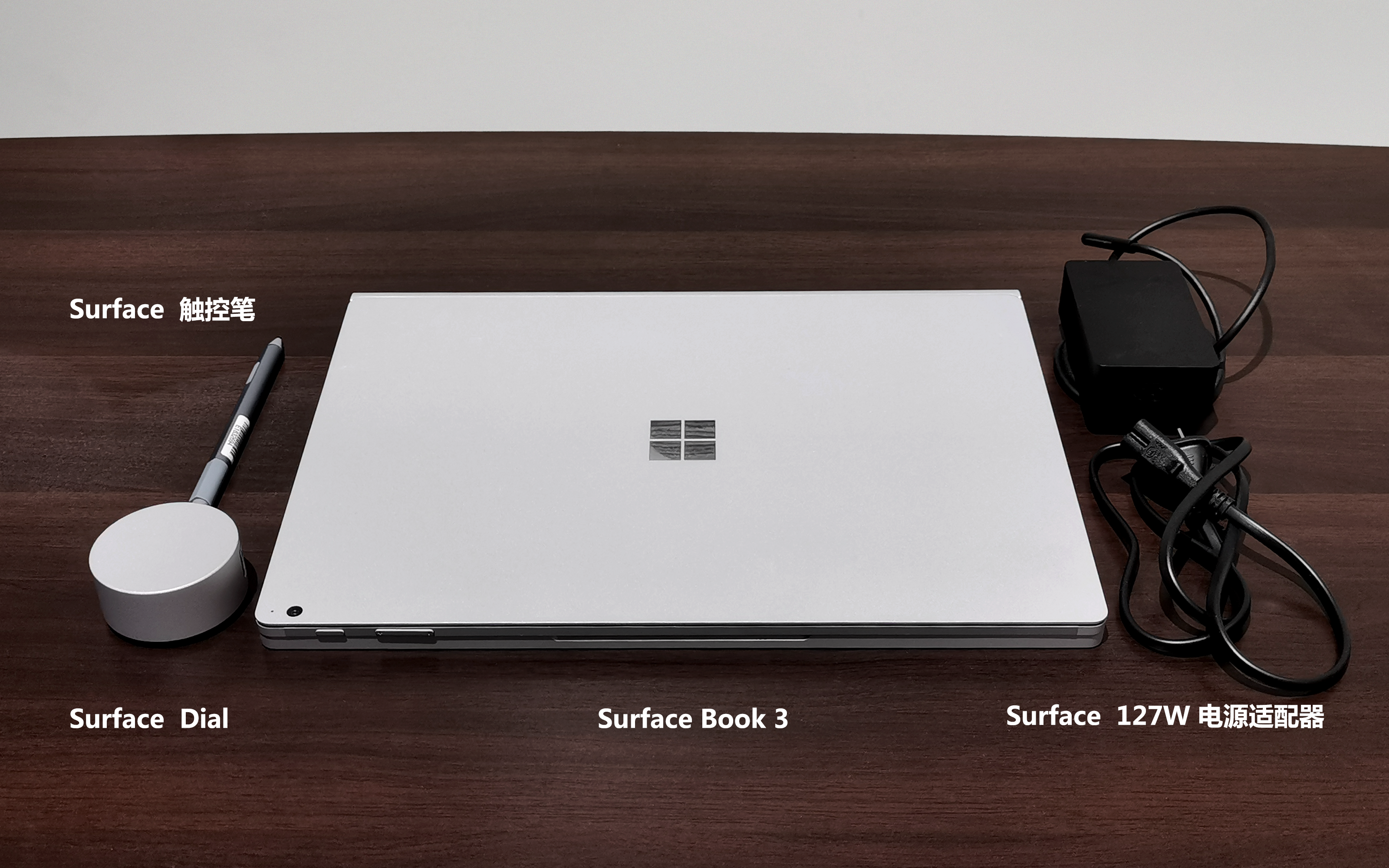
[Design First]]
My first reaction when I opened the package was: cool wu ~
The cold corners, the simple style of the cold light, the absolutely rational aesthetics of science and technology.
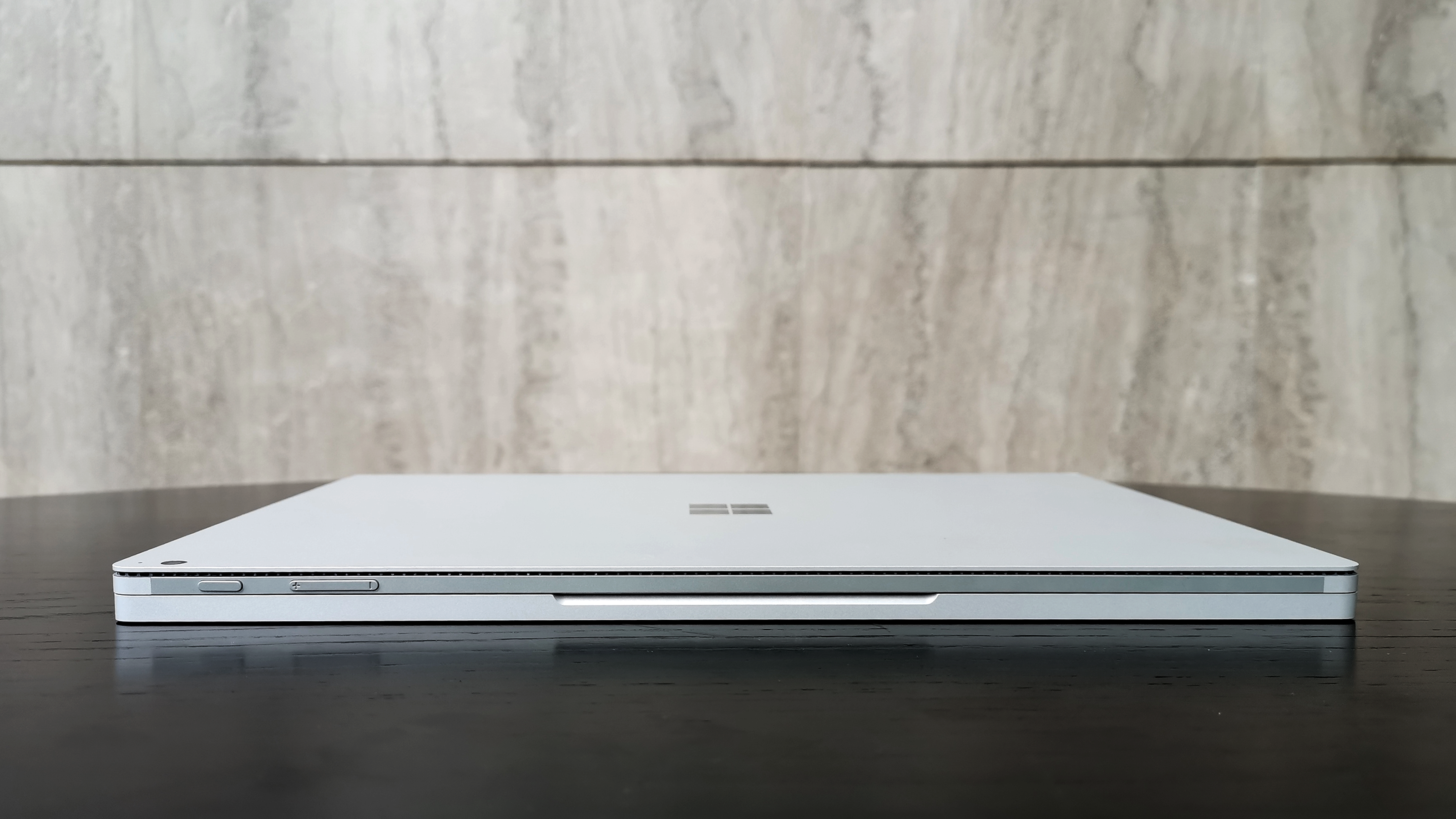
Magnesium alloy material, bright platinum metallic paint surface texture. At present, magnesium alloy on the market has been widely used in medium and high-grade ultra-thin creative design PC. This material has obvious advantages. Its hardness is several times that of ABS engineering plastic, but its weight is only its 1/3, and its heat dissipation is better and its appearance is more textured.
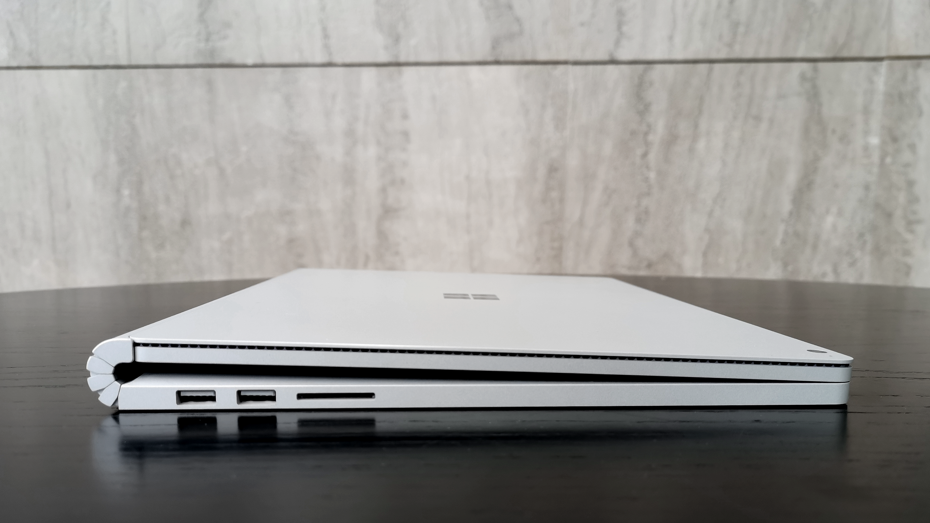
Two USB-A on the left and one full-size SDXC card reader.
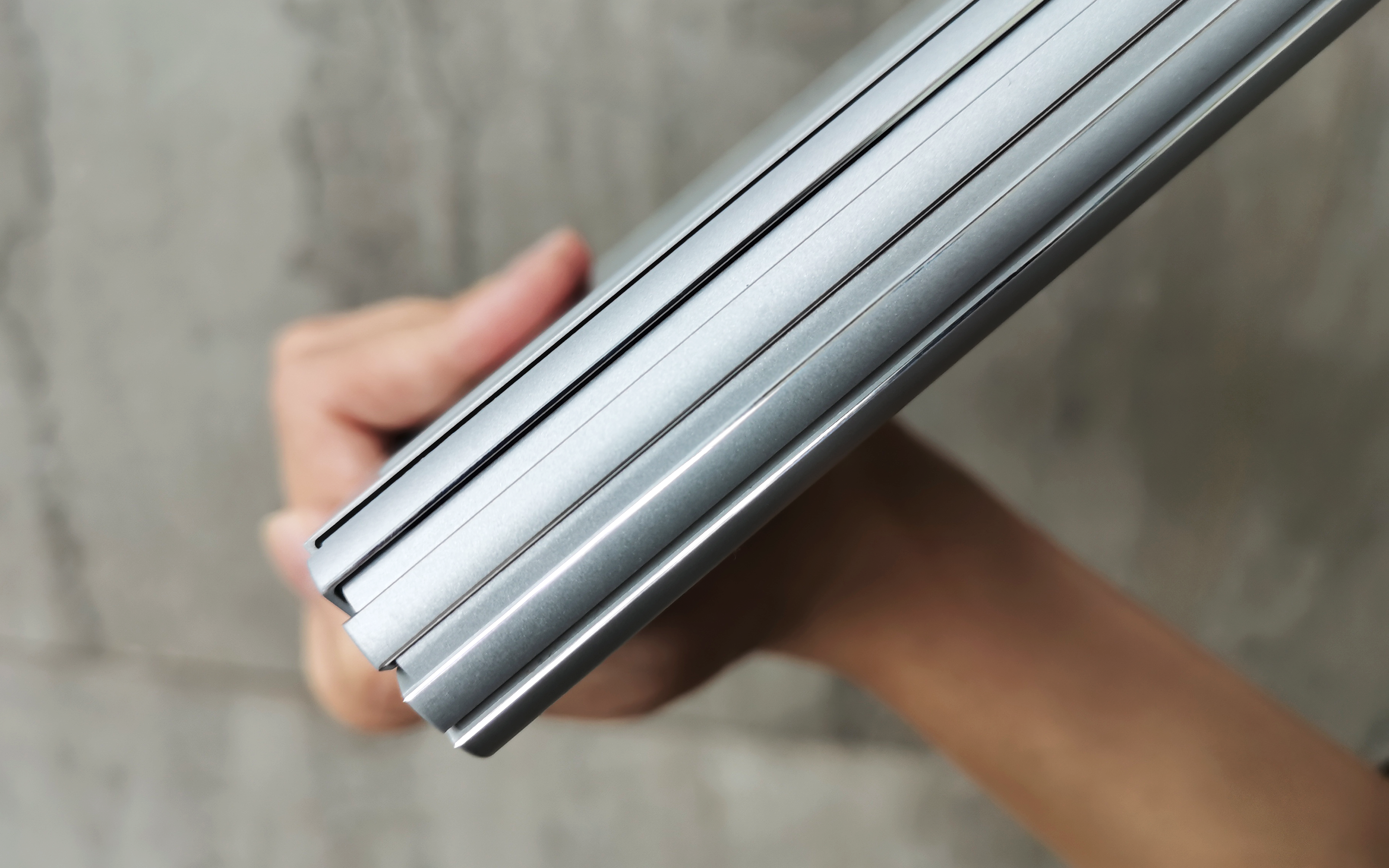
The Surface Book 3 looks like a closed magazine on the side because of its hinge structure designed for a detachable flat plate. This shape is the only design in the world, which is completely different from any laptop flat plate and other products on the market. I will use it for a while because of this appearance these days ~
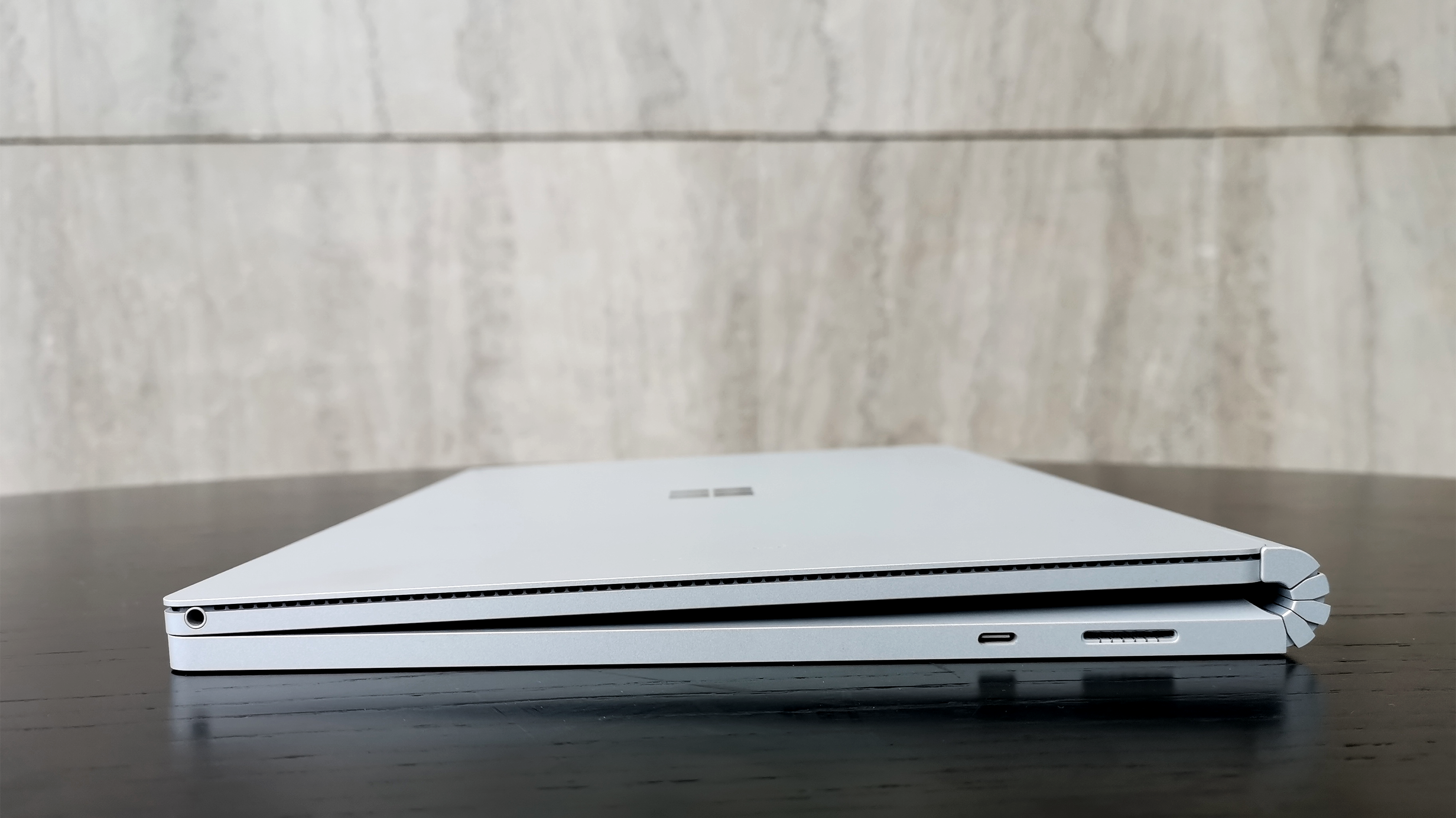
Right one USB-C™And a power interface, because of safety problems, there is no lightning 3 interface.
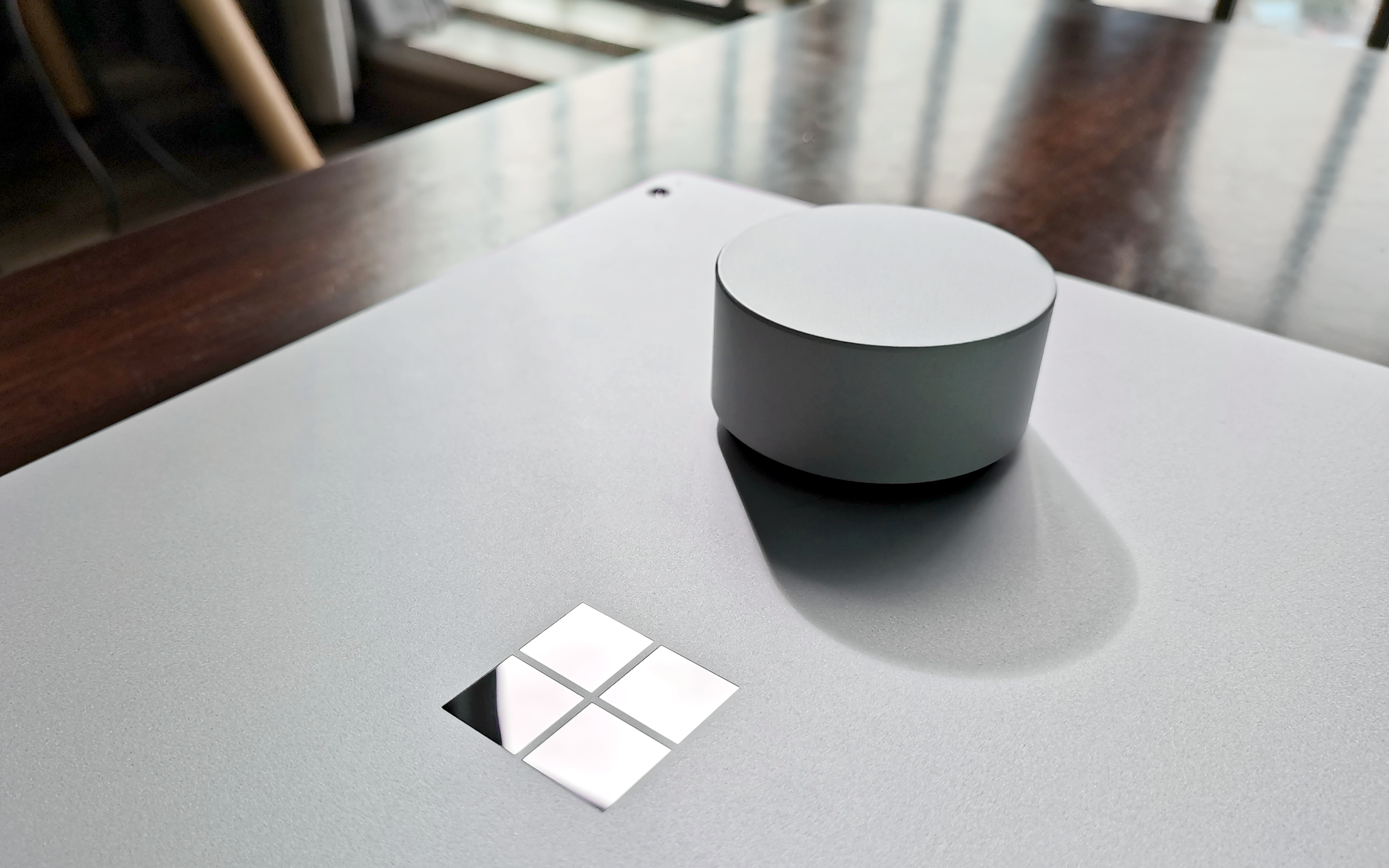
The top design is very simple, the most obvious is a mirror "Tian" logo, light can look at the mirror.
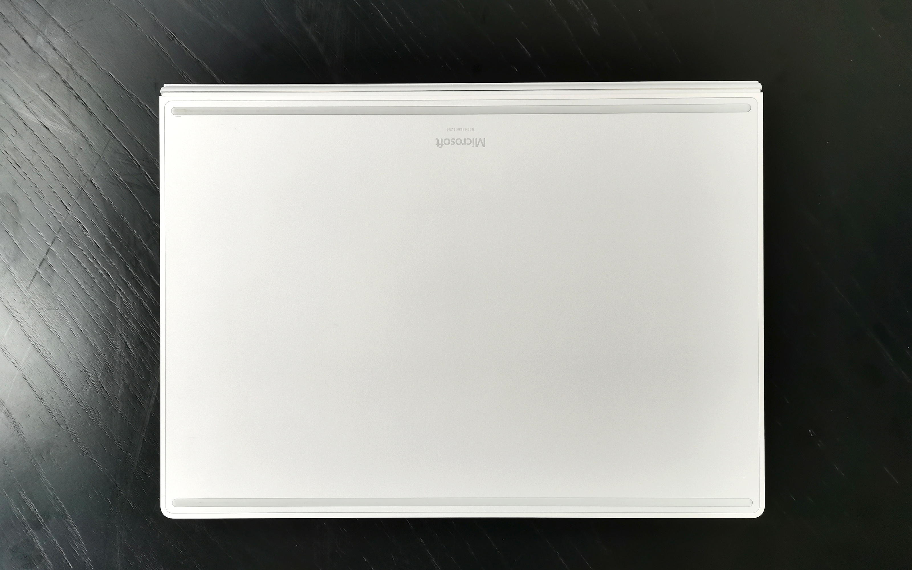
It is worth mentioning that the bottom surface design of the Surface Book 3. Usually, the laptops we see have large heat dissipation holes on the bottom surface, while the bottom surface of the Surface Book 3 has only two ultra-simple foot pads. The screw holes are hidden under the two foot pads, and the whole surface is non-porous and clean.
[Details let's say in several parts ~] ~]
1. Flat Plate
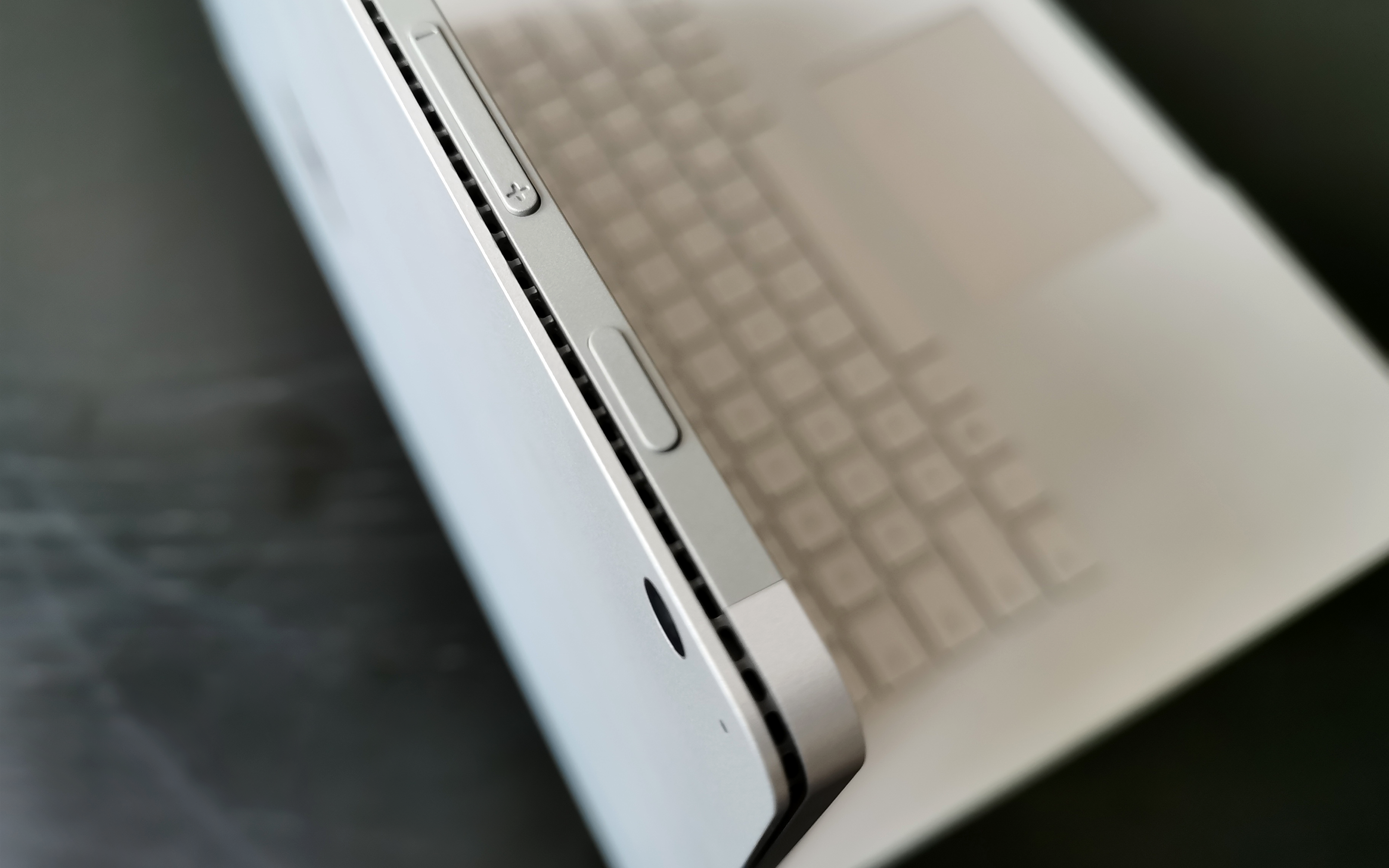
The side of the flat plate part has a complete circle of heat dissipation holes, an extreme 1mm heat dissipation hole, the design is very precise, and the side has a power switch and volume button.
There is a 5 million-pixel front camera directly above the screen and an infrared camera that supports Windows Hello facial recognition.
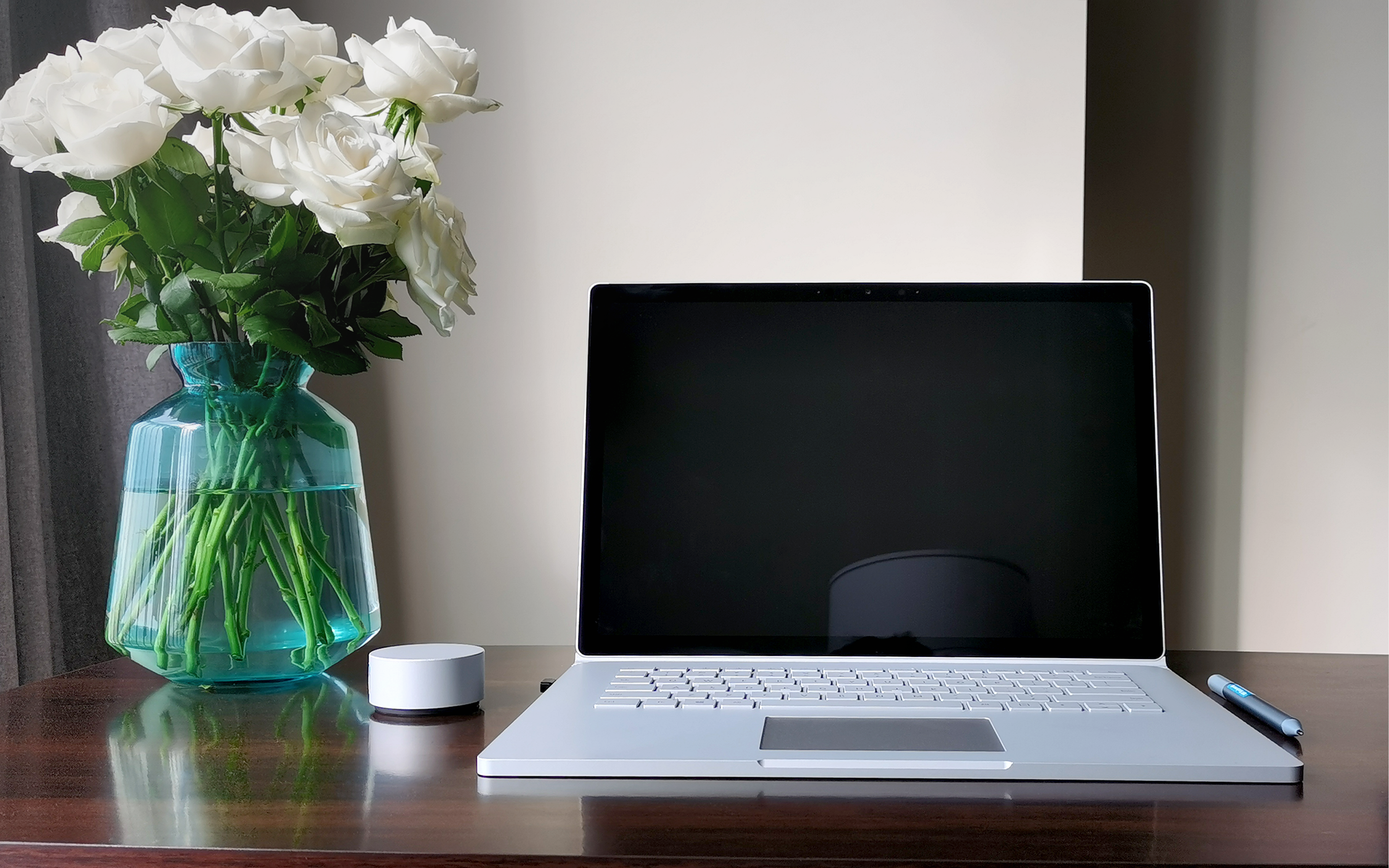
Because designers are business-oriented people, they have higher requirements for privacy and convenience, so the Surface Book 3 biometric system is very considerate and the recognition speed is extremely fast.
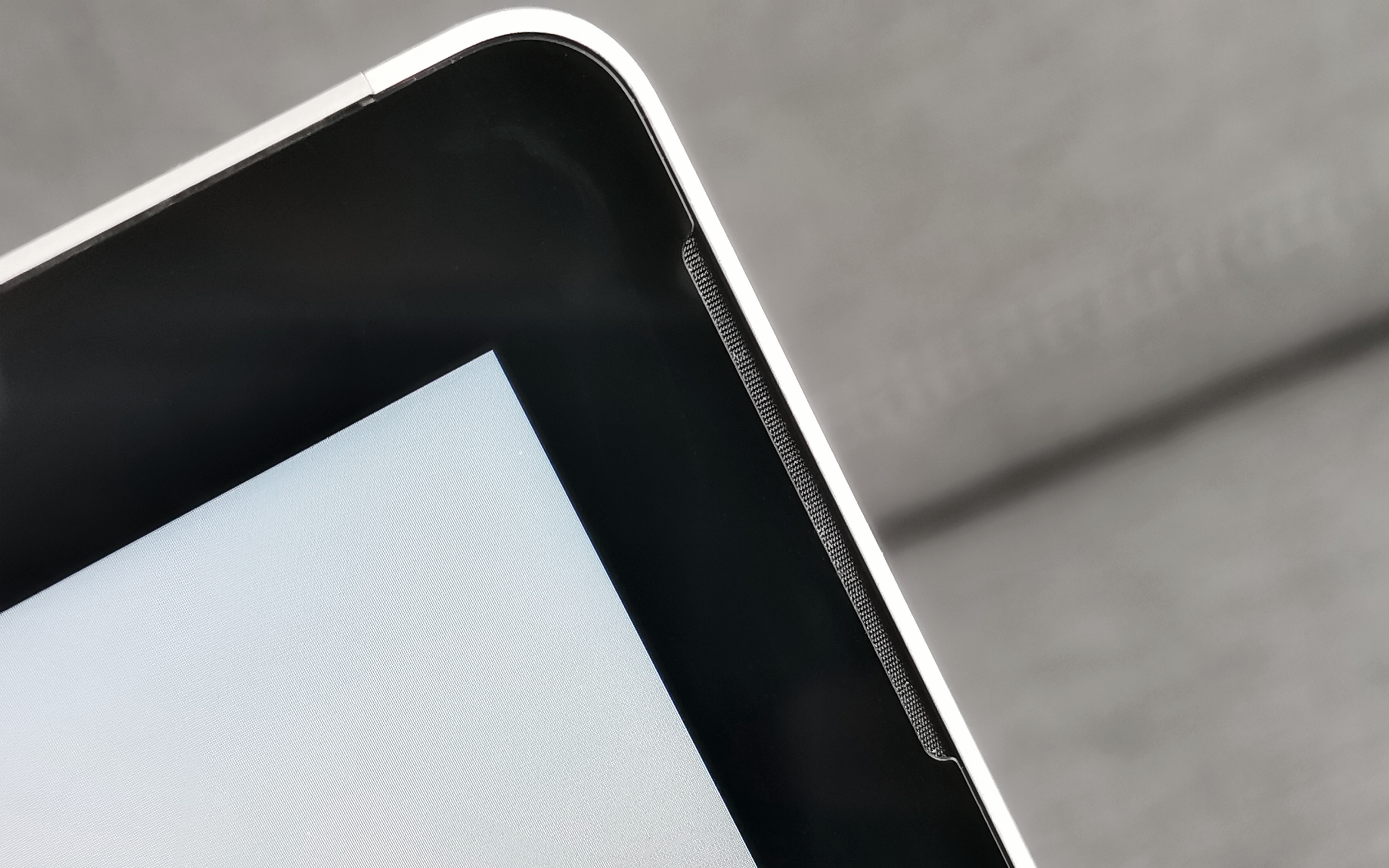
The speaker is located on the upper part of the left and right sides of the frame. It is a very secret and exquisite design. It is only found when playing music.
There is a 3.5mm standard earphone interface on the side of the tablet. As shown in the figure, the earphone cable is inserted into this position. In the laptop mode, if the right-hand mouse is operated, the earphone cable will fall between the mouse and the keyboard.

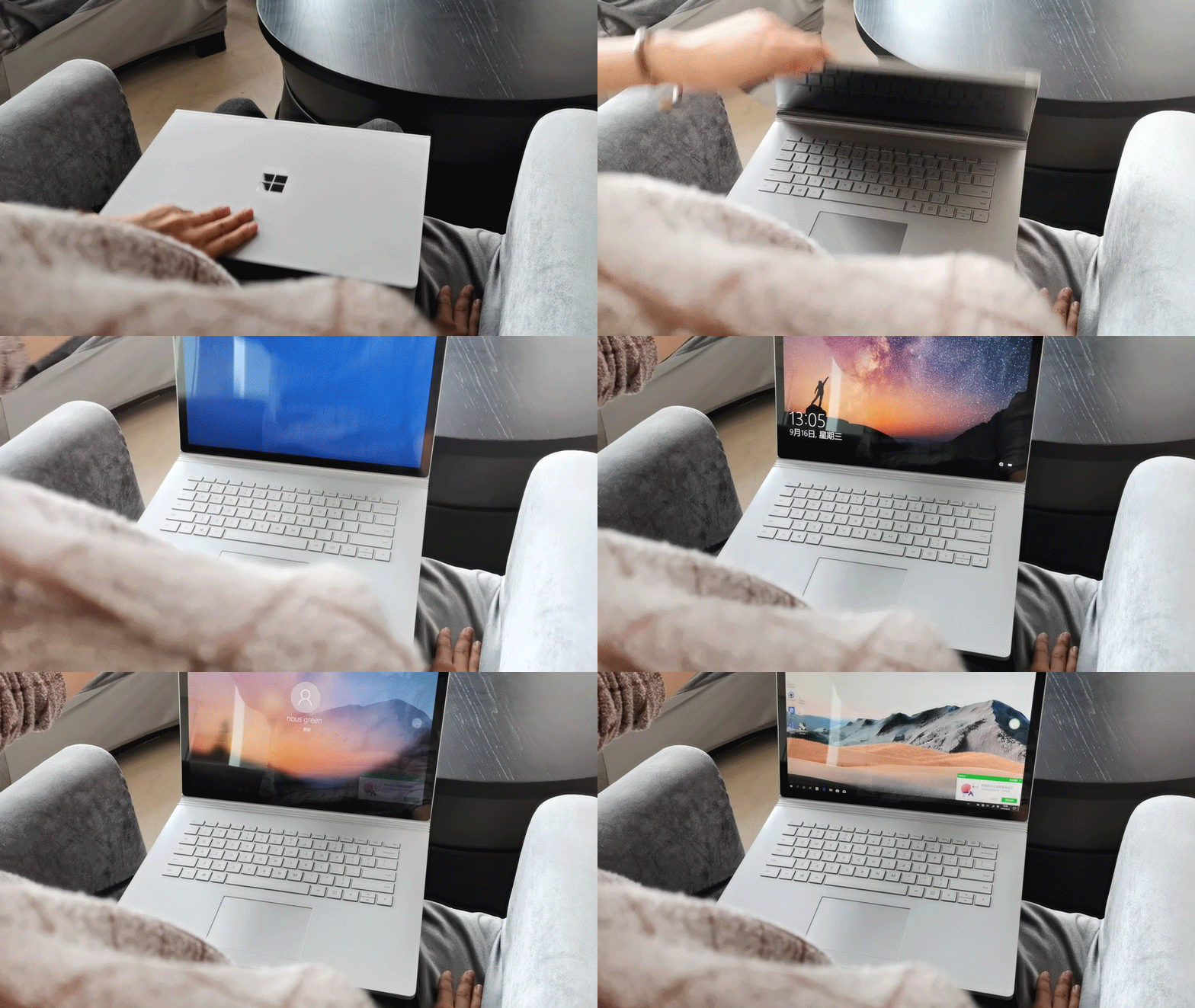
The position of the link between the tablet and the keyboard has also been magnetically designed to facilitate insertion and alignment. The successful insertion and connection is basically 1-2 seconds, which is very fast.

8 million pixel autofocus rear camera is very simple, I personally love it. The most important thing is that the front and rear cameras of the Surface Book 3 support 1080p HD video, and finally it is not a cloud of pixels when the computer opens the video!
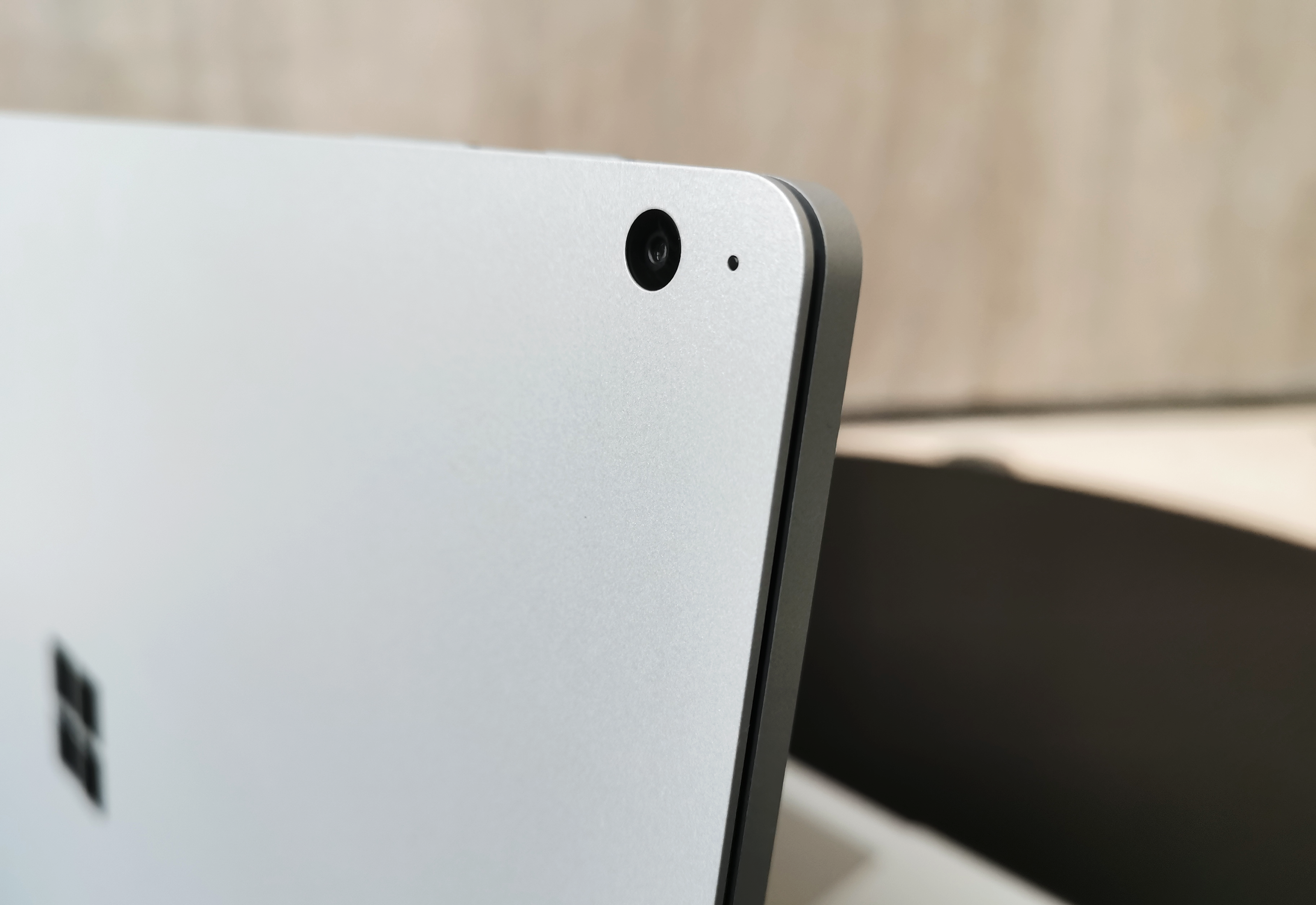
2. Keyboard
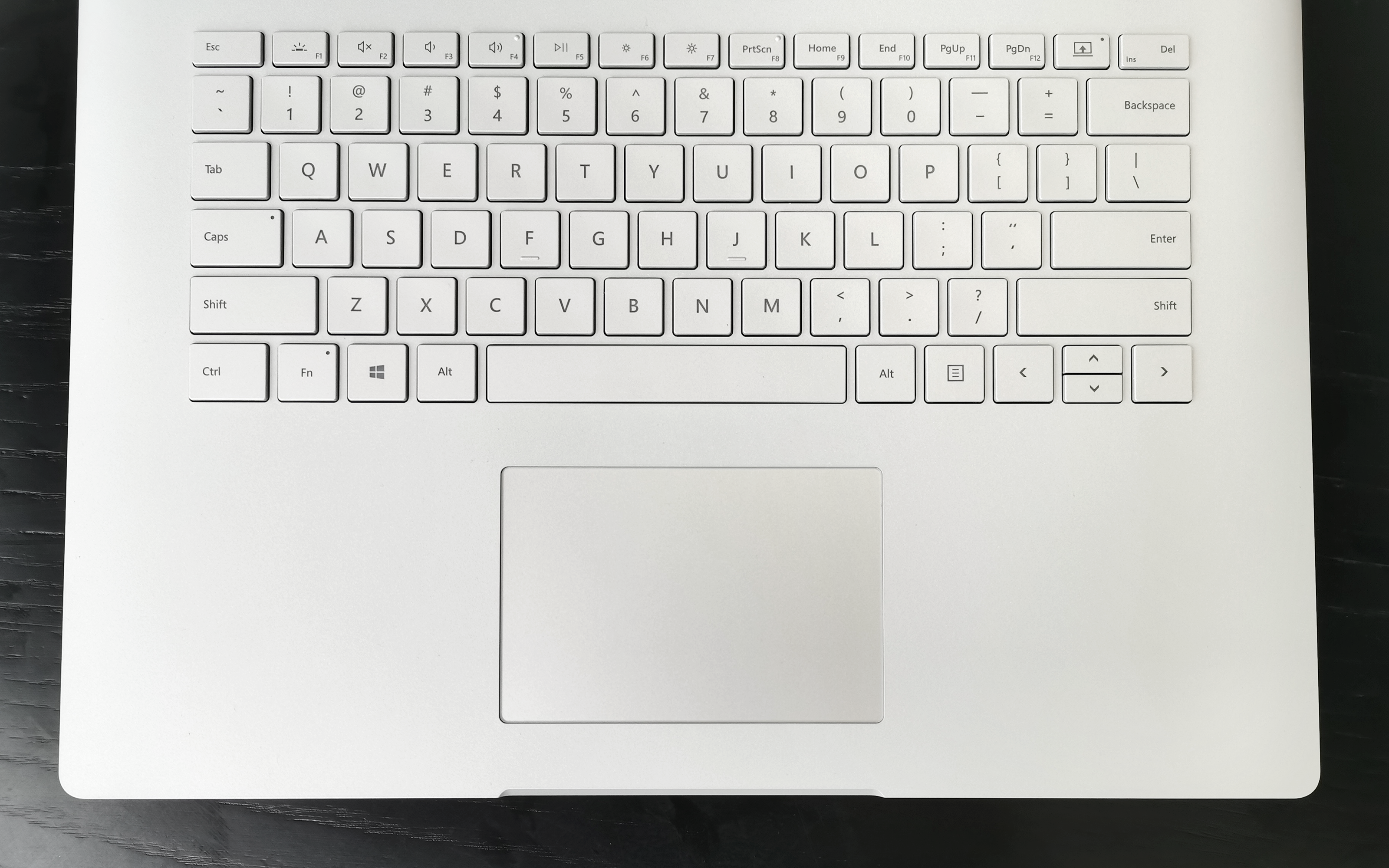
First give a keyboard face.
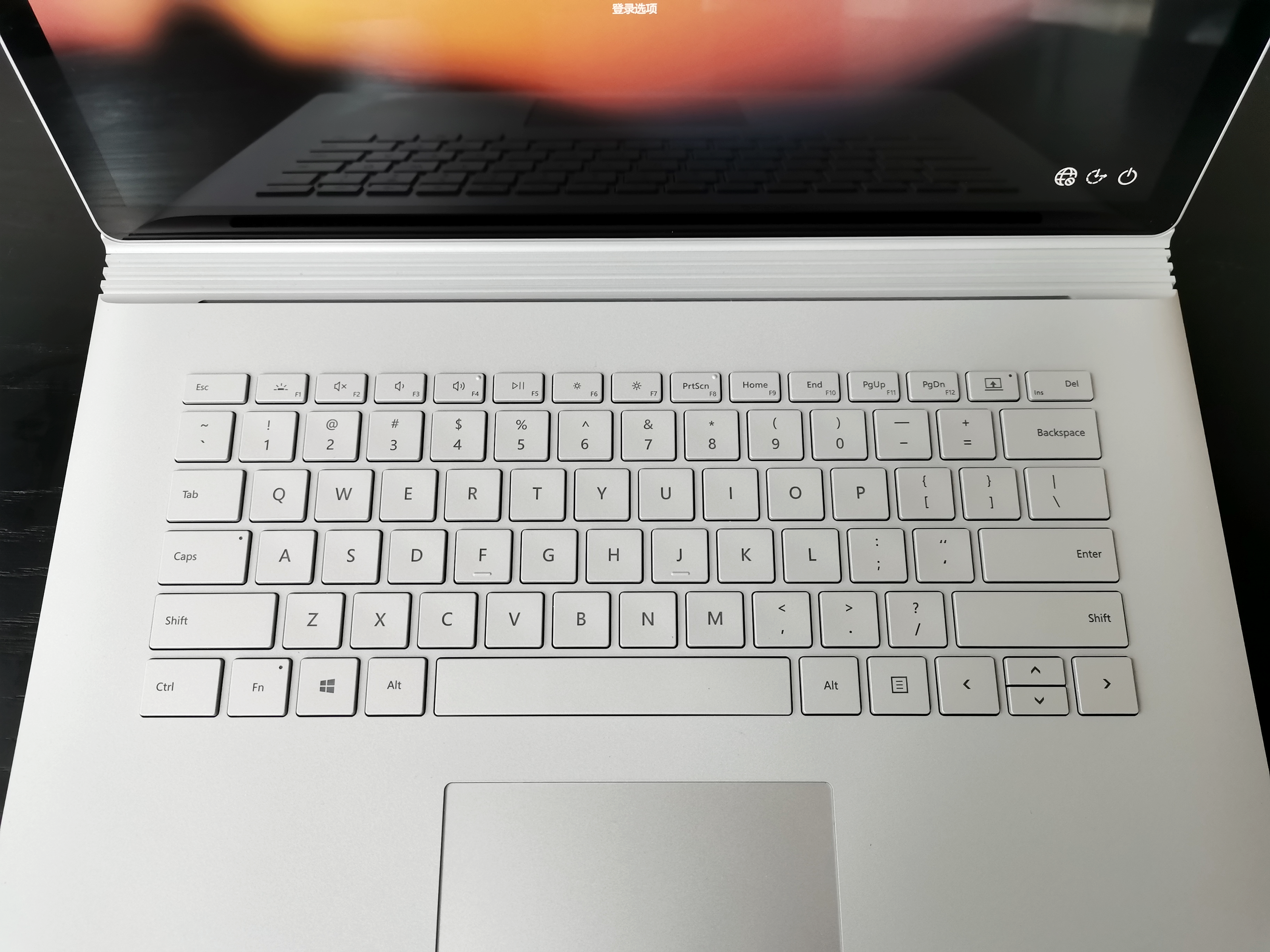
Personally, I think the design of the keyboard is extremely excellent. There are two points worth mentioning.
First, 1.55mm key stroke. It is much higher than the MacBook 1mm and feels better.
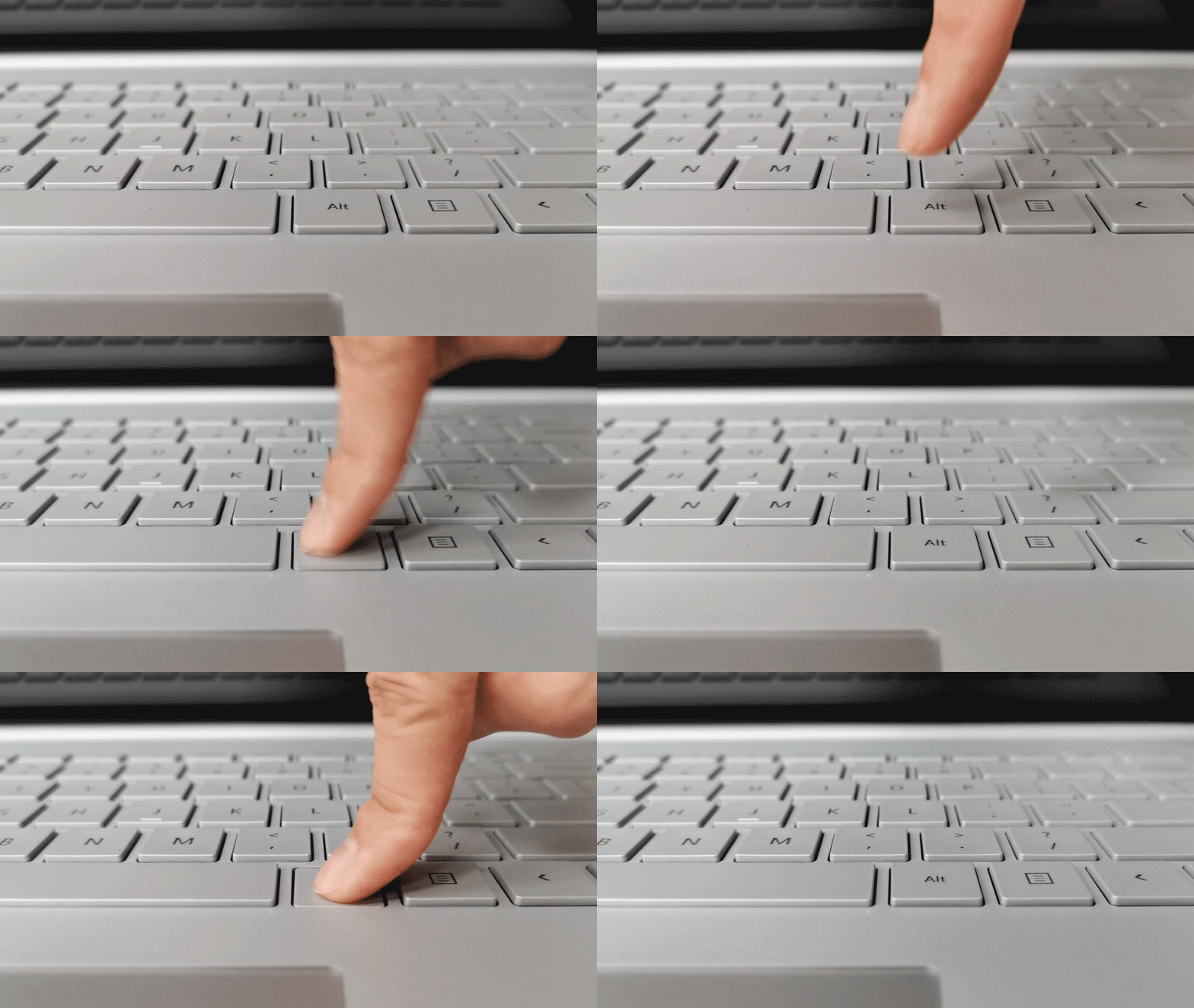
Second, the side arc of the keyboard is closed. This is my favorite. When typing, the hand has a supporting point on this arc, which is very warm and comfortable.

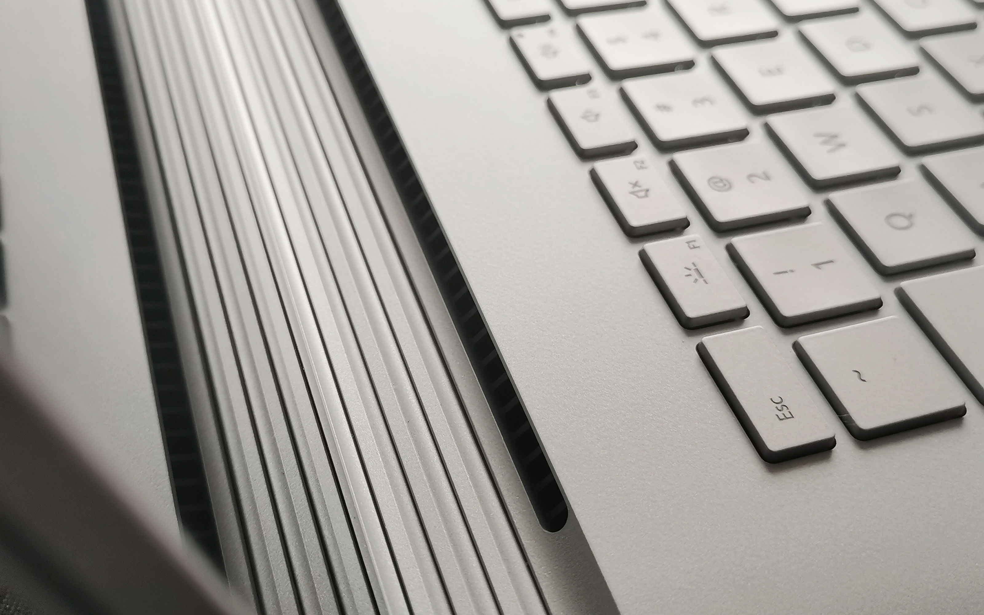
Say a few more words at the position of the keyboard. There is a row of separate heat dissipation holes at the connection between the keyboard and the hinge, which is more extreme and hidden than the design of many laptops on the market that directly make the heat dissipation holes on the side or top of the keyboard. The Surface Book 3 cooling hole design is a surprise.
3. Trackpad:
The touchpad is made of glass, and the smoothness and sensitivity of pressing and sliding feel are excellent when used. The size of the touchpad is indeed not large, but the editor believes that in terms of proportion, it is more balanced and beautiful than the large-size touchpad.
4. Hinge
Say Surface Book 3 has to say its business card-hinge.
Microsoft named this hinge: Dynamic Fulcrum Hinge. Separable, powered, stepless shaft and strong support, all together create this world-leading hinge design. The opening and closing force of the hinge part is very comfortable, the base will not slide when the cover is opened, and the screen can be kept stable when the opening and closing reaches the maximum angle. Surface the overall visual effect of Book 3 is cold and rational, the hinge, as a signature image point, also has this style.
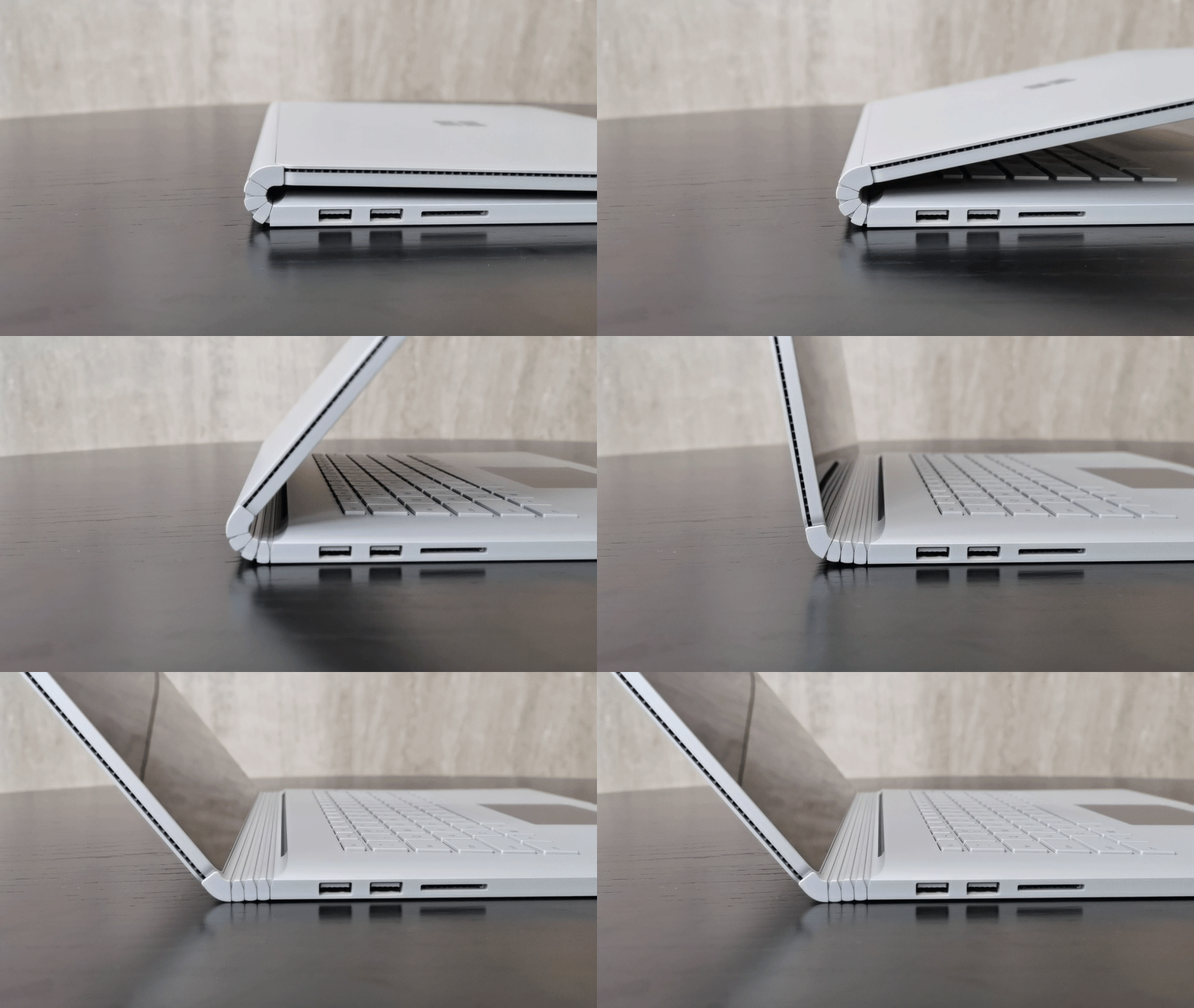
Enlarge the details to look at each side, can only say that Microsoft's CNC machining standards are rigorous without any feelings, feel the precision of mechanical watches, here really admire Microsoft's strong execution of innovative design landing. When the advantages of the hinge are finished, let's also talk about the disadvantages, because the design of the hinge causes the middle of the Surface Book 3 to not be completely closed, and the maximum thickness reaches 23mm.
5. Power supply
The charger is still a classic design. Apart from the rounded corners on the four sides of the cuboid, it adopts the same sharp and simple right-angle edges as the body of the Surface Book 3. The most noteworthy thing is that there is an additional USB interface to charge other devices, which can solve the embarrassment of charging multiple devices in the office and robbing the jack. It is a very humanized design consideration.
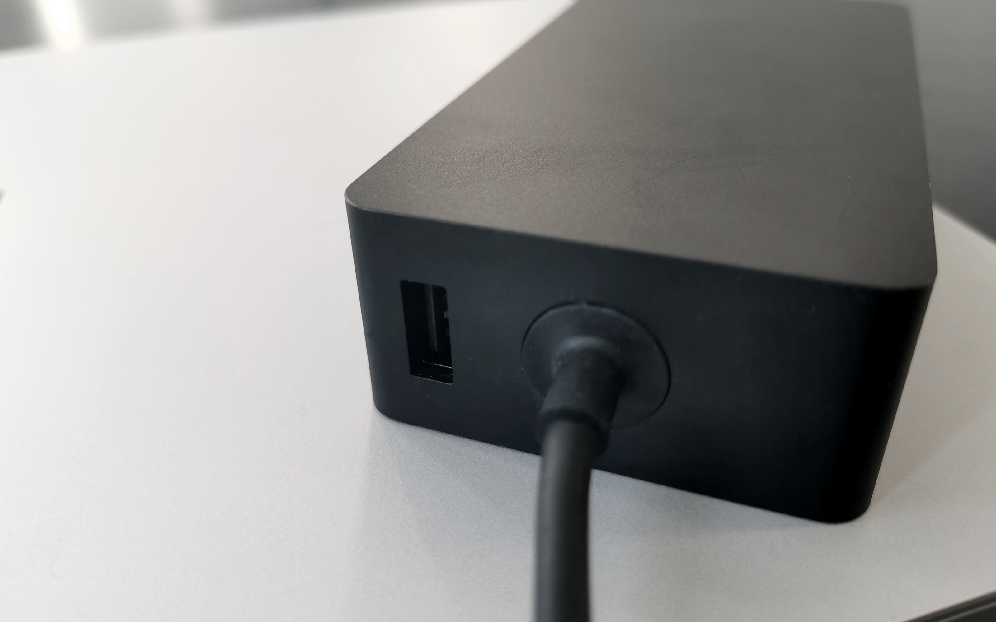
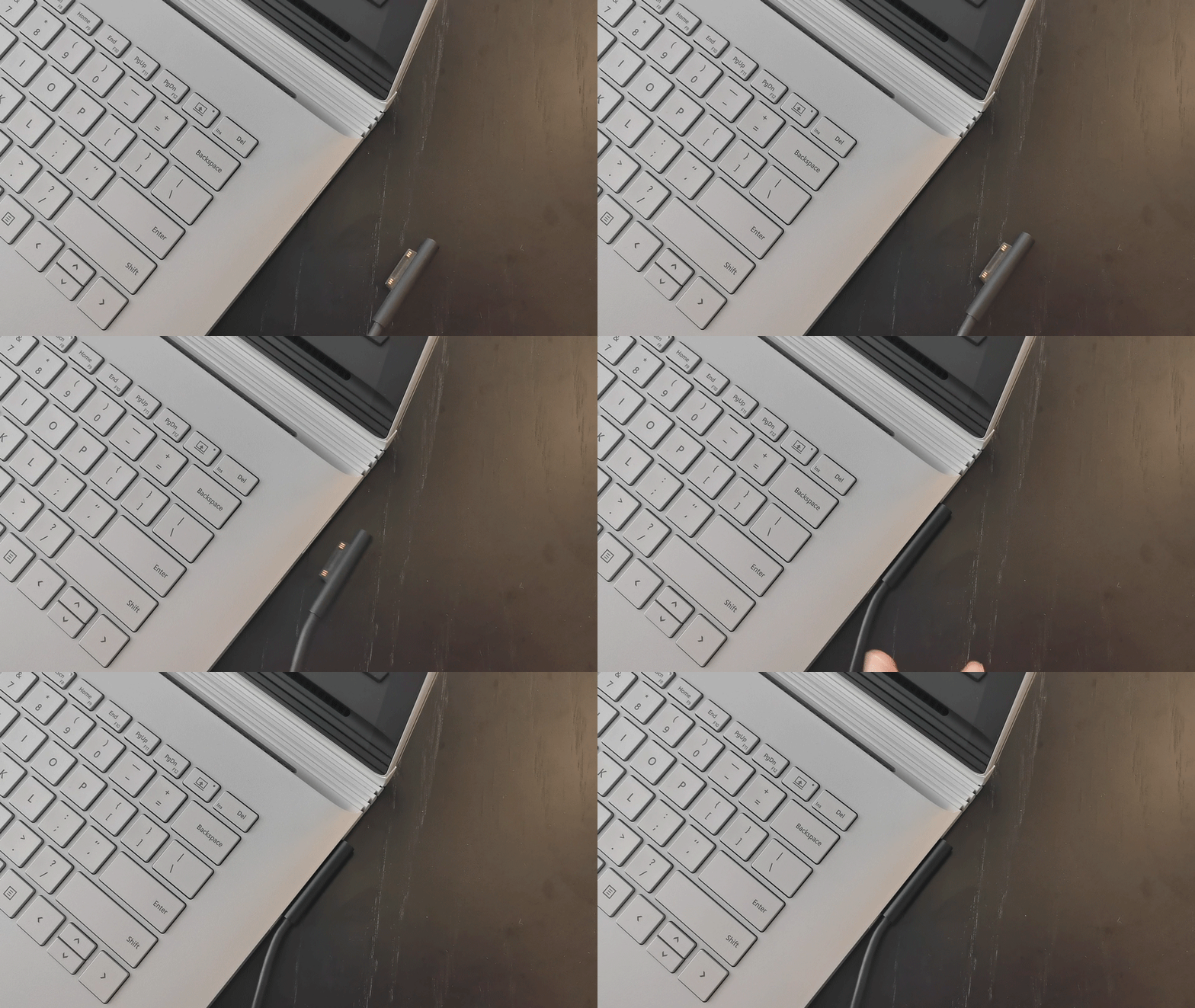
Another comfortable design is to connect the charging connector to the computer. This design is not only convenient, it does not need to look at the jack with eyes, and does not distinguish the front and back directions. As long as it is close to the interface position, it can blindly operate the plug-in, and even if it is accidentally pulled to the power cord during charging, it will not take the computer away together.
Finally, the weight of the overall charger is about 455 grams. Personally, I think it is slightly heavier as a business notebook power supply and can be designed lighter.
6. Stylus
The new generation of Surface stylus has an eraser key at the end of the pen and a physical key on the side of the pen. Long press can change the left mouse button of the pen tip to the right mouse button.
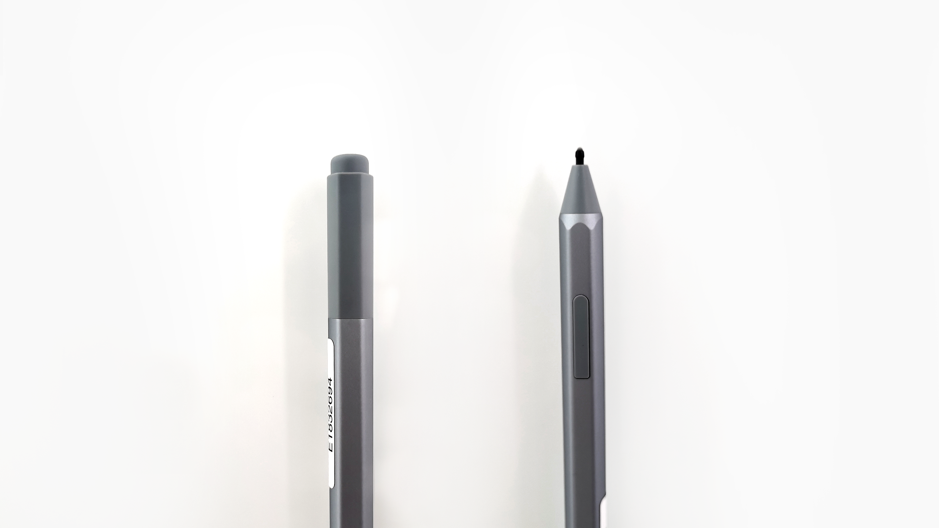
The pen tip has a damping design and can be replaced. The front-end "pen bead" part is made of silicone, which has a comfortable paper writing experience. I will expand this in the later drawing performance evaluation stage. Regarding the battery, the pen is powered by a 4A battery. Align and pull out the back cover to replace the battery. It is said that it can be used for 18 months.
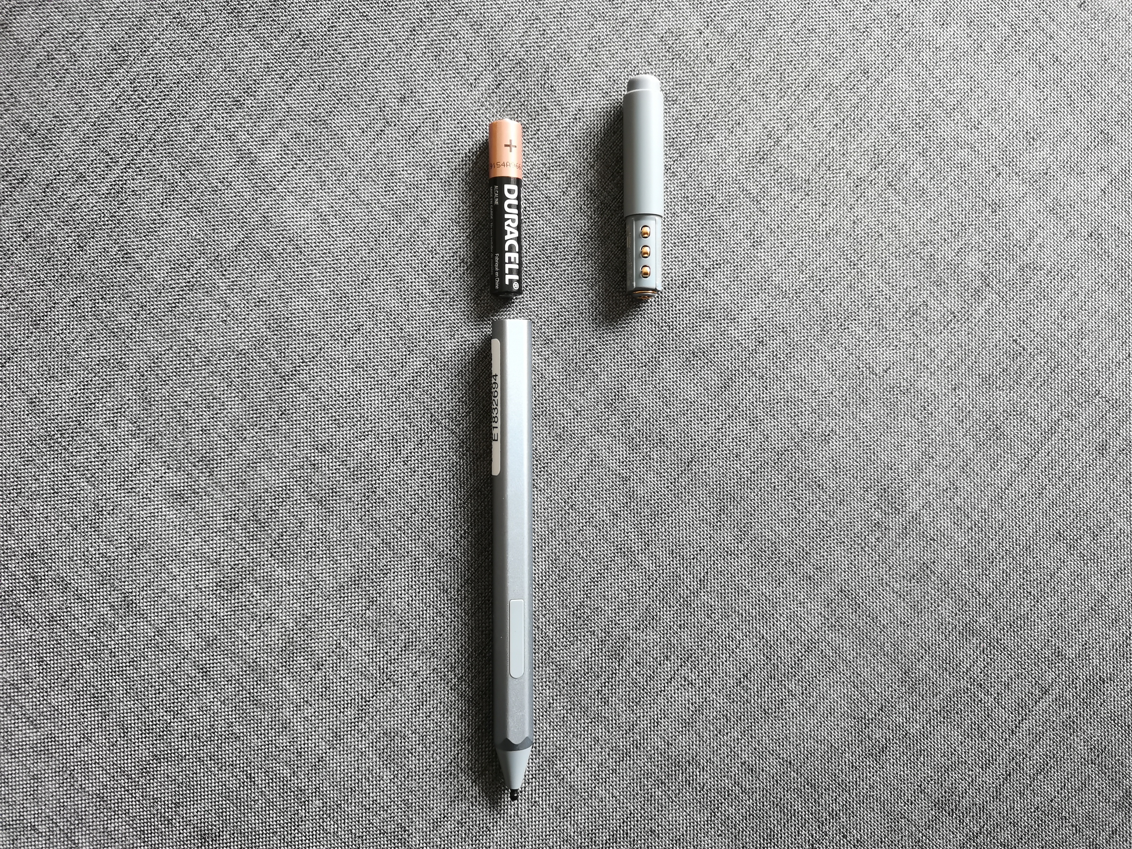
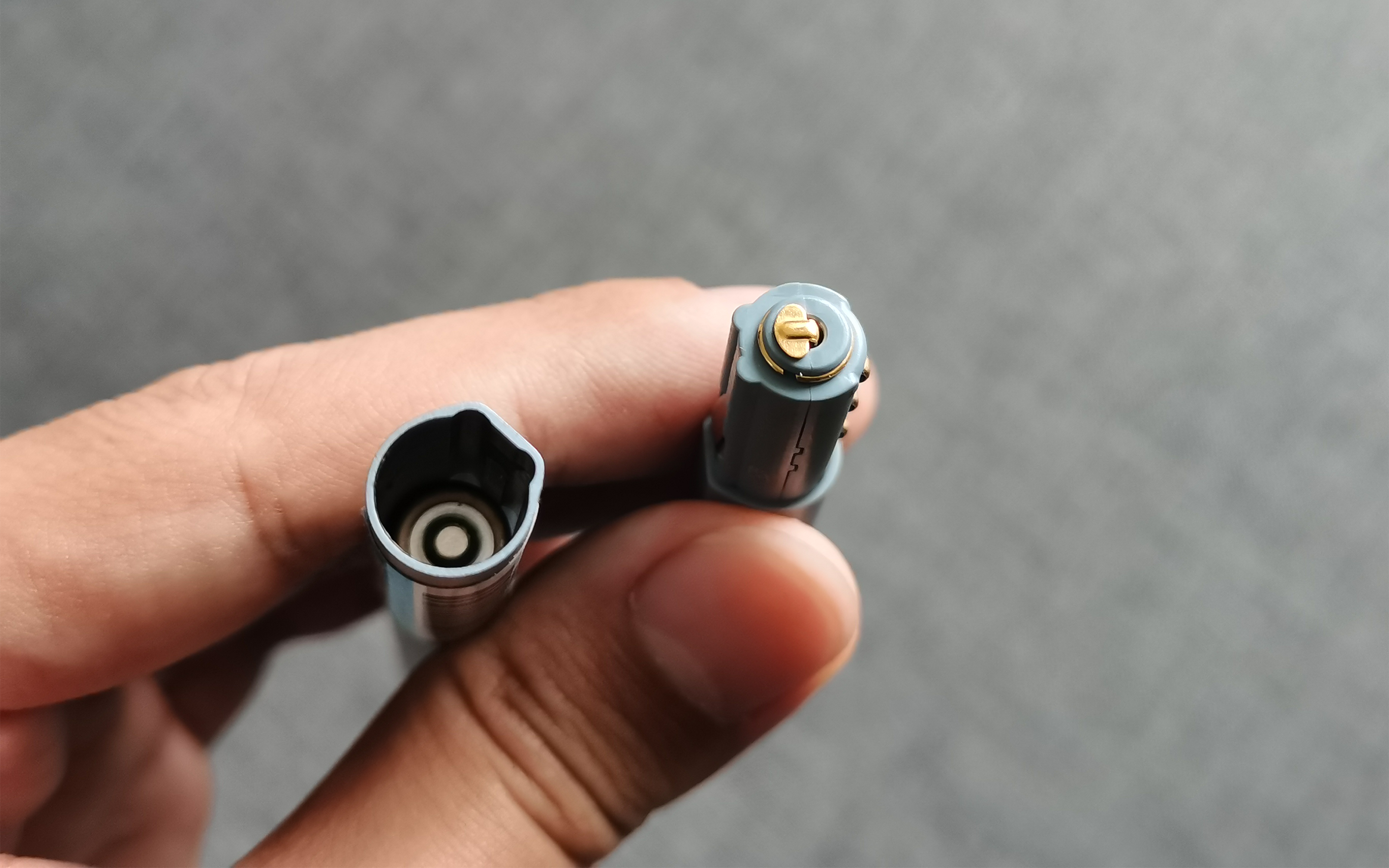
The upper and lower parts are fastened by the elastic metal bump clamping structure, which is not loose at ordinary times, and can be removed by pulling out with force. The fastening position is designed to prevent the insertion position from damaging the fastening structure. In addition, the Surface stylus can be magnetically sucked on the left side of the Surface. After magnetically sucked, the power will be automatically turned off, and the magnetic attraction will be automatically turned on. It is still well received in terms of power saving. (The picture below shows the fool-proof design of the buckle part)
7. Surface Dial
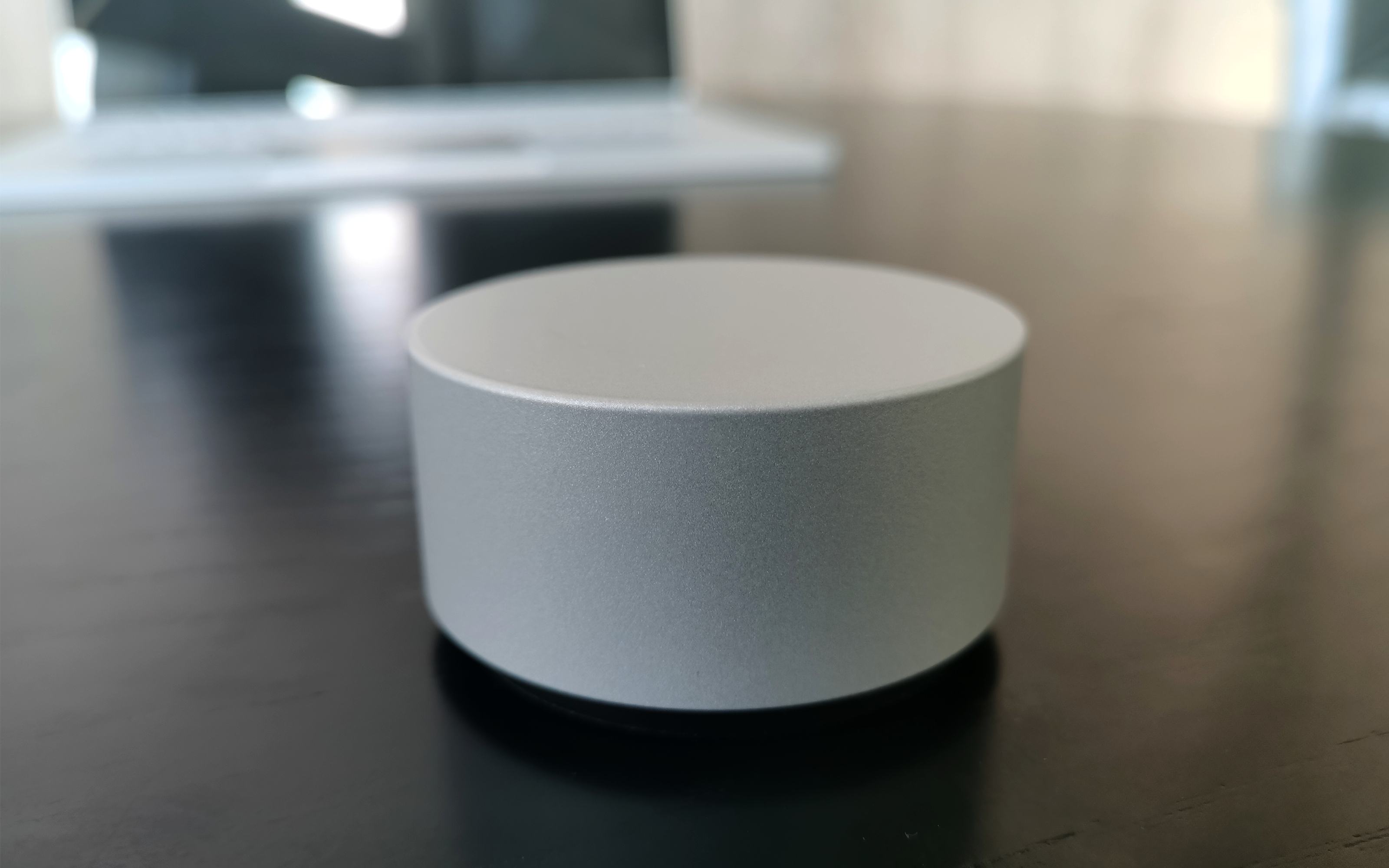
Consistent with the material and surface treatment process of Surface Book 3, the rotatable part is composed of all magnesium alloy, with a positive cylinder shape and a classic ratio of 2:1 in diameter.
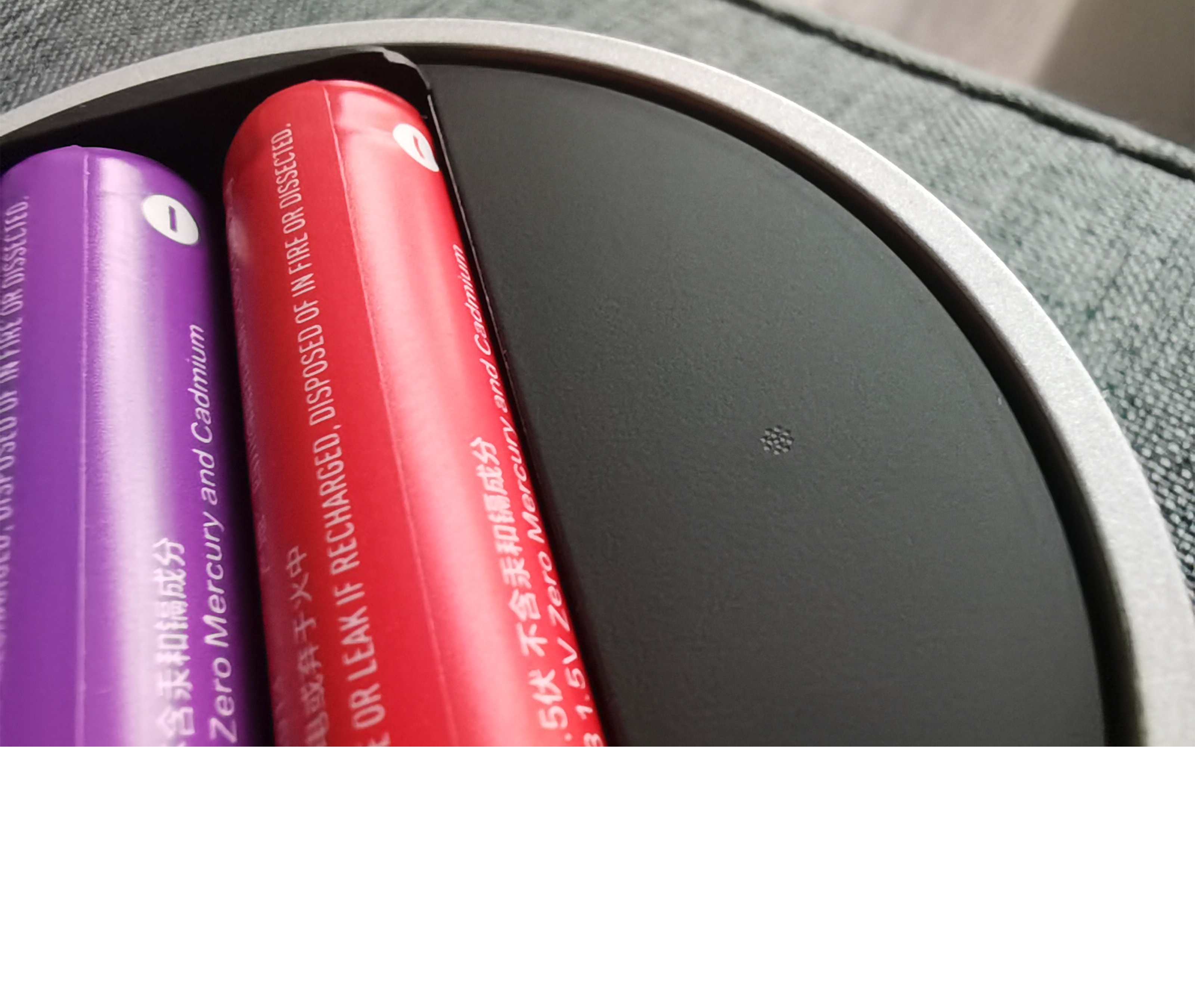
The bottom cover is assembled by magnetic attraction and automatically adsorbed when close to it. Two 3A batteries need to be installed at the bottom before use. The switch button is also hidden beside the battery slot and can be opened by long pressing.
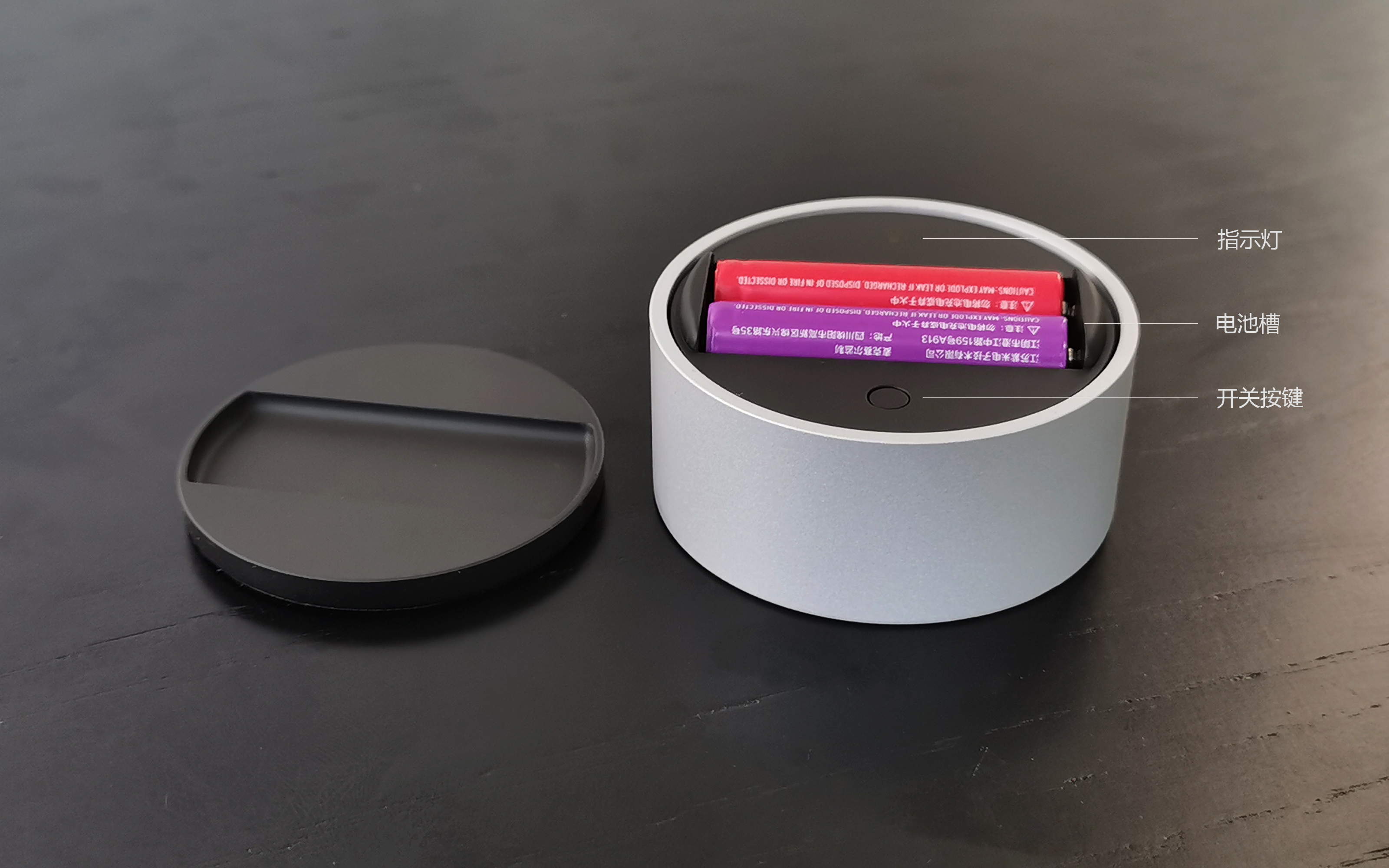
The position of the indicator light uses laser microporous technology, which is precise and hidden.
[Let's talk about the experience]]
1) Screen resolution
The 15-inch screen we evaluated is very insensitive to hardware parameters, so the numbers are simpler and mainly describe the usage experience: it has 3240*2160 resolution, and the feeling is similar to 4K screen effect, which can be used as a 4k screen with cut edges. The aspect ratio is 3:2, which is basically the size of a piece of A4 paper. Now many Ultrabook have this ratio, which is high enough to look at web documents. Can achieve 1600:1 contrast ratio, online said is still lower than the latest OLED screen, but, how to say, the notebook itself is not big, now contrast, the small editor feels the image quality is so delicate that it can be said to be sharp, is completely enough.
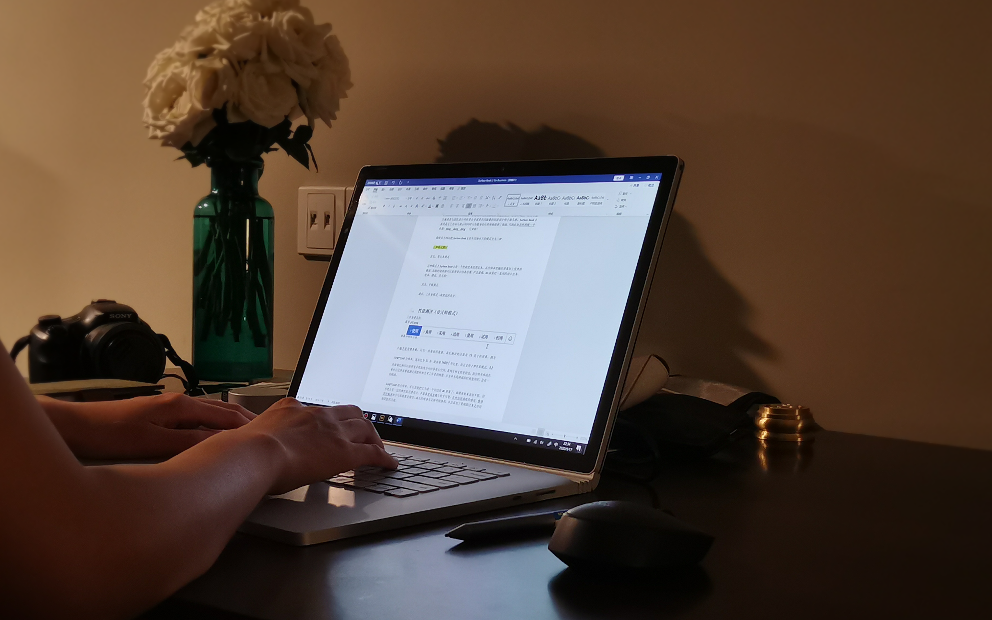
Night work screen effect
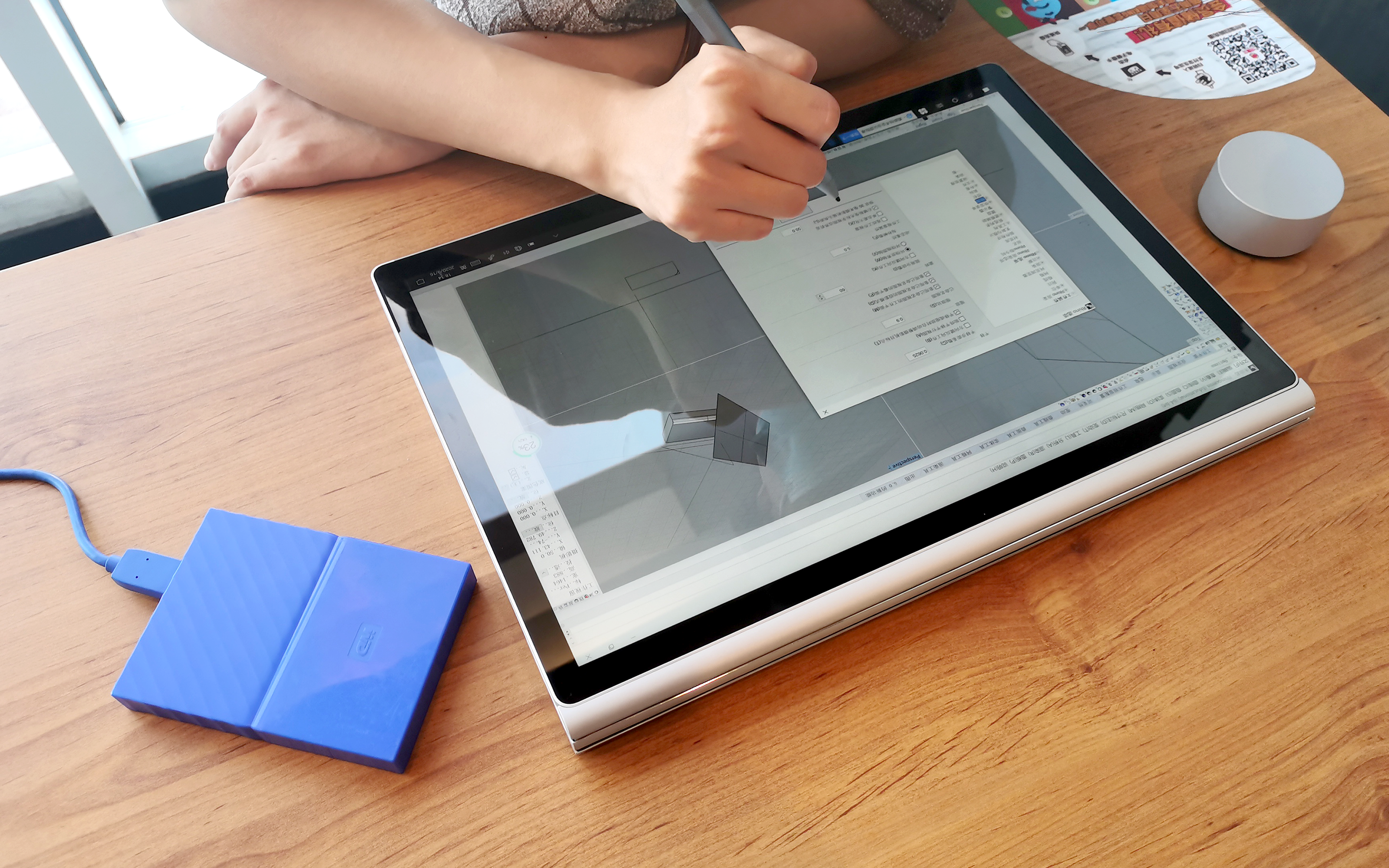
PixelSense the screen, I have checked a lot of explanations about this small editor. What I understand means is a screen with pixel-level recognition capability. In terms of experience, it can very accurately identify whether the touch screen is a finger, a palm or a Surface stylus. It is very powerful to prevent false touch. In addition, I evaluated this Surface stylus as a 4096-level pressure sense. With PixelSense technology, there was almost no delay in the whole use process. The pressure sense was accurate and the stroke could be drawn.
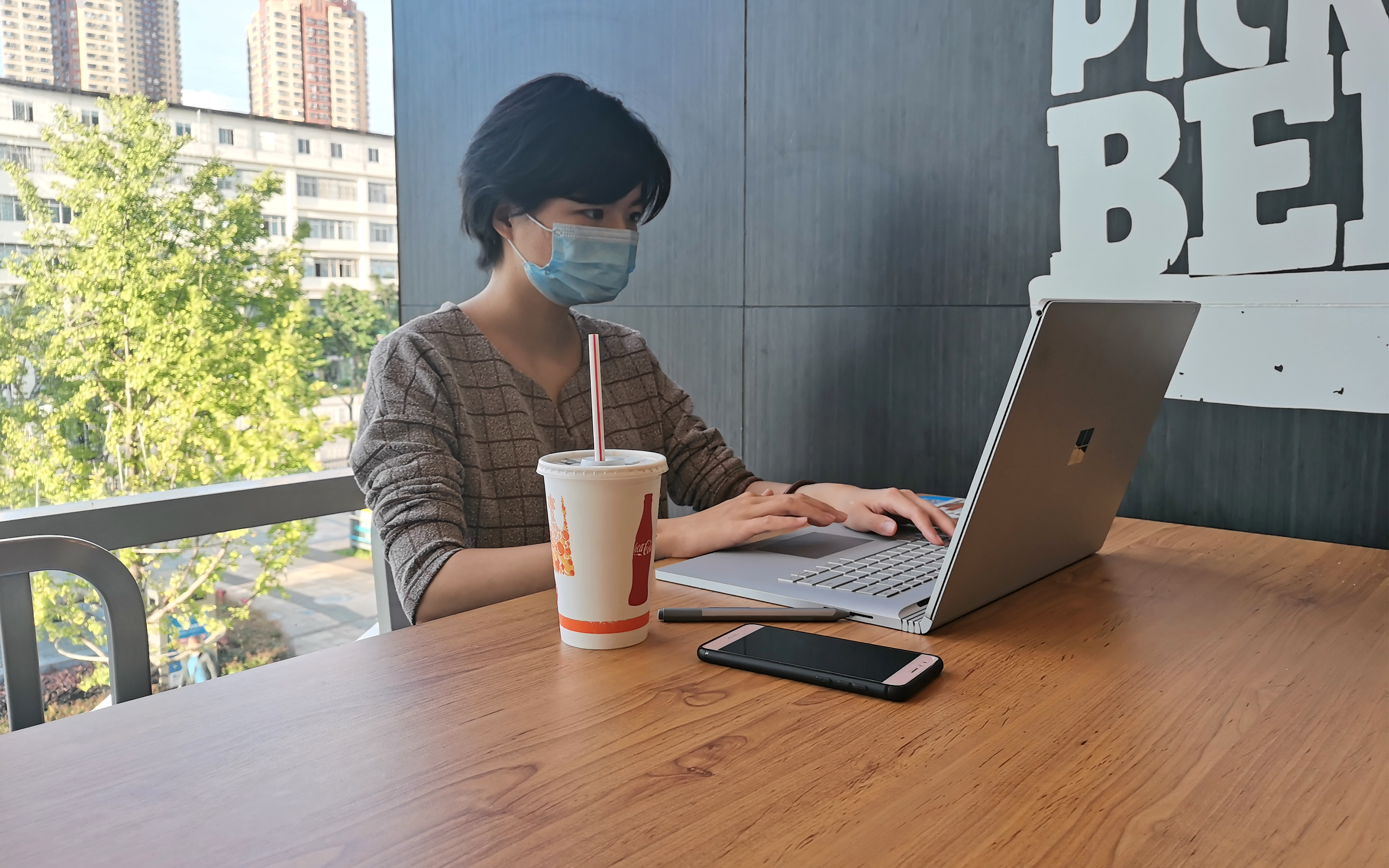
There is a little discomfort, the screen is more reflective. When the surrounding environment is relatively bright, there are some obstacles. It is recommended to open the software to a light gray background, so that the reflection is not so obvious, and it can also protect the eyes.
2) Screen Color
Surface Book 3 supports two color modes: sRGB and enhancement mode
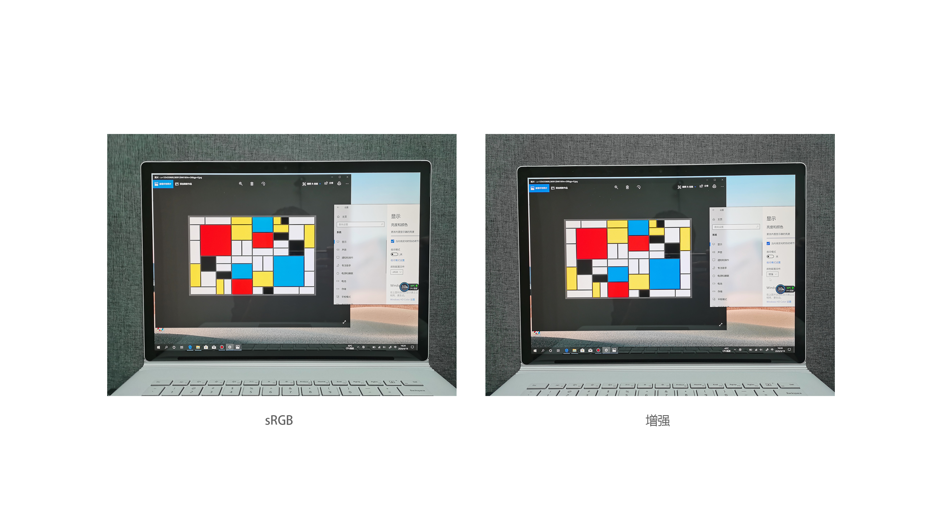
SRGB mode: control the display color gamut of the screen in the sRGB range, so that the image looks closer to the color of the actual printed matter; It is very important for designers (especially graphic designers) to have this sRGB mode, otherwise there will often be embarrassing situations in which printed matter is not found.
Enhancement mode: As the name implies, compared with sRGB, the enhancement mode has more colorful colors, greater contrast, and more impact on movies.
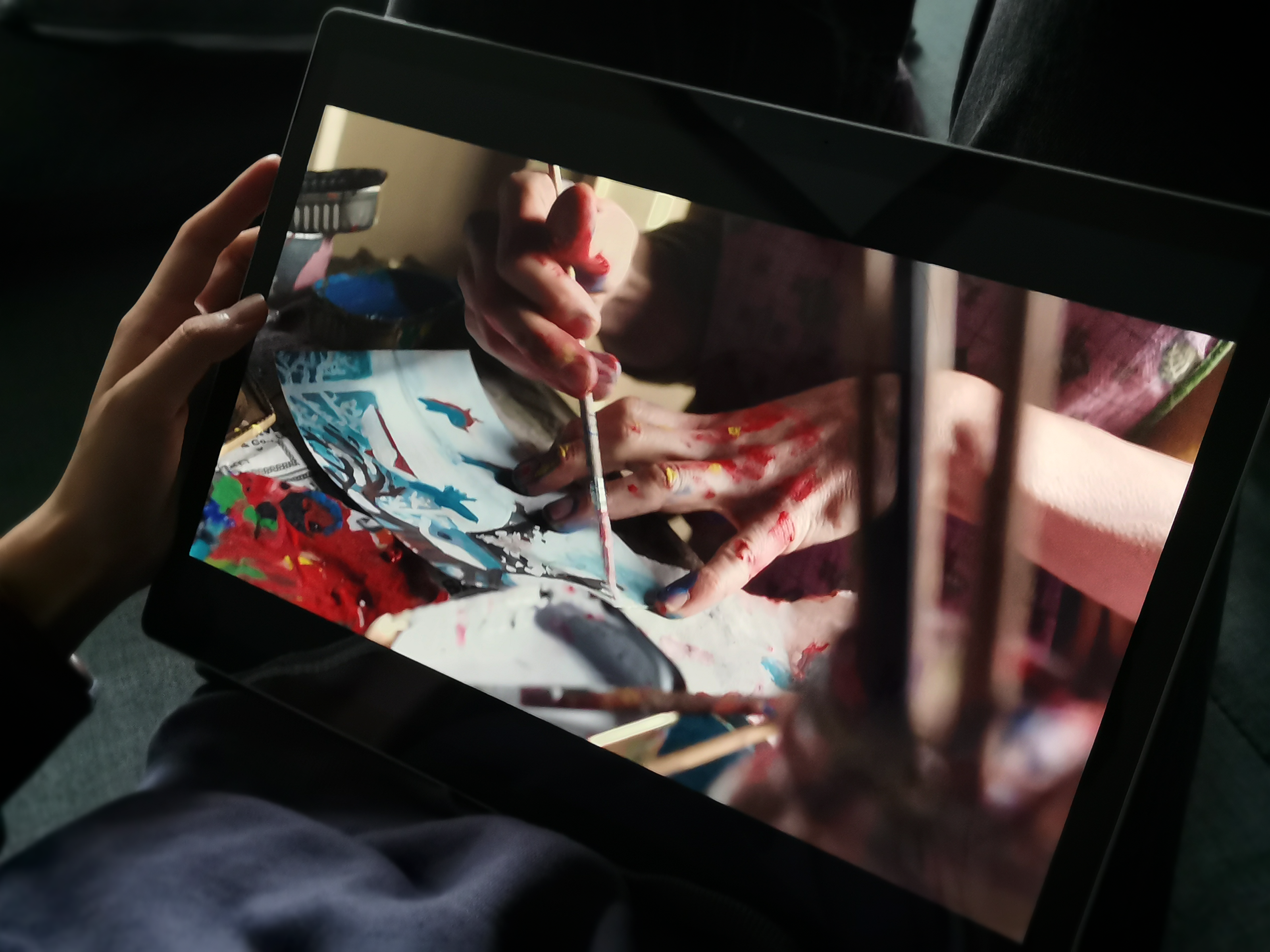
However, if there is only sRGB mode, playing games, watching pictures and brushing videos, the whole picture will bring you the overall saturation and black experience, so this two-color mode really takes care of the work and life of designers.
3) Performance of Stylus and Dial
I mentioned in the first part of the design that the tip of the Surface stylus has an elastic damping design. This design will give you a kind of natural writing comfort, unlike HP and Dell pens, which have a feeling of drawing plastic when used;

In addition to the design of the pen itself in line with the psychology and habits of daily use, Microsoft is also very considerate in the interaction between it and the flat panel. Under the 4096 level of pressure, writing and drawing lines can basically simulate our natural state on paper. The thickness change of pencil lines and the writing marks of ink pens are very natural. Xiaobian thinks there is still some decompression effect.
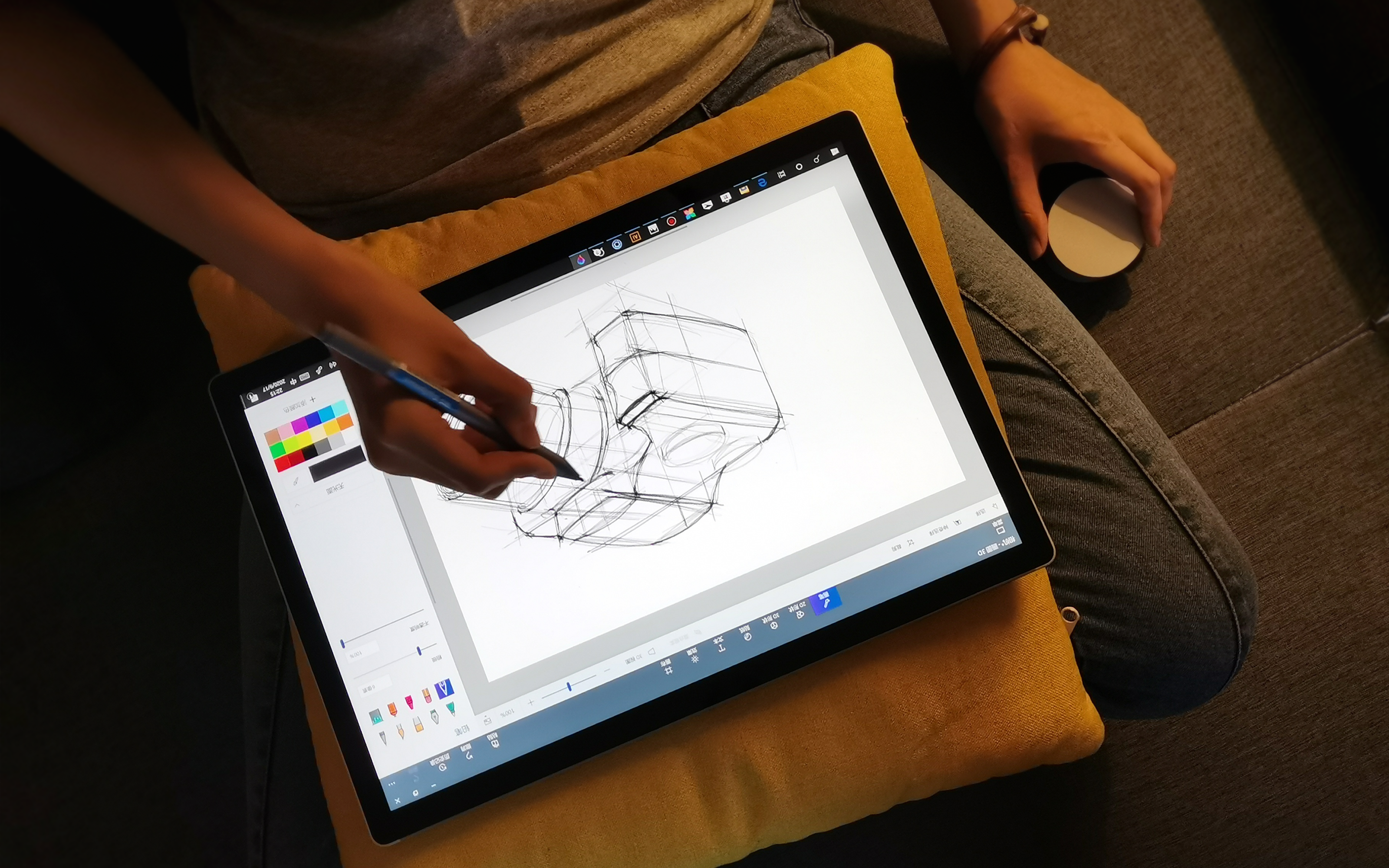
In addition, when I used Wacom's tablet to open PS and AI, many settings were not available or not useful. I need to set some keys or shortcut keys triggered when rotating myself. Surface, these software on Book 3 have their own settings when they are opened, and they are in line with my expected operation habits. this step really saves a lot of things.
Dial can adjust the volume and brightness without turning on the software, and the function is not obvious. When used in software, it mainly plays an auxiliary role in Surface stylus, especially in the stage of hand-drawing and modeling. The main functions are still in the use of software, such as Dial color selection.

You can also adjust the 3D view

Having talked about software, let's start software evaluation in several dimensions ~
Some of the following software evaluations are compared with my game book and desktop workstation, so give a rough parameter
My game book (graphics card NVIDIA GTX980M; Processor i7-6700HQ)
My desktop computer (NVIDIA GTX1060 6GB; Processor i7-8700)
Because this evaluation is 16G/256G,NVIDIA GeForce GTX graphics card products (the lowest configuration in the 15-inch screen of this product), Quadro RTX high-performance discrete graphics card is uniquely added to the higher configuration version of Surface Book 3. I saw in some professional performance evaluation of Surface Book 3 on the Internet that this graphics card can open 8000 Lego Star Wars building block models smoothly and can provide a better experience.
1. Design software opening speed
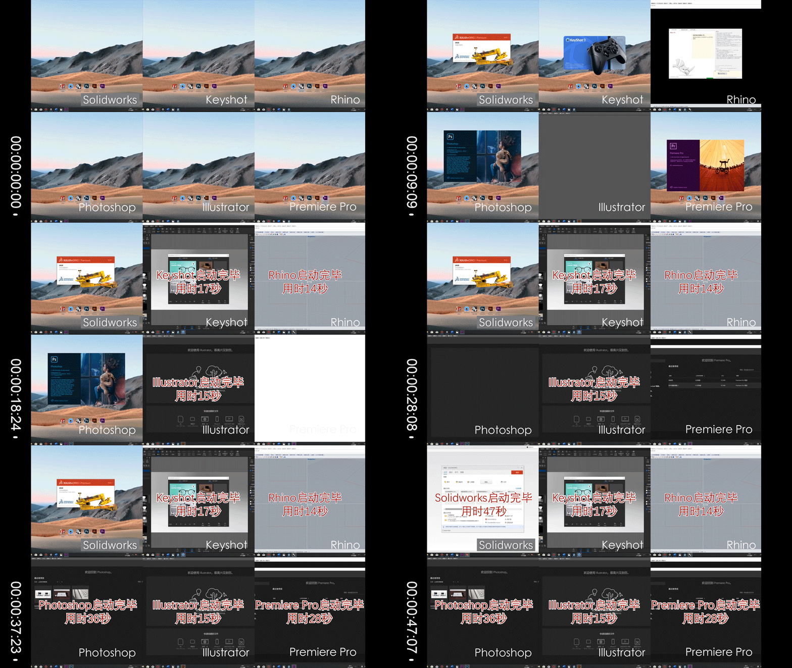
I tested six software commonly used by designers on Surface Book 3 (the above picture shows the software on and on). Their opening speeds are as follows:
Solidworks2020:47 seconds;
Keyshot9.1:17 seconds;
Rhino5:14 seconds;
Photoshop CC 2020:36 seconds;
Illustrator CC 2020:15 seconds;
Premiere Pro CC 2020:28 seconds
Because Xiaobian usually operates these software on the desktop, I feel that the above speed is not fast, but compared with my game book, it is already very good. After all, everyone knows the difference between laptop and desktop.
2. Fluency of software use
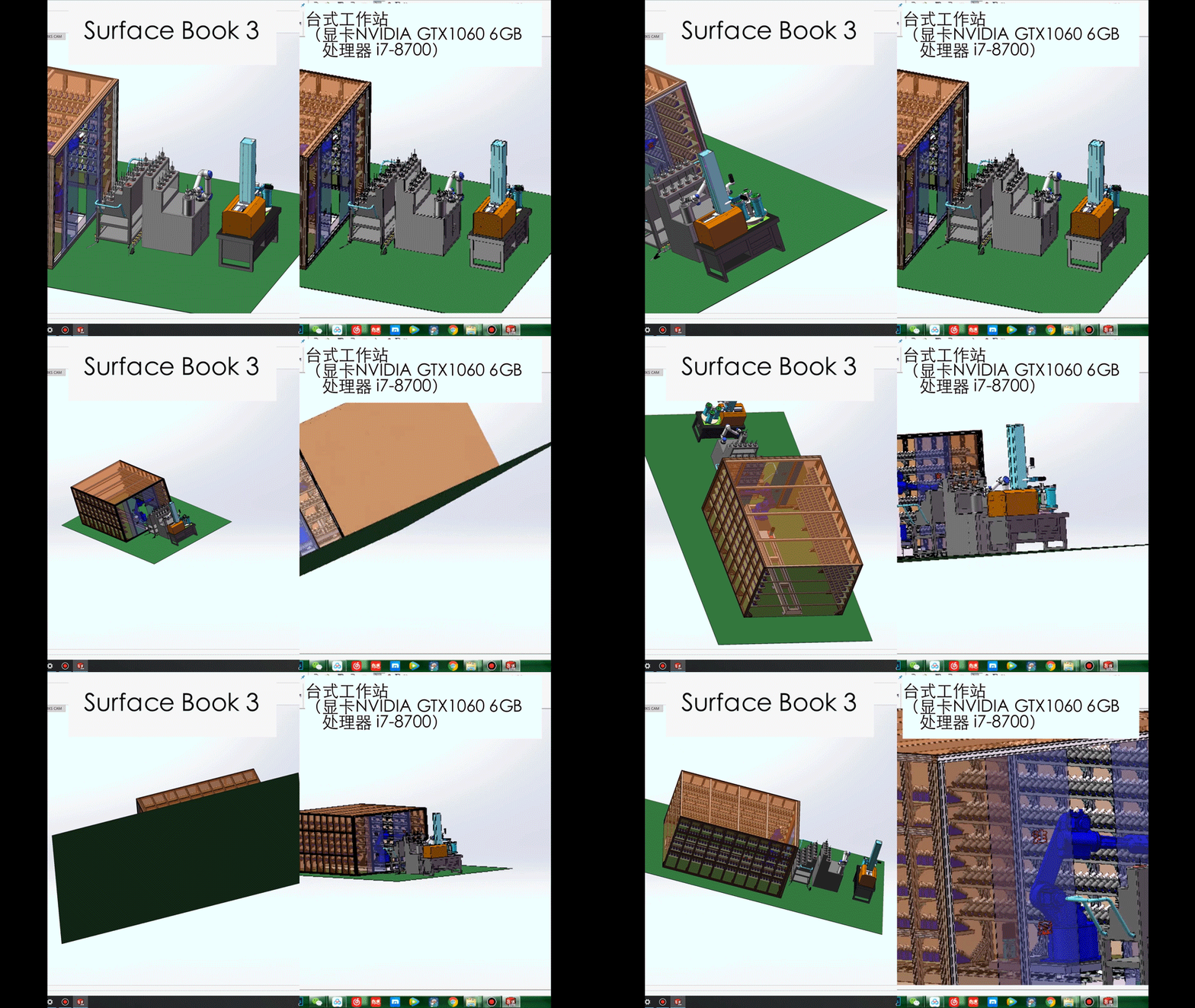
Fluency is directly compared with my desktop computer. Let's look at the picture directly.
Comparing Rhino -- 260MB Electric Scooter Structure Model

Comparative Solidworks-Workshop of Robot Arm Tool Library
Contrast Keyshot-TV Cabinet Scene Rendering

The smoothness of use is basically the same as that of my desktop computer! Even if you open the Soildworks model of more than 4000 components and Keyshot single scene rendering, you can operate smoothly.
3. Rendering processing speed
I compared Surface Book 3 with the game book and desktop.
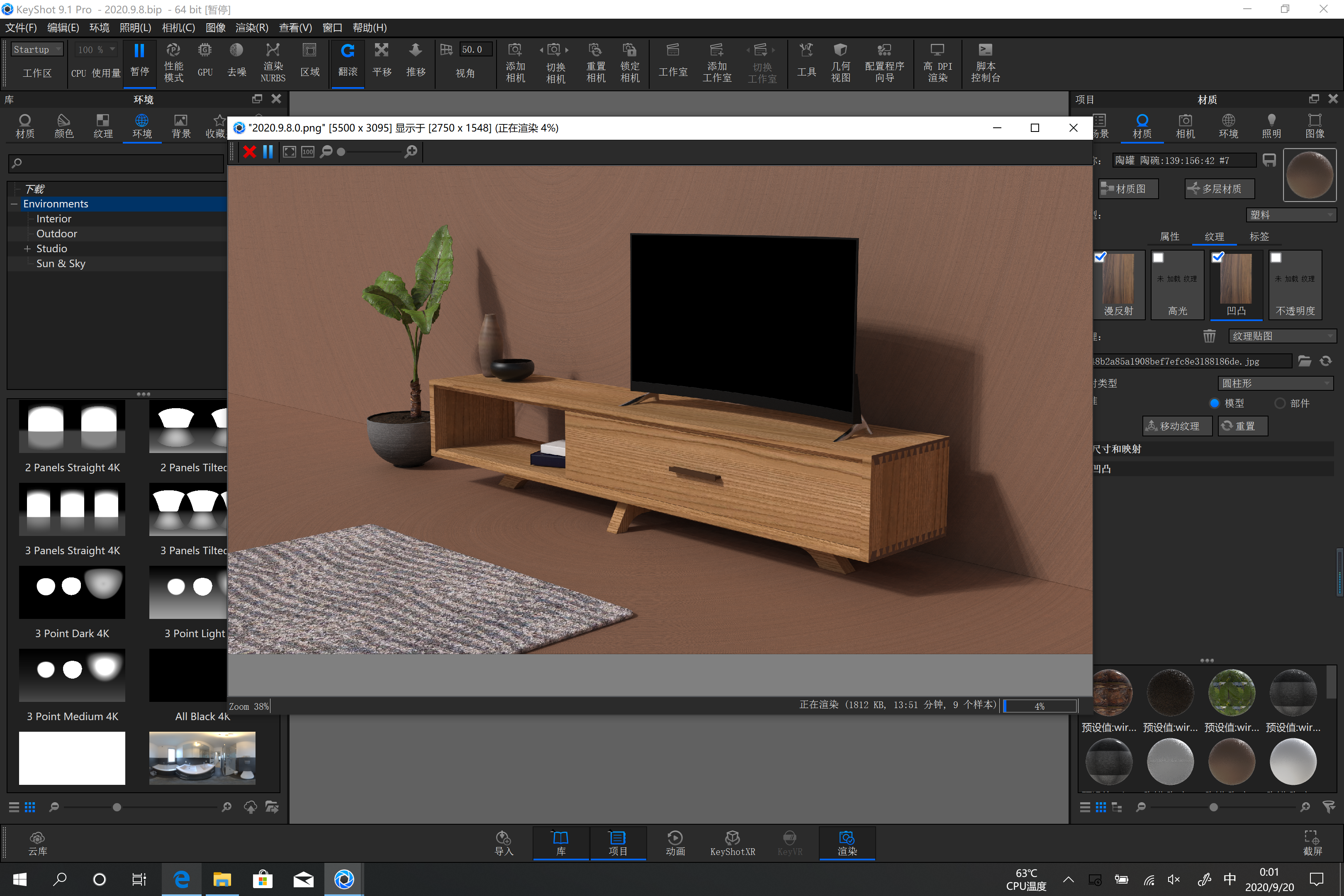
The same rendering of the above picture
The main parameters are:
Resolution: 5500*3438;300DPI; Sampling Value: 200
Rendered on my desktop for 2 hours and 3 minutes;
Rendered for 6 hours and 13 minutes on Surface Book 3;
It was rendered on my game book for 12 hours and 32 minutes.
Because the desktop is a pure workstation mode, there is still a big gap between the rendering speed and the laptop. If it is not necessary, it is not recommended to render many large pictures on the laptop. The sampling value can be lowered for rendering only for deliberation or internal discussion, and the work of really eating the machine can be left to the workstation;
By the way, the CPU for the whole rendering process is 100%, but there is no noise for the whole Surface Book 3. Only by putting your ears close to the fan can you hear a little. Compared with my game book, the fan blows a lot of noise.
4. Say two additional interesting discoveries.
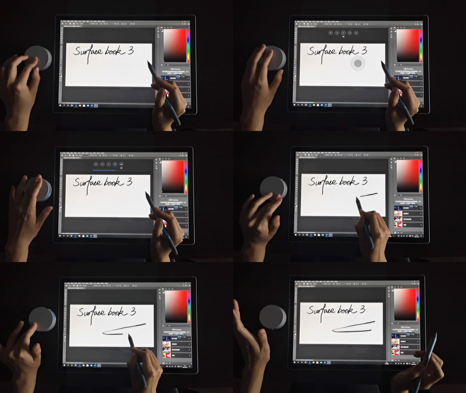
Surface the effect of the combination of stylus and Dial in some software is my pleasure in this evaluation. Let's talk about PS and Solidworks here.
In PS, there are not only basic items such as cancellation, adjustment of brush size, transparency and color, canvas size direction, etc. In addition to pressure feeling, Dial option is also added to PS brush option, which means Dial can cooperate with Surface stylus to achieve real-time thickness change as shown in the above figure.
In the Solidworks, there is a sketch ink function specially controlled by a pen, which is convenient for pen control modeling. Amazingly, it can even support gesture touch modeling, and engineering software can do whatever it wants ~
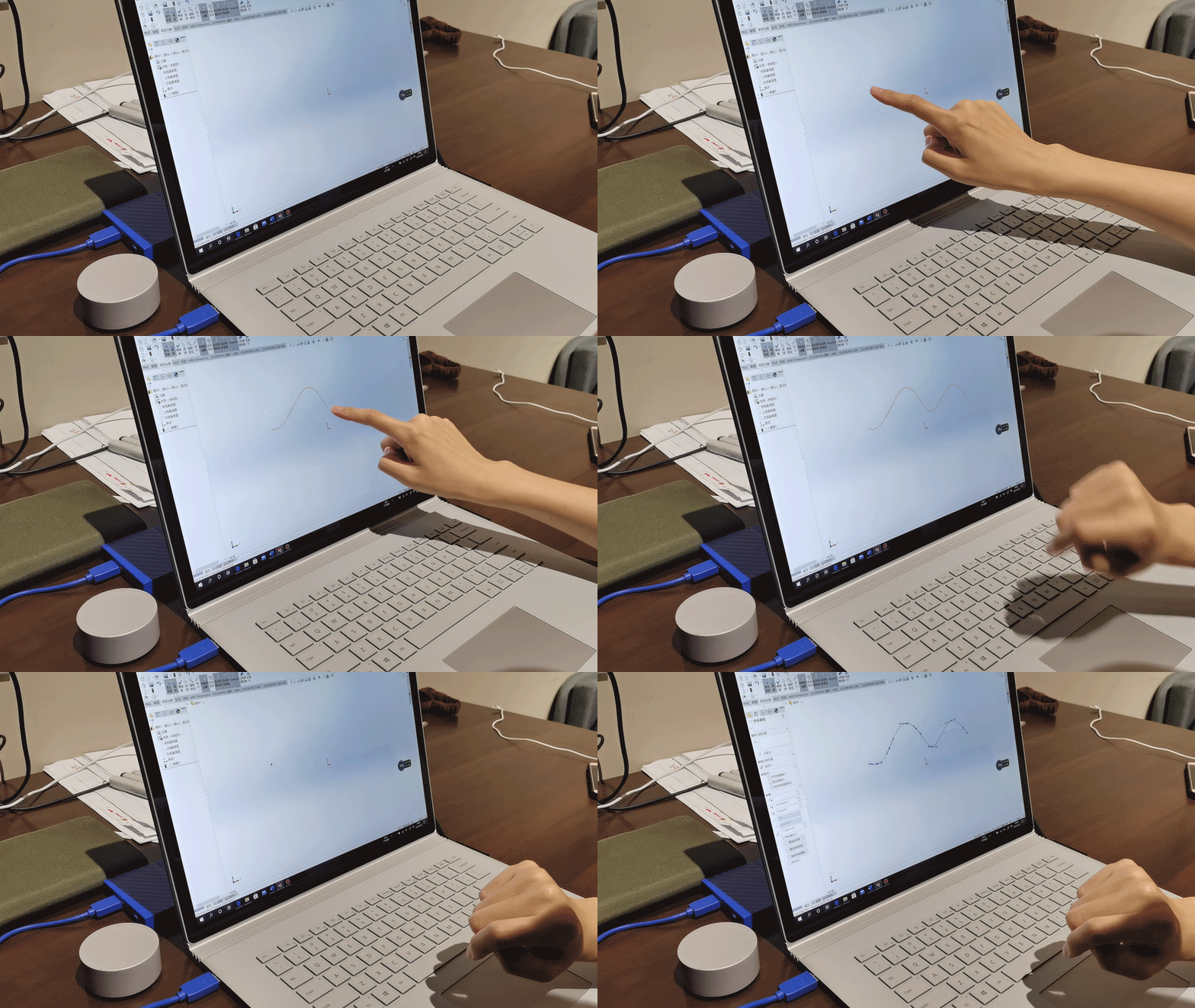
[Finally, talk about the three unique usage modes of Surface Book 3]]
Microsoft's official website divides the modes of Surface Book 3 into three types
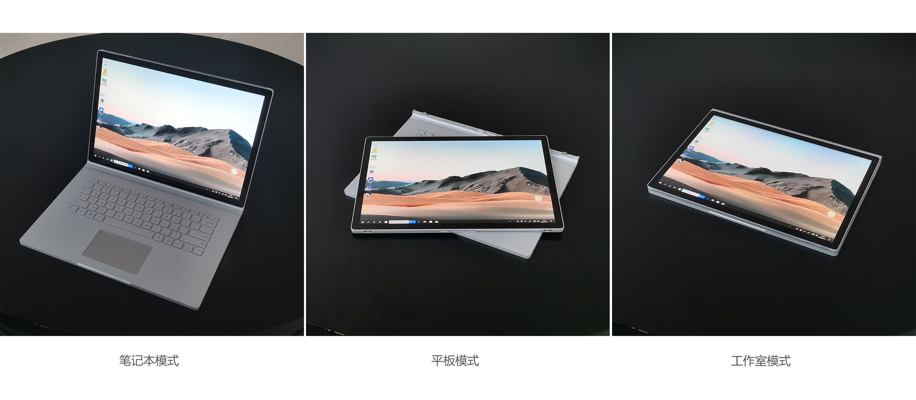
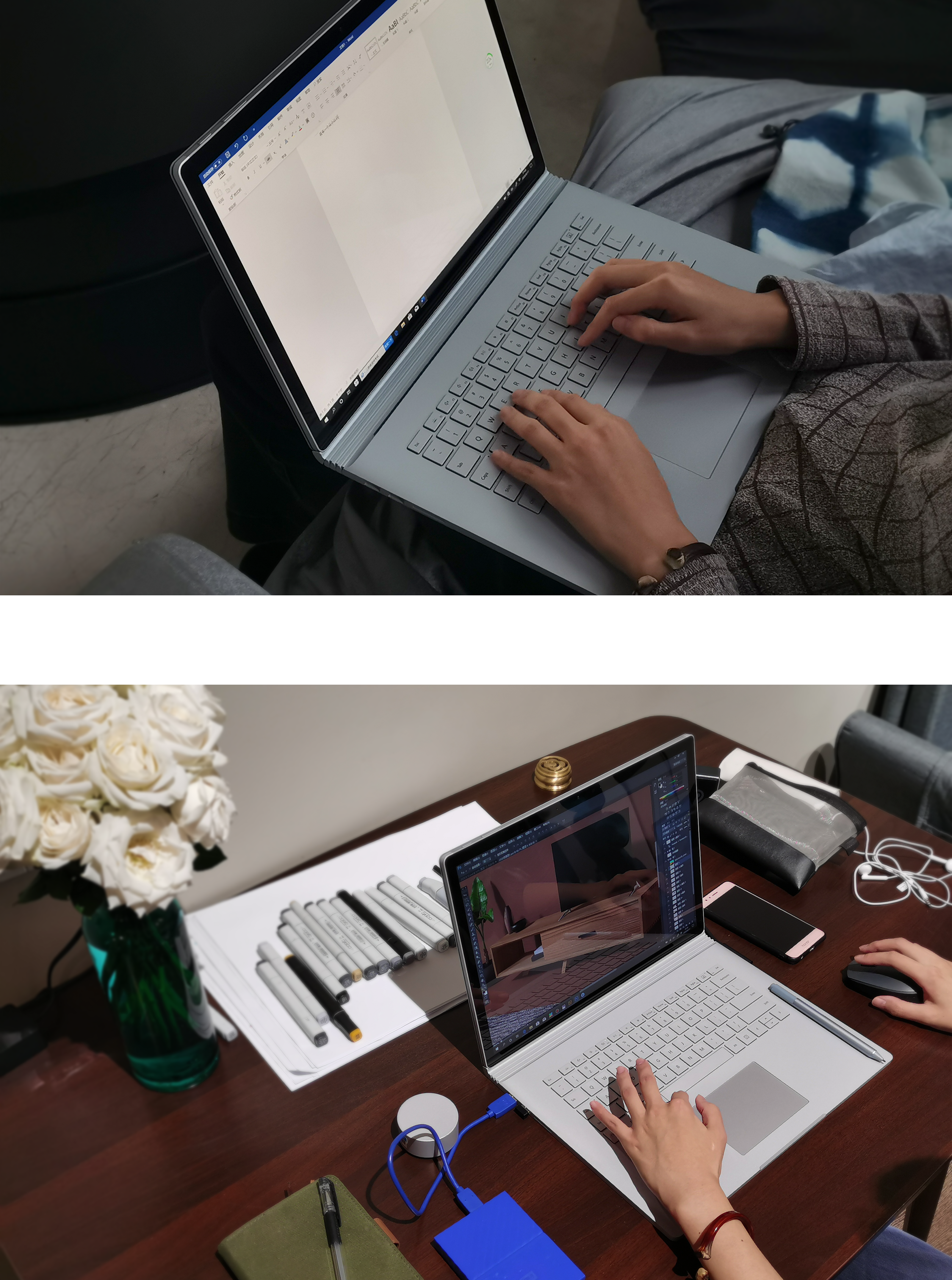
First, notebook mode
In this mode, the Surface Book 3 is a touchable notebook with excellent performance. The high-resolution dual-color touch screen and excellent keyboard can process business documents, display and report, support design creative drawing, product modeling and 3D rendering. It is comfortable, excellent and has no problem ~
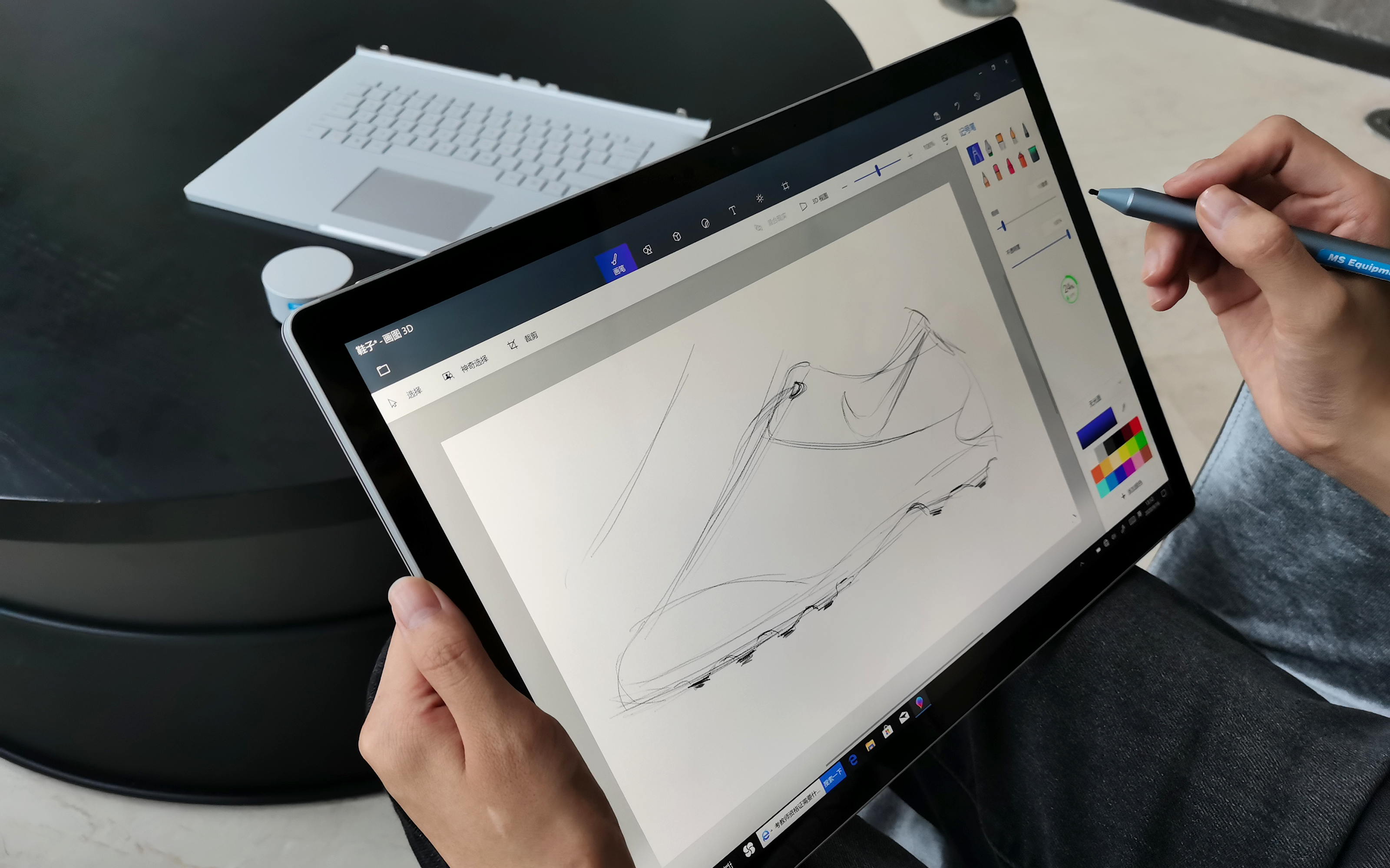
Second, the flat panel mode
The 15-inch super-large flat panel is much lighter than expected. It can be used for hand-drawing. When querying the web page, double-click to enlarge it automatically. The size of the screen keyboard is suitable and convenient to use. There is nothing to say about watching movies and the screen.
Finally, the studio mode
This mode is mainly designed for pen-controlled software, and can provide a comfortable angle for hand-drawing or modeling, and can carry out a large number of sketch creativity and modeling experiments. In addition, this mode can also be used as a display function to lift the screen. After testing by the mode, the keyboard cannot be used in this mode.

The above is the content of this evaluation. Now let's look at Surface Book 3 and we can summarize some of its characteristics:
Light and portable, simple appearance business;
Notebook tablet two in one, can meet the needs of multi-scene use;
Touch is accurate and powerful, and can be used with professional software;
"Stacking" is sufficient and its performance can cope with professional design work;
The screen quality is excellent, which can meet the needs of designers with high requirements for color and picture quality;
Pay attention to silence and relatively conservative performance release.
Surface Book 3 is a more comprehensive personal PC. In terms of professionalism, if you need to perform a large number of professional and demanding design tasks, it is still a heavy workstation PC that is more reliable. However, Surface the Book 3 can meet more usage scenarios, you can install a tablet with a canvas bag when you go out. And if you want excellent touch experience professional design software, then it is what you need.
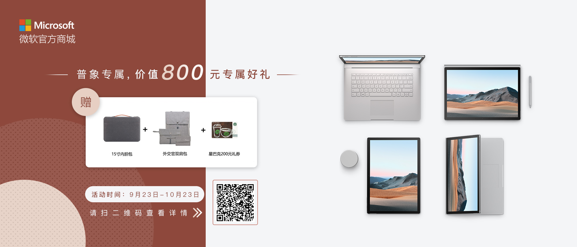
Now go to Microsoft's official mall to buy the commercial version of Surface Book 3, call customer service to mention the general elephant, and you can get an exclusive gift worth 800 yuan!
In addition, the Surface Book 3 commercial version has a 3-year hardware warranty. Microsoft's official mall can also enjoy exclusive price, integration scheme, after-sales worry-free, trade-in and other advantages!
Welcome to call and place orders! Ordering hotline: 400-805-6783
The copyright of this work belongs to 逃鱼儿. No use is allowed without explicit permission from owner.

New user?Create an account
Log In Reset your password.
Account existed?Log In
Read and agree to the User Agreement Terms of Use.

Please enter your email to reset your password
Will it be easy to accumulate dust?
Love, love
When I was in school, I worked in an electronics factory to test this. This notebook felt NICE when I took off the screen. I advise you not to buy discounted books on the internet as much as possible. many systems cannot be tested (about 3 times or more). the main board is directly glued through by screws... these books will be classified and put into storage. they are generally discounted products from online channels
What version is the solidworks version and whether piracy can be adapted so well
How about heat dissipation
Originally, I wanted to buy it, but I can accept it at the price. After all, Yan's value is comparable to that of apples. Its performance is the same as that of apples. But I feel that the frequency of using my notebook is too low and I want to give up. The appearance of the product is beautiful, and the function is super practical, but the disadvantages are after-sales trouble, expensive accessories, whether the evaluation is reliable, want to think about it, not just need, or forget it.
To be honest, the evaluation is better than the product. Colleagues bought the product and are now in a burning state. The edge of the screen is full of red light.
A small suggestion: when taking some moving pictures, adjust the camera to manual mode, and fix the focal length, color temperature, etc., so that the picture is more stable.
The border is too wide! It's all 2020. The border is still racing.
Heartbeat.
SB 3 (Surface Book3) SB 2(Surface Book2) Ha ha ha
You have a new understanding of my design instructions.
Too strong
It's a heartbeat ~
The hands are really beautiful!