This is a temporary project from last year ~ ~
I worked in a hand tool foreign trade company in Hangzhou from 2010 to 2015, and did the design and development of hand tools for five years. The brand defines and maintains the products (the top of the maintenance level is industrial level, and the bottom of the maintenance level is household level, which is commonly known as DIY). In South America, it is the first line in the second line, and it is the second in our family except for the local brand TRUPER.
Therefore, I will not post detailed pictures on the front part of this project, that is, the understanding of tape measure. Or this stage is no longer to say what brand I want to investigate, to analyze its structural advantages and disadvantages, use methods, including technology, precision, service life, etc., I only consider the style and appearance. (For the research of hand tools or friends who need to discuss, you can open a post to talk about it later.)
First of all, Party A (old and old owner) gives a clear message: "Cheap monochrome model, you can consider the direction of simplicity"-this goal is very clear and clear, and also brings a sample, (meaning that this concise model looks good, let's lean in this direction? Of course, other models of monochrome can also be considered. Because the market to sell good monochrome modeling is simple and complex;
All right, the picture above shows ~ ~
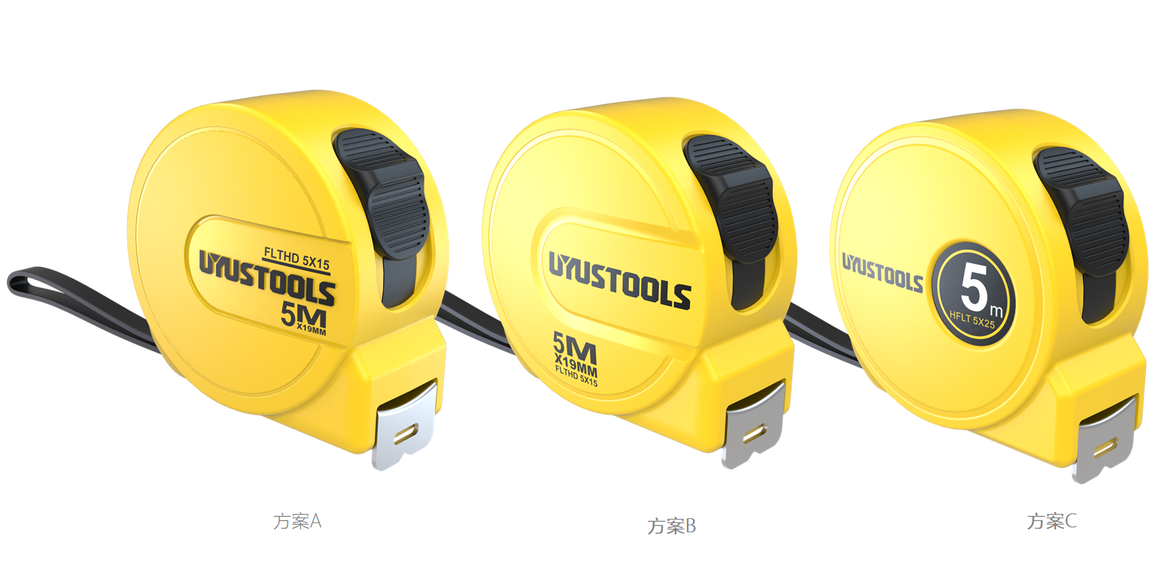
Since I am very familiar with my partners, I don't have too many formats. I keep communicating with them. I will quickly PS in the early stage and select several proe models in the later stage. Finally, I will see things prevail;
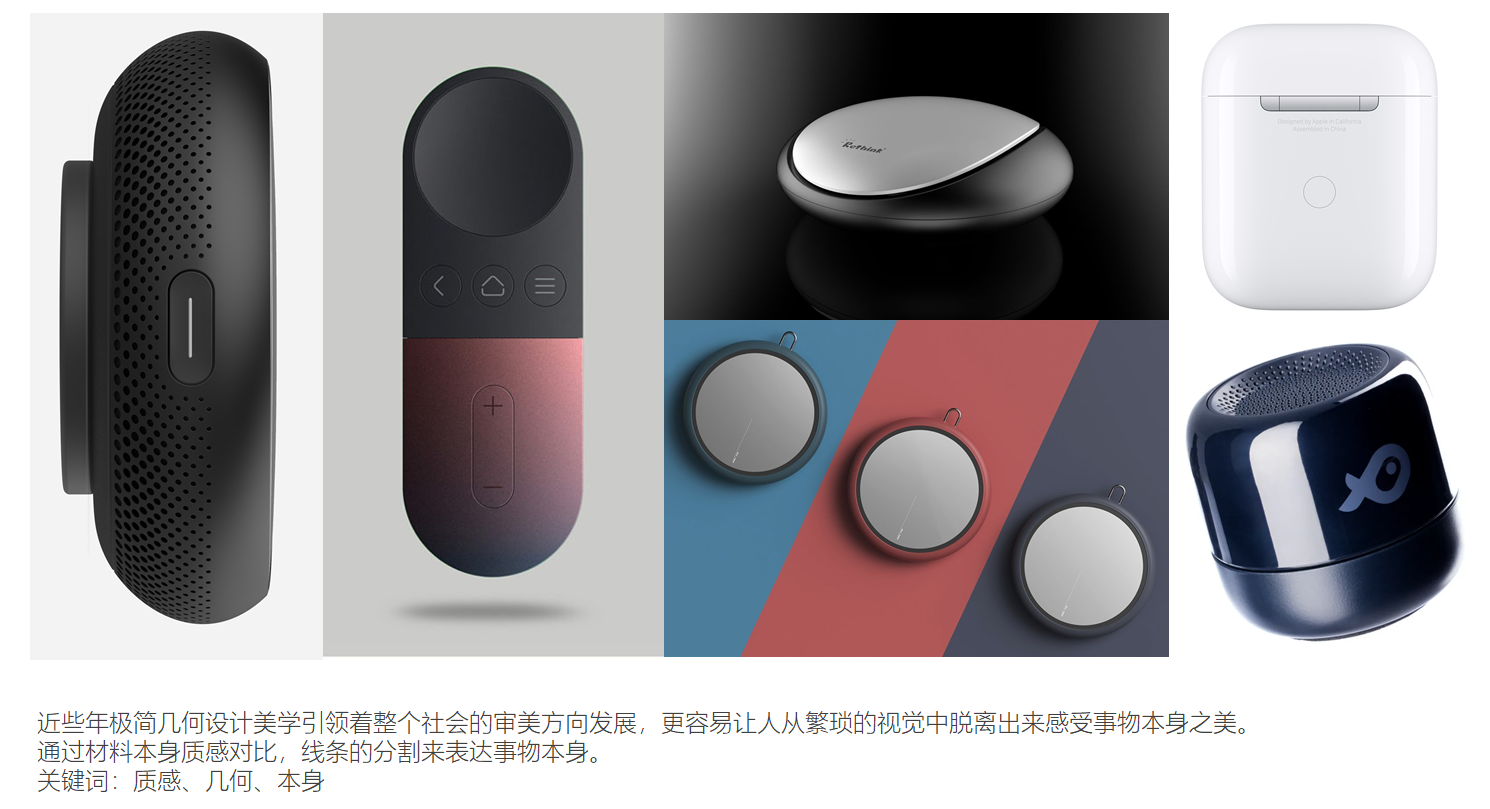
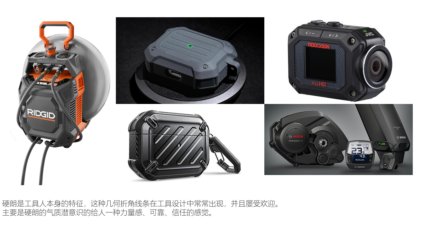
One other product style reference, then one's own product design intention, simple and clear.
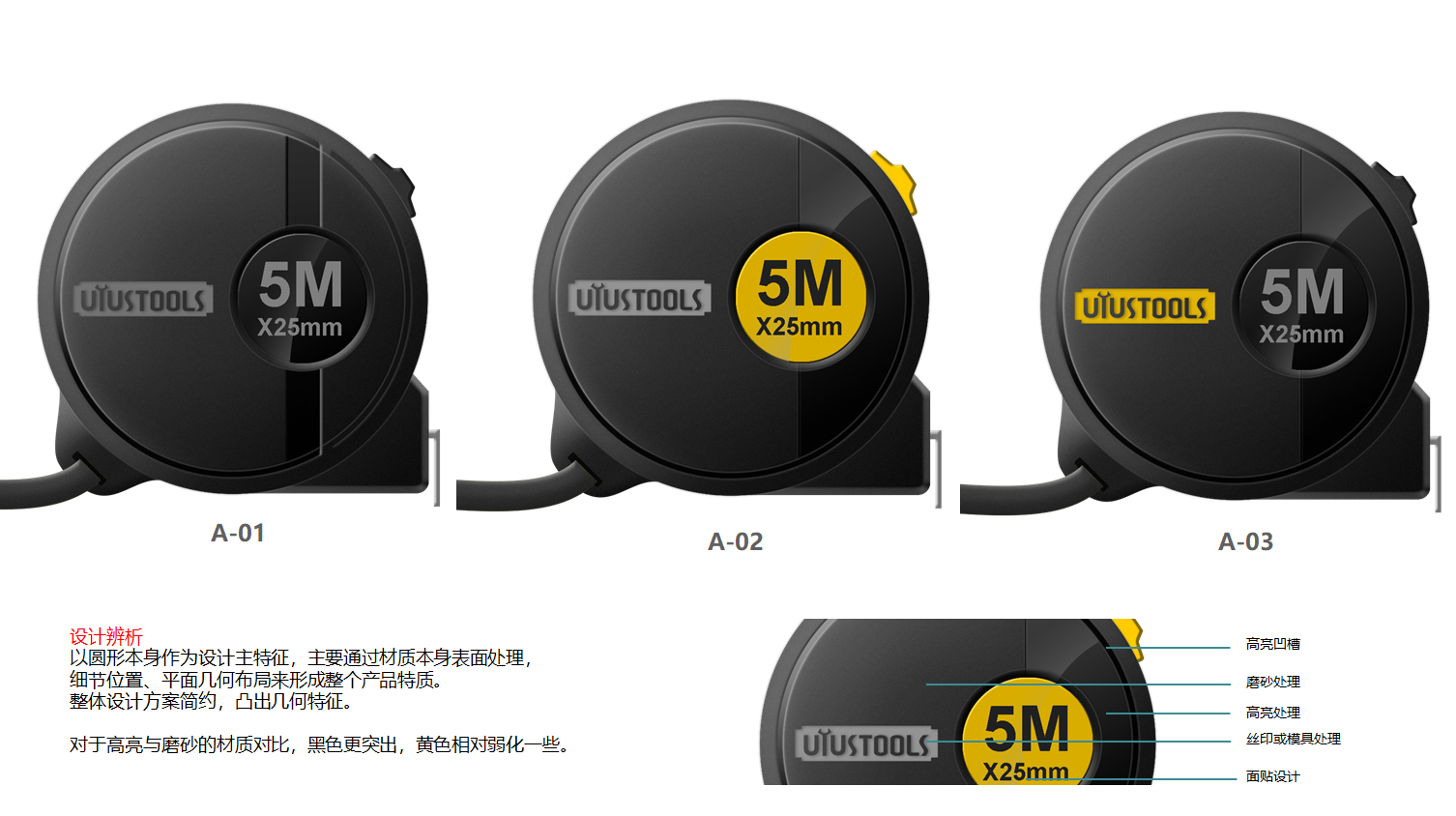
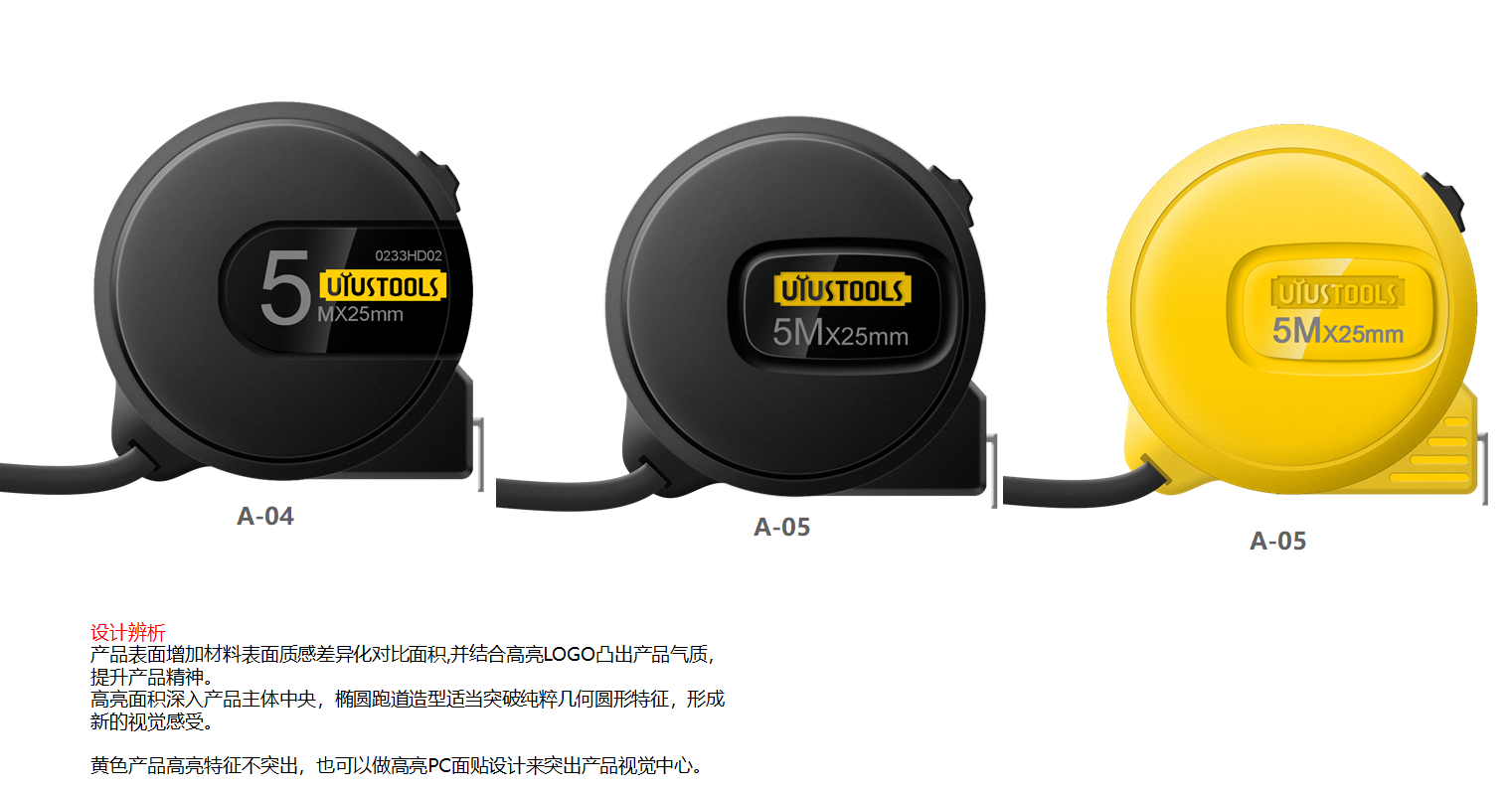
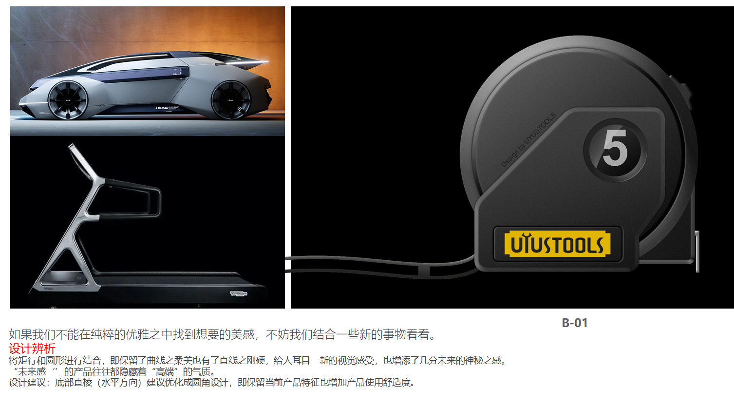
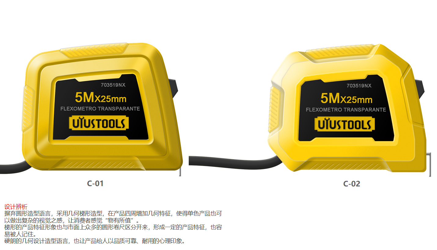
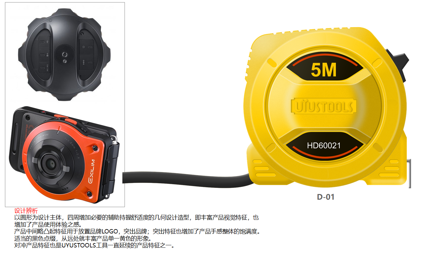
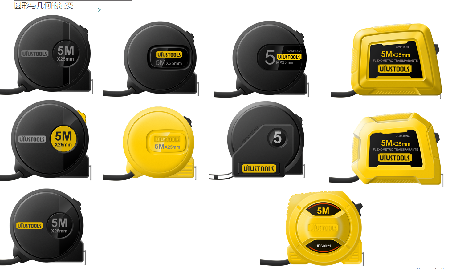
PS is drawn according to the actual size, and the expansion speed is still acceptable. Draw more plans for reference when there is plenty of time;
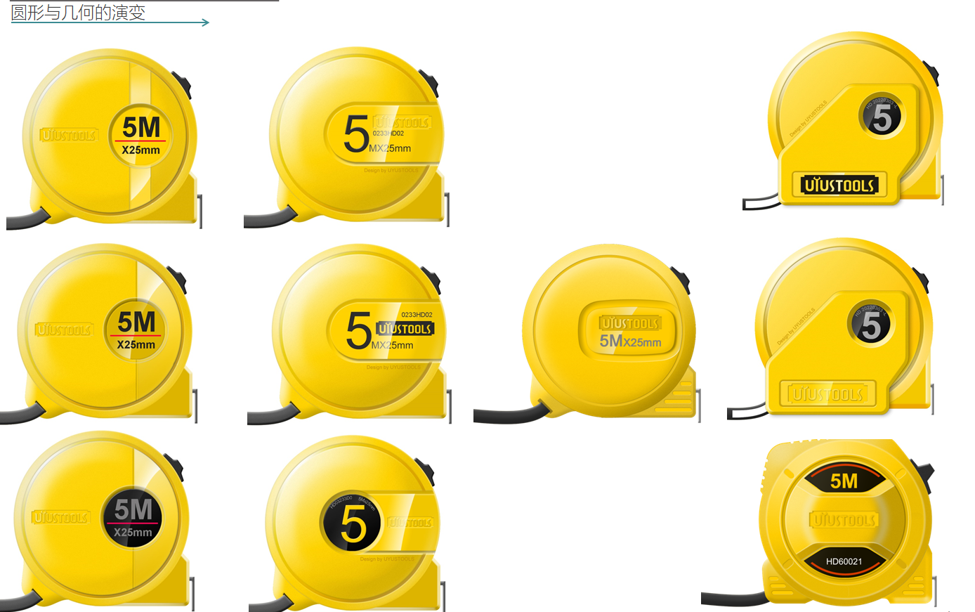
Also solid color, yellow style.
The old owner's color is yellow, so the only color is this color.
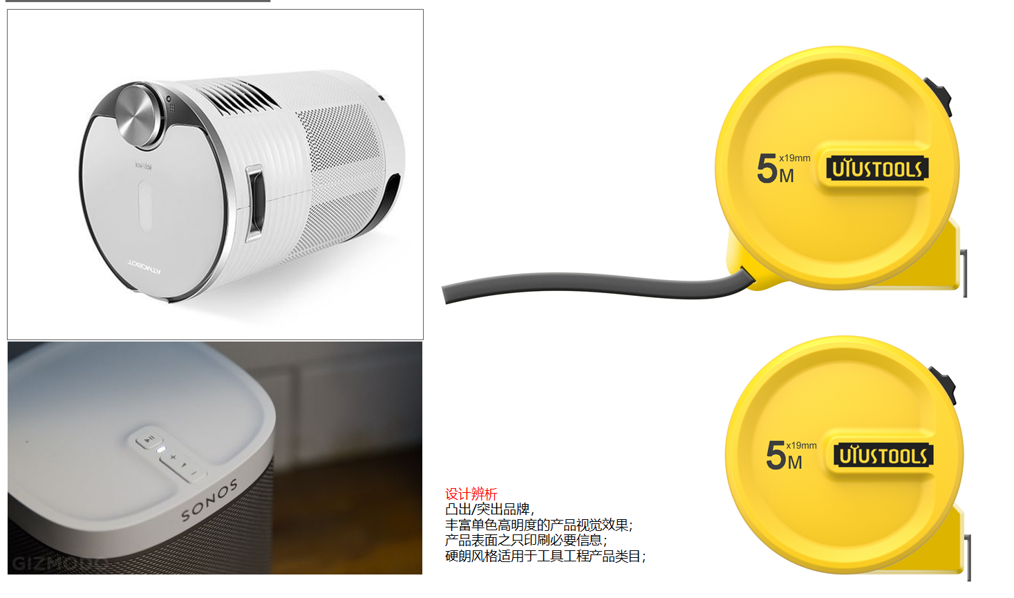
I still like this design direction very much, and I also have different designs from other styles in the market.
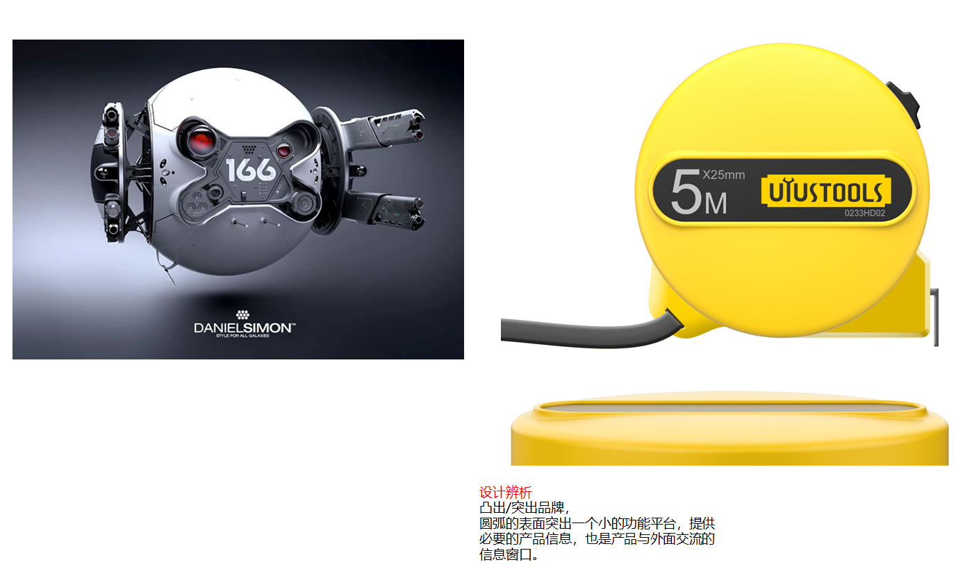
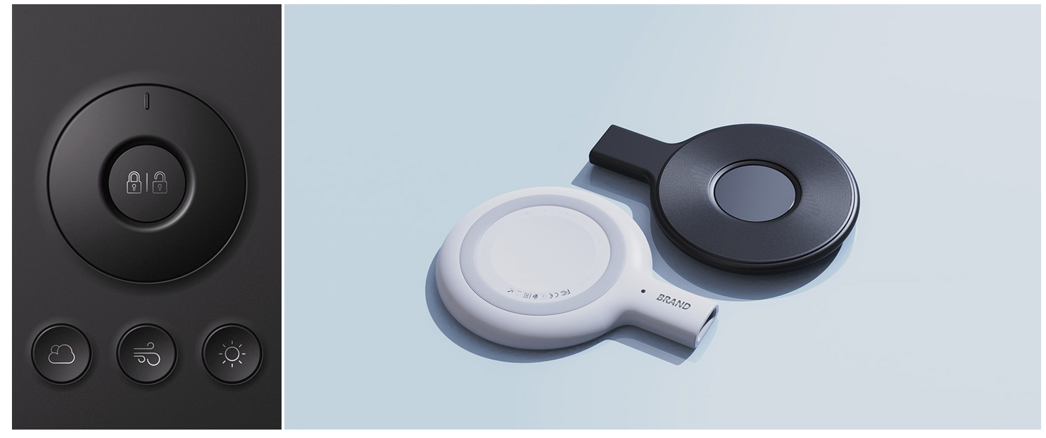
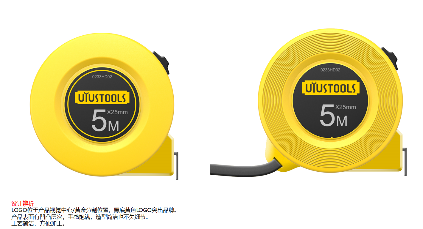
The mold is well done, and this product should also be good.
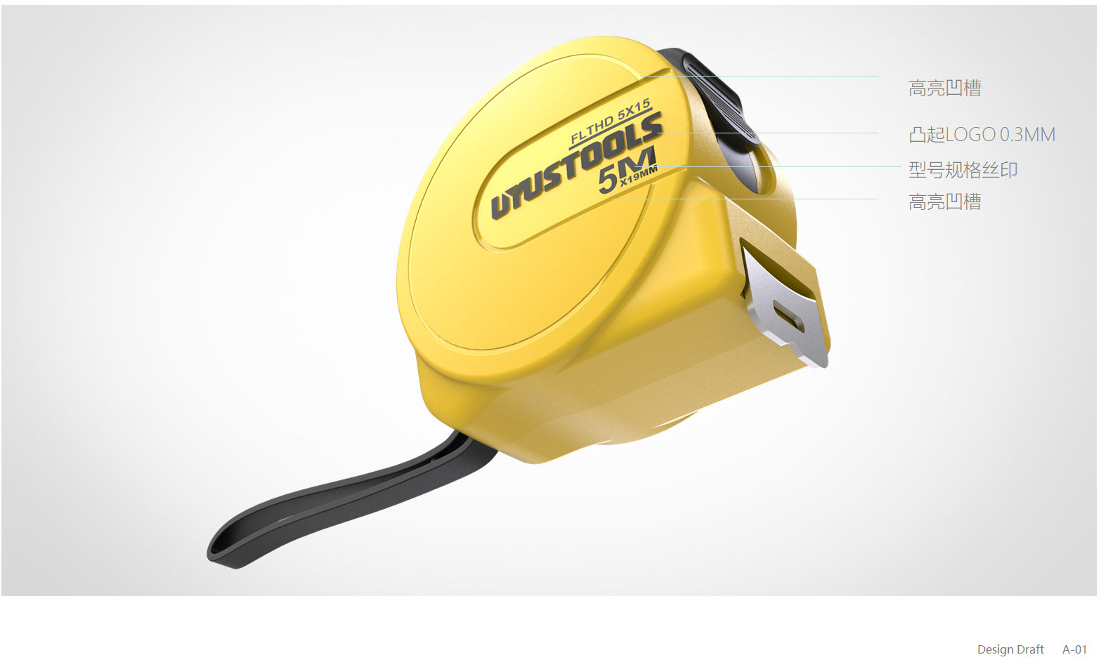
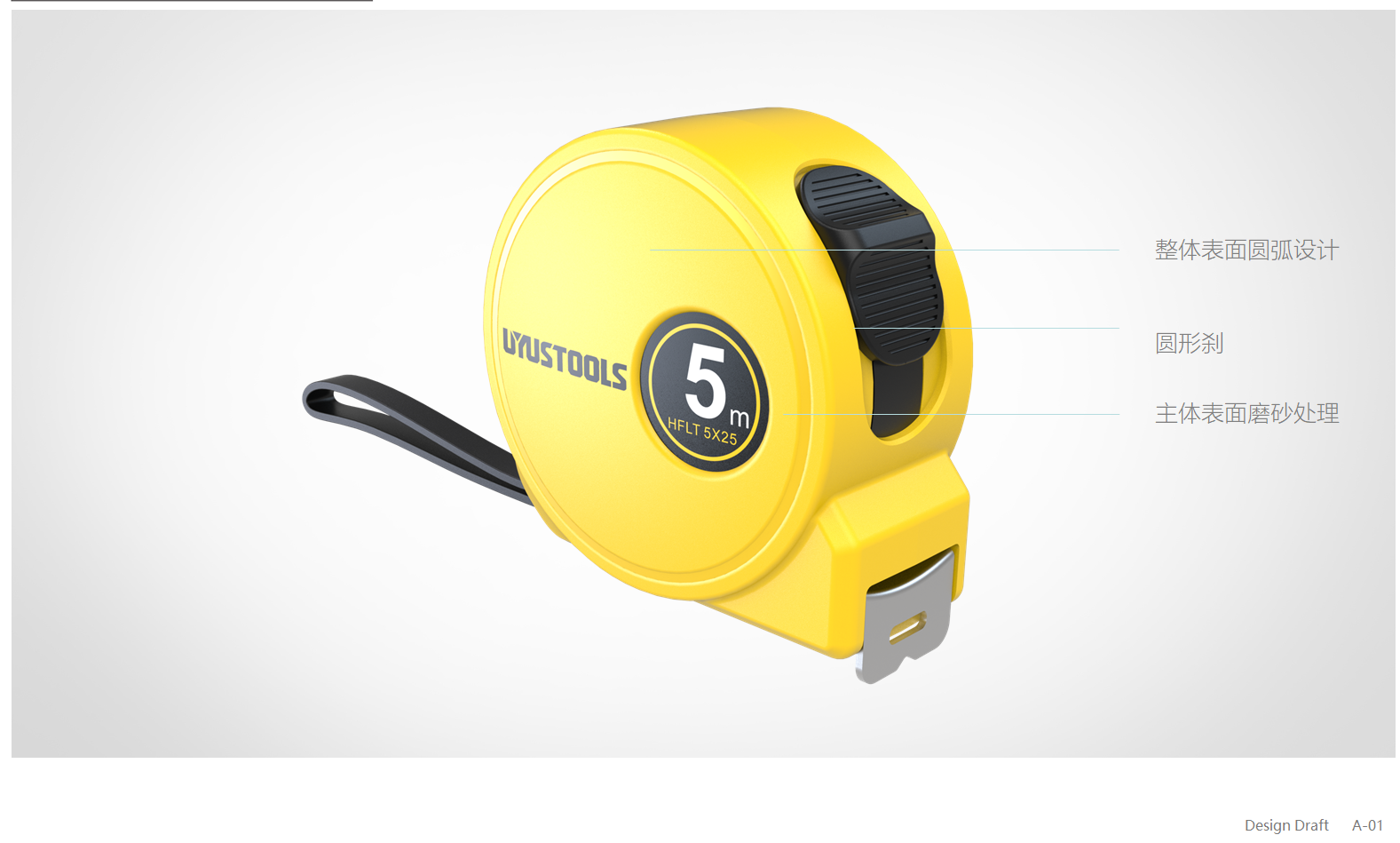
This is the content of the second PPT, just take a screenshot.
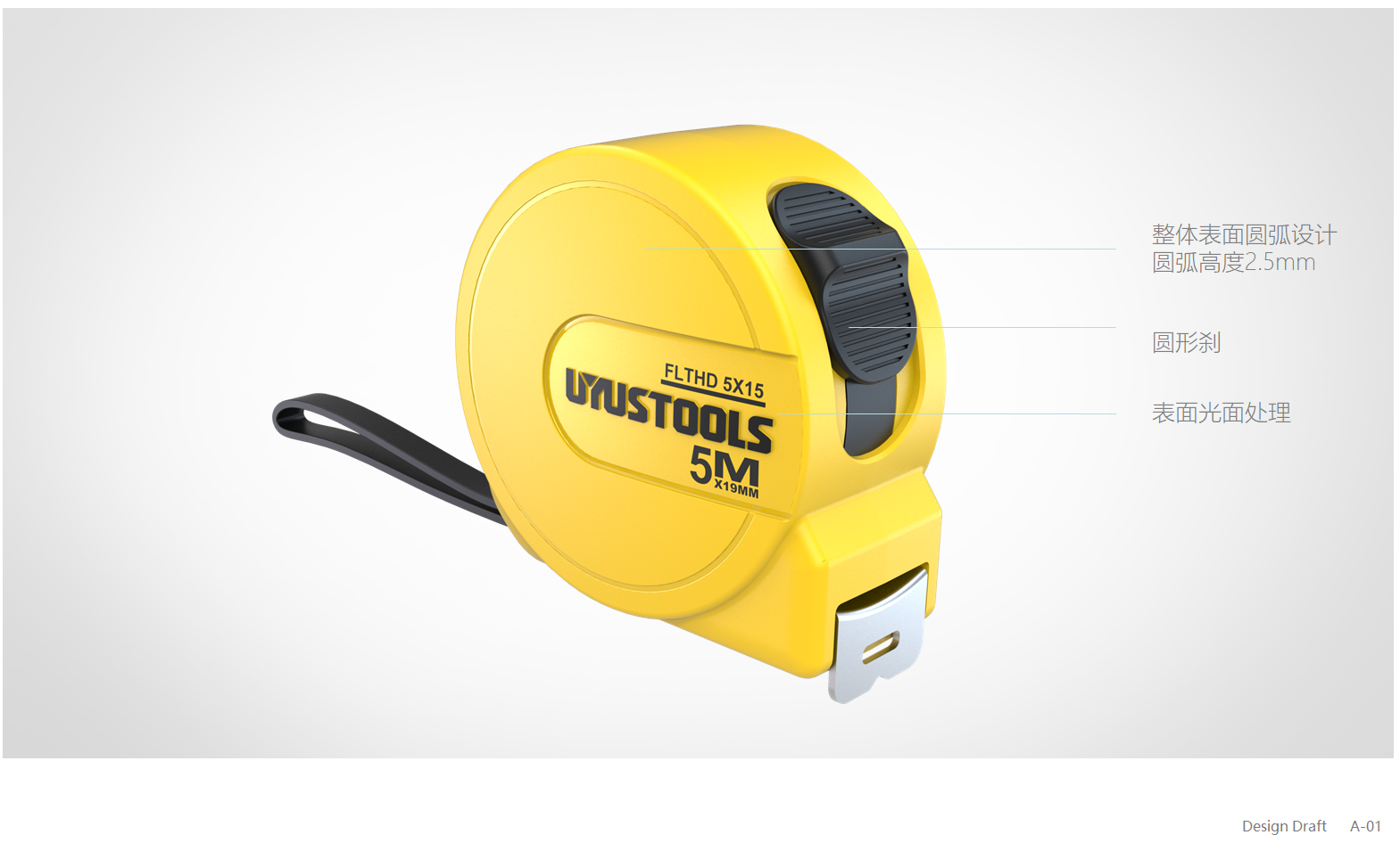
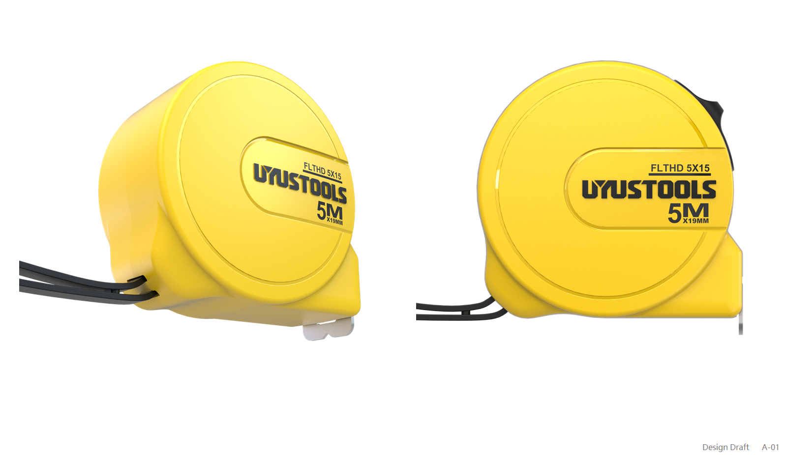
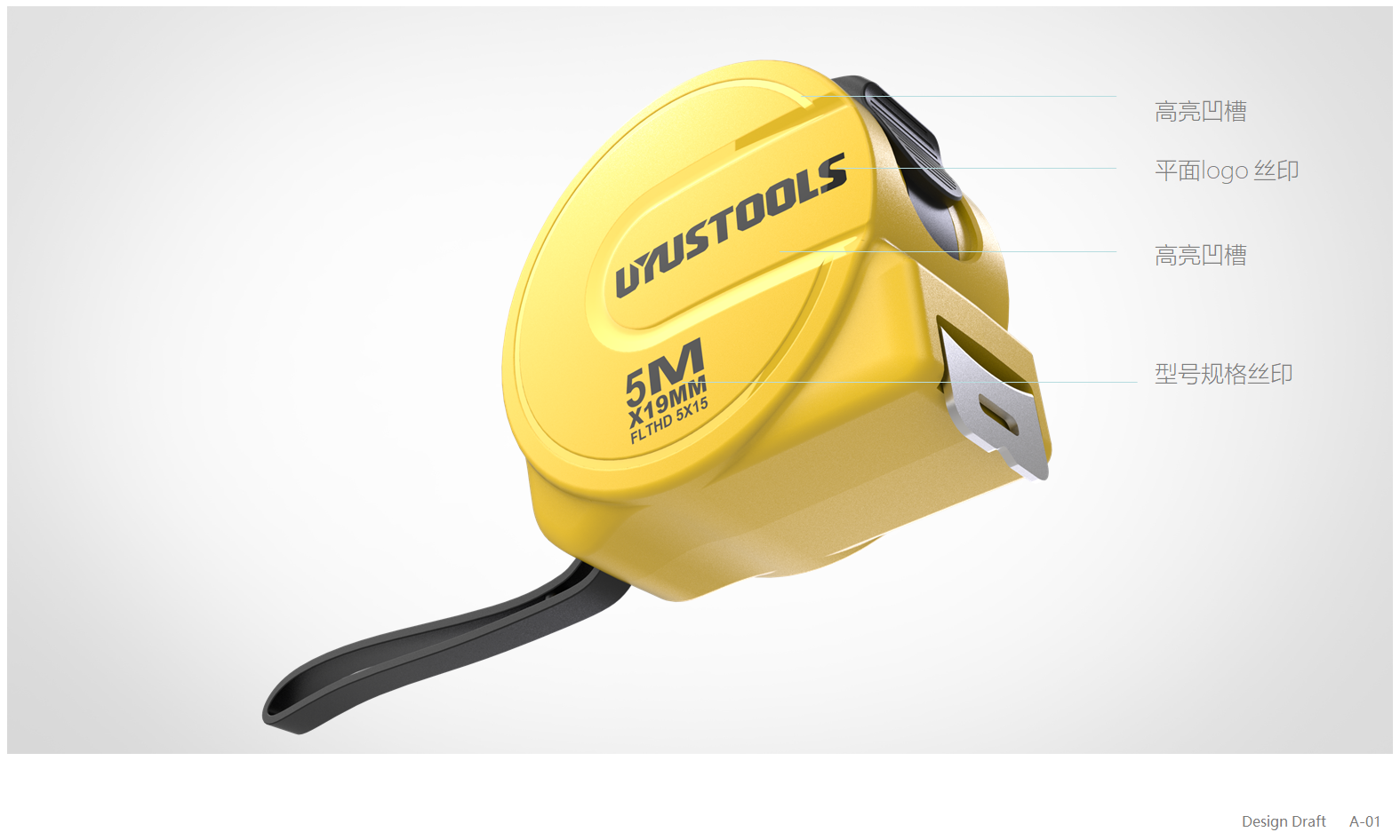
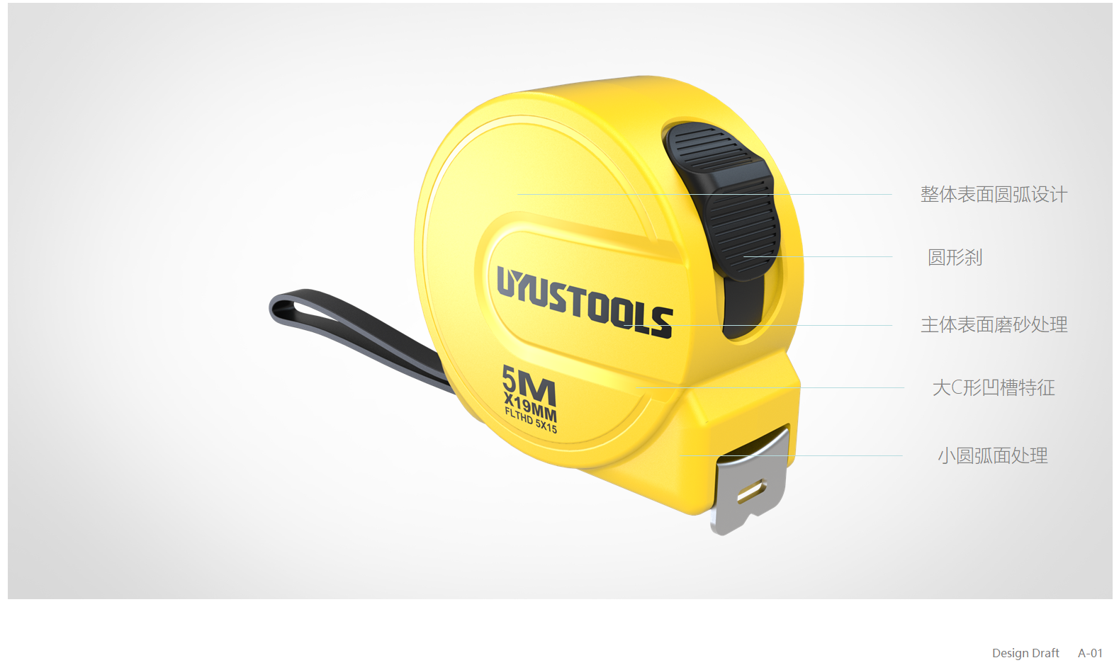
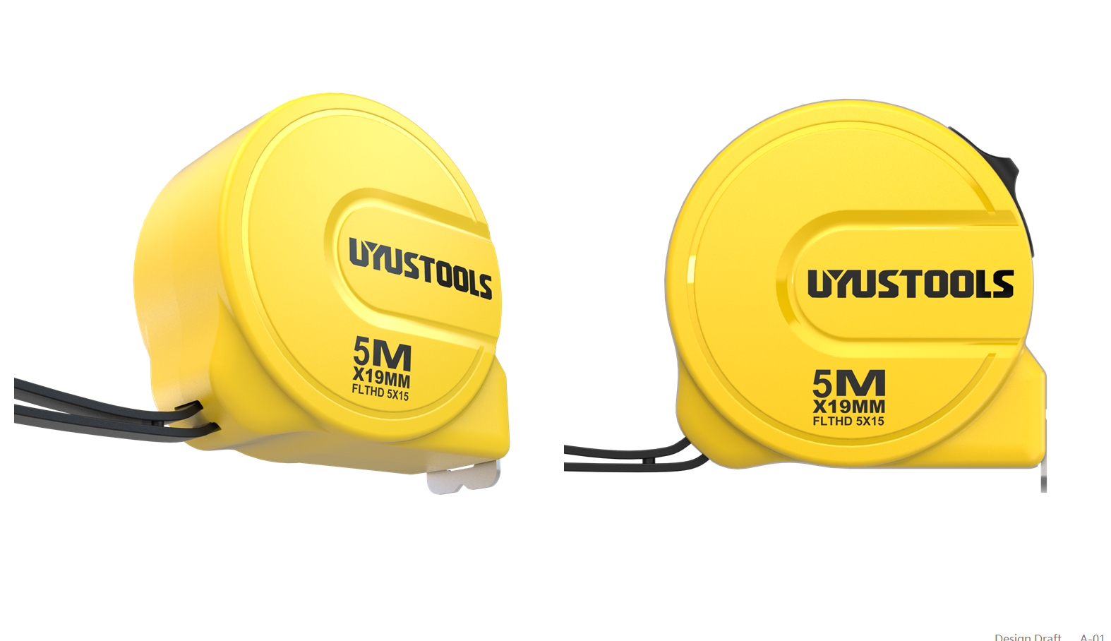
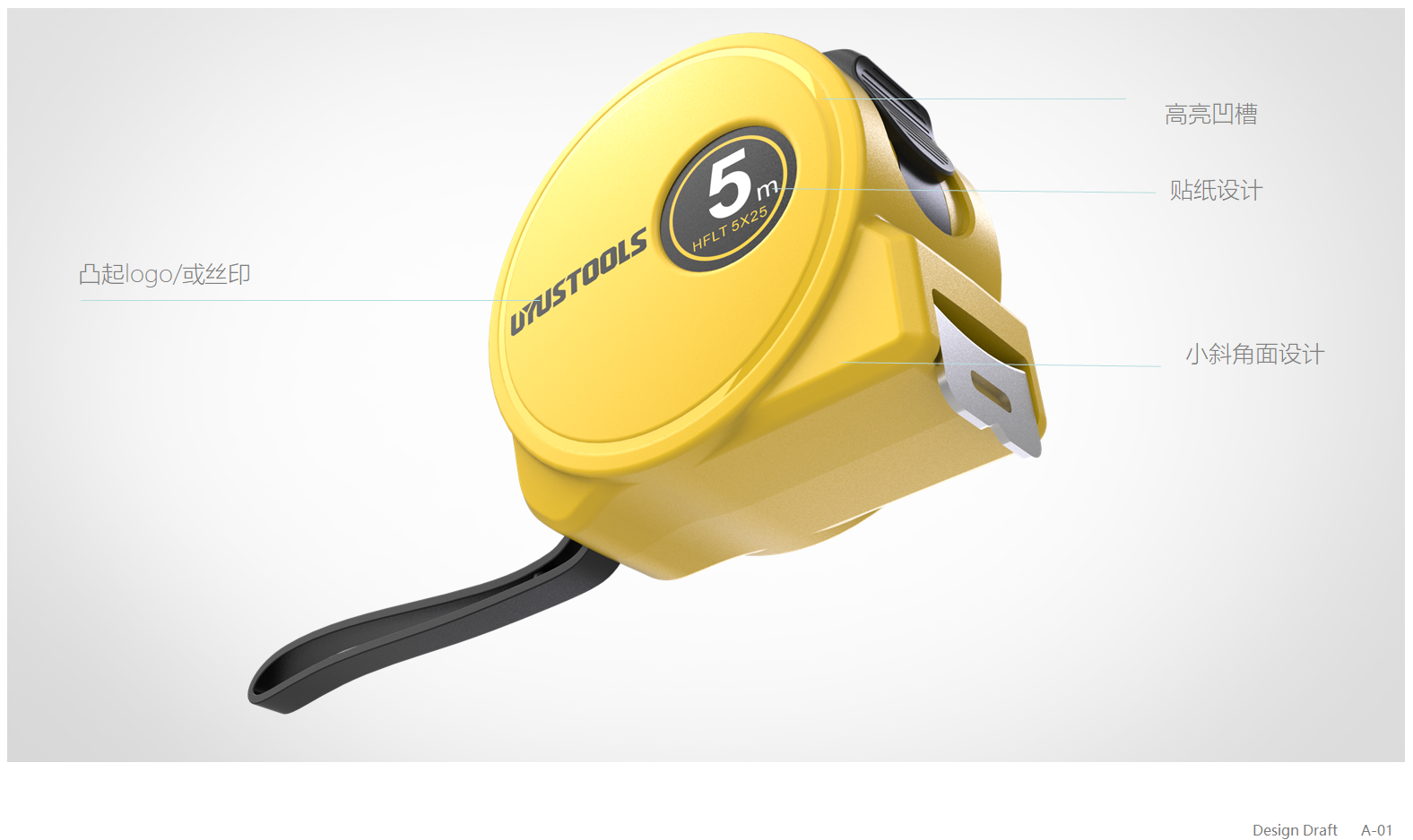
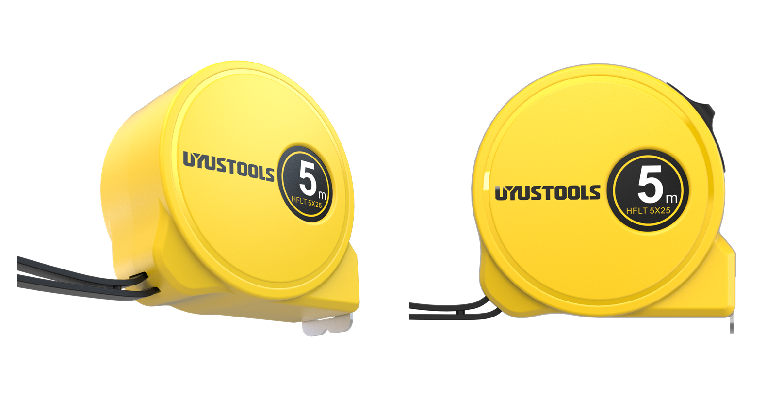
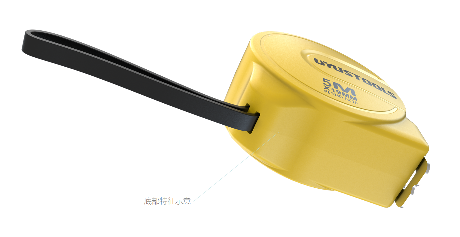
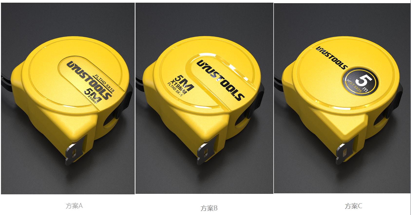
Monochrome design, mainly through the surface treatment to pull the visual level, monochrome yellow surface treatment effect is not black surface treatment effect of the level is obvious. The main yellow brightness has been raised....
The copyright of this work belongs to 一束光产品设计. No use is allowed without explicit permission from owner.

New user?Create an account
Log In Reset your password.
Account existed?Log In
Read and agree to the User Agreement Terms of Use.

Please enter your email to reset your password
666, with so many plans, which one did the customer finally choose?
Yes
666
nice