This time, the customer is CRRC, a new brand established by the merger of North and South cars, which urgently needs to reflect the new brand spirit and product strength.
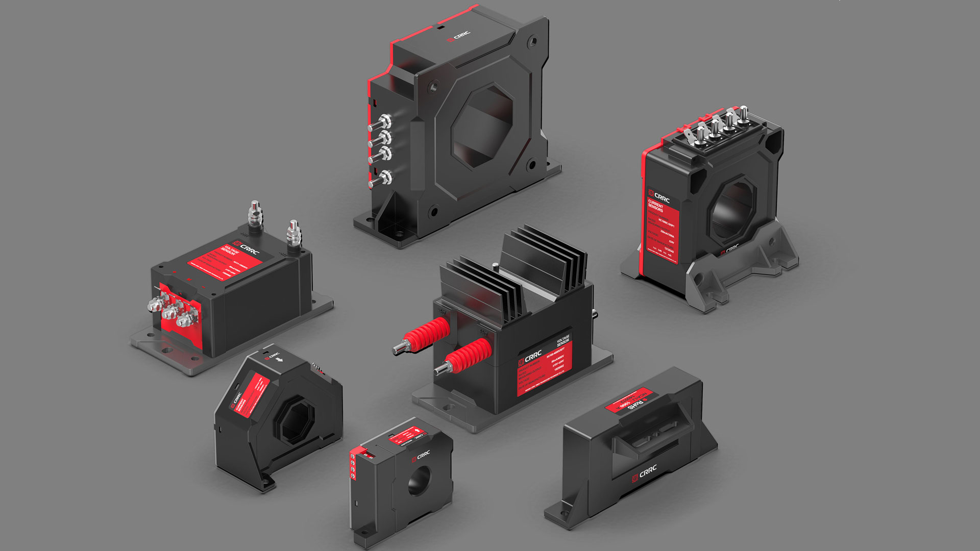
After communication and discussion with the design team of Octavia, both parties have implemented the design requirements and key points: redesign the classic product of the Chinese car-sensor. The goal of this design is not only to break through the early products: lack of design sense, lack of series sense, lack of outstanding brand image characteristics, but also to highlight professional, modern, safe, efficient, stable and other product characteristics in new products, and more importantly, highlight the brand image of CRRC.
in short: let people see this product, the first impression in their hearts is that it is a product of "China car.
Q:
End consumers can't see the appearance of component products at all. What is the difference and focus of the significance of our appearance design?
A:
Imagine, when you ride in a clean and tidy high-speed rail car, the braking line of the vehicle is the following two modes, which one would you prefer?
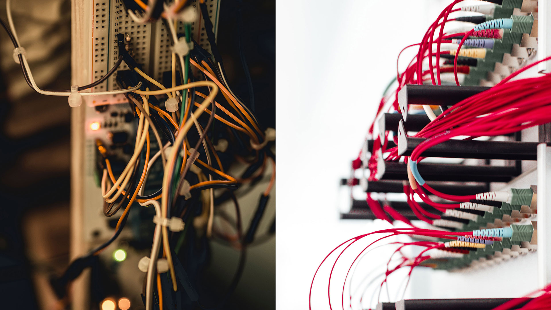
Obviously, an orderly arrangement will give people a sense of safety and sureness than a disorganized design.
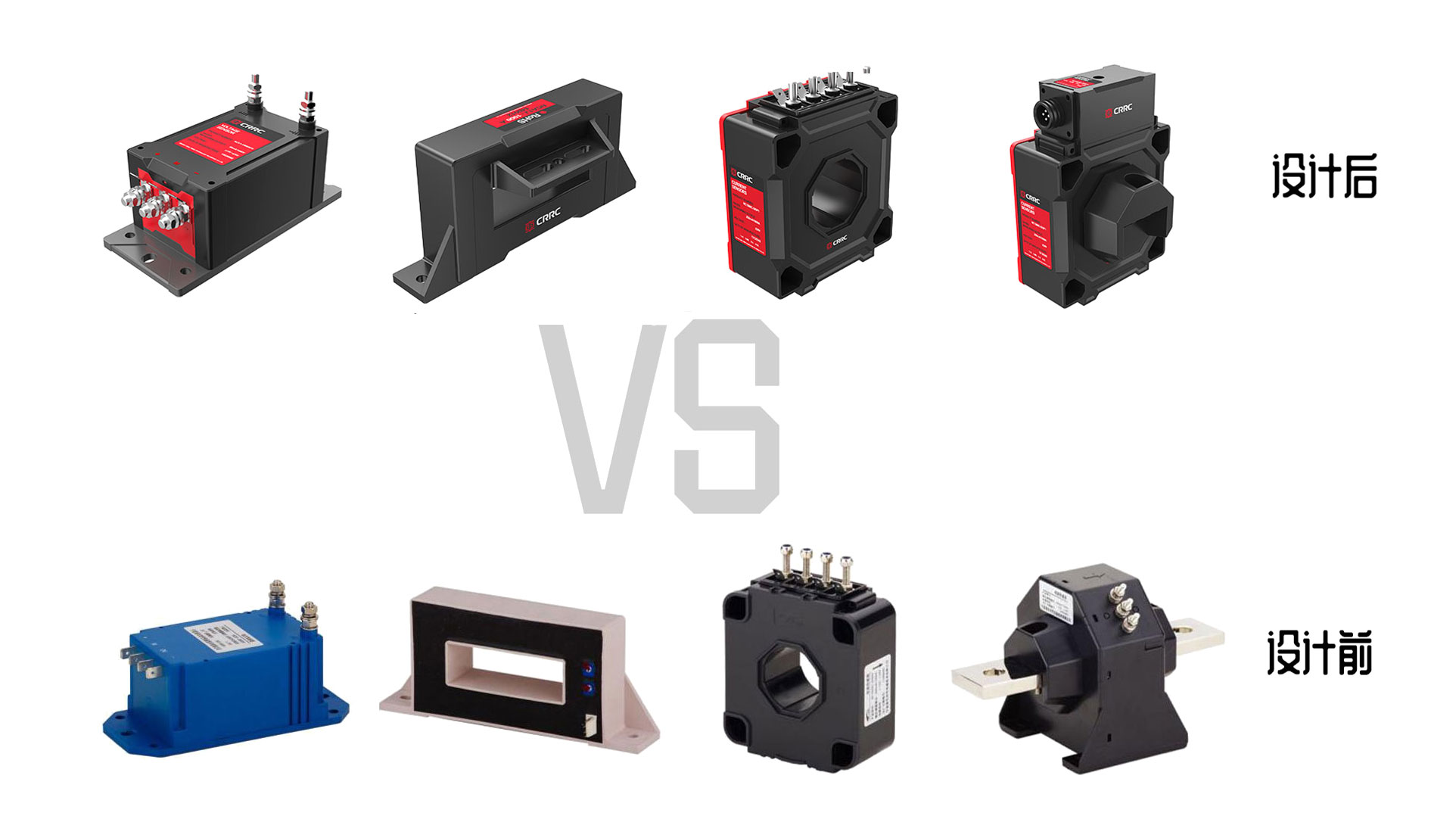
The soft clothes of high-speed rail should be exquisite and comfortable, and the hardware should be exquisite and meticulous, even if it is a small sensor.
Octavia Design allows customers to have a safe and reliable first impression through appropriate design, and enhances the brand image of CRRC through a unified and serialized design language. Let China have a strong advantage when facing international competition! Let "high-speed rail diplomacy" become a new business card for national development.
Design elements of x
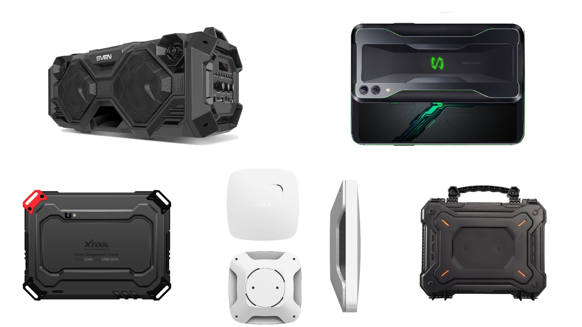
"X" type elements often give people a stable sense of structure and a stable sense of strength. They are widely used in products that need to emphasize reliability and stability.
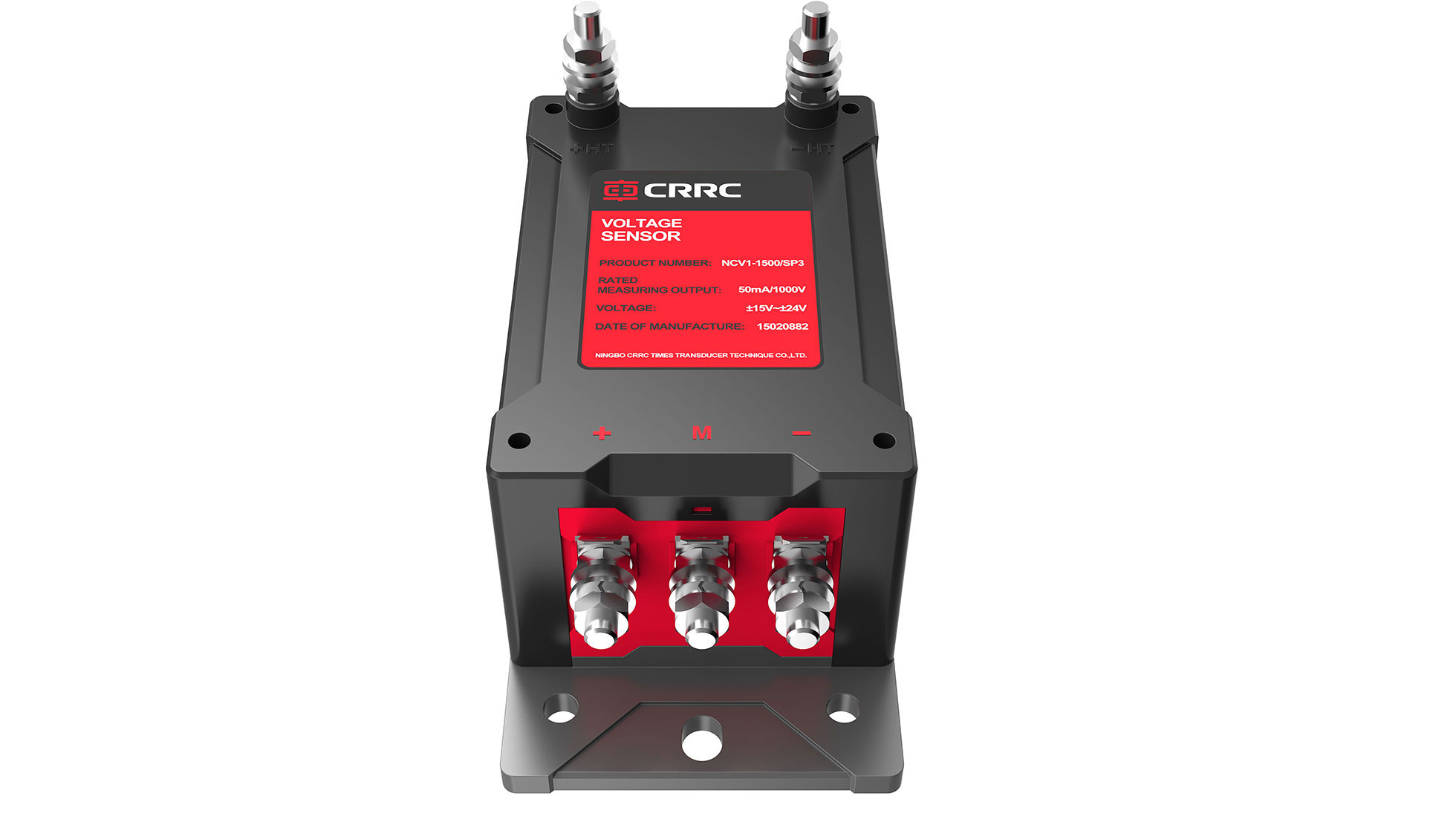
The folding surface treatment is used in the details to increase the visual power of the product. Although the sensor is small in size, its effect is large and should not be underestimated.
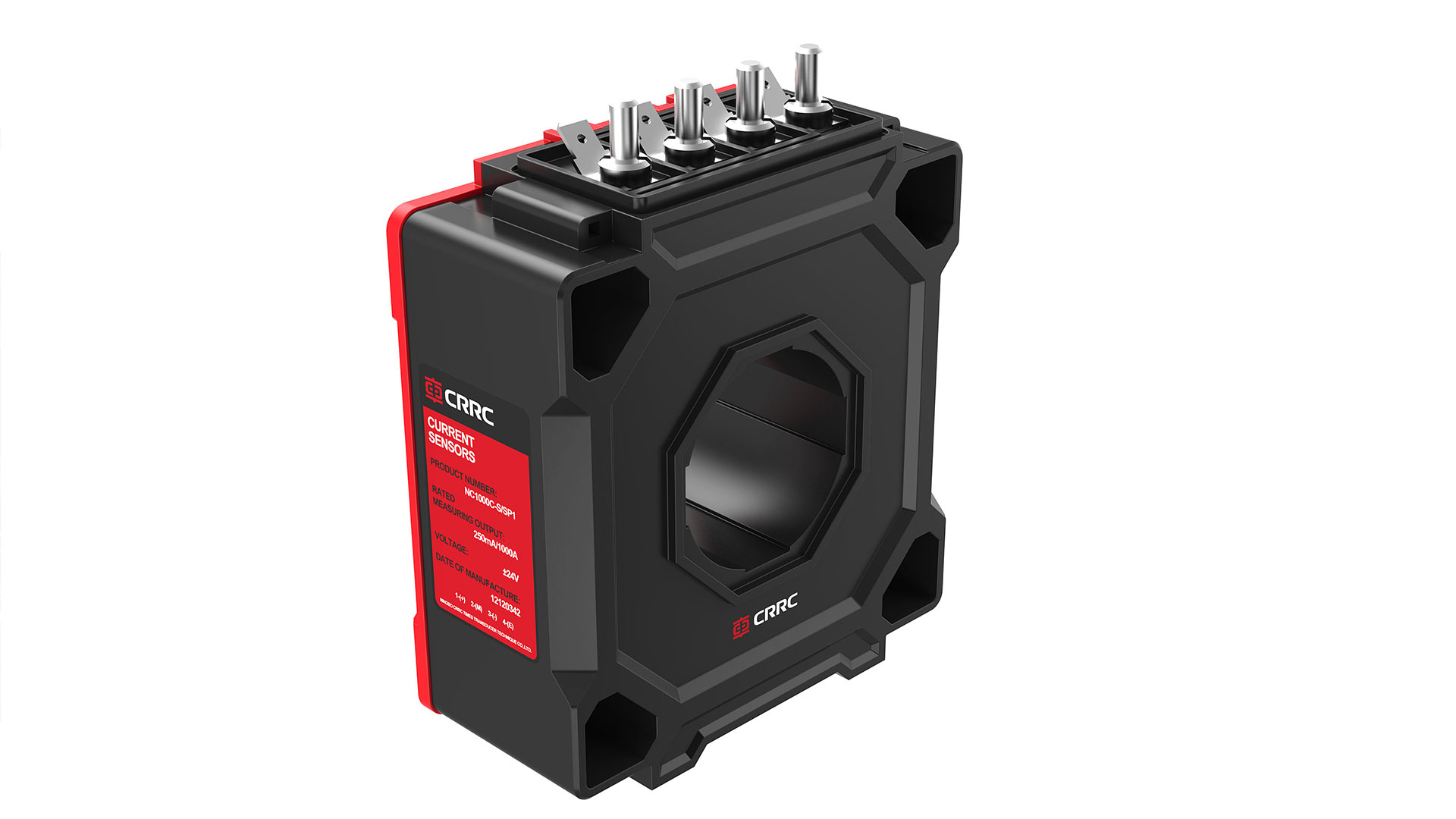
Unified color matching, emphasizing the sense of product series
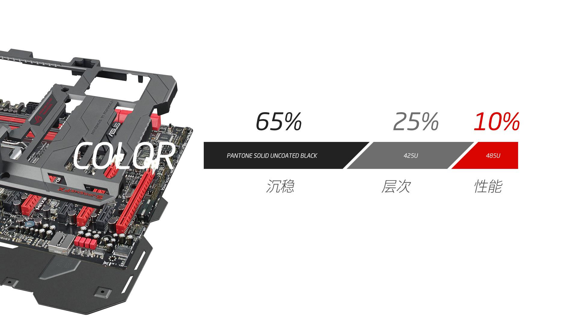
65% black stable color + 25% level dark gray highlights + 10% Chinese red performance color.
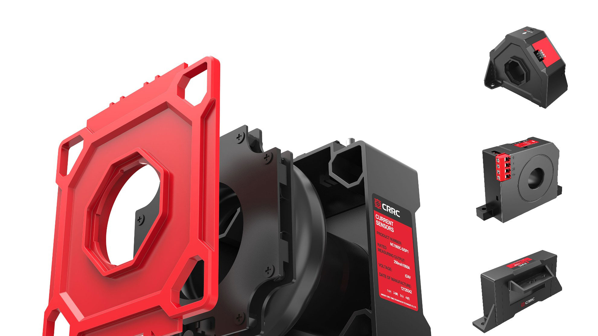
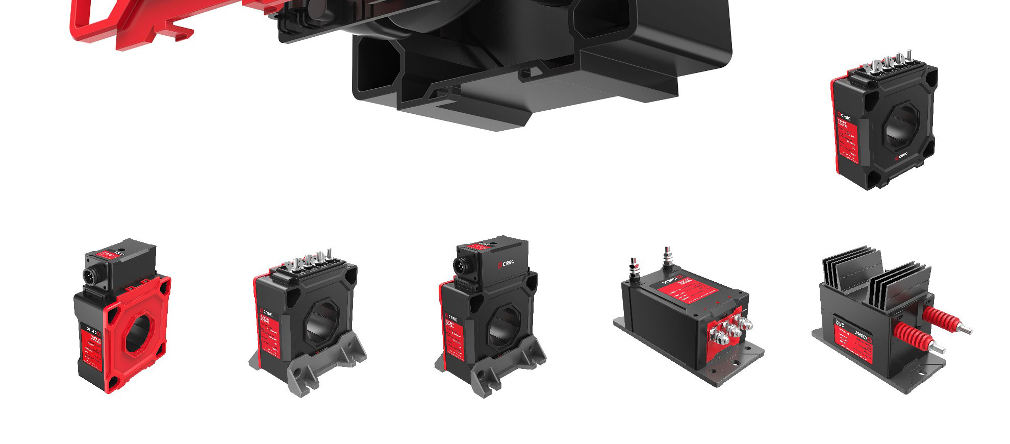
Black is the main color, stable, reliable and stable. Some parts are dark gray, which increases the sense of visual hierarchy while ensuring the main tone, while small parts and labels use red as the series of color matching characteristic colors, giving high-performance impression.
The Chinese red tone adopted this time is also in line with the brand image of CRRC, echoing the logo.
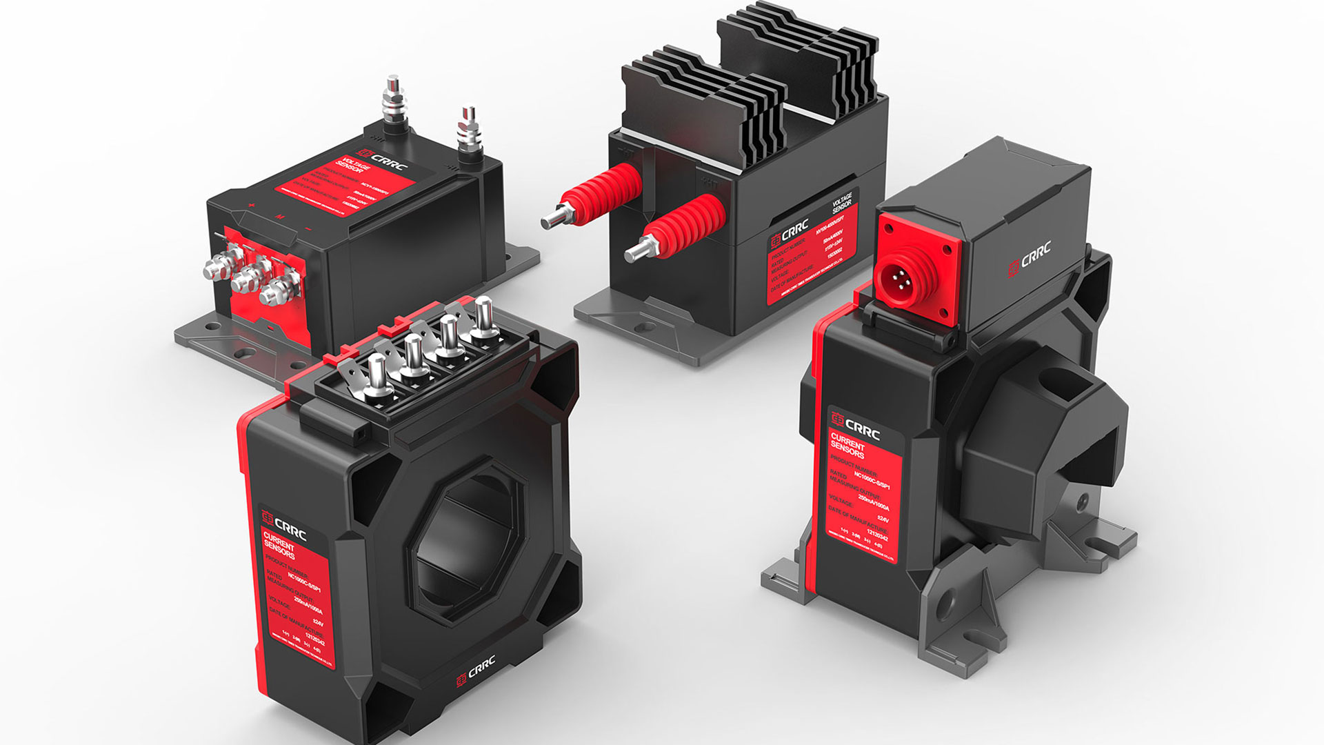
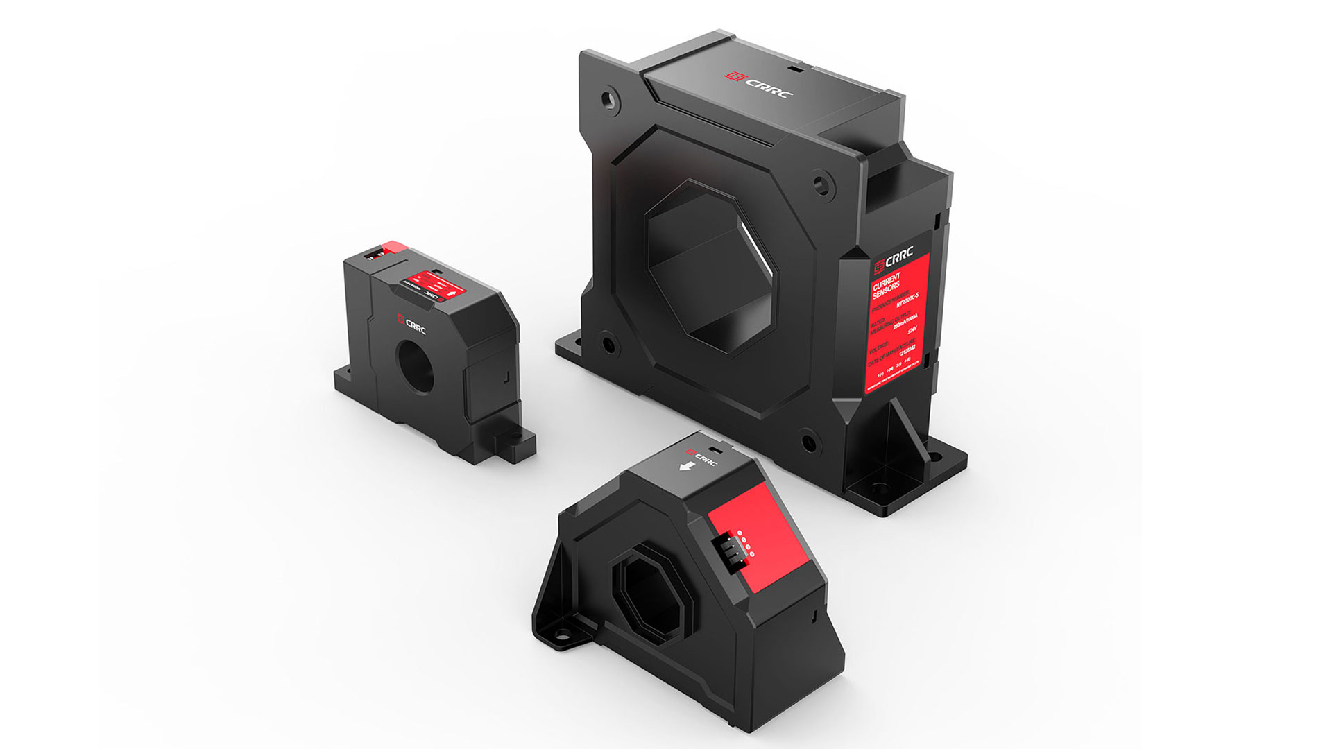
On the premise of not changing the structural size, the product is endowed with distinct and unified design details, and the uniform color matching and label design is adopted to strengthen the product's sense of series and brand.

The copyright of this work belongs to 明锐设计. No use is allowed without explicit permission from owner.

New user?Create an account
Log In Reset your password.
Account existed?Log In
Read and agree to the User Agreement Terms of Use.

Please enter your email to reset your password
The X element is really a panacea.
nice
The style of color elements is obvious, good
Full of texture
Good job
Professional!