Title: Packaging Design of Tsingtao Beer and White Beer
Brand Holding: Tsingtao Brewery Co., Ltd.
Original Design: Tiger Pan
Executive design: Chi Qian, Guo Rui
Illustrator: Yi Ping
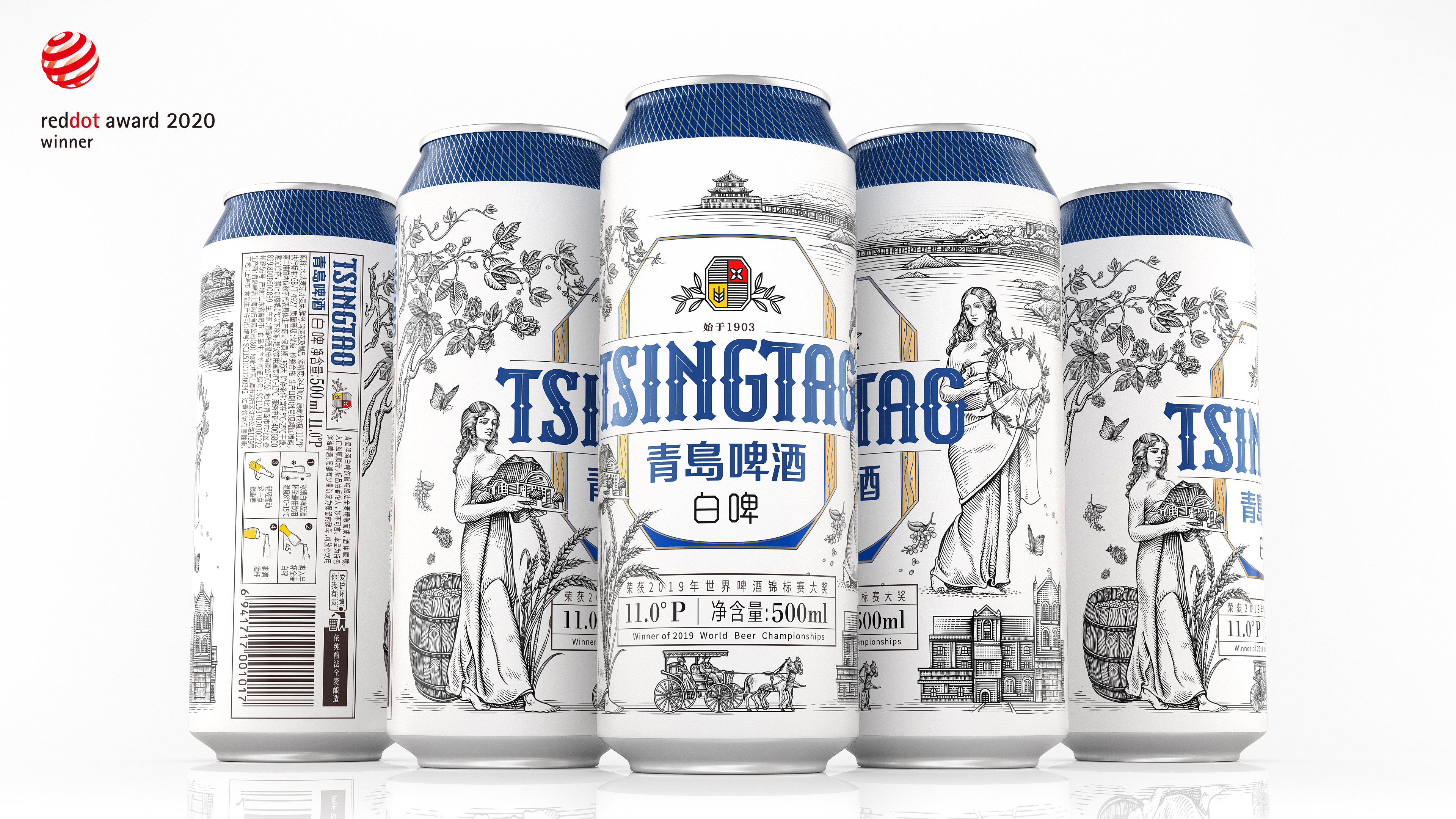
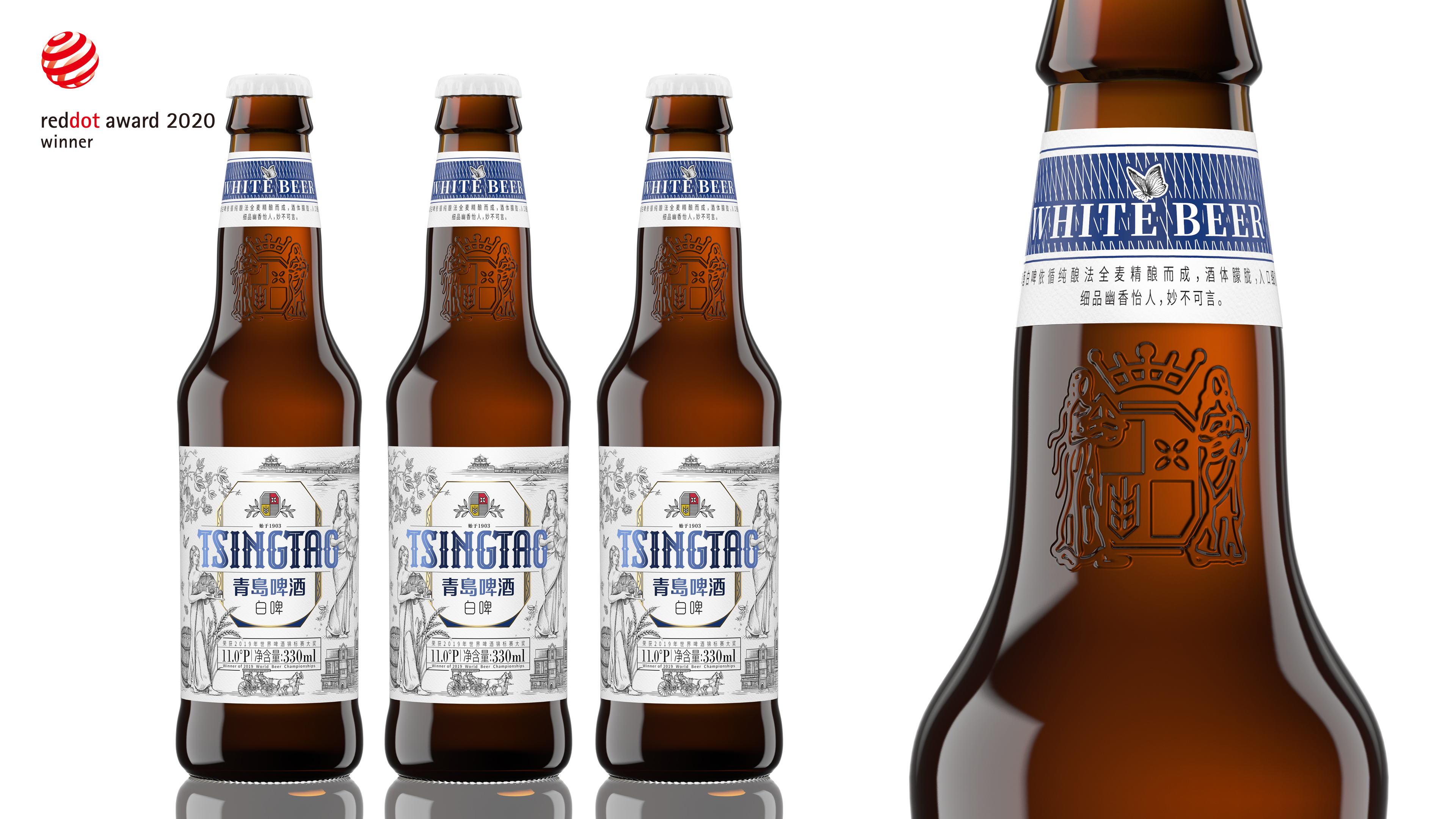
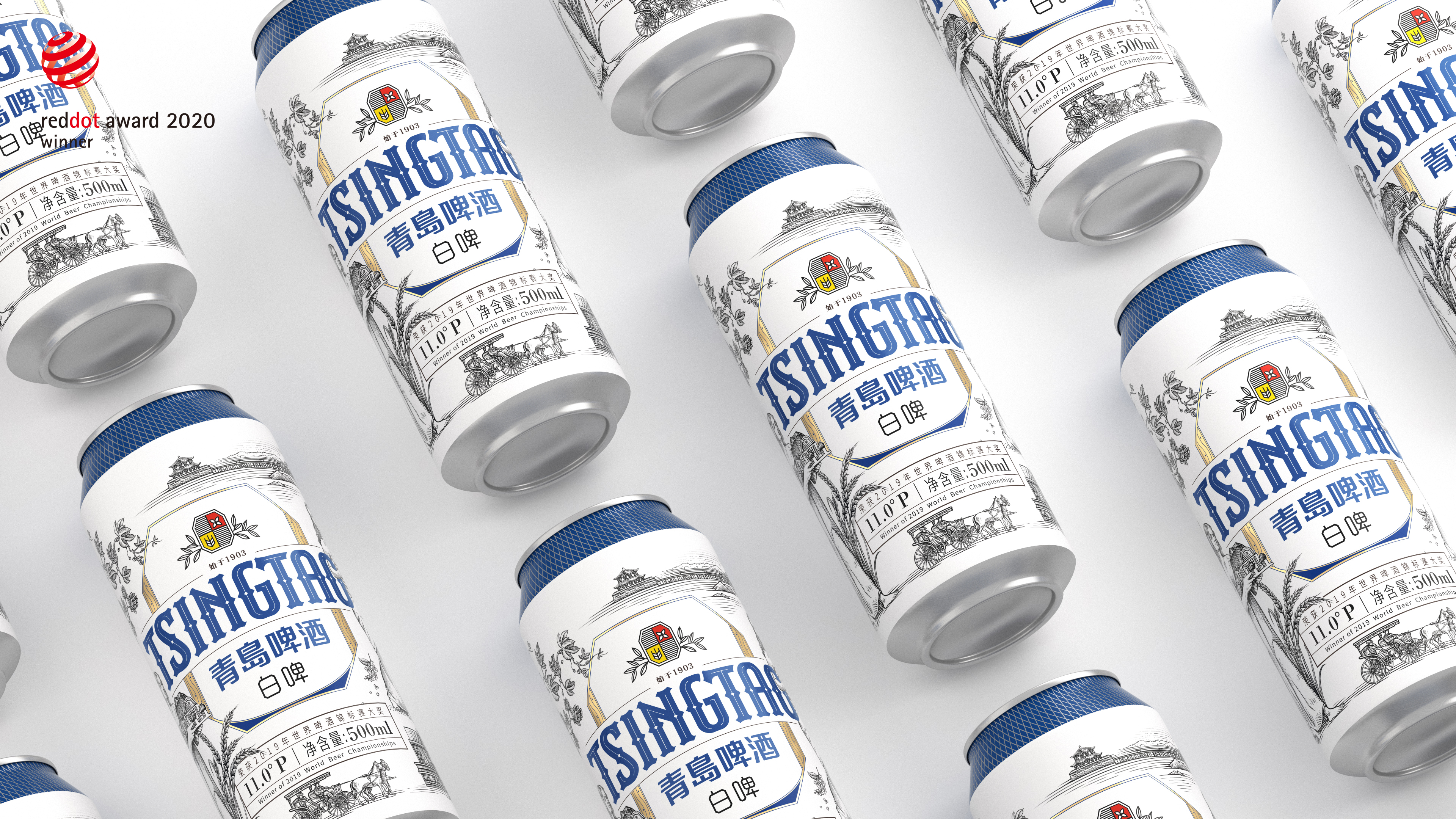
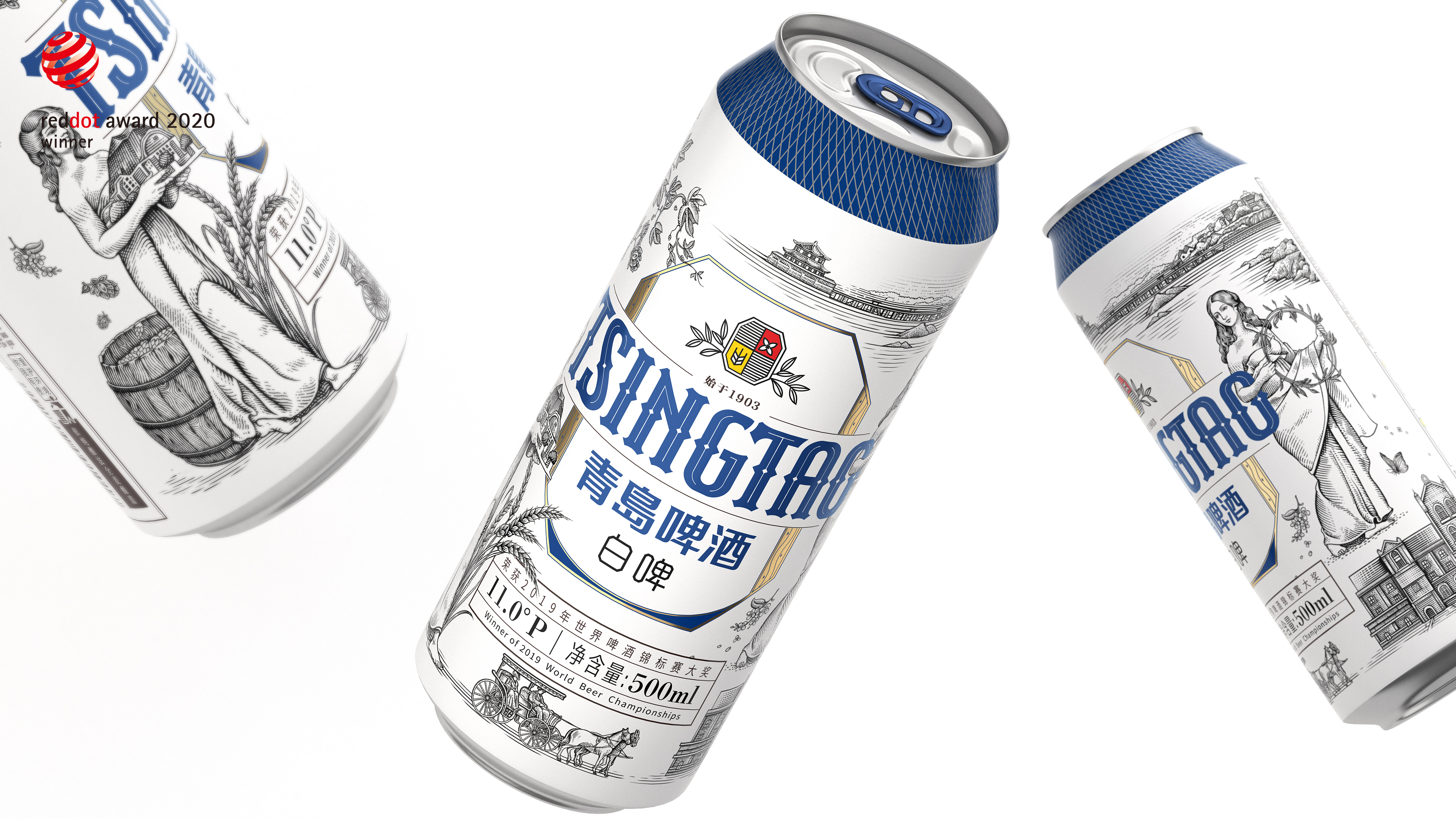
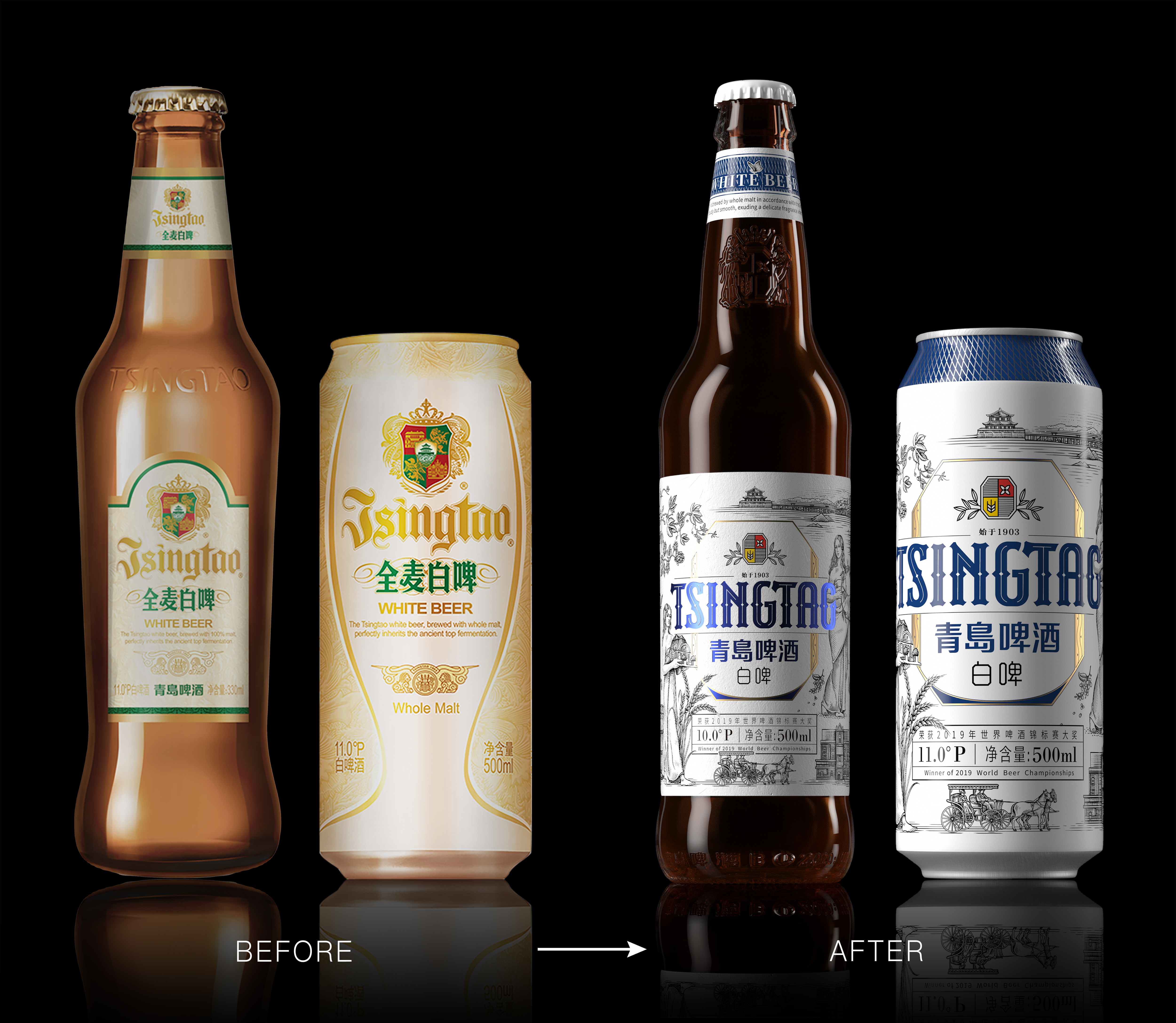
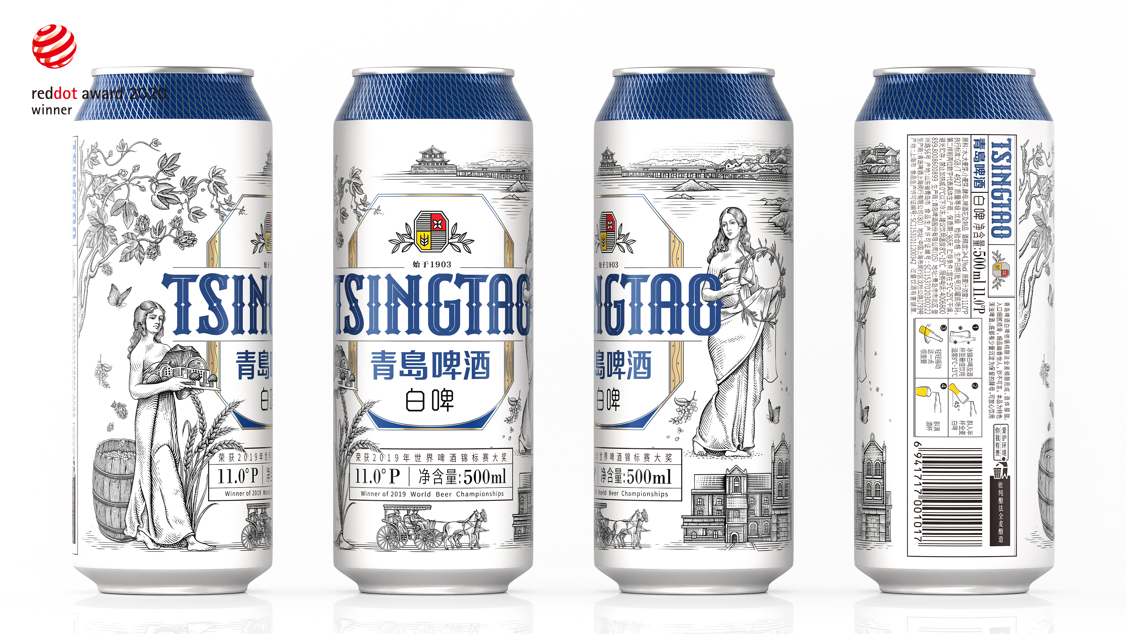
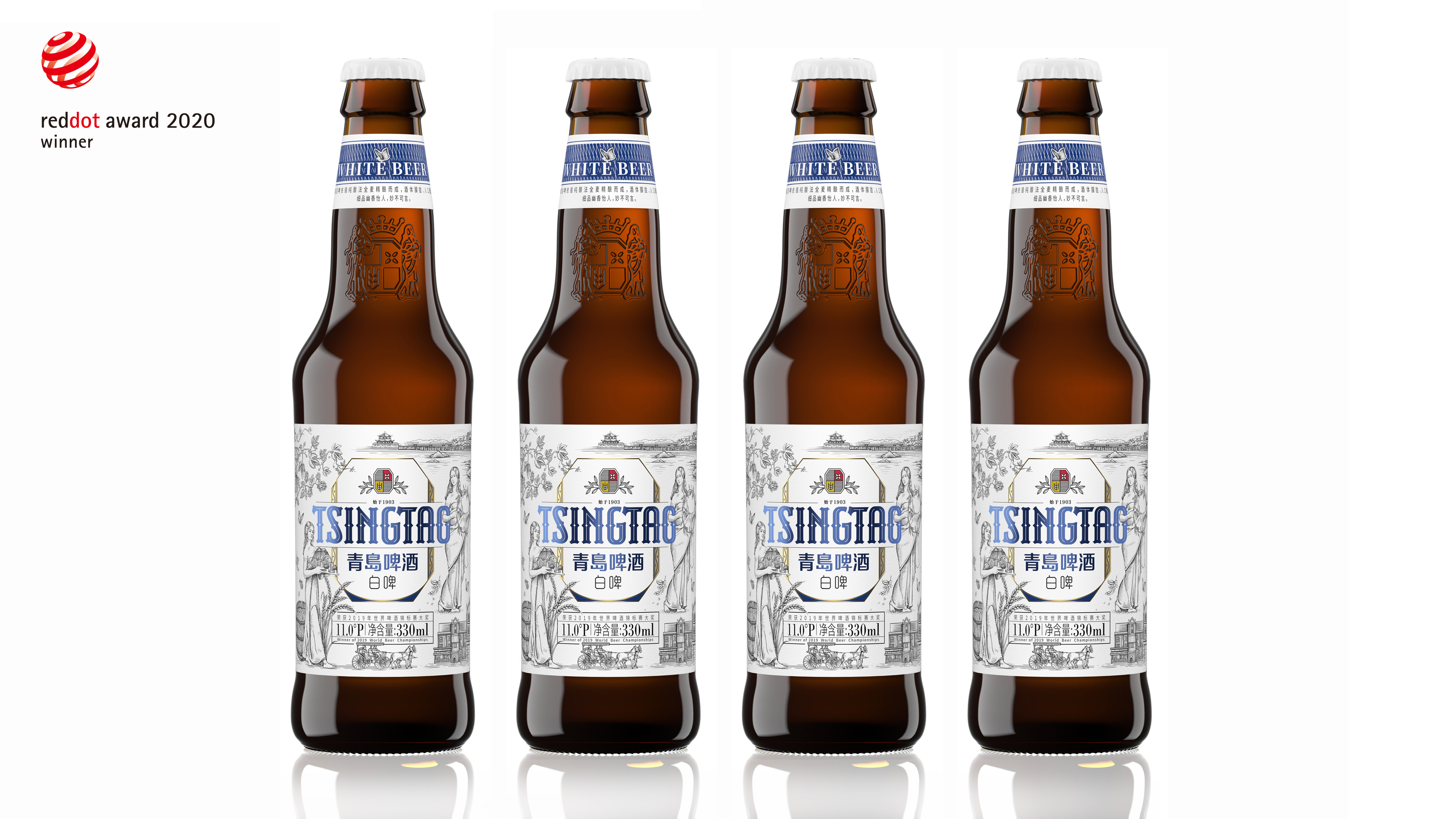
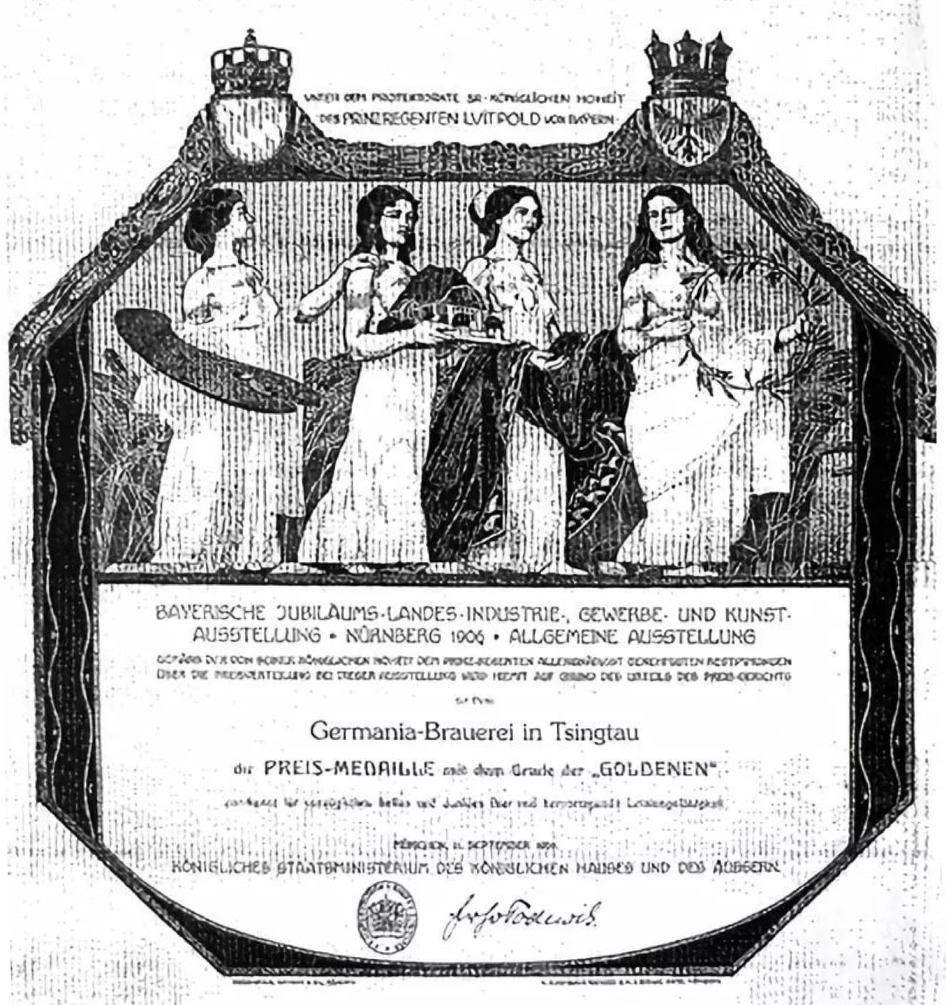
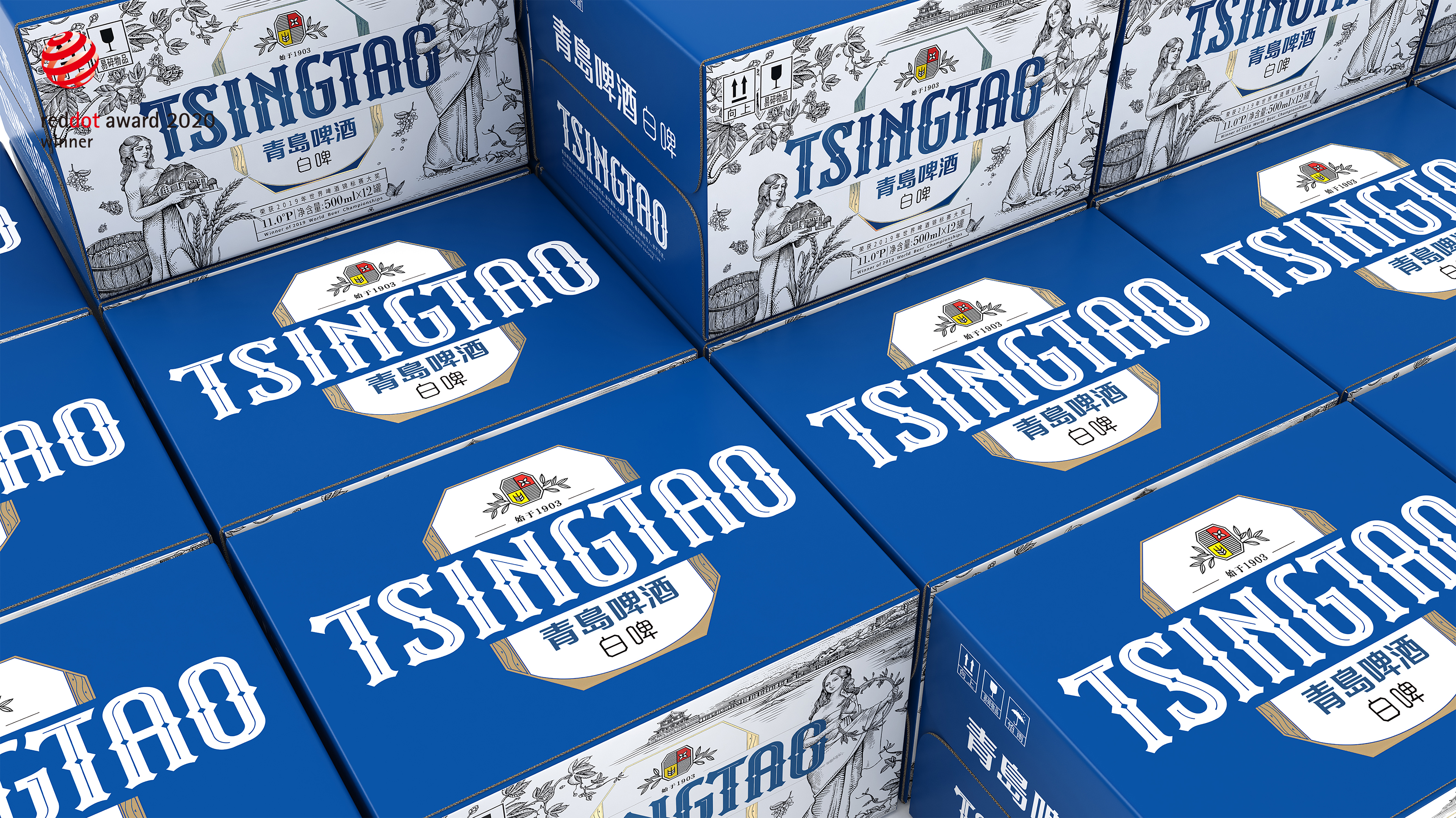
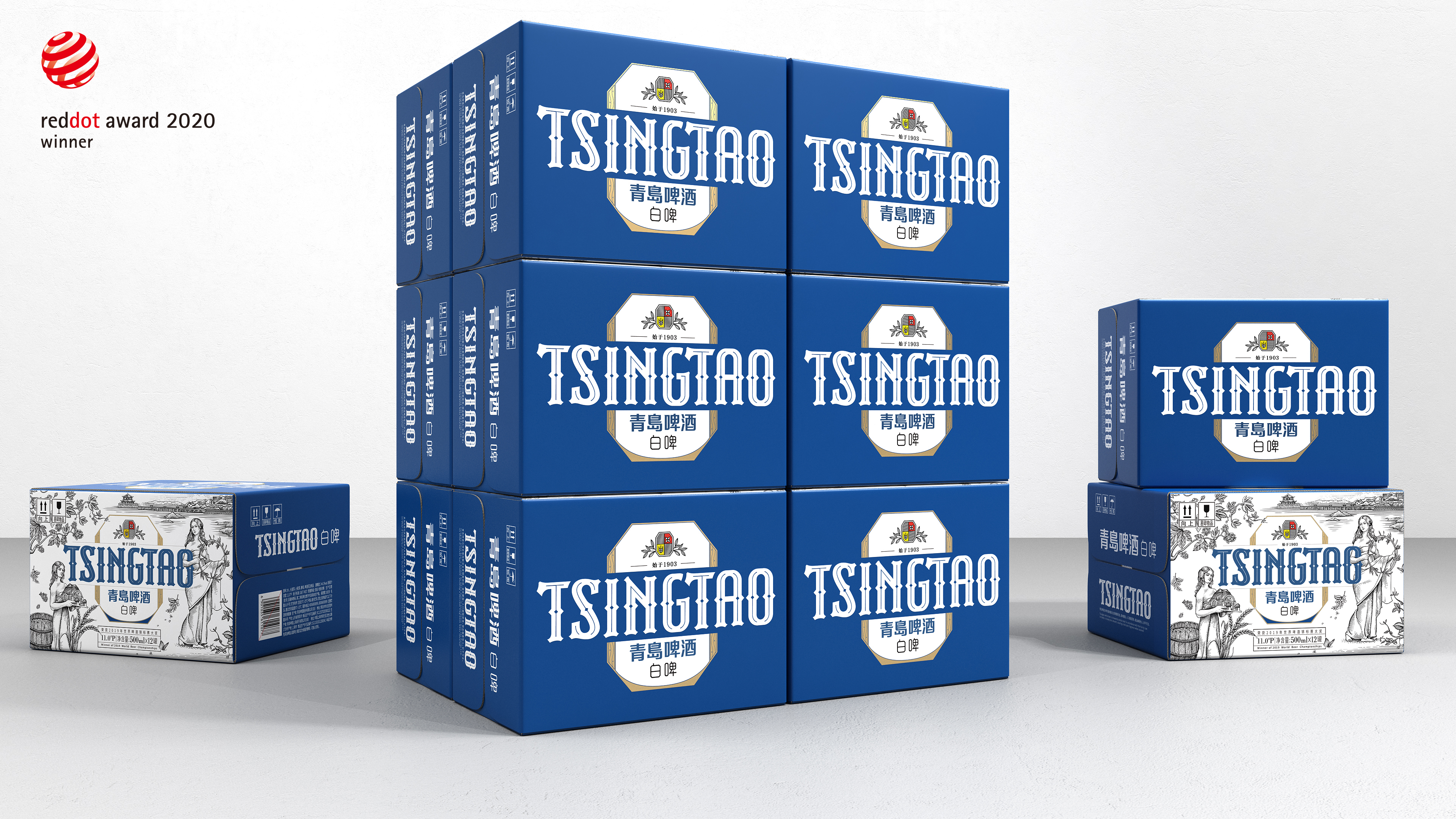
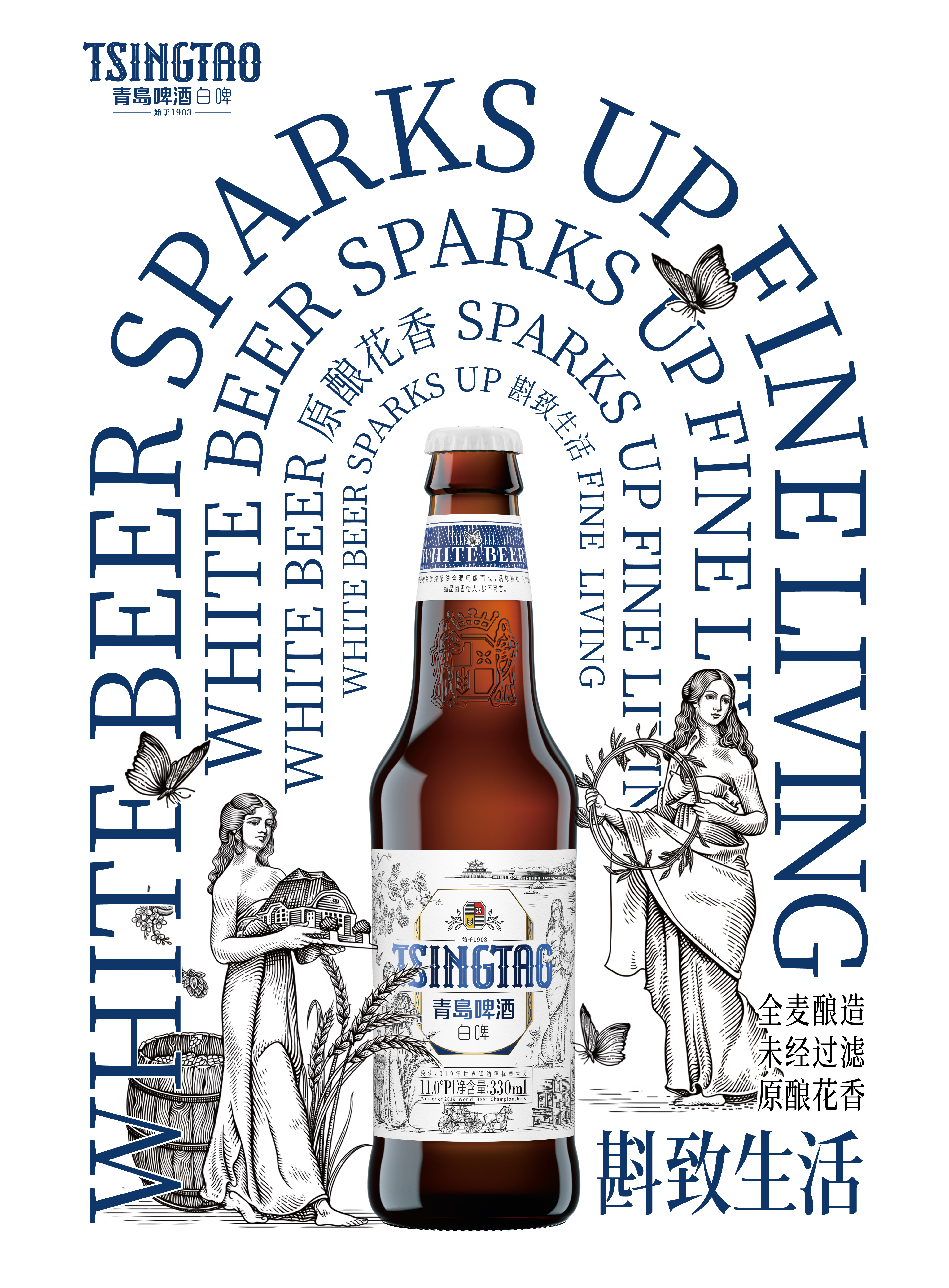
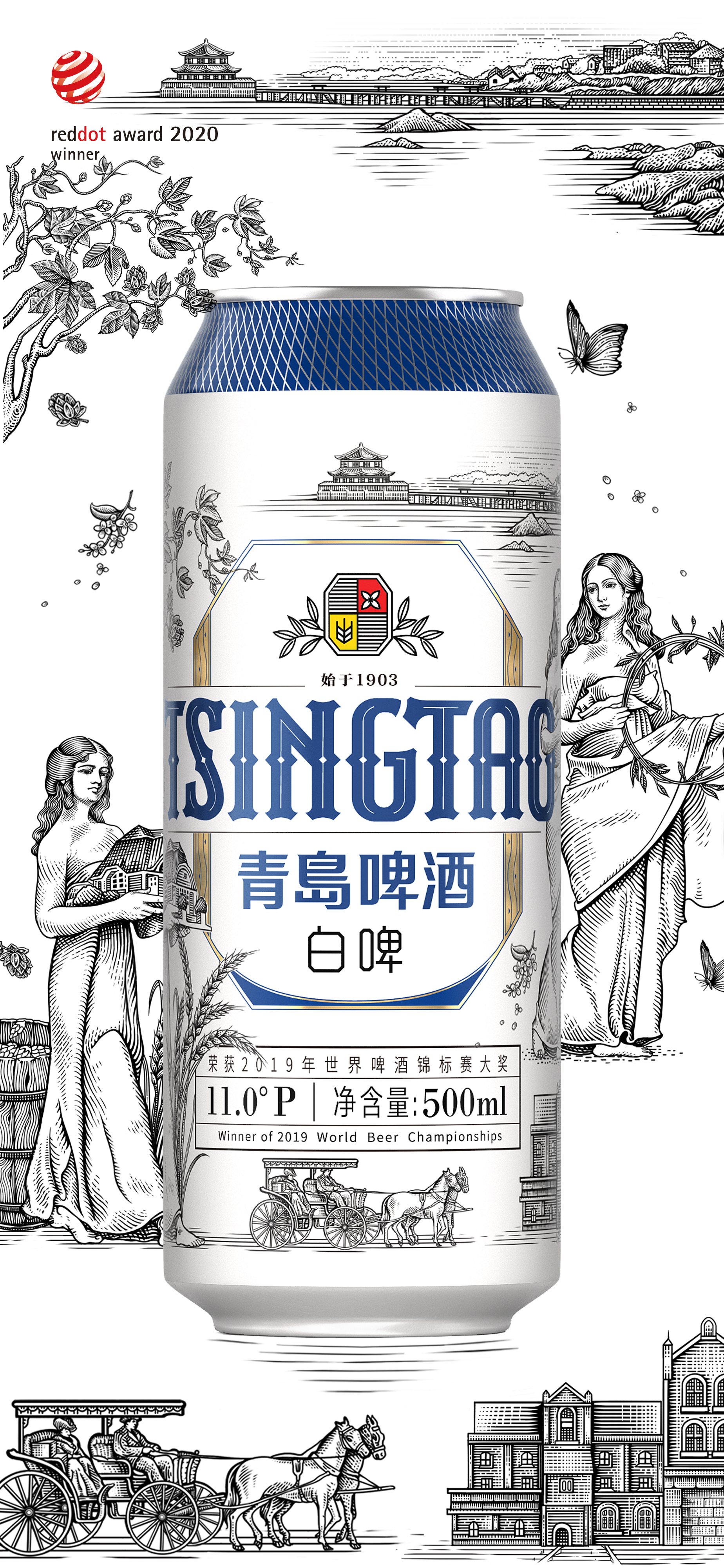
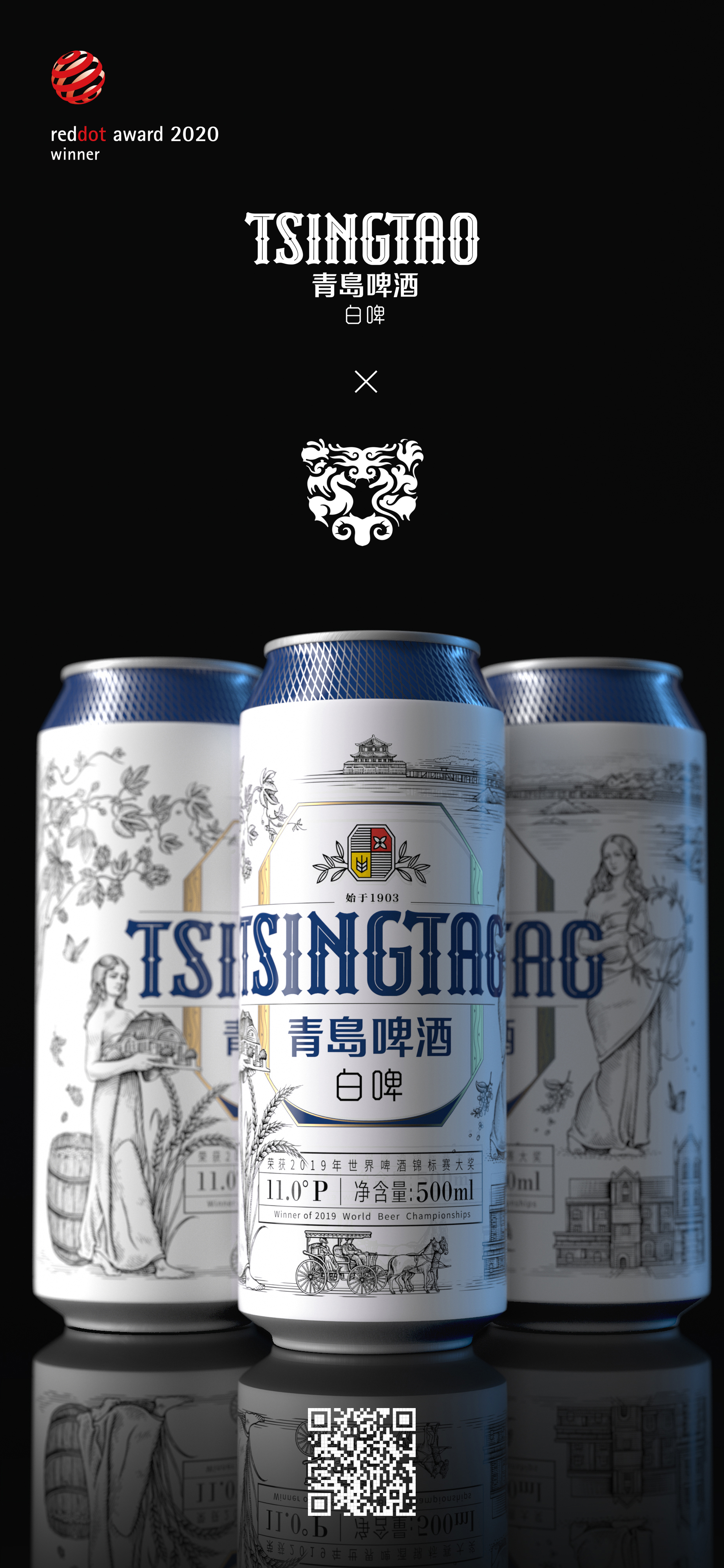
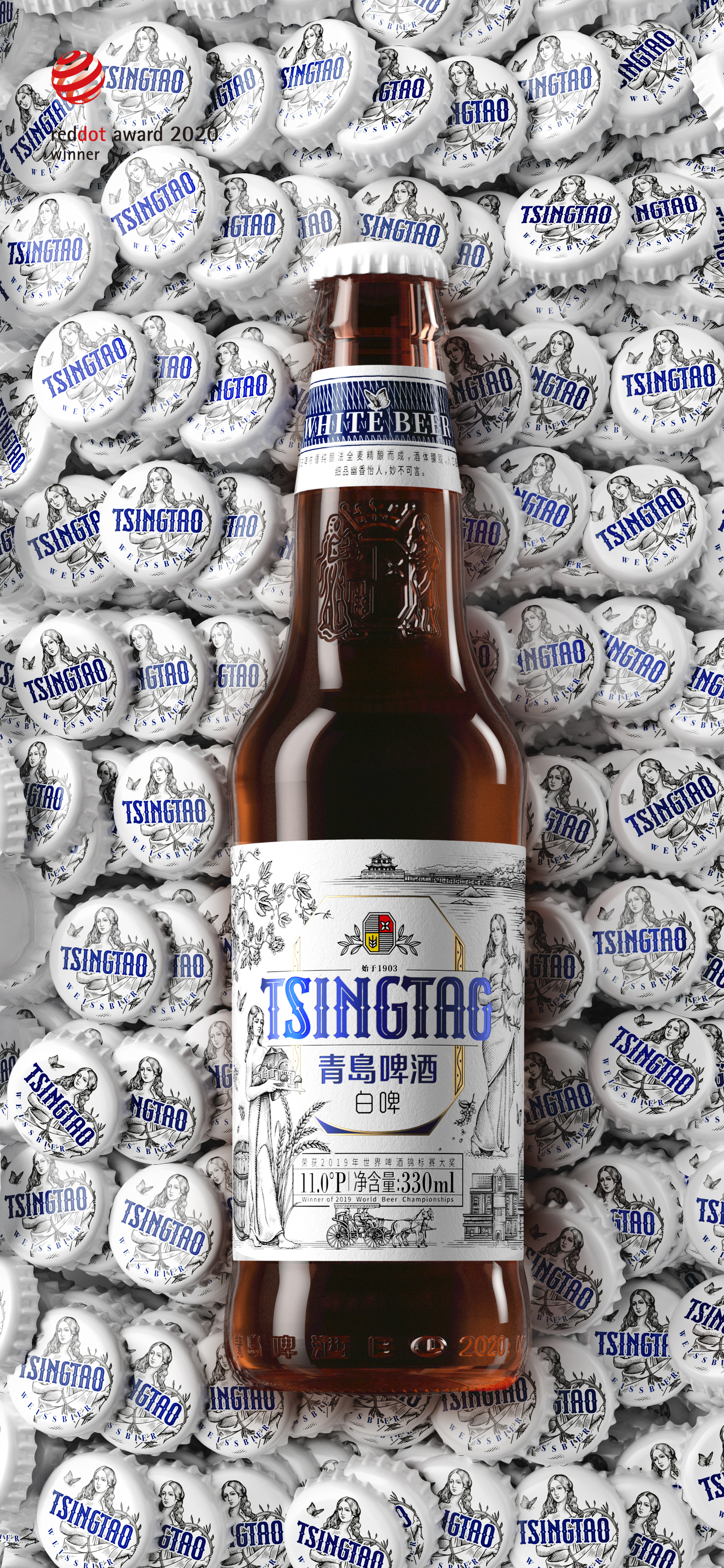
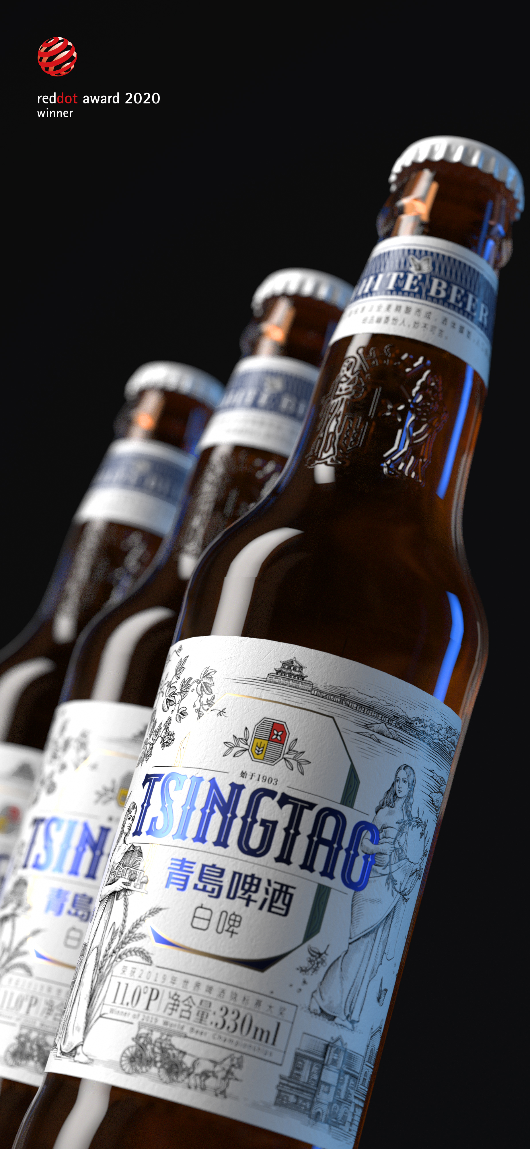
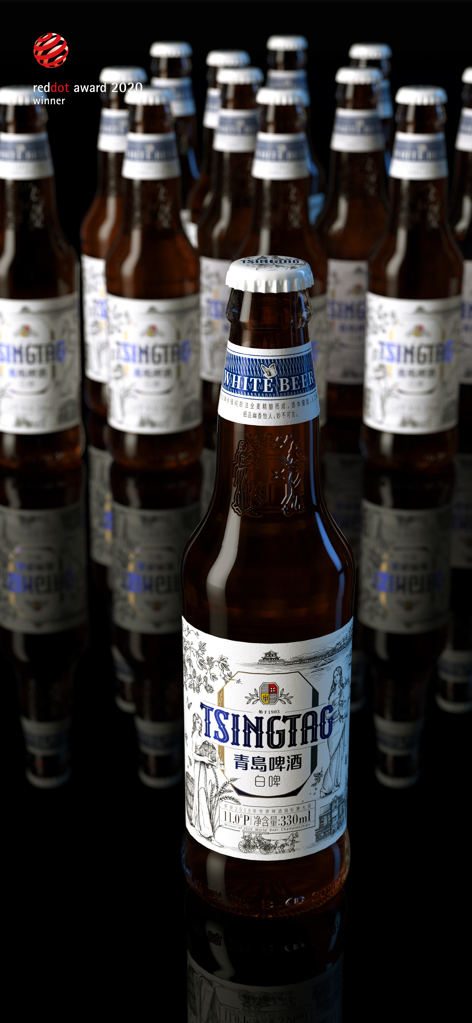
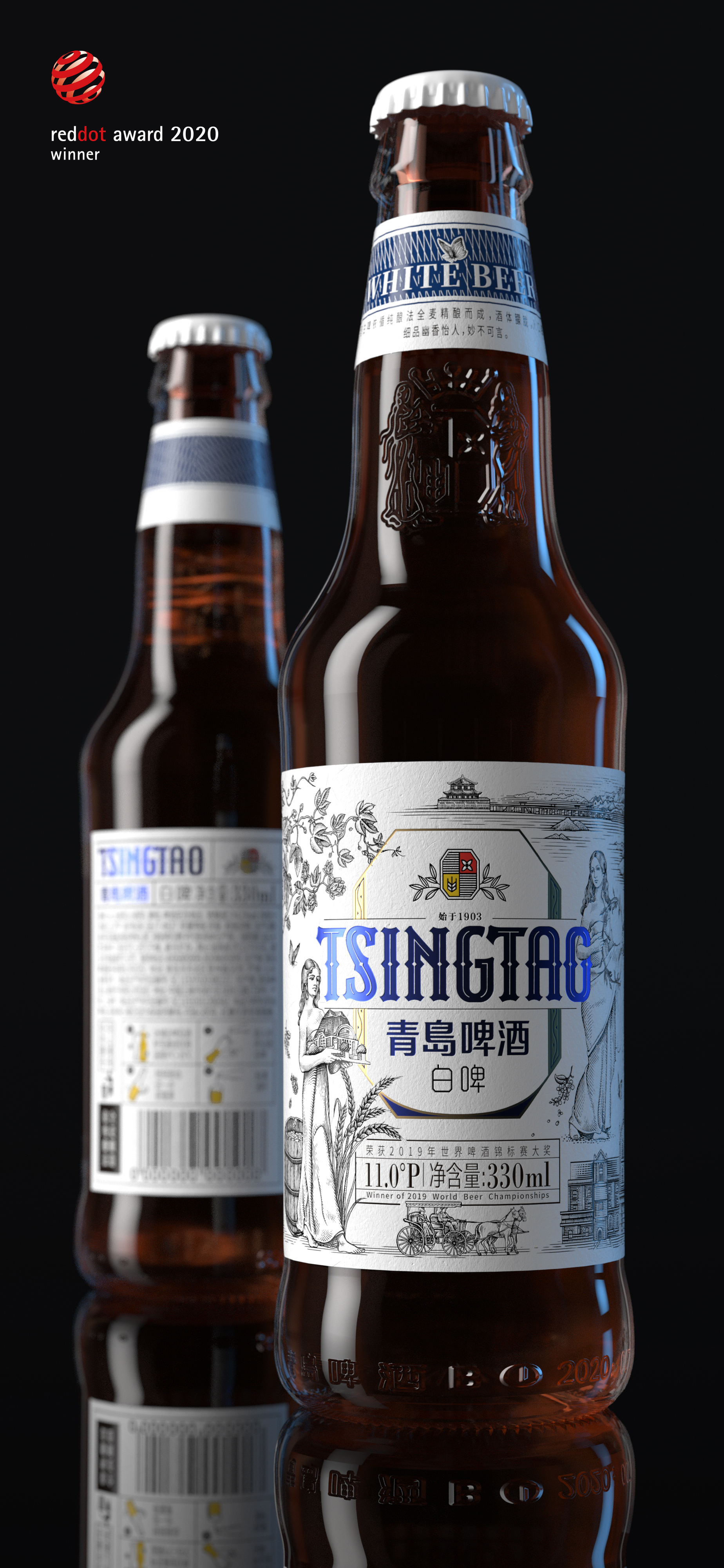
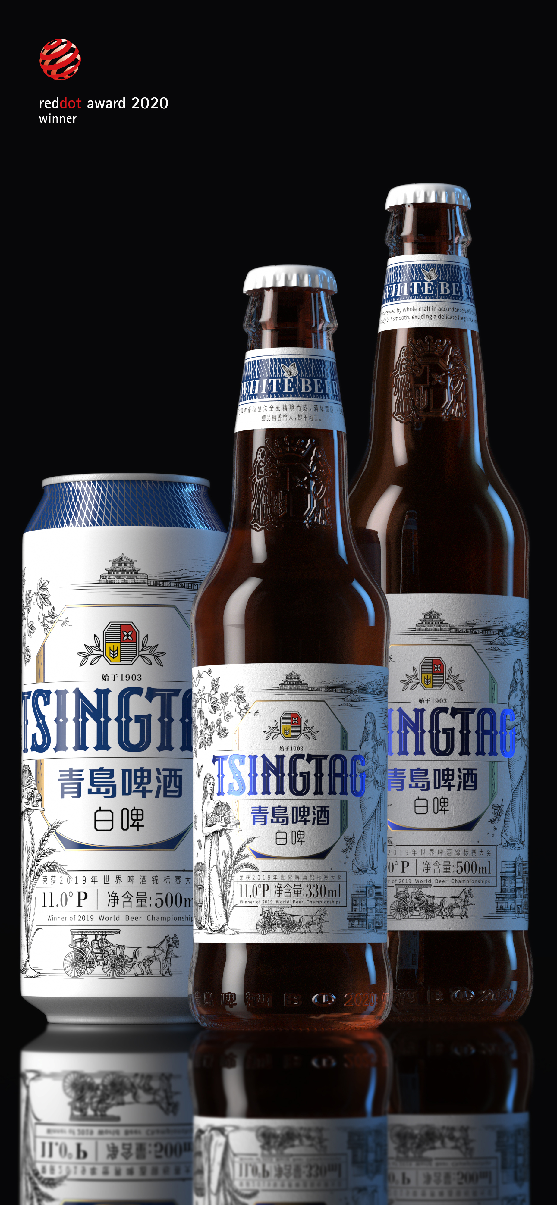
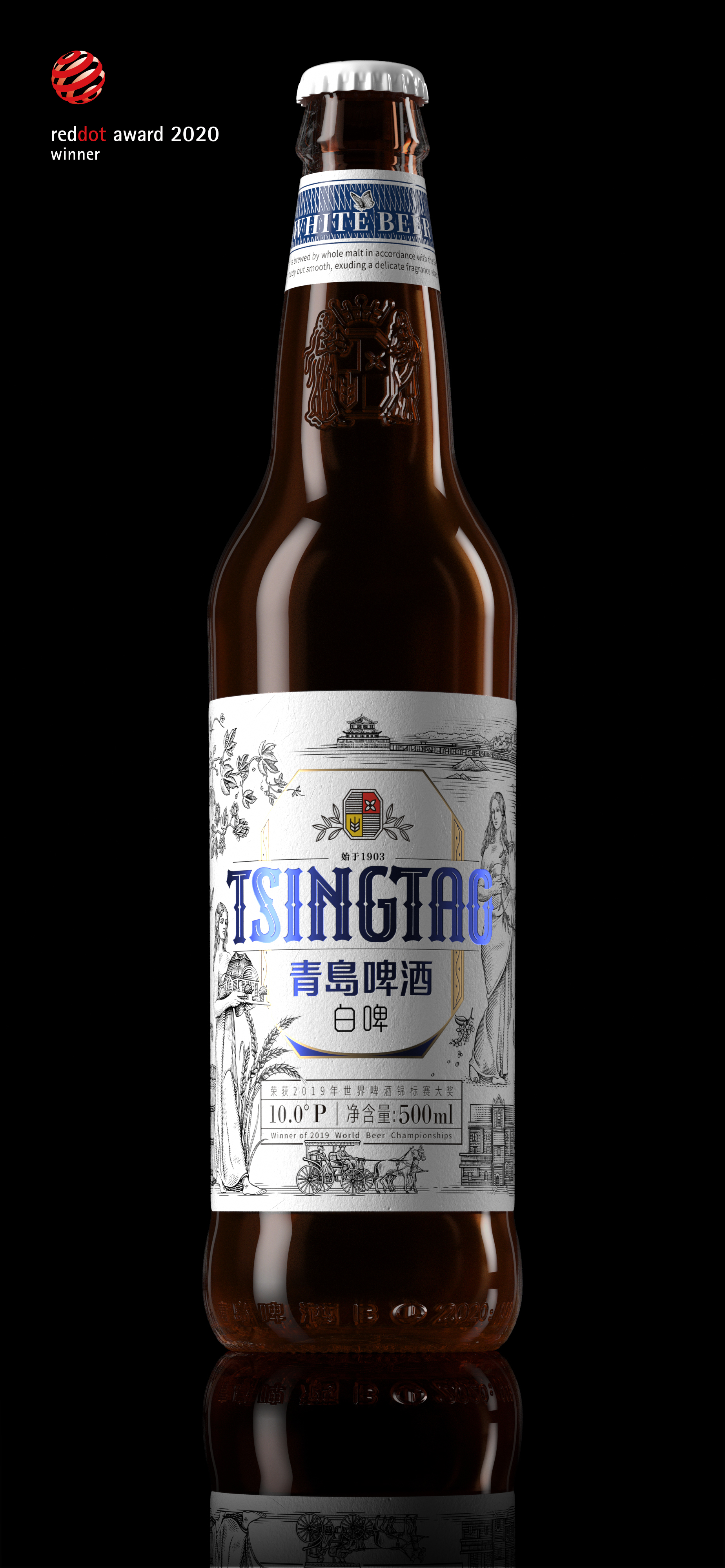
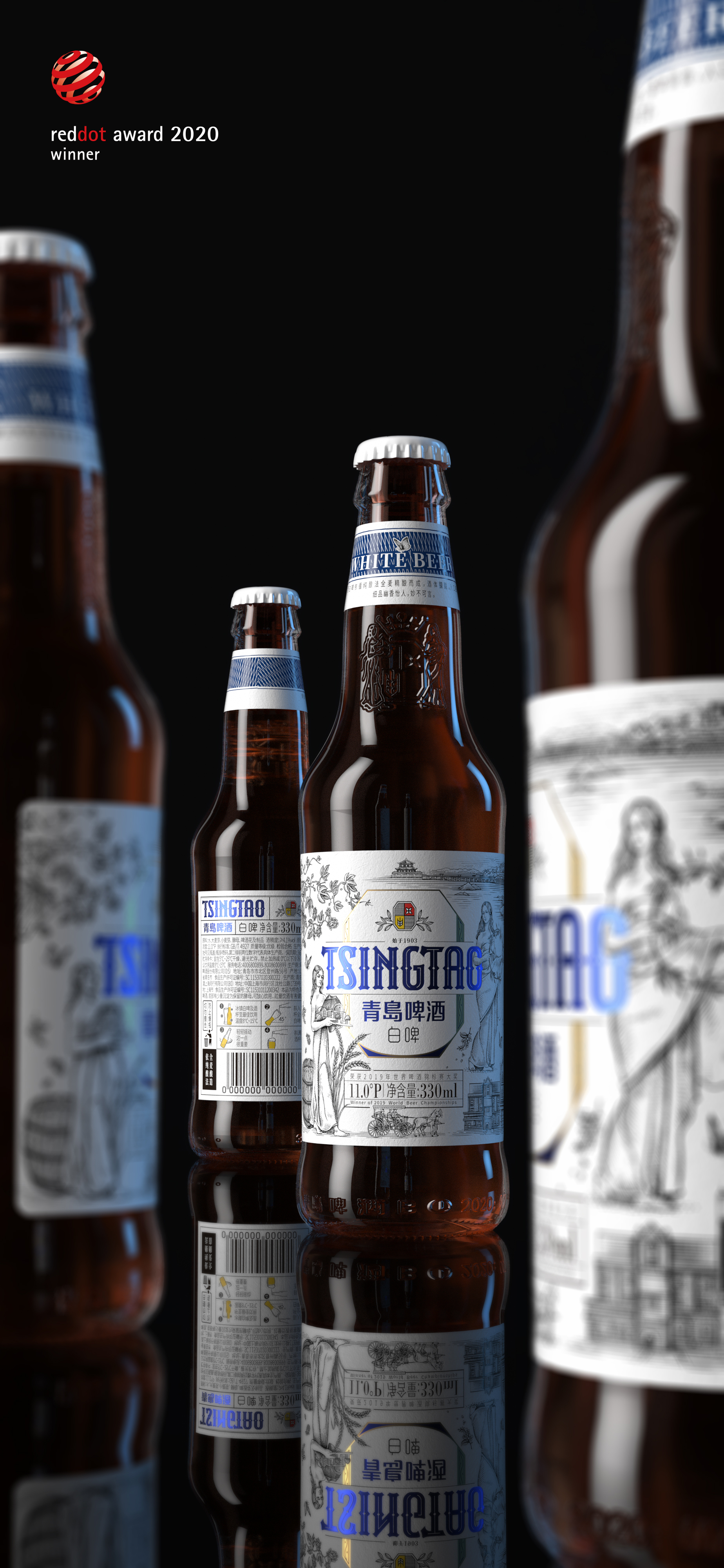
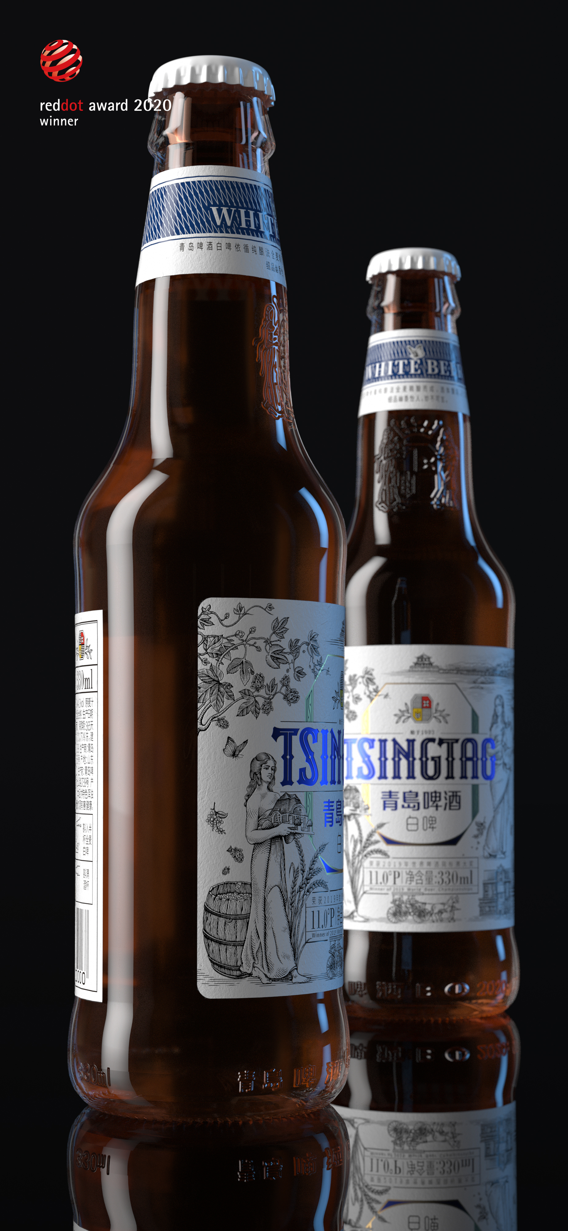
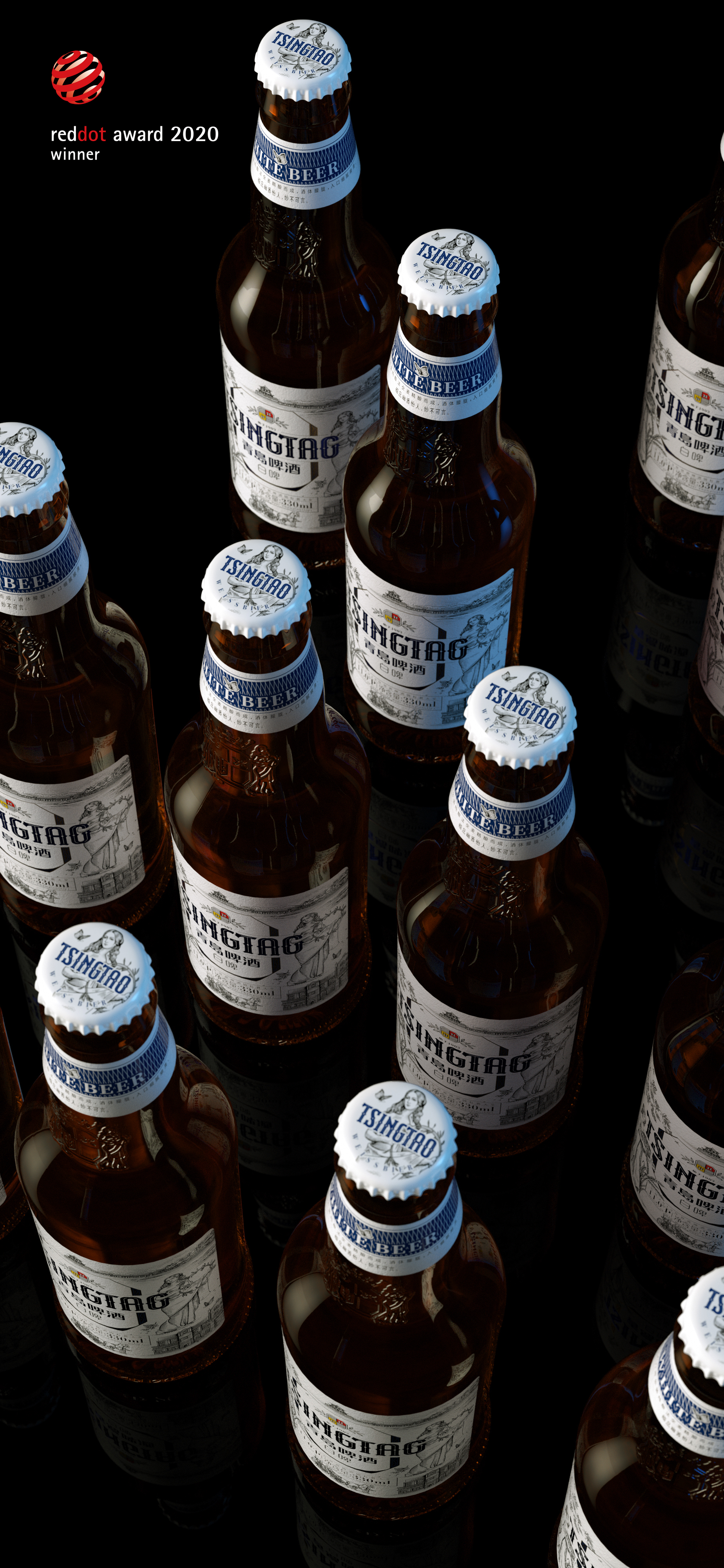
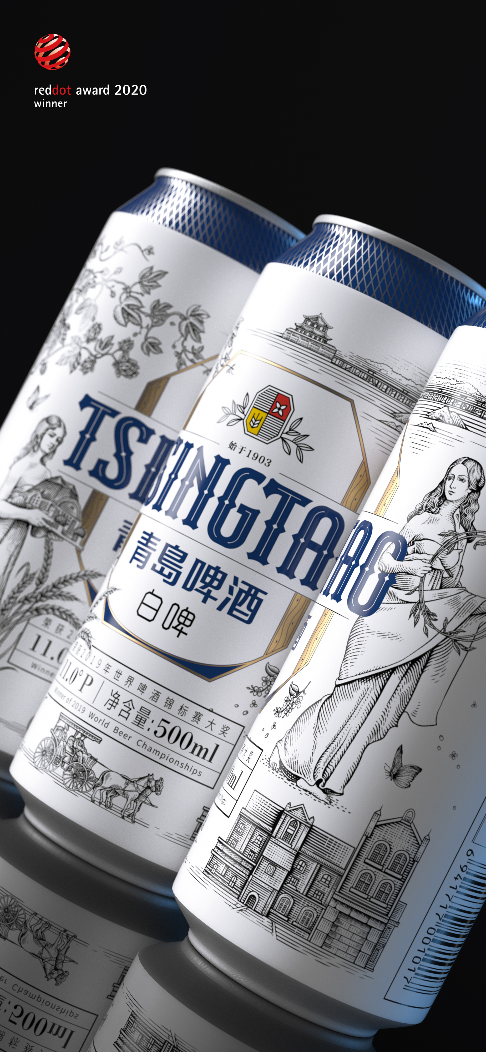
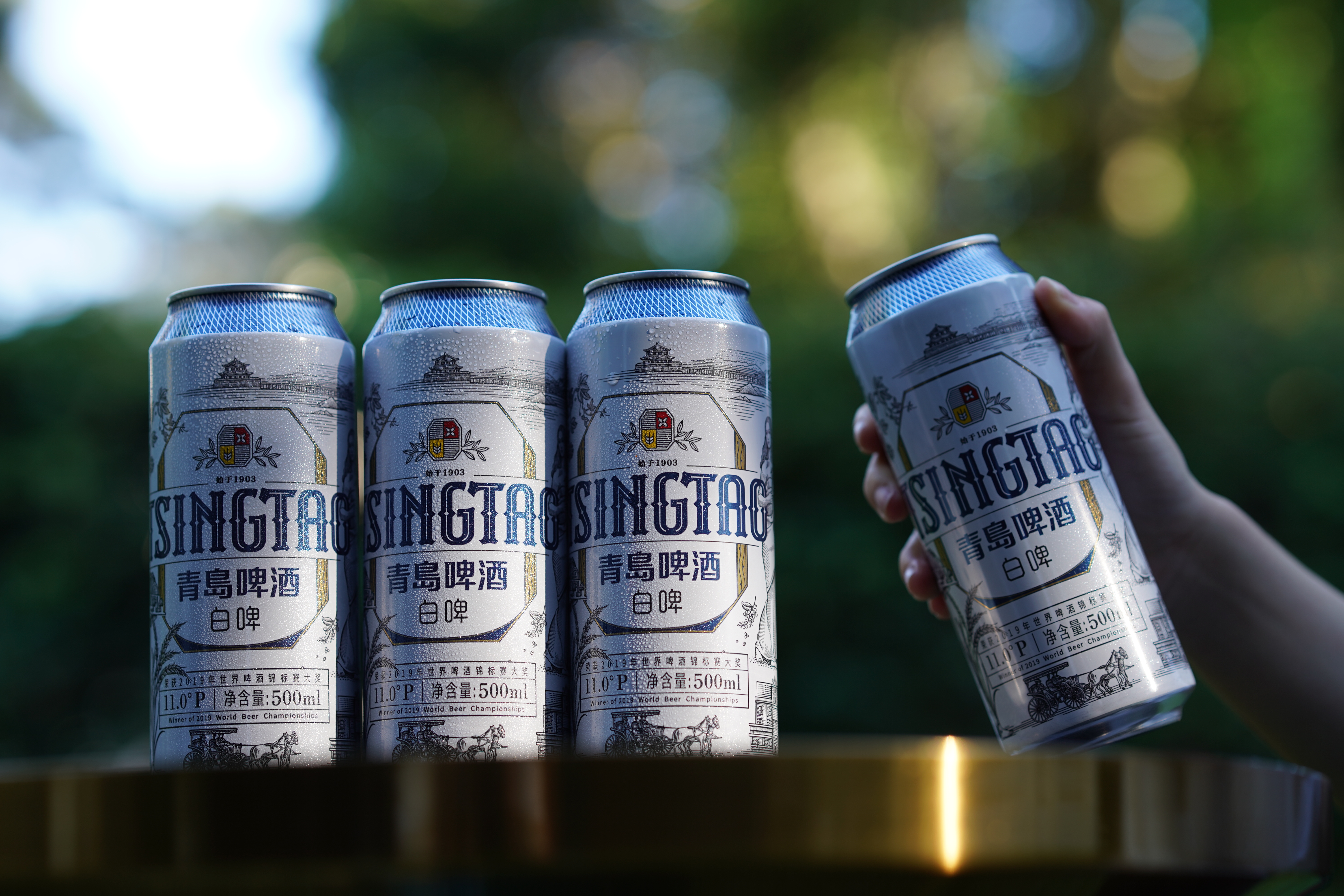
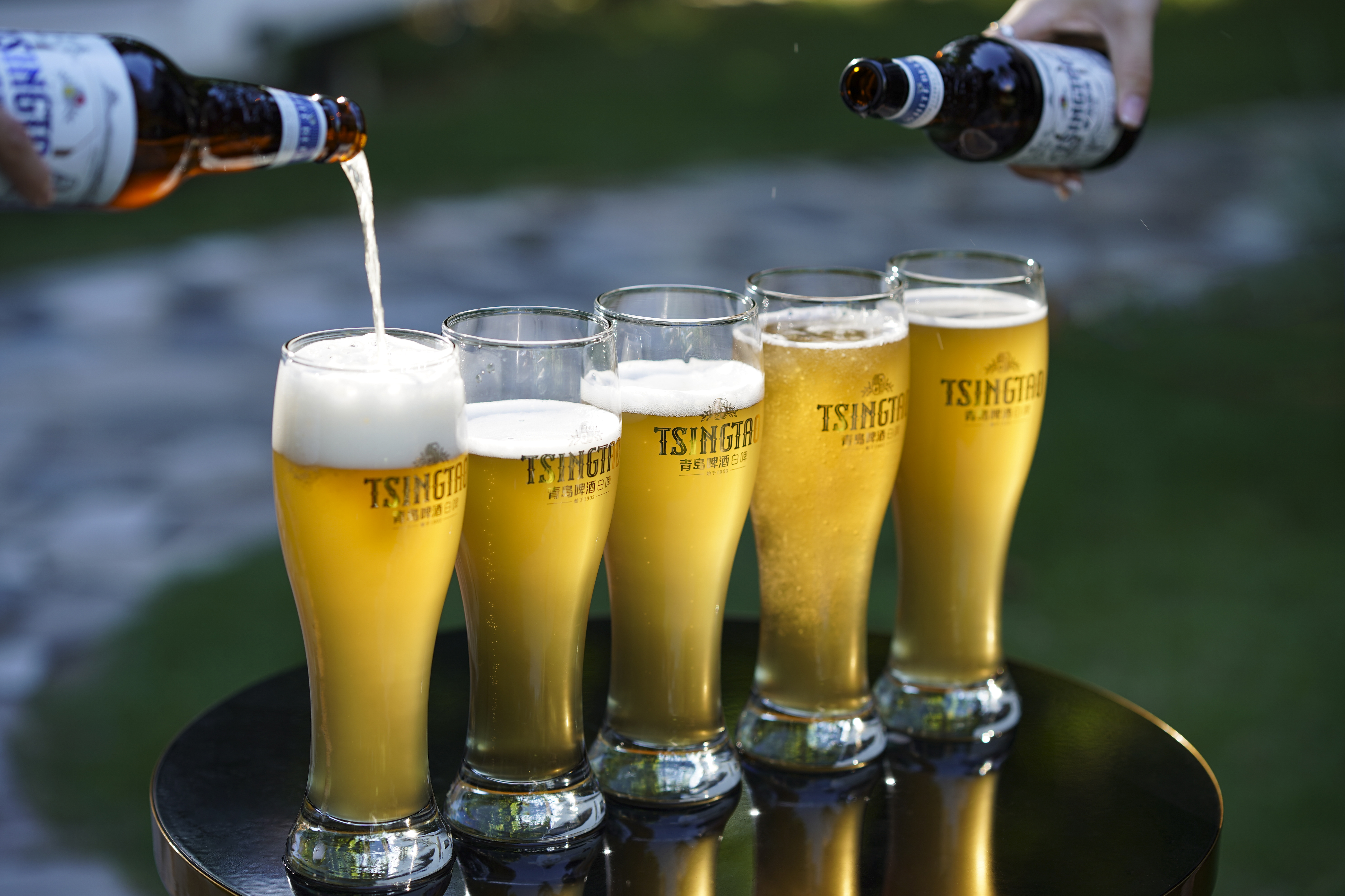
Tsingtao Beer White Beer is a white beer with a fragrance of flowers and fruits and a turbid body. This time, the packaging design of Tsingtao White Beer was upgraded, using dark brown glass bottles and opaque cans. The overall design was inspired by the Gold Medal Certificate of the Munich Beer Expo won by Tsingtao Beer Museum and Tsingtao Beer in 1906. We extracted the octagonal frame on the Gold Medal Certificate of the Munich Gold Medal as a visual symbol throughout the whole, the wooden texture of the beer barrel is applied to both sides of the octagon to remember the unchanging persistence of Qingdao White Beer's "Chinese Fine Brewing.
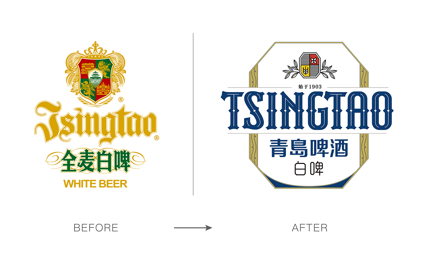
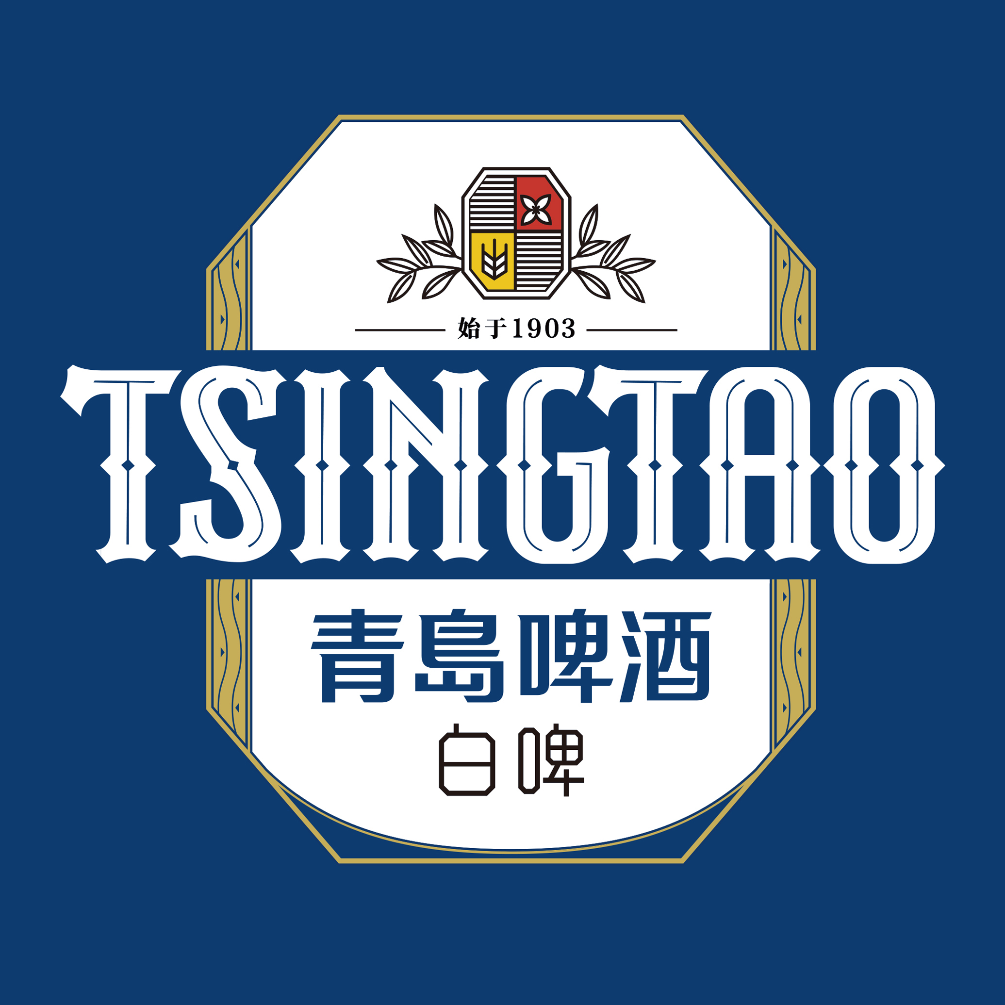
In the design and upgrade of LOGO, the badge on the top changes the complexity of the traditional badge and uses graphical wheat and lilac flowers to present it in a simpler and more symbolic way. The "Beginning at 1903" embedded above the brand logo is a record of Tsingtao Beer's pioneering time. The Chinese and English fonts of logo are redesigned. The "TSINGTAO" adopts a retro English font design style, with thick strokes and thin lines in the middle of the font to outline, in the middle, a small diamond-shaped square runs through the font structure, breaking the complex structure of the original English font, and the visual recognition is higher.
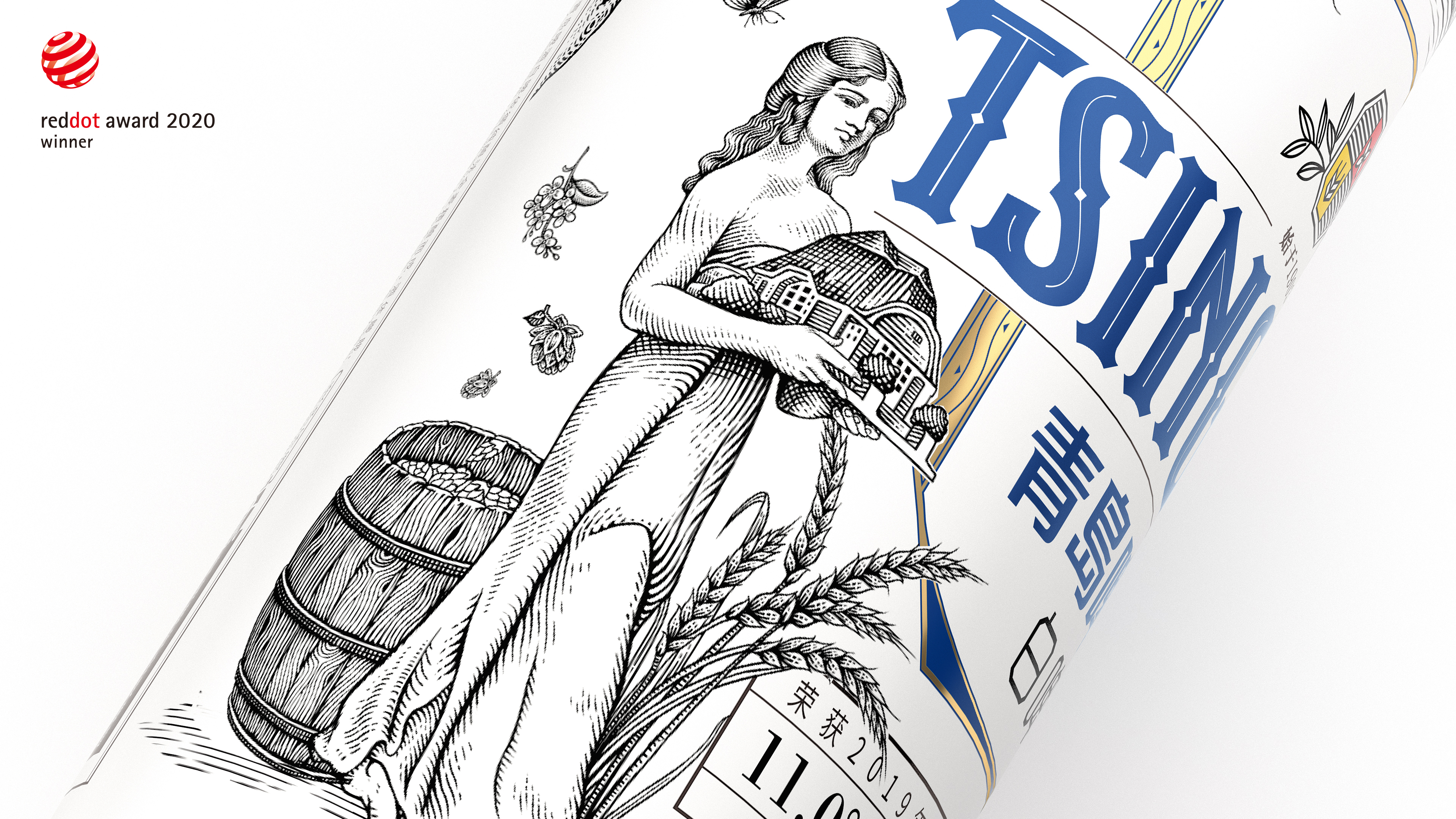
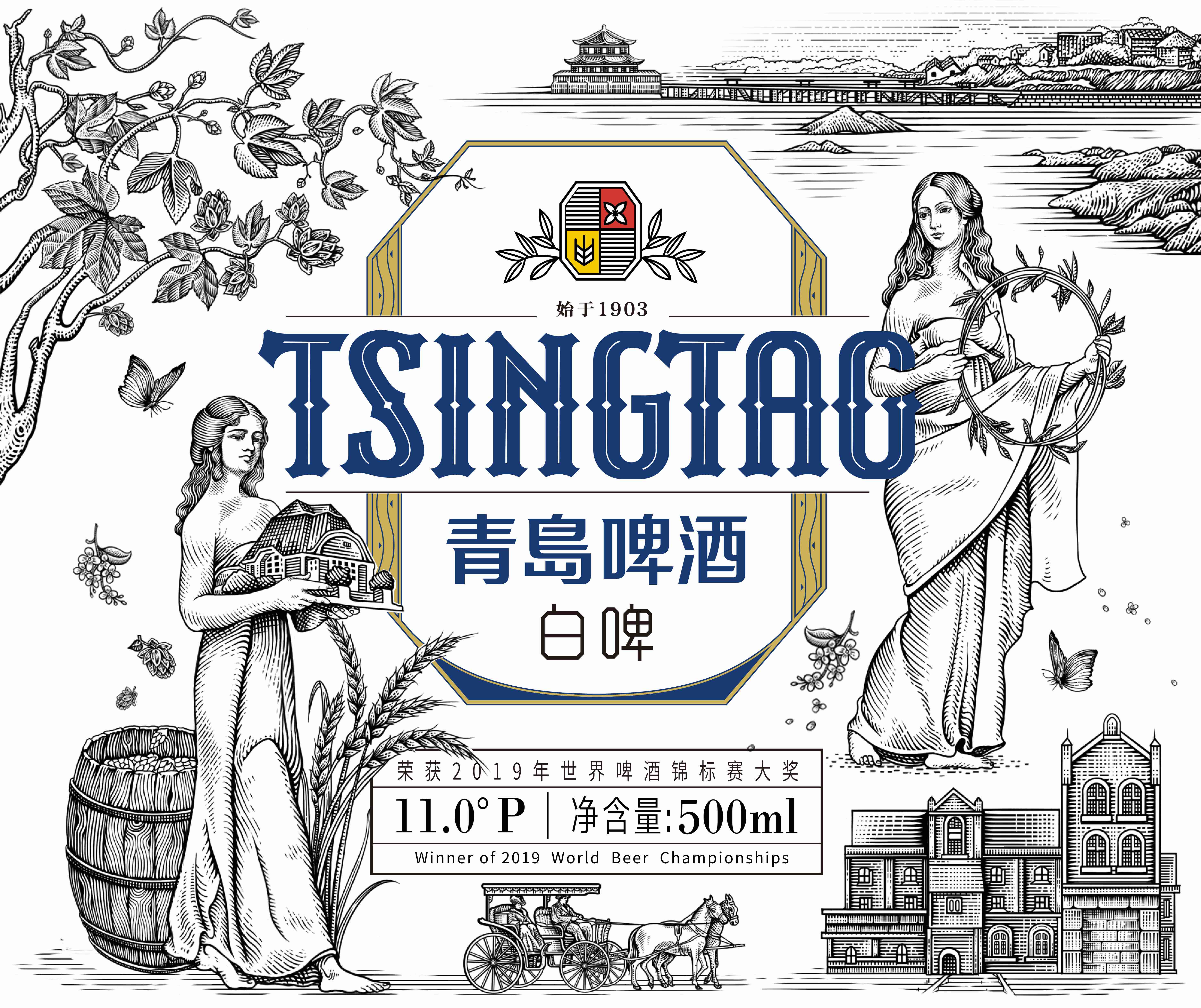
The illustration design on the package is taken from the two goddesses in ancient Greek mythology on the gold medal certificate screen of the Munich Expo. The whole illustration is drawn in the form of prints. The patron saint of the family Hestia (Hestia) symbolizes family harmony and family well-being. The goddess of grain Demeter (Demeter) symbolizes the full warehouse of grain, the rolling wealth of money, and the meaning of beauty.
The color matching of the overall packaging is decorated with appropriate amount of red and yellow, expressing the German attributes of the product, refreshing blue and pure white, and you can feel pleasure and beauty at a glance. We hope that through this new packaging, we can inject new vitality into the original brand and maintain communication with consumers with a new visual image.




The copyright of this work belongs to 潘虎设计实验室. No use is allowed without explicit permission from owner.

New user?Create an account
Log In Reset your password.
Account existed?Log In
Read and agree to the User Agreement Terms of Use.

Please enter your email to reset your password
After drinking so much of this beer, I finally saw the original effect diagram of this wine today. Master Pan designed it. Ha, ha, ha,
Let me really convinced not much, you count as one
Buy for the package
Mr pan is a good cow.
Top Tsingtao Beer
Beautiful
I am in charge of beautiful flowers ha ha ha ha ha ha ha laugh to death me
This is also too beautiful!!!!
It's too beautiful!!!
Visual inspection shows that more and more works will be added with 2020 red dot award logo.
There are many pictures, and the design is also great!!!
The packing box is very much like milk.