The popularity of the tide play culture has brought hundreds of billions of emerging markets. Behind this is the emotional sustenance of young consumers under the trend, and it is also the rise of emerging consumption concepts. According to the QuestMobile "Generation Z" Insight Report, IP, National Tide and Entertainment Trend represent the three major preferences of Generation Z in consumption. Tide play has become a new social tool for young people.
The new generation of young people have a childlike innocence, and their love for "playing" has become a unique topic circle. The background of the birth of Playlab is "research: play 」.
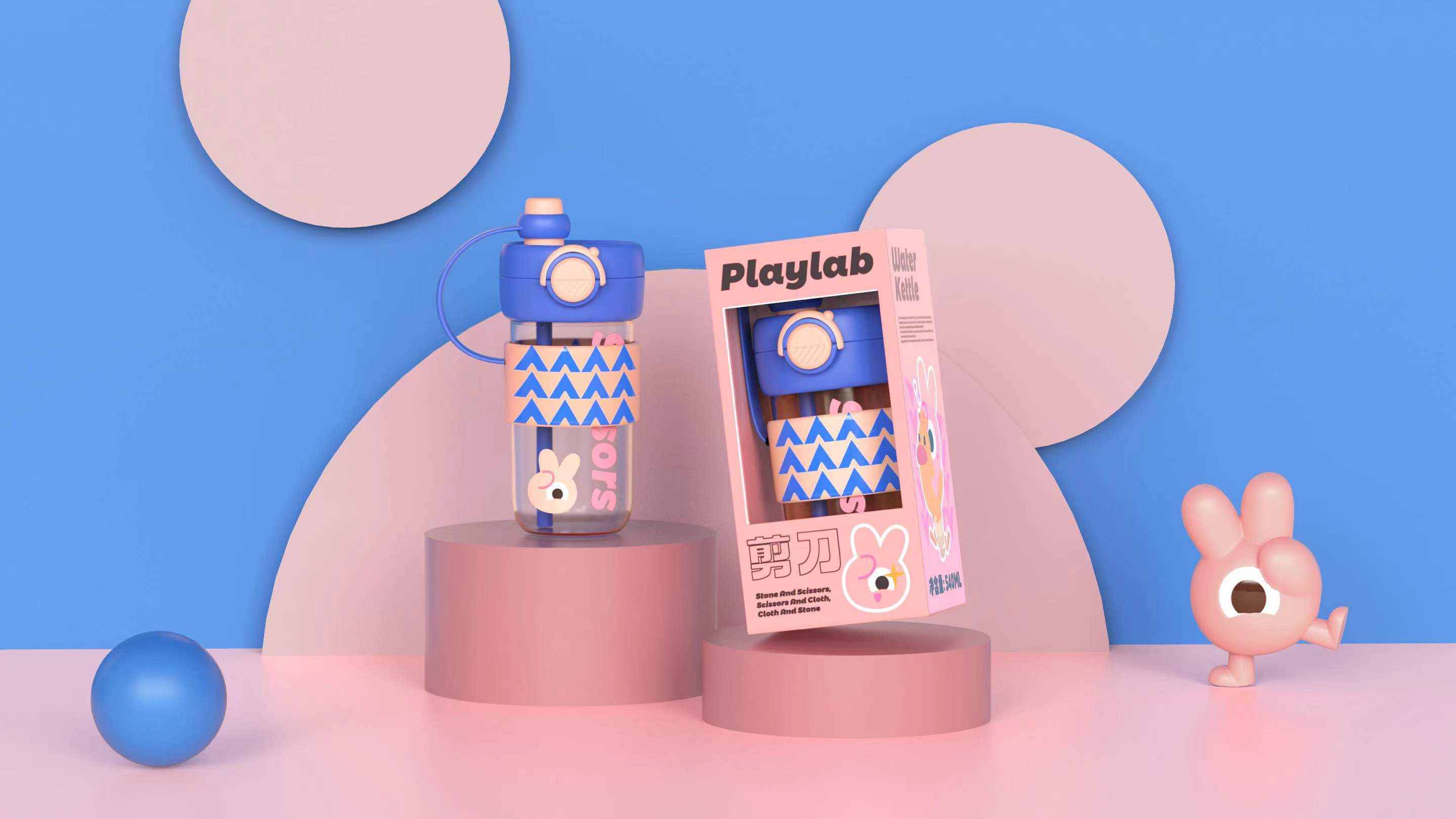
Childhood is precious, special and unforgettable. The designer chose the "hammer scissors cloth" in the national game as the design core of the Playlab's own IP to create a family image.
The simple pen outlines the anthropomorphic image of three kinds of guessing gestures, which is intuitive and easy to understand. According to the gesture characteristics, the designer drew different expressions for the hammer, scissors and cloth:
Hammer is a stubborn boy with strong personality. Scissors are little boys with many clever ideas. Cloth is a curious ignorant girl... In them, we can always catch our own shadow.
Color is the first design language. IP visual performance is mainly based on bright primary colors, which conveys the brand characteristics of fashion, liveliness and youth. The recognition degree of different colors also effectively distinguishes the differences between individuals.

The design of the auxiliary symbol further abstracts the IP outline, and brings the possibility of infinite derivation through the arrangement and combination of simple geometry.
The most direct use of the cup is to install "water", which belongs to the catering utensils. Whether it is the ordinary cold white open, or the health soup of eighteen traditional Chinese medicines, "practical" is an unavoidable function of the water cup. And can not be avoided, it means more exposure and a wider range of application scenarios.
A good cup is a strong brand identity and a display of contemporary social taste.
Playlab first themed product chose the accompanying cup. The main body of the cup body and the anti-slip cup cover respectively use three different IP main colors and auxiliary graphics, and make a clear contrast color matching with the cup lid with great identification.
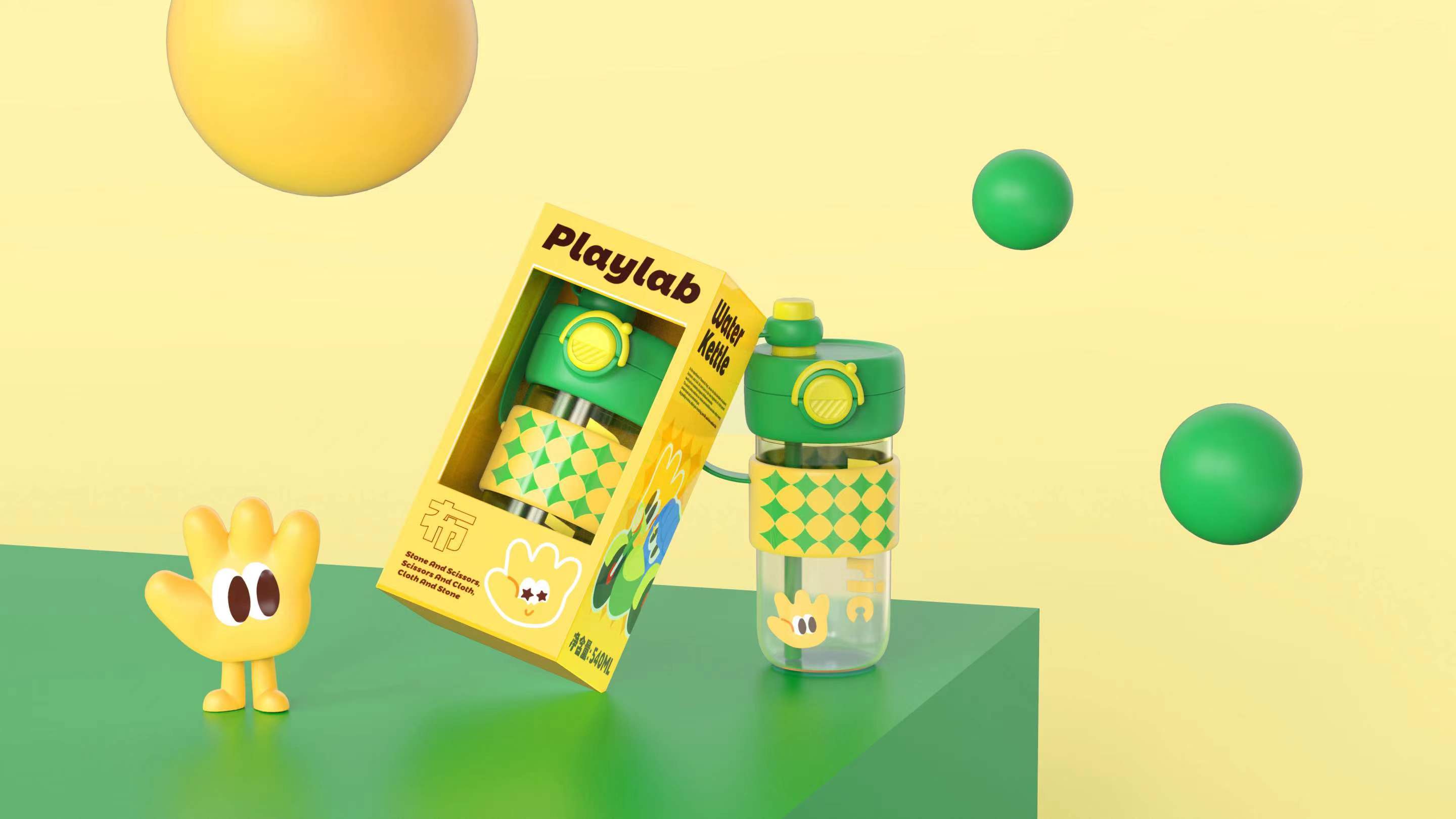
If the "marriage" between IP and water cup is only the coating change of appearance, consumers will have a "leek feeling". Because of this, the Octavia design adds a double drink to this accompanying cup. According to the different drinking scenes and habits, users can freely choose the straw or open the lid to drink.
"Water cup = lifestyle. 」 A cup can be applied in different scenes, and different scenes can also be matched with different cups. Playlab is not only the wonderful operation of IP and product function stacking buff, but also the happiness that users dig out when studying new patterns of cups.

The copyright of this work belongs to 明锐设计. No use is allowed without explicit permission from owner.

New user?Create an account
Log In Reset your password.
Account existed?Log In
Read and agree to the User Agreement Terms of Use.
Please enter your email to reset your password


Very cute, feel very energetic! If you are willing to buy it!
UOOHA
I like this style.
The feeling of young
good tide