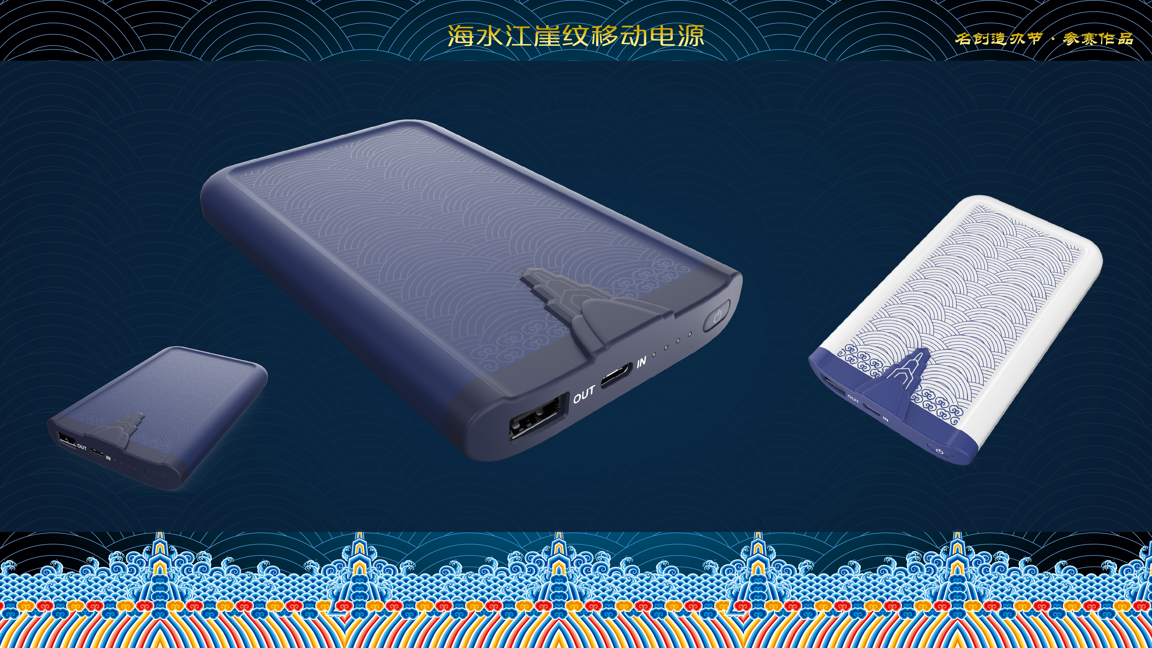
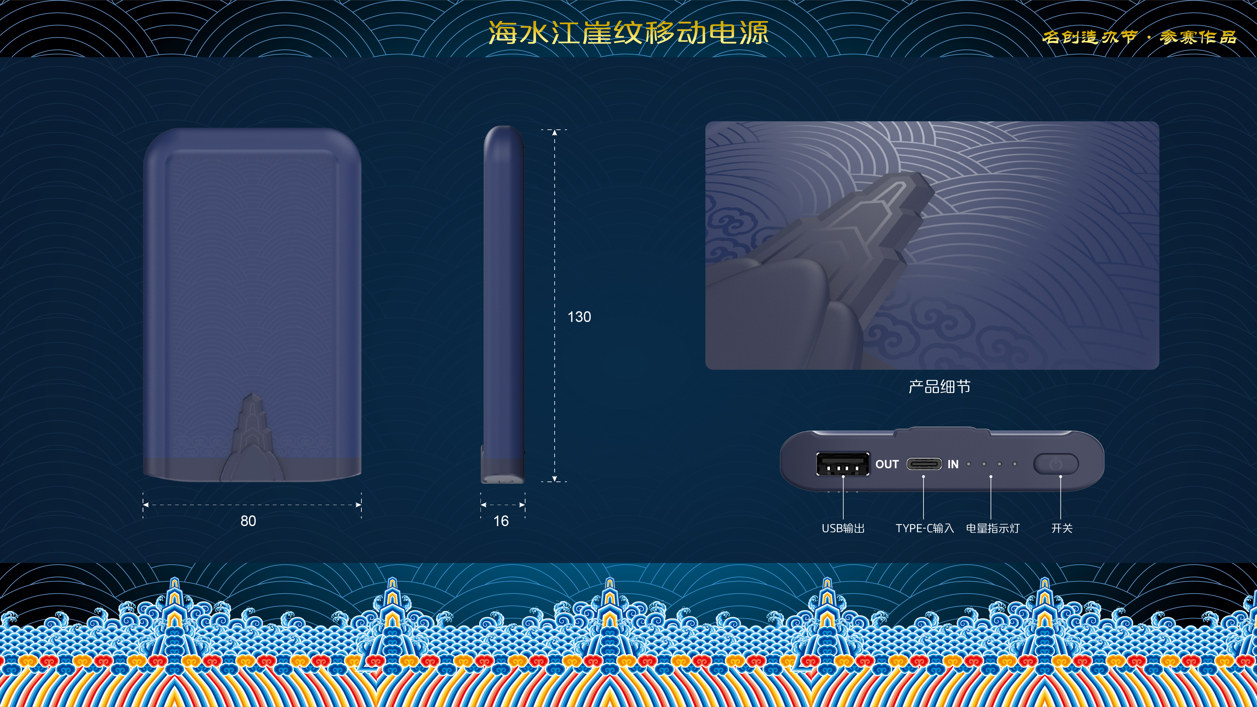
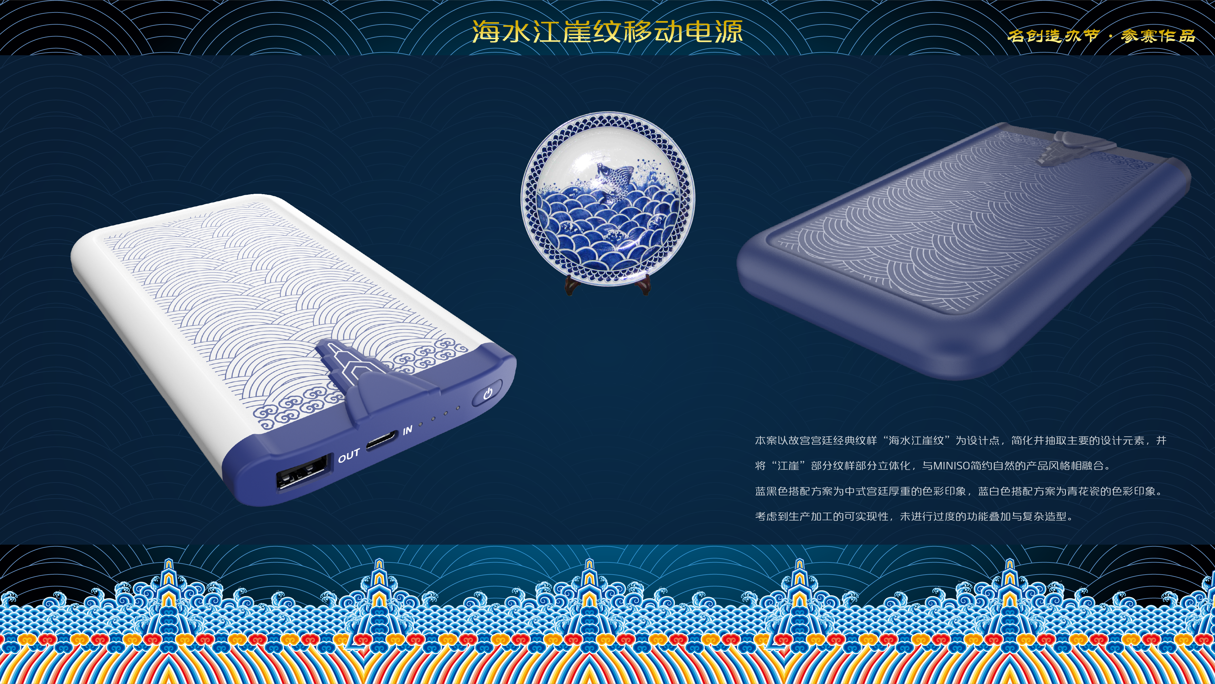
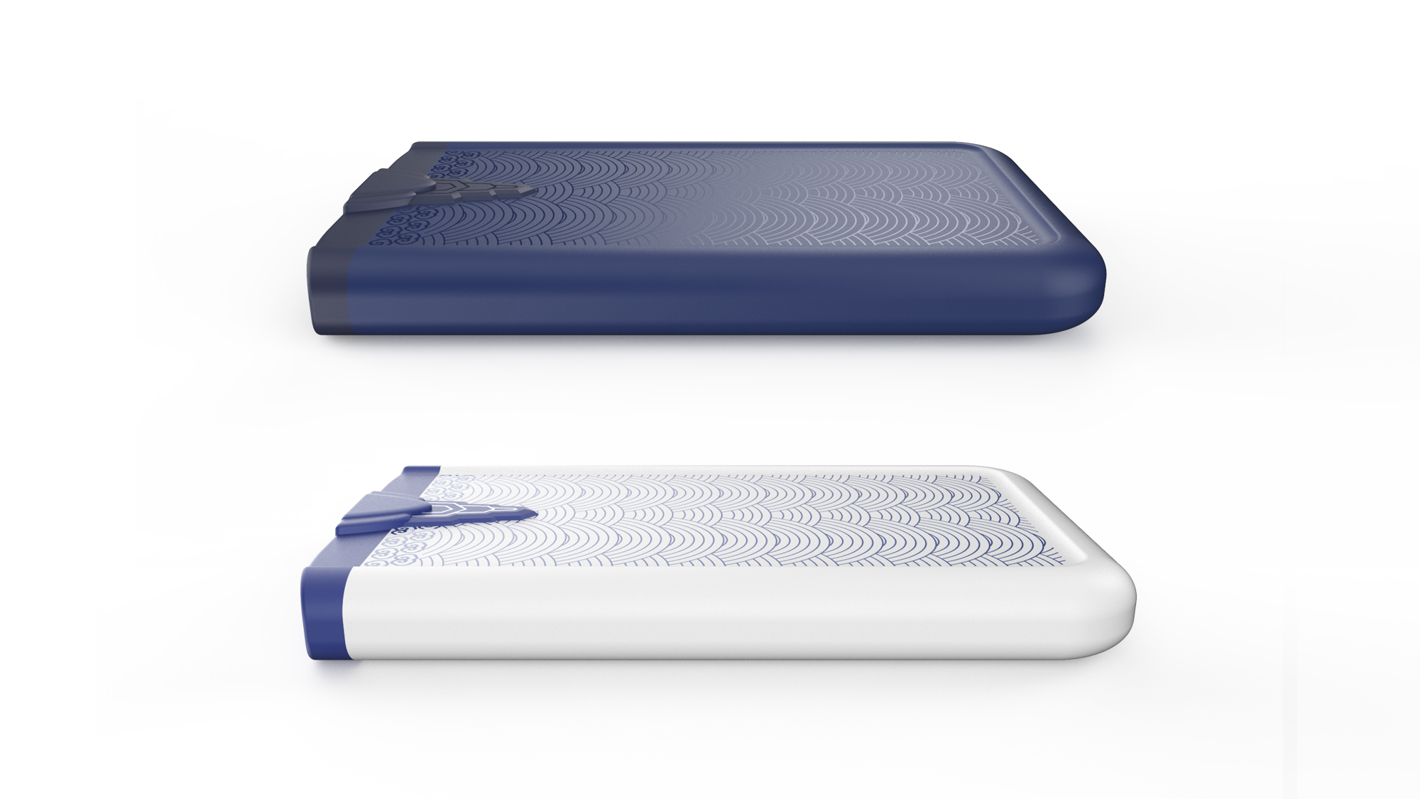
I usually like the product style of MINISO, and I am full of respect and awe for the culture of the Forbidden City. As a professional industrial designer, I seldom have time to participate in the competition, but the judging criteria this time touched me a little. The first design of cultural and creative products was carried out by oneself, and it took a lot of trouble from the selection of the case to the conception to the decision. Although eventually lost, also gladly accept; to see the final award announcement (https://www.puxiang.com/subject/miniso/award), there are like, some admire, but also confused, pre-match signs of visual tone, innovation, mass production, normative criteria should be treated? But the original purpose of participation is to communicate and share, the other light.
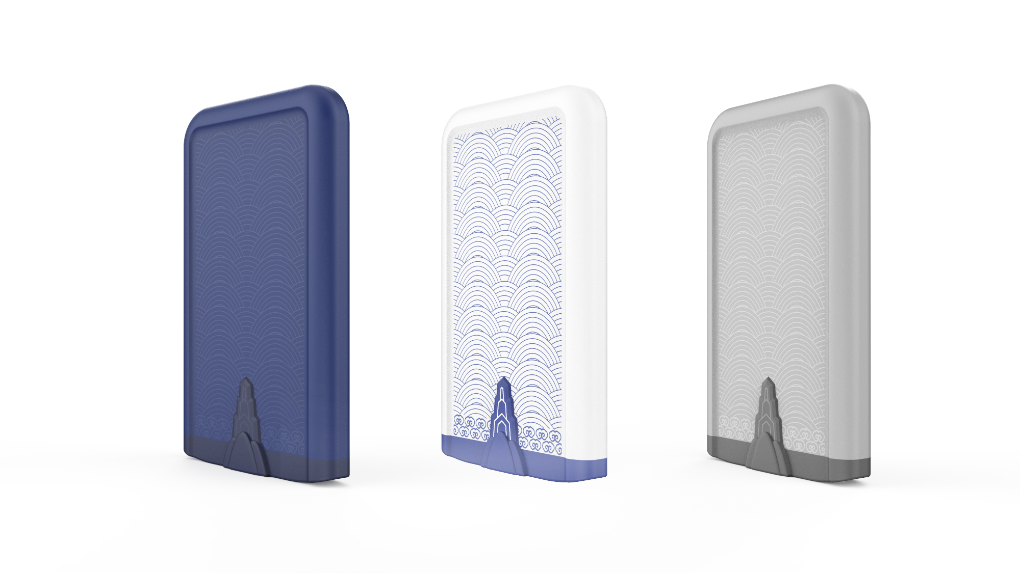
The copyright of this work belongs to etherealelf. No use is allowed without explicit permission from owner.

New user?Create an account
Log In Reset your password.
Account existed?Log In
Read and agree to the User Agreement Terms of Use.

Please enter your email to reset your password
Ah, courage is good, it is worth learning.
Blue is good, white is good, and the writing is well written... I really can't make it up.
Symbolization is better
Hard work, even if the creativity is not good enough, the shape is not good enough, and there is not enough theme.
After seeing the winning work, "alas"
Alas
The pattern elements are well used.
It's pretty good.