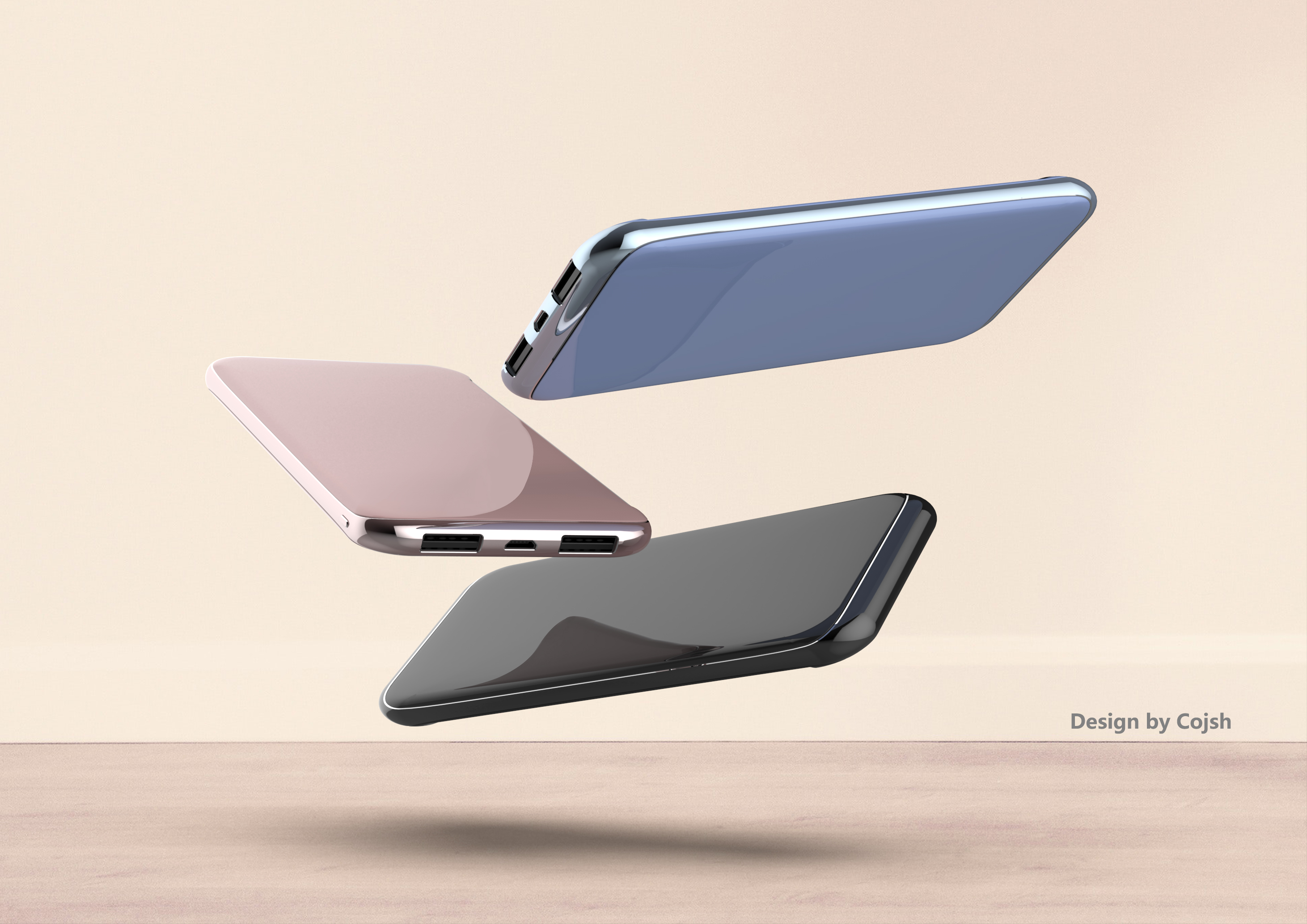
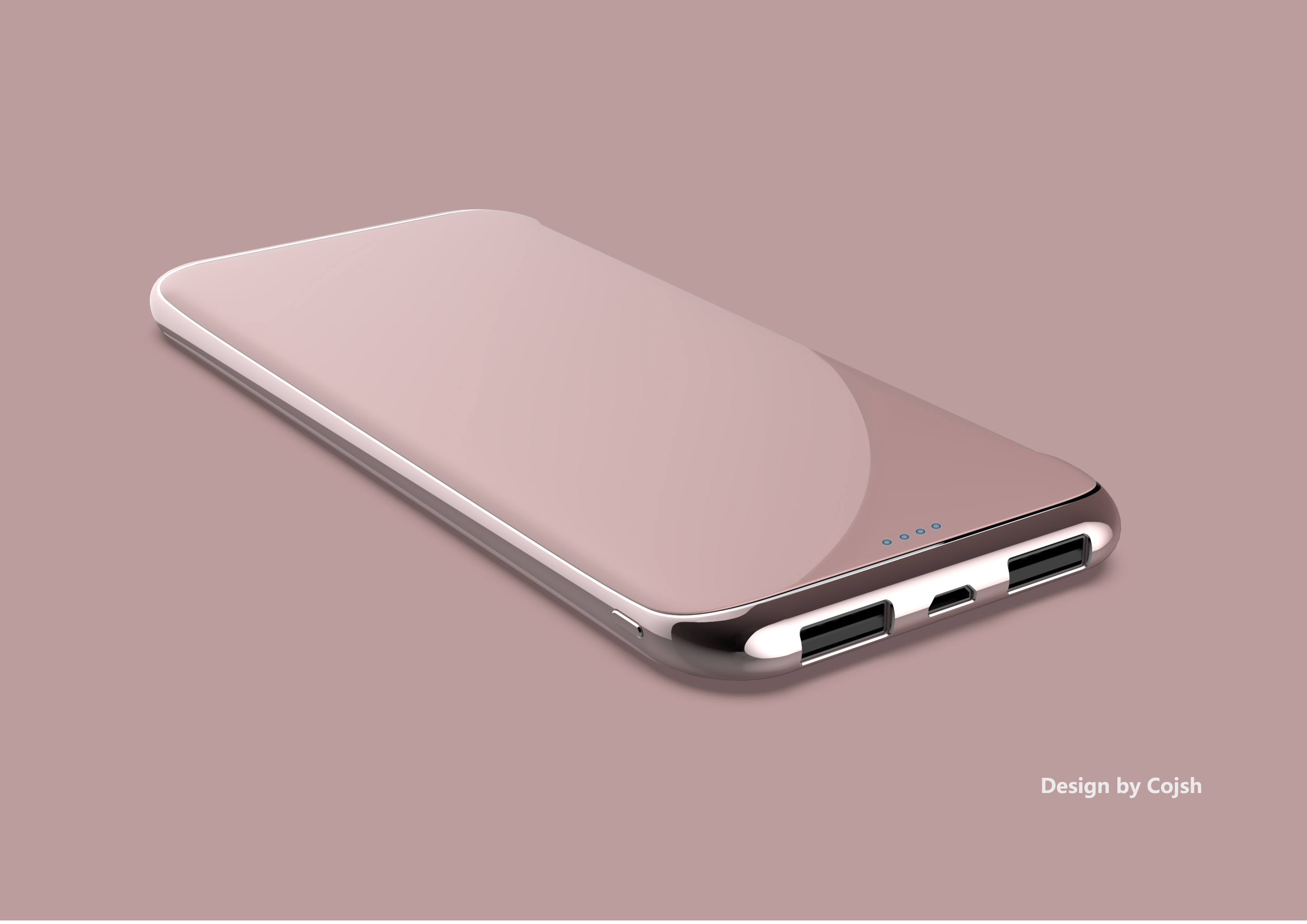
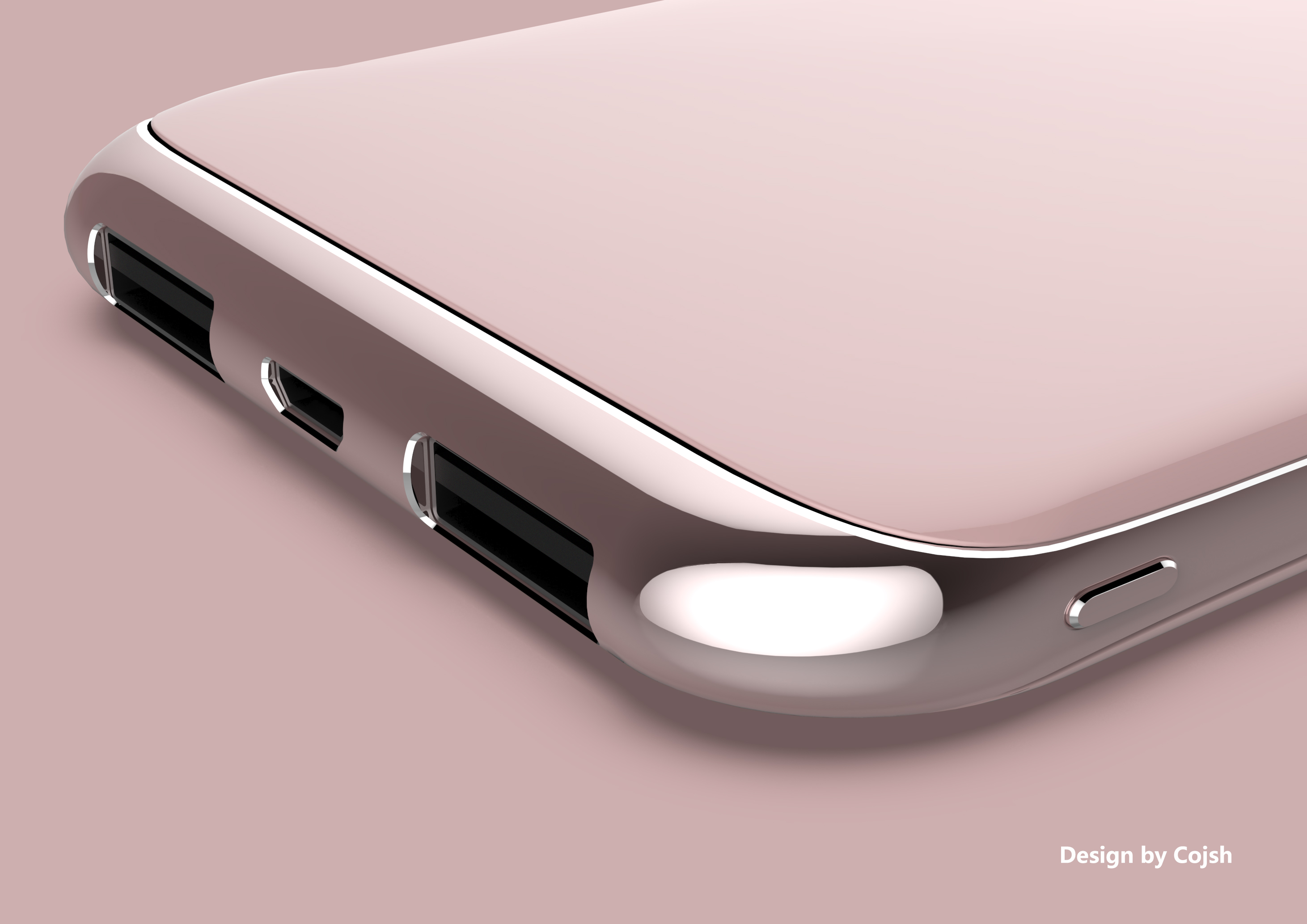
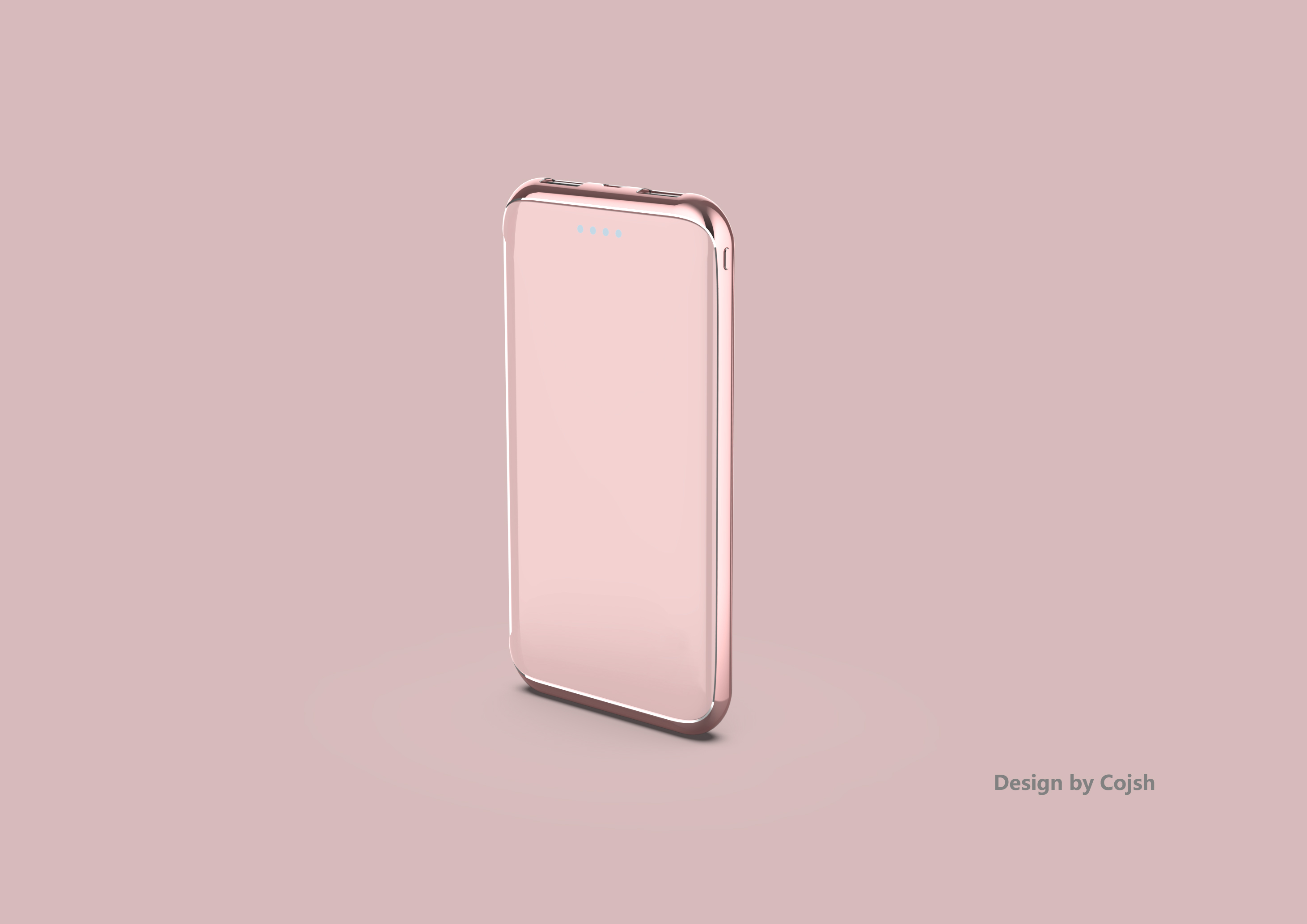
The round shape is divided into pieces by the cutting method of the curved screen of the current mobile phone. The smooth upper and lower shells and the middle metal frame are inlaid with bright noodles, forming a strong visual impact and giving the product a friendly emotional space.


The copyright of this work belongs to Cojsh. No use is allowed without explicit permission from owner.

New user?Create an account
Log In Reset your password.
Account existed?Log In
Read and agree to the User Agreement Terms of Use.

Please enter your email to reset your password
For small companies, following the trend with the lowest cost material is indeed the safest way. But from a design point of view, there is really no design of any value.
Three-three-Samsung S8?· · ·
How do I feel like a mobile phone case, and in this highly homogeneous design market, why are I doing almost the same thing with no innovation... personal point of view, don't spray if you don't like it
It looks too much like a mobile phone.