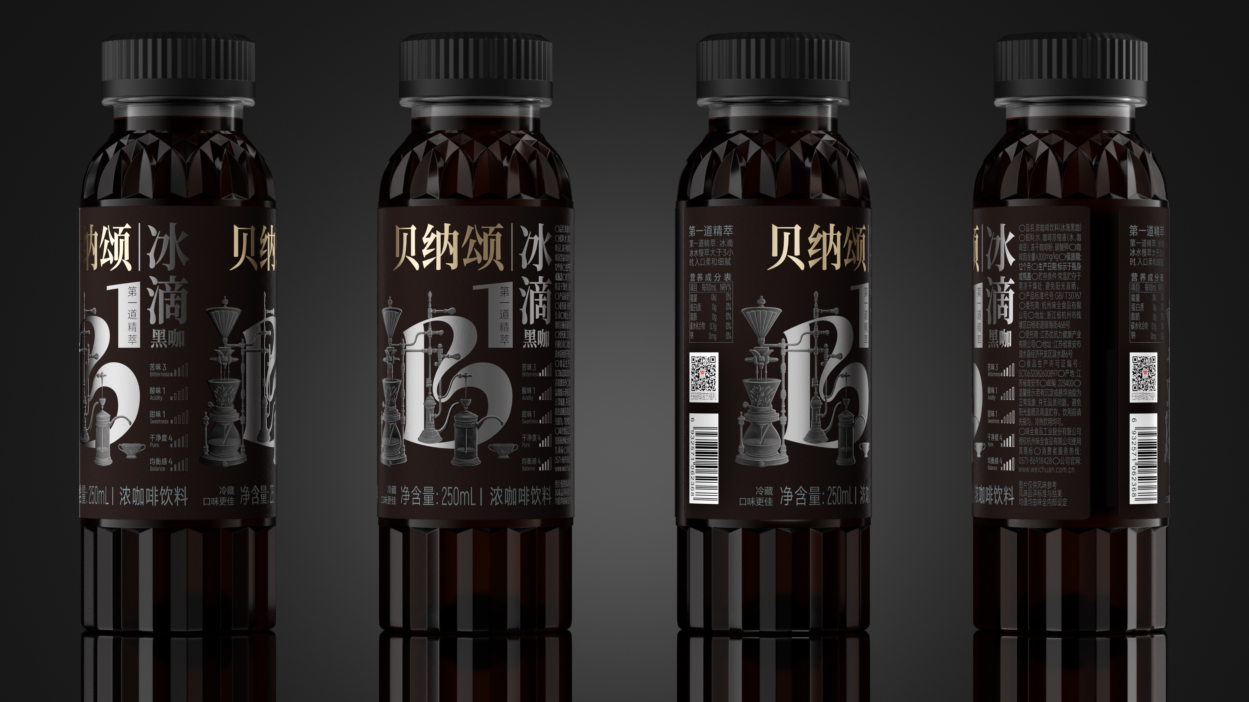
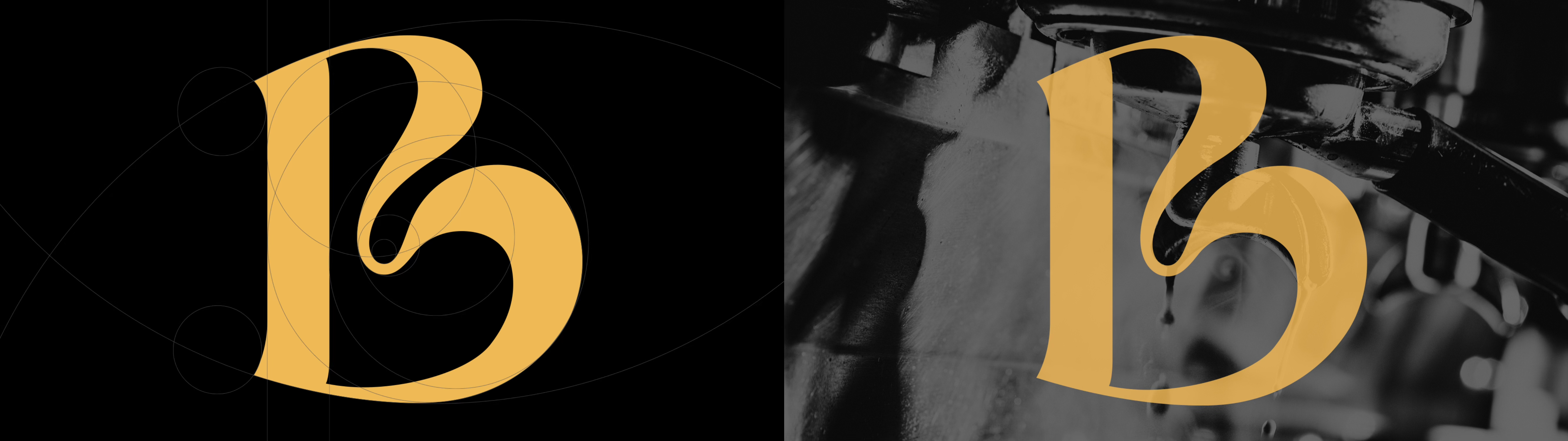
In this packaging upgrade of Benasson Coffee, Pan Hu Design Laboratory took the brand initials "B" and the number "1" as the core visual symbols to form a brand logo with both recognition and spirit, representing the brand's dedication to first-class quality and high-quality coffee extraction. The overall packaging design combines exquisite hand-drawn illustrations and innovative bottle structures to restore the ritual of making coffee from visual to tactile. Strengthen the high-end temperament of the brand in the details. The goal is to help Benasson create a new visual identity that resonates with coffee drinkers who focus on taste and aesthetics.
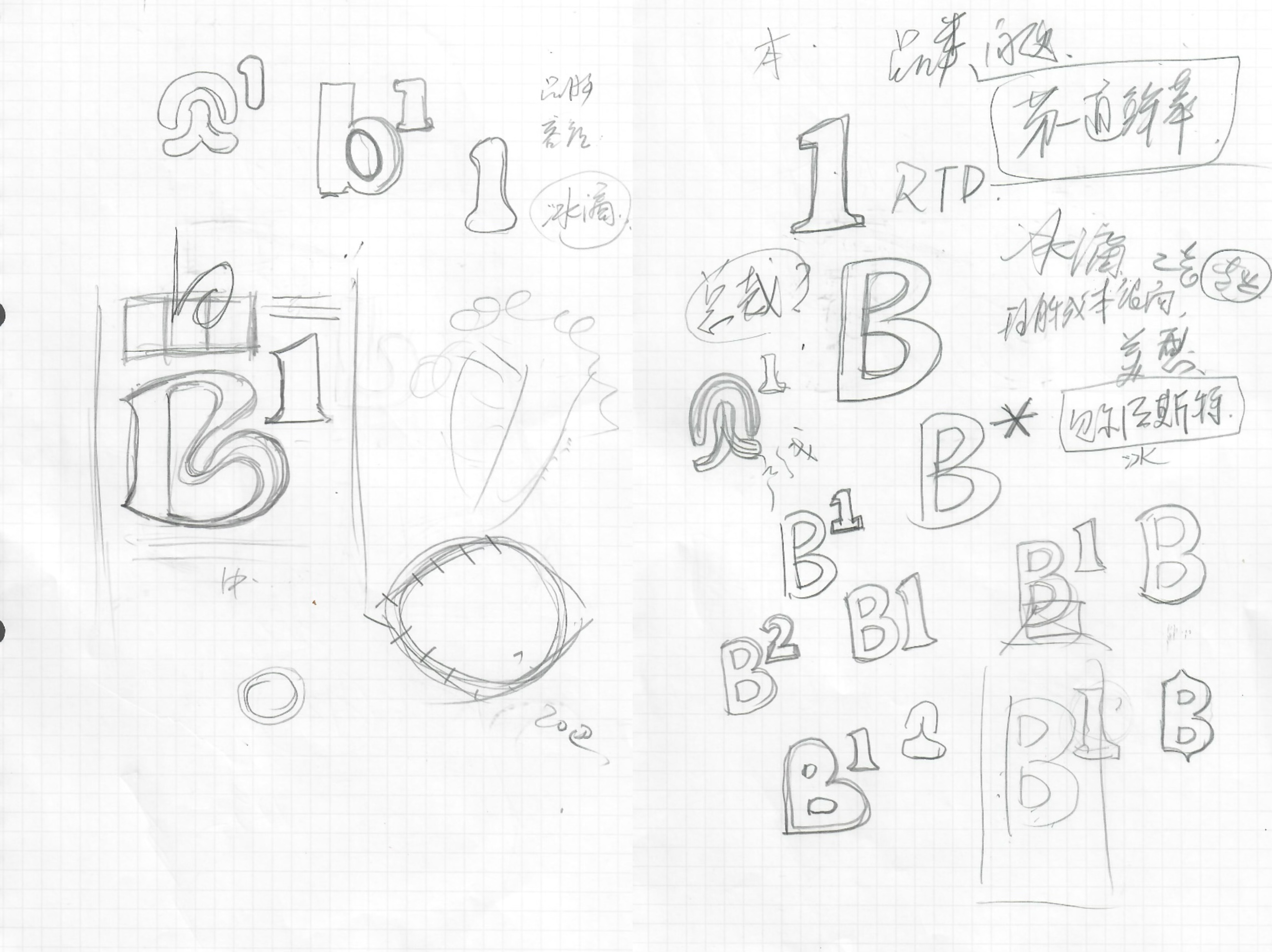
Part of the preliminary sketch
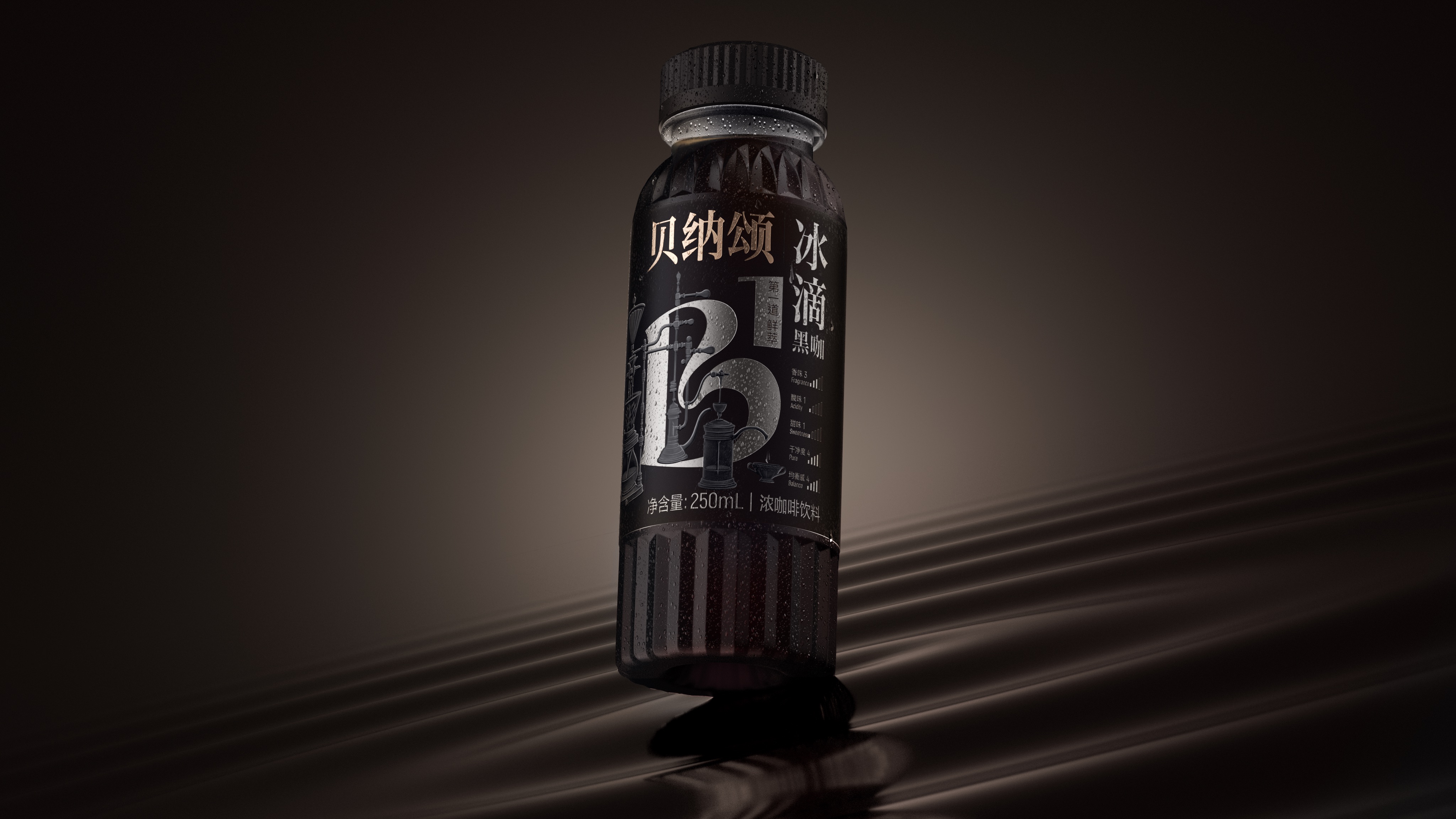
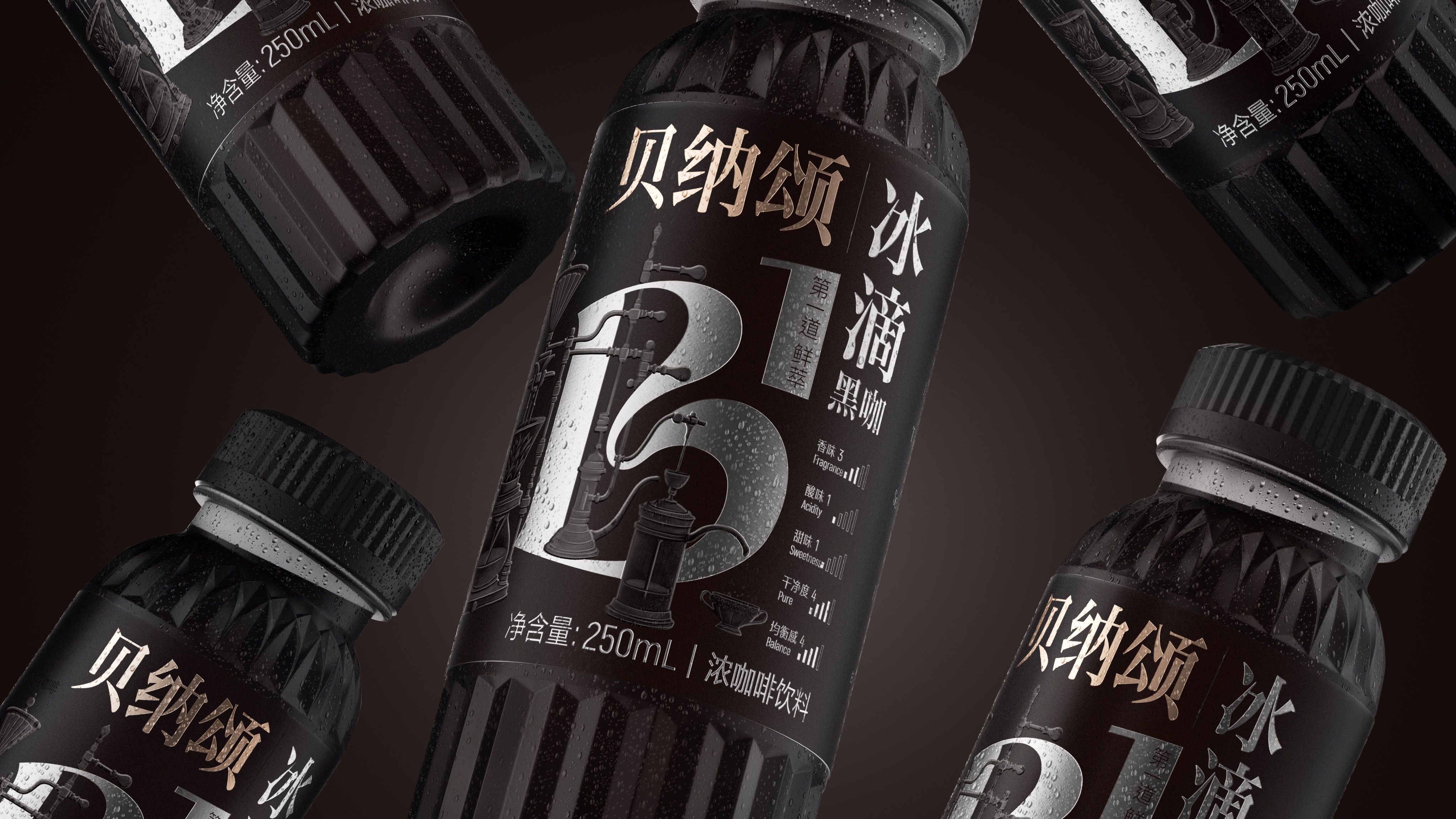
The name of the work, Benasson Ice Drop Black Cafe
Brand Holding | Hangzhou Weiquan Food Co., Ltd.
Original Design, Tiger Pan
Executive Design, Xia Xuedan
Illustration Drawing, Yi Ping
Visual Presentation, Zhu Yuling, Wang Qichang
Process Design, Xie Zhangkun, Lu Miaorong
Project Management, Peng Lei
Media Relations | Xiang Lingli

New user?Create an account
Log In Reset your password.
Account existed?Log In
Read and agree to the User Agreement Terms of Use.
Please enter your email to reset your password


It's too high
Master Pan's Works
It tastes good at a look