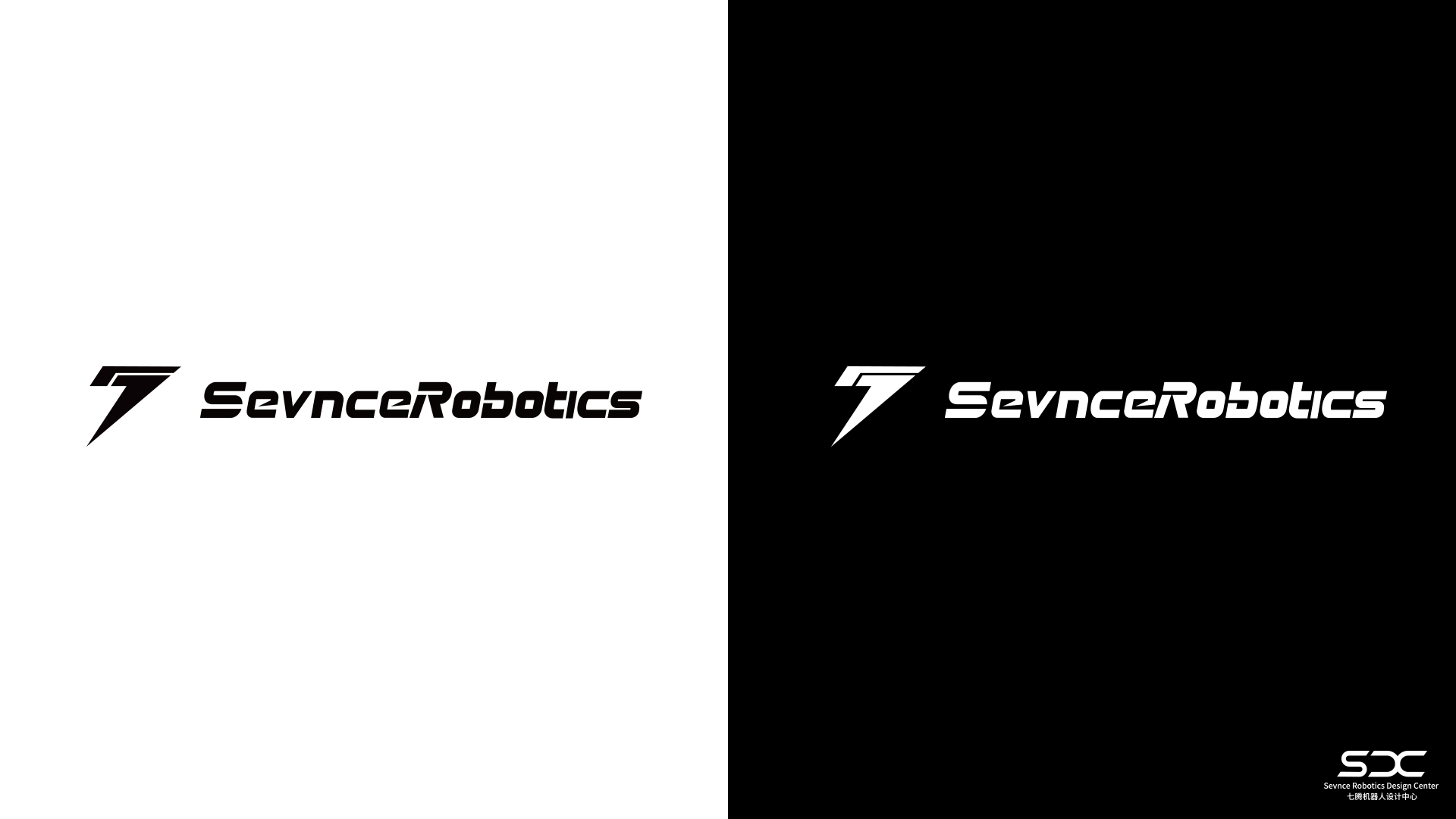
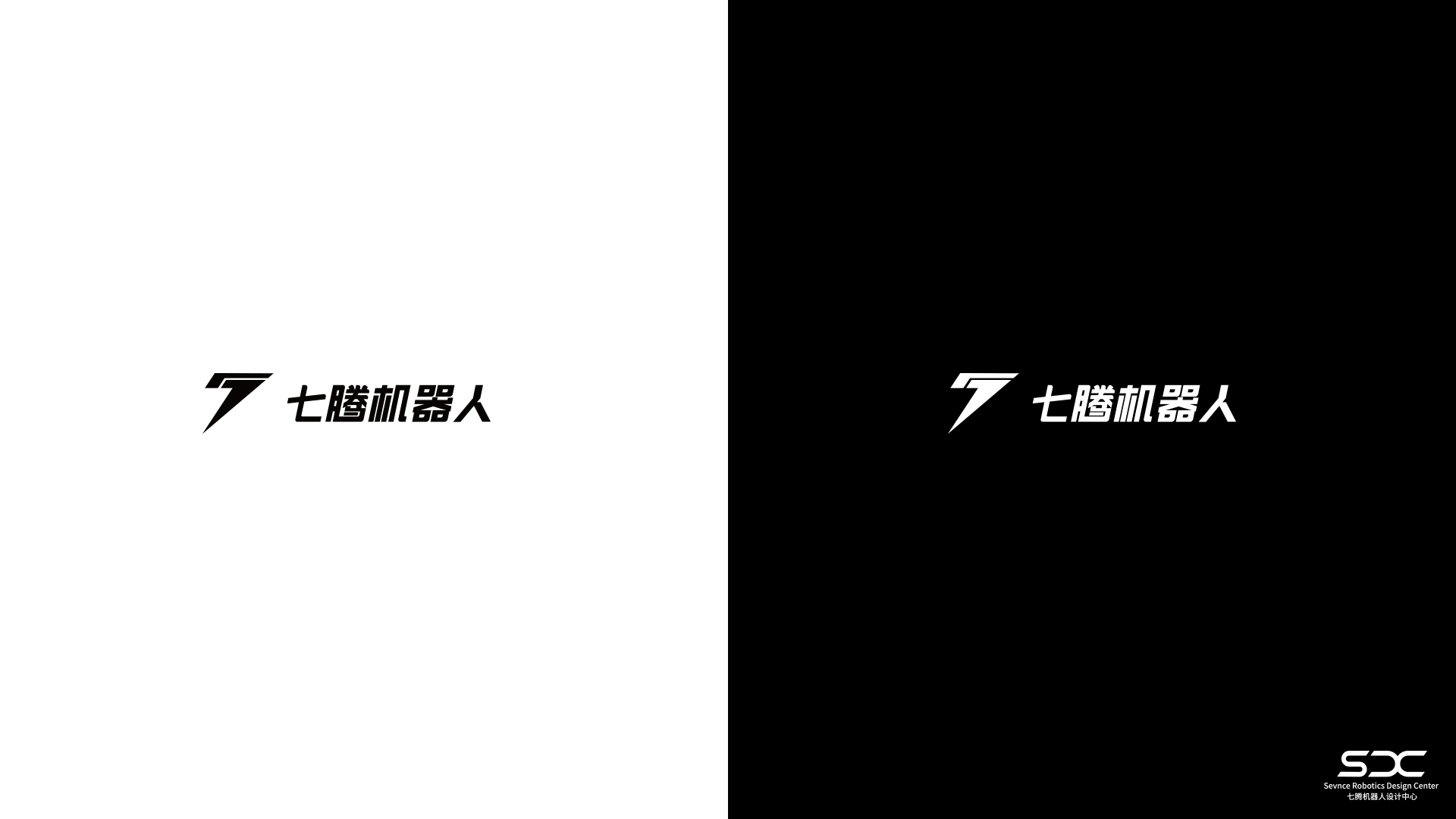
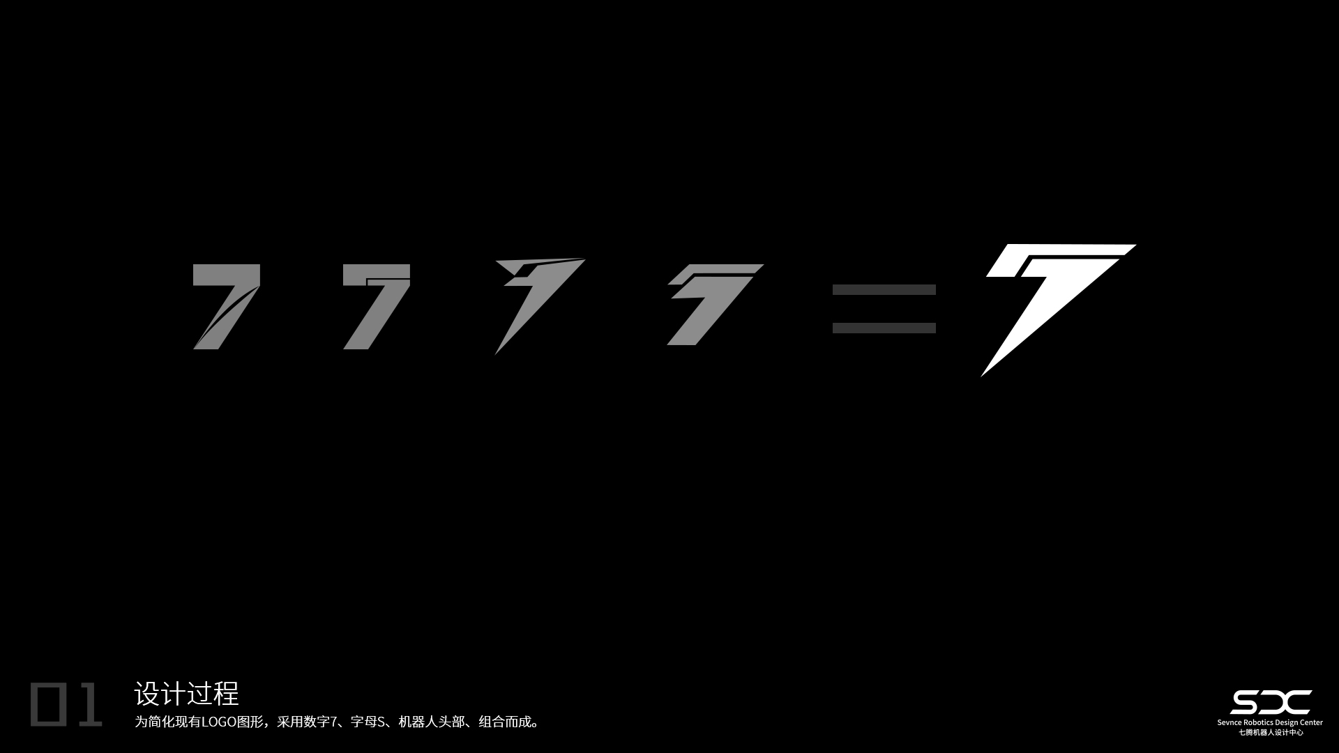
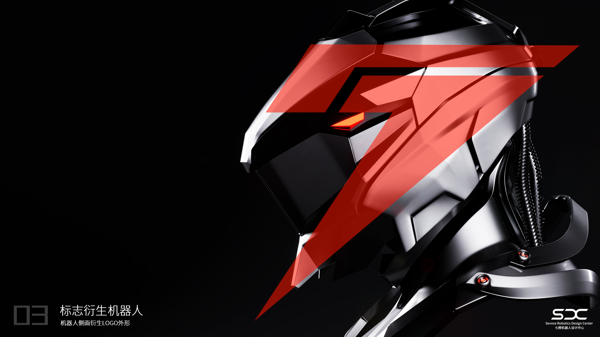
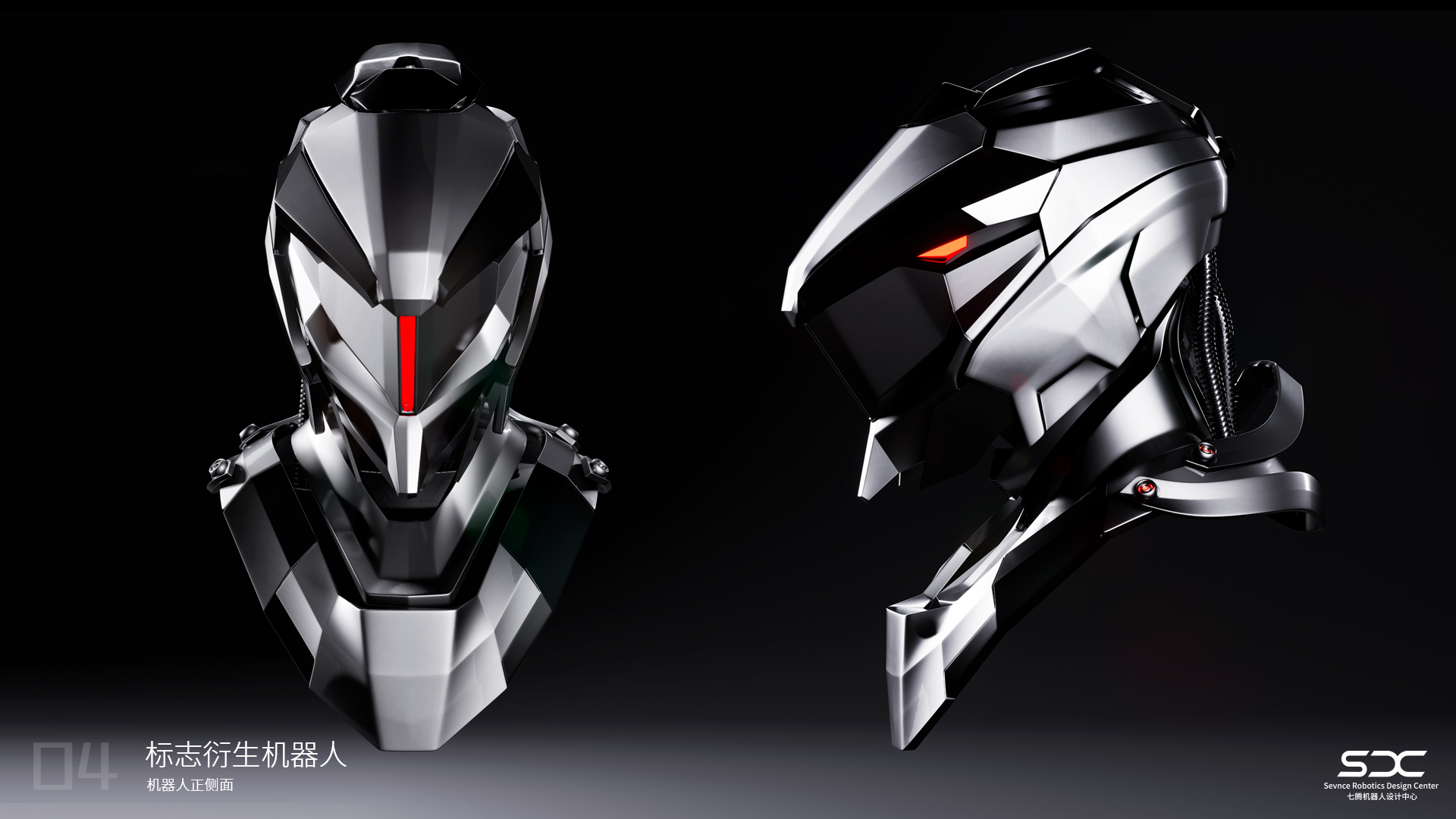
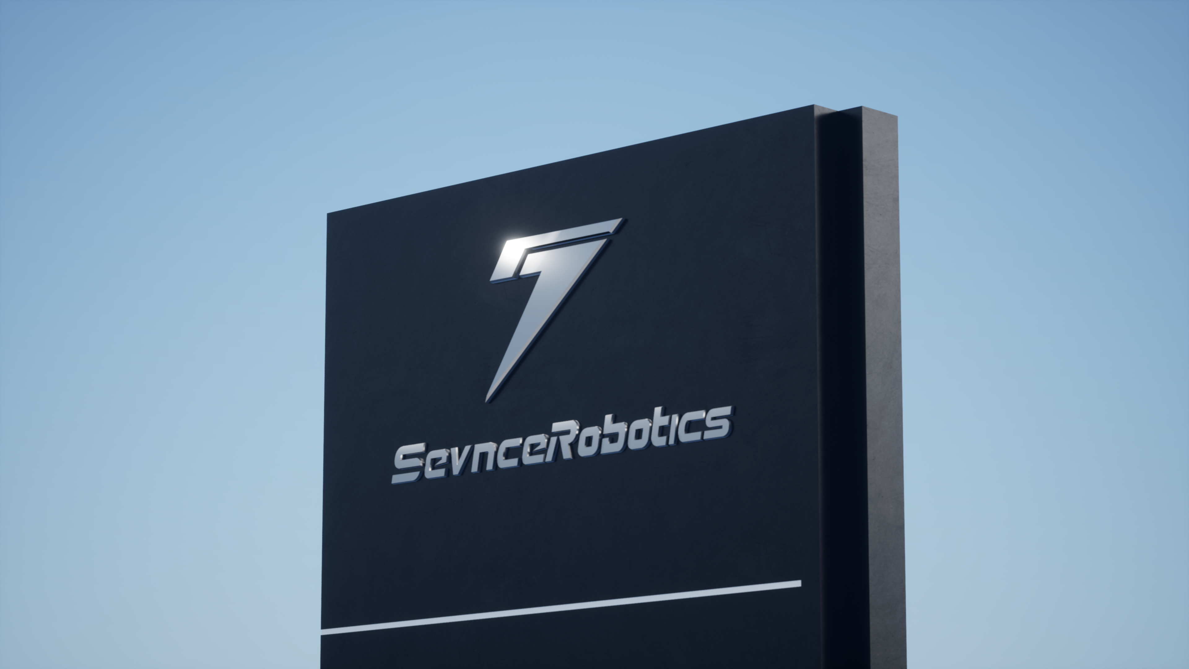
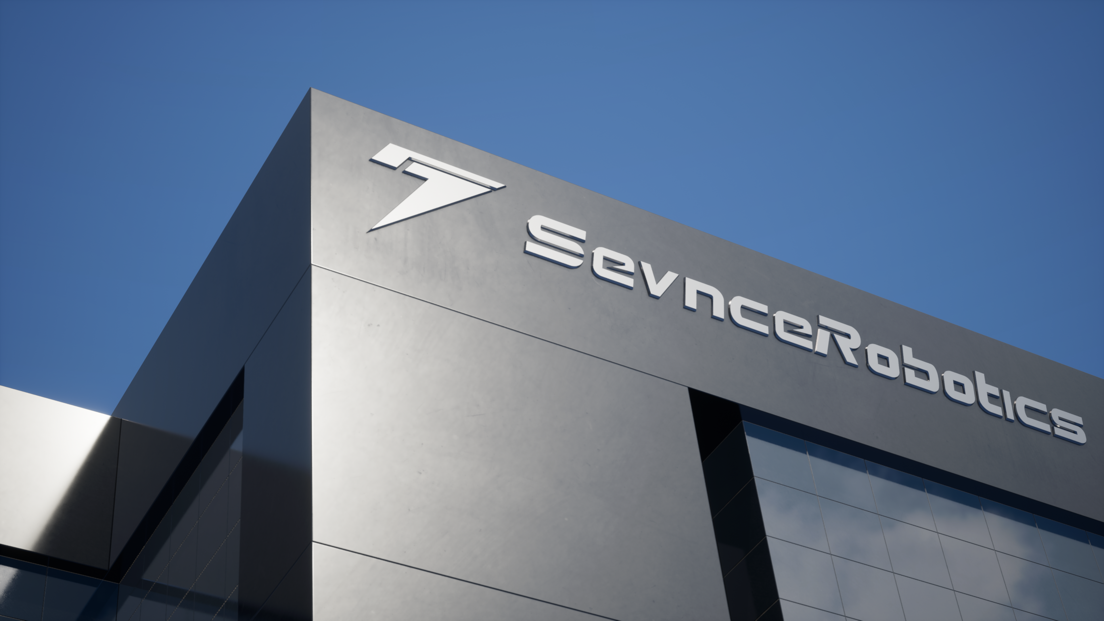
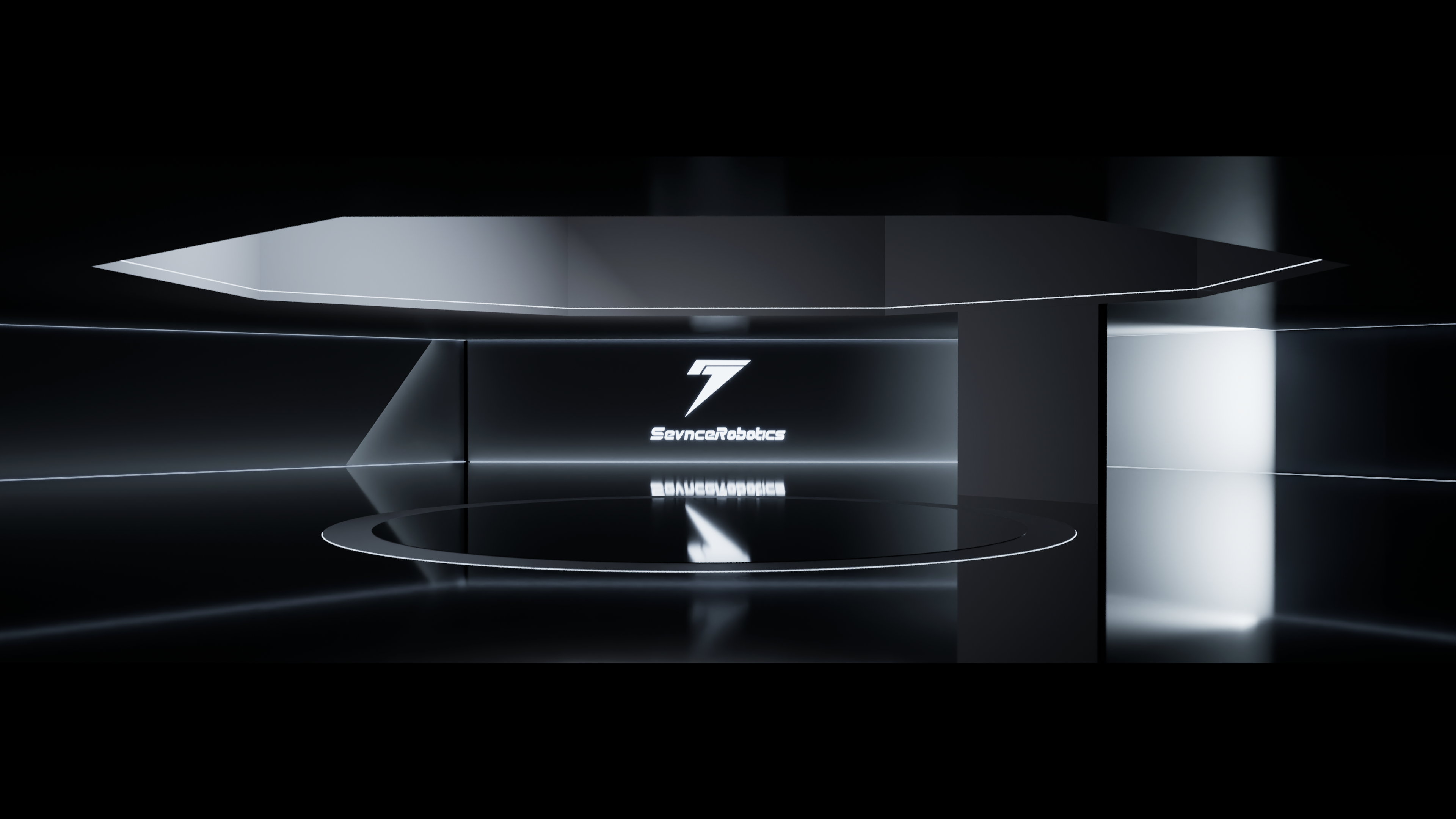
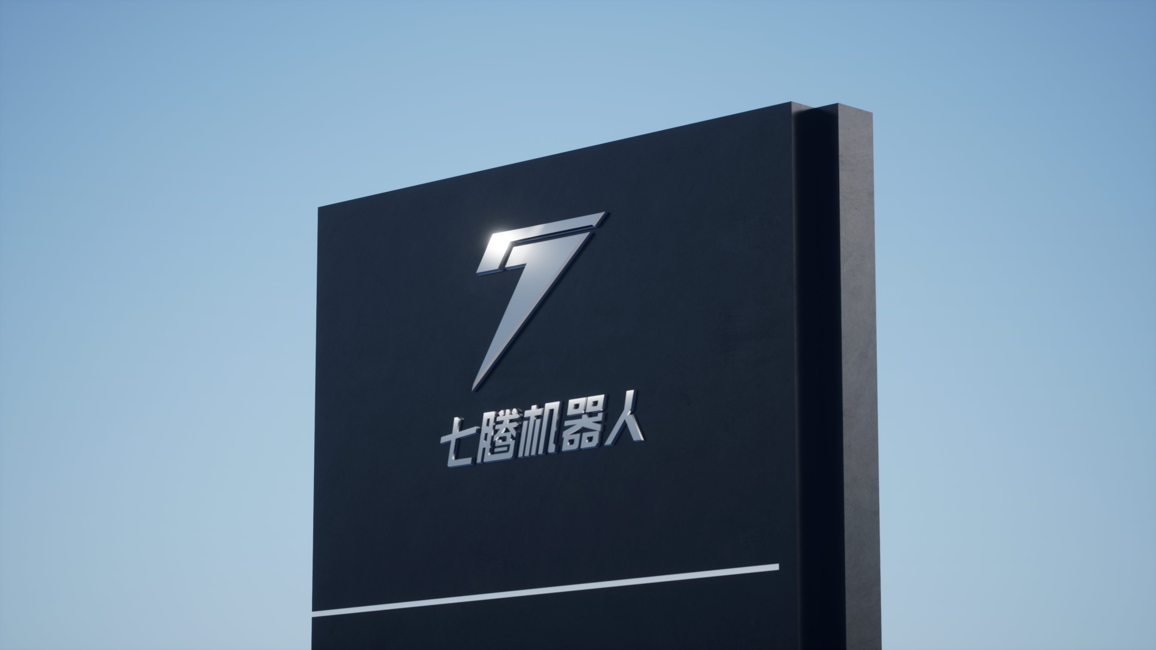
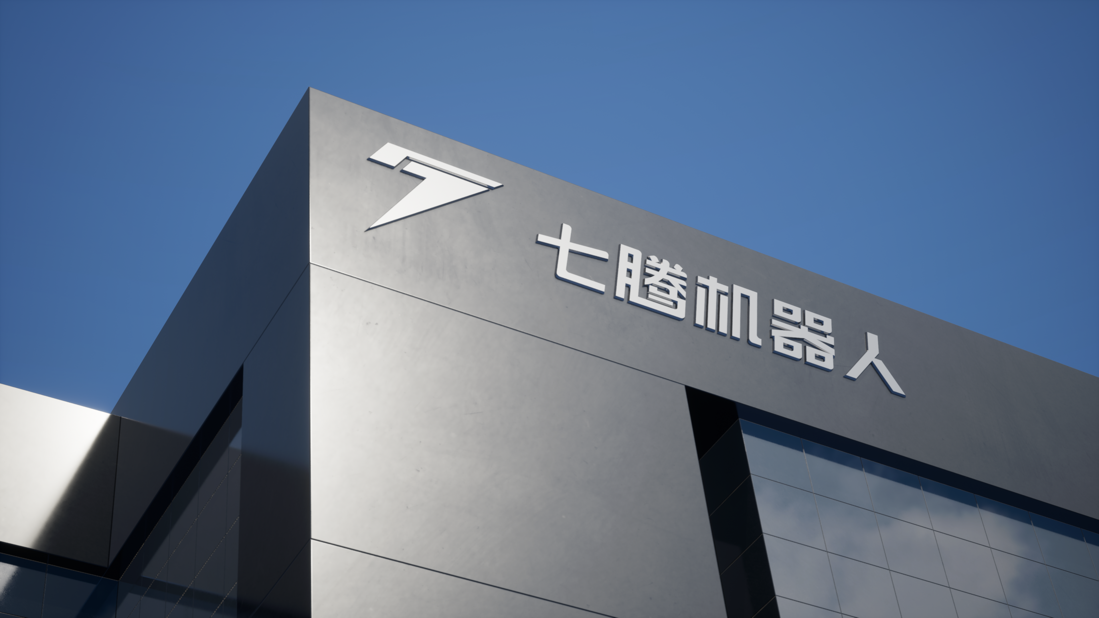
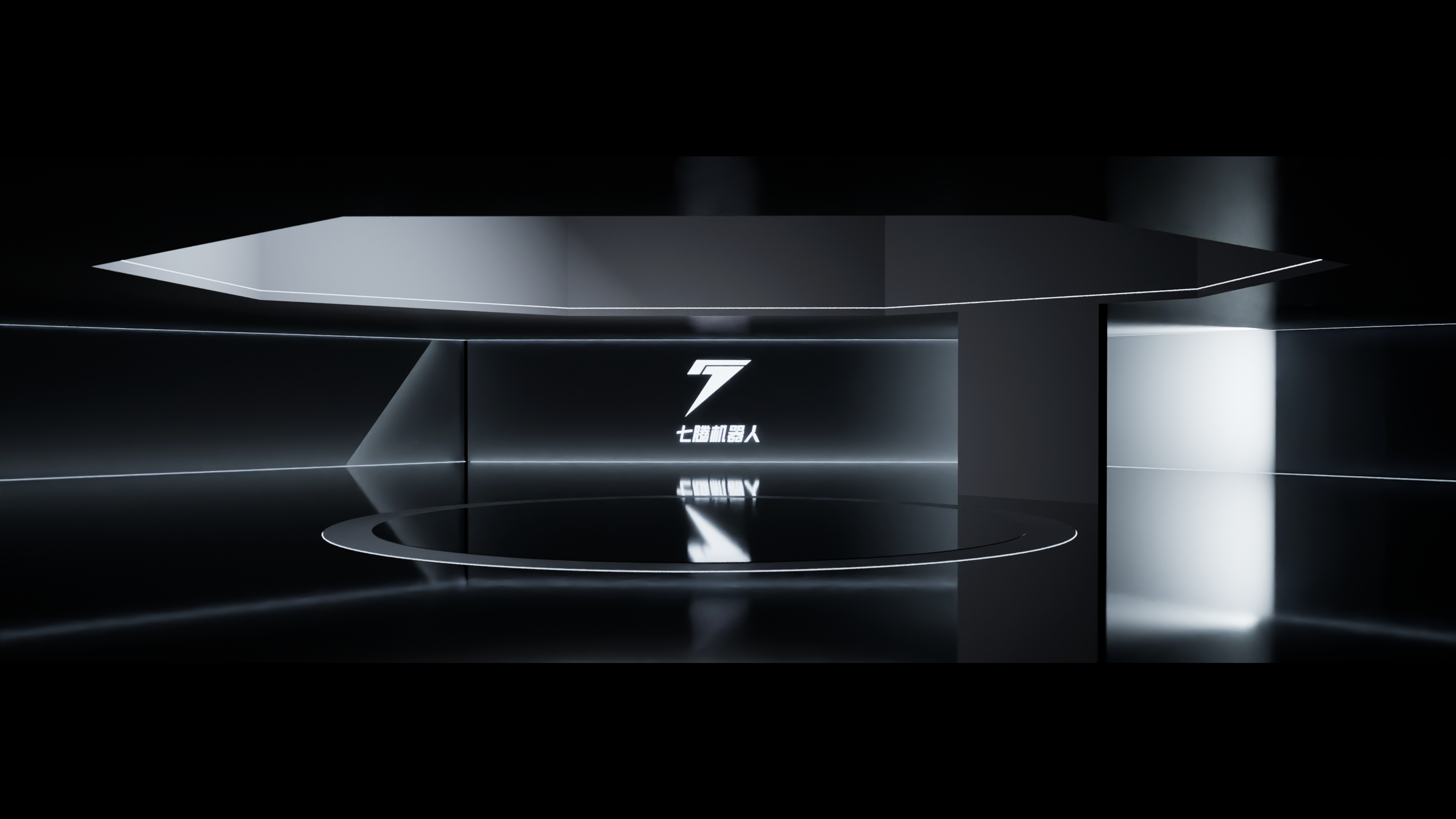
The logo graphic of Qiteng Robot is made by simplifying the combination of existing elements. Its design concept is to combine the number 7, the letter S and the robot head to achieve a simple and recognizable effect. The number 7 is part of the logo graphic, which represents the uniqueness and unique personality of the Qiteng robot. The number 7 was carefully designed into a streamlined shape to highlight the modern and technological feel of the robot. The letter S is also part of the logo graphic, which represents the first letter of the name of the Qiteng robot. The letter S has been optimized and simplified to conform to the overall design style and echoes the number 7. This design makes the LOGO graphics more concise and clear, but also enhances the brand recognition. The robot head is one of the core elements of the LOGO graphic. It symbolizes the core business and technology of Qiteng Robot. The robot head has been carefully designed and optimized to make it futuristic and technological, and has been integrated with the number 7 and the letter S to form a unique and creative combination. By combining the number 7, the letter S and the robot's head, the logo graphic of the Qiteng robot simplifies the existing elements and forms a unique and creative logo.


New user?Create an account
Log In Reset your password.
Account existed?Log In
Read and agree to the User Agreement Terms of Use.

Please enter your email to reset your password
domineering side leakage
Fashion
This logo is great.
The appearance is so cool
That's cool.