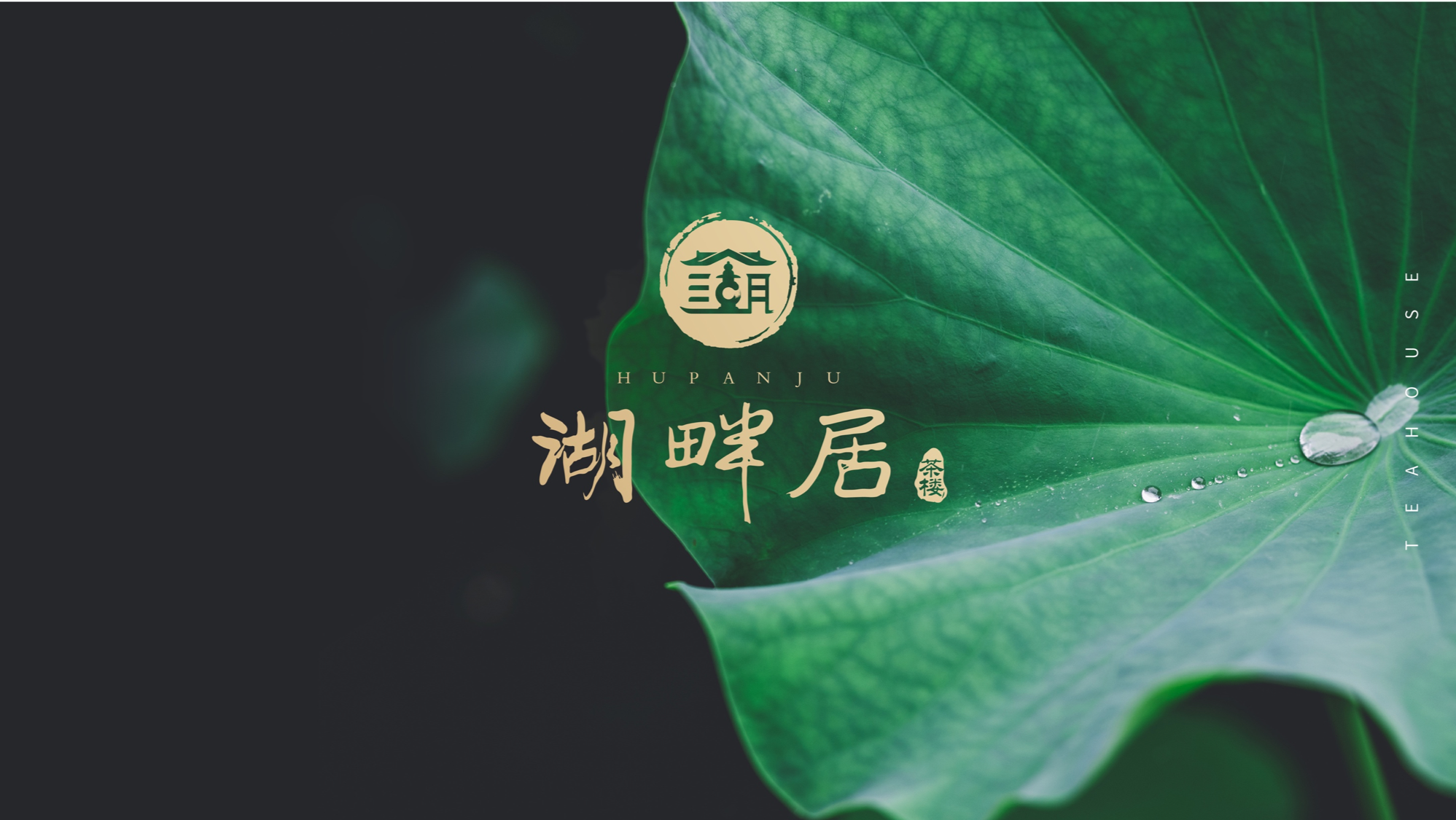
Service Customer: Lakeside Residence
Service Team: Rhett Design Brand
Service Content: Brand Strategy | Brand VI Design | Packaging Strategy | Packaging Design
Service Time: 2019
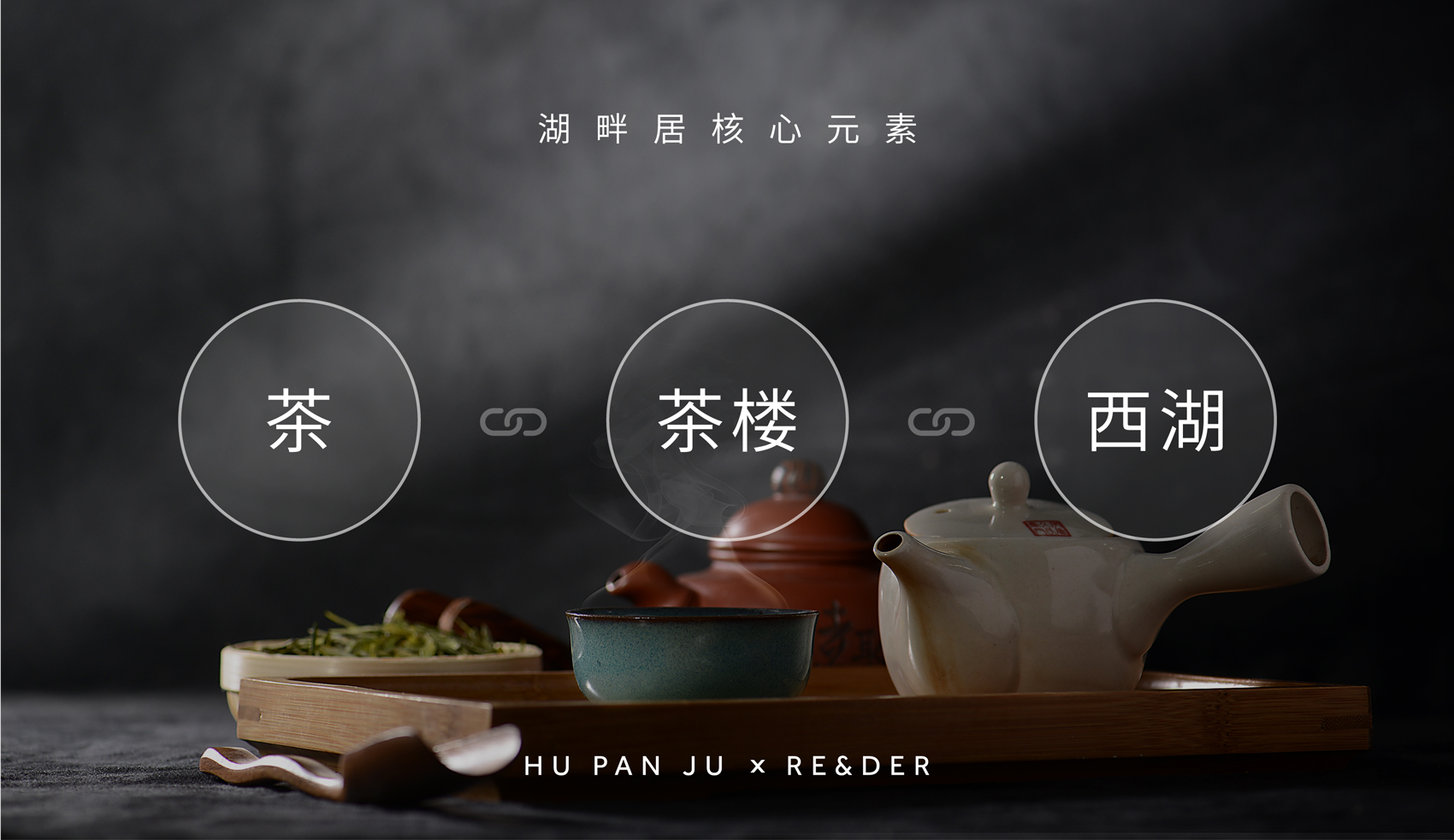
For Hangzhou people, a cup of Longjing and a teahouse can enjoy a whole day's leisure. Among them, the "Lakeside Tea House" closest to the West Lake is not only loved by tea guests, but also an important platform for political and cultural exchanges. During the 2016 Hangzhou G20 Summit, CCTV media broadcast the "Eye of the West Lake" to the world ".
# Visual Language Containing Culture
It is a super symbol and a cultural mark.
Rhett design brand has created a highly graphical "lake" character for lakeside residence creativity, which is both "lakeside residence" and "West Lake". It combines the brush strokes in traditional Chinese calligraphy art, strengthens the brand temperament in details, and perfectly matches the national style temperament of the teahouse. Combined with urban culture, let the brand achieve the effect of 1 1 far greater than 2 when spreading.
# Tea packaging that can tell stories
Good tea also needs good packaging. Tea packaging not only directly connects tea customers and brands, but also conveys the values and culture of teahouses.
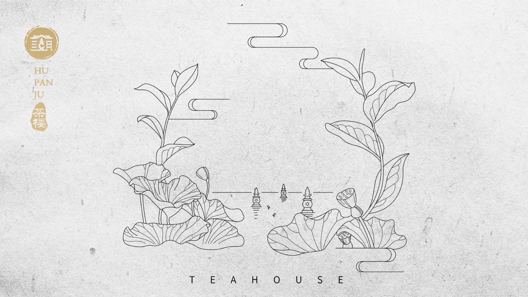
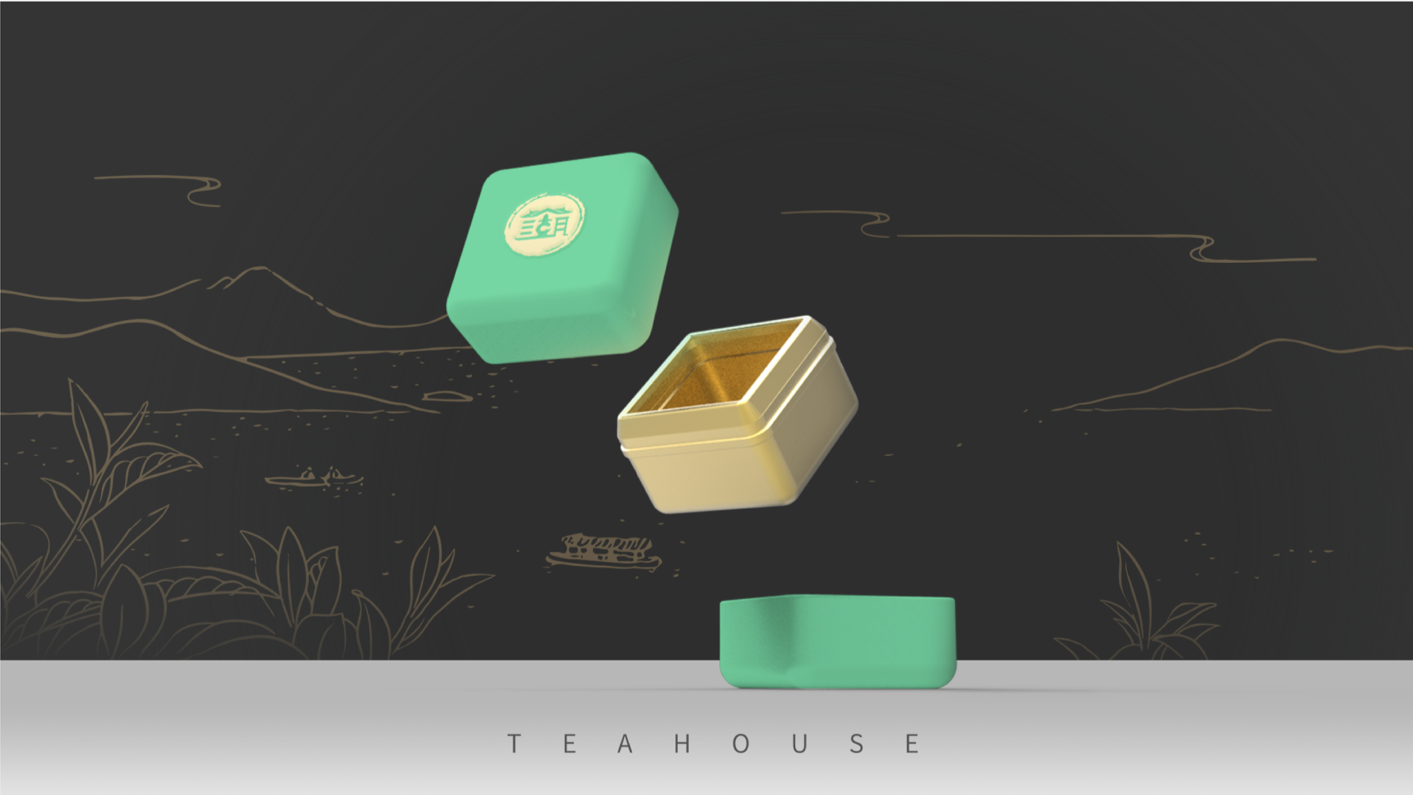
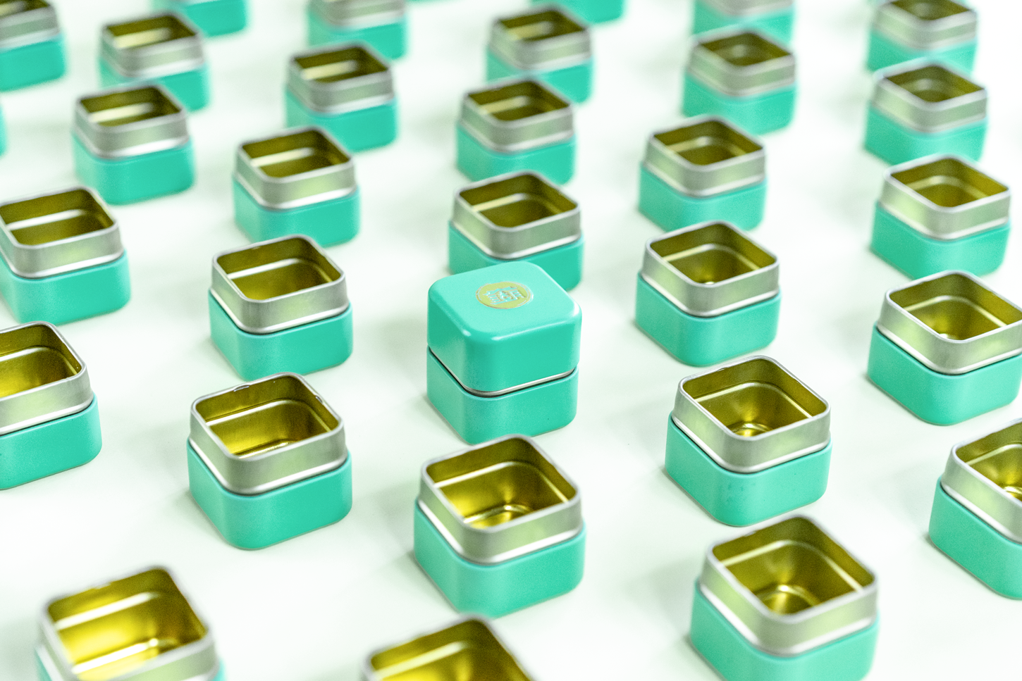
The brightness and saturation of the color of the tea can are higher than before, and the overall vision is fresher and more natural. The illustration is based on the characteristics of the veins of Longjing tea, taking the buds and leaves as the prototype, and integrating into the representative West Lake landscape. The team also created a star product with excellent beauty and art-small square can for lakeside residence innovation, redefining the public's tea consumption experience.
The birth of new visual symbols not only represents the new image of the brand, but also becomes a new window to promote the development of Hangzhou tea tourism industry and a new business card to promote the spread of tea culture.
/Super Design Triggers Business Future

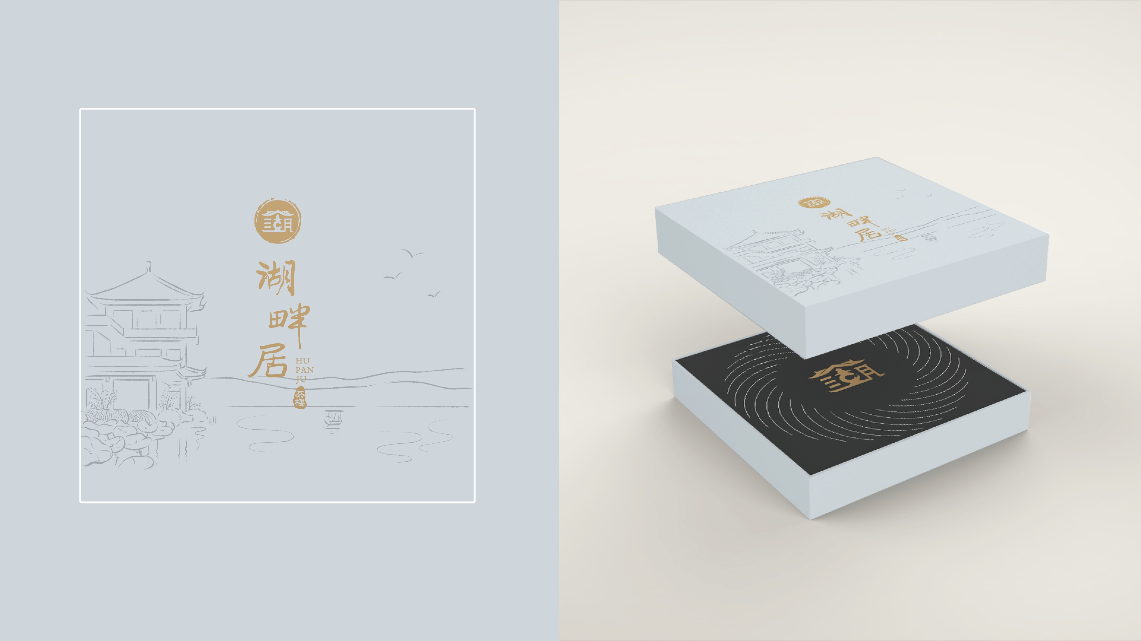
The word "lake" is both "lakeside residence" and "West Lake". It combines the brush strokes in traditional Chinese calligraphy art and strengthens the brand temperament in details.

The pinyin "HU PAN JU" of Lakeside House uses a symmetrical font to enhance the recognition of LOGO.
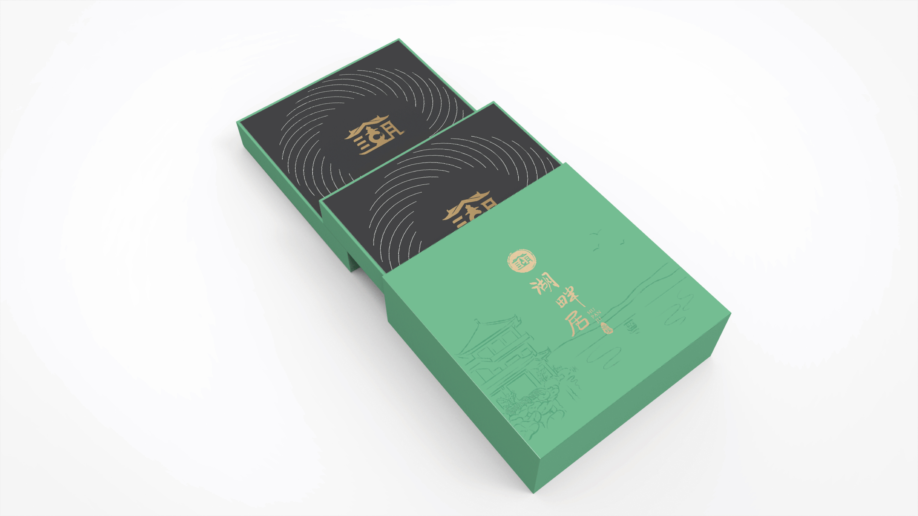
New colors for teahouse packaging
Green Tea & White Tea Pot (New)

Green Tea & Black Tea Pot (New)

Compared with symbols and words, the illustration of the can body is more expressive in telling the product story.
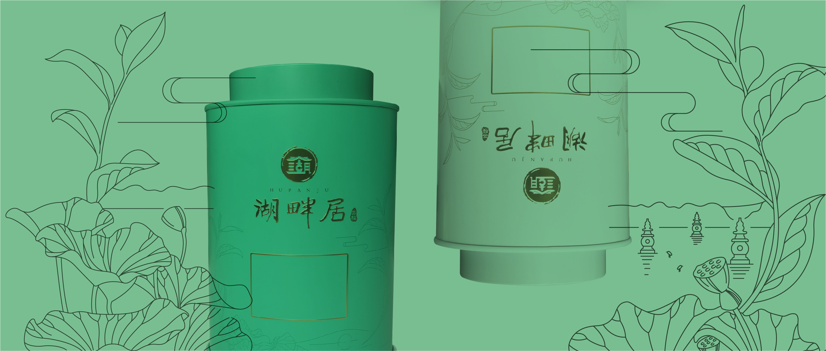

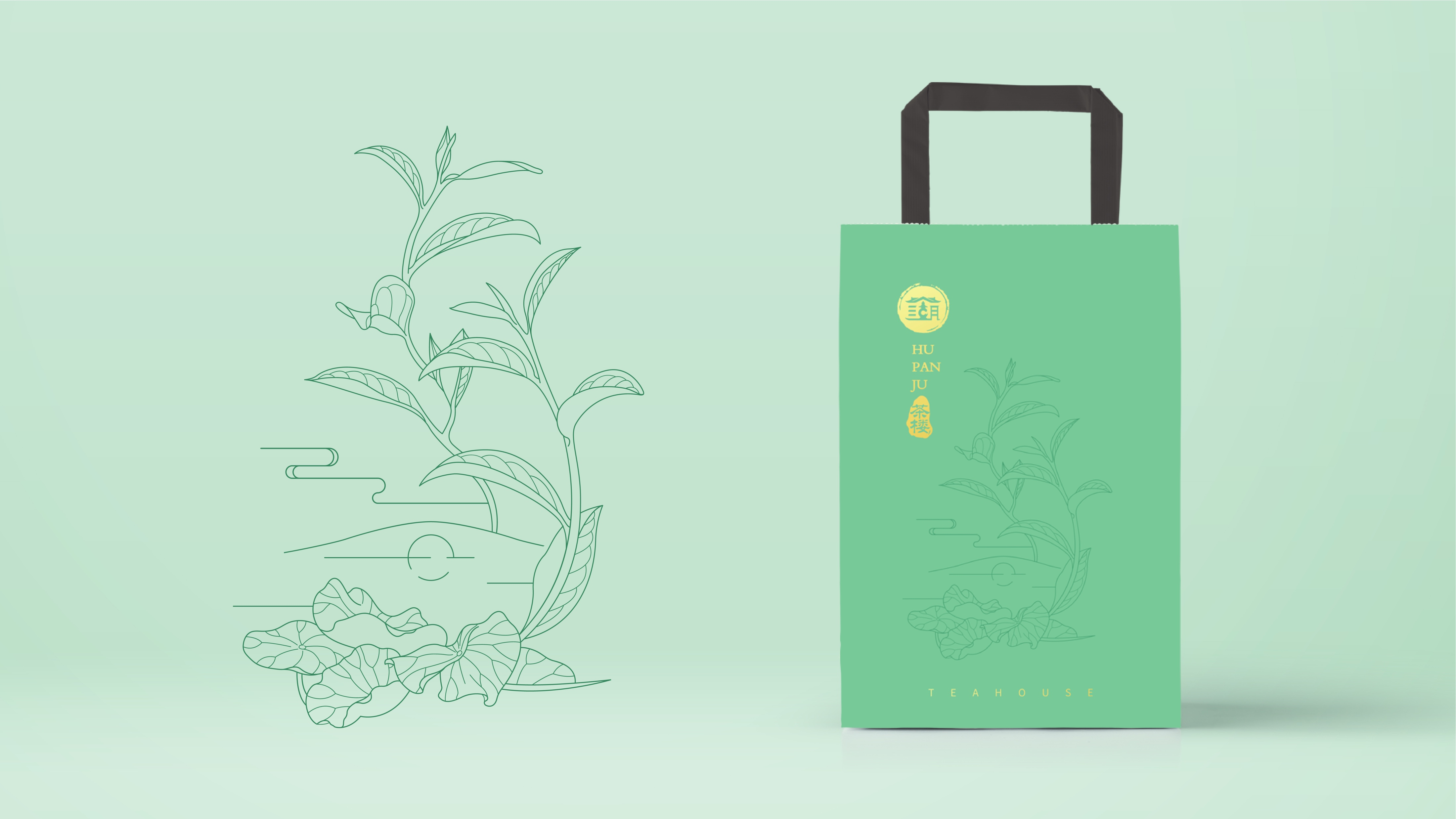
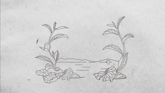
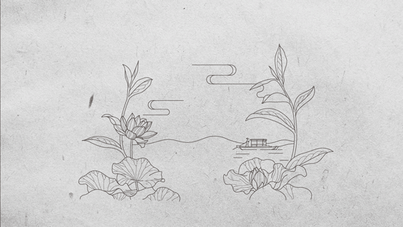
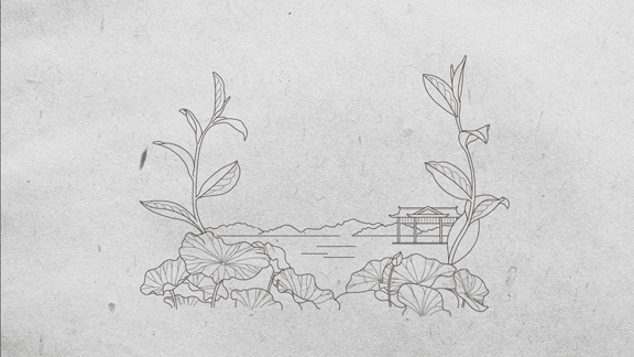
The illustrations of the cake tea series products are designed according to the lakeside residence's own architecture, leaving a lot of blank space for people to imagine,
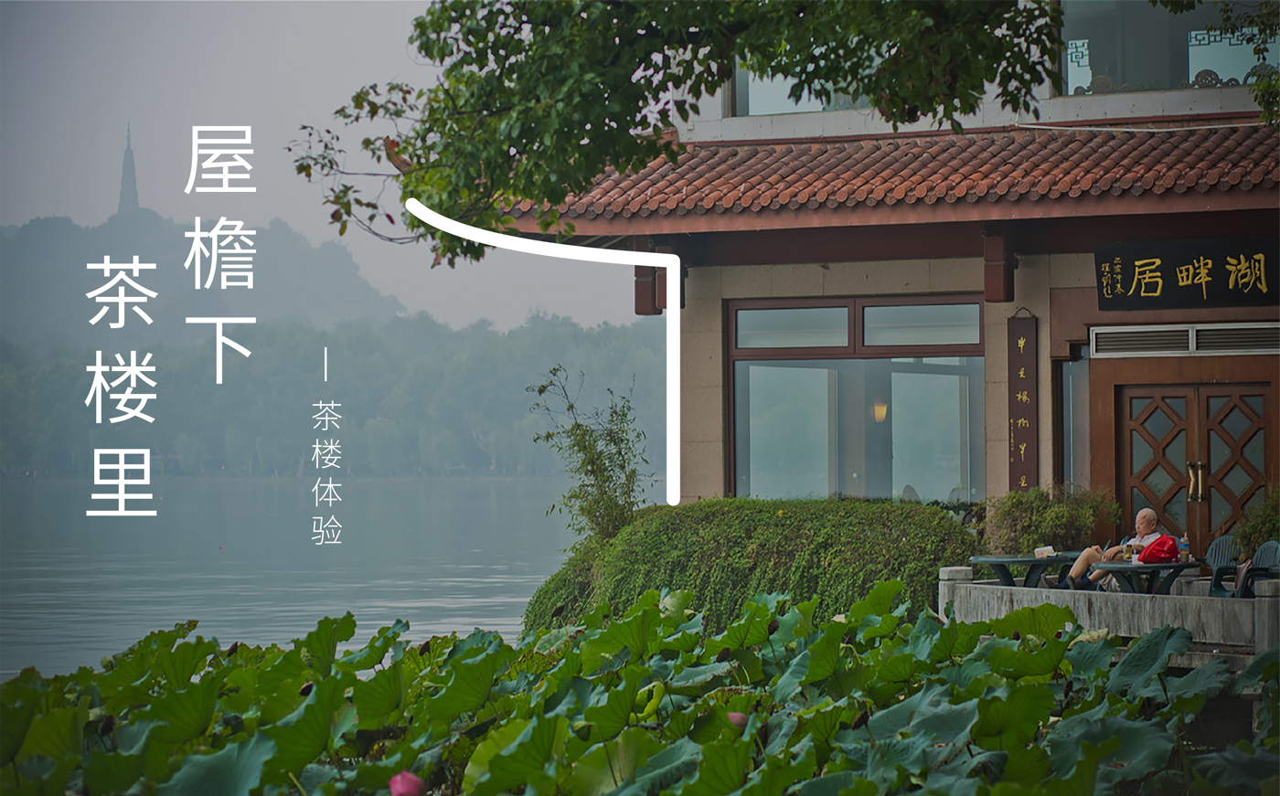
The scenery of lakes and mountains and lotus leaves fully reflect the unique geographical advantages of the teahouse.
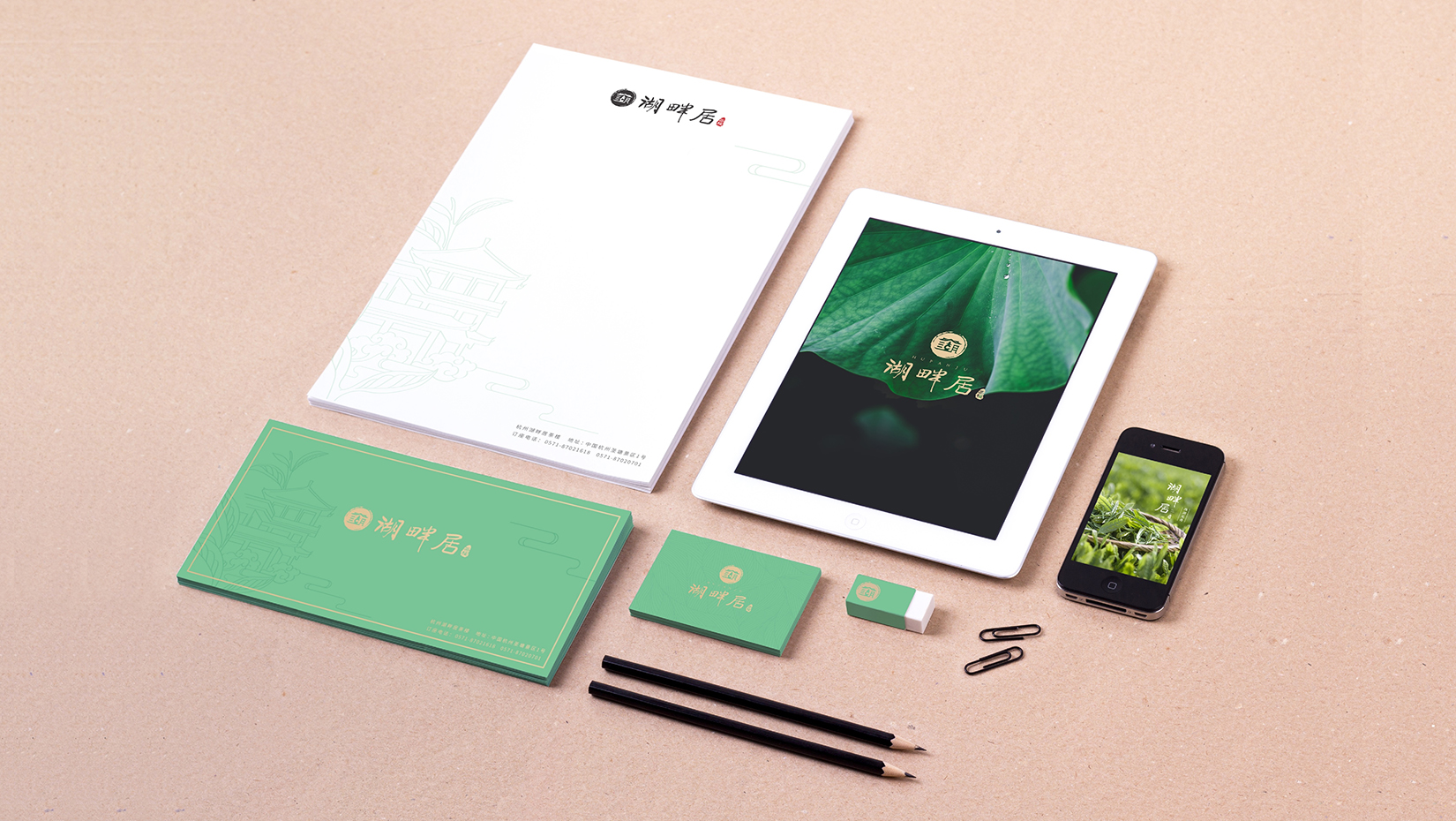
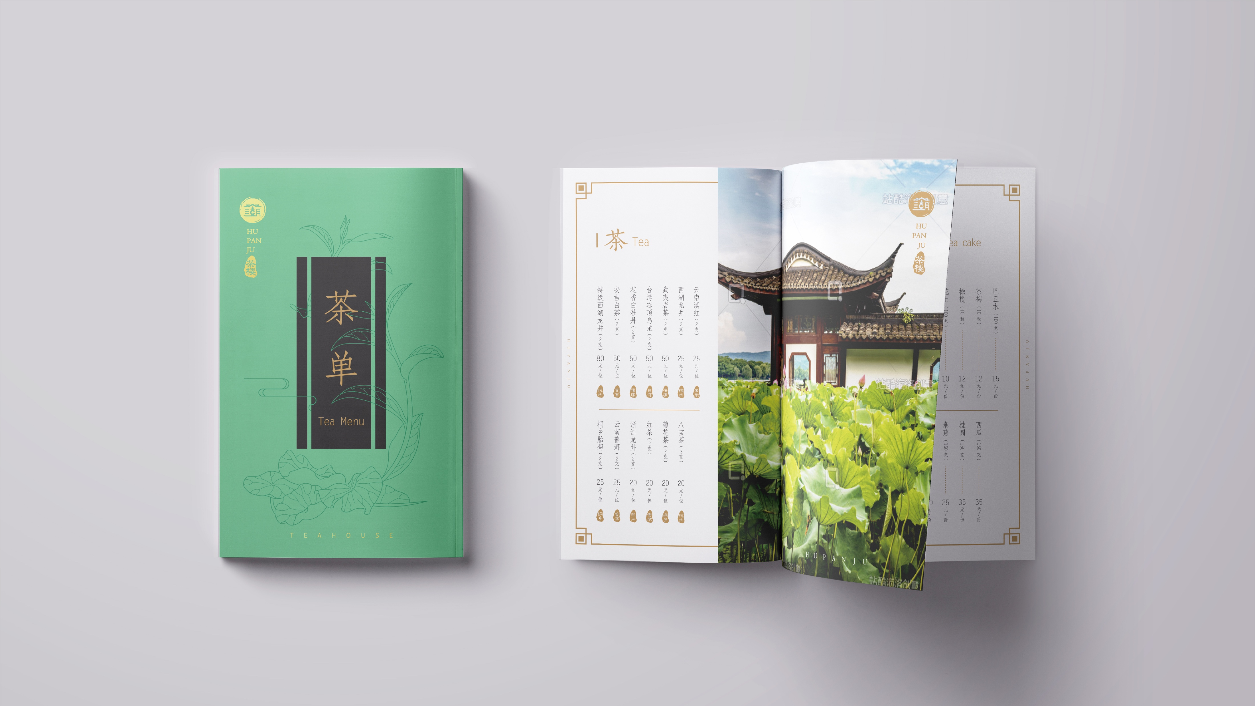
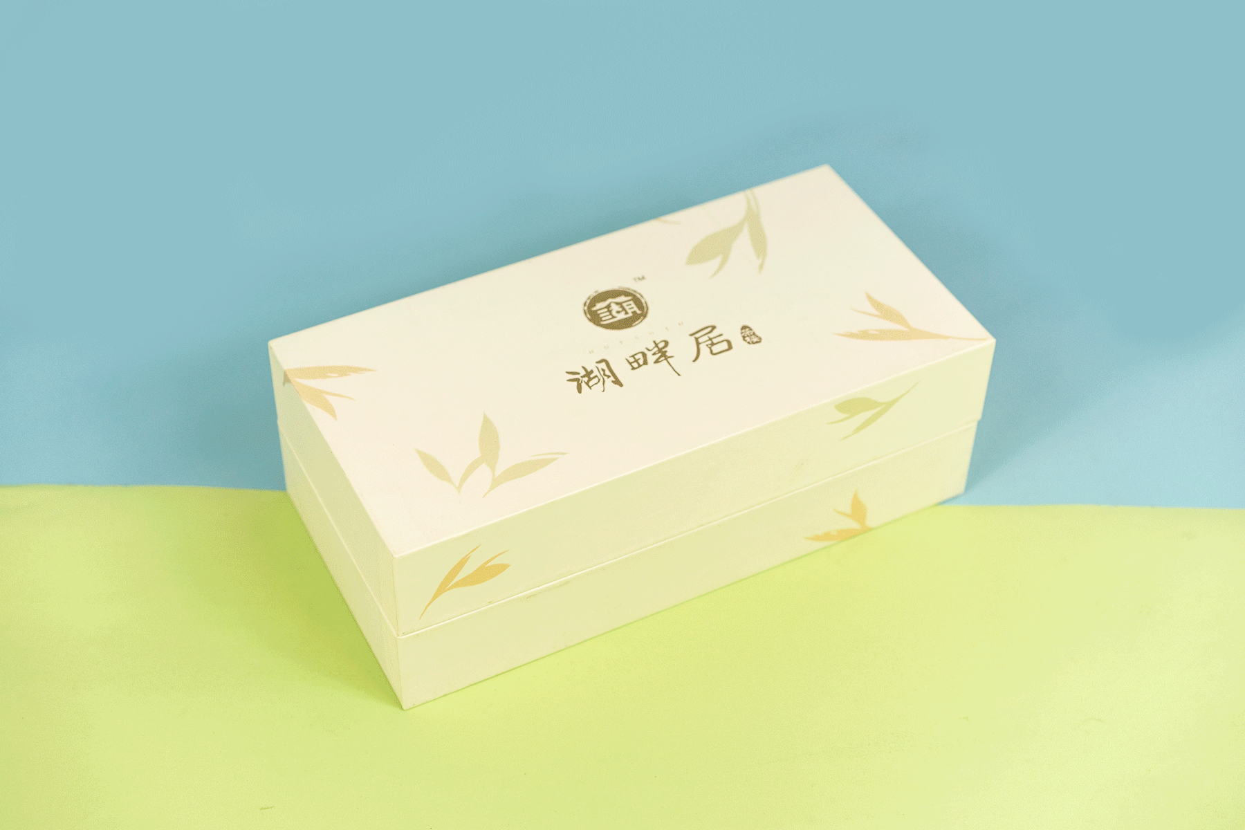
Brand materials such as brochures, tea lists, handbags, etc. are mainly green, and the logo is elegant gold, supplemented by illustrations, which is full of spring.


According to the characteristics of the leaf veins of Longjing tea, taking the bud leaves as the prototype,
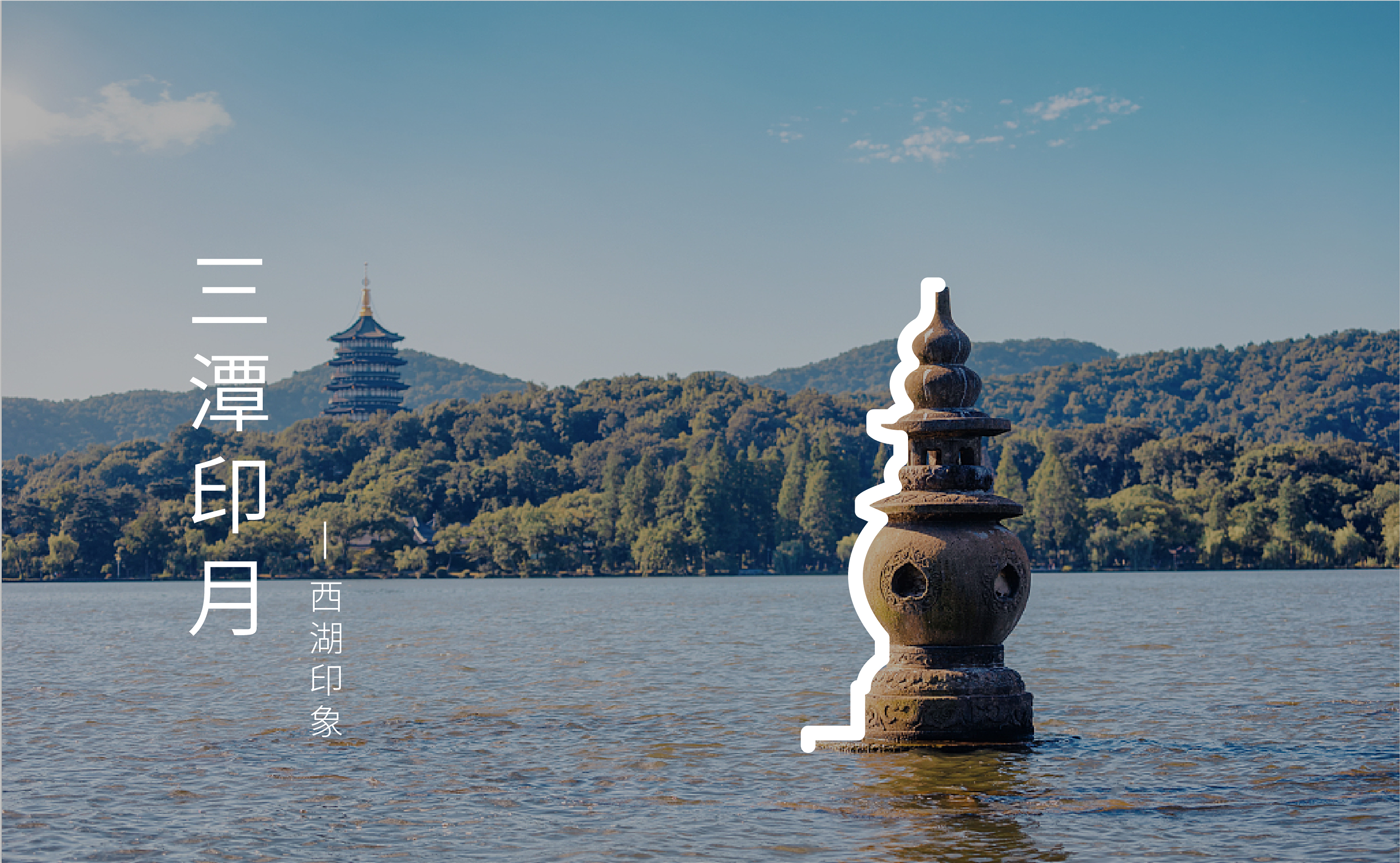
Incorporate into the representative West Lake landscape such as Broken Bridge, Huagang Fish Watching, Three Pools and Moon Printing, and Cruise Boat,
As well as the lotus leaf lotus in front of the teahouse by the lake, the corresponding illustrations were drawn for the four series of teas.
The copyright of this work belongs to 瑞德设计. No use is allowed without explicit permission from owner.

New user?Create an account
Log In Reset your password.
Account existed?Log In
Read and agree to the User Agreement Terms of Use.
Please enter your email to reset your password


It's good to give people away.
The feeling of West Lake
Looks particularly cultural
Good-looking
Very good
It is quite good to make a sketch into a moving picture.