Client :Motorola Motorola
Design: New Unknown Design
Time :2021
Service: User Research | Market Analysis | Trend Research | User Experience Analysis | Appearance Design
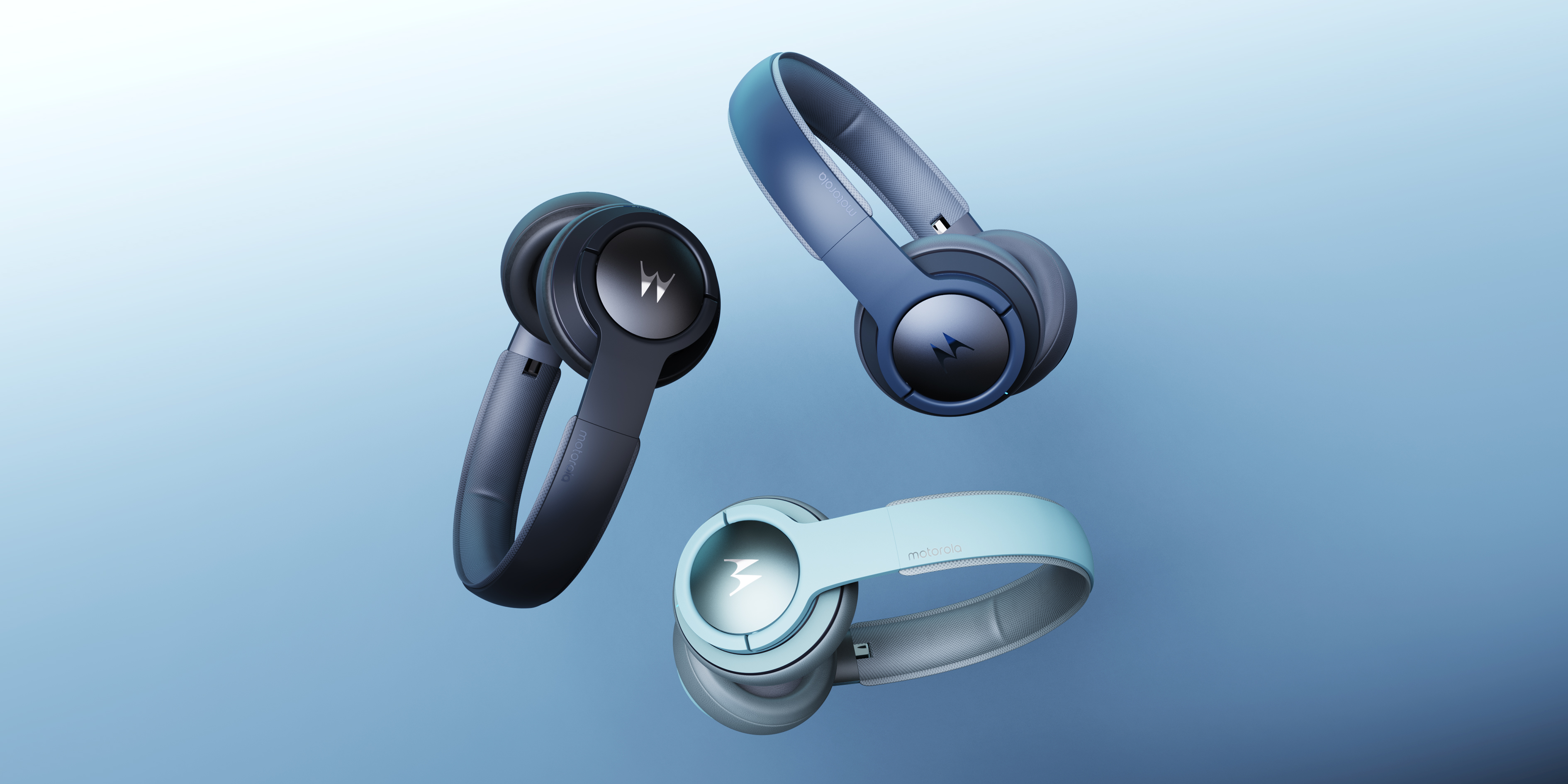
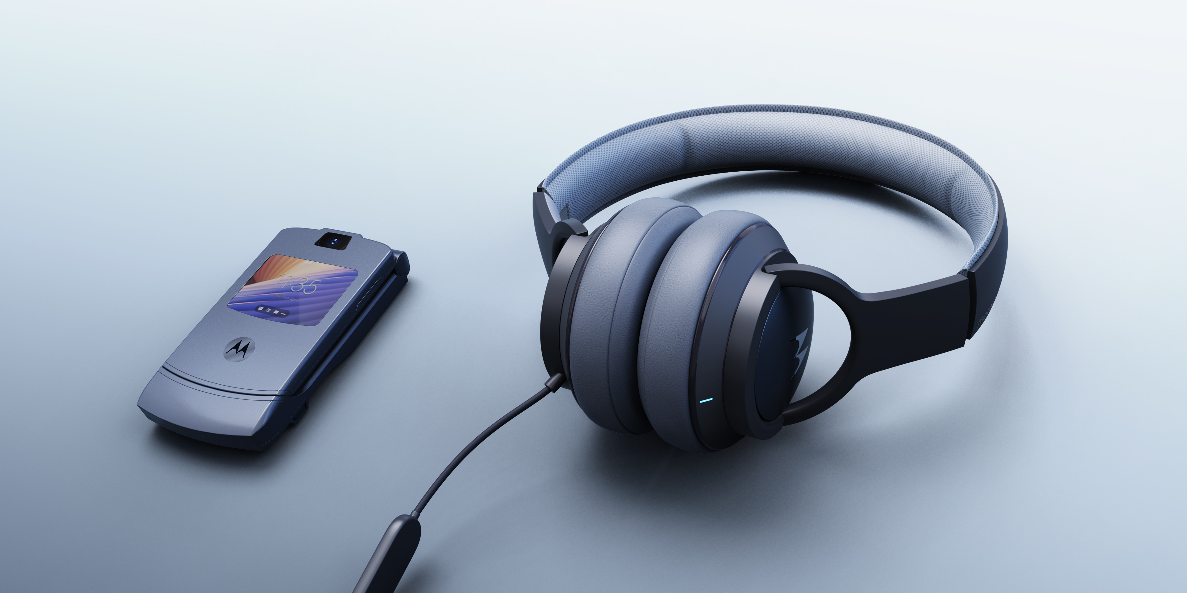
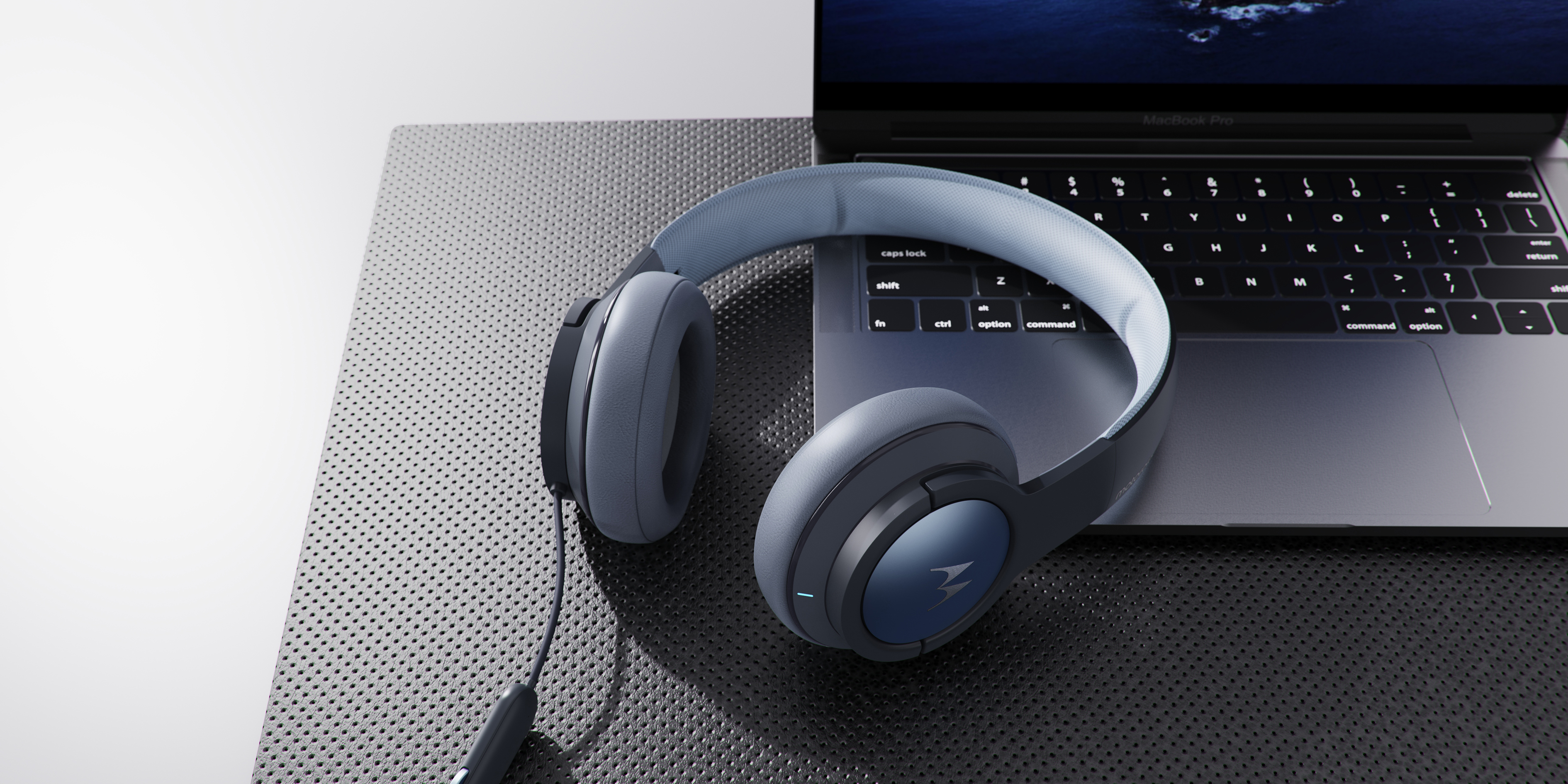
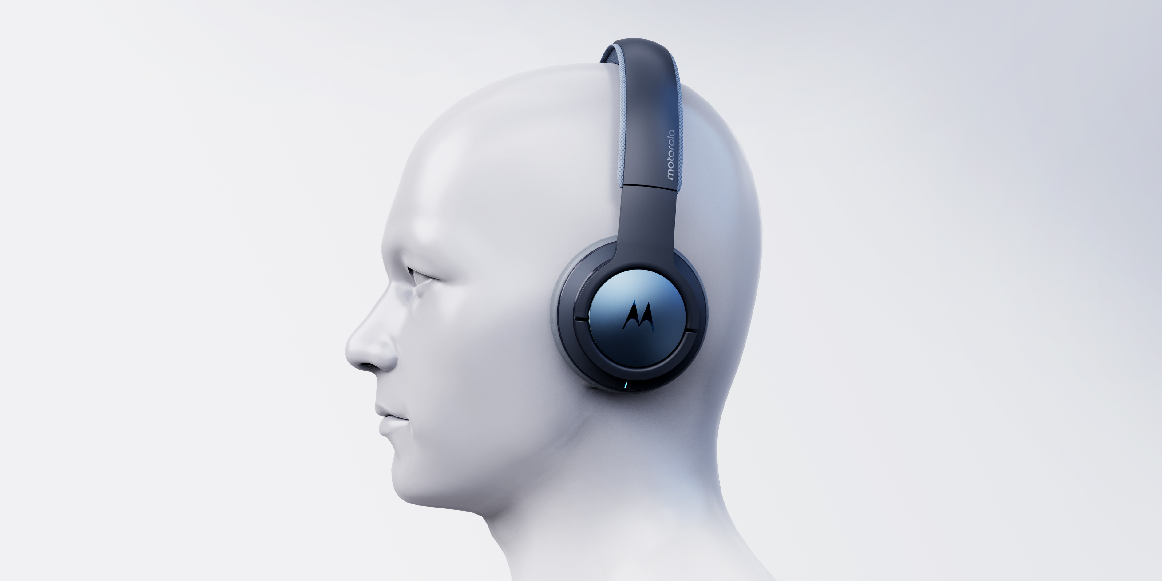
Newix works with motorola to create a comfort-oriented headset. The brand's expectations for the product are simple and forward-looking, but everything must be based on the user experience, so more thinking about this headset The point is still on "comfort.
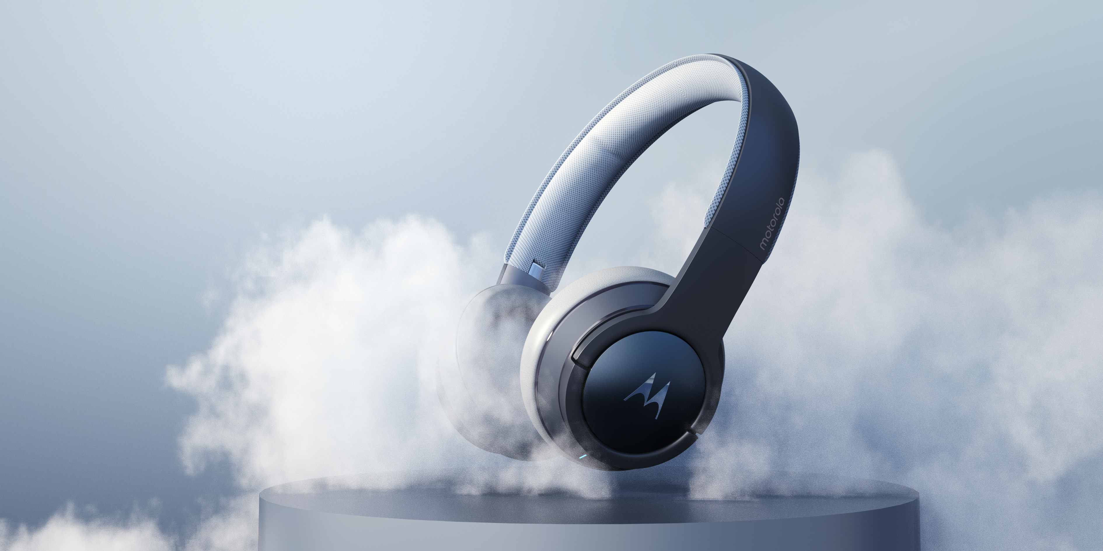
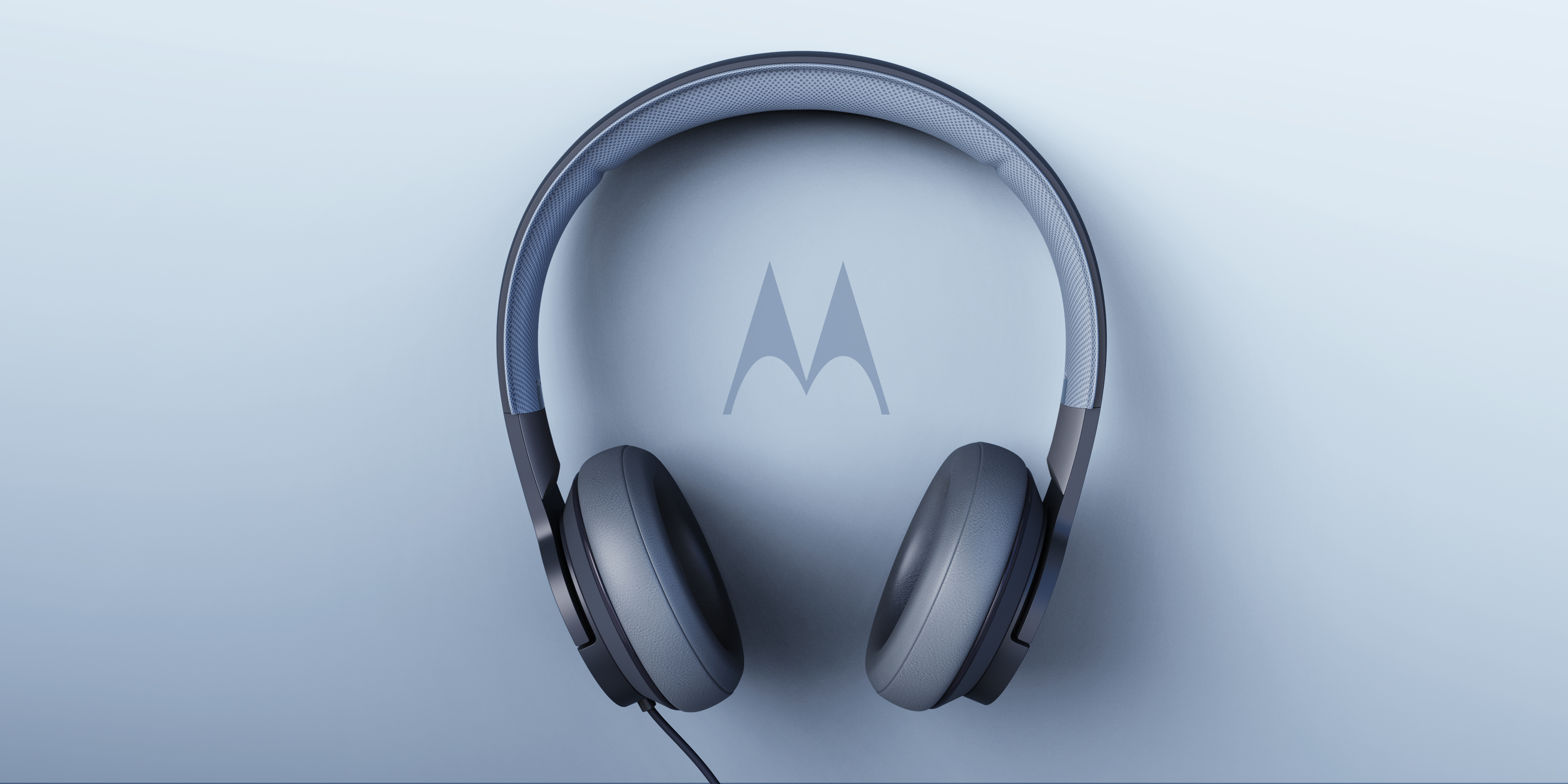
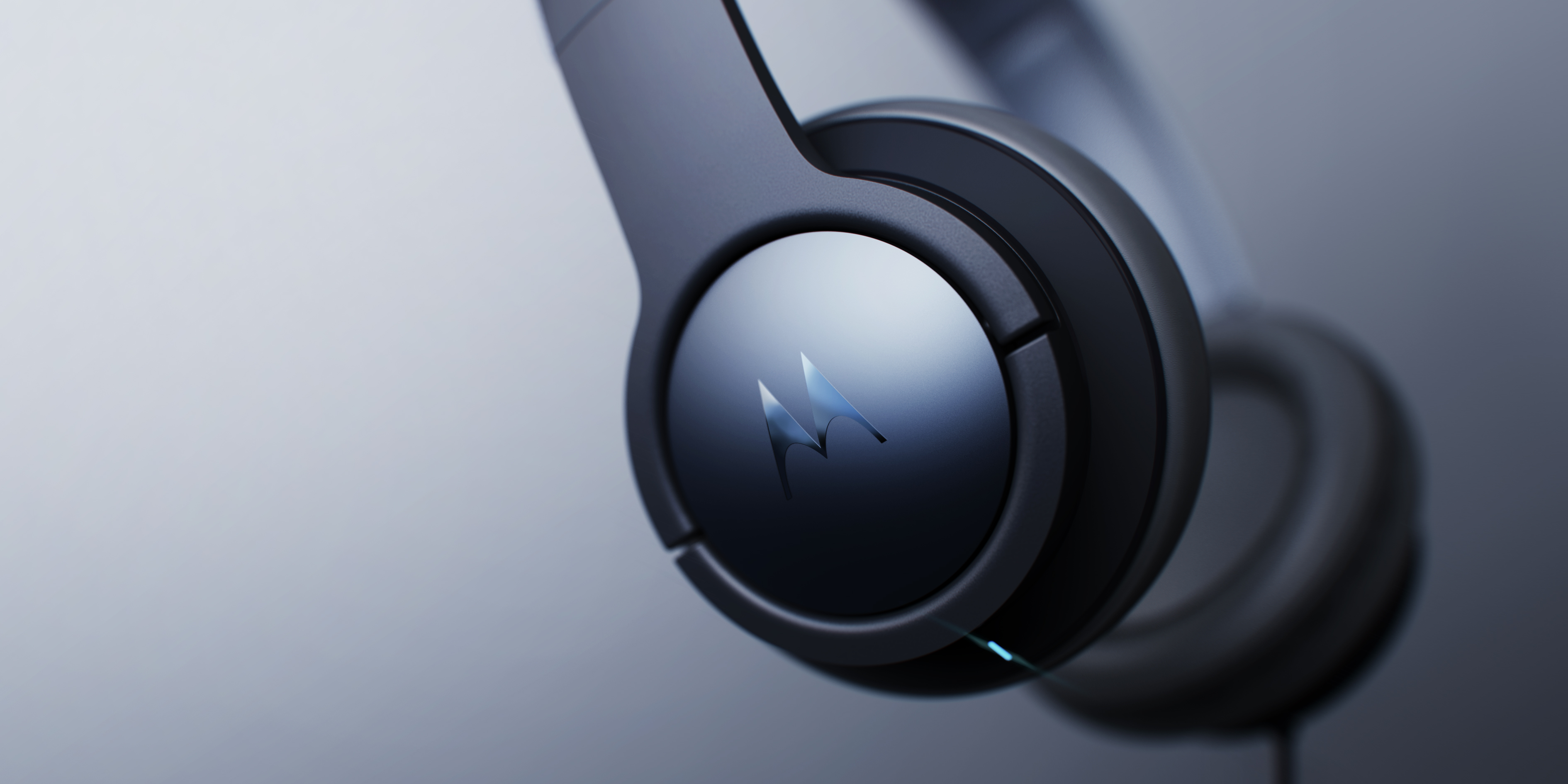
With pure geometry as the main body, a soft and tension-rich surface is created to convey a "comfortable" visual experience to the user from the appearance. Starting from the brand logo, the circle is selected as the basis. The overall design follows the concept of "concentric circles". The circular structure and the "M" on both sides of the earphone form Motorola's logo. The lines spread in the form of concentric circles. The areas divided by partial lines need to be integrated into the shape to reflect the brand sense while maintaining a simple overall sense.
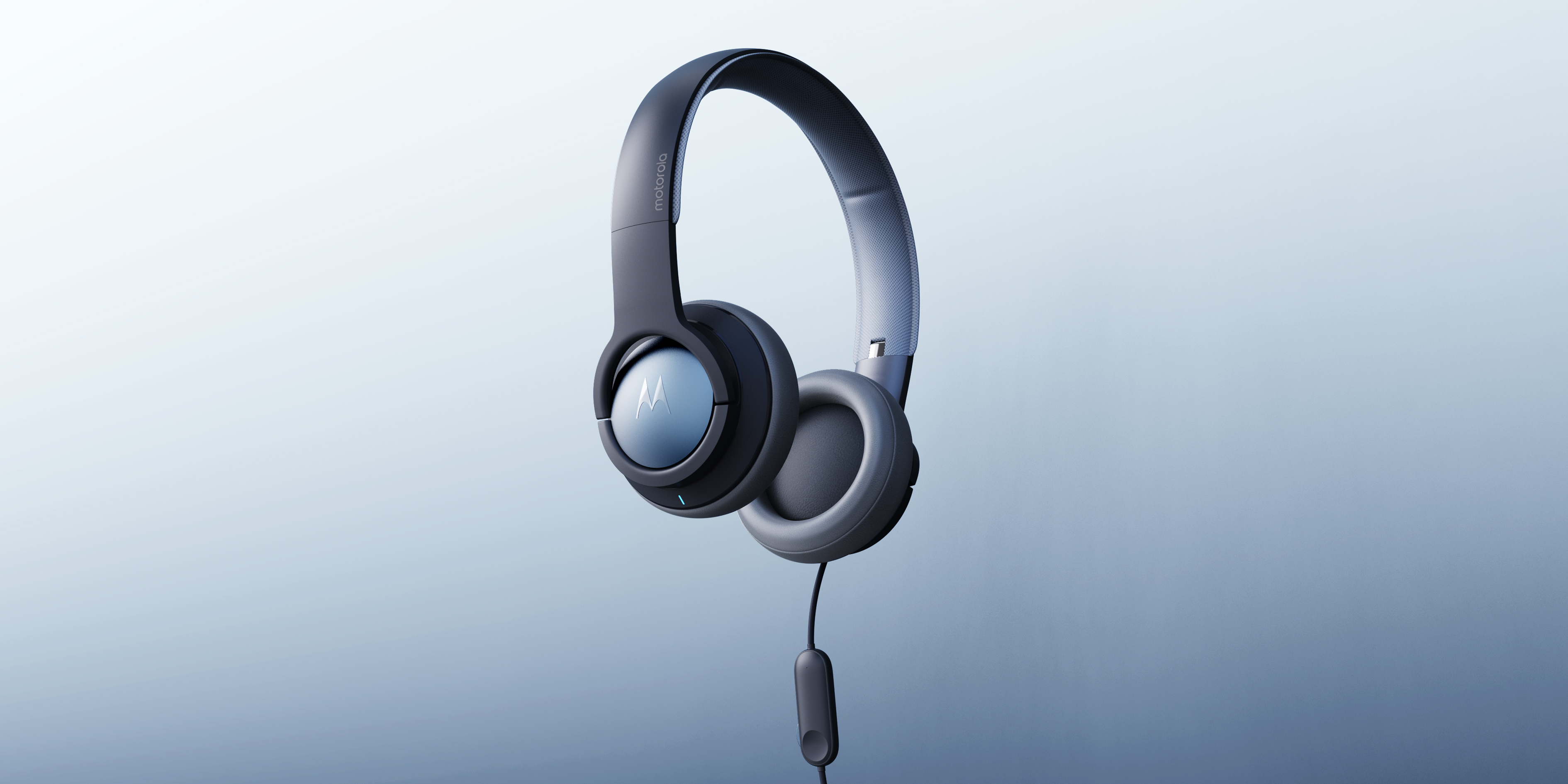
The innovation of the soft bag of the headset part and the traditional headset is that the soft bag is beyond the headset part, and the edge of the headset is wrapped with the soft bag, which improves the user's comfort experience.


The copyright of this work belongs to 新未知 NEWIX. No use is allowed without explicit permission from owner.

New user?Create an account
Log In Reset your password.
Account existed?Log In
Read and agree to the User Agreement Terms of Use.

Please enter your email to reset your password
I mean this "soft and tension-rich surface" is interpreted in place by the old irons.
6666
Bullfrog
M's LOGO feels a little less beautiful on it.
Is moto only the mobile phone acquired by Lenovo?
It's so beautiful
PL !!!