Recently, I have time to learn about the node materials of the KEYSHOT and share some learning experiences. At the end of the article, I have already shared KEYSHOT source files. For more sharing, you can pay attention to my personal subscription number YoNoBi ~

I just finished the prototype design of a product and took a break, so I remembered something I wanted to learn but didn't bother to move for a long time-node material. As for why this article is available, there are two main reasons. First, it was a pity not to pretend to be forced in front of the novice. Second, I have been on vacation recently and talk less at home. Writing articles can train my ability to make things clear.
1#
What is the node material?
In fact, the node editing method is not unique to KEYSHOT. It is very common in various 3-dimensional software. For example, GRASSHOPER is programmed in the form of battery diagrams. C4D and 3Dmax have node editors.
My understanding is that node mode is an intuitive way of programming. Programmers, in order to facilitate the development of our visual animals, modular visual programming tools, make various functions into small modules one by one, and connect modules with wires to achieve various complex effects and adjustments.
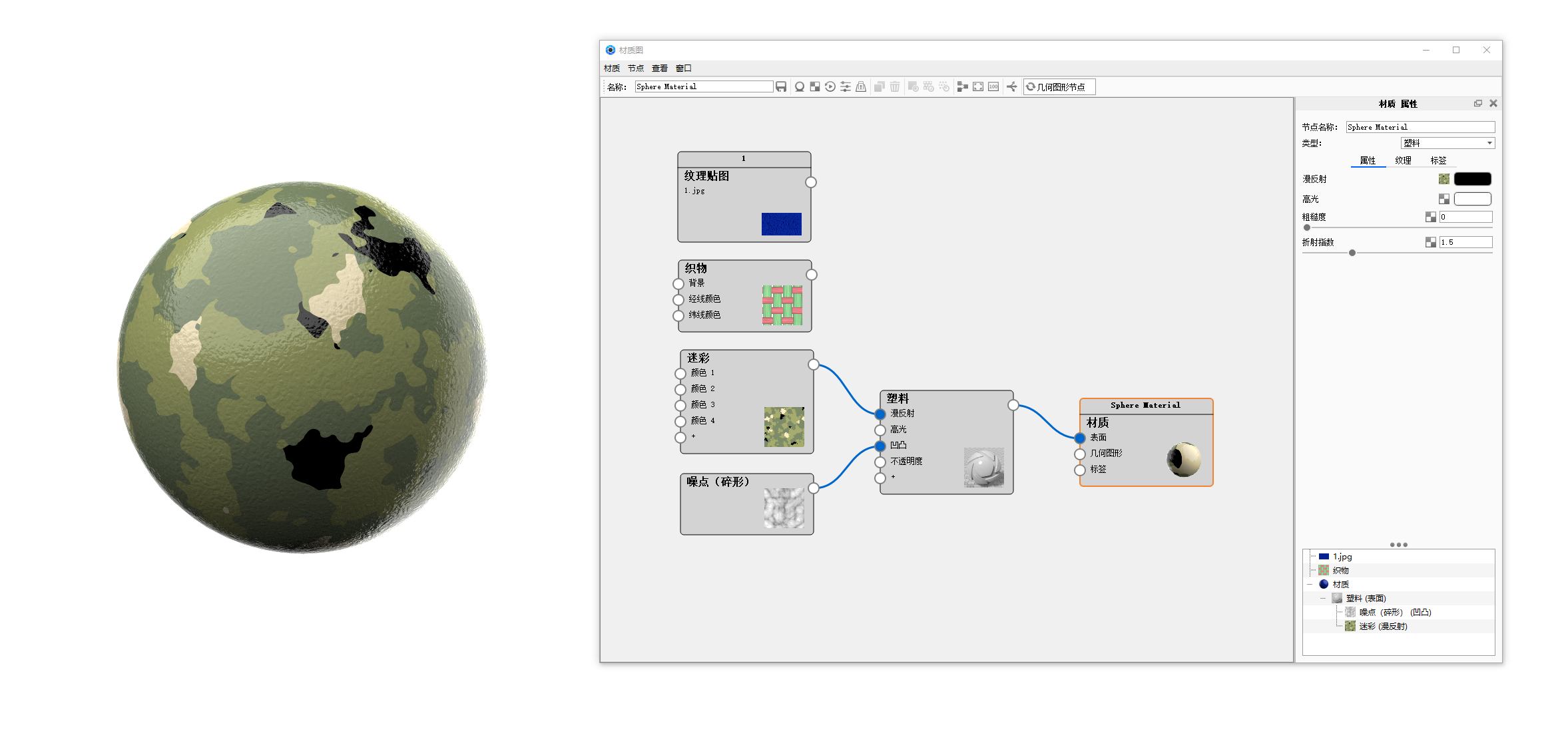
For example, in the following figure, the node editor intuitively divides each action into a small square (functional module), and links them to the right square to achieve different effects, and each module can perform separate adjustment parameters.
2#
No, okay?
For the daily work of industrial designers, it is possible.
However, as a very practical and difficult new knowledge, learning a hundred benefits without any harm.
Yesterday, after I sent a circle of friends, someone told me that the node material is essentially the same as the traditional material, just a gimmick. In fact, is this the case? First of all, there must be a reason for long-term existence, so I compared and thought about whether it was really to look professional, but it was just a gimmick.
My conclusion is that the essence is similar, but the form of expression is completely different! Compared with traditional material editing, the advantage of node editor is that it can clearly show the editing process and logical relationship of the whole material in one picture, which is more conducive to our grasp and control of the effect of complex materials.
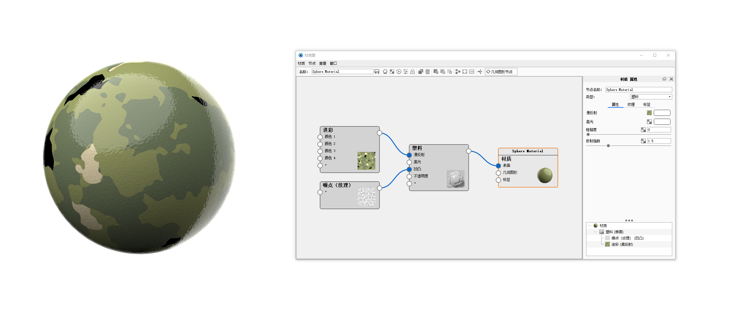
First of all, let's look at the simple one. Let's take the above picture as an example.
Do it with node editor
With the traditional model
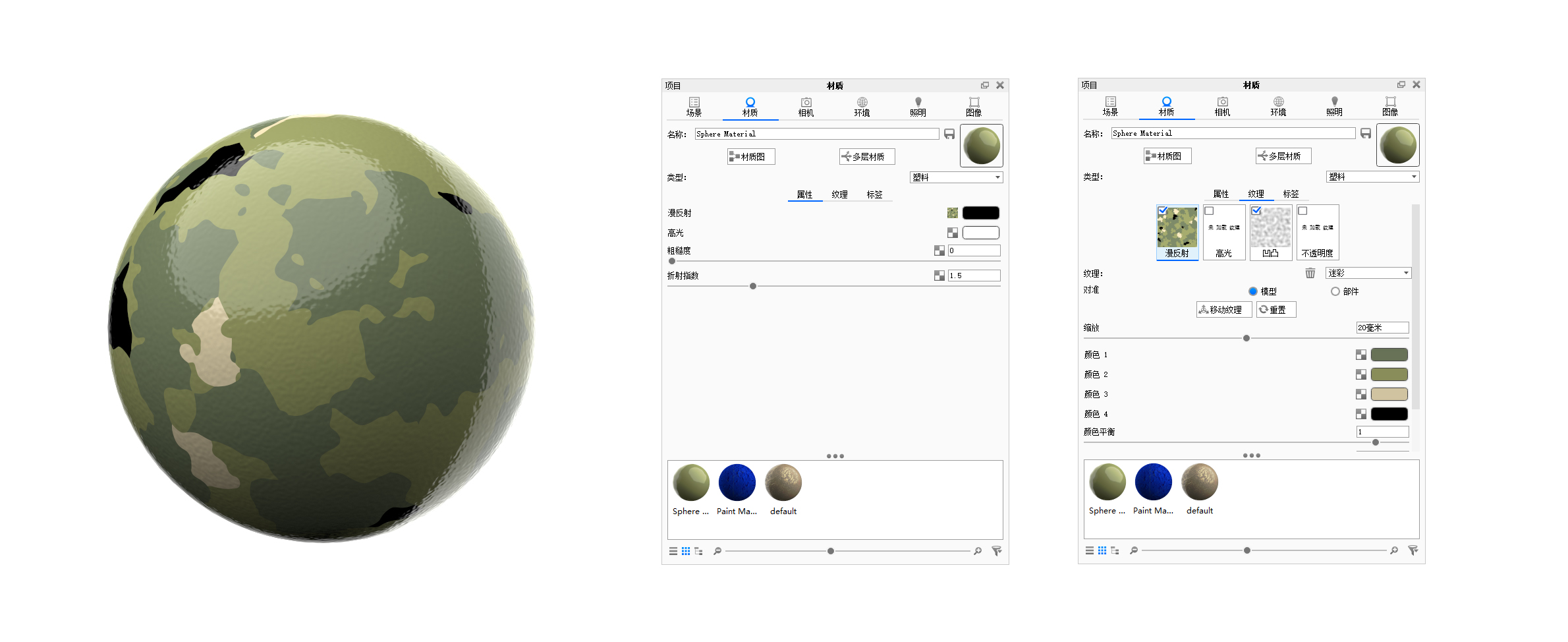
For this simple material, the difference between the two methods is really not big, and even the traditional mode, the sticky editing method, is easier to understand. I suddenly understood why this method is called simple mode in 3dmax ~
Look at the complex materials, take this exposed copper David as an example.
This time let's look at the traditional model first.
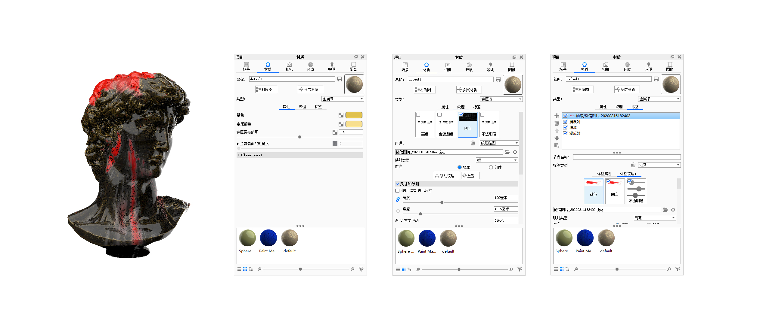
Children, you must have a lot of question marks ~ this David is superimposed with many layers of materials. with the traditional mode, it is difficult to understand the relationship between each layer. it will be very laborious to change a certain detail.
What if you use node mode
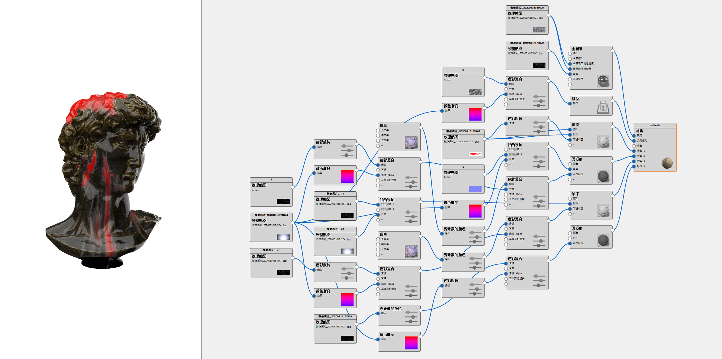
There are a lot of batteries, which may be scary when I see them. But in fact, what we are afraid of is not complexity, but logic confusion and lack of laws. As long as you understand the logic of the node, this diagram will become very intuitive, and adjustment will become convenient, referring to which type.
This is the third part.
3#
Guide to the use of documents.
Thank you for having such a group of good people in this world who are willing to share tutorials ~ in order to show their respect, share this complete source file of David's KEYSHOT unconditionally. if you are interested, click to read the original text and download it yourself. extract the code vbjv.
Click on the link to jump to feng brother tutorial
If you are interested in the detailed tutorial, click on the link above. I will only share the basic logic of the whole rendering.
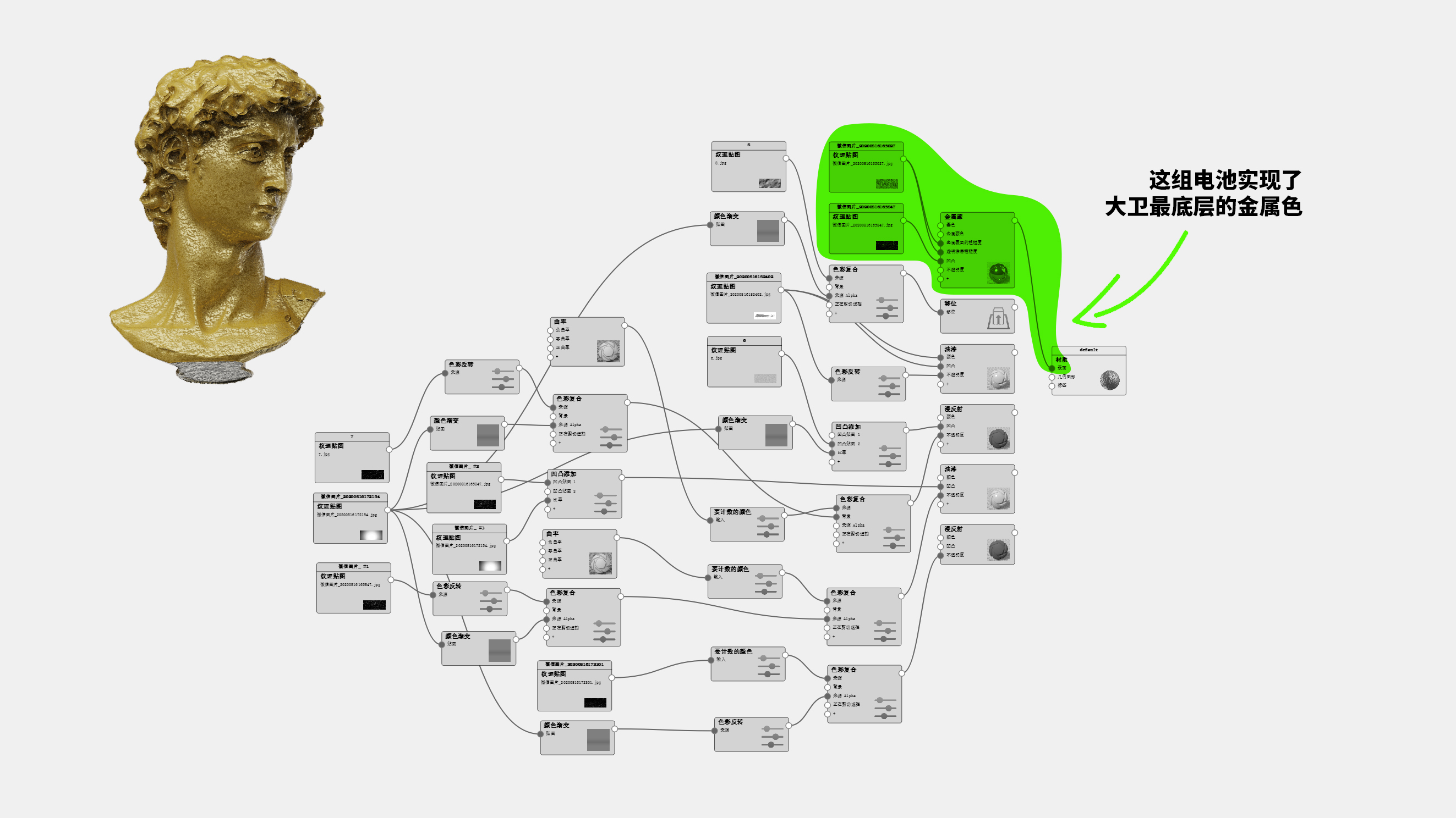
At first glance, it is quite complicated to see this thing. In fact, the basic idea is to superimpose multiple layers of materials, and then add transparency maps to allow the upper and lower layers of materials to partially reveal, forming the final effect. Is it very similar to Photoshop layers and masks. For most children's shoes with KEYSHOT foundation, the blind spot of knowledge may be how to control the exposed metallic parts. So this is also the new knowledge I just learned after reading the above tutorial. I use the combination of keyshot curvature texture and counting color tool to select the edge part of the model and link it to transparency, thus revealing the bottom metal color.
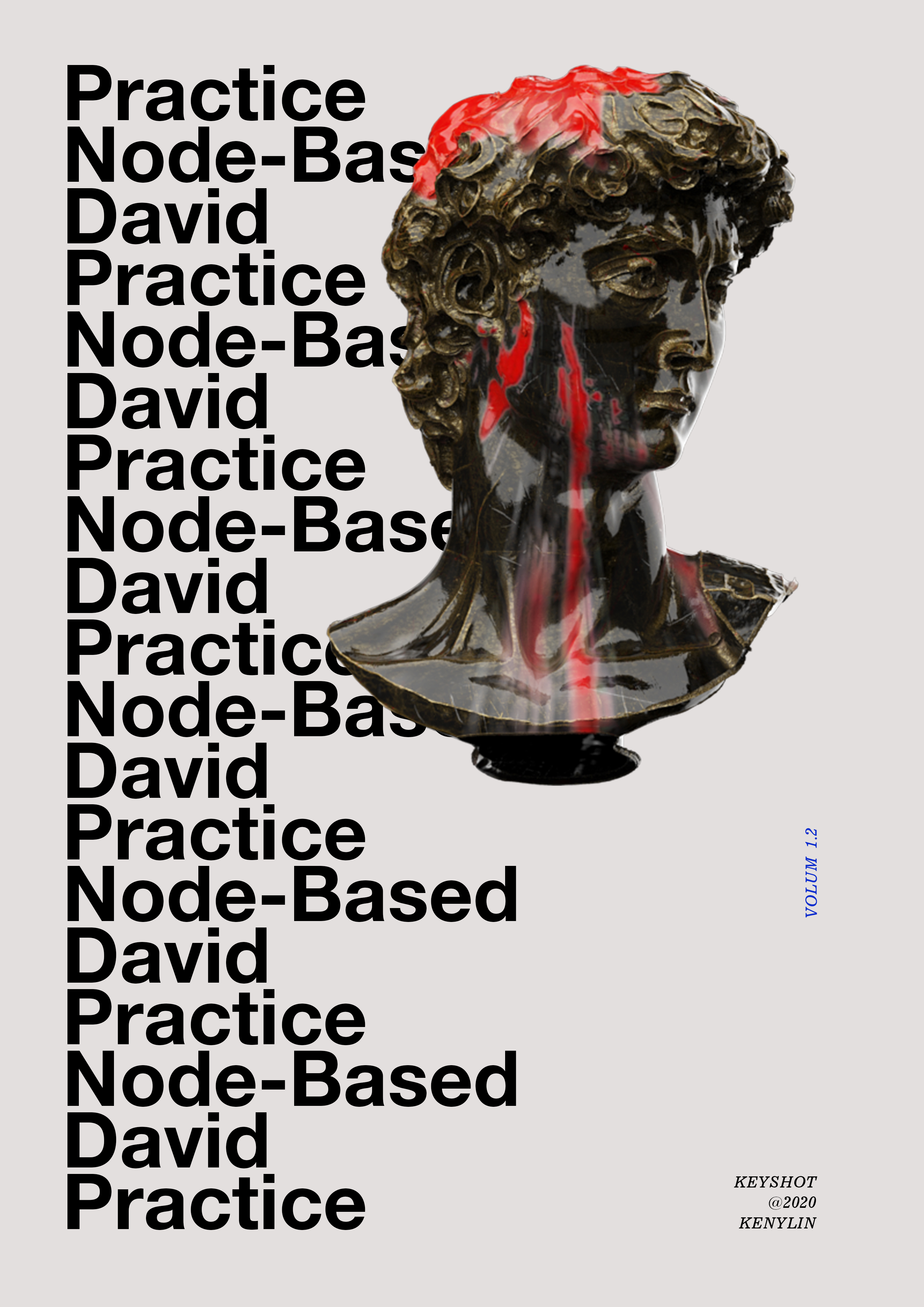
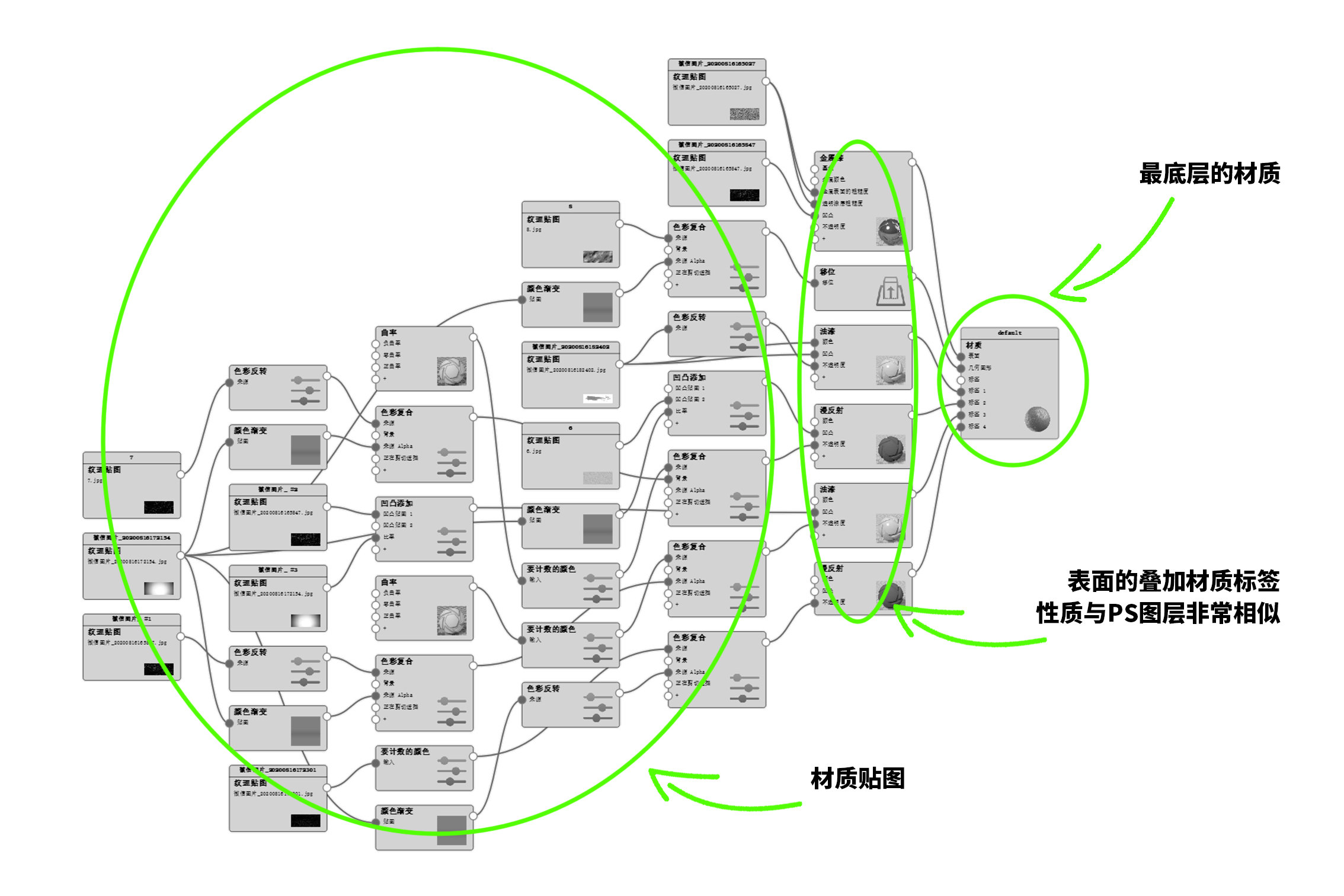
Because of laziness, I have reused some maps, so the lines look a little messy. But it doesn't matter, the big lump on the left looks very complicated, but it is just something very repetitive. The fancy effect on David's surface is realized through the keyshot label function, which can be understood as the layer in PS, while the transparency is the layer mask, which controls the relationship between the upper and lower materials through the mask (transparency).
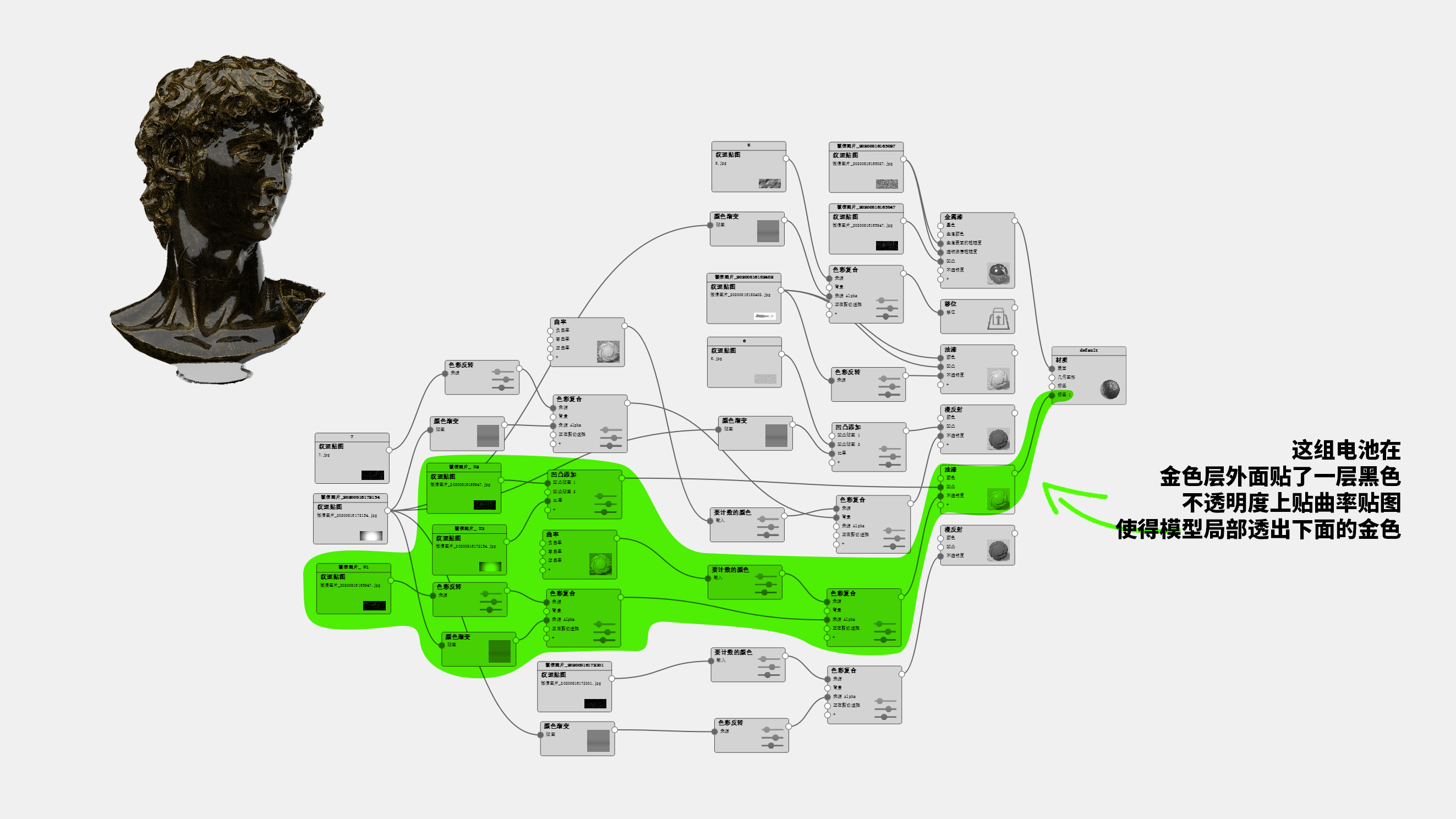
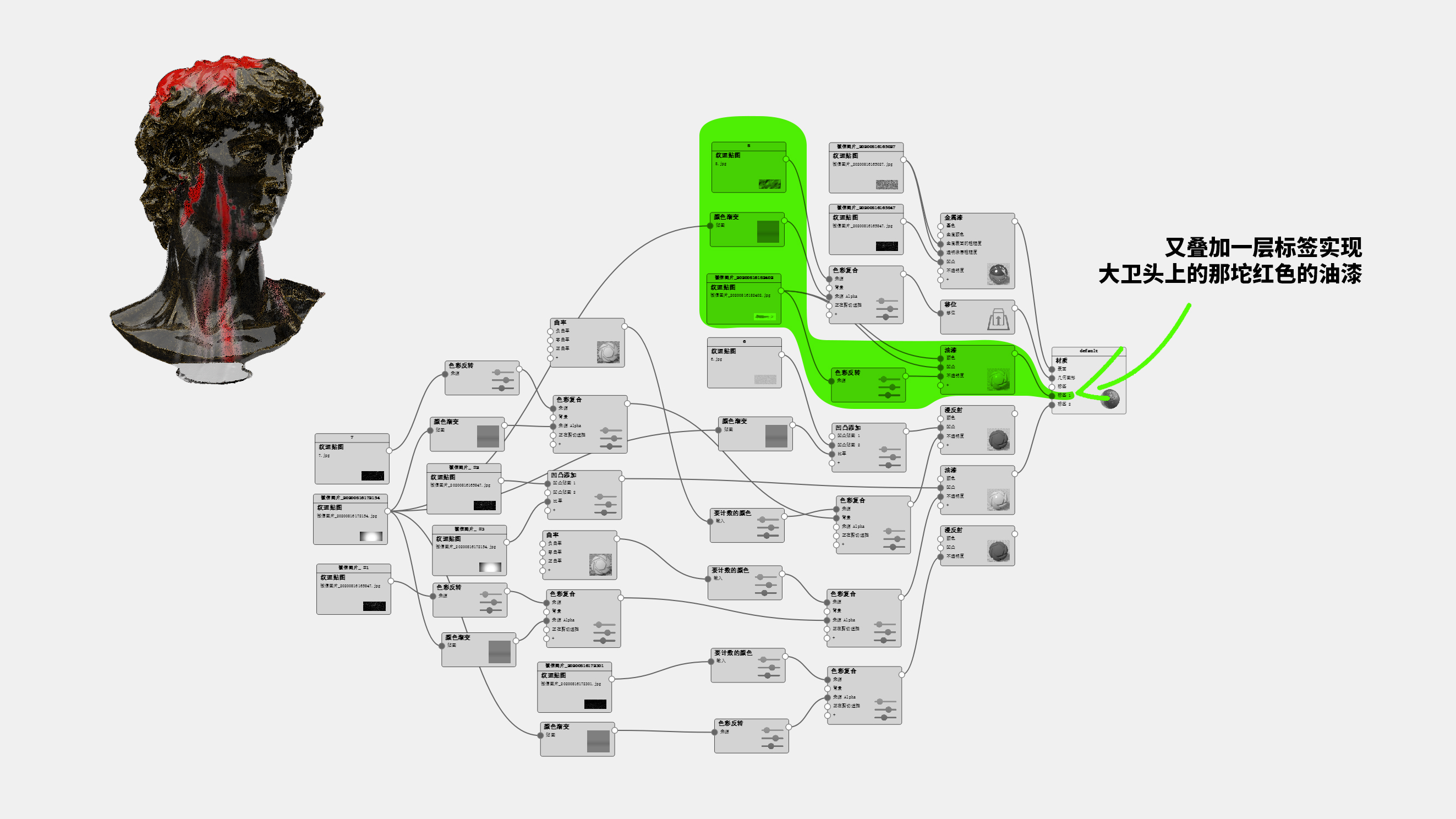
For the remaining two groups of labels, the shift group is actually a displacement map to enhance the real effect of surface bumps. You will find that the color compounding tool is widely used in the whole material drawing. In fact, the function is to control the map range. If this is removed, the map (such as the map effect inside the shift) will act on the entire model. By adding a composite tool, you can link an additional black and white (black and white) gradient map to control the range of shift. The last group of labels produced some marks on David's surface and added surface details. In fact, if you are too busy, you can keep adding labels, for example, add another set of labels and stick a flower on David's head.
The blue David in front applied what he learned and took a few minutes to do it. Please download the Keyshot file and understand it yourself ~
About Lights
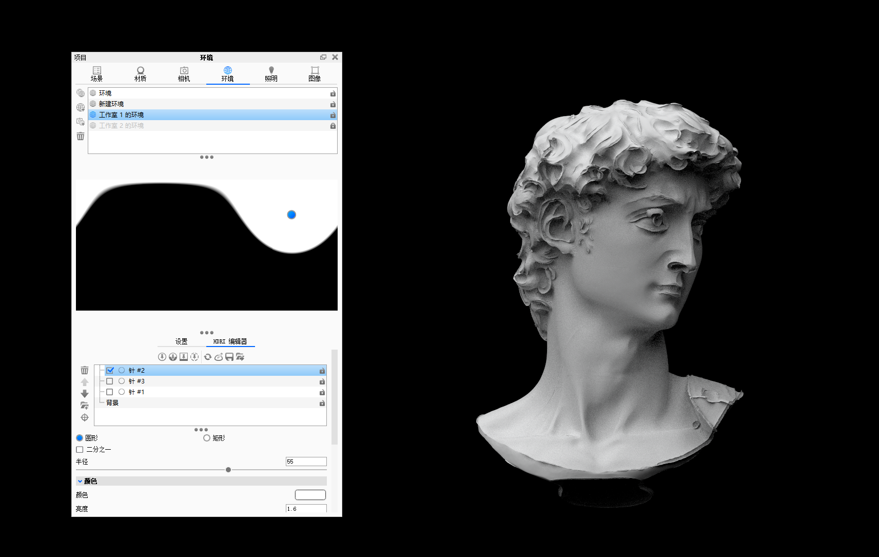
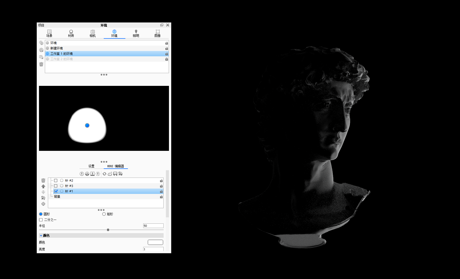
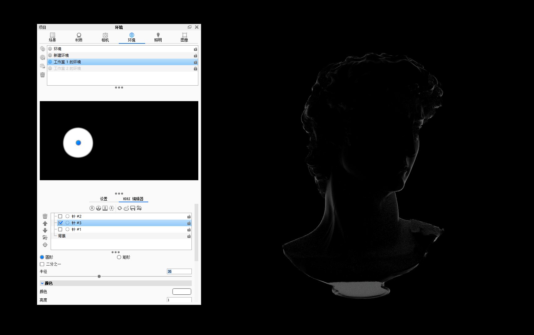
The attachment uses a very classic and very basic three-point light distribution method. The main lamp on the upper left obliquely downward illuminates the product, the auxiliary lamp on the right avoids the dark part from dead black, and a contour light on the back outlines the shape while making the main body easier to separate from the background. In fact, most of my work is rendered, and I will light up the outline, leaving only two lights.
Write at the end
What kind of rendering software does industrial designers use?
Recently, I have spent more time freely arranging. After watching the basic operation of C4D and some case videos, the interaction of C4D is indeed much more humanized and intuitive than the old 3dmax. For example, various dynamic effects such as ball melting effect, glow and SSS materials can be said to kill max, which is very simple and can produce effects. It is no wonder that the e-commerce details page has been light polluted in the past two years. If you are interested in dynamic effect and think that you may be able to do the full stack design yourself in the future, there is no problem if you have the time and energy to learn C4D. However, based on the actual combat experience of the past few years, silly operation, good effect, faster rendering speed and real-time preview, keyshot can be said to be the most suitable rendering tool for the daily work of industrial designers.
Technology is advancing too fast, and software is becoming more and more user-friendly. Maybe it will soon be possible to move the mouth to make the color the way Tony asked Jarvis to design the appearance of Iron Man. This also made me more aware that as a designer, the most important thing is the design itself rather than the software operation. Even if you read all kinds of tutorials and let you do the design without the case, I believe many people's brains are blank. Tools always serve your brain. The design ability out of nothing is what you want to keep learning and improving without changing your career.
For more sharing, you can pay attention to my personal subscription number YoNoBi ~
https://pan.baidu.com/s/1L1b3CNyMgObMypKeTrPbdA
Extract code vbjv

The copyright of this work belongs to Keny Lin. No use is allowed without explicit permission from owner.

New user?Create an account
Log In Reset your password.
Account existed?Log In
Read and agree to the User Agreement Terms of Use.

Please enter your email to reset your password
Please send me a copy, thank you 2553387728@qq.com
Big Brother Link Failed
The link failed and inserted an eye, which effectively kicked me
Dream Linkage Peak Brother
Both vray and keyshot are used. vray renders faster and embeds rhino directly. keyshot, it usually makes scene diagrams with background.
Link Fails, Big Brother
The link has expired... Big Brother!!! The link has expired!!!!
cool @!!!!
Tools always serve your brain. The design ability out of nothing is what you want to keep learning and improving without changing your career.
Click like
Ah ah, the link is invalid, can you send another copy? Thank you very much ~
Thank you, I learned
Niubi
Stick stick stick
Great tutorial, very detailed.
Learning