In 2021, Rhett Design and Brand was invited to build brand assets for the new brand Haipoqui from 0 to 1, and establish its own brand identification system to help Haipoqui occupy the user's mind and stand out among the main "polypeptide" ingredient effective skin care products.
Customer Service: Haibo Cui
Service Team: Rhett Design Brand
Service Content: Brand LOGO Design | Brand VI Design | Packaging Strategy and Design
Service hours: 2021
# Extract "technology, professional, high-end" brand DNA
Reid Design · The brand starts from the brand name of Haibo Quintessence "Extract Essence from the Deep Sea", combined with the core differences of the "polypeptide" component products, and extracts the "technology, professional, high-end" brand genes and "ocean" The brand tone is used as the basis for constructing the Haibo Quintessence brand visual recognition system.
# Build a brand identification system to convey perceived high-end skin care positioning
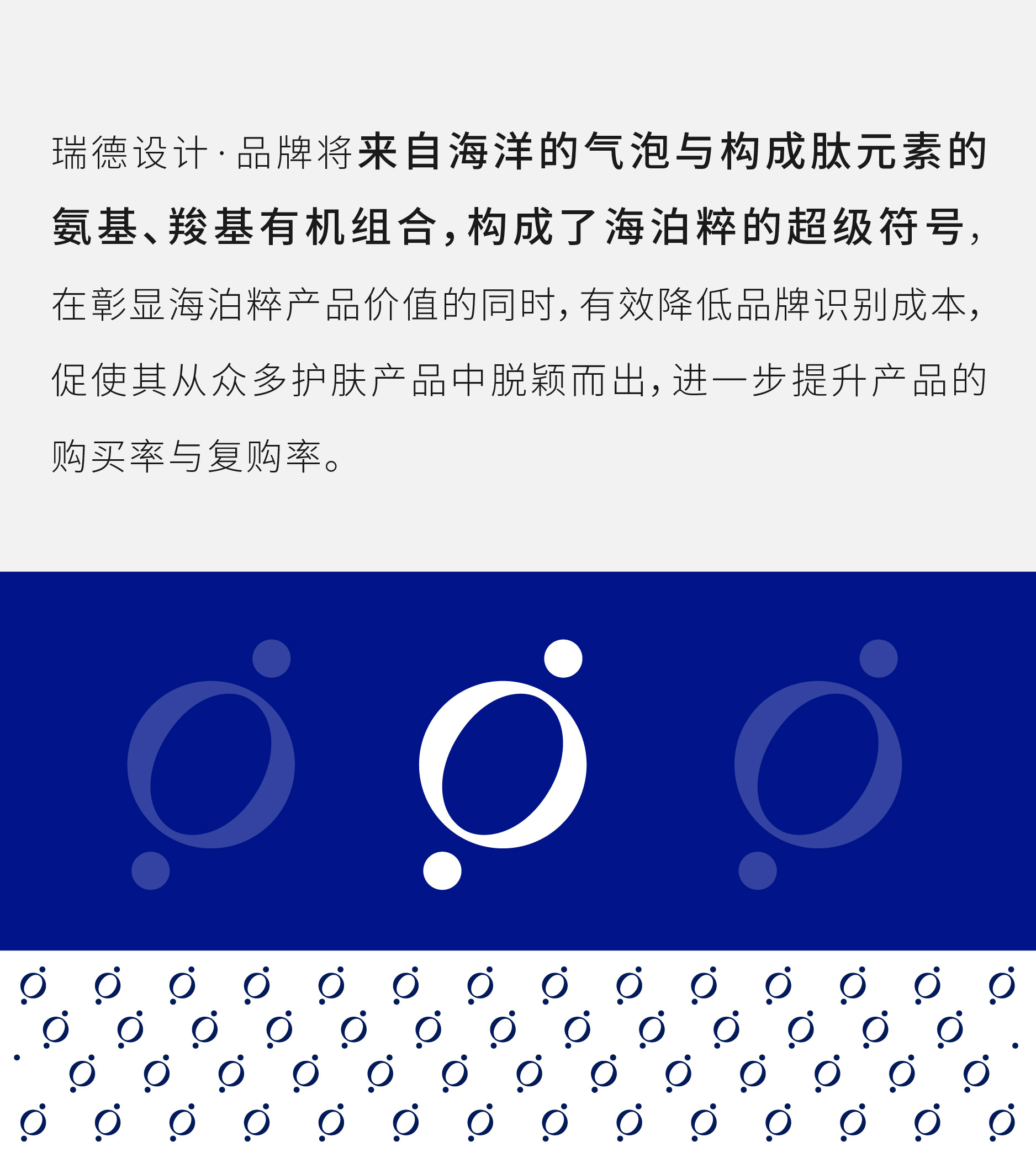
1. Extract super symbols to create visual anchor points for scientific and technological skin care
2. High recognition LOGO design, presenting elegant and delicate brand charm
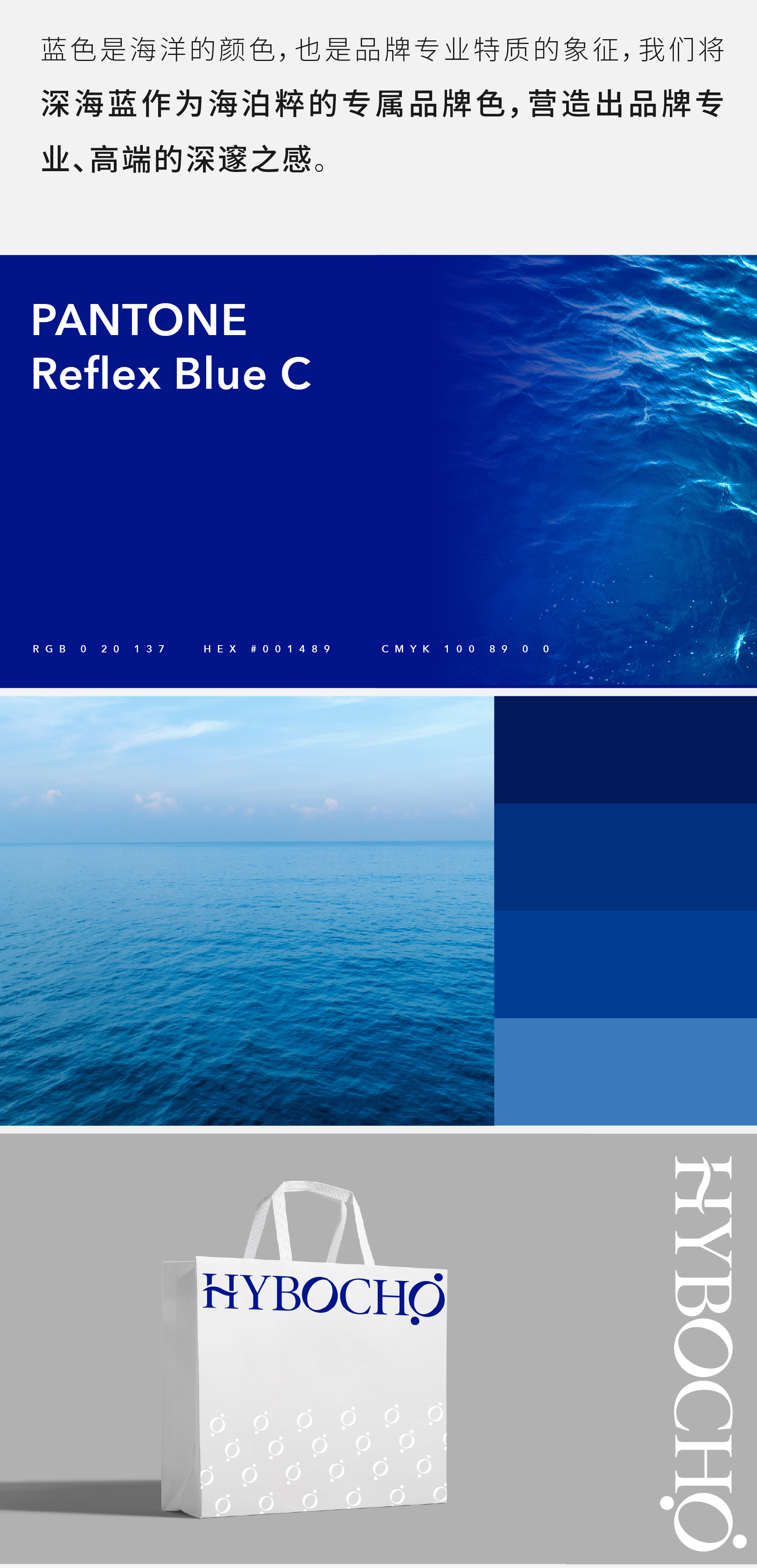
3, exclusive color synesthesia, convey the deep temperament of the brand
# Create core competitive advantage of serialized packaging and visualized brand
Through the serialized packaging design, it intuitively conveys the professional, technological, and high-end brand characteristics of Haibo, and makes a unified and prominent presentation of its "polypeptide" component skin care product characteristics, which reduces consumers to a certain extent The decision-making cost of the company has effectively improved Haibo's product power and brand power, and then detonated its sales power.
/Super Design Triggers Business Future
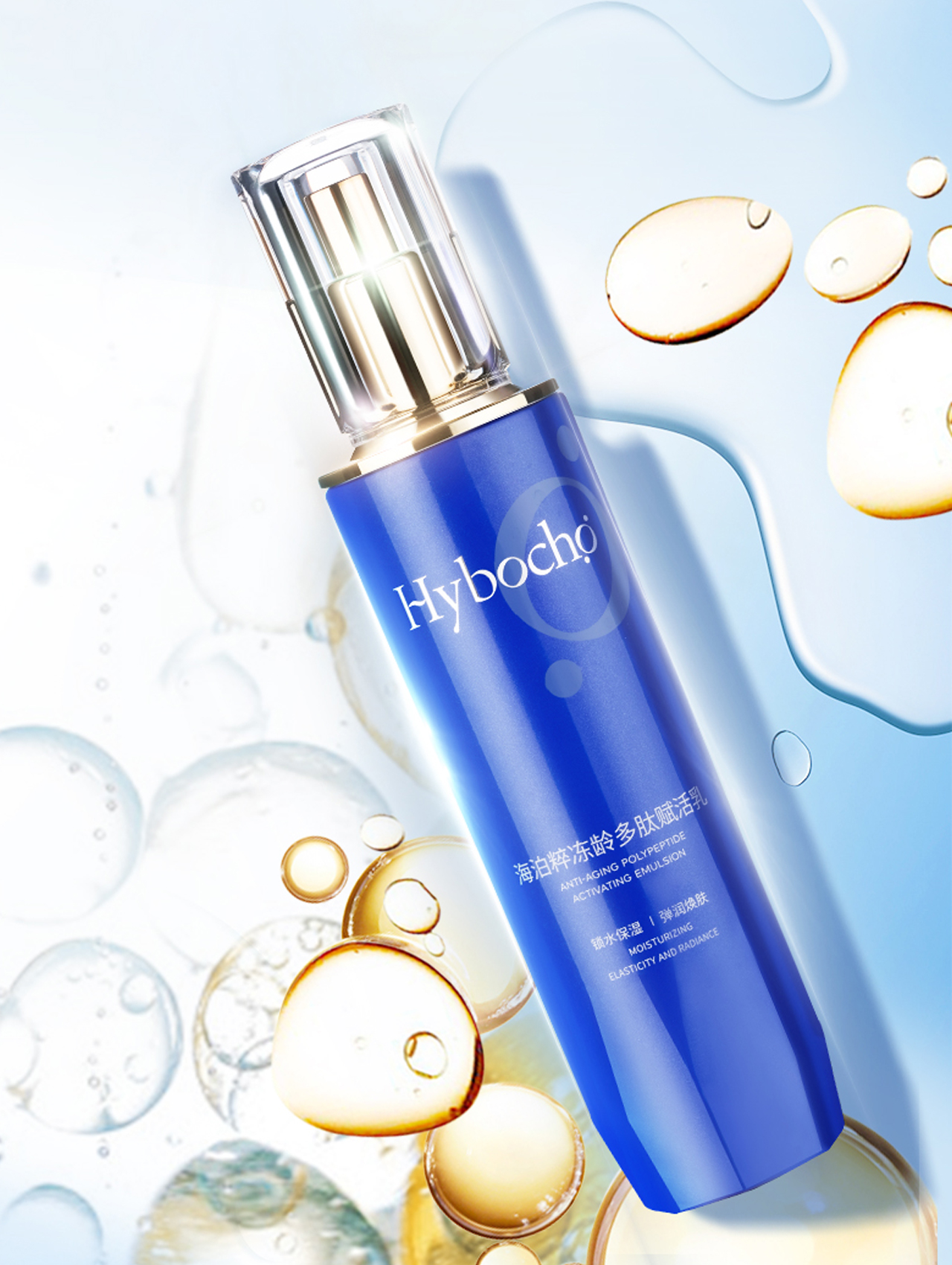
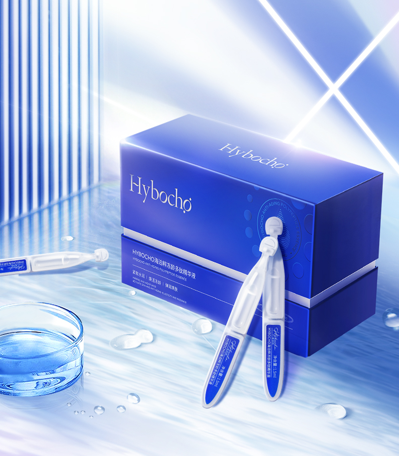

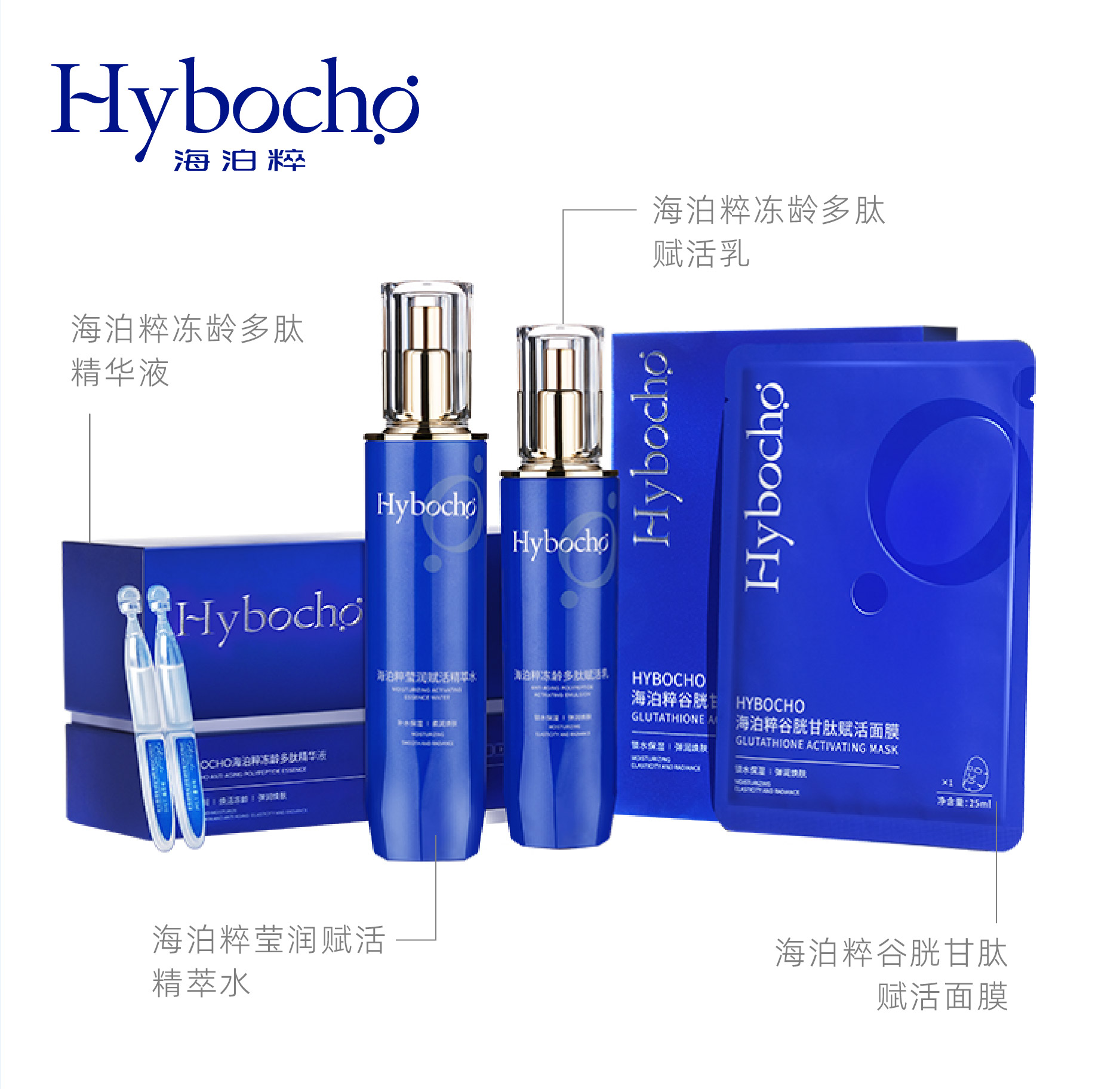
As a brand new brand, Haibo Cuiu launched 4 products for the first time
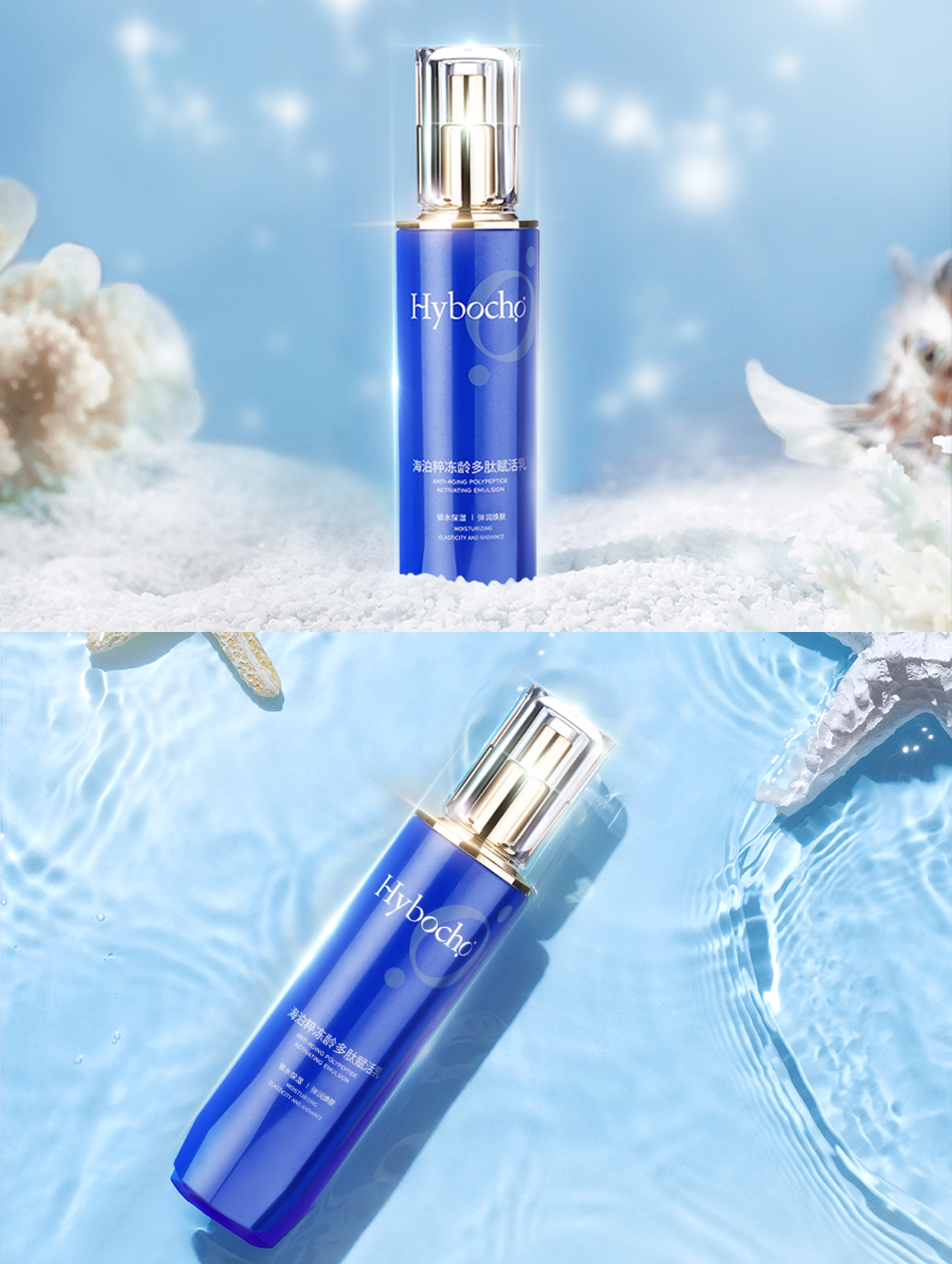
The bottle body is made of brand color deep sea blue, combined with pearlescent technology, so that deep sea blue can be light and shimmer, highlighting the light texture of the ocean, with geometric cut transparent bottle cap and gold pressure pump, high-end display.
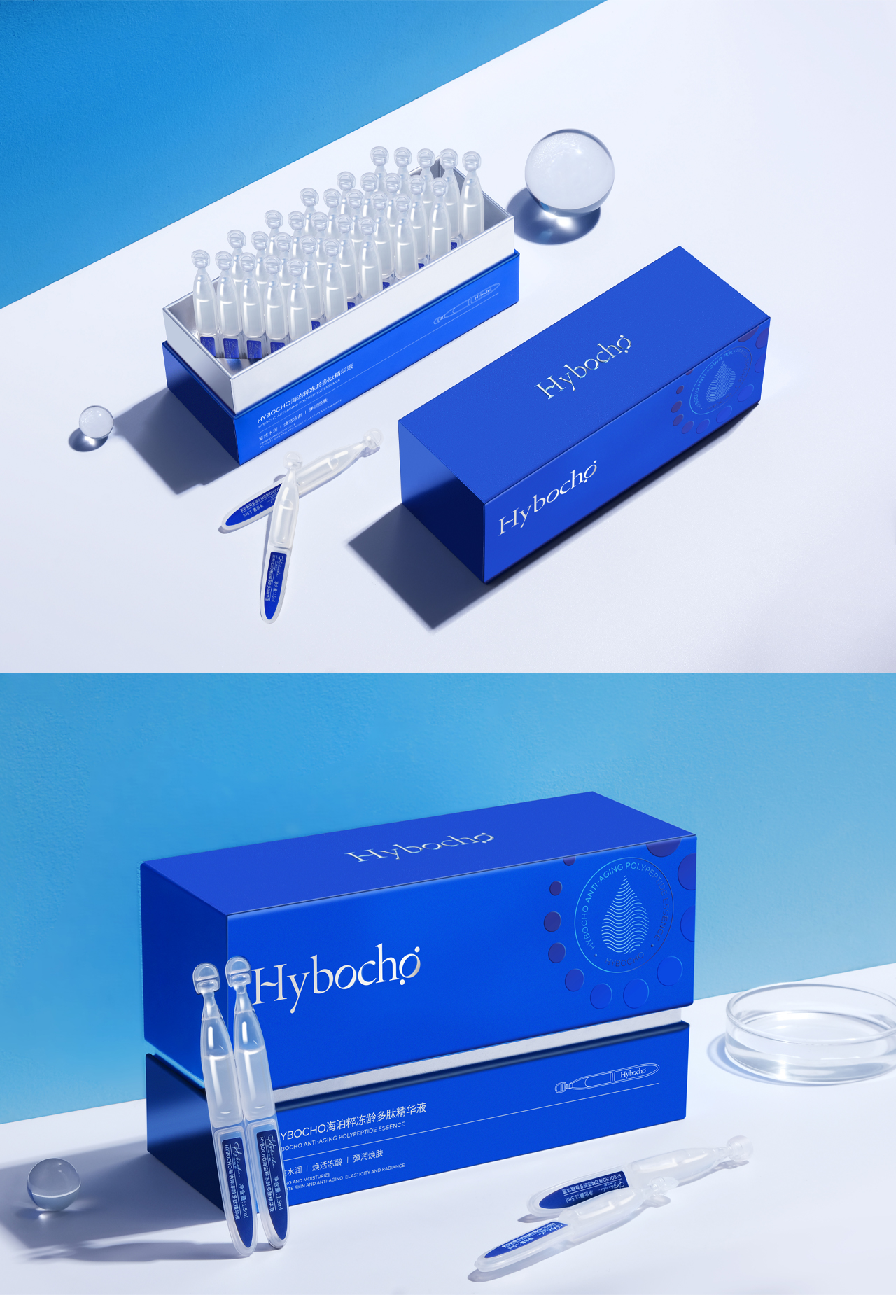
The brand super symbol and drop-like essence ingeniously combined, intuitive presentation of polypeptide essence highly concentrated characteristics, efficient delivery of the core selling points of the product.
The outer box uses a combination of deep sea blue and silver, and the silver lines divide the box body. The shape is simple and modern.
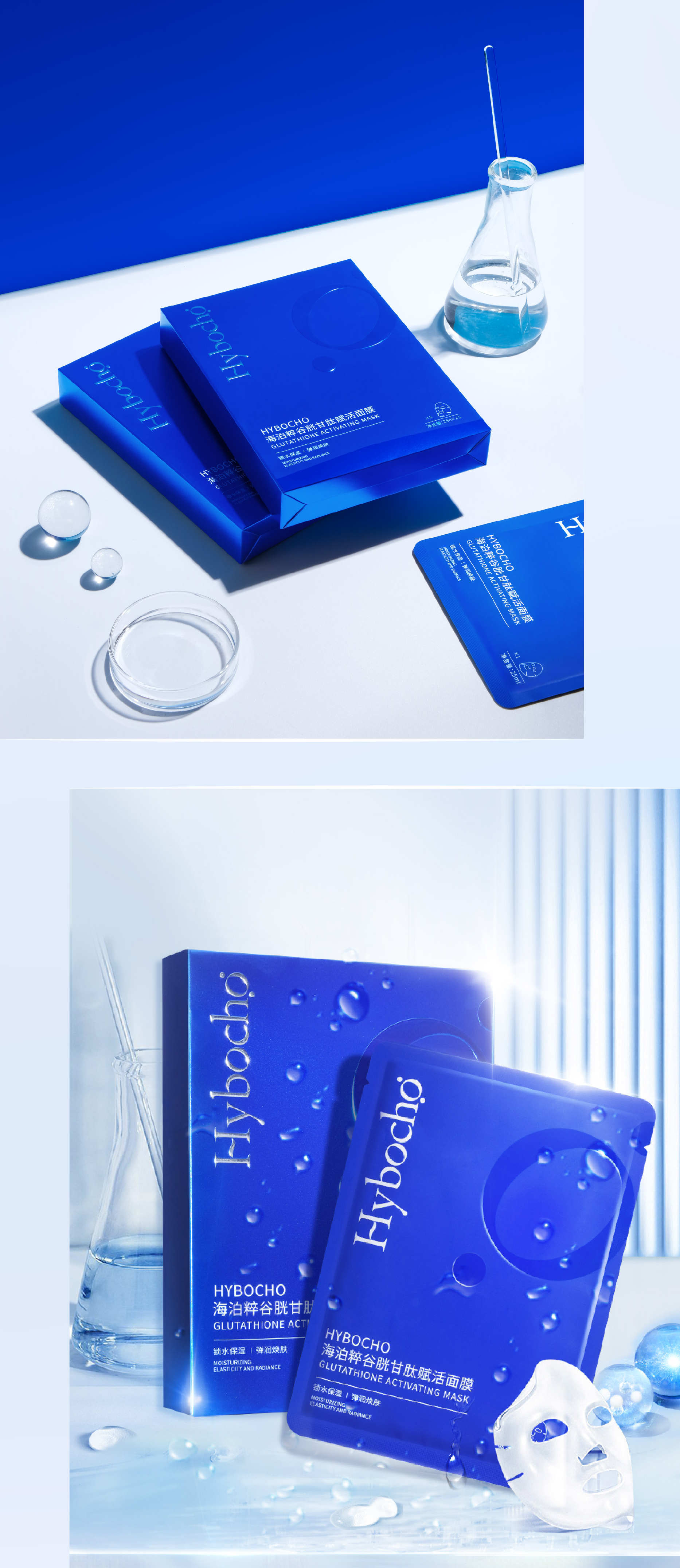
In terms of packaging technology, the outer box of the product is made of silver card material to make the packaging light and light in the deep sea. UV coating is used to highlight the super symbol of the essence of the sea and deepen the product characteristics of "polypeptide" skin care.
Brand LOGO adopts the process of striking convex superposition and revealing silver, which is uniformly presented in the product packaging, enriching the visual level and further deepening the brand imprint.
The copyright of this work belongs to 瑞德设计. No use is allowed without explicit permission from owner.

New user?Create an account
Log In Reset your password.
Account existed?Log In
Read and agree to the User Agreement Terms of Use.

Please enter your email to reset your password
Blue looks comfortable
Very general
Is it okay
Does brand design also include product packaging?
nice job!