In early June 2024, Pan found the Lemet team and planned to launch his brand new brand: Kitchen Township. It is hoped that through this brand, it can bring consumers better rice, flour, grain and oil products, and at the same time, it is also looking for new growth points for its own development.
In this case, we will analyze it in detail from 4 aspects to establish a new brand image for the kitchen township good brand and quickly realize the accumulation of brand equity.
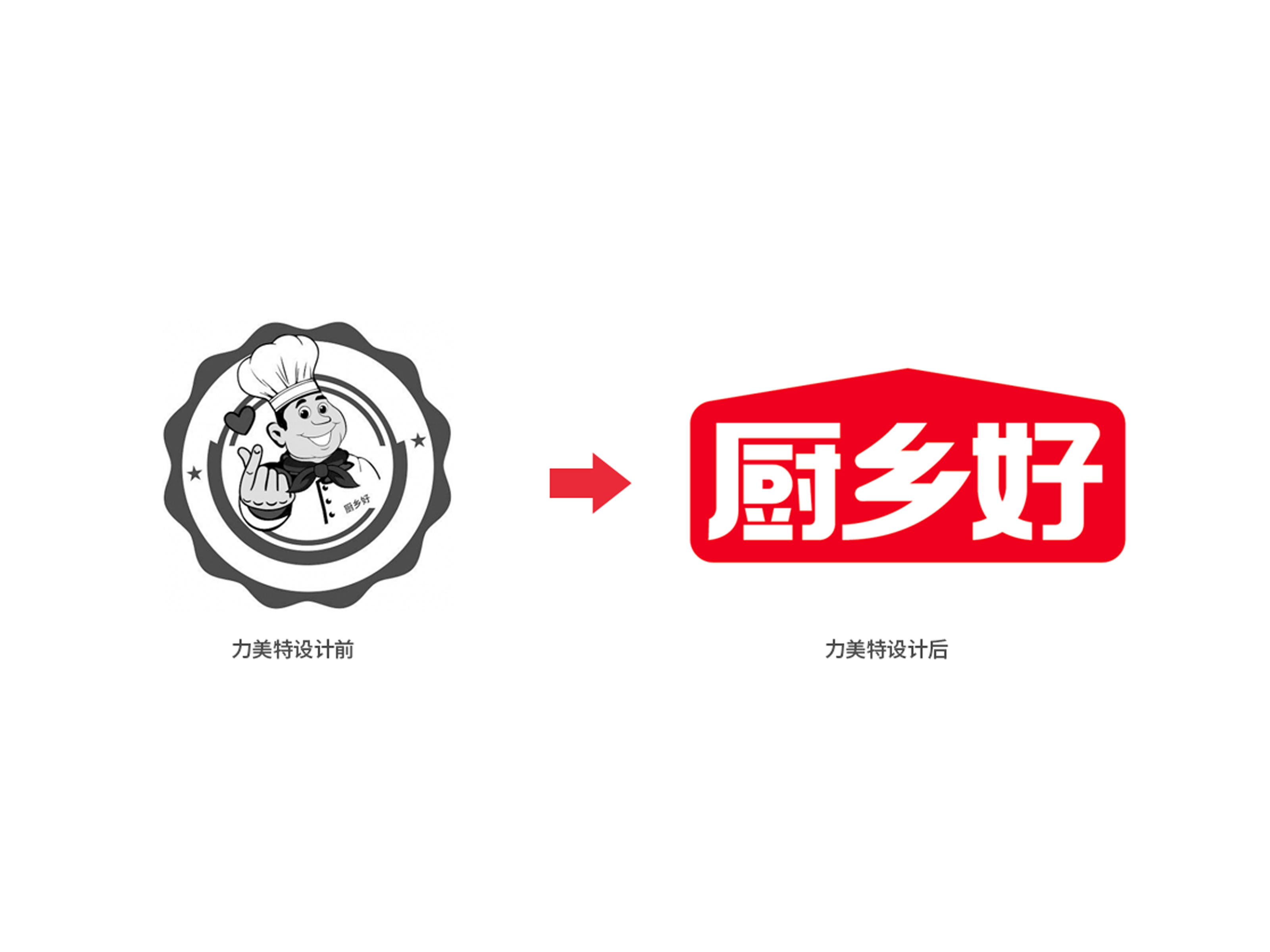
1. Brand upgrade logo
Because all the brand marketing is for the brand communication service. The design of this logo, not to mention the aesthetic feeling and graphic modeling ability of the design, there is a big problem in the dissemination. If the logo is reduced, it will not be able to read and remember.
The limet team has designed a brand-new brand logo. starting from the three words kitchen, township and good, the house modeling elements (meaning kitchen, hometown, granary, etc.) are extracted, and the font design with good recognition is integrated, and the brand is presented concisely and clearly with the font logo, which has good recognition.
2. Product naming
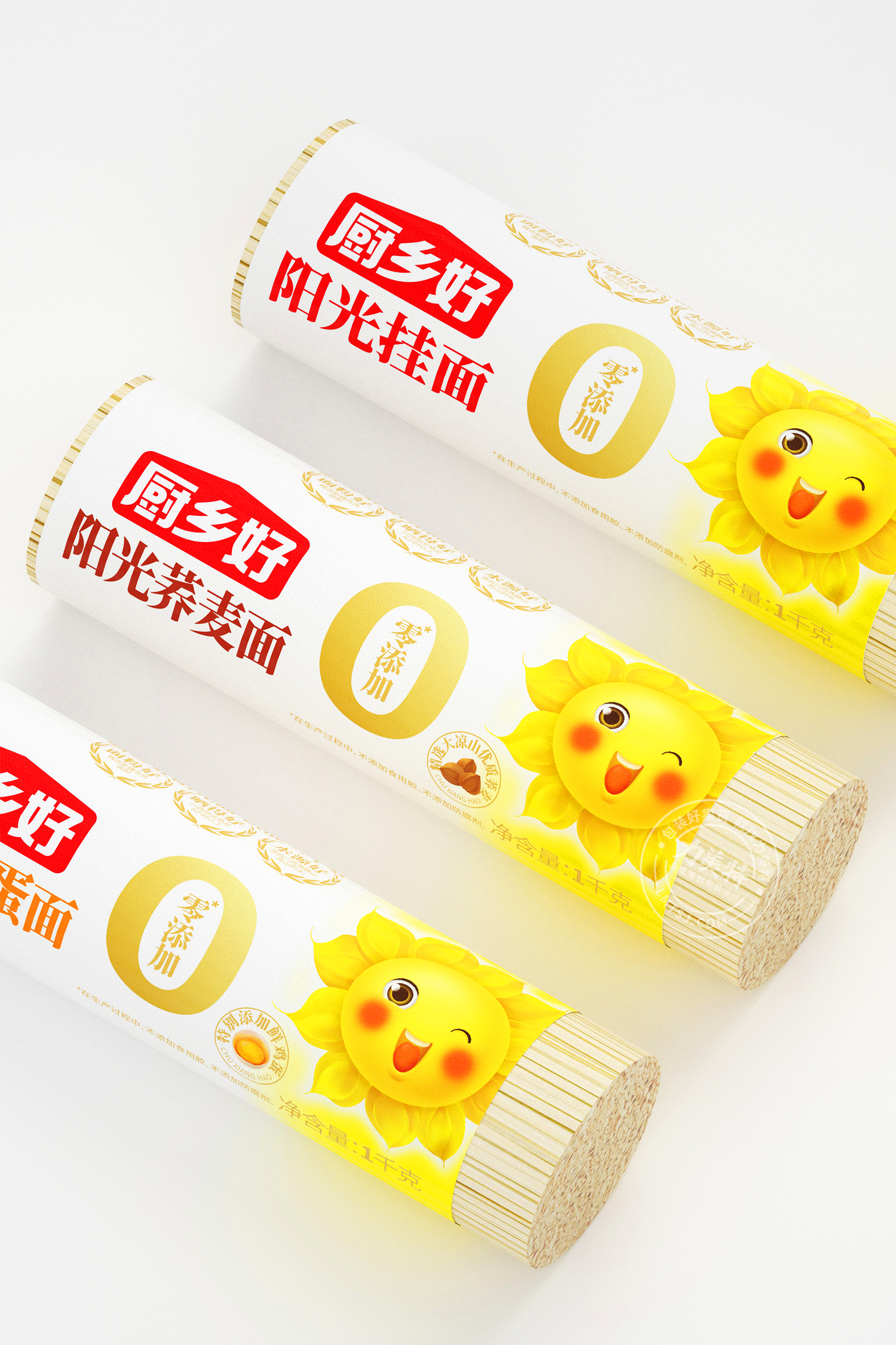
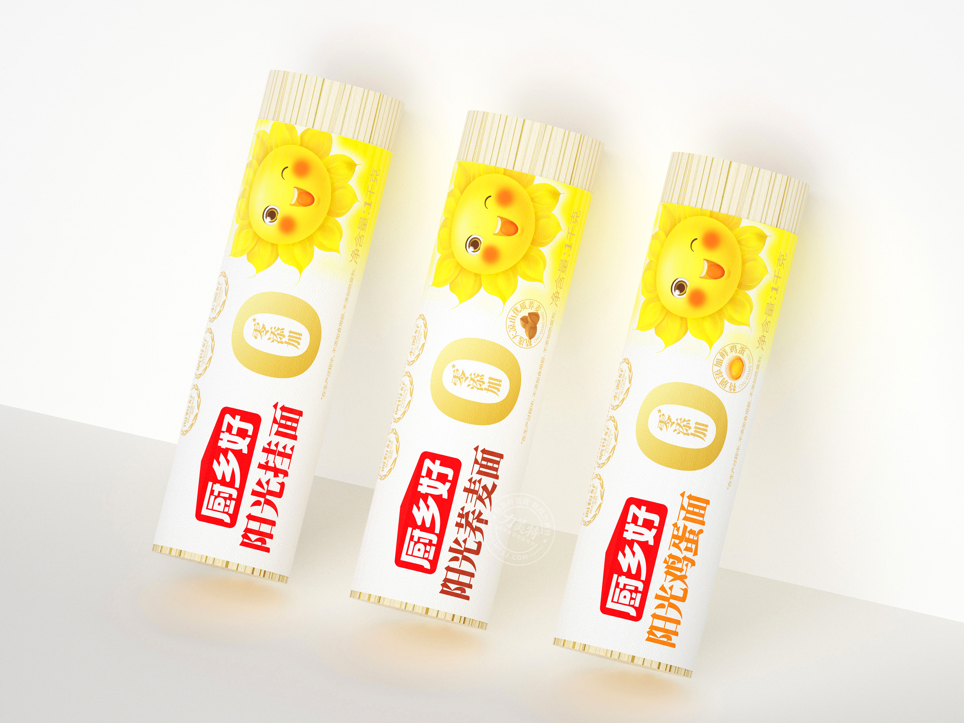
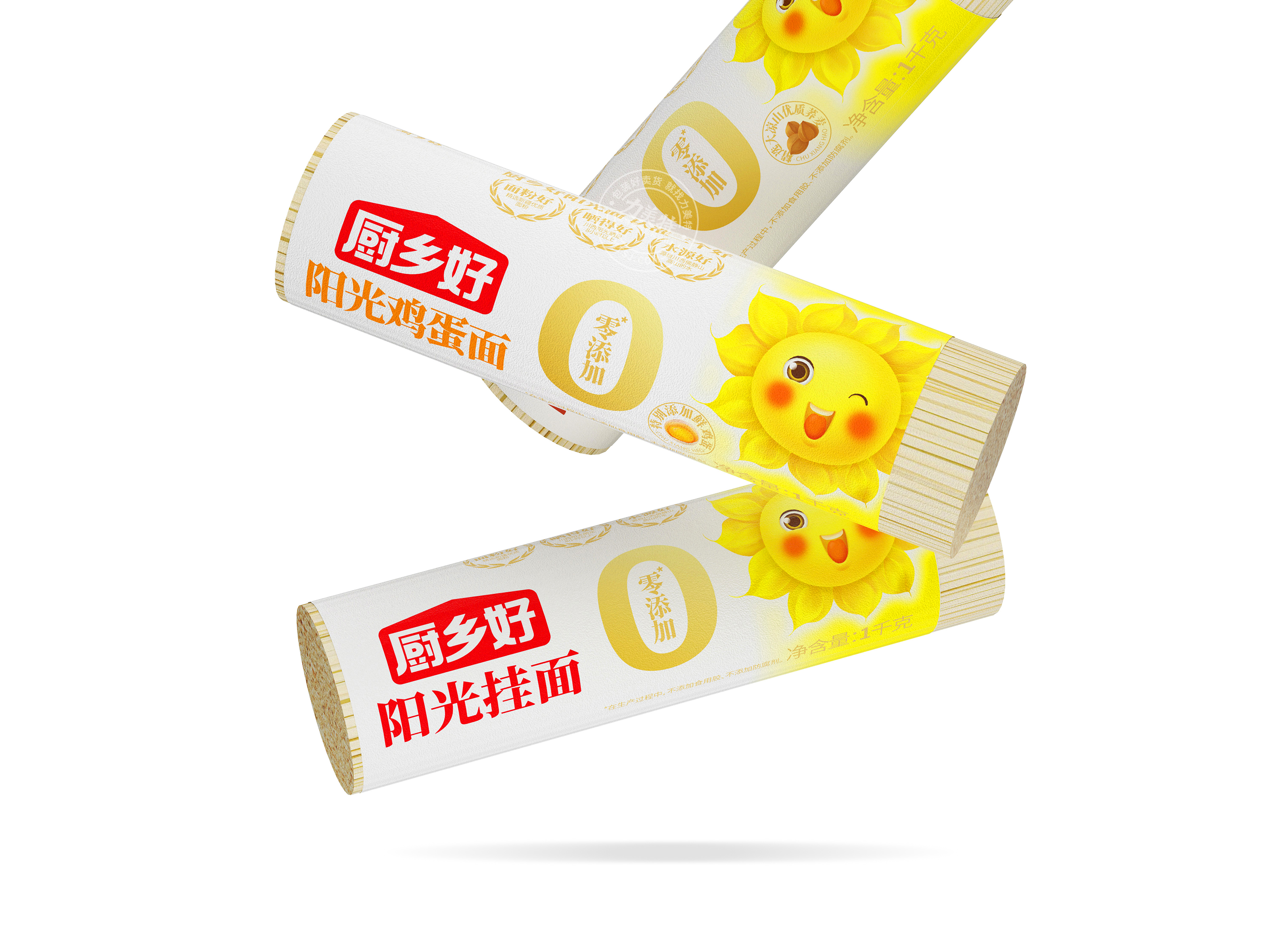
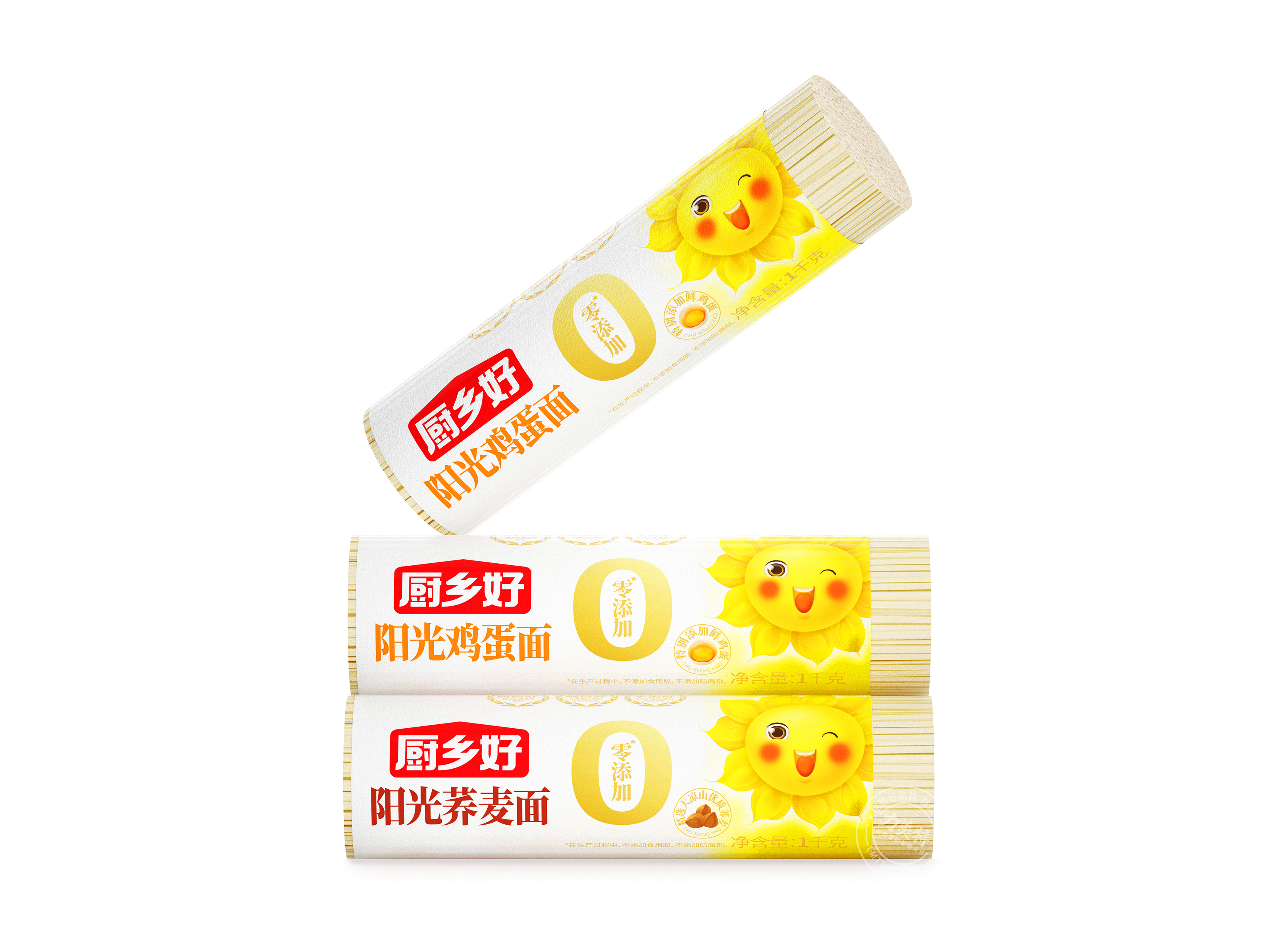
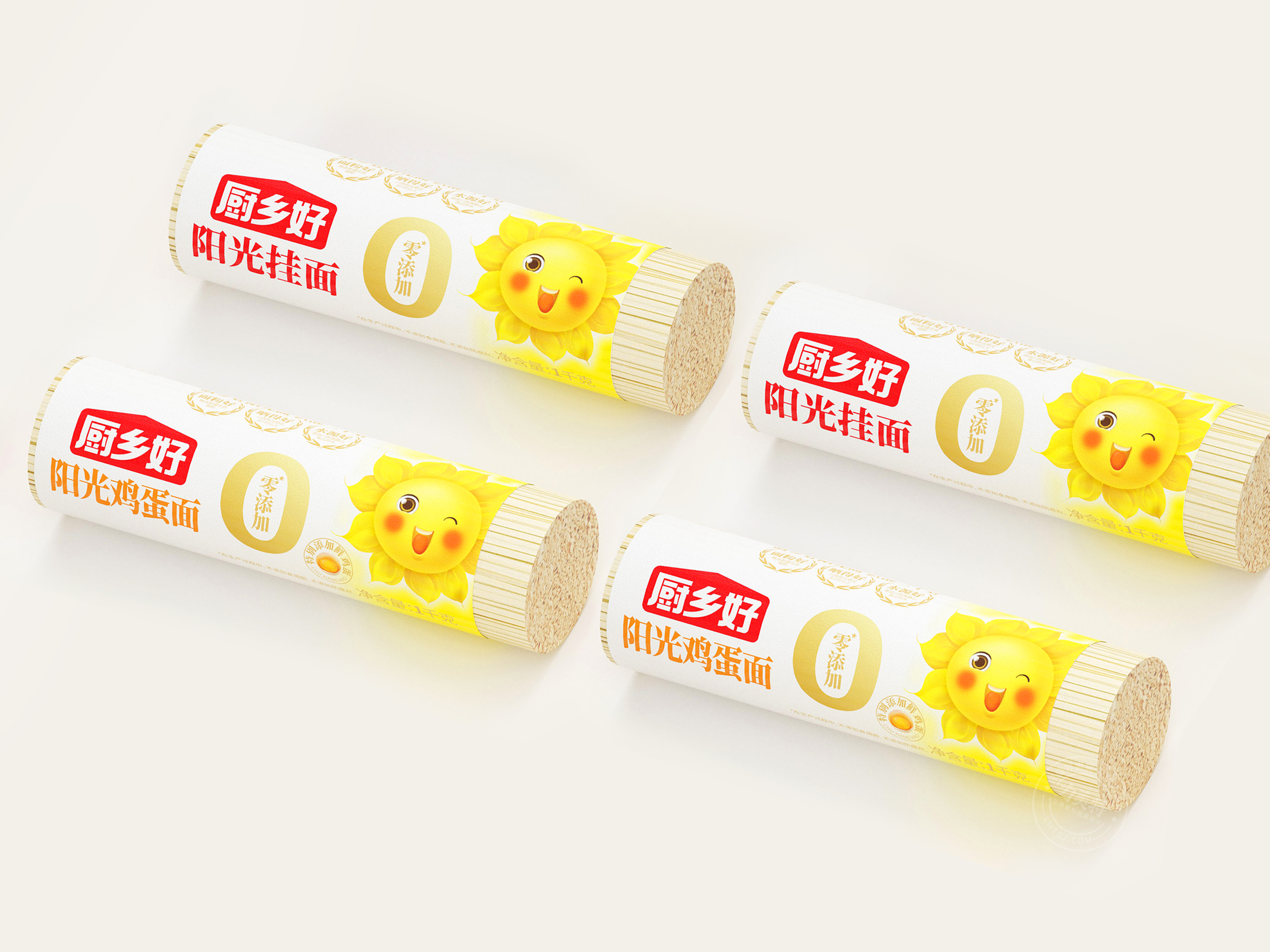
Product is information, packaging is the media. Then when naming products, naming is often the call! Through in-depth communication and exchange with Pan Zong, we have learned that this series of noodle products have the characteristics of relatively special origin and long sunshine time, and are made of high-quality flour from Xinjiang. Therefore, their taste is strong, unique chewy and long-cooked, which is indeed the top grade of noodles.
Therefore, we directly named the product: sunshine.
3. Super-Discourse
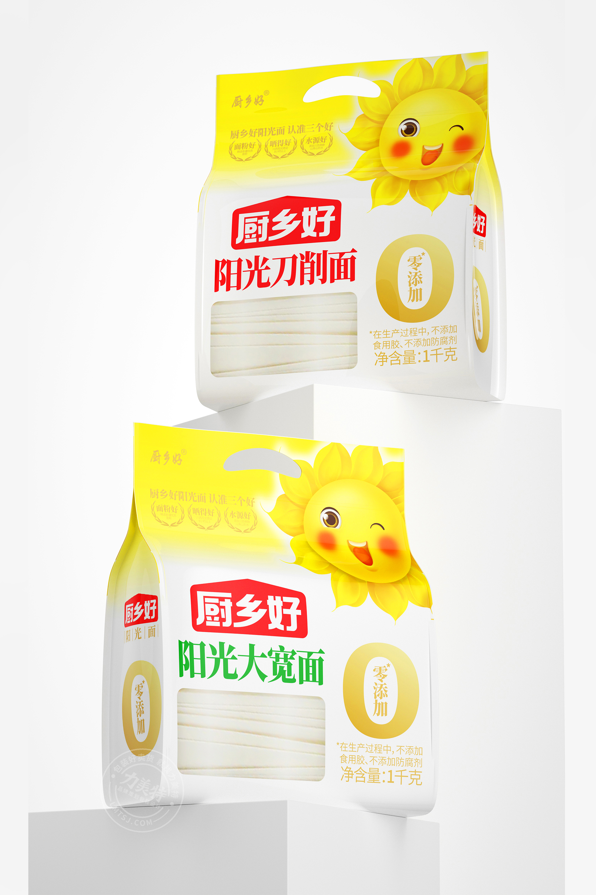
We said that the advertising language should have a brand name, and it is better to have a category at the same time. Therefore, our advertising language came into being: Kitchen Village has a good sunny face, and identify three good ones! In the brand trust form respectively listed three good, good where? And put it in the packaging design, realize the visualization of the purchase reason.
4. Super IP and Super Packaging Design
For a good packaging design strategy in Kitchen Township, we have determined two points: first, we use the principle of super symbol to design packaging, and use symbolic brand image to make consumers remember everything; The second is that the format design is divided into regular designs on the market, which are as concise and clear as possible, while the selling points are clear and the logic is reasonable.


The copyright of this work belongs to 力美特品牌策划. No use is allowed without explicit permission from owner.

New user?Create an account
Log In Reset your password.
Account existed?Log In
Read and agree to the User Agreement Terms of Use.
Please enter your email to reset your password


not bad, huh
It looks delicious.
Children's Noodles Bar
Lovely