Ben also designed official website: https://designben.com/
Service Items: Industrial Design | Brand Design | Commercial Value | Aesthetic Performance
We are keen to explore new design concepts and look forward to working with you on the journey of innovation.


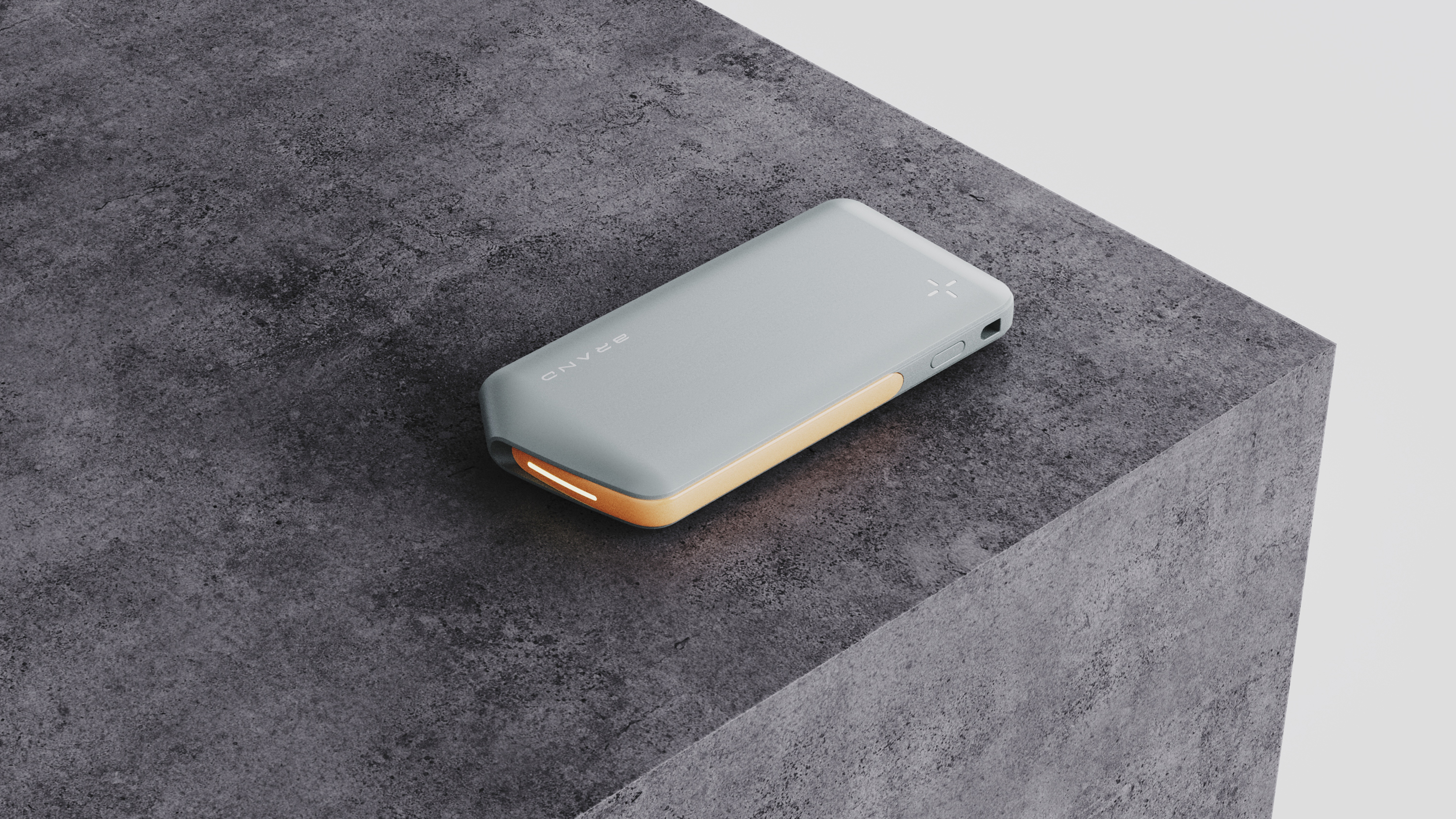
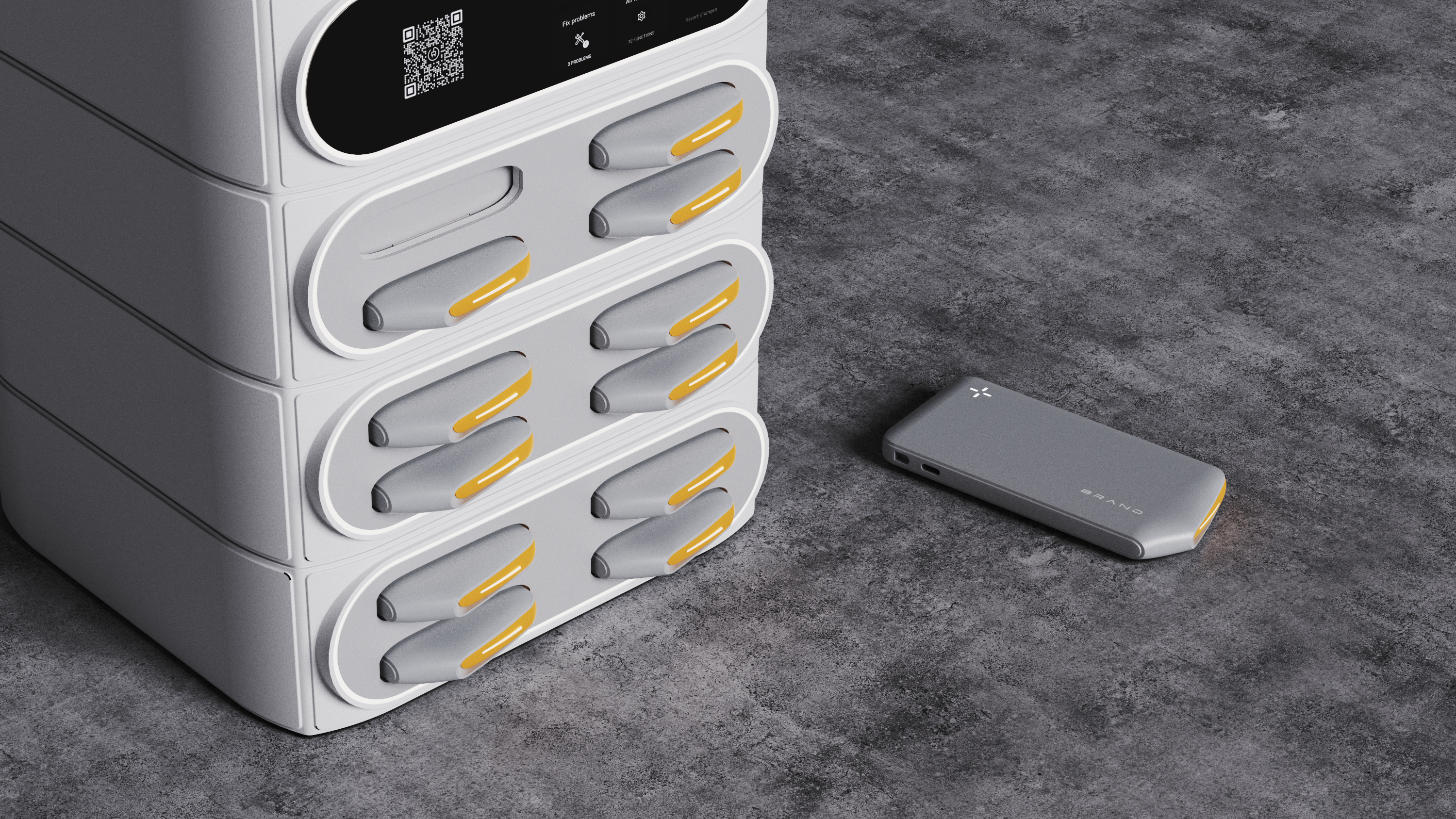
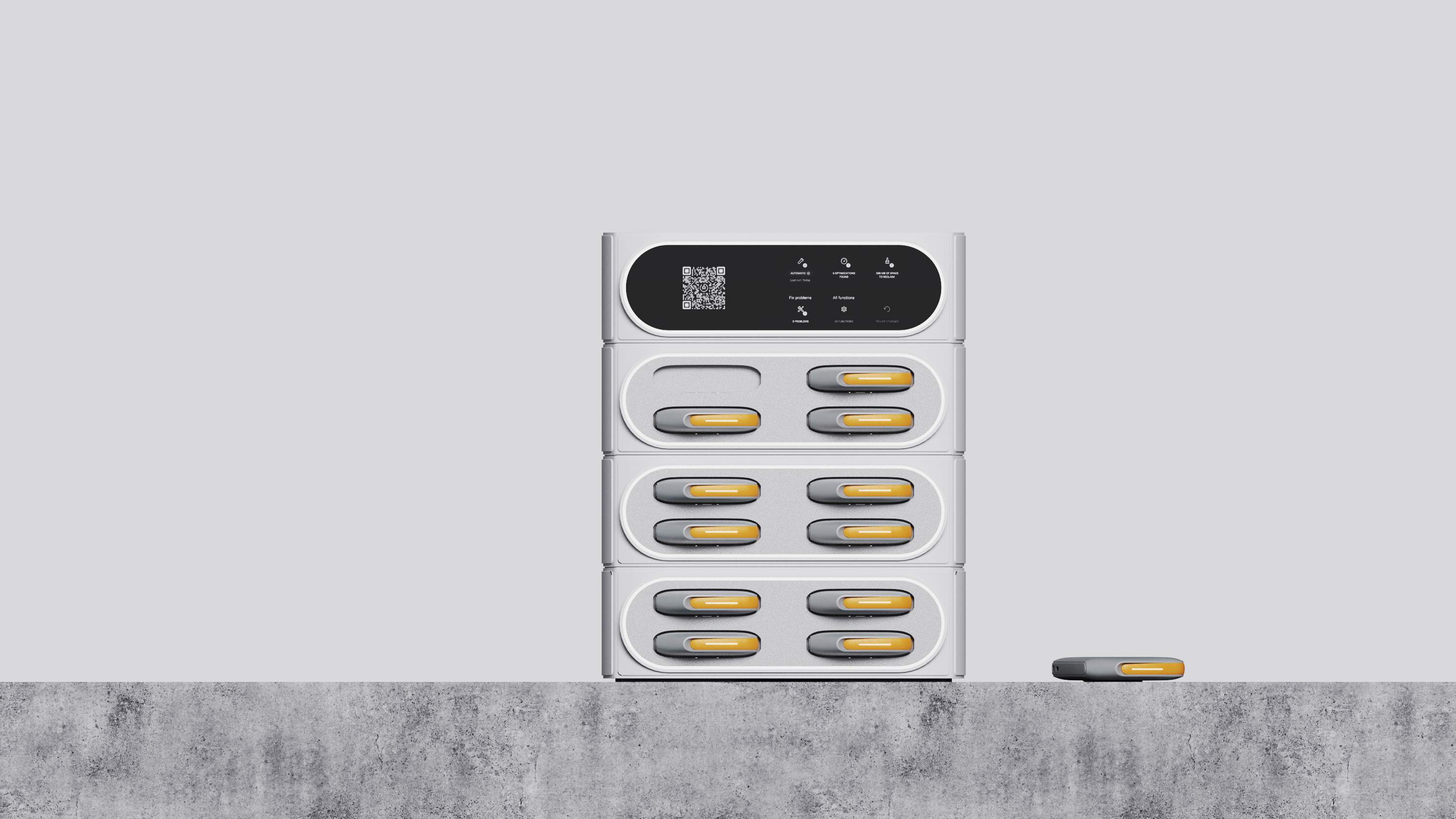
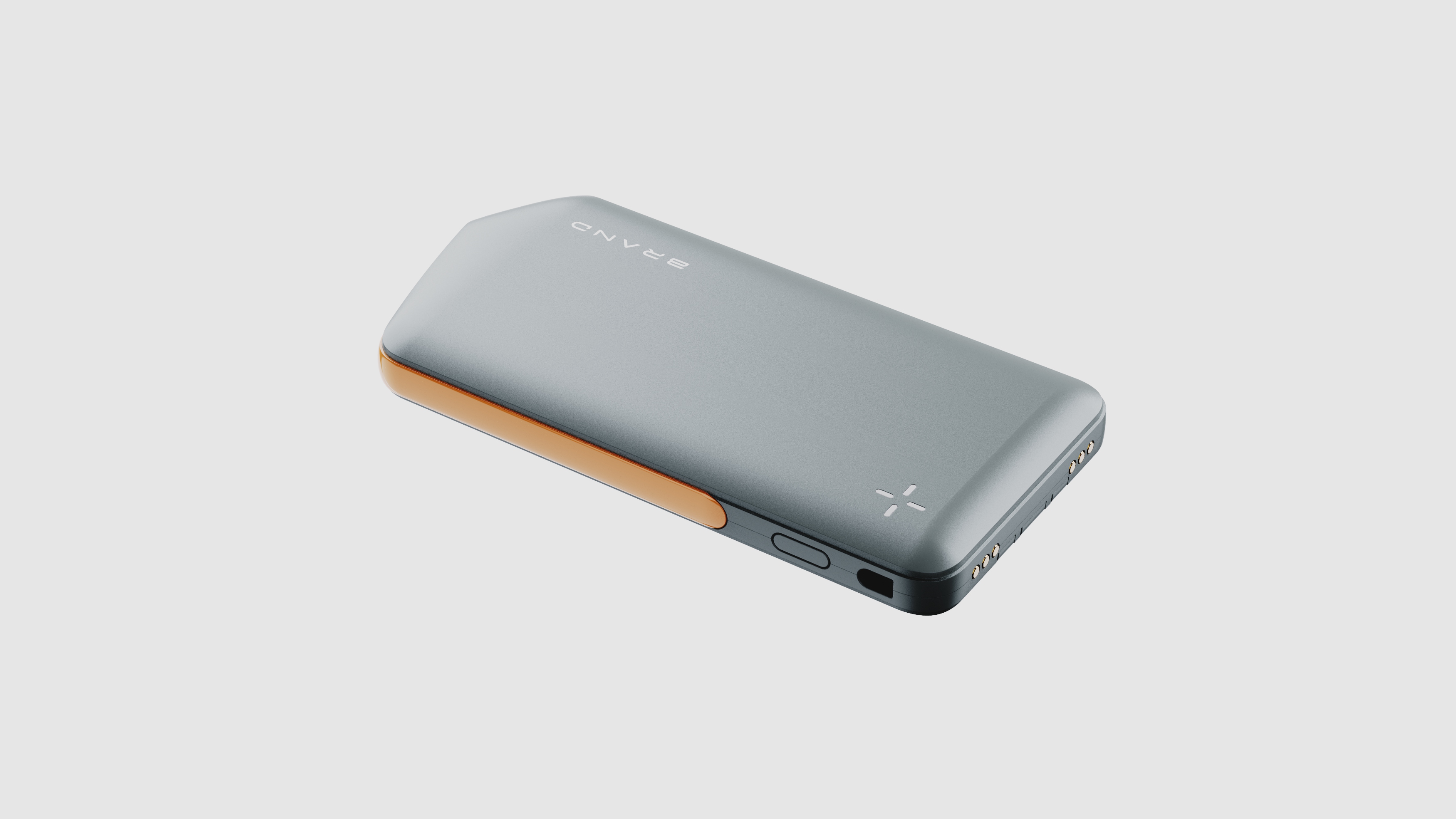
Compared with the charging treasure products on the market, which appear in symmetrical shapes, this charging treasure takes irregular "corner cutting" design as the core highlight, breaking the shackles of symmetrical shapes and showing unprecedented visual freshness and personality charm.
The clever combination of color and material is the biggest memory point of the design. We use the middle decorative strip design of the contrast color design, which forms a sharp contrast with the main body of the shell. In addition, the material contrast of the matte surface not only enhances the layering and depth of the product, but also brings a strong visual impact.
See the real chapter for details, so I have made great efforts in the design of the indicator light. Abandoning the traditional small dot shape and shaping the indicator light into a "cross star" shape, this creative move not only breaks the dullness, but also gives the indicator light vividness and interest. Every charge seems to be guided by starlight, adding a touch of interest and expectation to the user's daily life.
The overall shape of the charging treasure also adopts the edge design, which makes the product more visually thinner and more fashionable. This design is not only easy to carry, but also improves the overall aesthetics of the product.


These noodles are too bad
porridge
it's not bad
The shape is too special