A good product can first attract other people's attention in appearance design, so that people have a desire to buy, thereby stimulating consumption.
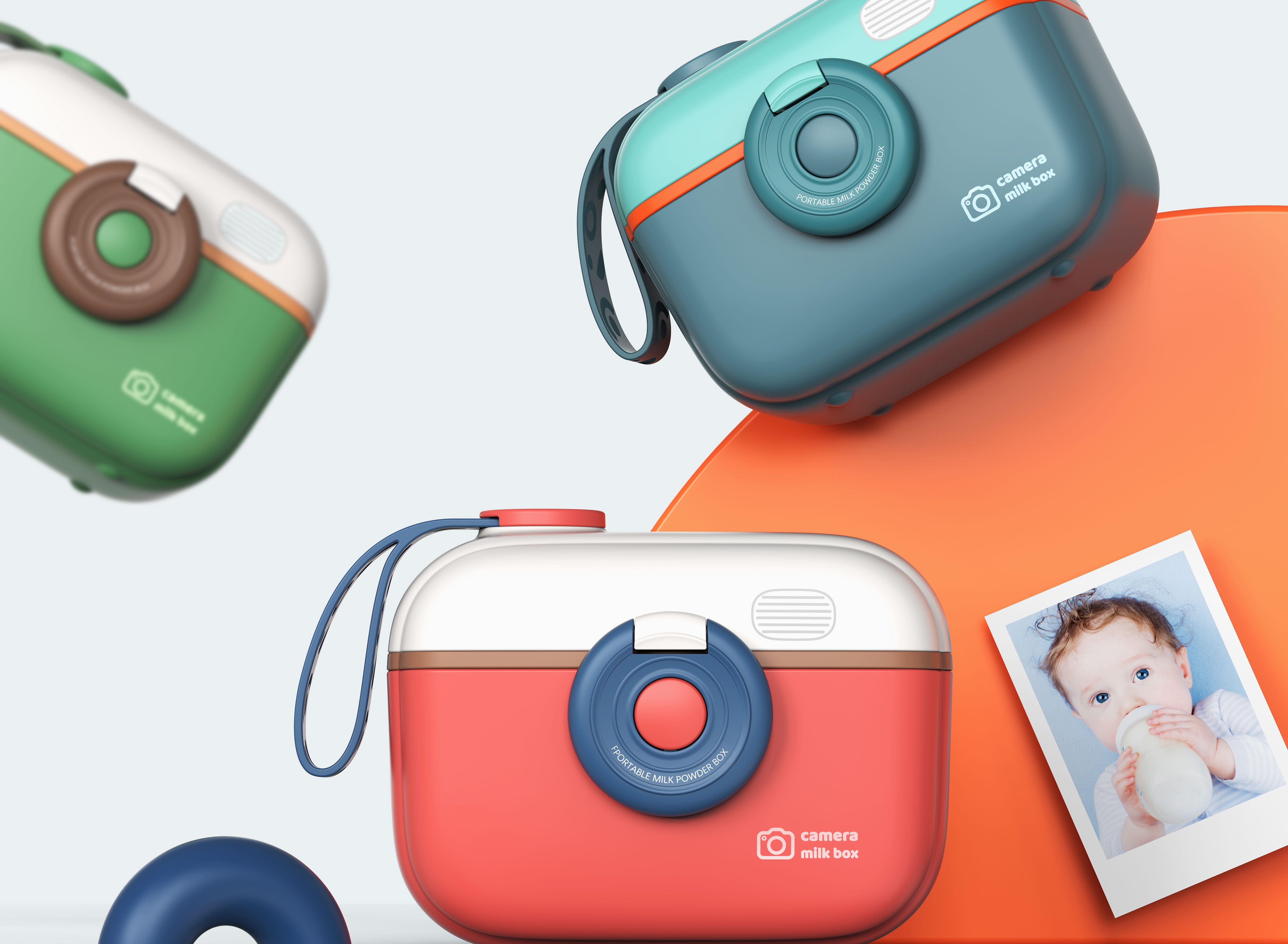
This camera milk powder box designed by Octavia adopts a conventional cuboid structure as a whole. How to increase the interest and artistic aesthetics of baby products in addition to the conventional appearance has become a major focus of Octavia designers.
After countless brainstorms, I got inspiration from the corrugated paper camera in the manual class when I was a child. The whole adopts a warm color system with low saturation and matches different colors to form a bright and lively contrast style.
Excellent products encourage consumers to share, and high-quality product sharing guides new users to place orders, thus creating aExplosions products.
"Parenting" provides mothers with new topics and scenes to share with social media, while excellent product design allows customers to share life experiences independently in various social media and circle of friends, bringing high exposure and transformation to brands.
A good product can first attract other people's attention in appearance design, so that people have a desire to buy, thereby stimulating consumption.
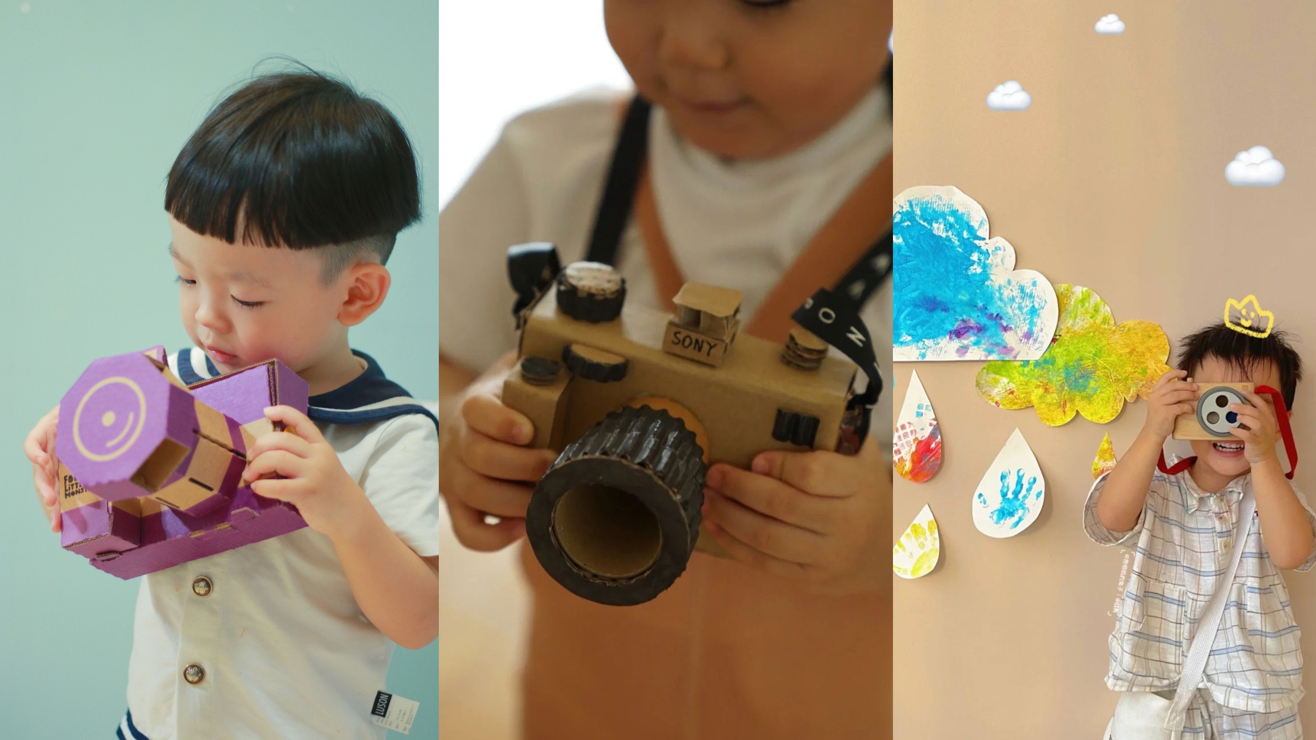
After countless brainstorms, I got inspiration from the corrugated paper camera in the manual class when I was a child. The sealed buckle was used as the camera lens, and the camera logo (flash) was added to the box body. The shutter position of the camera was skillfully used to design parts and increase the silicone handle, which not only solved the problem that the conventional milk powder box could not be carried by hand, but also increased the interest of the milk powder box.
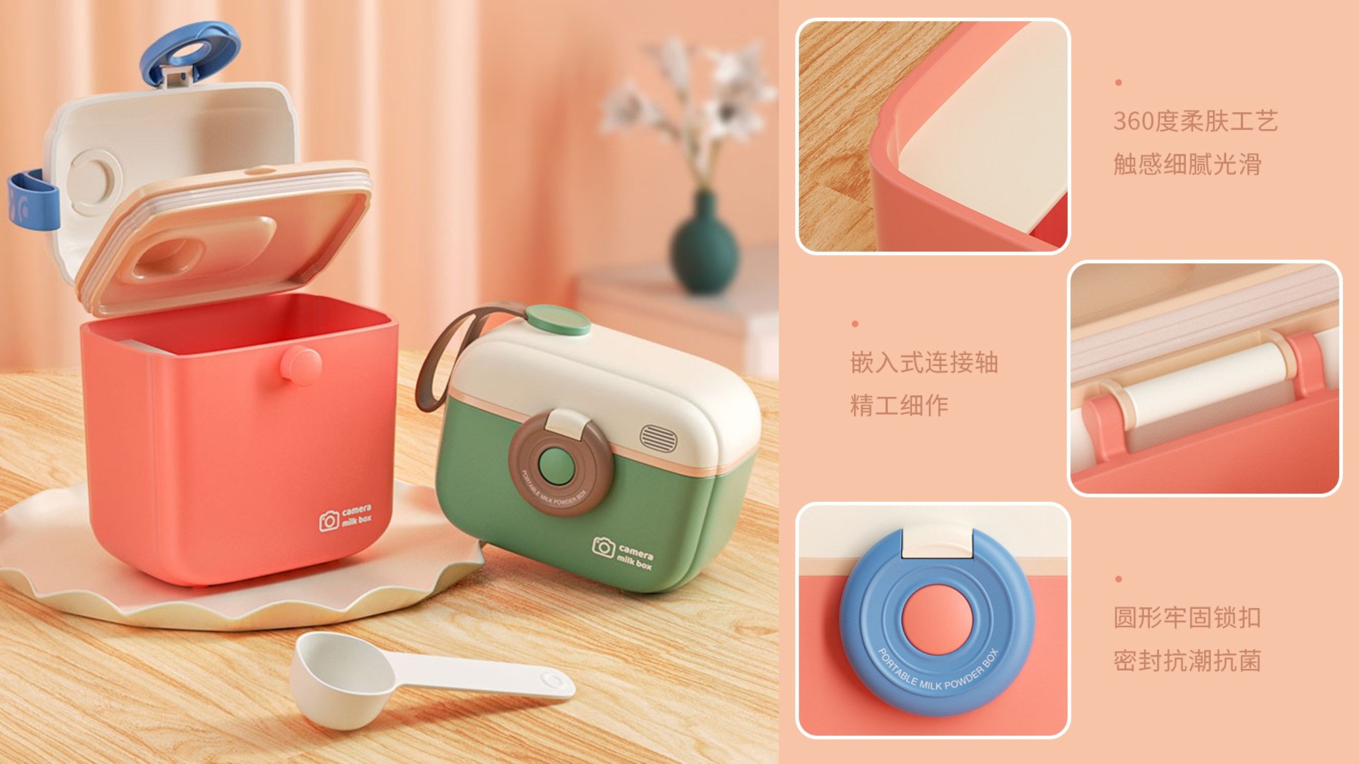
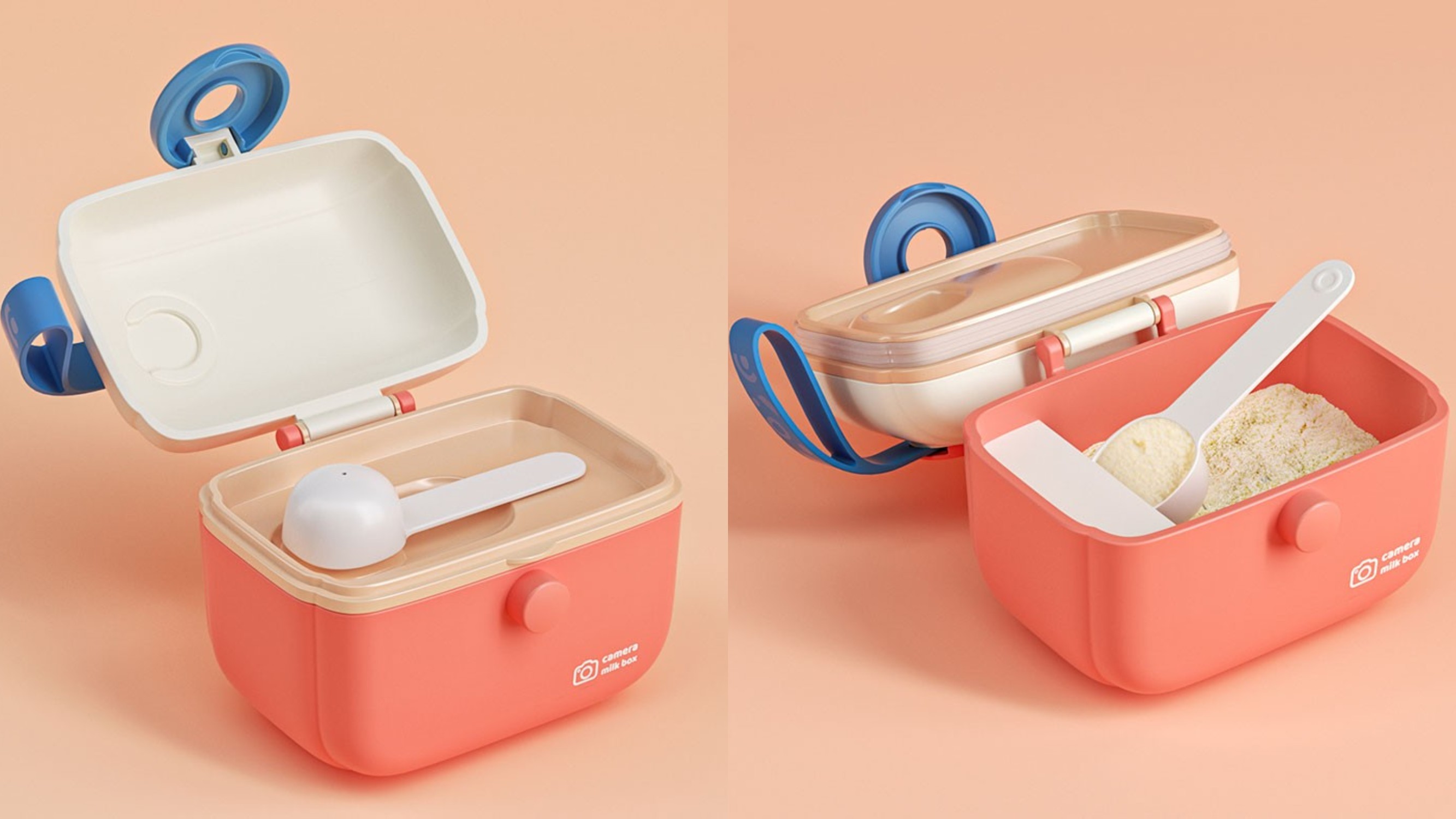
Considering the characteristics of milk powder to be sealed and preserved, a sealing rubber ring is added between the spoon and milk powder, which not only achieves the cleaner and more hygienic effect of the separation of the spoon, but also enhances the sealing of the milk powder can.
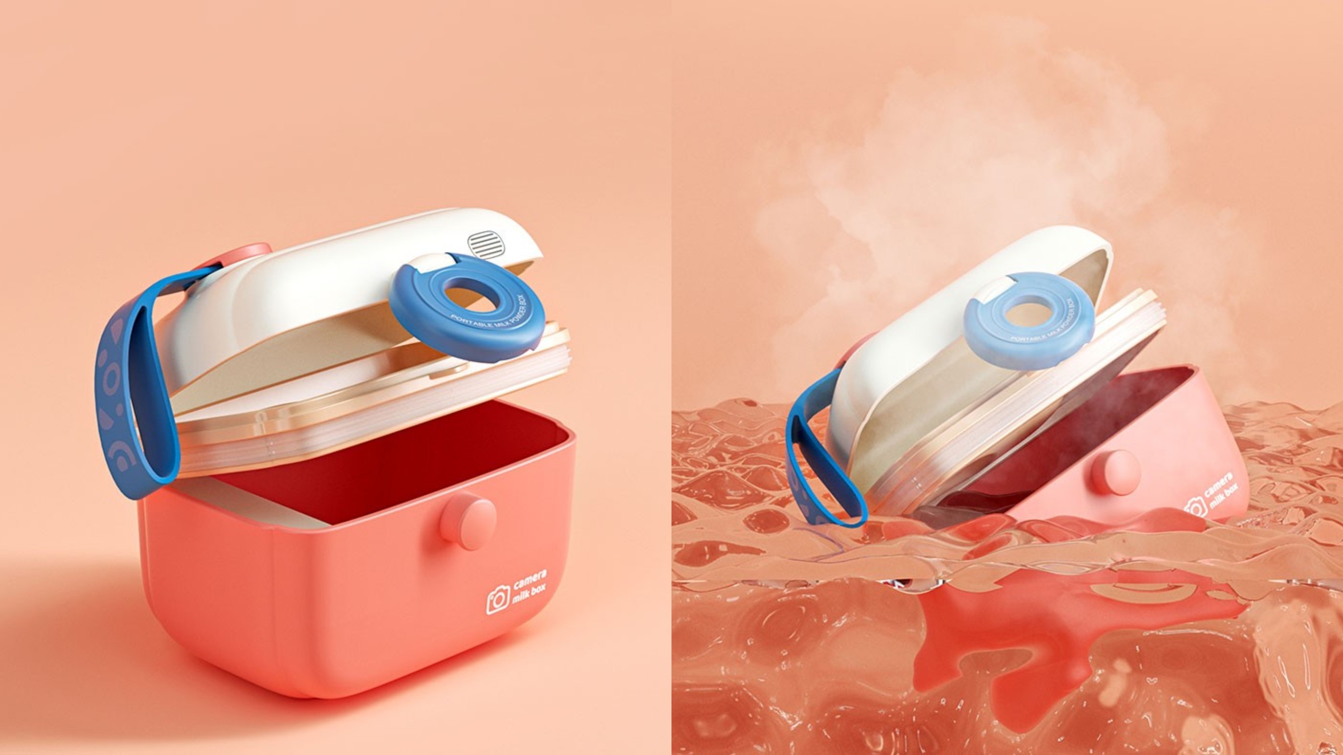
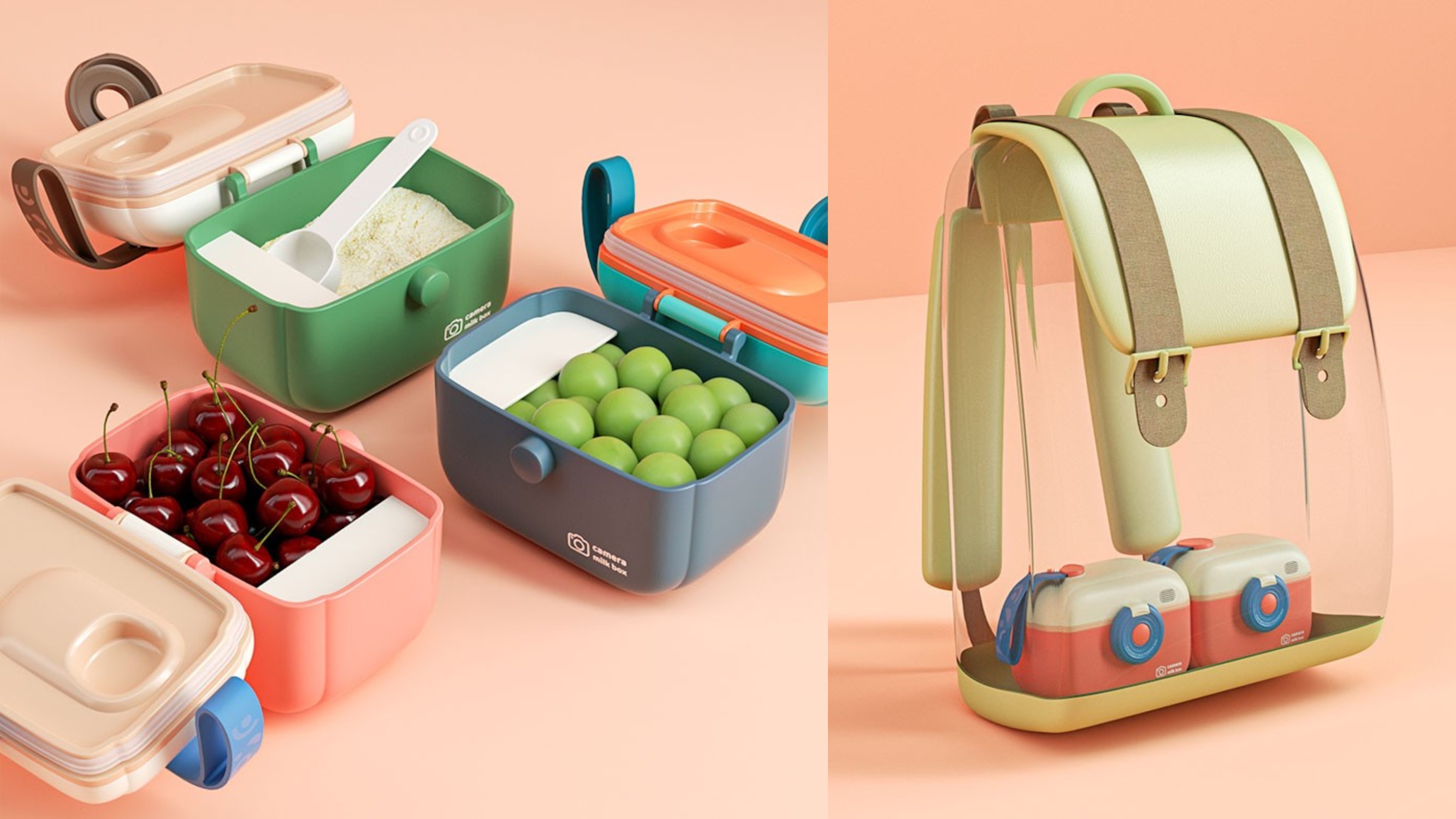
Easy storage, no land occupation, palm size, to meet the needs of children's short-distance travel.
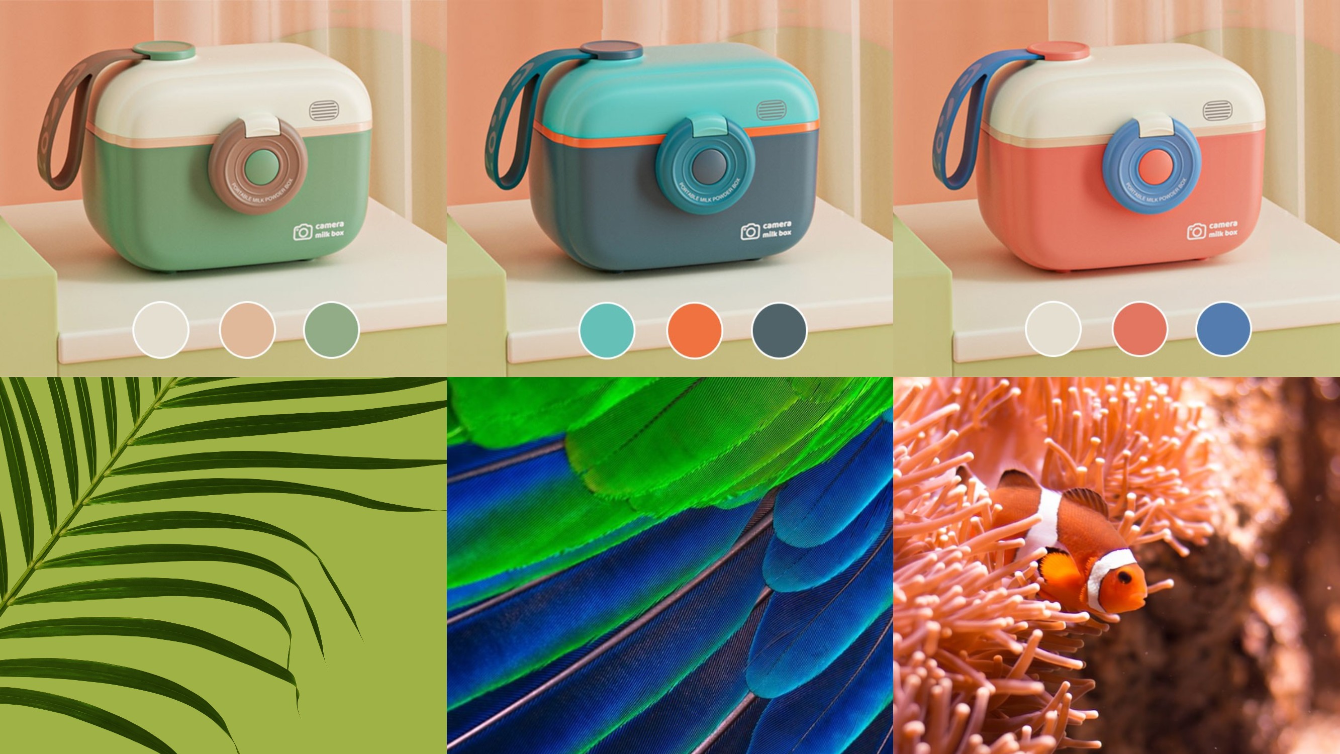
The whole uses a low-saturation warm color system, with vibrant coral orange, vigorous vegetation green, bright peacock blue as the main color, with similar low-saturation colors, forming a bright and lively contrast style.
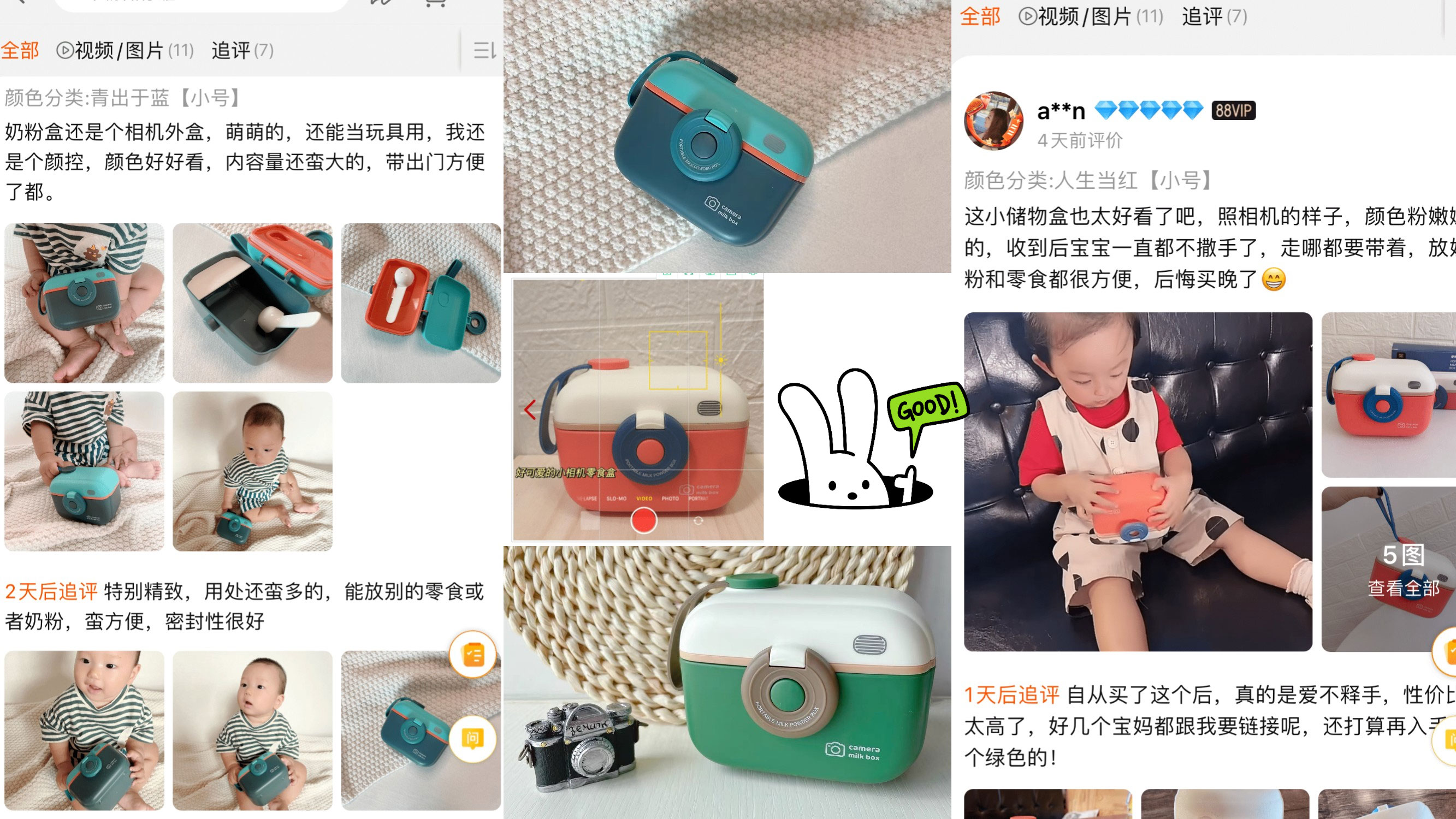
It is consistent with the concept of "artistic aesthetics starts with children" recently emphasized by maternal and infant brands. Without too many complicated matches, less is more design concept to make the product more brilliant.
As soon as the product entered the market, it quickly became a grass item for mothers.

The copyright of this work belongs to 明锐设计. No use is allowed without explicit permission from owner.

New user?Create an account
Log In Reset your password.
Account existed?Log In
Read and agree to the User Agreement Terms of Use.

Please enter your email to reset your password
Without babies, I think I can even match my cat master with a snack
Kawai
"For example, this model F40 is a big brother on the surface, but you see, there is a layer of white metal mesh. In fact, it is a razor. Even when I perform a task, I can shave unnoticed. "" As for this, it looks like a razor. It turns out that it is a hair dryer. "" The hair dryer is just a cover for its surface. In fact, it is still a razor! "
Kawaidana ~
It turned out to be a milk powder box, ha ha, 666
nice job!
The idea is fantastic
The product is awesome!