Hello everyone, I am Gu Xiaoyi, a professional beverage packaging design company editor! Gu Yi provided the following services for Pingba sake this time: brand overall creativity, brand font design, illustration design, sake wine label design, bottle neck label design, wine label physical proofing, and product display effect rendering
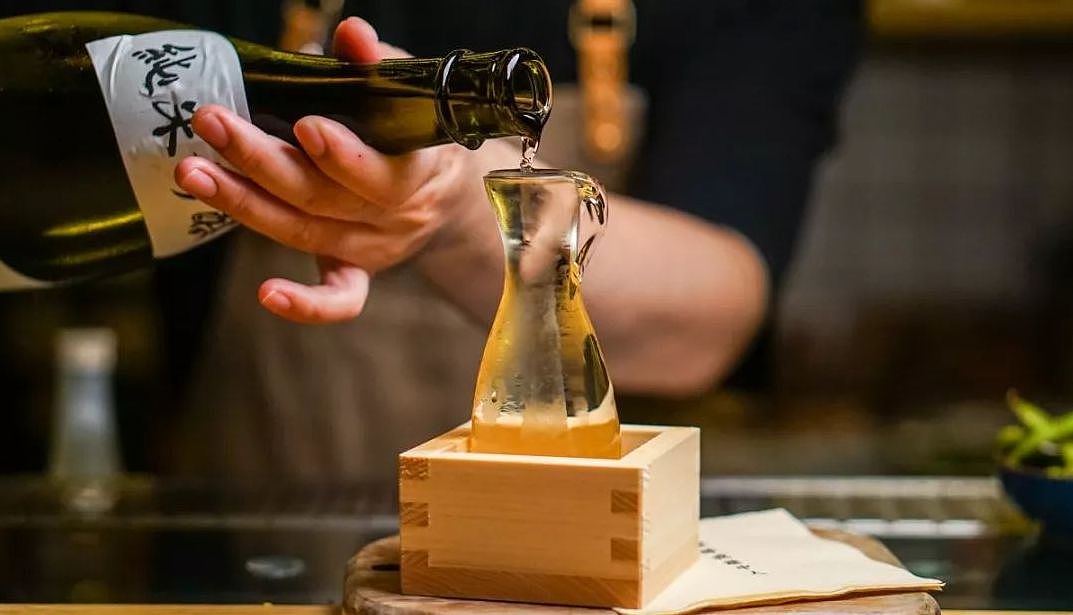
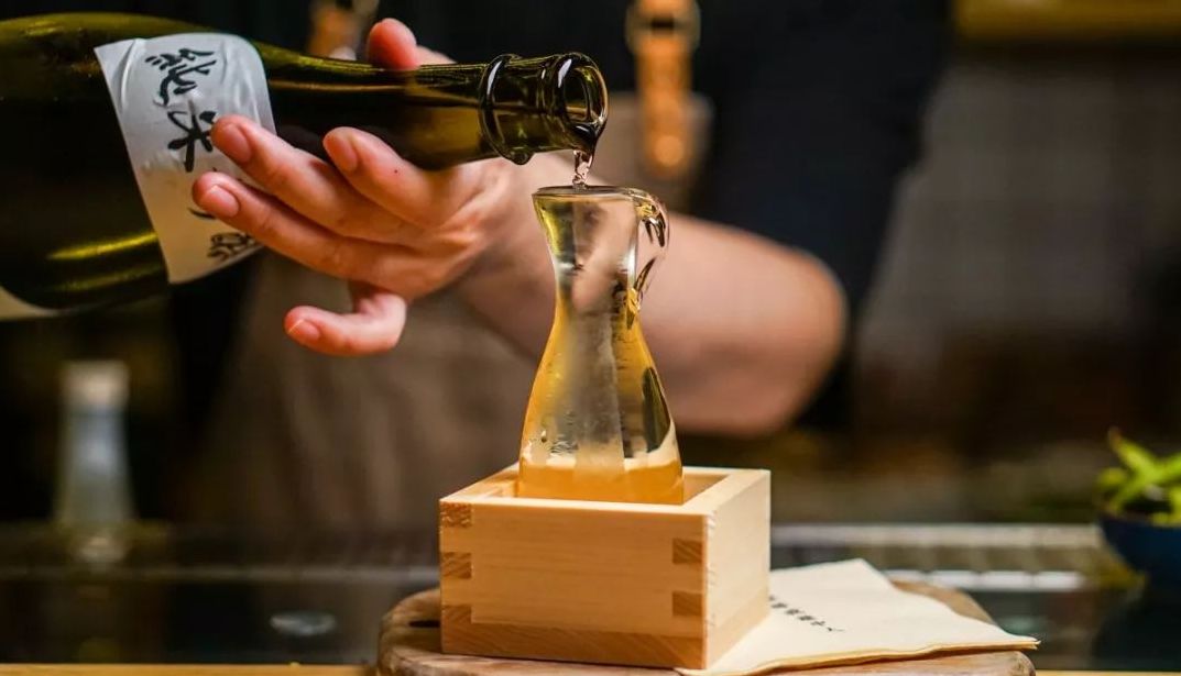
Sake: Japanese national wine, if we have been to a Japanese restaurant, we will find the existence of sake. The practice of Japanese sake is to imitate the production process of our country and use rice and water as raw materials for fermentation. The wine body is very clear and similar to water. When you drink it, you can feel its mellow fragrance. After drinking it, it has a long aftertaste. It is also very popular all over the world. A popular drink. This time, Xiaobian will also bring you our company's sake packaging design case last year. In the explanation of this sake packaging design case, Xiaobian will give you a good analysis: make the products more competitive from the psychological and physiological needs of consumers, and then impress consumers to finally place an order for purchase.
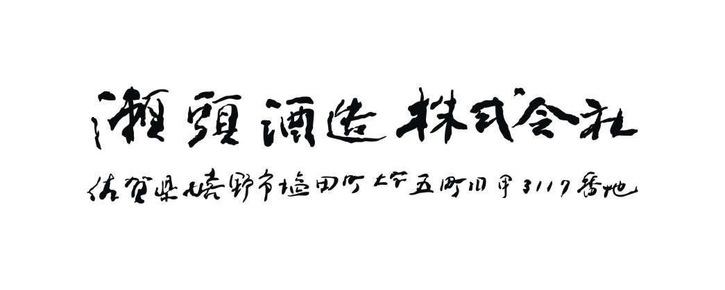
Title: Ping Ba Sake
Customer Name: Seto Wine Co., Ltd.
Service content: font design, sake wine label design, neck label design
Service Team: Guyi Brand Packaging Design Department
Before formally introducing the case, Xiaobian also needs to design an award ceremony for this Pingba sake product:
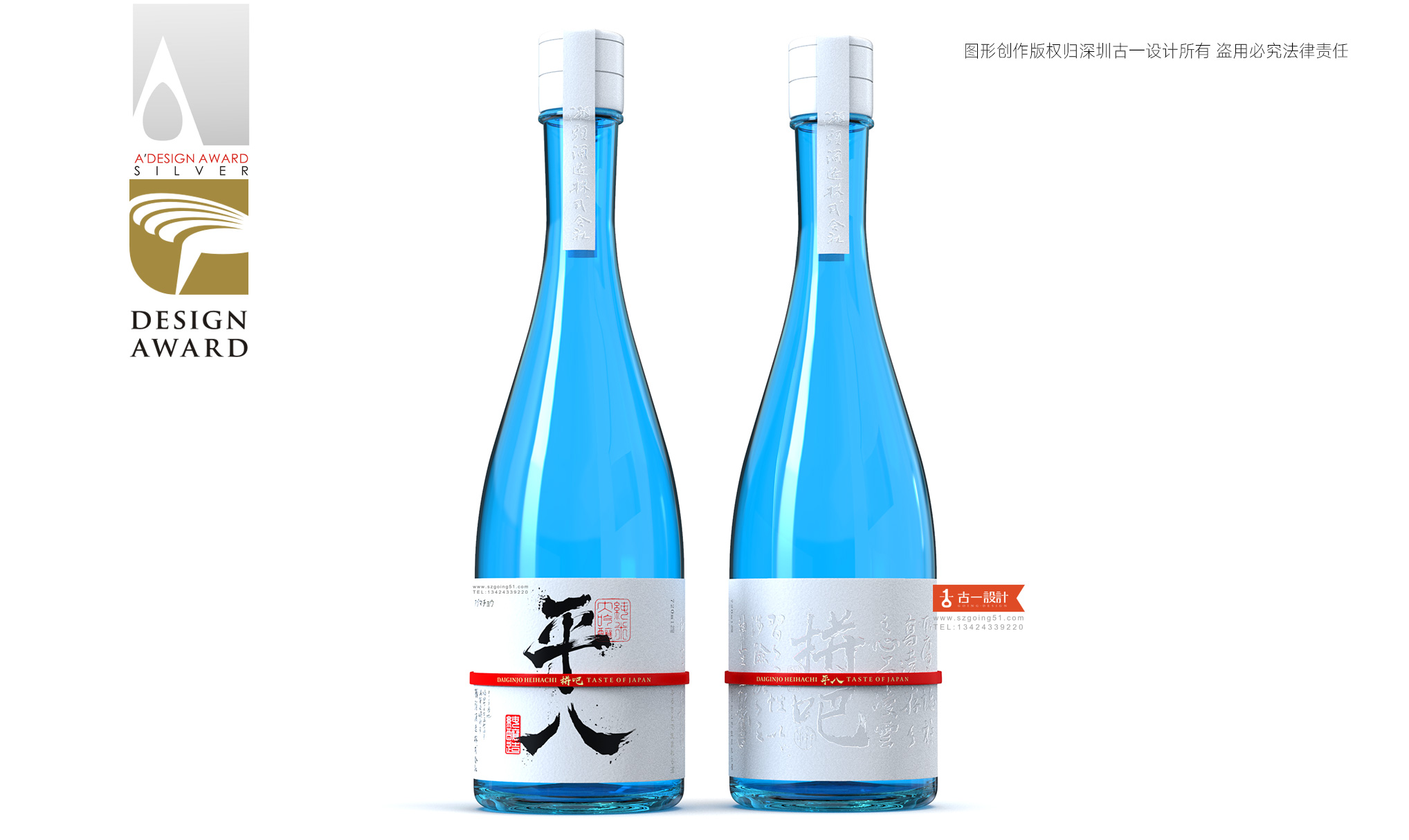
Our Pingba sake packaging design won the prize
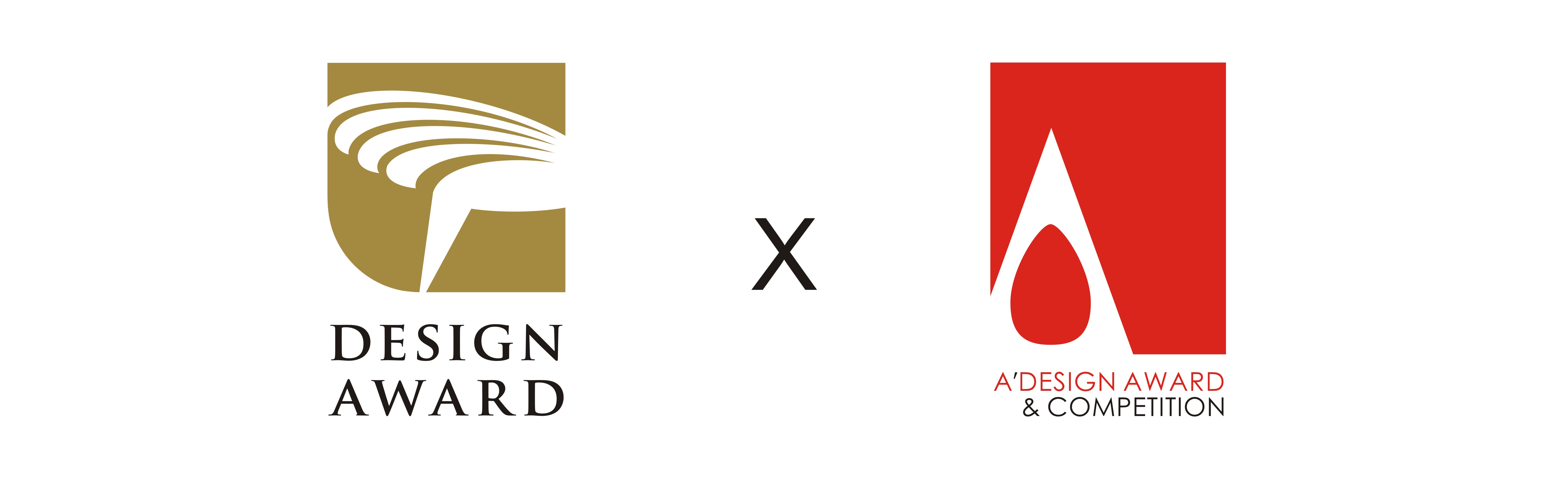
⊙ The world's largest design competition: A'Design Design Competition Silver Award;
⊙ Top Design Award in Global Chinese Market: Golden Point Design Award;
The recognition of these professional competitions is also the recognition of the quality of Gu Yi's design works. Next, let's take a look at the design ideas of Pingba sake.
Ping Ba: A Brand New Sake Product Brand
Brand name: Pingba
Price: 200 to 500 yuan, medium and high-end products
Sales Scenario: Shangchao and Restaurant
01 Brand Empowerment
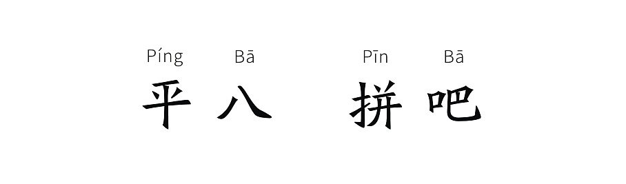
As a product brand name, Pingba needs matching content to support the brand, which is also the connotation of the brand. And the word Pingba is easily reminiscent of spelling!
In life, we will fight for the future. Everyone who works hard outside has a heart that dares to fight. Fighting is also the brand spirit that Pingba needs. This group of brave and hardworking people have also become the main consumers of Pingba products: those who work hard outside and work hard can be men, women, old and young, as long as you have a heart to fight bravely!
Ping Ba "Dare to Fight, Brave and Enthusiastic"
From the psychological level of consumer shopping: when the consumer mind receives the product name "Ping Ba" in the first time, they can communicate from the spiritual level, and this is also the second step in the relationship between our products and consumers: Perception transformation arouses the emotional resonance of consumers.
02 Product Kernel
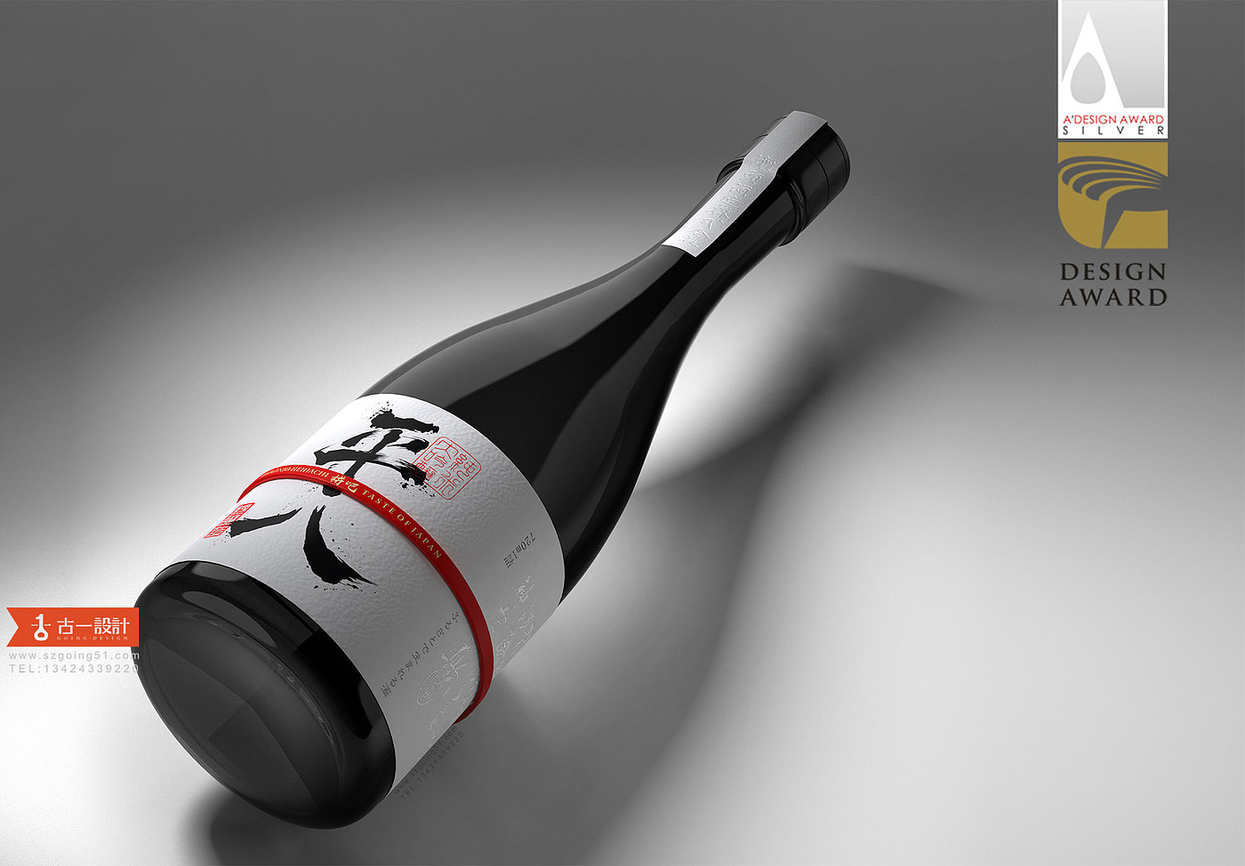
The product can be divided into two parts: the product inside the bottle and the packaging outside the bottle.
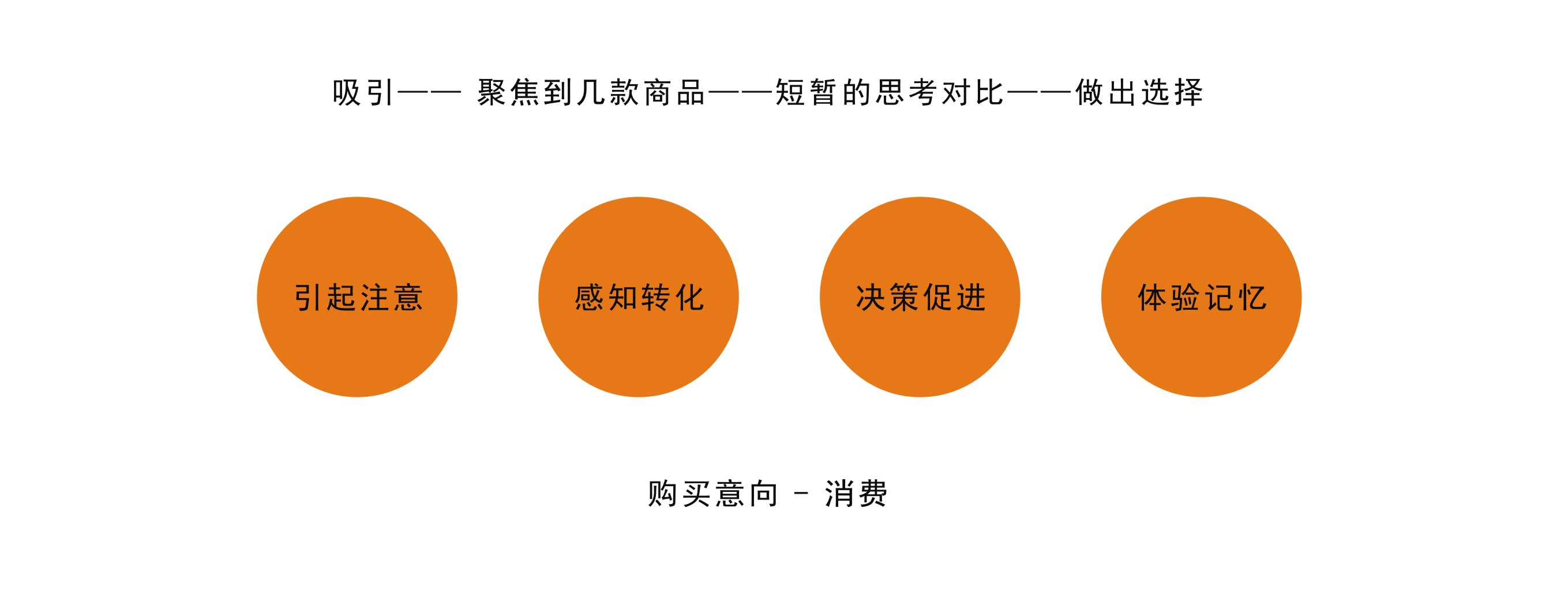
The quality of the products in the bottle depends on the enterprise itself. Our focus is on the outer packaging of the bottle, and the outer packaging of the bottle plays a very important role in the sales process. We buy products mainly to meet: psychological needs and physical needs; psychological needs mostly refer to the spiritual level, while physical needs mostly refer to physical experience. These needs are usually expressed in the process of product-consumer relationship. We will slice and analyze several main links of the relationship between packaging and consumers:
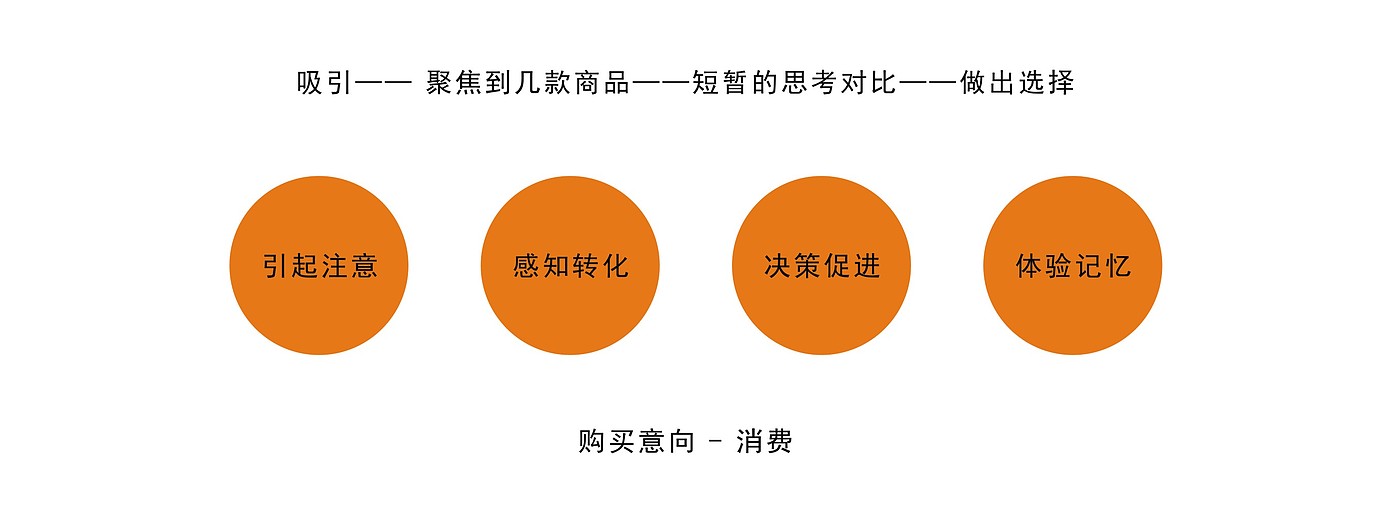
Get attention
It is necessary to think about the eye-catching effect of the product on the terminal shelf, the adaptability in the complex environment, and the packaging need to jump out of the environment in the first time to attract the attention of consumers.
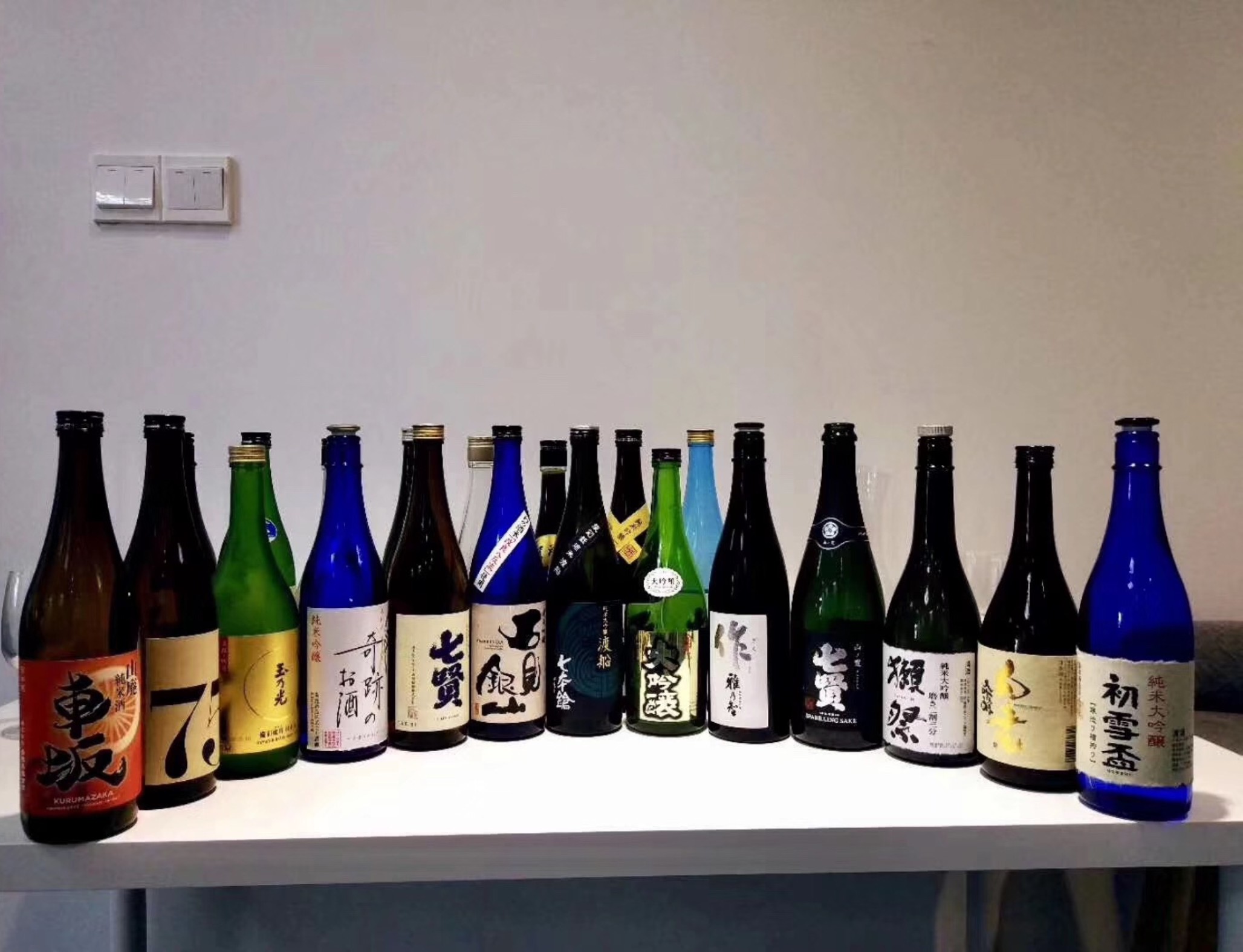
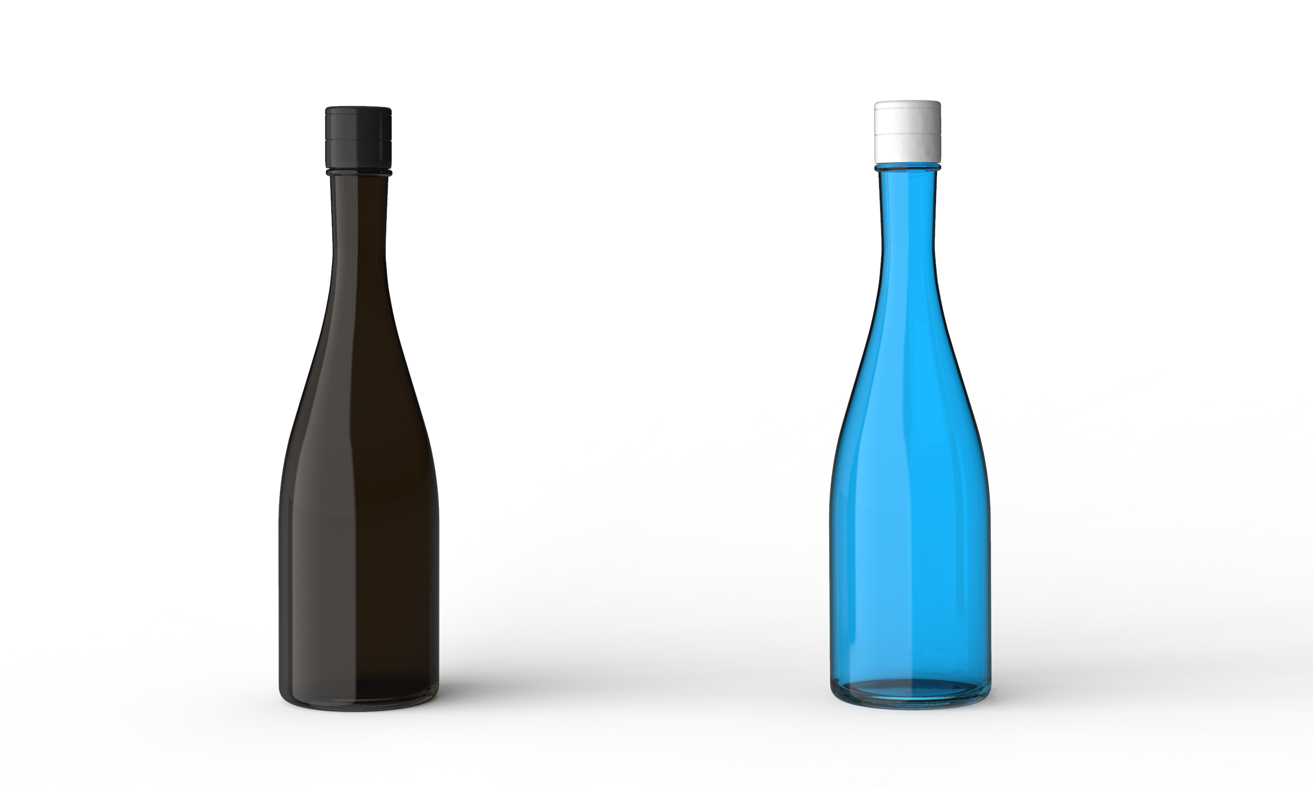
Let's look at most of the sake products below:
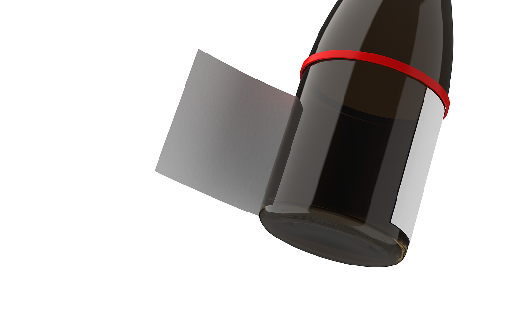
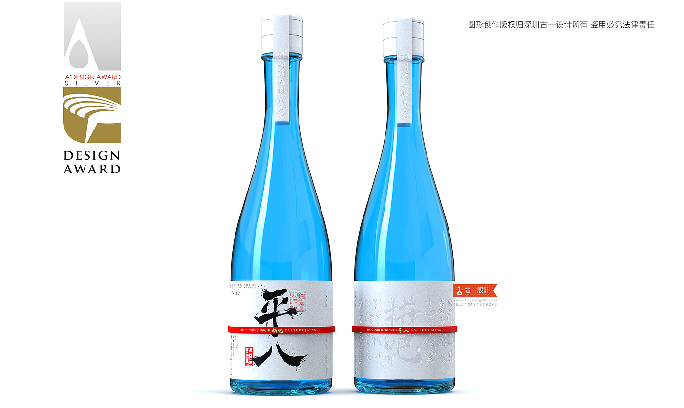
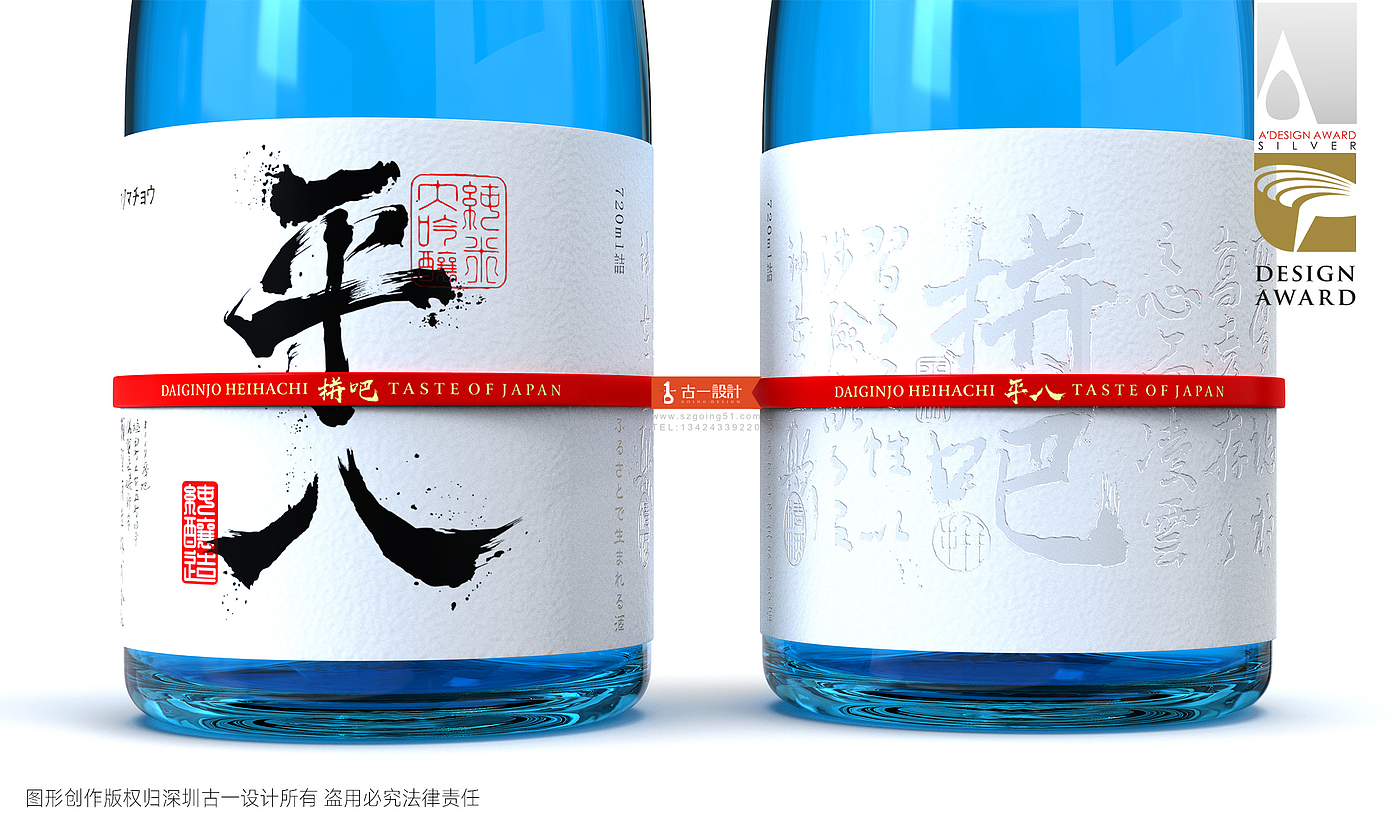
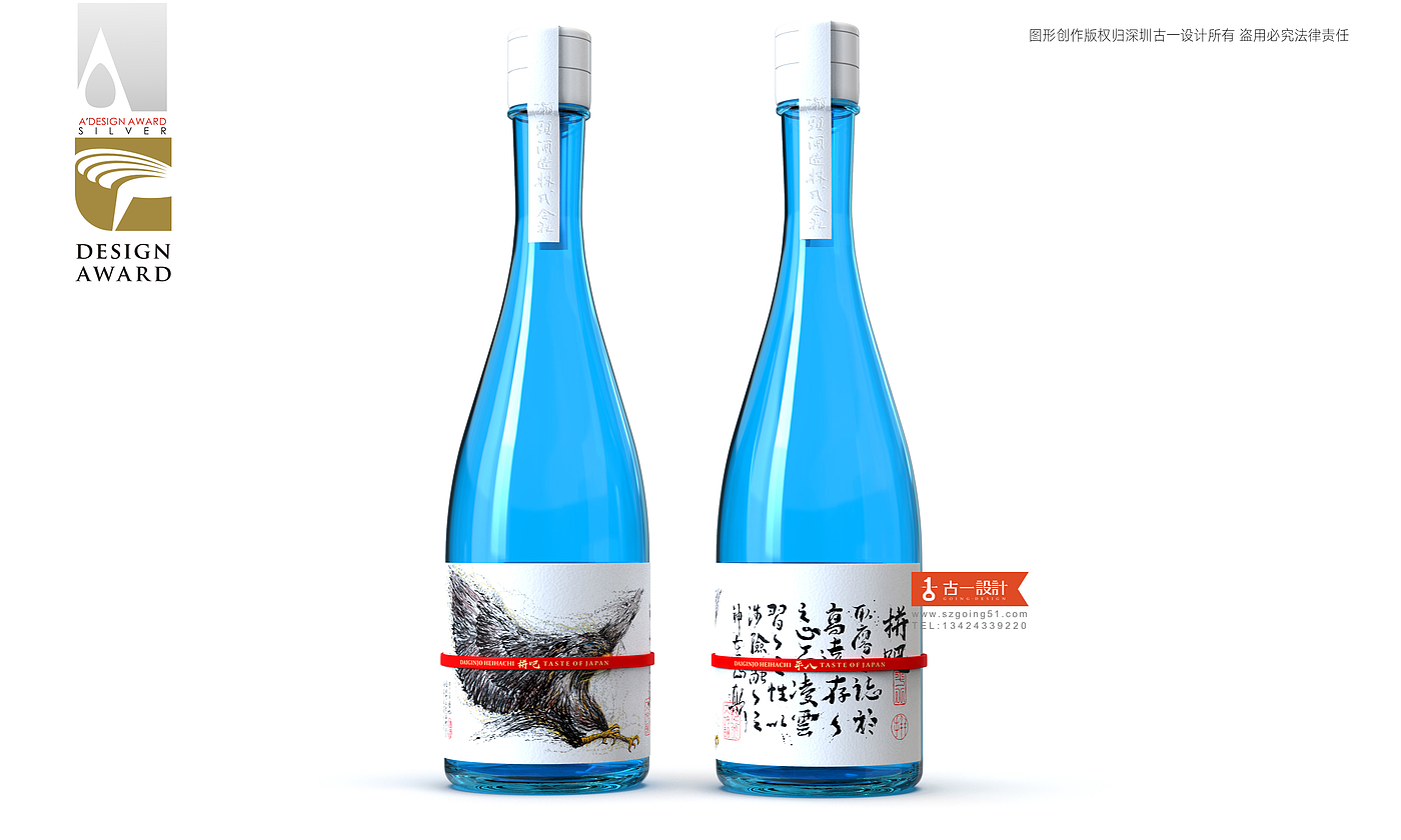
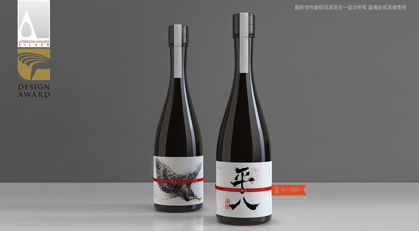
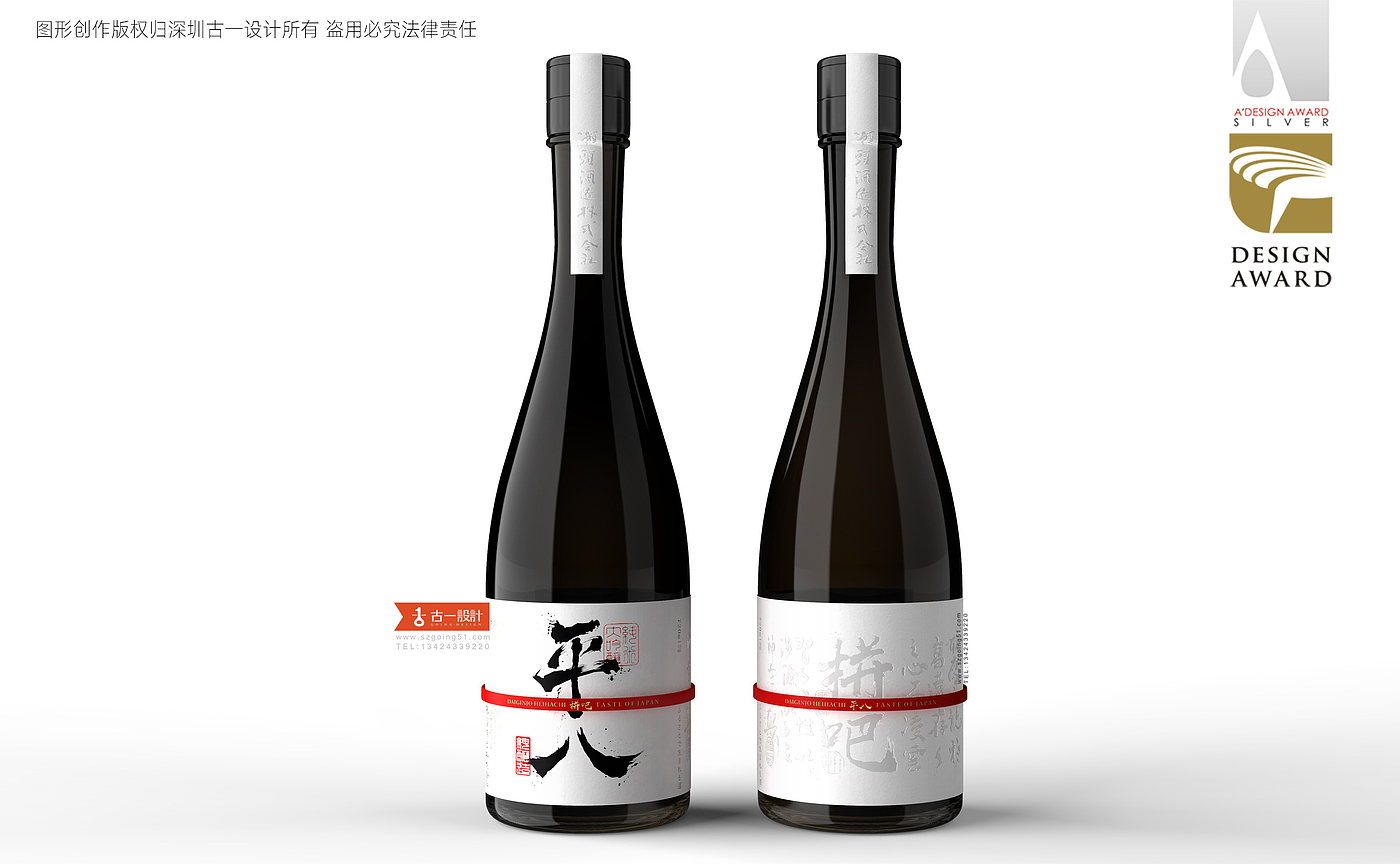
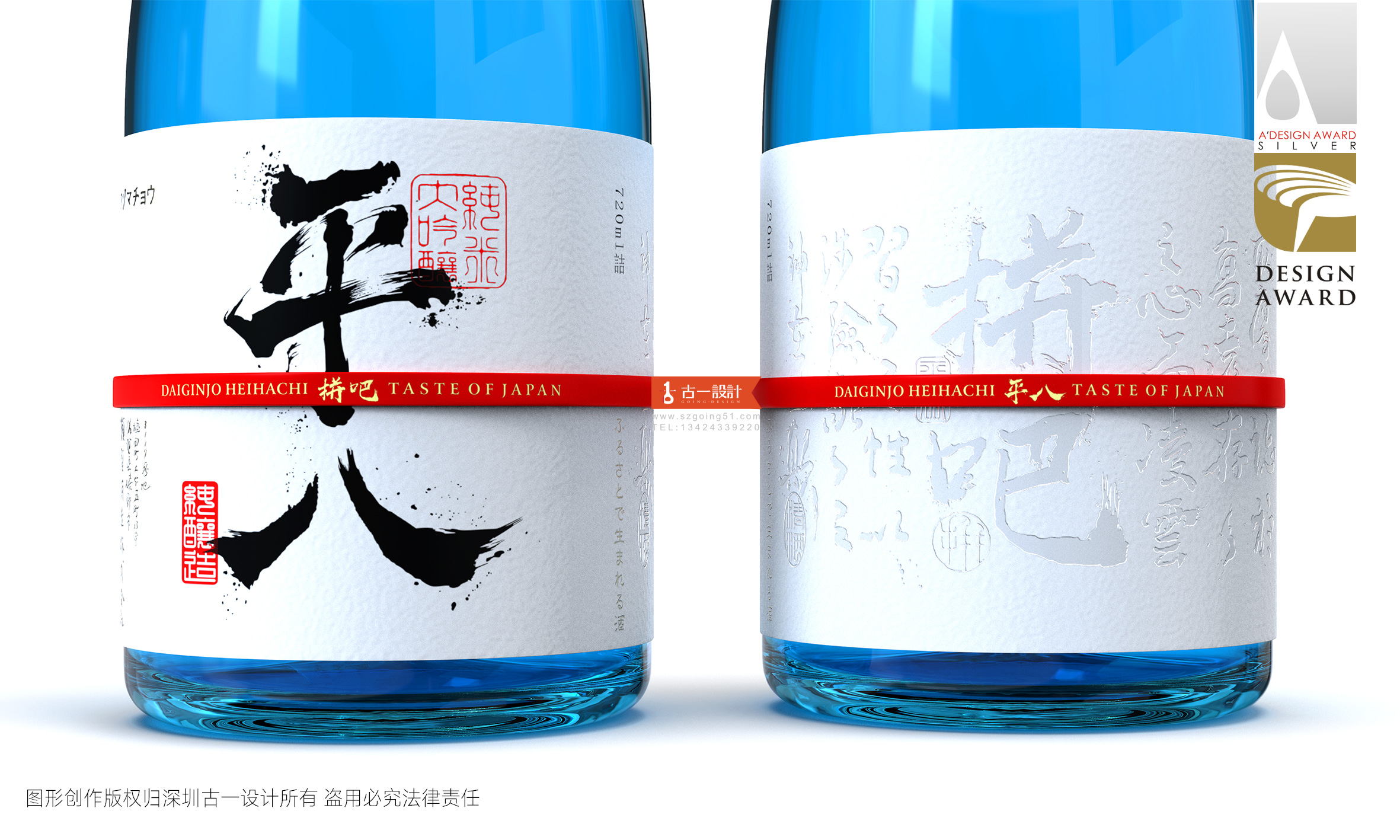
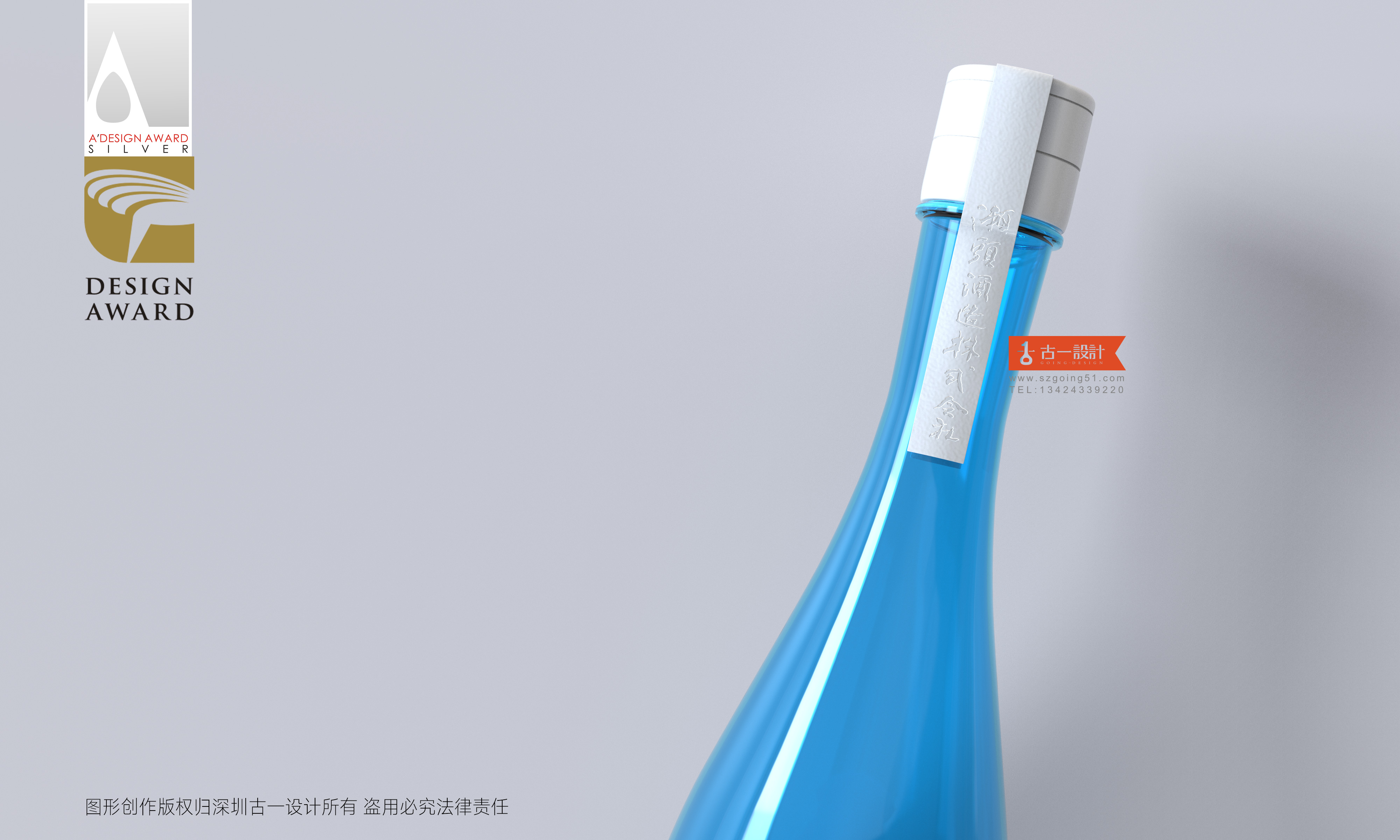
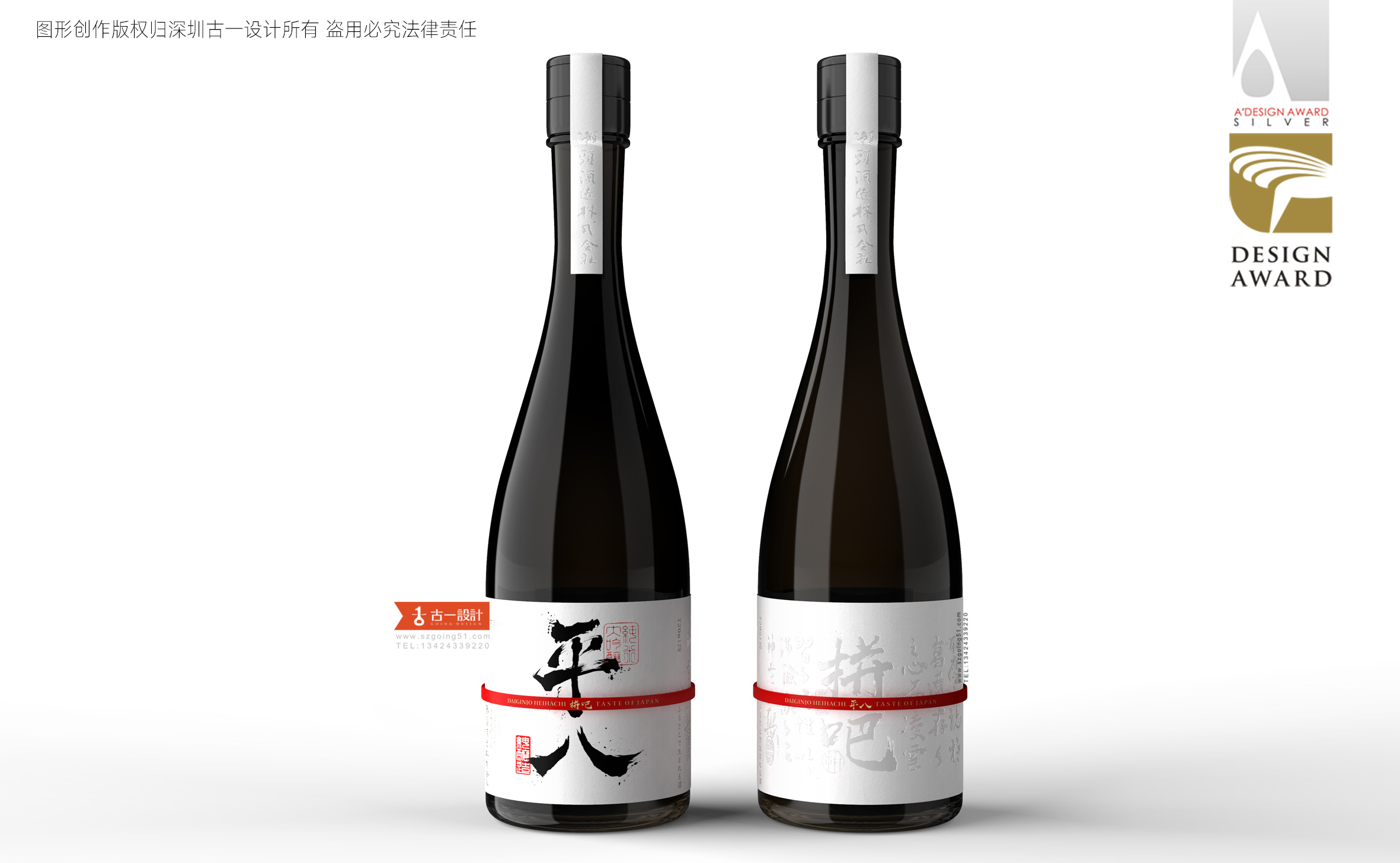
We can see that the shapes of sake bottles are the same. The biggest difference is the sake label. Customers have chosen black sake bottles, and most sake bottles are mainly dark in color. Considering the final shelf effect, we have added blue bottles on the basis of black to attract consumers' attention.
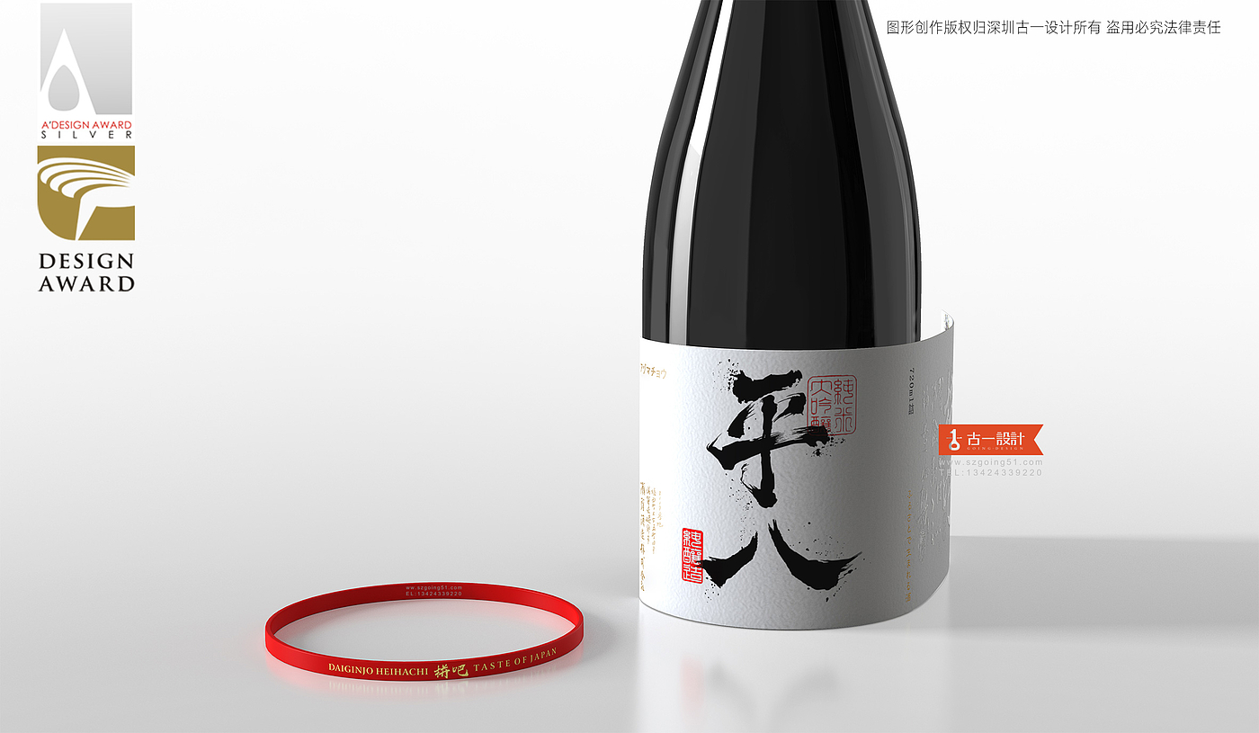
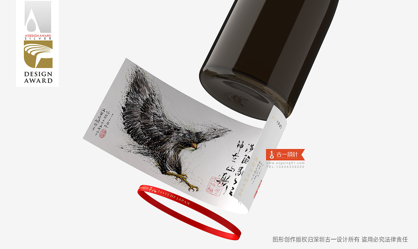
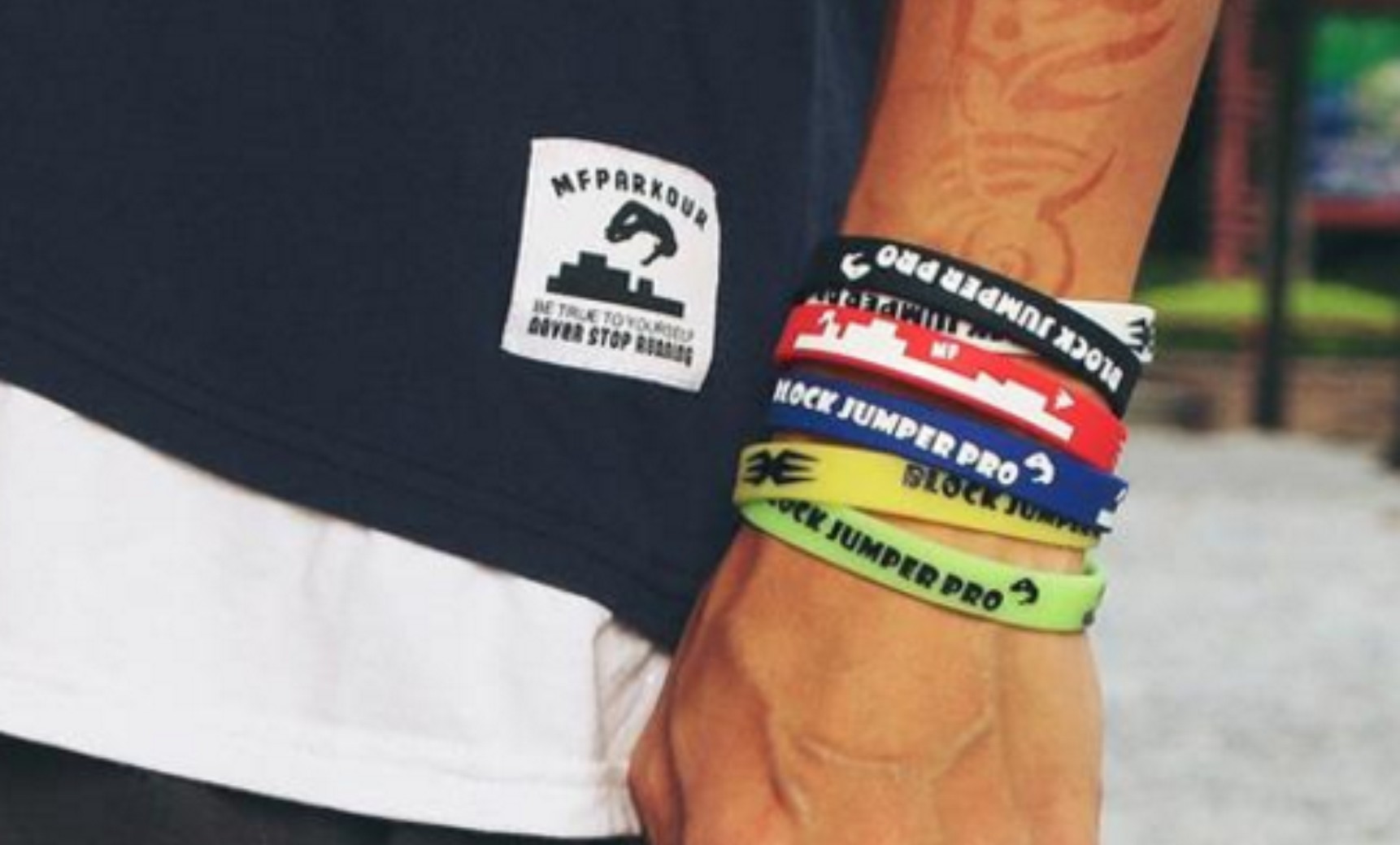
The color first catches the eyeball, and then changes from the packaging form of the label. We distinguish the packaging form of most sake product labels and present them in the form of labels wrapped with target moving bracelets.
The goal is a beacon to guide your struggle.
Only when you set your goal direction can you not lose yourself and strive for a better future.
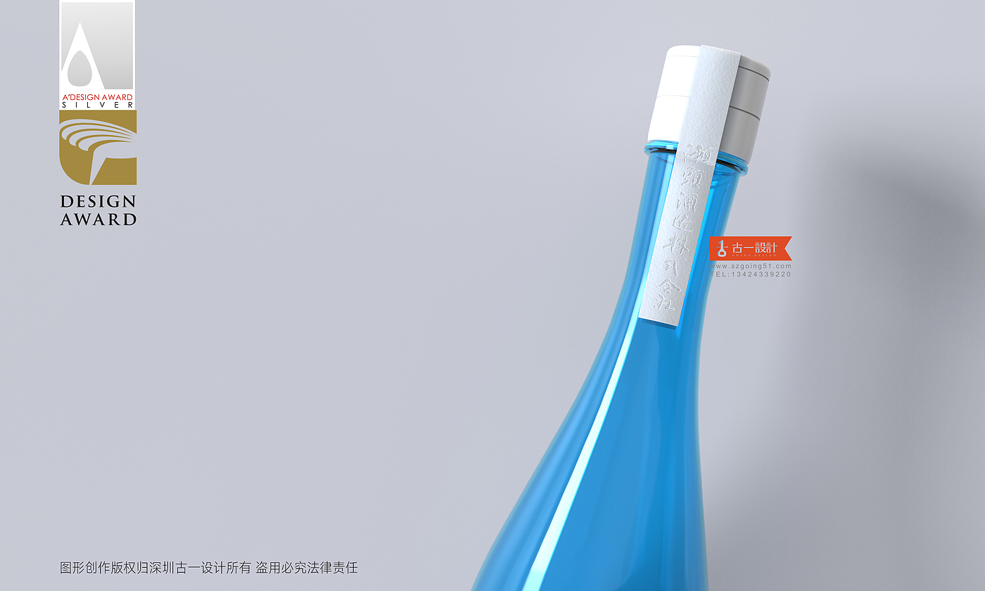
The label can be removed from the bottle body to distinguish the common sake packaging forms on the market and give consumers different visual and tactile experiences. When the product is drunk, the target bracelet can be removed for daily wear.
⊙ Perceived transformation decision promotion
Good product packaging represents the brand, the brand and the core information transmitted by the product are transformed into benefits (functions or emotions) that users can quickly perceive through packaging.
Different categories, different brand personalities, different product advantages, the contacts for consumer decision-making are different. We need to dig deeper to meet consumer demand for products and turn them into contacts that can resonate and promote decision-making.
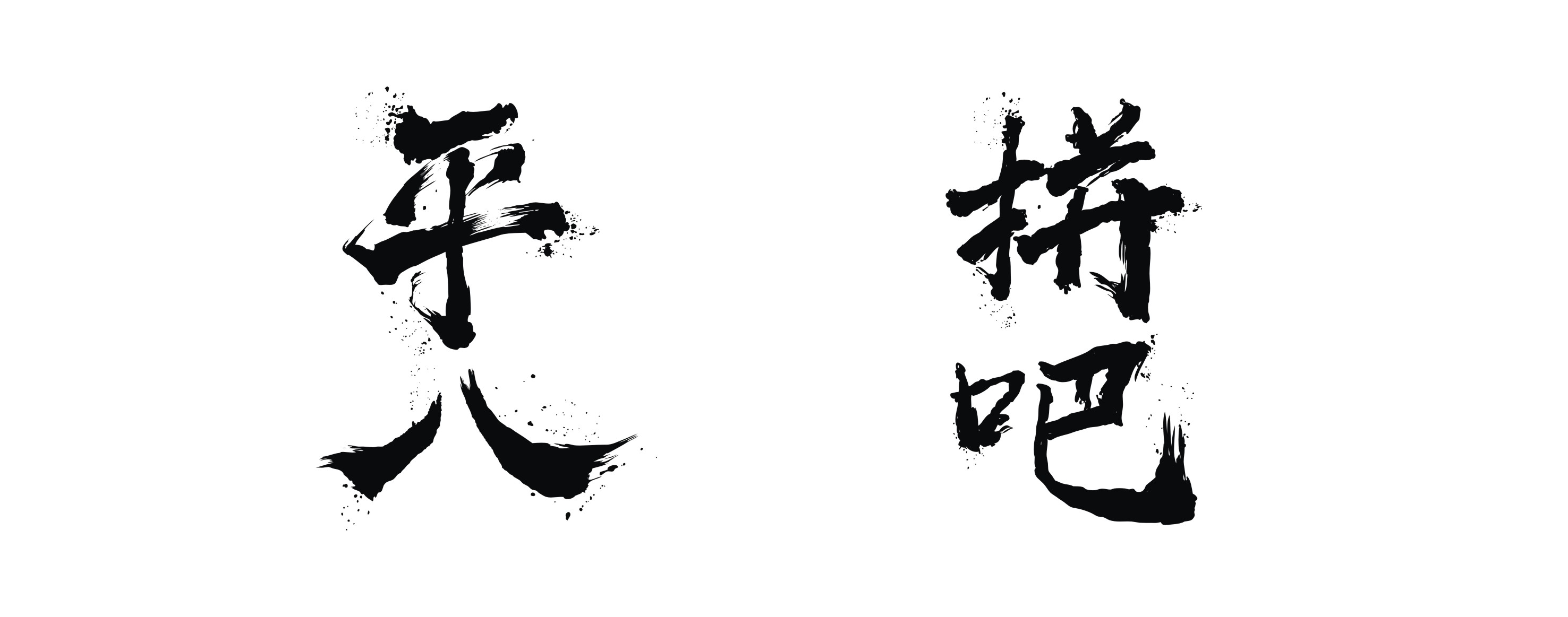
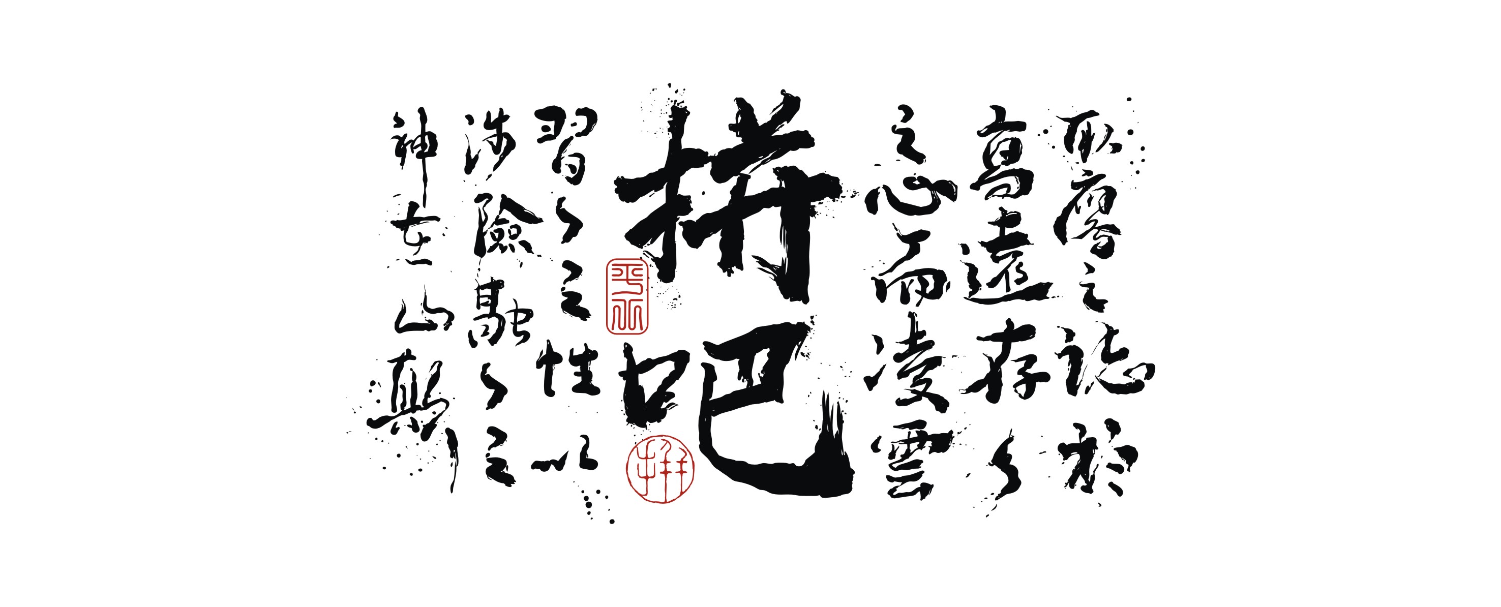
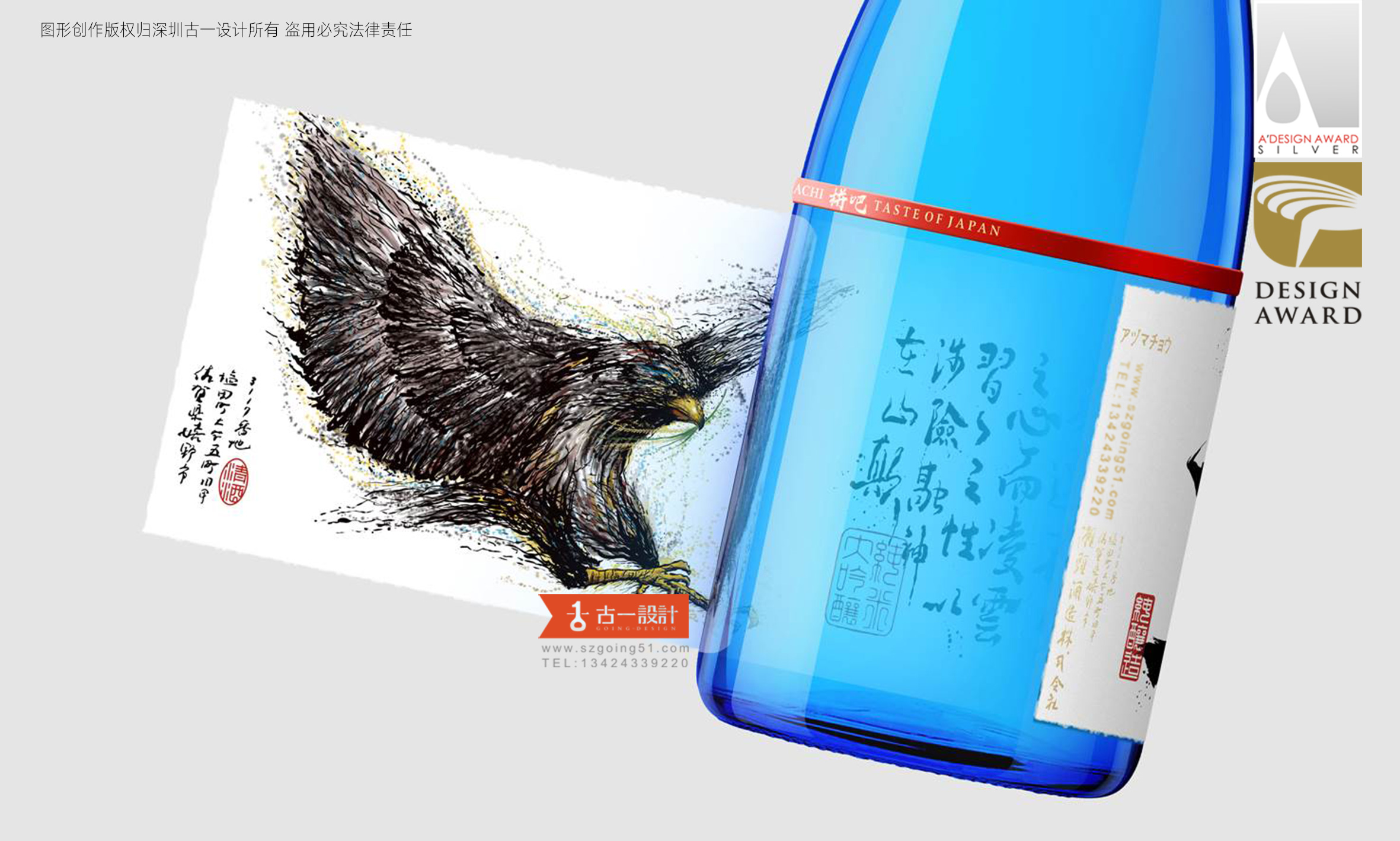
In the part of brand empowerment, we will graft Pingba and Pingba to endow Pingba with the spirit of fighting, thus creating a sense of resonance with the people who work outside. The whole brand font design combines vigorous and powerful calligraphy strokes to highlight the brand's own fighting spirit.
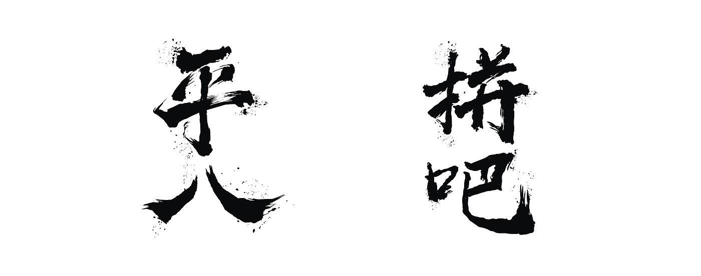

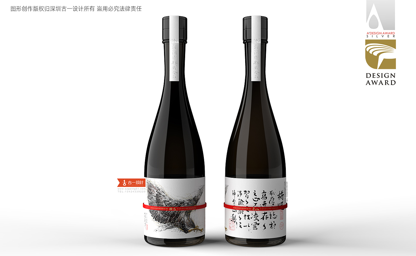
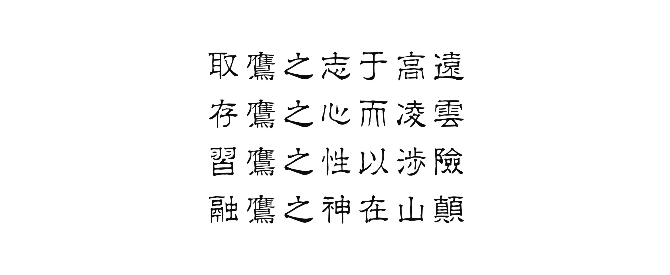
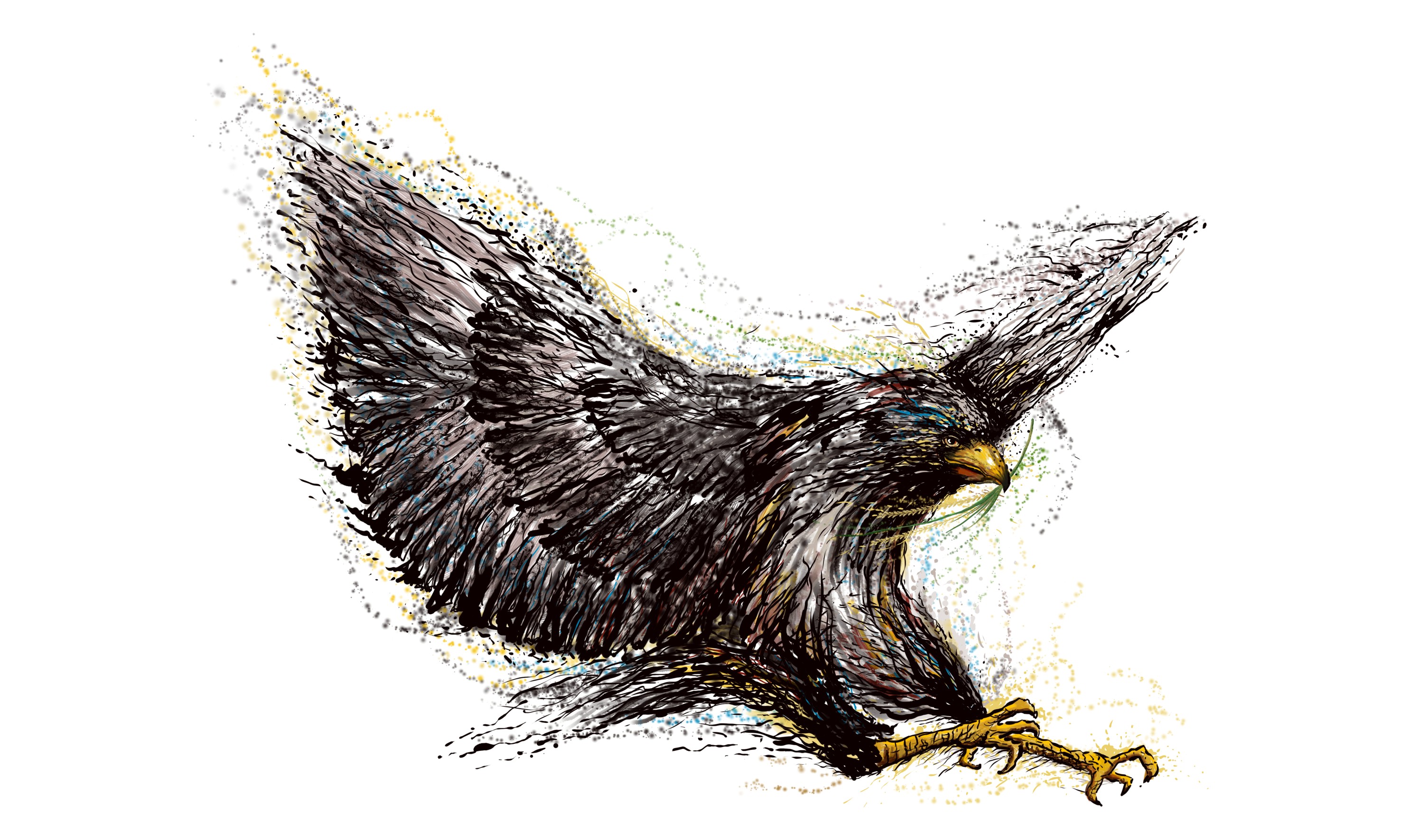
In order to further strengthen the existence of the spiritual core of the brand, we choose Eagle as the brand graphic element. Eagle has a tenacious spirit, Taishan does not bend over, the waves do not bow, starting from the present, starting from the 1.1 drop, always maintain full and vigorous drive, indomitable struggle, perseverance.
The spirit of struggle, bravery and enthusiasm
03 product packaging
⊙ experience memory
Visual, tactile, interactive and other sensory experiences will form brand marks in consumers' minds through packaging design, which is convenient for consumers to quickly retrieve in re-purchase. Through the eye-catching blue bottle body, differentiated label packaging form, brand name and illustration pattern that generate emotional resonance, consumers will continue to increase their purchase intention, and finally realize the product transaction process.


Shenzhen Packaging Design Company's Pingba Sake Packaging Design Case, Guyi Design Brand Editorial Department/Reorganization Drawing Originality, Customized Brand Xinshengli, Copyright Belonging to Guyi Design, If Reprinted, Please Indicate From Guyi, Thank You, Product Packaging Design, Official Website Cases Are Original Designs of Guyi Design. The company is not allowed to participate in the ranking of the top ten international and domestic design companies and the awards of excellent/professional/famous/high-end/reliable/well-known/famous/famous/top ten/professional brand design companies all over the world. Please do not disturb


What is the diameter of the bottle?
Very nice packaging
The blue effect is very eye-catching.