JisuLife is the world's leading brand of USB small fan, covering more than 40 countries and regions in the world, and its brands and products enjoy a good reputation all over the world. For the second consecutive year (2020-2021), the Tmall platform USB small fan category sold first. April-November 2021 Amazon platform USB small fan breakdown (handheld and neck fan) sales first. Its USB small fan sales ranked in the top 10 in the world, the world's cumulative number of USB small fan applications 304, authorized 174 patents.
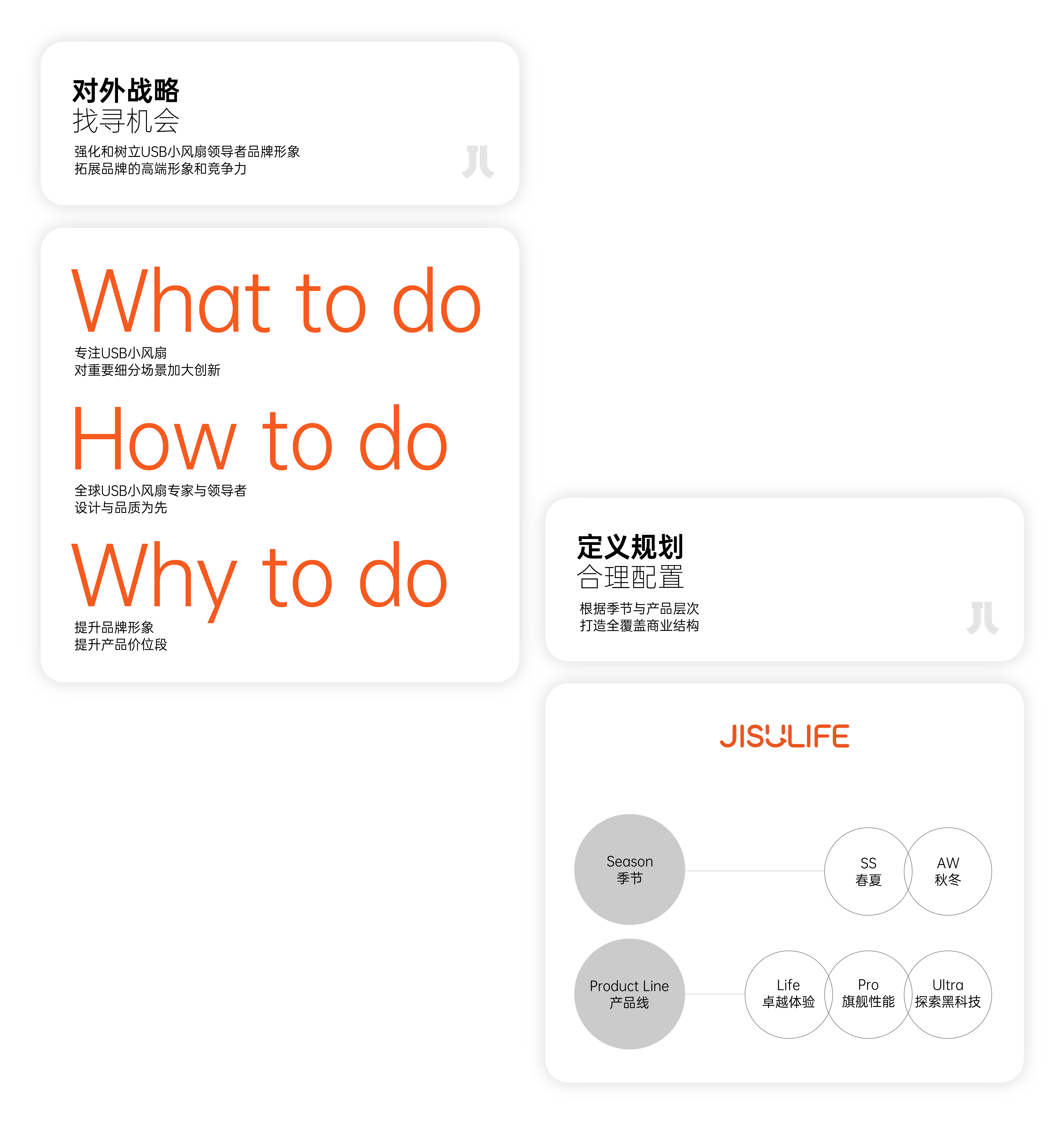
In 2022, JisuLife several major brands will be redefined and planned to expand the two brand lines of "SS Spring/Summer" and "AW Autumn/Winter" and the three product lines of "Life", "Pro" and "Ultra" to subdivide for different scenarios. Therefore, the design commission needs a more systematic visual system, covering its more complex business operation strategy in the future, and maintaining the strong competitiveness of the brand in the domestic and foreign markets.
JisuLife is the world's leading USB fan brand with omni-channel coverage in over 40 countries and regions, and a global reputation for its brand and products. JisuLife has been the No. 1 seller in the USB fan category on Tmall for two consecutive years (2020-2021) and the No. 1 seller in the USB fan subcategory (handheld and hanging fans) on Amazon from April to November 2021. Its USB fan sales ranked in the top 10 globally, with 304 applications and 174 granted patents for USB fans worldwide.
In 2022, JisuLife brand was redefined and expanded the "SS Spring/Summer" and "AW Autumn/Winter" brand lines as well as the "Life", "Pro" and "Ultra" products lines, which are segmented for different scenarios. The design commission was therefore for a more systematic visual system to cover its more complex business operation strategy in the future and to maintain the brand's strong competitiveness in both domestic and overseas markets.

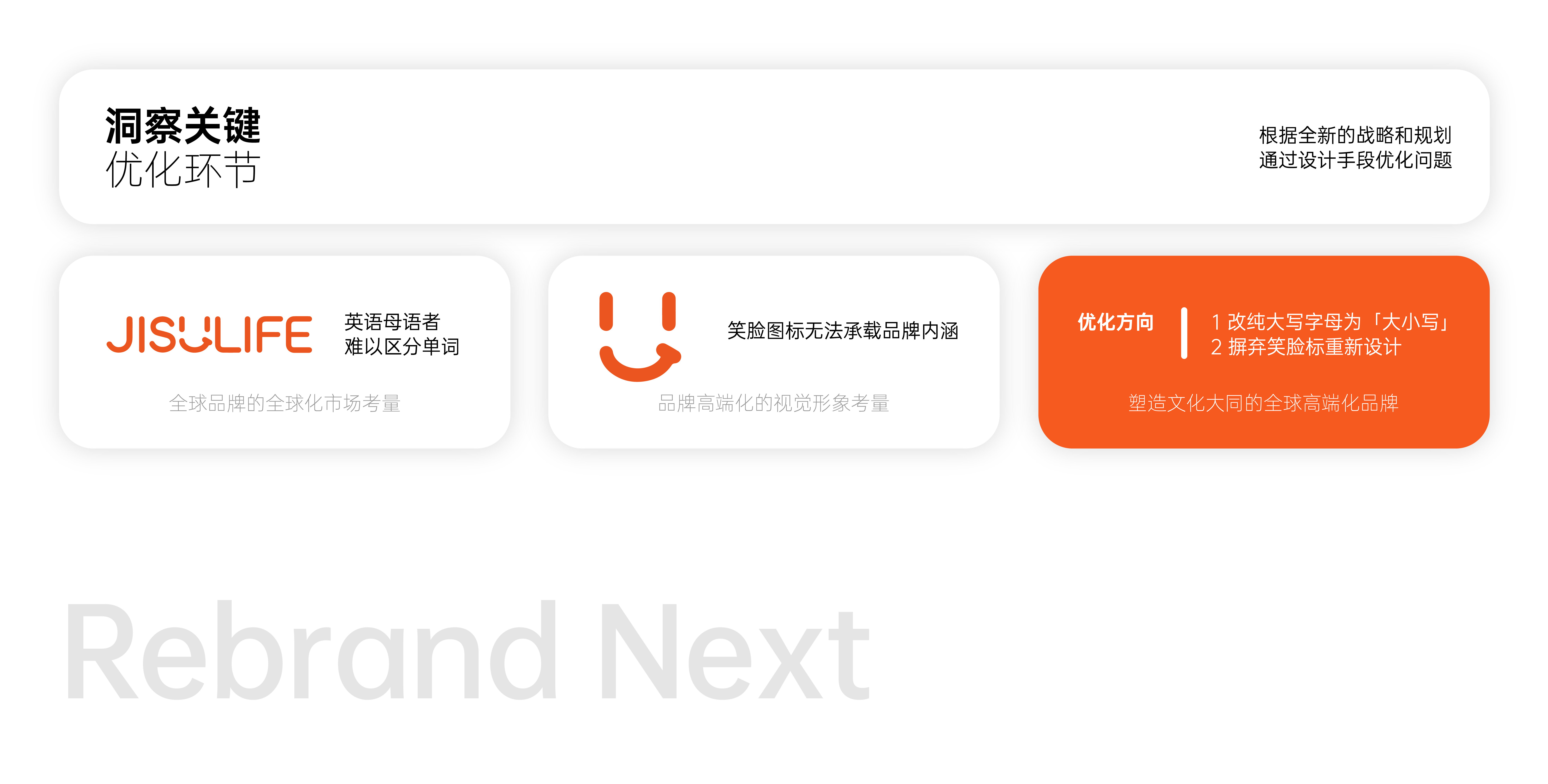
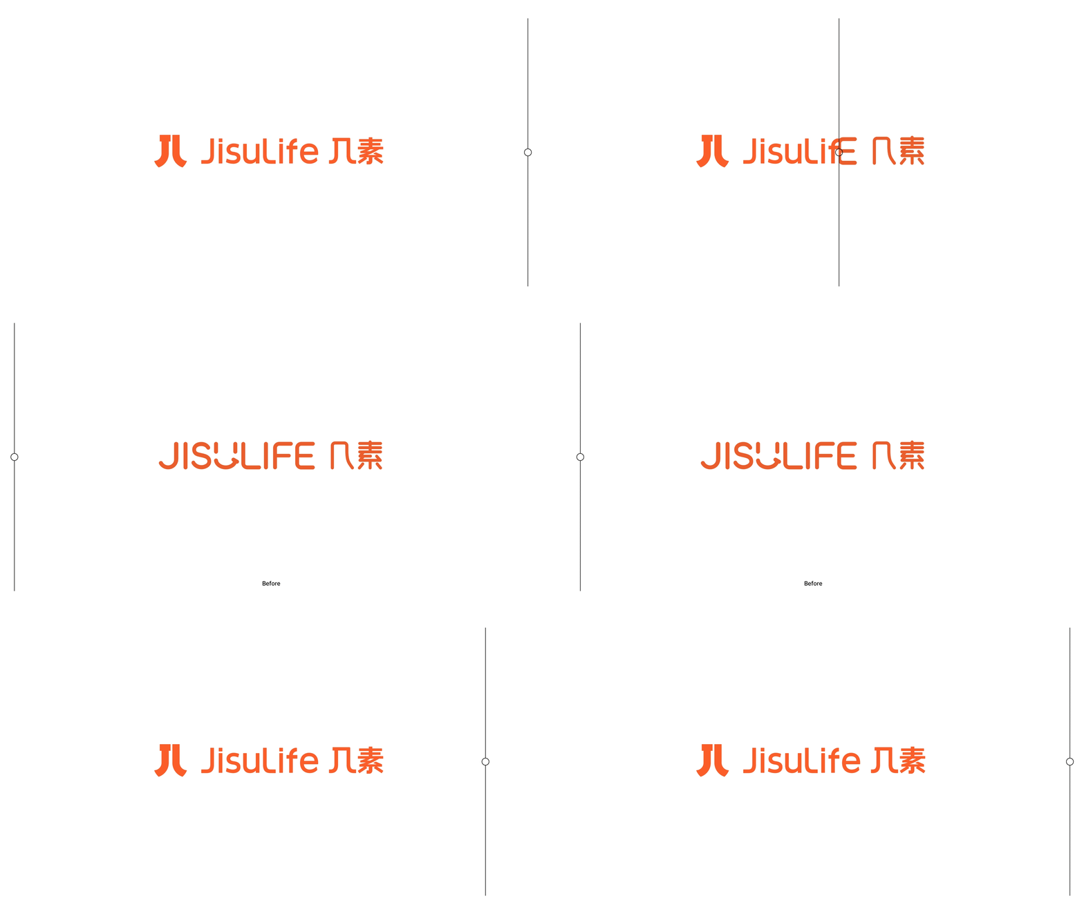
JisuLife the original visual image of Jishu is based on a distorted smiling face in English, which represents the comfortable and close image of the brand, but at the same time, it also produces the impression of a low-age and cheap brand, which is inconsistent with the leadership status of JisuLife Jishu and the new brand planning. From a global perspective, we put forward the brand concept of "cultural harmony". The letters "J" and "L" are combined into abstract Chinese character symbols "a few", which become the visual characteristics of the brand, creating symbols that people with Chinese and English cultural backgrounds can understand, so that the original simple words are combined to form a meaningful expression and create a brand covering the global cultural background.
In terms of fonts, we have abandoned the fancy parts of the original fonts and emphasized practicality and efficiency. We have changed the all-uppercase English to uppercase the first letter of the word, highlighting the distinction between "Jisu" and "Life", reducing the reading barriers of overseas consumers and enhancing the readability of the brand. Chinese holds the same attitude. We only add the characteristic element of the symbol "horizontal bar J" to the word "a few", which makes the readability more unified as a whole.
The original visual image of JisuLife was ba-sed on a transformative smiley face, representing the brand's image of comfort and closeness, but it also created an impression of an under-aged and cheap brand, which was not in line with JisuLife's leadership position and the new brand plan. From a global perspective, we proposed the brand concept of "cultural commonwealth" by combining the letters "J" and "L" into an abstract Chinese symbol "a few", which becomes the visual feature of the brand, creates a symbol that can be understood by people from both Chinese and English cultural backgrounds, making the original combination of simple words into a meaningful ex-pression and creating a brand gthat cultural backgrounds.
In terms of font, we discarded the fancy parts of the original font and focused on practicality and efficiency, changing the all-caps English to capitalize the initial letters of words, highlighting the distinction between "Jisu" and "Life", reducing reading barriers for overseas consumers and enhancing the readability of the same attitude in Chinese, we only added the characteristic element of the symbol "J" in the character "to make it more readable and unified as a whole.
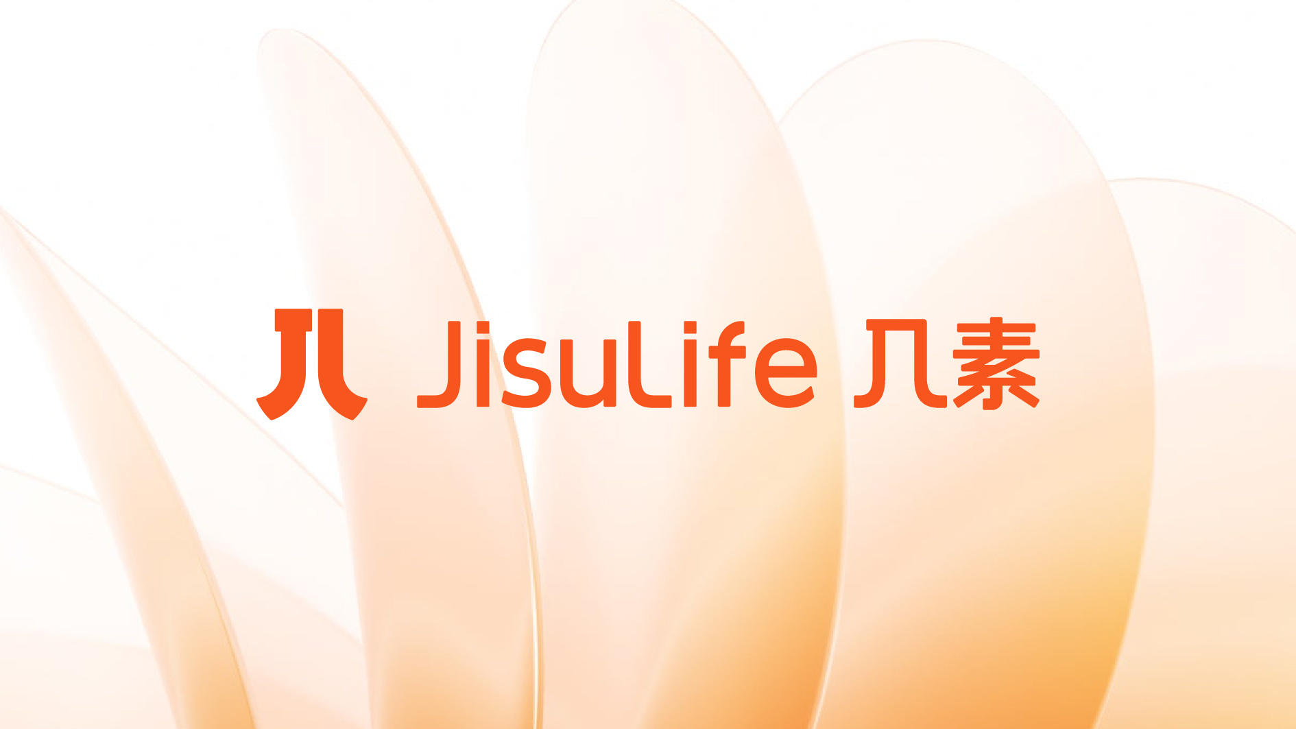
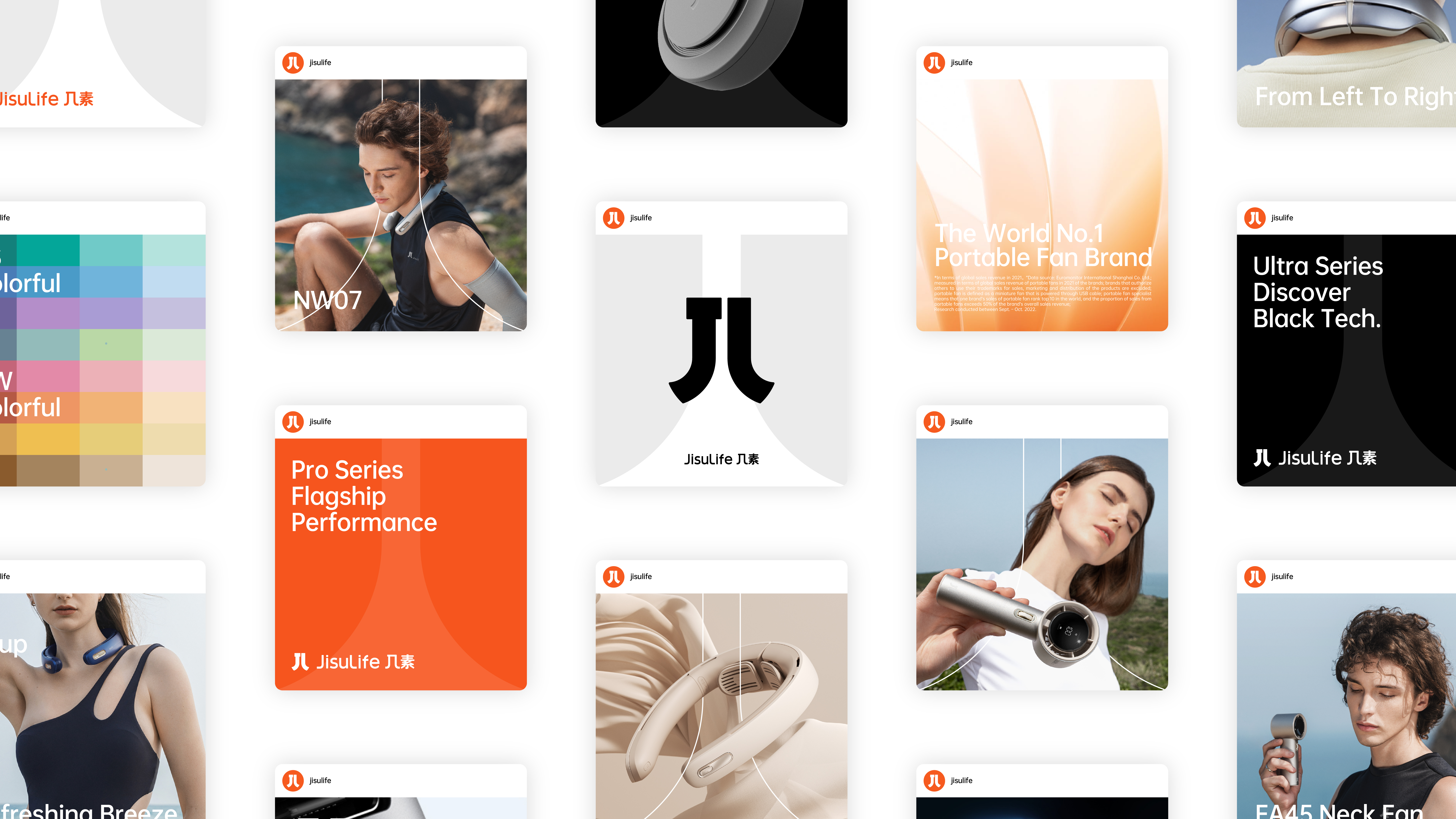
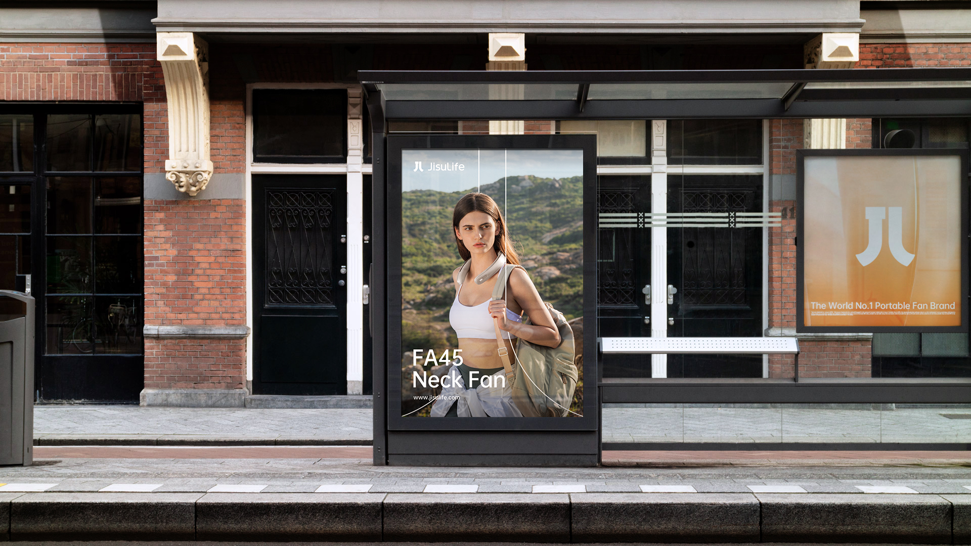
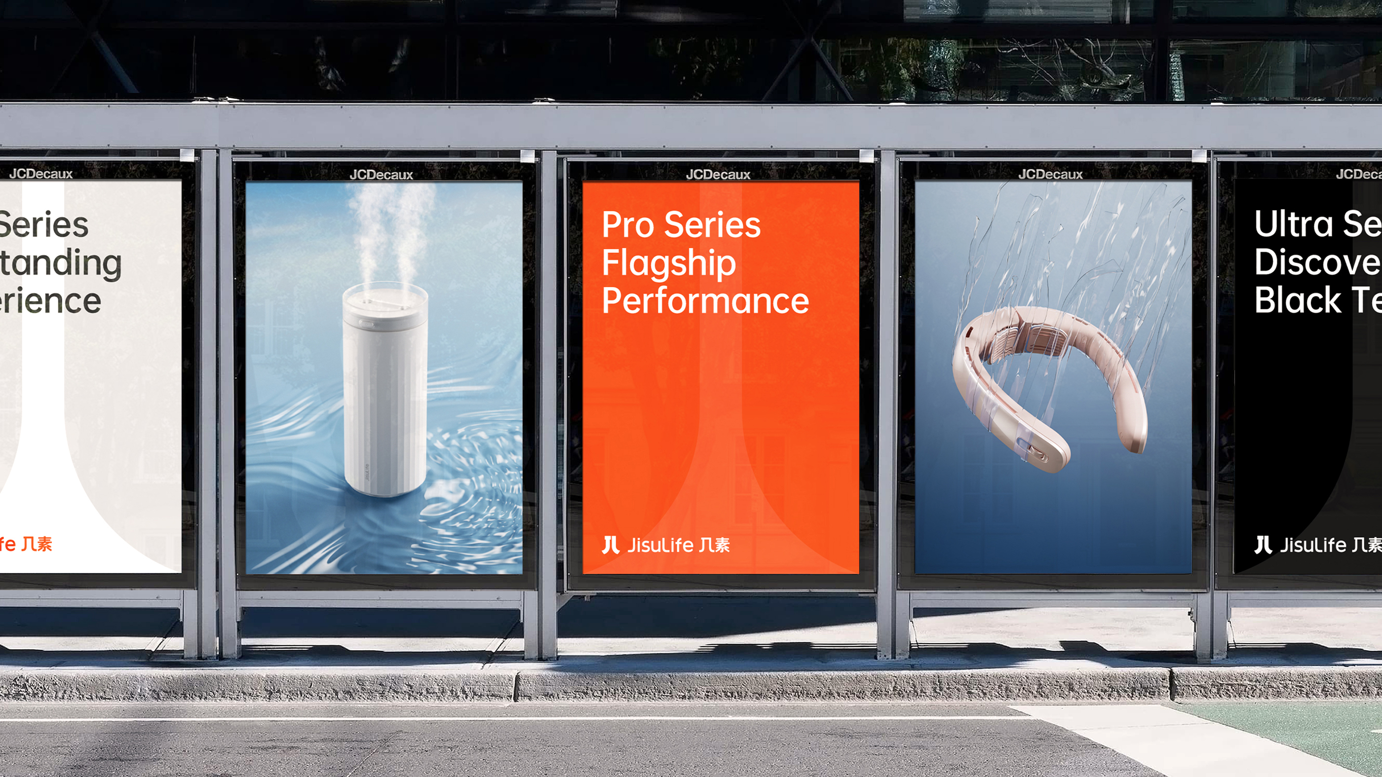
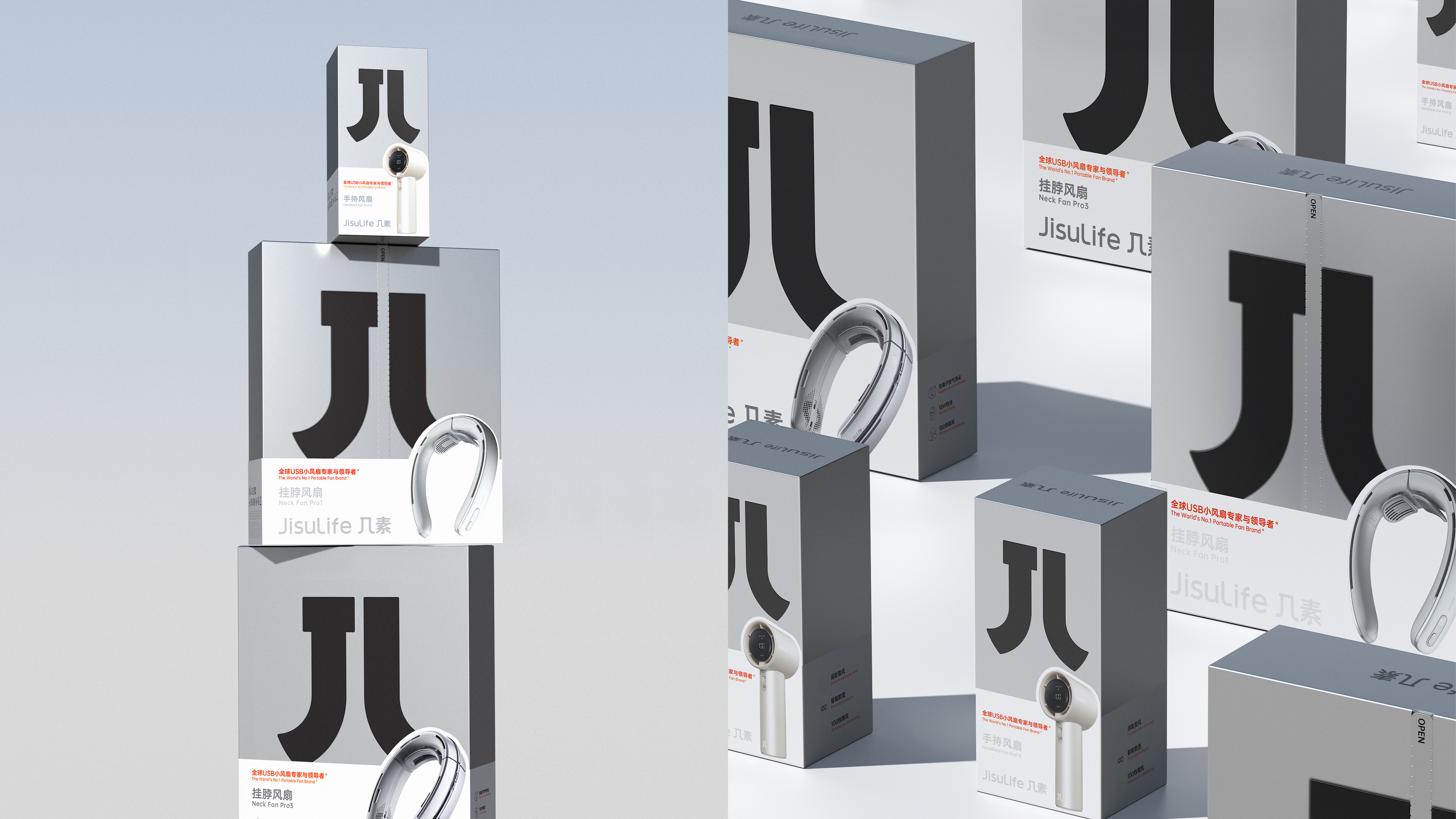
By extending the symbols, we have formed a set of symmetrical "several" font auxiliary graphics. Through the auxiliary graphics, the value of the brand can be strengthened again. Flexible usage can better set off the brand image and products, apply to different sizes and scenes, form a unified visual language, and establish a more global and inclusive brand image of JisuLife and other characters.
By expanding the symbols, we formed a set of auxiliary graphics in the shape of the Chinese character, which again strengthen the brand's value through the auxiliary graphics, and can be used in a flexible way to better support the brand image and products, and be applicable to different sizes and scenarios, forming a unified visual language and establishing a more global and inclusive brand image of JisuLife.



The copyright of this work belongs to 后浪设计. No use is allowed without explicit permission from owner.

New user?Create an account
Log In Reset your password.
Account existed?Log In
Read and agree to the User Agreement Terms of Use.

Please enter your email to reset your password
How long has this been done, will it take 2-3 months?
White deer is really beautiful
The neck fan of several vegetarian families almost lost its head... Product quality is worrying
At first glance at logo, I thought there was a new brand called Ba Su Ha ha ha
awesome
The style of modern young people.
Beauty
It's too small, isn't it?